 February 28, 2023
  copycat


- Why is CSS Border important?
- What is border CSS?
- How do CSS borders work?
- How to Add and Style CSS Borders
- Understanding Border Radius and Custom Border Styles
- How do I change my border style? (Custom border styles)
- What is the difference between CSS outline and Border?
- Best Practices for Using CSS Borders
- More Real Life Examples using CSS Border
- Create Great Design Easily with CSS Border
Why is CSS Border important?
You may have struggled to add a border to your website or wanted to customize the border style beyond the basic options provided by your content management system. Whatever your experience, it’s clear that CSS border is essential to web design. CSS border creates various visual elements on websites, from simple outlines around images to complex custom border styles that make designs stand out.
We’ll explore everything you need to know about CSS border, including how to add a border in CSS, style CSS borders, draw a border in CSS, and much more. Read on to understand how to create stunning borders that will make your website stand out.
What is border CSS?
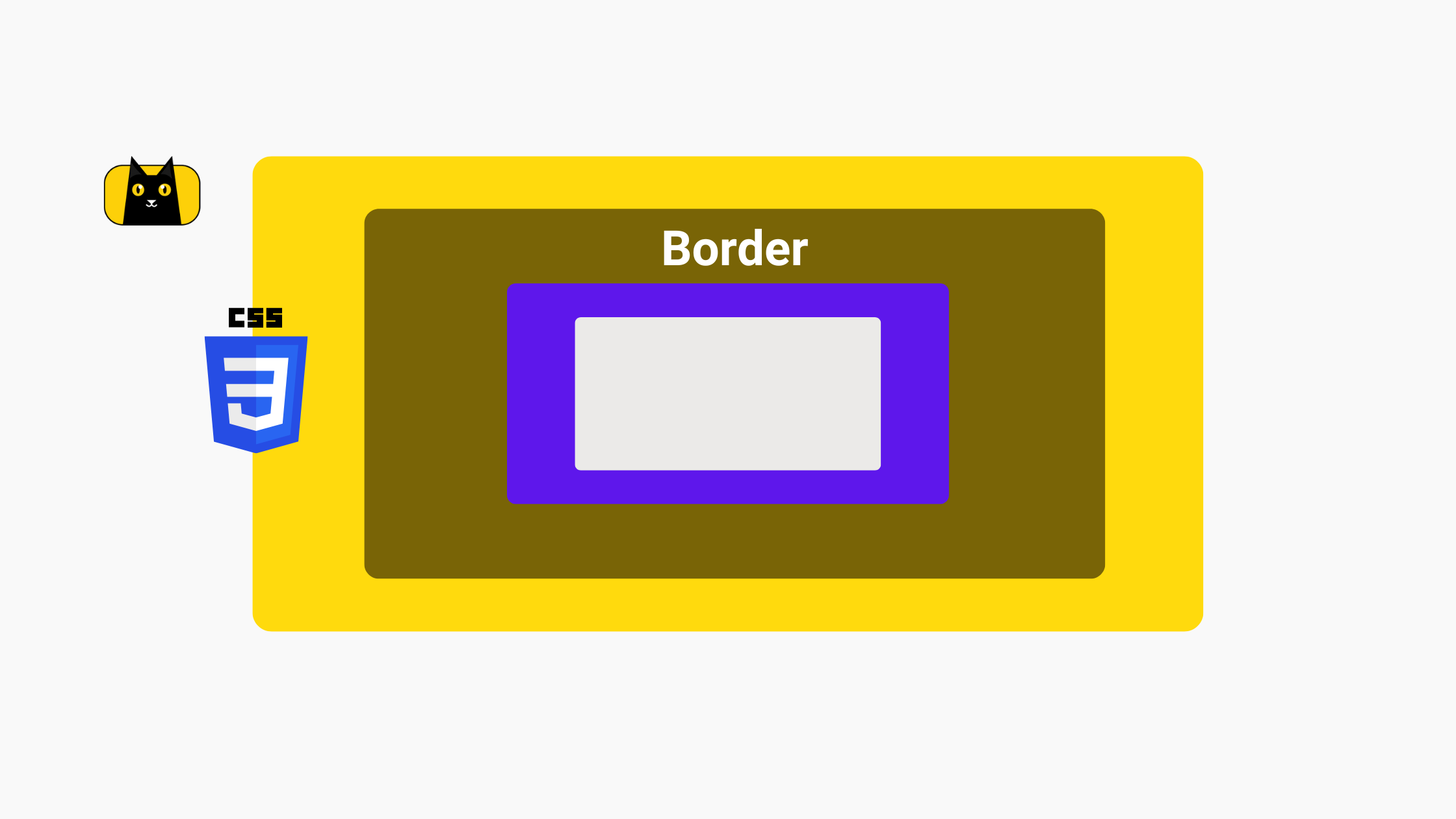
Border CSS is a property in Cascading Style Sheets (CSS) that allows you to add a border to an HTML element. A border is a visual element that surrounds an element and separates it from other elements on the page. The border CSS property has three main components: border-width, border-style, and border-color. These components combine to create various border styles, from simple lines to complex patterns.
The border CSS property is commonly used in web design to add visual interest to an element or to separate elements on a page. With border CSS, you can create custom borders that fit your design needs, including rounded corners, dotted lines, and gradient borders. By using the border CSS property, you can enhance the visual appeal of your website and create a cohesive design that engages your users.
How do CSS borders work?
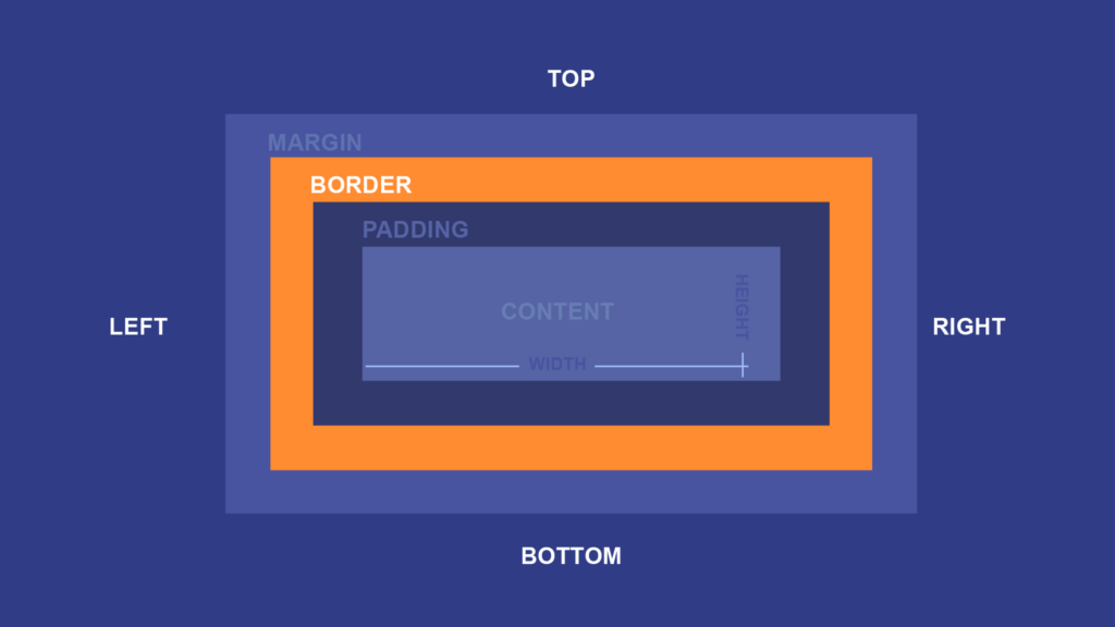
CSS borders work by creating a visible edge around an HTML element. The border is added to the element’s box model, which includes the content, padding, and margin. You can use the border CSS property to customize borders with different thicknesses, styles, and colors. Here’s how to use CSS border in 2 minutes:
The border CSS property has three components: border-width, border-style, and border-color. Border-width controls the border’s thickness, border-style controls the style of the border, and border-color controls the border’s color. Combine these components to create a wide variety of border styles.
Borders apply to any HTML element, including images, text, and containers. People often use borders to create visual separations between elements, highlight specific content, or create visual interest. For example, you might use a thick, red border to draw attention to a warning message or a dotted border to create a decorative effect around an image.
CSS borders are a simple yet effective way to enhance the visual design of a website and create a more engaging user experience. But how do we use it?
How to Add and Style CSS Borders
Like previously mentioned, CSS borders are created using the border property, which has three main components: border-width, border-style, and border-color. Here’s how to use each component to add and style a border in CSS.
How to add a border in css?
To add a border to an HTML element, you can use the border property and specify the desired values for border-width, border-style, and border-color. Here’s an example of how to add a simple border to a paragraph element:
<p style="border: 1px solid black;">This is a paragraph with a border.</p>
In this example, the border-width is set to 1 pixel, the border-style is set to solid, and the border-color is set to black. You can adjust each value to create the desired border style.
How do you style a border in CSS?
Once you’ve added a border to an HTML element, you can style it further using the following properties:
border-color:
This property allows you to change the color of the border. Here’s an example of how to change the border color to red:
<p style="border: 1px solid black; border-color: red;">This is a paragraph with a red border.</p>
- Select the HTML element you want to add a border color to.
- Open your CSS stylesheet or create a new CSS block within your HTML document.
- Add the
border-colorproperty to the CSS block for the selected element. - Set the value of
border-colorto your desired color. This can be done in several ways:- Use a color name, such as
red,blue, orgreen. - Use a hexadecimal value, such as
#ff0000,#0000ff, or#00ff00. - Use an RGB or RGBA value, such as
rgb(255, 0, 0)orrgba(0, 255, 0, 0.5). - Use a CSS color function, such as
currentColororhsl(120, 100%, 50%).
- Use a color name, such as
- Save your CSS stylesheet or HTML document and refresh your webpage to see the updated border color.
border-width:
This property allows you to change the width of the border. Here’s an example of how to change the border width to 2 pixels:
<p style="border: 1px solid black; border-width: 2px;">This is a paragraph with a 2-pixel border.</p>
- Select the HTML element you want to add a border width to.
- Open your CSS stylesheet or create a new CSS block within your HTML document.
- Add the
border-widthproperty to the CSS block for the selected element. - Set the value of
border-widthto your desired width. This can be done in several ways:- Use a pixel value, such as
1px,2px, or5px. - Use a percentage value, such as
50%. - Use one of the predefined values:
thin,medium, orthick.
- Use a pixel value, such as
- Save your CSS stylesheet or HTML document and refresh your webpage to see the updated border width.
border-style:
This property allows you to change the style of the border. Here’s an example of how to change the css border style to dashed:
<p style="border: 1px solid black; border-style: dashed;">This is a paragraph with a dashed border.</p>
- Select the HTML element you want to add a border style to.
- Open your CSS stylesheet or create a new CSS block within your HTML document.
- Add the
border-styleproperty to the CSS block for the selected element. - Set the value of
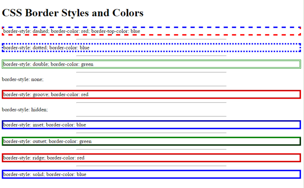
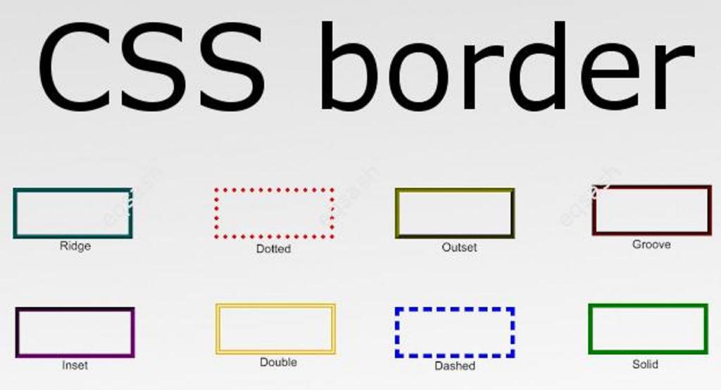
border-styleto your desired style. This can be done in several ways:- Use one of the predefined styles:
solid,dotted,dashed,double,groove,ridge,inset, oroutset. - Use the value
noneto remove the border. - Use the value
hiddento create a hidden border.
- Use one of the predefined styles:
- Save your CSS stylesheet or HTML document and refresh your webpage to see the updated border style.
You can combine these properties to create custom border styles that fit your design needs. Here’s an example of how to create a custom border with a blue color, a dotted style, and a 3-pixel width:
<p style="border: 3px dotted blue;">This is a paragraph with a custom blue border.</p>
CSS Properties Glossary Table
Here’s glossary table of styling properties in CSS:
| CSS Property | Description | Example Values |
border-radius | Sets the radius of the border’s corners. | 10px, 50%, 2px 4px 6px 8px |
border-width | Sets the width of the border. | 1px, medium, thin, thick |
border-style | Sets the style of the border. | solid, dotted, dashed, double, groove, ridge, inset, outset |
background-color | Sets the background color of an element. | #F5F5F5, rgb(255, 0, 0), transparent |
color | Sets the text color of an element. | #333333, rgba(0, 0, 255, 0.5), hsl(240, 100%, 50%) |
font-family | Sets the font family of an element. | Arial, sans-serif, 'Times New Roman', serif, monospace |
font-size | Sets the font size of an element. | 16px, 1rem, larger |
font-weight | Sets the font weight of an element. | normal, bold, 600 |
line-height | Sets the line height of an element. | 1.5, 1.2em, 120% |
text-align | Sets the horizontal alignment of text within an element. | left, center, right |
text-decoration | Sets the decoration of text within an element. | none, underline, line-through |
text-transform | Sets the case of text within an element. | none, uppercase, lowercase, capitalize |
These are additional properties that can be used in combination with border-radius, border-width, and border-style to further customize the appearance of elements on a web page. For example, you could use background-color and color to set the background color and text color of a button element, while font-family and font-size could be used to set the font style and size of the text within the button. text-align and line-height could be used to align and space out the text within the button, and text-decoration and text-transform could be used to
Real-Life Example: Adding a Border to an Image Gallery
Let’s say you’re creating an image gallery on your website and you want to add a border to each image to create a visual separation between them. Here’s how you can do it using CSS border:
- Create a class for your image elements and set the desired border properties. Here’s an example of a class called “image-border” with a 2-pixel solid black border:
.image-border {
  border: 2px solid black;
}
- Apply the class to each image element in your HTML code. Here’s an example of how to apply the “image-border” class to an image element:
<img src="example.jpg" alt="Example Image" class="image-border">
Following these steps, you can add a border to each image in your gallery and customize it further by adjusting the border properties as needed. Adding and styling CSS borders is an essential part of web design. You can create various border styles to fit your design needs using the border property and its components. Whether creating a simple border for an element or a custom css border style for an image gallery, CSS border is a powerful tool to help you create stunning designs.
Understanding Border Radius and Custom Border Styles
As we have seen in the previous section, CSS borders provide a simple and effective way to add visual interest and separation to HTML elements. However, borders don’t have to be limited to just simple lines. With the border-radius property, you can create rounded corners for your borders, and with custom border styles, you can create unique and complex border designs.
Border Radius CSS
Border radius is a CSS property that allows you to create rounded corners for your HTML element’s border. This property can be used to soften the edges of your website’s design, creating a more organic and modern look.
Add the border-radius CSS property to the CSS rule for the element you want to style and set a value for the corner’s radius. The value can be in pixels or percentages and can be set for each corner independently.
Here’s an example of how to use the border-radius property:
<style>
  .box {
    border: 1px solid black;
    border-radius: 10px;
    width: 200px;
    height: 100px;
    background-color: #f2f2f2;
  }
</style>

<div class="box">This is a box with rounded corners.</div>
In this example, we’ve created a div element with the class “box” and applied a 1px solid black border to it. We’ve also set a border-radius of 10 pixels, which creates rounded corners for the box. Finally, we’ve added some width, height, and background color styles to make the box more visible.
You can also set different values for each corner, like this:
<style>
  .box {
    border: 1px solid black;
    border-radius: 10px 20px 30px 40px;
    width: 200px;
    height: 100px;
    background-color: #f2f2f2;
  }
</style>

<div class="box">This is a box with different rounded corner values.</div>
In this example, we’ve set different border-radius values for each box corner. The first value is for the top left corner, the second is for the top right corner, the third is for the bottom right corner, and the fourth is for the bottom left corner. This creates a unique shape for the box that can add visual interest to your design. Border radius CSS is a useful property to help you create more dynamic and modern designs. You can use it to soften the edges of your website’s elements, add unique shapes and styles, and create a more engaging user experience. If you’re looking for something more specific, don’t worry, custom styling sounds right for you.
How do I change my border style? (Custom border styles)
Custom border styles in CSS refer to creating unique borders for your HTML elements beyond the traditional solid or dashed line styles. CSS provides several border styles by default, including solid, dotted, and dashed, but you can create your custom styles using the border-image property. You can combine different border styles, widths, and colors. The border-image property allows you to use an image as the border, and you can control how the image is sliced and repeated to create a border effect.
border-image property
One of the most popular ways to create custom border styles in CSS is by using the border-image property. This property allows you to use an image as the border of your element, instead of a solid line. You can also specify where to slice the image so that it fits the size of your element correctly.
Here’s an example of how to use the border-image property:
<style>
  .box {
    border-image: url(border-image.png) 30 30 round;
    border-width: 30px;
    width: 200px;
    height: 100px;
  }
</style>

<div class="box">This is a box with a custom border image.</div>
In the above example, we’ve created a div element with the class “box” and applied a custom border image to it. We’ve used the border-image property to specify the image file (in this case, “border-image.png”), as well as the slice values (30 pixels on each side) and the border rounding method (“round”).
border-image-slice property
Another way to create custom border styles in CSS is by using the border-image-slice property. This property allows you to specify exactly how to slice the border image, giving you even more control over the final result. You can also use gradients or patterns as border images instead of just images.
Here’s an example of how to use the border-image-slice property:
<style>
  .box {
    border: 10px solid transparent;
    border-image: linear-gradient(to bottom, #f00, #00f) 10 10 repeat;
    border-image-slice: 30;
    width: 200px;
    height: 100px;
  }
</style>

<div class="box">This is a box with a custom border gradient.</div>
In this example, we’ve used a linear gradient as the border image for our element. We’ve set the slice value to 30, which means that the image will be sliced into 30px sections. We’ve also used the border-image-repeat property to make sure the gradient repeats along the border, instead of stretching or distorting.
So, custom border styles in CSS are a great way to add unique and engaging visual elements to your website’s design. By using the border-image property, you can incorporate images, gradients, and patterns into your borders, creating a more dynamic and interesting look.
What is the difference between CSS outline and Border?
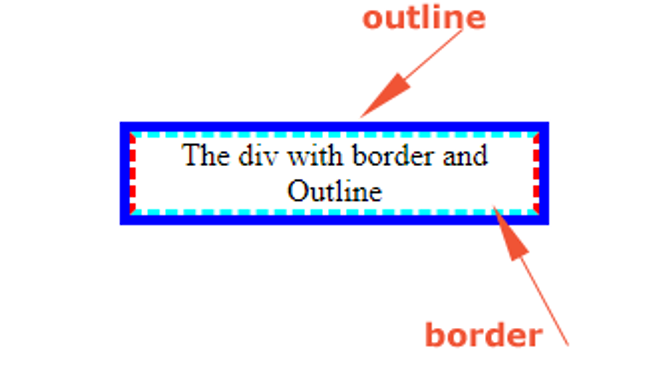
Regarding styling HTML elements, borders, and outlines are two of the most commonly used properties. While they may seem similar at first glance, they have several key differences. The most apparent difference between borders and outlines is their visual appearance. Borders are displayed around the outside of an element, while outlines are displayed around the border of an element. In other words, borders are inside the padding box of an element, whereas outlines are outside of the border box.
Another key difference between borders and outlines is their behavior regarding sizing. Borders are included in an element’s size calculations, while outlines are not. This means that if you add a border to an element, it will increase the width and height of that element accordingly. However, adding an outline to an element will not affect the element’s size. Regarding styling options, borders offer more flexibility than outlines. Borders can be customized in terms of color, width, style, and even their radius. On the other hand, outlines are typically limited to a few basic options like color and style. Watch this ten minute video as a recap!
One important thing to keep in mind is that while borders and outlines are similar in some ways, they cannot be used interchangeably. If you need to create a visual border around an element that affects its size, you should use the border property. If you need to create a non-visual outline around an element that does not affect its size, you should use the outline property.
border property
Here’s an example of how to use the border property:
<style>
  .box {
    border: 2px solid #000;
    padding: 10px;
    width: 200px;
    height: 100px;
  }
</style>

<div class="box">This is a box with a border.</div>
outline property
And here’s an example of how to use the outline property:
<style>
  .box {
    outline: 2px solid #000;
    padding: 10px;
    width: 200px;
    height: 100px;
  }
</style>

<div class="box">This is a box with an outline.</div>
As you can see, the visual difference between the two properties is subtle but important. The border is inside the padding box of the element and affects its size, while the outline is outside of the border box and does not affect its size. Here’s a table comparing the two:
| Property | Description | Affects Element Size | Customization Options |
border | Adds a visual border around an element | Yes | Color, width, style, radius, etc. |
outline | Adds a non-visual outline around an element | No | Color, width, style, etc. |
As you can see, the border property affects an element’s size, while the outline property does not. Additionally, borders offer more customization options than outlines.
Best Practices for Using CSS Borders
Now that you know the basics of using CSS Borders, we’ll discuss some best practices for using CSS borders effectively in your web designs. By following these guidelines, you can create polished and professional designs without going overboard with borders. We’ll cover topics like choosing the right border style, using border radius for rounded corners, and testing borders on multiple devices and browsers.
Choose the Right Border Style
There are many different types of border styles available in CSS, from solid to dashed to dotted and more. When choosing a border style, consider the context of your design and choose a style that complements the overall aesthetic.
Use Border Radius for Rounded Corners
If you want to add rounded corners to an element, use the border-radius property instead of relying on images or other workarounds. This will help your design look more polished and professional.
Consider Border Widths Carefully
Border widths can be an important aspect of your design, but using them judiciously is important. Thick borders can be overwhelming and distracting, while thin borders may not be noticeable enough. Consider the context of your design and choose a border width that complements the overall aesthetic.
Avoid Using Borders for Layout
While borders can be a useful tool for adding visual interest to your designs, they should not be relied upon for layout purposes. Instead, use CSS layout techniques like flexbox or grid to create a structured, responsive layout.
Test Borders on Multiple Devices and Browsers
Finally, it’s important to test your borders on multiple devices and browsers to ensure that they display consistently across different platforms. Use a tool like BrowserStack or CrossBrowserTesting to test your design on different devices and browsers.
More Real Life Examples using CSS Border
Now, we’ll explore some more real-life examples of how CSS borders can be used in web design. By seeing how borders are used in context, you can get a better sense of how to apply them in your own designs.
1. Highlighting Interactive Elements
One common use of borders in web design is to highlight interactive elements, like buttons or links. For example, you might use a solid border with a contrasting color to draw attention to a clickable button or link.
.button {
  border: 2px solid #007bff;
  color: #007bff;
  padding: 10px 20px;
  text-align: center;
  text-decoration: none;
  display: inline-block;
  border-radius: 5px;
}
2. Creating Dividers Between Content Sections
Borders can also be used to create dividers between different sections of content on a web page. For example, you might use a dashed border with a subtle color to separate paragraphs or images from each other.
.section {
  border-bottom: 1px dashed #ccc;
  padding-bottom: 20px;
}
3. Styling Form Fields
Borders can also be used to style form fields, like input boxes or dropdown menus. For example, you might use a rounded border with a light color to style a text input field.
input[type="text"] {
  border: 2px solid #ddd;
  border-radius: 5px;
  padding: 10px;
  width: 100%;
}
These are just a few examples of how CSS borders can be used in real-world web design scenarios. By using borders judiciously and thoughtfully, you can add visual interest and structure to your designs, without overwhelming the user.
Create Great Design Easily with CSS Border

CSS borders are a powerful tool for adding structure and visual interest to web designs. By carefully choosing border styles and thicknesses, you can draw attention to essential elements, create dividers between content sections, and style form fields. It’s important to use borders judiciously and thoughtfully, however, as overly ornate or complicated border styles can distract from the main content on the page. Following best practices and keeping the user in mind, you can use CSS borders to enhance your designs and create more engaging user experiences. So, why not experiment with different border styles and thicknesses in your next web design project? With creativity and attention to detail, you can take your designs to the next level using CSS borders.
Related Articles
-
 Uncategorized
From Beginner to Pro: Everything You Need to Know About TypeScript Enums
Introduction Are you tired of writing code that's difficult to read and maintain? Do you struggle to keep track of the values and options used throughout your web applications? If you're nodding your head in agreement, you're in the right…
February 17, 2023 -
Uncategorized
Unlock the Secret Power of React Hook Form and Avoid Unnecessary Component…
Introduction In web development, forms are used to collect required information in a logical, useable format for communication and data transfer to another entity such as database or component. Additionally, React Hook Form is one of the libraries in which…
June 17, 2022


