 September 21, 2022
  Temitope Asama


Introduction
CSS frameworks are a very popular trend in modern web development.
From small startups to mid-scale firms and large organizations, these styling solutions seem to be overtaking pure CSS as a styling choice, with newer frameworks constantly created with even more powerful upgrades.
In this article, we’ll be finding out what CSS frameworks are, how they work, their advantages, factors to consider when choosing one for your product, and the top 10 most popular CSS frameworks to consider in 2022.
What are CSS frameworks?
A CSS framework is essentially a collection of CSS stylesheets that are ready for use by web designers and developers.
The stylesheets are built up for use with common web design components, including fonts, navbars, layout, and color selection.
In general, scripting languages like SASS and JavaScript support and enhance these CSS stylesheets.
How do CSS Frameworks work?
With a CSS framework, the user simply needs to code the HTML with precise classes, structures, and IDs to put up a website because the CSS stylesheet is already complete.
For typical UI components like a navigation bar, slider, footer, hamburger menu, grid, column-based layouts, etc., the framework already includes classes, such that users only have to adjust these classes to meet their preferences.
Why do we need CSS Frameworks in 2022?
- Less code – CSS frameworks can cut down on the amount of coding required. These frameworks provide you with all the resources you need to create a simple UI without forcing you to build everything from scratch. Then, you can devote your efforts to enhancing this interface to precisely fit the needs of your project. You’ll have more time to concentrate on the particular aspects that make your website or app distinctive since you won’t be beginning every project from scratch.
- Speed of Coding – A CSS framework might be helpful for businesses and independent contractors that oversee the websites of several clients. You may design a theme or component and then apply it to a huge number of websites. With less significant growth in your workload, you may onboard new clients more rapidly and expand your firm.
- Uniformity – A CSS framework can assist you to create uniformity if you’re working on a project with several individuals. A CSS framework, for instance, uses conventional naming rules rather than requiring that every team member come up with their own class names. As a result, the code is usually of higher quality and simpler to understand and maintain.
- Ease of Hand-off – Additionally, you’ll find it simpler to integrate new team members or independent contractors when your code is consistent. It’s important to keep in mind that just because your staff members are content in their current position doesn’t imply they will remain there indefinitely.Making ensuring that your project can continue even if your lead developer leaves is a wise move. Implementing a standard strategy that is well-defined and understood by everyone ensures that your project is never entirely dependent on a single person. You may attain this uniformity across your project with the use of a CSS framework.
Factors to consider before using a CSS Framework
For your project, a CSS framework can be a useful addition. Before diving into the realm of frameworks, it’s crucial to become comfortable with CSS if you have little to no prior familiarity with it.
- CSS Knowledge – You’ll be able to see flaws with your syntax if you invest in learning pure CSS. You’ll find it simpler to browse your framework’s documentation for the details you require if you know how to achieve the appropriate effects with only CSS. This can increase your productivity, especially when it comes to troubleshooting and problem-solving. So before looking for a good framework, we always advise spending some time honing your CSS skills. This might take a lot of time and work, depending on your background knowledge and expertise.
- Project Requirements – Using a CSS framework where it is entirely irrelevant increases your project’s overhead. Depending on the project, this could range from a significant amount of pointless or irrelevant code that you never ever use to even performance costs.
- Ease of Overriding Styles – Do you need to have free rein over your project’s styling? Then a CSS framework could be restrictive for your application or website. This is because your project is contained within the CSS framework such that there’s a limitation to what and when you can override styles.
- Uniqueness – There is also a chance that your completed project may resemble other websites and applications that utilize the same CSS framework if you rely on it excessively. When it ought to stand out from the crowd, this might cause your project to appear dull and lack originality.
- Other factors include learning curve, ease of use and customization, community support and resources etc.
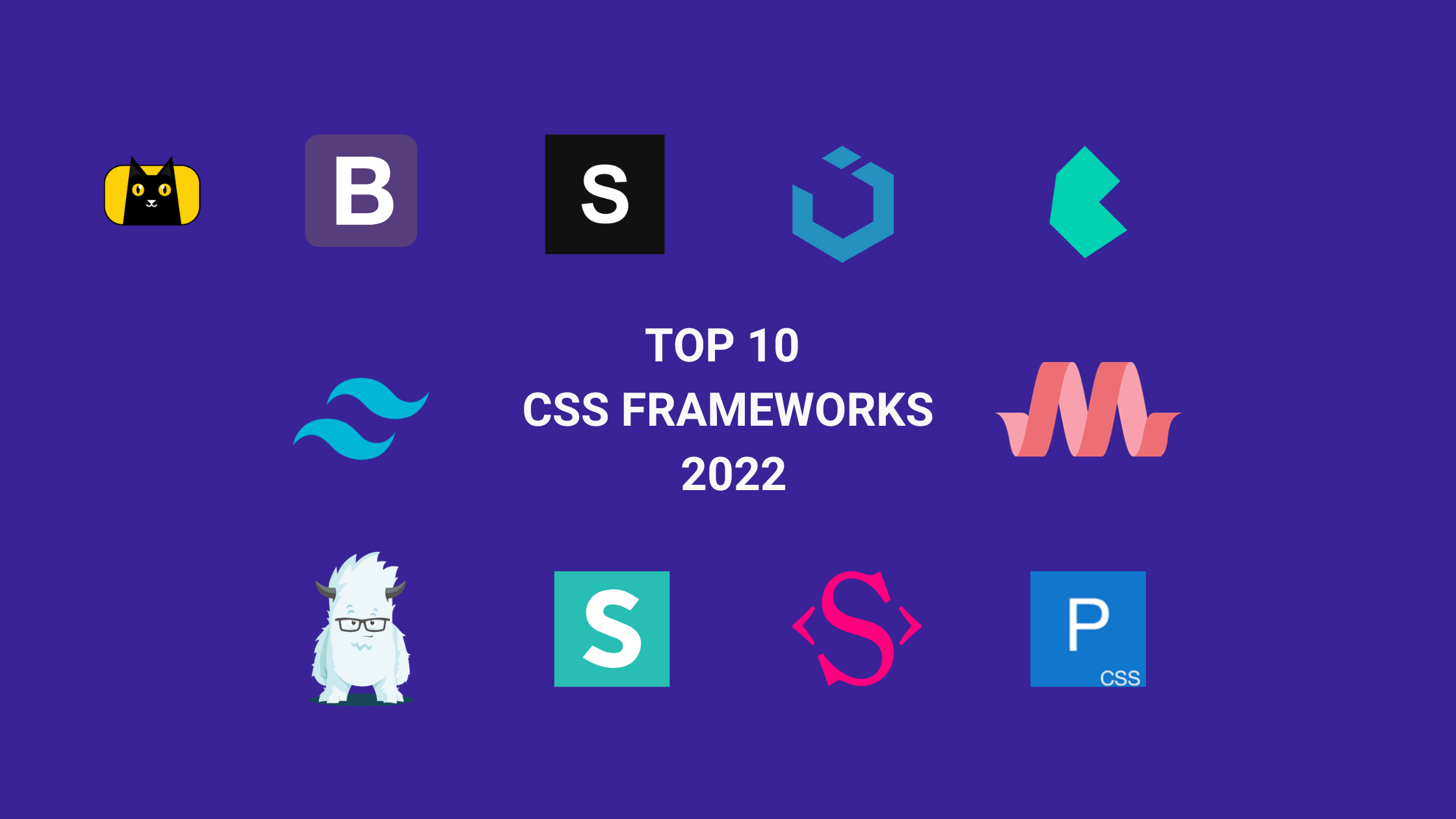
Best CSS Frameworks in 2022
It might be difficult to select just one CSS framework when so many options are available. This is the reason we’ve put together this list of the top ten CSS frameworks for you in 2022. We’ll guide you along the way by offering suggestions for the kinds of projects that each framework is ideal for, so you can make the best choice.
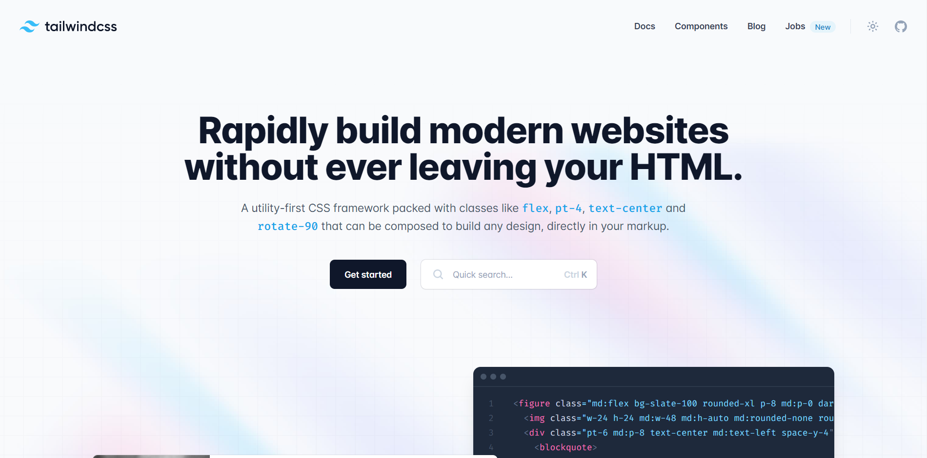
Tailwind CSS
The official Tailwind CSS documentation refers to it as a “utility-first CSS framework” that includes classes capable of creating unique UI designs directly in the markup of users. Unlike similar CSS frameworks like Bootstrap or Materialize CSS, it lacks preset components. Instead, it functions at a more basic level, providing you with a number of CSS helper classes, allowing you to create clean and efficient front-end user interfaces. Without creating any external CSS file, it is easy to use inline style to create beautiful and responsive user interfaces.
With over 27k stars on GitHub, this highly flexible, low-level utility-first CSS framework provides all the building blocks required to create unique designs without requiring you to struggle to override unwanted opinionated styles.
Features
- It is a utility-first framework that offers easy and quick tutorials.
- You have the flexibility and freedom to style your website to your taste.
- You can quickly search for what you need, thanks to each class’s comprehensive documentation.
- It has a small package and bundle size and allows for increased productivity.
- No naming or context-switching is required, i.e., you don’t have to flip between HTML and CSS files to observe the changes as your styles are declared inline.
- The “components” feature enables efficient code reuse.
Advantages
Highly Customizable: Tailwind CSS has a default setting, but a tailwind.config.js file can override it. This makes it simple to customize things like style, themes, spacing, and color schemes.
Common Utility Pattern: Using Tailwind CSS, you may avoid the pitfall of naming too many classes. It includes typical utility patterns to handle standardized needs, such as class organization and specification, class cascading, etc. Simply said, it becomes much simpler to create new components.
Optimization via PurgeCSS: PurgeCSS shrinks files by examining HTML code and removing unneeded classes. This is very helpful when used with Tailwind CSS. The size of the associated CSS files increases along with a project’s growth. PurgeCSS optimization makes CSS files smaller and cleaner, which makes them much easier to maintain, especially before deployment.
Easy Responsiveness: Tailwind CSS employs a mobile-first strategy by default. Every utility class in Tailwind can be applied conditionally at various breakpoints, which makes it simple to develop complicated responsive interfaces without ever leaving your HTML, according to the website. Utility classes make it easier to create intricate responsive layouts while still enabling their use at various breakpoints. The outcome? deployment of responsive design without any hassle.
Other advantages also include great documentation and community support, fantastic browser support etc.
Check out this video course on Tailwind CSS:
Ideal for: Small businesses and simple front-end projects.
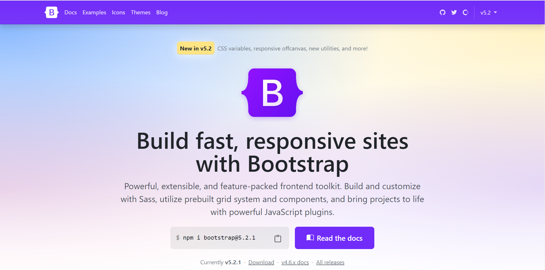
Bootstrap
The most popular CSS framework in the world, Bootstrap, enjoys widespread community support. This framework was created using JavaScript, SASS, and HTML. The most recent version, Bootstrap 5.2.1, has additional components and more utility classes to increase responsiveness. It targets front-end development that is responsive, mobile-first, developer-friendly, and useable on any device. All current browsers support Bootstrap. The best feature of bootstrap is that it offers excellent JavaScript components with CDN or custom files.
It advocated the now-ubiquitous idea of “mobile-first” and gave the necessary resources for its simple application. It achieved this by adding a grid and dividing the screen into columns.
With Bootstrap, developers can adapt a site for smaller screen sizes without having to create different projects just for that purpose. The design will automatically adapt if the appropriate Bootstrap classes are included.
Features
- 100% browser support; therefore, there is no need to develop browser-specific code, enabling quick prototyping.
- The most popular CSS framework, with widespread community resources and support.
- Navigation, forms, cards, buttons, badges, and other built-in elements.
- Outstanding JavaScript components with a unique CDN
- Free to use, and version 5.2 provides improved responsiveness and pre-set layouts.
- User-friendly.
- Easy to learn(Check out this article at CopyCat on Bootstrap and React).
Advantages
Large Community: Bootstrap has the largest ecosystem of all front-end frameworks. It has the best community support in the sector.
Rapid prototyping: By utilizing Bootstrap, designers may create designs faster by avoiding the need to make adjustments for things like CSS positioning and browser compatibility.
Twitter Support: Users may rest certain that an open-source project is here to stay and has high confidence among those in the industry when a large commercial entity backs it. The success of Bootstrap is demonstrated by the fact that it was created by and is supported by Twitter.
Supports SASS and LESS: While most developers don’t use LESS, important projects rely on it. Support for SASS is obviously quite desirable as well. Apart from Bootstrap, hardly many CSS frameworks offer both.
Check out this video course on Bootstrap:
Ideal for: People and companies who desire both high levels of customizability and usability.
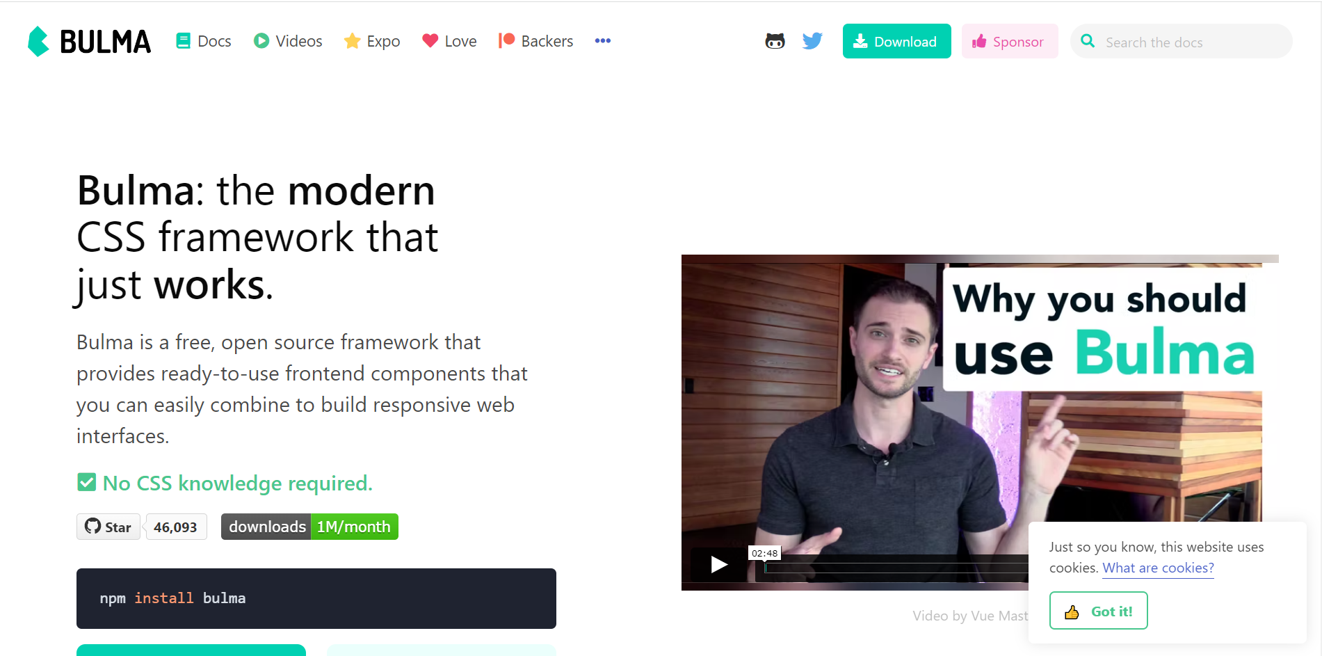
Bulma
This framework comes with built-in CSS flexbox, SASS, and HTML. Bulma offers a variety of customization possibilities utilizing variables, web packs, and SASS files to meet your needs. Because Bulma is made entirely of CSS, utilizing the framework just requires one CSS file and no JS files.
Bulma contains a number of very innovative features that can help you create a website with less code and greater aesthetic appeal. The grids are identical to Bootstrap. You may also utilize SASS modules with Bulma. The .icon element makes it compatible with both Font Awesome 4 and Font Awesome 5.
Features
- Innovative customization features using SASS variables make personalization easy, even for beginners.
- a flexible front-end framework that includes media objects, layouts, tables, and components for vertical alignments.
- Bulma is free and open source (MIT License).
- Flexbox-based, making it simple to create things that are vertically aligned and grid-based.
- You just need to import the components that your project utilizes as it is modular; you don’t need to import everything.
- Bulma has practical functions for calculating things like colors, visibility, spacing, etc.
Advantages
Simple to use: Bulma is a favorite tool among developers and designers due to its modular design approach and high degree of customizability. Because of its responsive templates, less design work is required, and there is a wide variety of available components, like nav bars, tables, panels, dropdown menus, etc. Bulma also includes interactive training and startup templates. Additionally, it has a thriving Stack Overflow community, which is quite beneficial for getting questions addressed.
Simple to learn: Bulma’s modular design is intended to address real-world issues that independent developers could face. Bulma is designed to be simple to navigate, and anyone can immediately understand how it operates.
Browser Compatibility: Websites created with Bulma are compatible with the majority of popular browsers. This makes testing simpler for testers, especially when using different browsers.
Excellent Update Schedule: Despite Bulma‘s recency, new features are released on a regular basis. Updates are also made to fix any bugs or problems that users may be experiencing.
Check out this video course on Bulma:
Ideal for: Businesses on a budget.
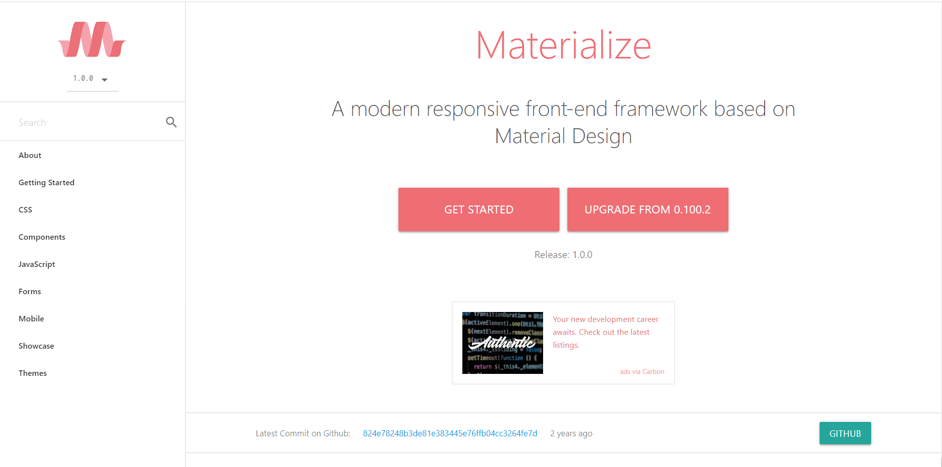
Materialize CSS
Materialize CSS is a responsive UI framework for webpages and Android apps that was developed by Google in 2014. It offers a large number of beginning templates, classes, and ready-to-use components. It has a responsive layout based on Bootstrap’s 12-column grid structure and is SASS compatible.
What’s best? it has varied color schemes.
Therefore, Materialize CSS will be a great alternative for you if you want to work with Material Design (Google’s design language) and implement Google-like effects on your website.
Features
- Utilizing material design principles, it is simple to use and prioritizes the user experience.
- Better built-in transitions and animations to hasten development.
- Many different colors and themes.
- graceful padding and depth effects, such as lighting and shadows.
- Materialize includes all of the features of Bootstrap, including colors, shadows, grids, tables(Check out this article at CopyCat on Material UI Table), badges, cards, chips, and navbars, and just utilizes jQuery (unlike Bootstrap, which also requires popper.js).
Advantages
- Accelerates development
- Cool User Interactions and Experiences
- Easy-to-integrate loaders that are simple to code and develop.
- A color scheme that works well with Material Design.
- Form validation and animation effects are simple to integrate.
- Availability across all web browsers.
- Simple to use and open-source.
- Many color palettes.
- Easy integration of all JavaScript plug-in types.
Check out this video course on Materialize CSS:
Ideal for: Creative web designs
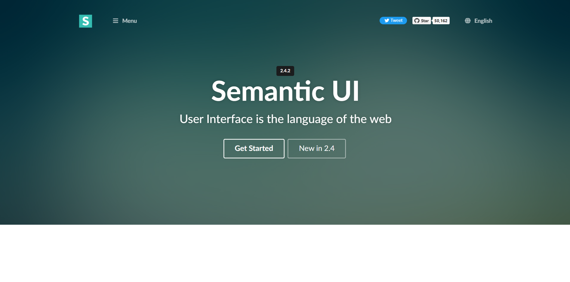
Semantic User Interface
Semantic UI is designed with the specific purpose of establishing a common UI vocabulary. Semantic, which is based on natural language concepts, empowers designers and developers by improving the readability and comprehension of the code. Users cite Semantic UI as being intuitive and simple to use.
Semantic UI distinguishes itself with features that go beyond a CSS framework, such as streamlined debugging and the capacity to customize UI elements, collections, views, modules, and behaviors.
Features
- Accessible.
- All components have comprehensive documentation that is arranged effectively.
- Excellent for individuals with a fundamental knowledge of JavaScript.
- 50 UI components and more than 3,000 theme variables allow for extensive customisation.
- More stringent code standards than other CSS frameworks.
- Allows you to structure application functionality and UI components alongside one another by being readily linked with third-party libraries like Angular, React, and many more well-known frameworks.
Advantages
- User-friendly
- Designing a page takes less time
- Versatility
- Several themes to choose from.
Check out this video course on Semantic UI:
Ideal for: HTML Sites
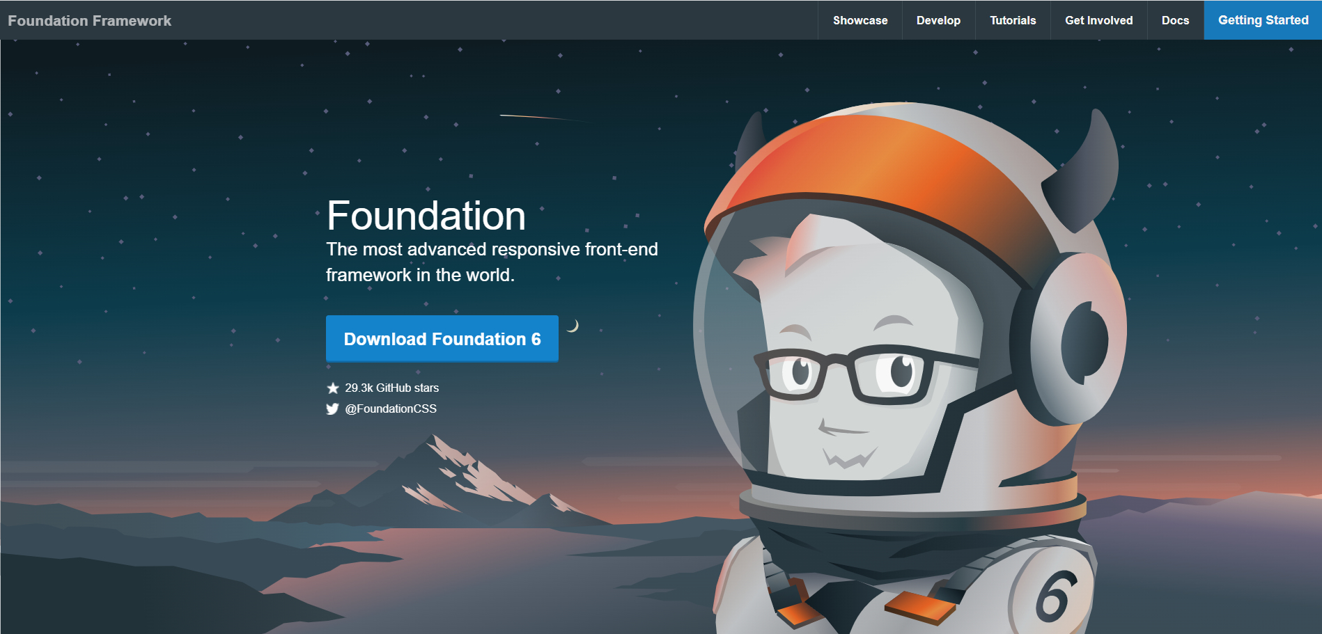
Foundation
Foundation is a sophisticated front-end CSS framework with integrated HTML, SASS, CSS, and Javascript. It is mostly used to create wonderful websites using its built-in starter templates.
This framework has a SASS compiler for quicker website design. You may easily install Foundation’s own CLI on your computer or laptop by utilizing specific commands. This CSS framework uses a mobile-first strategy and has completely responsive components.
There are several forums accessible for support and assistance in order to rapidly resolve any problem. Finally, it is fully adaptable, readable, versatile, and semantic.
Features
- Simple to use
- Has a command-line interface (CLI) that enables the compilation of Foundation sources into CSS for usage in HTML markup.
- Modular, adaptable, and extendable
- Offers a wide variety of extra optional JavaScript plugins and components, like tooltips, alarms, carousels, dropdowns, placeholders, cookies, etc.
- Flexible navigational patterns increase productivity by reducing the amount of code needed.
Advantages
Massive toolkit: Foundation provides far more than what a CSS framework is expected to provide. The vast, modular toolset it offers helps most front-end developers find solutions to problems.
For instance, it provides distinct foundation components for webpages and emails, each ready to run in those domains. Additionally, a command-line interface (CLI) is available for developers using module bundlers like Webpack.
Greater Flexibility: Foundation is designed to provide front-end developers total control over their user interfaces. For instance, it doesn’t compel developers to utilize a specific style or language. Due to all of this, a far larger group of developers favor it as a tool.
UI components and more: Foundation includes a responsive image system, a price table, responsive embeds, form validation, right-to-left compatibility, and much more in addition to the usual UI components. This provides developers with a lot more tools at their disposal.
Tutorial Options: ZURB provides a variety of Foundation training courses and consultancy options, which is particularly useful for businesses looking to work on expensive, large-scale projects.
Check out this video course on Foundation:
Ideal for: Building responsive apps, websites and emails.
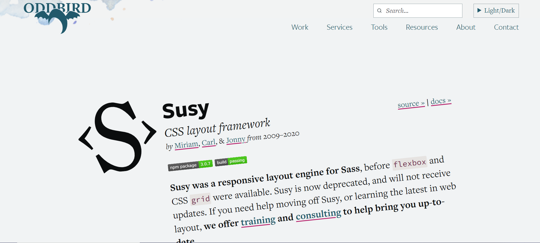
Susy
Although Susy is a relatively unknown framework right now, its concept is intriguing and novel. With no established concepts of float, grid, Flexbox, tables, or anything else, Susy is a SASS-based, pure-layout framework that enables you to create any layout you need. It is designed to build very modular, staggered arrangements with incredibly intricate, unique, and exact requirements.
Features
- SASS-based framework
- Powerful arithmetic features
- Easy-to-customize grid systems
- Cross-browser compatibility
Advantages
Learning Is Relatively Simple: Susy shouldn’t be too challenging for you to learn if you’ve used other frameworks (like Bootstrap or Foundation) and if you have even a passing familiarity with Sass. Susy doesn’t require in-depth expertise and is a wonderful place to start, even if you’re very new to Sass. It’s worth reading up a little if you’re not familiar with Sass because the examples in this post presume that you have a working grasp of it.
Boost Your Workflow: Susy doesn’t have a ton of default styles that you have to change, unlike many other frameworks. It is just a grid layout framework; it lacks any ornamentation. Anything else is up to you to add; its only job is to do the arithmetic for you.
Check out this video playlist on Susy:
Ideal for: Complex websites that involve grids and a lot of math.
Pure
Pure is a collection of compact, flexible CSS components for all of your requirements. Only 3.8 KB when minified, Pure is extraordinarily minimal in size. Aside from that, you’ll save even more bandwidth if you decide to merely employ a portion of the available modules. Its foundation is Normalize.css. Pure offers layout and style for native HTML elements in addition to the most popular UI elements. You are encouraged to write your application styles on top of it because of its simple styles.
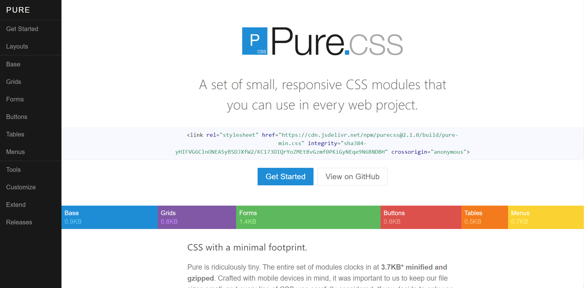
Features
- The smallest CSS framework, with a minified size of only 3.7 KB, is perfect when you only require a limited number of CSS capabilities.
- On top of the default elements already present, you may also create your own unique elements and designs.
- It comprises a responsive grid framework that prioritizes mobile devices and uses grid-responsive CSS.
- Contrary to Bootstrap, it does not allow a fixed layout.
- Because it has few features and doesn’t need compilation, it is simple to alter.
Advantages
- A flexible, dynamic grid that you can alter to suit your needs
- A strong foundation based on Normalize.css.
- Cross-browser compatibility
- Button designs that are consistent and compatible with the a and button components
- Styles for horizontal and vertical menus, along with dropdown menu support
- Form alignments that are useful and attractive on all screen widths
- Various standard table designs
- A very simple and customizable minimalistic style
- Responsive by default, with the choice of being non-responsive
- Skin Builder makes customisation simple and one-click
- Very little file size: minified and gzipped 4.5KB.
Check out this video course on Pure CSS:
Ideal for: Small sites andprojects that need a lightweight framework
Skeleton
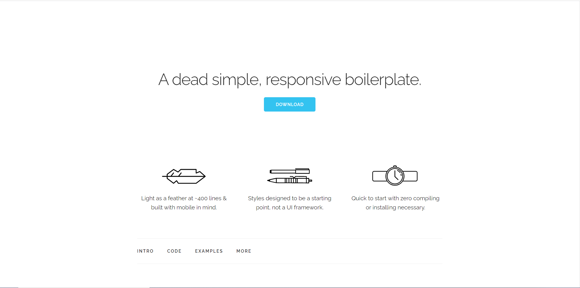
Skeleton is so basic that it doesn’t even refer to itself as a framework; rather, it describes itself as a “dead simple, responsive boilerplate”. It is so minimalistic that it only contains 400 lines of source code!
This front-end framework includes all required responsive design components and is designed to produce CSS components that work on both desktop computers and mobile devices.
It does this by splitting the page into a collection of 12-column grids with a maximum width of 960px, which accommodates small, medium, and big screens. Of course, the max-width may be modified with a single line of CSS code if necessary. The syntax is easy to use, quick to implement and makes it reasonably straightforward to put together responsive design.
Features
- Lightweight, making it simple to handle, store, and maintain.
- The tool was created with a mobile-first mindset and is excellent for designers to use as a starting point.
- Skeleton is the ideal tool for supporting tiny projects since it has only the necessary parts and HTML elements, including support for the Grid.
- Because it includes a fundamental CSS grid system and elements, it has a steep learning curve and ease of use even for beginners.
Advantages
It is super fast because of its extremely small footprint.
Check out this video course on Skeleton:
Ideal for: Small projects where the utility of an extensive framework is not there.
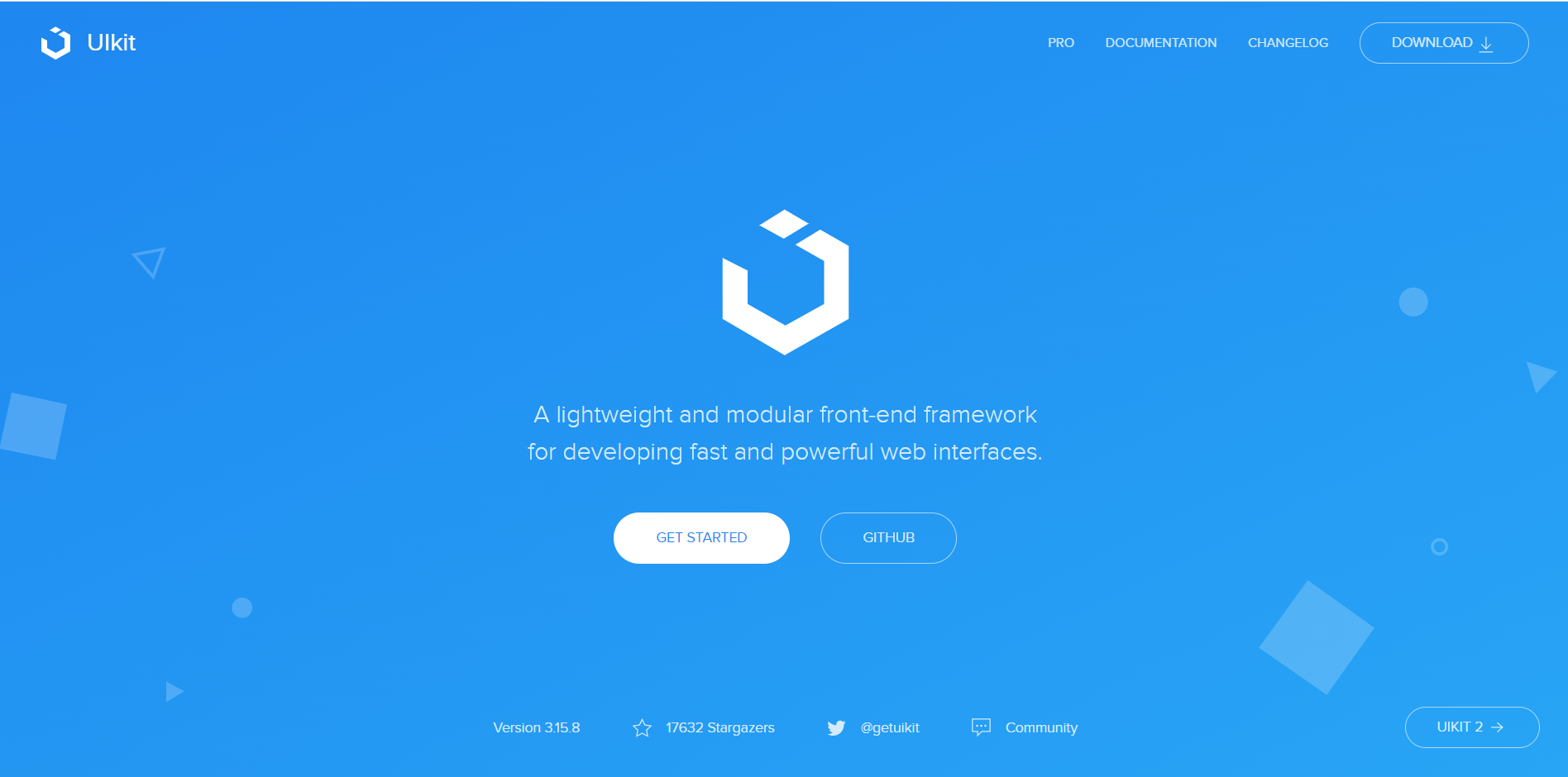
UI Kit
A front-end CSS and web UI design framework with nearly all the key capabilities of other frameworks, UI Kit is compact and adaptable. Numerous pre-built components, including Accordion, Alert, Drop, Iconnav, animations, Padding, and others, are included in UI Kit and demonstrate usage patterns, component settings, and techniques. There is no competition for UI Kit when it comes to its remarkable feature set, especially in terms of design.
Furthermore, UI Kit represents the future of app development on Apple’s platforms.
Features
- Includes a variety of pre-built elements, like animations, Iconnav, padding, alerts, accordions, etc.
- Modern UI with a simple, minimalistic style.
- A self-contained system that is more difficult to expand upon or change (when compared to other frameworks).
- Simple to set up
- A browser-neutral, open-source framework that is free to use.
Advantages
- It offers a window and view architecture that aids in implementing the interface for the developers.
- The event handling architecture provided by UI Kit also lets you provide multi-touch and other sorts of input to your application. It also gives you access to a primary run loop to manage user interaction.
- Ready-to-use UI components spare you the trouble of starting from scratch when designing new designs.
- Additional intriguing features include support for animation, sketching, text management, search, app extensions, and many more.
Check out this video course on UI Kit:
Ideal for: iOS apps
Here’s a infographic that shows the CSS frameworks trends in 2022;
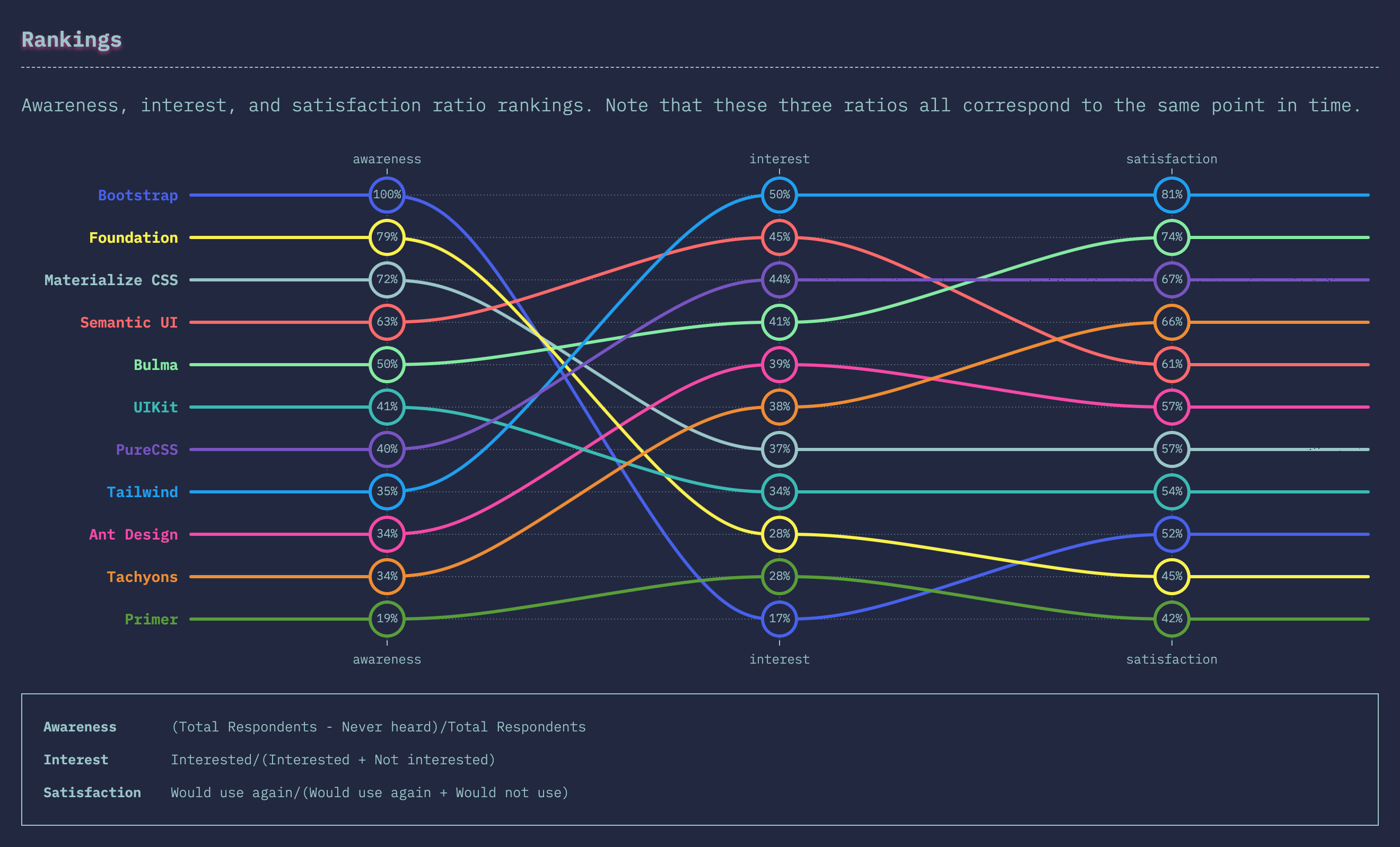
For more information on these trends, check out State of CSS here: https://2021.stateofcss.com/en-US/technologies/css-frameworks/
Conclusion
CSS frameworks are a must-have in web designers’ and developers’ toolkits. Developers must choose a framework they feel confident with and one that has all the features necessary to meet project requirements for any project to run successfully.
Selecting the ideal CSS framework can be challenging. As a front-end developer, everything depends on your own requirements and preferences. The list above should help you choose the best option for your project.
Finally, you can find awesome articles like this on our blog at CopyCat. CopyCat is a tool that saves you about 35% of development time by converting your Figma files to an up-and-running React project. Check it out here!
Related Articles
-
 Uncategorized
React useReducer Hook: Manage App State Better
Introduction State management has been a common topic in the development world over the years. It's a challenging part of the development process, especially for huge applications. This challenge in state management has been solved in many different ways over…
May 10, 2022 -
Uncategorized
The Top 16 Design System Examples for Devs
Introduction Every successful team has a set of roadmaps while developing its products. These do not only improve their productivity but also help them develop the product to a standard. In this article, we'll define design systems and also provide…
June 9, 2022

