
 June 9, 2022
  Uncle Big Bay


- Introduction
- What is a Design System?
- Key Importance of Design System
- Pillars of Design System
- Principles of a Good Design System
- Tools for Building Design Systems
- Top 16 Design System Examples
- 1. The Google Material Design
- 2. The Apple Human Interface Guidelines
- 3. The Microsoft Fluent Design System
- 4. The Atlassian Design System
- 5. The Adobe Spectrum Design System
- 6. The IBM Carbon Design System
- 7. The GitLab Pajamas Design System
- 8. The Mailchimp Design System
- 9. The E*Trade Design Language
- 10. The Salesforce Lightning Design System
- 11. The Uber Design System
- 12. The Guardian Digital Design Style Guide
- 13. The Audi Design System
- 14. The Lexicon(Liferay) Design System
- 15. The Help Scout Design System
- 16. The Figma Design Systems
- In Conclusion
- Where Do You Go Next?
Introduction
Every successful team has a set of roadmaps while developing its products. These do not only improve their productivity but also help them develop the product to a standard. In this article, we’ll define design systems and also provide popular design system examples. Additionally, each example will have a great user experience and interface that you can learn from to improve your product.
What is a Design System?
A design system is a collection of reusable standard components, such as documents, code snippets, articles, templates, screenshots, examples, design guidelines, and so on.
Design systems enable teams to develop products with a consistent user interface and deliver them more quickly with standard guidelines.
Key Importance of Design System
This article breaks down the key importance of a design system into four sections:
Reusability(reusable components)
Design systems are a single source of truth for product development, and they comprise ready-made UI components and design principles that are used as an integral part of another component.
Specifically, a reusable UI component is potentially a button or an icon used as a sub-component on a navbar or form page.
Standardisation
Setting standards is a crucial part of a design system that helps to provide a positive user experience. It contributes to the user’s and the team’s overall familiarity with the system.
A standard is based on how a specific component must be developed and what principles guide its implementation. Standardisation will also ensure uniformity in the product’s final outcome.
Uniformity and consistency
Maintaining uniformity and consistency in a design system can help express the purpose and goal of a product to its audience across multiple assets or channels.
Above all, uniformity and consistency remove repetitive tasks from development, which saves a lot of time and resources.
Improved user experience
Design systems are not only for the product designers but for all the actors involved in the product’s development and use.
As a matter of fact, design systems assist all stakeholders in understanding the development process and what the end product will look like.
Pillars of Design System
When developing a new design system, it’s important to include some of the fundamental concepts below as they are also common within existing design systems.
Style Guides
A design system style guide is a document that describes how things are done consistently throughout a product or website. This can also be referred to as brand design, and it’s common to all design systems.
For example, while creating a button, a typical style guide should define the color, font-size, width, and height of the button across all web pages.
Pattern Library
The patterns library, or design patterns, defines what a user interface component is, what it does, and how it should be implemented in the system. Hence, pattern libraries are user interface elements like forms and buttons.
Component Library
The team will develop the user interface elements from the pattern library, such as forms and buttons, using any front-end framework they choose.
Generally, a button can be designed with Tailwind CSS, Bootstrap, Semantic UI frameworks or Vanilla CSS.
A component library is also created once in a design system, reducing the time and expense of creating the same components again.
Principles of a Good Design System
According to Wikipedia, a principle is a proposition or value that is a guide for behavior or evaluation. Furthermore, in law, it is a mandatory rule.
Indeed, a design system principle is a set of standard rules that guide the development and decision-making of a product by the product team.
Every design system has its own set of principles. So now we’ll go through five design system principles below:
- Simplicity: A good design system does not attempt to solve all problems at once, but rather focuses on solving one problem at a time.
- Usability: The intended audience eventually uses a good product. Therefore, every design system component must be simple to use.
- Extensibility: Every design system component or feature must be extensible to other components, products, or use cases. This will undeniably avoid the need to reinvent the wheel.
- Design systems surely must be scalable to service or accommodate new features within the system and solve new challenges.
- Reliability: Moreover, a design system must accomplish exactly what it intends.
Tools for Building Design Systems
Below are common tools used in developing a design system:
- Storybook
- Adobe XD
- Sprint UI
- BuilderX
- Figma
Top 16 Design System Examples
We’ll go through some of the best design system examples, Figma design systems, and design system guidelines so you can get started faster.
1. The Google Material Design
Google Material Design is number one on our list of design system examples. Evidently, it’s considered one of the Big Four technology companies, alongside Amazon, Apple, and Microsoft. They deal in internet-related services such as online advertising technologies, a search engine, cloud computing, software, and hardware.
Google Material Design was introduced in 2014, and since then it has been a source of inspiration for other companies and is widely used across Google’s platforms.

You can make use of Google Material Design by directly downloading their design component source files for any of their design software like Sketch and Figma.
Google Material Design provides useful design tools and resources such as Material Icons, Google Fonts, Figma Black Theme Kit, Color Interface Kit, etc.

According to the Material Design documentation, it’s designed with a built-in, baseline material color theme that is used as-is, straight out of the proverbial box to customize your app.
Google material design system is made up of the following main features:
- Layout
- Components
- Design Source Files
- Color
- Typography
- Material Theming
- Mobile Guidelines
- Starter Kits
You can further learn more about getting started with the Google Material Design system from the Material Design official Youtube channel.
Additionally, learn how to work with Material UI Table in React.js here.
2. The Apple Human Interface Guidelines
Apple’s human interface is one of the most valuable design systems in the world. It’s also a guide for developing all of Apple’s platforms and products (like the iPhone, Mac, etc.).

Apple human interface guidelines also provide downloadable templates and design guidelines for pattern libraries that you can use as your product design system foundation.

Likewise, the Apple human interface guidelines consist of Steve’s job design principles:
- Craft, above all, with attention to detail
- Empathy
- Focus on what’s truly important
- Impute
- Friendliness for bother novice and advanced users
- Simplify
Additionally, its main features include:
- Buttons
- Fields and Labels
- Selectors
- Indicators
- Touch Bar
- Extensions
- Themes
- Visual Index
- App Architecture
- User Interaction
- System capabilities
- Visual Design
- Icons and images
- Window and View
- Menus
You can learn even more about the Apple human interface guidelines overview below:
3. The Microsoft Fluent Design System
Microsoft Corporation is an American multinational technology corporation that produces computer software, consumer electronics, personal computers, and related services.
Particularly, the Microsoft Fluent design system is the official front-end cross-platform React-based open-source UI framework designed to build experiences that seamlessly fit into various Microsoft products. The design system was also developed in 2017 by Microsoft.

In addition, the Microsoft Fluent Design system provides design toolkits that are made up of styles, Figma design systems examples, controls, and layout templates. Their features enable you to create both beautiful and coherent Microsoft experiences across different platforms and devices.
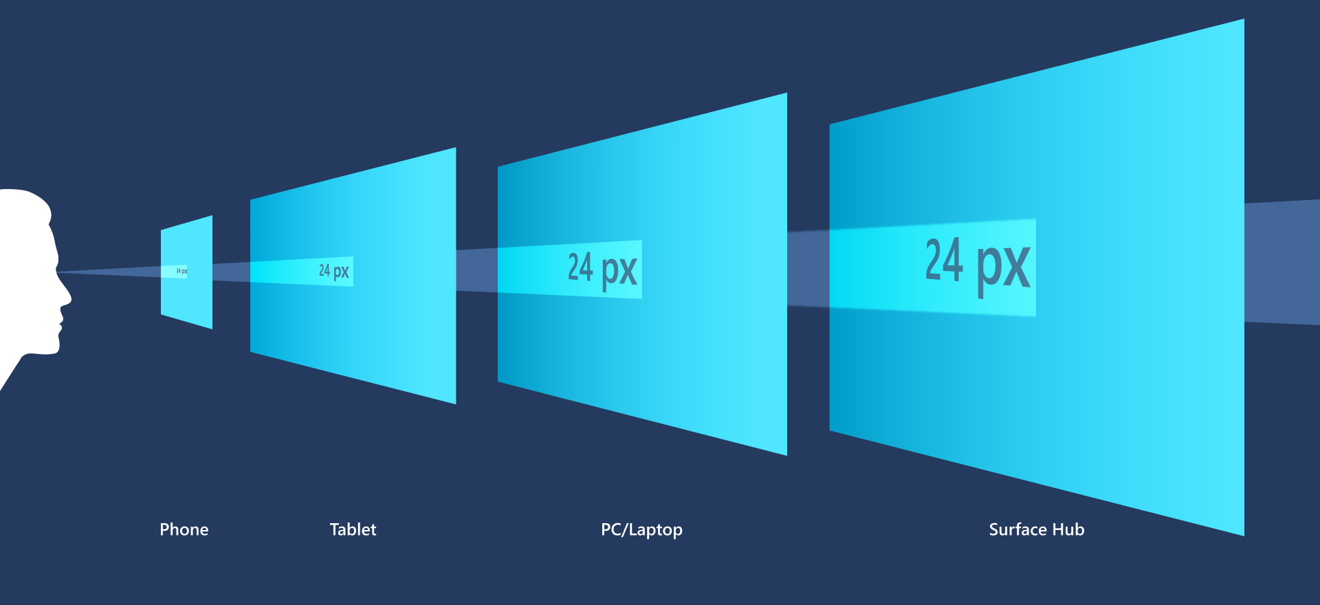
Above all, the Microsoft Fluent design system can help you develop an inclusive product faster with no need to start from scratch.
At any rate, Microsoft’s system’s main features include:
- Layout
- Motion
- Typography
- Colors
- Elevation
- Iconography
- Localization
- Theming
Learn about the Microsoft Fluent Design System and how it’s different from the Google design system examples:
You can also learn how to build React components from here.
4. The Atlassian Design System
Atlassian Corporation Plc (Atlassian design system) is an Australian software company that develops products for software developers, project managers, and other software development teams. Their products also include product management tools like Jira and Trello.
Furthermore, millions of users globally rely on Atlassian products every day for improving software development, project management, collaboration, and code quality.

In addition, the Atlassian Design System heavily adopts the agile methodology to keep track of each phase of developing and delivering a project.
The Atlassian Design System’s main features include:
- Brand guidelines
- Design Principles
- Illustration
- Product
- Personality
- Prototyping
- Marketing
In similar fashion, check out this great talk on the Atlassian Design System by the Atlassian design lead:
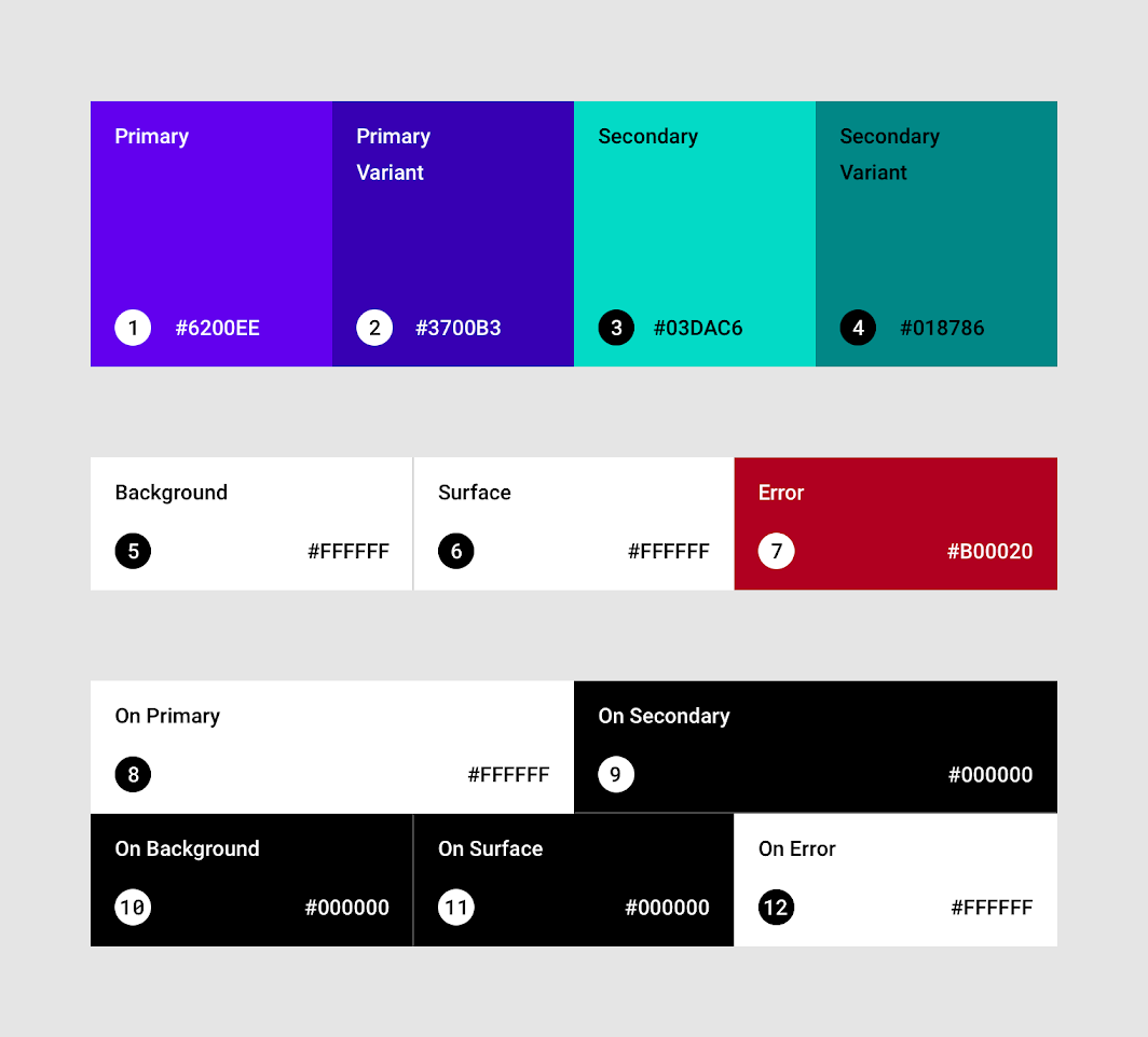
5. The Adobe Spectrum Design System
Spectrum, like other design system examples discussed above, provides components and tools to help product teams work more efficiently and to make Adobe’s applications more cohesive.
Above all, it was made available to the public in 2019, and it’s used to create a common user experience across all Adobe platforms.

The Adobe Spectrum Design System’s main features include:
- Component Library
- Pattern Library
- Content
- Tools and resources
The Adobe Spectrum Design System also provides patterns and component libraries that can be easily reused in any project. For instance, the component snippet below will create a table view.
<TableView
  aria-label="Example table with static contents"
  selectionMode="multiple"
>
  <TableHeader>
    <Column>Name</Column>
    <Column>Type</Column>
    <Column align="end">Date Modified</Column>
  </TableHeader>
  <TableBody>
    <Row>
      <Cell>Games</Cell>
      <Cell>File folder</Cell>
      <Cell>6/7/2020</Cell>
    </Row>
    <Row>
      <Cell>Program Files</Cell>
      <Cell>File folder</Cell>
      <Cell>4/7/2021</Cell>
    </Row>
    <Row>
      <Cell>bootmgr</Cell>
      <Cell>System file</Cell>
      <Cell>11/20/2010</Cell>
    </Row>
    <Row>
      <Cell>log.txt</Cell>
      <Cell>Text Document</Cell>
      <Cell>1/18/2016</Cell>
    </Row>
  </TableBody>
</TableView>
Below is the output of the code above:

Adobe Spectrum design system patterns are also available for import as Adobe XD files or as Spectrum CSS.
Watch how to create a design system in Adobe XD by the Adobe XD team:
6. The IBM Carbon Design System
International Business Machines (IBM) is best known for manufacturing and selling computer hardware and software, as well as business consulting, cloud computing, and data analytics.

Additionally, IBM created Carbon, an open-source design system that consists of reusable working code, design tools, resources, and human interface guidelines.
The primary design kit for the IBM Carbon Design System is Sketch, an alternative to the Figma design system. Instead, the IBM Carbon Design System helps solve a specific data presentation with components like accordion, breadcrumb, button, checkbox, etc.

For example, here is the code for a simple accordion below:
<Accordion align="start">
  <AccordionItem title="Section 1 title">Section 1 panel</AccordionItem>
  <AccordionItem title="Section 1 title">Section 1 panel</AccordionItem>
  <AccordionItem title="Section 1 title">Section 1 panel</AccordionItem>
</Accordion>
Which will produce the output below:

Carbon has support for popular frontend frameworks such as React, Angular, Vue, Svelte and Vanilla CSS.
The following are Carbon guiding principles:
- Carbon is…
- open.
- inclusive.
- modular and flexible.
- and Carbon…
- puts the user first.
- builds consistency.
You can learn more from their official blog website here or watch the Carbon Design System Journey below:
7. The GitLab Pajamas Design System
GitLab is a popular alternative to Github, a code repository manager with over 3,000 community contributors.
The Pajamas Design System guides all the design and resources used in building GitLab. Specifically, it’s a single source of truth for everyone contributing to the development of GitLab.

The following three principles guide GitLab design systems:
| Productive | GitLab is an application to support what people do, day in day out. We need to respect the importance of their work and avoid gimmicky details. |
| Minimal | While work can get complicated, GitLab is about bringing a sharp focus to help our customers know what matters now. |
| Human | We need to build empathy with our users. This means we must understand their state of mind and connect with them on a human level. |
Check out this introduction video on using GitLab as a design team, it is surely useful:
8. The Mailchimp Design System
Mailchimp is a popular marketing automation platform not only for email marketing services for managing mailing lists but also for creating email marketing campaigns to send to customers.
Their design is categorized into two sections: the foundations and the components.

As shown above, the foundation section consists of colors with their functional guidelines, data visualization with charts, a grid system of different sizes, and typography.
For example, here are the mailchimp design system grid sizes:

The component section specifically consists of UI elements like Buttons, Dialogs, Feedback, Form Elements, Freddicons, Helper Classes, Lists, Navigation, Slats, Stats/Data, and Tables.
In like manner, here’s an example of a dialog modal component in the Mailchimp design system:

As can be seen, the dialogue above is achieved with the code below:
<div data-dojo-type="dijit/Dialog" data-dojo-id="featureModal" class="feature-dialog">
  <div class="dijitDialogPaneContentArea max-height-inherit alignc !padding--lv0 selfclear">
    <img src="/release/1.1.1ba293a20b6cd9053d0af465e0c562543e6c167c1/images/campaigns/ab-testing.svg" class="padding--lv6">
    <div class="margin--lv3">
      <p class="full-width margin-bottom--lv0">We’ve updated the AB testing
        <span class="hide-mobile">campaign</span> interface.
      </p>
      <p class="full-width">Now you can easily test your content.
      </p>
    </div>
  </div>
  <div class="dijitDialogPaneActionBar alignc">
    <button class="button p1" data-action="dismissDialog" onclick="featureModal.hide(); return false;">Dismiss</button>
  </div>
</div>
Learn how to make designs in detail with MailChimp below:
9. The E*Trade Design Language
ETrade Financial Corporation is a financial services company, that offers an electronic trading platform to trade financial assets.

The Etrade design language is made up of four parts:
- The design components (symbols and patterns)
- CSS styling
- A React component library,
- and a documentation
By using the above basic building blocks, ETrade design language ensures an excellent user experience with front-end consistency coupled with accessibility across all their websites and applications.
10. The Salesforce Lightning Design System
Salesforce, Inc. is an American cloud-based software company founded in 1999. It provides customer relationship management software and applications focused on sales, customer service, marketing automation, analytics, and application development.
Moreover, the Salesforce lightning design system was created in 2015 to power all the designs of websites and applications in Salesforce.

The following are Salesforce lightning design system features:
- Platforms
- Design Guidelines
- Accessibility
- Component blueprints, and
- Utilities
For instance, the Salesforce code snippet below will create a basic alert:
<p><div class="slds-notify slds-notify_alert" role="alert">...</div></p>
Then the output of the code above is shown below:

11. The Uber Design System
Uber is a platform where those who drive and deliver can connect with riders, eaters, and restaurants.
Uber is also the creator of Base Web a library of UI components such as icons, typography, color, grid, and iconography, etc.

Straightaway Uber’s design system features include:
- Logo
- Brand Architecture
- Color
- Composition
- Iconography
- Illustration
- Motion
- Photography
- Tone of voice
- Typography
12. The Guardian Digital Design Style Guide
The Guardian Digital Design style guide is a single-page overview of design guidelines covering brand use, color palette, typography, grid and spacing, and UI components.

13. The Audi Design System
Audi is an automotive manufacturer of luxury vehicles. Their design system examples consist of UI/UX principles, code snippets, animation guides, UI components such as buttons, loaders, drag & drop, navigation, etc.

For example, the Audit design system code snippet below will create a basic button:
<button class="aui-button aui-button--primary aui-js-response" type="button">
Primary Button
</button>
Then the output of the code above is shown below:

14. The Lexicon(Liferay) Design System
The Liferay Lexicon is a design language that provides a framework for creating interfaces across the Liferay product ecosystem.

15. The Help Scout Design System
The Help Scout design system is divided into Visual Elements, Content Style, Product Design, and Resources.

The Helpscort design system examples consist of the following visual elements:
- Logos
- Color
- Typography
- Illustration
- Graphic Elements
16. The Figma Design Systems
Figma is a vector graphics editor and prototype tool that is primarily web-based, with desktop apps for macOS and Windows enabling additional offline features.
The Figma Design System examples among other design system examples showcase both the features of a design system and how you can achieve them with the Figma tools.
Comparatively, Figma Design System examples (Design Systems for Figma) include Ant Design System, Bold Design System, etc. You can also check out the complete collection of Figma Design System examples here.
Markedly, Figma features include:
- Implementation of reusable components
- Creating responsive components that align with code
- Several utilities and templates to kickstart your design
- Prototyping

In Conclusion
To sum up, a design system is a collection of reusable user interface components, code, and styling guidelines that reduces redundancy in product development.
This article discusses some of the best design system examples that you can reference for inspiration while creating your own design system or product.
Where Do You Go Next?
Do you want to build a better UI? Do you also want more information on React? Check out tips on how to build better UI faster with CopyCat:
- Learn React best practices from here.
- Learn how to use Bootstrap in React from here.
- Learn React Navigation here.
Related Articles
-
 Uncategorized
Why Mastering Coding Fundamentals Are More Valuable than Expertise in One Language
Introduction As a web developer, it can be tempting to focus on mastering one programming language, such as JavaScript, to become an expert. However, a broad understanding of web development is often more valuable in the long run. You can…
January 17, 2023 -
Uncategorized
10 CSS Frameworks for Frontend Developers in 2022
Introduction CSS frameworks are a very popular trend in modern web development. From small startups to mid-scale firms and large organizations, these styling solutions seem to be overtaking pure CSS as a styling choice, with newer frameworks constantly created with…
September 21, 2022
