
 February 25, 2022
  Abhishek KG


- Introduction: How to Use Bootstrap with React
- What is React Bootstrap?
- How to install Bootstrap in React?
- Using React Bootstrap Components Once Your Integration Completes
- How to use Bootstrap in React
- How to modify a rendered component or an HTML tag?
- Managing Accessibility in ReactJs Bootstrap Components:
- Adding Custom Themes to ReactJS Bootstrap
- Adding Transitions to your ReactJS Bootstrap components:
- Ratio Maintenance in ReactJS Bootstrap:
- Conclusion

Introduction: How to Use Bootstrap with React
ReactJS Bootstrap is a front-end toolkit component library developed by React, which is the most used JavaScript framework, to create responsive, component-based elements. It is a counterpart to Bootstrap Javascript and offers accessible, easy to integrate, and dynamic react components to ease our development process. A few of the widely used React Bootstrap components from are buttons, input fields, badges, tables, and many more. After reading this article, you’ll be able to use Bootstrap in your react application and react app like a pro.
What is React Bootstrap?
Javascript Bootstrap uses JQuery for powering its component’s interface. JQuery manipulates the Document Object Model (DOM) directly, so Javascript Bootstrap contradicts the declarative approach that ReactJS follows. There are times when you have seen Javascript Bootstrap used inside a React Project, but its support components are simple Vanilla Bootstrap stylesheets and do not invoke JQuery. In those cases, you can use the Javascript Bootstrap. However, the React components that rely on JQuery cannot integrate in such a manner. Hence, React app developers developed their component library that follows the Virtual DOM concept and does not involve JQuery.
How to install Bootstrap in React?
There are different ways to integrate bootstrap into your apps; here’s how to install bootstrap in react. To install all the required dependencies, you can either use an npm install bootstrap or yarn package manager or set the browser’s globals with ReactJS Bootstrap CDN.
NPM install bootstrap method:
npm install react-bootstrap bootstrap
Using Yarn package manager:
yarn add react-bootstrap
CDN method:
<script src="https://unpkg.com/react/umd/react.production.min.js" crossorigin></script>

<script
 src="https://unpkg.com/react-dom/umd/react-dom.production.min.js"
 crossorigin></script>

<script
 src="https://unpkg.com/react-bootstrap@next/dist/react-bootstrap.min.js"
 crossorigin></script>
How to import bootstrap in react?
Once you set up all the dependencies into your node modules, next, you need to set up the stylesheet dependencies. You can import them into your src/index.js or App js file, or you can add a bootstrap CDN in your browser globals.
Using an import into your App.js or src/index.js for CSS:
import 'bootstrap/dist/css/bootstrap.min.css';
Using an import into your App.scss for SASS:
Note: You need to import your sass file into your App.js/index.js files.
@import "~bootstrap/scss/bootstrap";
Using a CDN:
<link
 rel="stylesheet"
 href="https://cdn.jsdelivr.net/npm/bootstrap@5.1.3/dist/css/bootstrap.min.css"
 integrity="sha384-1BmE4kWBq78iYhFldvKuhfTAU6auU8tT94WrHftjDbrCEXSU1oBoqyl2QvZ6jIW3"
 crossorigin="anonymous"
/>
After adding these node modules and CSS imports, you can now use the ReactJS Bootstrap in your React Application and React apps.
Using React Bootstrap Components Once Your Integration Completes
There are many React Bootstrap library components. Let us see a few commonly used components and discuss how it adds more value to your React application.
How to use Bootstrap in React
Buttons:
React Bootstrap library supports buttons designed with different variants, including multiple sizes and states.
To use a Button in your Component, you need to import the button component and use the selector provided.
 import Button from "react-bootstrap/Button";

<div className="component">
             <Button variant="primary">Button</Button>
</div>
Tabs:
You can create dynamic tabbed interfaces using ReactJS Bootstrap, with high-level javascript components for quickly creating Navs.
To use the Tabs inside your component, you need to import the Tab and Tabs component and set your event keys and default active Nav accordingly.
import Tab from "react-bootstrap/Tab";
import Tabs from "react-bootstrap/Tabs";

       <div className="component">
             <Tabs
               defaultActiveKey="profile"
               id="uncontrolled-tab-example"
               className="mb-3"
             >
               <Tab eventKey="home" title="Home"></Tab>
               <Tab eventKey="profile" title="Profile"></Tab>
               <Tab eventKey="contact" title="Contact" disabled></Tab>
             </Tabs>
           </div>
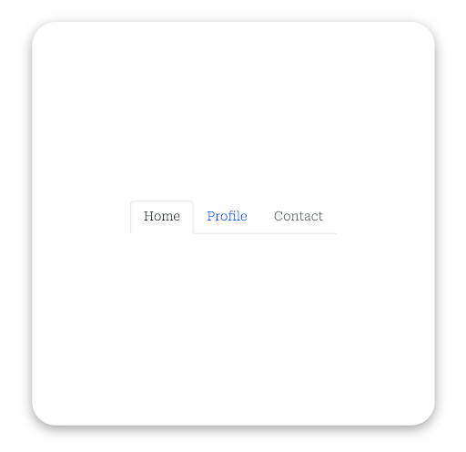
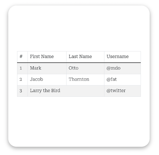
Table:
You can create Tables of different variants with multiple options with the theme, border, and responsiveness.
To use Table, import it inside your component. Add pairs of td and tr depending on your requirement and structure.
import Table from "react-bootstrap/Table";

<div className="component">
             <Table striped bordered hover>
               <thead>
                 <tr>
                   <th>#</th>
                   <th>First Name</th>
                   <th>Last Name</th>
                   <th>Username</th>
                 </tr>
               </thead>
               <tbody>
                 <tr>
                   <td>1</td>
                   <td>Mark</td>
                   <td>Otto</td>
                   <td>@mdo</td>
                 </tr>
                 <tr>
                   <td>2</td>
                   <td>Jacob</td>
                   <td>Thornton</td>
                   <td>@fat</td>
                 </tr>
                 <tr>
                   <td>3</td>
                   <td colSpan={2}>Larry the Bird</td>
                   <td>@twitter</td>
                 </tr>
               </tbody>
             </Table>
           </div>
Dropdowns:
Dropdowns are toggleable UI elements with a list rendered throughout for the selection. This component uses Popper JS, which provides dynamic positioning and viewport detection.
To use dropdown, import the Dropdown component in your component. You can use the attributes and props provided by the component to customize add themes, variants, and many other features.
import Dropdown from "react-bootstrap/Dropdown";

 <div className="component">
             <Dropdown>
               <Dropdown.Toggle variant="success" id="dropdown-basic">
                 Dropdown Button
               </Dropdown.Toggle>

               <Dropdown.Menu>
                 <Dropdown.Item href="#/action-1">Action</Dropdown.Item>
                 <Dropdown.Item href="#/action-2">
                   Another action
                 </Dropdown.Item>
                 <Dropdown.Item href="#/action-3">
                   Something else
                 </Dropdown.Item>
               </Dropdown.Menu>
             </Dropdown>
</div>

Alerts:
Alerts provide contextual feedback messages for the user actions and are available in multiple variants. You can put any length string inside it, and it takes care of the responsiveness.
To use Alert, import it inside your component. You need to provide variants as props to the component.
import Alert from "react-bootstrap/Alert";

   <div className="component">
             <Alert variant="primary">This is a alert—check it out!</Alert>
           </div>

There are many valuable and straightforward to use javascript components provided by React Bootstrap. We discussed a few of the above and looked into the various ways you can use them with proper attributes and props. Let’s see a bunch of them at a glance. You can check all of them here.
import "./App.scss";
import Button from "react-bootstrap/Button";
import Alert from "react-bootstrap/Alert";
import Badge from "react-bootstrap/Badge";
import Breadcrumb from "react-bootstrap/Breadcrumb";
import ButtonGroup from "react-bootstrap/ButtonGroup";
import Card from "react-bootstrap/Card";
import CloseButton from "react-bootstrap/CloseButton";
import Dropdown from "react-bootstrap/Dropdown";
import Toast from "react-bootstrap/Toast";
import Tab from "react-bootstrap/Tab";
import Tabs from "react-bootstrap/Tabs";
import Table from "react-bootstrap/Table";
import Spinner from "react-bootstrap/Spinner";
import ProgressBar from "react-bootstrap/ProgressBar";
import Placeholder from "react-bootstrap/Placeholder";

function App() {
 const isShown = true;
 return (
   <div className="App">
     <div className="components-library">
       <div className="react-bootstrap-components">
         {isShown && (
           <div className="component">
             Example heading <Badge bg="secondary">New</Badge>
           </div>
         )}
         {isShown && (
           <div className="component">
             <Breadcrumb>
               <Breadcrumb.Item href="#">Home</Breadcrumb.Item>
               <Breadcrumb.Item href="https://getbootstrap.com/docs/4.0/components/breadcrumb/">
                 Library
               </Breadcrumb.Item>
               <Breadcrumb.Item active>Data</Breadcrumb.Item>
             </Breadcrumb>
           </div>
         )}
         {isShown && (
           <div className="component">
             <ButtonGroup aria-label="Basic example">
               <Button variant="secondary">Left</Button>
               <Button variant="secondary">Middle</Button>
               <Button variant="secondary">Right</Button>
             </ButtonGroup>
           </div>
         )}
         {isShown && (
           <div className="component">
             <Card style={{ width: "18rem" }}>
               <Card.Img variant="top" src="holder.js/100px180" />
               <Card.Body>
                 <Card.Title>Card Title</Card.Title>
                 <Card.Text>
                   Some quick example text to build on the card title and make
                   up the bulk of the card's content.
                 </Card.Text>
                 <Button variant="primary">Go somewhere</Button>
               </Card.Body>
             </Card>
           </div>
         )}
         {isShown && (
           <div className="component">
             <Toast>
               <Toast.Header>
                 <img
                   src="holder.js/20x20?text=%20"
                   className="rounded me-2"
                   alt=""
                 />
                 <strong className="me-auto">Bootstrap</strong>
                 <small>11 mins ago</small>
               </Toast.Header>
               <Toast.Body>Hello, world! This is a toast message.</Toast.Body>
             </Toast>
           </div>
         )}
         {isShown && (
           <div className="component">
             <Tabs
               defaultActiveKey="profile"
               id="uncontrolled-tab-example"
               className="mb-3"
             >
               <Tab eventKey="home" title="Home"></Tab>
               <Tab eventKey="profile" title="Profile"></Tab>
               <Tab eventKey="contact" title="Contact" disabled></Tab>
             </Tabs>
           </div>
         )}
         {isShown && (
           <div className="component">
             <Spinner animation="border" role="status">
               <span className="visually-hidden">Loading...</span>
             </Spinner>
           </div>
         )}
         {isShown && (
           <div className="component">
             <ProgressBar now={60} />
           </div>
         )}
         {isShown && (
           <div className="component">
             <Card style={{ width: "18rem" }}>
               <Card.Img variant="top" src="holder.js/100px180" />
               <Card.Body>
                 <Placeholder as={Card.Title} animation="glow">
                   <Placeholder xs={6} />
                 </Placeholder>
                 <Placeholder as={Card.Text} animation="glow">
                   <Placeholder xs={7} /> <Placeholder xs={4} />{" "}
                   <Placeholder xs={4} /> <Placeholder xs={6} />{" "}
                   <Placeholder xs={8} />
                 </Placeholder>
                 <Placeholder.Button variant="primary" xs={6} />
               </Card.Body>
             </Card>
           </div>
         )}
       </div>
     </div>
   </div>
 );
}

export default App;

How to modify a rendered component or an HTML tag?
You may want to update the user interface react bootstrap components you have rendered on the UI several times. The best way to do so is to keep the styling of the rendering element and switch the react component that renders. You need to use the “as” prop API within your Bootstrap React components.
Let’s see an example to understand this better.
Import a ReactJs Bootstrap component Nav.
import Nav from "react-bootstrap/Nav";
Now, create a simple Nav Component.
<div className="component">
             <Nav className="tabs-div" variant="tabs">
               <Nav.Item>
                 <Nav.Link className="pending" eventKey={-1}>
                   Pending
                 </Nav.Link>
               </Nav.Item>
               <Nav.Item>
                 <Nav.Link className="positive" eventKey={1}>
                   Positive
                 </Nav.Link>
               </Nav.Item>
               <Nav.Item>
                 <Nav.Link className="negative" eventKey={0}>
                   Negative
                 </Nav.Link>
               </Nav.Item>
             </Nav>
</div>
Now, the output looks something like this:

Assume that you now have to keep the styling of the Navs, but you want to render or switch one of the Nav Bar to a button. The switching is possible using the “as” prop.
Let us create a Button Element.
const BtnPending = () => {
 return <button className="btn btn-warning">Pending</button>;
};
Now, use the “as” prop inside one of the Nav Bars of the Nav component.
<div className="component">
             <Nav className="tabs-div" variant="tabs">
               <Nav.Item>
                 <Nav.Link className="pending" as={BtnPending} eventKey={-1}>
                   Pending
                 </Nav.Link>
               </Nav.Item>
               <Nav.Item>
                 <Nav.Link className="positive" eventKey={1}>
                   Positive
                 </Nav.Link>
               </Nav.Item>
               <Nav.Item>
                 <Nav.Link className="negative" eventKey={0}>
                   Negative
                 </Nav.Link>
               </Nav.Item>
             </Nav>
</div>
The resulting output will be like this:

Managing Accessibility in ReactJs Bootstrap Components:
React Bootstrap has “Accessibility by default.” One using the components inside the App need not worry about that. As per React Bootstrap documentation,
“Each component is implemented with accessibility in mind. The result is a set of accessible-by-default components, over what is possible from plain Bootstrap.”
Although, if you need to manage and take control over the accessibility of the UI Elements you are rendering with the help of Bootstrap React, you can explicitly define your tab-indexes and aria-labels as per your requirements.
Adding Custom Themes to ReactJS Bootstrap
ReactJS Bootstrap is highly compatible with the existing Javascript Bootstrap themes. You can simply use the basic installation process provided by Javascript Bootstrap to get that. But, in case you need to set up a custom theme for your component, you need to override Bootstrap’s theme.
Let us see how you can do that.
- First, you need to install sass and create your SCSS file to write the overriding code.
npm install sass
2. Next, you need to import the bootstrap CSS file into your custom theme sass file.
// Override default variables before the import
$body-bg: #000;

// Import Bootstrap and its default variables
@import '~bootstrap/scss/bootstrap.scss';
3. Finally, you need to import this file to your index.js/App.js instead of the bootstrap CSS file to bring the custom theme file into effect.
Note: You need to add the ‘~’ symbol while importing bootstrap to resolve node modules in your project.
React Bootstrap with States:
React Bootstrap follows the behavior of React Javascript, allowing you to pass props to the Bootstrap React components. These can make the components highly flexible when used with states. Adding states as prop to the react component avoids direct manipulation of the DOM state and effectively manages the highly complex components.
Let us see an example:
const StatesWithReactBootstrapComponents = () => {
 const [shouldOpen, setshouldOpen] = useState(false);

 return (
   <>
     <Button
       onClick={() => setshouldOpen(!shouldOpen)}
     >
       click me
     </Button>
     <Collapse in={shouldOpen}>
       <div id="example-collapse-text">
         Some Message
       </div>
     </Collapse>
   </>
 );
}

render(<StatesWithReactBootstrapComponents />);
In the example above, open is a state managing the toggling of the collapsible Component.
Adding Transitions to your ReactJS Bootstrap components:
You can add fundamental CSS transitions to your bootstrap components. React Bootstrap has bundled all of them into a composable <Transition> component, a commonly used animation wrapper in react.
There are two commonly used transitions effects, Collapse and Fade.
Collapse does the transitions either vertically or horizontally, and fade plays with the opacity of the container in transition. Let’s see how you can import them to your project.
import Collapse from 'react-bootstrap/Collapse'

import Fade from 'react-bootstrap/Fade'
Now, let us see an example for the Fade Transition.
const  FadeComponent = () =>{
 const [shouldOpen, setshouldOpen] = useState(false);
 return (
   <>
     <Button
       onClick={() => setshouldOpen(!shouldOpen)}
     >
       Fade Transition Effect
     </Button>
     <Fade in={shouldOpen}>
       <div id="example-fade-text">
         I am the fading text. Click the button above to fade me.
       </div>
     </Fade>
   </>
 );
In the above code snippet, a handler is attached to the button, toggling the Fade Component visibility, depending on the state.
The output looks something like this:

Ratio Maintenance in ReactJS Bootstrap:
You can add Aspect Ratio to the components you are using from React Bootstrap. These aspect ratios can be pre-defined or custom, depending on your requirement, and you need to import this to your react component to use the Ratio first.
import Ratio from 'react-bootstrap/Ratio'
Pre-defined Ratio:
<div style={{ width: 660, height: 'auto' }}>
 <Ratio aspectRatio="16x9">
   <embed type="image/svg+xml" src="/anySampleImage.jpg" />
 </Ratio>
</div>
Custom Ratio:
<Ratio aspectRatio={1 / 2}>
<div>2x1</div>
 </Ratio>
 <Ratio aspectRatio={50}>
   	<div>2x1</div>
 </Ratio>
Conclusion
In summary, ReactJS Bootstrap offers many components and the flexibility to bind them with your React Components. It moves alongside ReactJS architecture, following Virtual DOM and state management. It has predefined accessibility and responsiveness features which make this even more robust. You can also use the ReactJS Bootstrap template in your React application to use the ready-to-use web pages to make development faster. Two of the widely used ReactJs Bootstrap templates are Reactify and Architect UI.
In the end, I hope this blog has given you some good deeper insights about ReactJS Bootstrap and its components. Now you can start using Bootstrap with React with confidence. If you want to convert Figma to HTML code, check out CopyCat, which helps you in building web applications faster.
Interesting Reads From Our Blogs
- Impress Your Users Using The Top 8 React Animation Libraries
- Utilize React to the Max With The Top 15 React Component Libraries
- What to Read When Using Typescript In Your React App
- Use Bootstrap Card to Responsively Layout Contents in Your React App: Examples + Walk-throughs
- Your Comprehensive Guide To Bootstrap Forms
Related Articles
-
 React.js
Create Modals easily with Material UI Modal
Introduction Modals are common User Interface(UI) elements in applications. Material UI, a React JS component library makes it easy and straightforward to implement Modals. During the design stage of developing applications, it is possible to transform those designs into code…
December 24, 2022 -
React.js
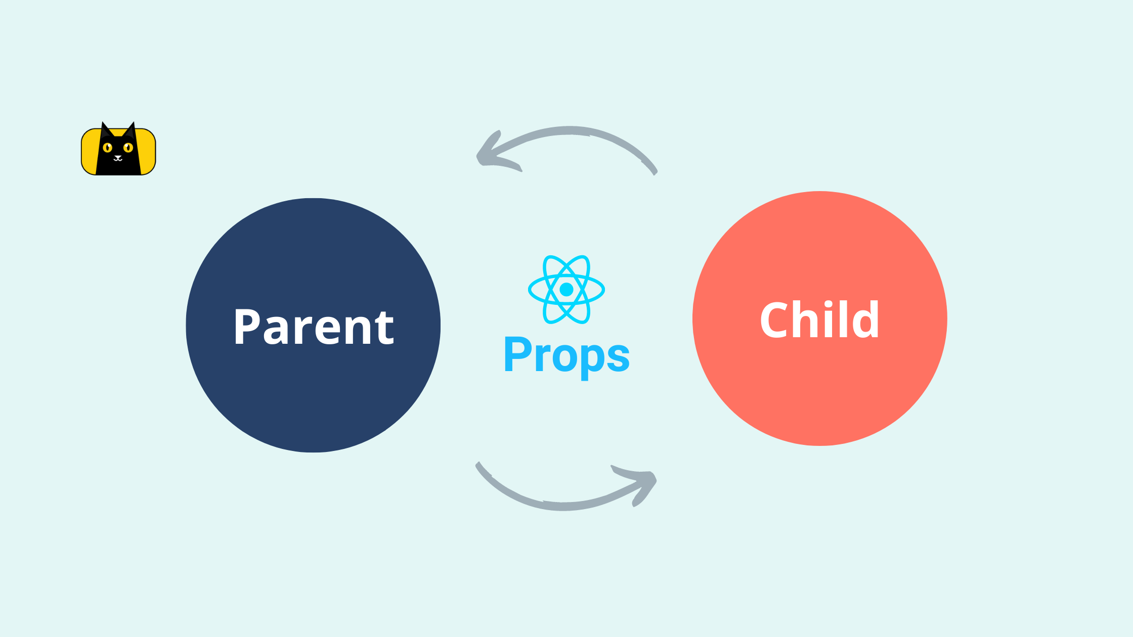
All You Need to Know About React Props
What are React Props? Props represent a component's " properties, " and it’s similar to the concept of parameters and arguments in JavaScript functions. Props enable us to share dynamic data from one component to another. How Props works in…
October 31, 2022

