 February 17, 2023
  copycat


- Introduction
- Understanding CSS Overflow
- How to Use CSS Overflow
- Best Practices for CSS Overflow and Responsive Design
- For containers with fixed heights and widths, use "auto" or "scroll" values
- Use "hidden" value for containers with dynamic heights or widths.
- Use "text-overflow: ellipsis" for long text within fixed-size containers.
- Avoid using negative margins or padding to fix overflow issues.
- Test the design on different devices and screen sizes.
- Use media queries to adjust the overflow values for different screen sizes.
- Consider using CSS Grid or Flexbox to create more responsive layouts.
- Use JavaScript to dynamically adjust the overflow values based on user interactions.
- Closing Remarks
Introduction
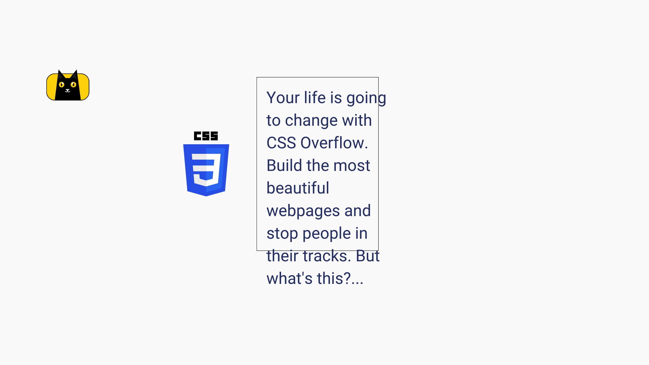
Have you ever visited a website where the content spills over the edges of its container and obscures other elements on the page? It can be frustrating, making it difficult to read and navigate the site. This is where CSS Overflow comes in. By controlling the overflow of content within an element, developers can prevent these kinds of problems and create a visually appealing and functional website.
In this article, we’ll provide an in-depth guide on CSS Overflow and its different values, as well as how to use it to fix content overflow issues. We’ll also discuss the best practices for using it in responsive design and answer some common questions about it. By the end of this article, you’ll have a comprehensive understanding of CSS Overflow and be equipped to use it effectively in your web design projects.
Understanding CSS Overflow

CSS Overflow is a property in CSS that determines how content should be displayed when it exceeds the available space within an element. There are four values for its property: visible, hidden, scroll, and auto which determine how content should be displayed when it exceeds the available space.
Visible
The visible value allows content to overflow the boundaries of its container, appearing as if it’s floating above other elements on the page. When you want to make sure that content isn’t clipped by its parent element, or when you want to show a tooltip or pop-up, use Visible.
Hidden
The hidden value hides any content that overflows its container, effectively clipping it. Use this value when you want to hide content that extends beyond the bounds of its container, such as drop-down menus or image galleries.
Scroll
The scroll value adds a scrollbar to the container, allowing users to scroll through the overflowed content. This value is often used when you want to allow users to view all the content that extends beyond the bounds of the container, without compromising the layout of the page.
Auto
The auto value automatically determines the best way to handle overflow based on the content and available space. If there is no overflow, set the value to visible, and if there is overflow, set the value to scroll. Developers often use this value when they want to allow the browser to handle overflow automatically, without specifying a specific value.
In addition to the four values of CSS Overflow, there are also CSS Text Overflow, CSS Overflow Hidden, and Ellipsis, which provide additional ways to handle content overflow. Understanding CSS Text Overflow, Hidden, and Ellipsis can help you create more dynamic and visually appealing designs that accommodate different types of content.
CSS Text Overflow
CSS Text Overflow is a property in CSS that controls what happens to text that exceeds the width of its container. It has two values: clip, which clips the text at the edge of the container, and ellipsis, which truncates the text with an ellipsis (…). The CSS Text Overflow ellipsis can be a useful way to indicate that there is more text available, while avoiding cluttering the layout with unnecessary content.
CSS Overflow Hidden
CSS Overflow Hidden is a value of the CSS Overflow property that hides any content that overflows its container, effectively clipping it. Use Hidden when you want to hide content that extends beyond the bounds of its container, such as drop-down menus or image galleries.
CSS Overflow Ellipsis
CSS Overflow Ellipsis is a value of the CSS Text Overflow property that truncates overflowed text with an ellipsis (…). This value is often used in combination with the Overflow Hidden property, where you want to show only a preview of the text, with the option to reveal the rest by clicking a “Read more” button.
By using these properties effectively, you can control how content display on your website, without sacrificing the overall layout and design.
You can also learn 24+ CSS properties through this video:
Why CSS Overflow Affects Responsive Design

When designing websites, it is important to consider how the site will be displayed on different devices with varying screen sizes and resolutions. Responsive design is an approach that creates web pages that adapt to different screen sizes, ensuring that the content is readable and accessible, regardless of the device used.
CSS Overflow is important in responsive design because it allows you to control how content displays when it exceeds the available space within an element. Without proper handling of overflowed content, a web page can become cluttered, difficult to read, or even broken, especially on smaller screens. Thus, you can use CSS Overflow and ensure that the content displays in a visually appealing and intuitive way, regardless of the device used.
Here are two examples of how CSS Overflow affects responsive design:
1. Drop-down menus

Many websites use drop-down menus to allow users to navigate to different sections of the site. However, if the menu items are too long or if there are too many items, they may overflow the container and become difficult to read or navigate. By using CSS Overflow Hidden, you can hide the overflowed menu items and provide users with an intuitive way to access the content, such as a “More” button that expands the menu.
2. Image galleries

CSS Overflow also affects Image galleries. If the images are too large, they may overflow the container, causing the layout to break or the images to become distorted. By using CSS Overflow Auto or Scroll, you can provide users with a way to scroll through the gallery and see all the images, without affecting the layout or visual appeal of the page. Additionally, with Ellipsis, you can provide users with a preview of the image and allow them to click on the image to see the full version.
In both of these examples, proper handling of CSS Overflow ensures that the content displays nicely. This is essential for responsive design, as it allows web designers to create pages that are accessible and readable on all devices, from desktops to smartphones.
Luckily, with CopyCat, you can avoid having to use CSS Overflow by generating production ready code from your design automatically. CopyCat generates code that is responsive and readable, with logically named components. We take care of the mundane CSS so you can focus on building a great app.
How to Use CSS Overflow
CSS Overflow is a powerful tool that can fix content overflow issues. In this section, we will discuss how to use it with different values and provide a step-by-step guide on how to force text overflow in CSS.
How to use CSS Overflow to fix content overflow issues
When content exceeds the available space within an element, it can cause layout issues and make the page difficult to read or navigate. By using CSS Overflow, you can control content display, ensuring that the layout is not affected and the content is still accessible. Here are the steps to use it to fix content overflow issues:
- Identify the element that is causing the overflow issue
- Set the CSS Overflow property for the element to the desired value (visible, hidden, scroll, or auto)
- Adjust the size of the element or its parent container, if necessary
- Finally, test the page on different devices and screen sizes to ensure that the content is still accessible and visually appealing
Example:
HTML:
<div class="container">
  <p class="content">This is a long text that exceeds the width of the container. Without CSS Overflow, it would cause layout issues and make the page difficult to read or navigate.</p>
</div>
CSS:
.container {
  width: 300px;
  height: 150px;
  border: 1px solid black;
  overflow: hidden;
}

.content {
  width: 400px;
}
In this example, the container has a fixed width and height and a border. The content within the container exceeds its width. By setting the “overflow” property to “hidden”, we ensure that any content that overflows the container is hidden. We also set the width of the content to a value that exceeds the container’s width to demonstrate how the overflow property works.
Step-by-step guide on using CSS Overflow with different values
CSS Overflow has four different values: visible, hidden, scroll, and auto. Each value controls how the content is displayed when it exceeds the available space within an element. Here is a step-by-step guide on using it with each value:
- Visible: This is the default value, which displays the entire content of an element, even if it exceeds the available space. To use Visible, simply do not set the Overflow property for the element.
- Hidden: This value hides any content that overflows the element, ensuring that the layout is not affected. To use this value, set the CSS Overflow property for the element to “hidden”.
- Scroll: This value adds a scrollbar to the element, allowing users to scroll through the overflowed content. To use this value, set the Overflow property for the element to “scroll”.
- Auto: This value automatically selects the best value between visible and scroll, based on the content and the available space. To use this value, set the CSS Overflow property for the element to “auto”.
Example with auto:
HTML:
<div class="container">
  <p class="content">This is a long text that exceeds the width of the container. Without CSS Overflow, it would cause layout issues and make the page difficult to read or navigate.</p>
</div>
CSS:
.container {
  width: 300px;
  height: 150px;
  border: 1px solid black;
  overflow: auto;
}

.content {
  width: 400px;
}
In this example, we’ve set the “overflow” property to “auto”, which automatically selects the best value between “visible” and “scroll” based on the content and the available space. This ensures that the content is still accessible and visually appealing, regardless of the device or screen size.
Explanation of how to force text overflow in CSS
Sometimes, you may want to force text to overflow within an element, such as when you want to create a preview or teaser for a longer text. To force text overflow in CSS, you can use the “text-overflow” property. Here’s how to do it:
- Set the CSS Overflow property for the element to “hidden”
- Set the “white-space” property for the element to “nowrap”
- Set the “text-overflow” property for the element to the desired value (ellipsis, clip, or string)
- Finally, adjust the size of the element or its parent container, if necessary
Example:
HTML:
<div class="container">
  <p class="content">This is a long text that exceeds the width of the container. Without CSS Overflow, it would cause layout issues and make the page difficult to read or navigate.</p>
</div>
CSS:
.container {
  width: 300px;
  height: 150px;
  border: 1px solid black;
  overflow: hidden;
}

.content {
  width: 400px;
  white-space: nowrap;
  text-overflow: ellipsis;
}
In this example, we’re using the “text-overflow” property to force text overflow within the container. We’ve set the “white-space” property to “nowrap” to ensure that the text is displayed on a single line, and the “text-overflow” property to “ellipsis” to add an ellipsis to the end of the text that overflows the container. By setting the “overflow” property to “hidden”, we ensure that any content that overflows the container is hidden. By following these steps, you can force text to overflow within an element and provide users with a preview or teaser for longer text.
Also, watch this video tutorial about force text for more detail:
Best Practices for CSS Overflow and Responsive Design

Responsive design is an essential part of modern web development. With the increasing number of devices and screen sizes, it’s crucial to make sure that your website looks and functions well on all of them. CSS Overflow is an essential tool for designing responsive layouts that accommodate different screen sizes without sacrificing content.
Here are some best practices for using CSS Overflow in responsive design:
For containers with fixed heights and widths, use “auto” or “scroll” values
- This ensures that content within the container will be scrollable if it overflows the fixed size.
.container {
  width: 400px;
  height: 200px;
  overflow: auto;
}
Use “hidden” value for containers with dynamic heights or widths.
- This hides any overflowed content within the container.
.container {
  width: 100%;
  height: 100%;
  overflow: hidden;
}
Use “text-overflow: ellipsis” for long text within fixed-size containers.
- This displays an ellipsis (…) at the end of the text when it overflows the container.
.container {
  width: 200px;
  white-space: nowrap;
  overflow: hidden;
  text-overflow: ellipsis;
}
Avoid using negative margins or padding to fix overflow issues.
- This can cause layout problems on different screen sizes.
Test the design on different devices and screen sizes.
- It’s essential to ensure that the design works well on a range of devices, from desktop computers to mobile phones.
Use media queries to adjust the overflow values for different screen sizes.
- For example, you might want to use “scroll” for a container on a desktop screen, but “hidden” on a mobile screen.
@media (max-width: 768px) {
  .container {
    overflow: hidden;
  }
}
@media (min-width: 769px) {
  .container {
    overflow: scroll;
  }
}
Consider using CSS Grid or Flexbox to create more responsive layouts.
- These CSS layout systems make it easier to adjust the layout based on the available screen space.
Use JavaScript to dynamically adjust the overflow values based on user interactions.
- For example, you might want to change the overflow value from “hidden” to “scroll” when the user clicks a “show more” button.
CSS Overflow affects different devices and screen sizes in various ways. For example, overflow values that work well on desktop computers may not work as well on mobile devices, where screen space is limited. Similarly, different browsers may handle overflow differently, so it’s essential to test the design on various devices and browsers.
Closing Remarks
In conclusion, we hope this article has helped you gain a deeper understanding of the importance of CSS Overflow in web design, and how it can be used to create more responsive and flexible layouts. Whether you’re building a website or an app, understanding how to use CSS Overflow effectively can make a big difference in the user experience.
By mastering the different values of CSS Overflow, such as “visible,” “hidden,” “scroll,” and “auto,” you can ensure that your content looks great and functions as intended, no matter what device or screen size your users are using. And by following best practices such as using media queries, leveraging CSS layout systems, and using JavaScript to adjust overflow values based on user interactions, you can create truly responsive designs that adapt to the needs and preferences of your users.
We encourage you to experiment with CSS Overflow in your own designs, and to also keep learning and exploring the many other powerful tools and techniques available to web designers today. By staying curious and creative, you can create truly innovative and engaging designs that inspire and delight your users.
Related Articles
-
 Uncategorized
React localStorage: set and get items with hooks
Introduction There are two main web storage mechanisms: React localStorage and sessionStorage. These storage types are similar to persistent cookies and session cookies respectively. Local storage and sessionStorage both maintain a separate storage area for each given origin that's available…
April 28, 2022 -
Uncategorized
Why Mastering Coding Fundamentals Are More Valuable than Expertise in One Language
Introduction As a web developer, it can be tempting to focus on mastering one programming language, such as JavaScript, to become an expert. However, a broad understanding of web development is often more valuable in the long run. You can…
January 17, 2023

