 February 17, 2023
  copycat


- Introduction
- What is Padding in CSS?
- Why is CSS Padding important?
- How to Pad in CSS
- Common Challenges with CSS Padding and How to Avoid Them
- What Does "10px" Mean in CSS?
- The Three Padding Values in CSS
- CSS Margin vs Padding
- CSS Padding Order
- Why Padding is Better than Margin
- Start Using CSS Padding in Your Projects
Introduction
Have you ever visited a website and found yourself struggling to click on a button? Or read the text on the page? Or perhaps you were frustrated by how cramped the content felt, with images and paragraphs seemingly crowded together? As a web user, these experiences can be off-putting, which is why CSS padding is so important. CSS padding is a crucial aspect of web design that determines the space between an HTML element and its border. Padding is one of the most common properties designers use to create visually appealing and user-friendly websites. For example, a button with appropriate padding can make clicking easier, while text with adequate padding can improve readability. But as much as padding can enhance web design, it can lead to common pitfalls. Poorly implemented padding can make content feel cramped, while excessive padding can make a website look cluttered and unprofessional.
This article will explore everything you need to know about CSS padding. Including best practices, common pitfalls, and how to use padding effectively in your web projects.
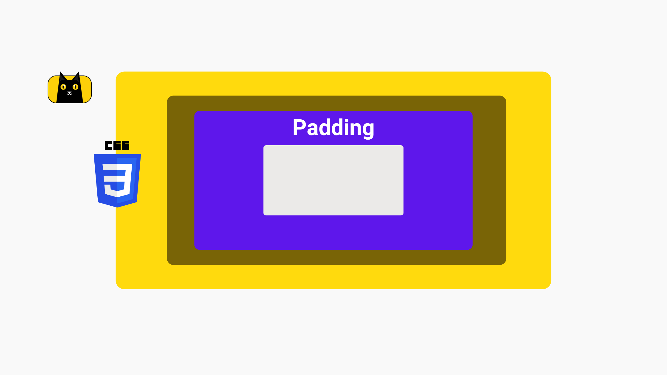
What is Padding in CSS?

CSS padding is a property that adds space between the content of an HTML element and its border. When you apply padding to an element, you add an invisible cushion around the content, increasing the distance between the content and the element’s border. Padding can be applied to all four sides of an element (top, right, bottom, and left) or to individual sides.
For example, you can apply padding only to the top and bottom of an element or only to the left and right. You can also use negative values for padding to decrease the space between the content and the border. Padding is often used to improve the usability and aesthetics of a website.
Another example is adding padding to interactive elements such as buttons, links, and input fields can make them easier to interact with, especially on mobile devices. Similarly, adding padding to text elements such as paragraphs and headings can improve readability and create visual hierarchy on the page.
Why is CSS Padding important?
In web design, padding is essential for several reasons. First, padding can improve the usability of a website. By adding appropriate padding to interactive elements such as buttons, links, and input fields, designers can make these elements more accessible and easier to interact with. For example, a button with enough padding around its text will be easier to click on, especially on mobile screens.
Second, padding can improve the readability of text on a webpage. Adequate padding around paragraphs, headings, and other text elements can make them easier to read and scan. In fact, studies have shown that readers tend to prefer text with more space around it, as it improves legibility and reduces eye strain.
Third, padding can improve the overall aesthetics of a website. Appropriate padding can create a sense of balance and visual hierarchy, making a website look more professional and polished. Overall, understanding and implementing CSS padding is critical for creating websites that are visually appealing but also user-friendly and accessible. In the next section, we’ll discuss developers’ challenges with padding.
How to Pad in CSS
The CSS padding property can be set using one of several different value types, including pixels, rems, and percentages.
Pixels
Pixels (px) are an absolute unit of measurement. This means they always represent the same physical size, regardless of the size or resolution of the device they are displayed on. For example, a 20px font will always appear the same size, regardless of the display resolution.
REMs
REMs (root ems) are a relative unit of measurement, which means that their size is based on the font size of the root element of the document (usually the <html> element). For example, if the root font size is set to 16px, 1rem will be equivalent to 16px. REMs are useful for creating responsive designs that scale based on the user’s device or viewport size.
Percentages
Percentages (%) are also a relative unit of measurement and are based on the size of the parent element. For example, if the parent element has a width of 200px and the child element has a width of 50%, the child element will have a width of 100px. Percentages are commonly used in responsive design to create flexible layouts that adjust to different screen sizes.
For example, the following CSS rule sets the padding of an element to 10 pixels on all four sides:
padding: 10px;
You can also set the padding for individual sides using the following syntax:
padding-top: 10px;
padding-right: 20px;
padding-bottom: 30px;
padding-left: 40px;
Overall, understanding how to use CSS padding effectively is critical for creating visually appealing and user-friendly websites. However, mastering CSS padding is easier said than done. We’ll save you the learning curve and show you this secret CSS padding trick you should know about:
In the next section, we’ll explore how padding affects the size and spacing of elements on a webpage.
Common Challenges with CSS Padding and How to Avoid Them

CSS padding is a powerful tool for adding spacing and visual interest to web designs. However, for many developers, CSS padding can be a source of frustration. It’s not always easy to get the element spacing right, or make a website look great on all devices and browsers. Here are some of the most common issues with CSS padding and how to avoid them:
Padding and Box Sizing
The box-sizing property in CSS affects how padding is calculated. If the box-sizing property is set to content-box, the padding is added to the element’s content box, which increases the total size of the element. If the box-sizing property is set to border-box, the padding is included in the element’s border box, which means the total size of the element remains constant.
Common issues with padding and box-sizing include unexpected changes to the size of elements and misaligned layouts. To avoid these issues, it’s best to set the box-sizing property to border-box for all elements by using the following CSS rule:
* {
  box-sizing: border-box;
}
Padding and Element Alignment
Padding affects the element alignment on a webpage, which is especially noticeable when elements are displayed in a grid or a row. Common issues with padding and element alignment include improperly aligned elements or that don’t line up with the grid.
To avoid these issues, it’s best to use consistent padding values for elements that need to align. You can also use CSS grid or flexbox to create more precise layouts, and adjust the padding values accordingly.
For example, when adding padding to an element, it can affect the element’s alignment with other elements on the page. For example, if you add padding to a button element, it may not be aligned with other page buttons. To avoid these issues, use margin instead of padding to adjust the spacing around elements.
/* Use margin instead of padding to adjust spacing around elements */
.element {
  margin: 10px;
}
Padding and Responsive Design
Padding can impact how elements are displayed on different screen sizes, which can be incredibly challenging for responsive designs. Common issues with padding and responsive design include elements that become incorrectly sized on different devices or inconsistent alignment. When designing for different screen sizes and devices, padding can have a significant impact on the overall layout and design. Use percentage-based padding instead of fixed pixel values to avoid inconsistent spacing and design issues. This ensures that padding scales proportionally with the size of the screen, resulting in consistent design.
/* Use percentage-based padding to ensure consistent spacing on different devices */
.element {
  padding: 10%;
}
To use padding effectively in responsive design, use relative values such as percentages or ems, rather than fixed pixel values. You can also use media queries to adjust padding values for specific screen sizes.
Padding and Browser Compatibility
Padding can be affected by different browsers. This can result in unexpected layout issues or inconsistent padding values across other devices. Different browsers can interpret CSS padding differently, leading to inconsistent padding on different devices and browsers. It’s best to use CSS resets or normalize.css to ensure consistent padding and standardized default styles across different browsers. You can also test your website on different devices and browsers to ensure consistent padding and properly aligned elements. To ensure compatibility with different browsers, you can use vendor prefixes for padding properties.
/* Use vendor prefixes for padding properties to ensure compatibility with different browsers */
.element {
  -webkit-padding-start: 10px;
  -moz-padding-start: 10px;
  padding-start: 10px;
}
By understanding these common challenges with CSS padding, you can create web designs that look great consistently.
Putting Padding into Development
CSS layouts can be time-consuming and tedious, especially when it can be tricky creating consistent padding. Instead of coding it all by hand, using a tool to do it for you may be worth the headache. CopyCat generates production ready code from Figma designs that takes care of the tedious layout code for you. Create consistent apps with beautiful UI and never code it from scratch again.
What Does “10px” Mean in CSS?
The Definition of “px” in CSS
In CSS, “px” is a unit of measurement used to define the size of various properties, including padding. “px” stands for “pixels,” which are the smallest unit of measurement on a computer screen. Pixels are used to define the size of text, images, and other elements on a web page.
When you specify a size in “px” in your CSS code, you are telling the browser exactly how many pixels wide or tall an element should be. For example, if you set a padding value of “10px” for an element, you tell the browser to add a padding of 10 pixels on all sides of that element.
Using “px” as a unit of measurement is considered to be a reliable and consistent way to define the size of elements in CSS. However, it’s important to keep in mind that the actual size of a pixel can vary depending on the display device and the user’s settings. So while “px” can be a reliable way to ensure consistent sizing, it’s still important to test your website on different devices to make sure everything is displaying as intended.
To use “px” in CSS, simply add the desired number followed by “px” after the property value. For example, to set padding of 10 pixels on an HTML element, the code would be:
padding: 10px;
Example of Using “10px” as a Value for CSS Padding
To demonstrate how “10px” affects the appearance of an element, consider the following example:
<div style="padding: 10px;">Some text here</div>
In this example, the “div” element has 10 pixels of padding applied to all sides. This means that there will be 10 pixels of space between the text and the edge of the “div” element on all sides.
The Three Padding Values in CSS
CSS padding can have up to three values: top padding, right padding, and bottom padding. Each value defines the amount of padding to apply to a specific side of an HTML element.
To use the three padding values in CSS, simply separate them with a space, like this:
padding: 10px 20px 30px;
The first value is for the top padding, the second for the right padding, and the third for the bottom padding. If only two values are provided, the first value is applied to the top and bottom padding, and the second value is applied to the right and left padding. If only one value is provided, it is applied to all sides of the element.
To demonstrate how the three padding values work together to create a specific appearance, consider the following example:
<div style="padding: 10px 20px 30px;">Some text here</div>
In this example, the “div” element has 10 pixels of padding applied to the top, 20 pixels of padding applied to the right, and 30 pixels of padding applied to the bottom. The left padding is not specified, so it will default to the same value as the right padding. This will result in the text being spaced further away from the top and bottom of the “div” element, but closer to the sides.
CSS Margin vs Padding

When it comes to spacing elements on a web page, two of the most commonly used CSS properties are margin and padding. While these two properties seem similar, they serve different purposes in web design.
Margin is used to add space around an element, while padding is used to add space within an element. In other words, margin is used to create space between elements, while padding is used to create space within an element’s borders.
Should You Use CSS Padding or Margin?
When deciding whether to use margin or padding in your web design, it’s important to consider the context and the purpose of the element you are styling. For example, if you want to create space between two elements, you would use margin. On the other hand, if you want to add space within an element, you would use padding.
Here’s an example of when you might use margin instead of padding. Let’s say you have a paragraph of text that you want to display on a web page. If you want to add space between that paragraph and the element above it, you would add margin to the top of the paragraph. To add space within the paragraph itself, you would add padding to the top, bottom, left, or right of it.
Another instance when you would bounce between the two. Suppose you have a box with a border around it, and you want to add space between the border and the box’s content. In that case, you would use padding. However, if you have two boxes that you want to separate from each other, you would use margin. If you have two images you want to separate, you would use margin to create space between them.
In general, using margin and padding effectively is an important part of creating a well-designed web page.
Here’s a quick video explaining the two:
CSS Padding Order
When using multiple padding values in CSS, it’s important to understand the padding order and how it affects the values. The padding order determines which value is applied to each side of an element.
By default, the padding order in CSS is top, right, bottom, and left. This means, if you specify only one padding value, it will be applied to all sides of the element equally. If you specify two values, the first value will be applied to the top and bottom, and the second value will be applied to the right and left. And if you specify three values, the first value will be applied to the top, the second value to the right and left, and the third value to the bottom.
However, you can change the padding order in CSS using the padding-top, padding-right, padding-bottom, and padding-left properties. For example, if you want to apply the padding values in a different order, you can use the padding properties to specify the values in the order you want them applied.
Here’s an example of how to change the CSS padding order:
div {
  padding: 10px 20px 30px;
  padding: 10px 30px;
}
In this example, the initial padding for the div element is set to 10px for the top, 20px for the right, 30px for the bottom, and 20px for the left (since there are only three values, the left value is the same as the right).
Then, the padding order is changed to 10px for the top, 30px for the left and right, and 0px for the bottom. This is accomplished by using the shorthand property padding and specifying the values in the order of top, right, bottom, and left. Let’s explore this shorthand in more detail.
What Does “padding 10px 20px” Mean?
When using CSS padding, it’s possible to specify multiple values to set different values for the top, right, bottom, and left padding. When you see the value “padding 10px 20px,” it means that the top and bottom padding will be set to 10 pixels, while the left and right padding will be set to 20 pixels.
This shorthand notation is especially useful when you want to apply different amounts of padding to opposite sides of an element. For example, if you want a navigation menu to have more padding on the left side to create more space between the menu items and the left edge of the screen, you could use the value “padding 0px 0px 0px 20px” to set the left padding to 20 pixels and the other padding values to 0 pixels.
Using the shorthand notation for CSS padding can simplify your code and make it easier to read and maintain.
Why Padding is Better than Margin
CSS padding and margin are two important properties in web design. While they both affect the spacing and layout of elements, padding is often the better choice in many scenarios.
One reason why padding is preferred is that it creates more space within an element, while margin pushes elements apart. Padding adds space within the element, while margin adds space outside of the element.
However, choosing between padding and margin can be challenging for developers. The two properties can create similar visual effects, making it hard to decide which one to use. In such cases, it is important to consider the specific layout requirements and the overall design goals of the website or application.
Use Padding over Margin
For example, padding can be a better choice than margin when trying to create space between the content and the edge of a box. If margin is used in this scenario, the space created will be between the box and the surrounding elements, while padding will create the space within the box itself.
Here’s another example:
Let’s say you have a container with a background color and a border, and you want to add some space between the content and the border. If you use margin to create this space, the background color will not extend into the space, and the border will appear to “break” at the edges of the content. However, if you use padding instead of margin, the background color will extend into the space and the border will remain intact.
Here’s an example of the CSS for this scenario using padding:
.container {
  background-color: #f2f2f2;
  border: 1px solid #ddd;
  padding: 20px;
}
And here’s an example of the same scenario using margin:
.container {
  background-color: #f2f2f2;
  border: 1px solid #ddd;
  margin: 20px;
}
In this case, using padding is a better choice than margin because it maintains the integrity of the border and background color, while creating the desired space between the content and the border.
In general, padding is more flexible and easier to work with than margin. It can be used to create space between content and the edges of a box, to create more breathing room within an element, or to add visual interest to a design.
Start Using CSS Padding in Your Projects
Understanding CSS padding is essential for web developers and designers who want to create visually appealing and functional websites. In this article, we’ve covered the basics of CSS padding, including its definition, how to use it, and the common challenges developers face when working with padding. We’ve also explored how padding compares to margin, and why padding is often a better choice than margin for creating space within elements. By mastering CSS padding, developers can create well-organized and visually appealing websites that provide a great user experience.
Related Articles
-
 Uncategorized
Why Mastering Coding Fundamentals Are More Valuable than Expertise in One Language
Introduction As a web developer, it can be tempting to focus on mastering one programming language, such as JavaScript, to become an expert. However, a broad understanding of web development is often more valuable in the long run. You can…
January 17, 2023 -
Uncategorized
10 CSS Frameworks for Frontend Developers in 2022
Introduction CSS frameworks are a very popular trend in modern web development. From small startups to mid-scale firms and large organizations, these styling solutions seem to be overtaking pure CSS as a styling choice, with newer frameworks constantly created with…
September 21, 2022

