 March 24, 2023
  copycat


- Why CSS Vertical Align is Important
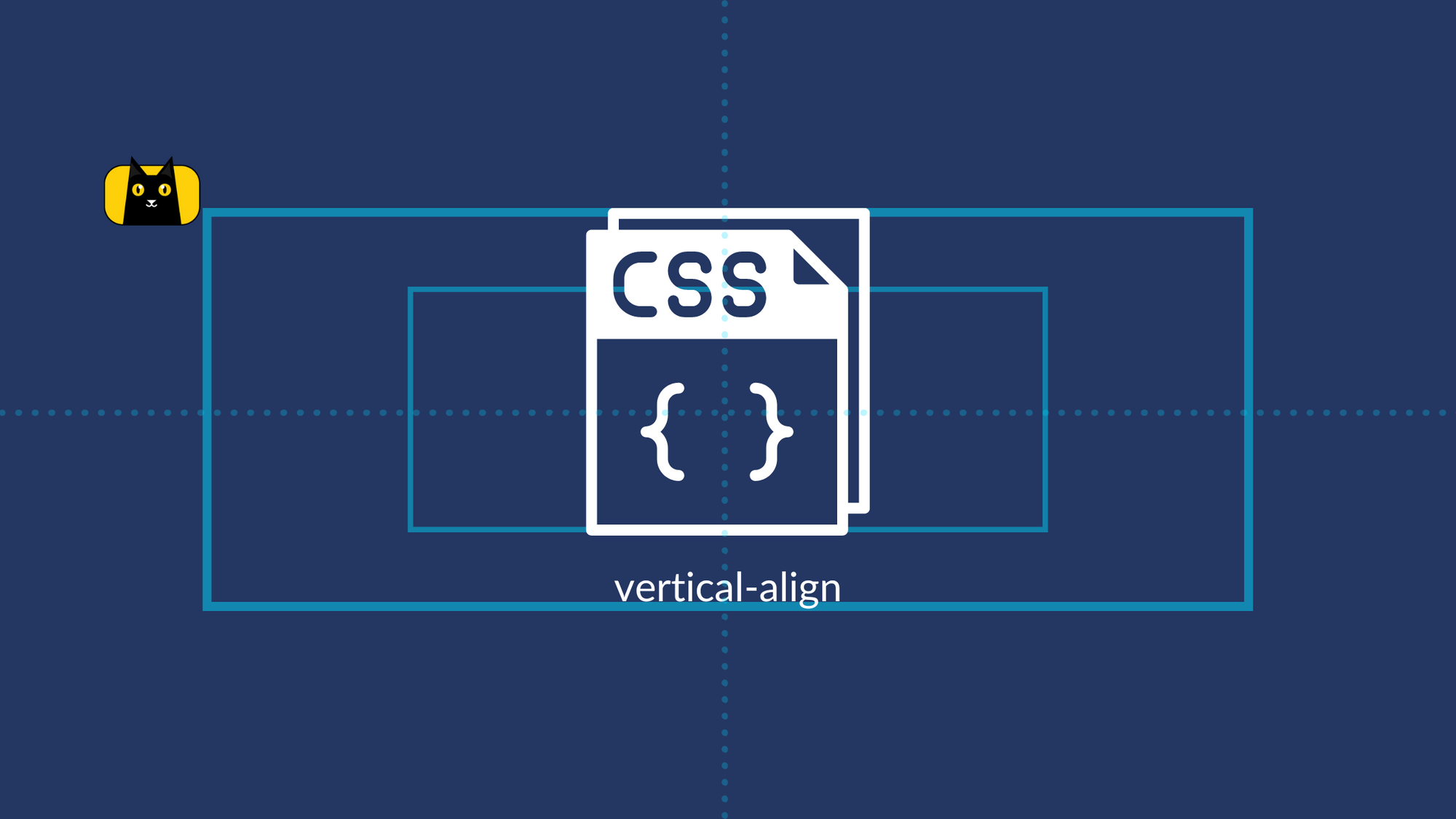
- What is CSS
vertical-align? - How do I align vertically in CSS?
- Using Table Display
- Using Line-Height
- Using Flexbox
- Using CSS Grid
- Using Position and Transform Properties
- Using
display: table-cell - Using CSS Frameworks like Bootstrap or Foundation
- Using JavaScript to Calculate Element Height and Adjust Position
- Comparison and Recommendations
- How do I align text vertically and horizontally in CSS?
- Create a Professional Looking Design with Vertical Align
Why CSS Vertical Align is Important
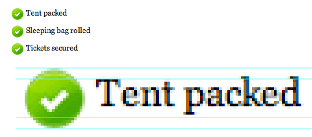
Have you ever visited a website where the text and images appeared misaligned or unbalanced, making it difficult to read and navigate? This common problem can arise when vertical alignment is incorrectly implemented in CSS. Vertical alignment refers to the positioning of elements along the vertical axis, which can greatly impact a website’s overall design and functionality.
Consider the following anecdote: a web designer was working on a new website for a client and struggled to get the text and images in a particular section to align correctly. Despite numerous attempts using different CSS methods, the elements remained stubbornly misaligned, leading to a frustrating and time-consuming experience for both the designer and the client. It wasn’t until the designer properly implemented vertical alignment that the issue was resolved, resulting in a more visually appealing and user-friendly website.
This anecdote illustrates the importance of properly implementing vertical alignment in CSS. In this article, we’ll explore some of the best methods for implementing vertical align in CSS and provide examples, code snippets, and recommendations for when to use each technique based on different layout requirements. By the end of this comprehensive guide, you’ll understand how to css vertical align text and achieve perfect vertical alignment in your web design projects.
What is CSS vertical-align?
The vertical-align property is used to vertically align inline or table-cell elements within a line or table row, respectively.
The vertical-align property can take several values, including:
baseline: aligns the baseline of the element with the baseline of the parent element.top: aligns the top of the element with the top of the tallest element on the line.bottom: aligns the bottom of the element with the bottom of the lowest element on the line.middle: aligns the middle of the element with the middle of the parent element.text-top: aligns the top of the element with the top of the parent element’s font.text-bottom: aligns the bottom of the element with the bottom of the parent element’s font.
How do you vertical align center css?
To vertically center an element in CSS, you can use the vertical-align property with a value of middle or use one of the other methods discussed earlier, such as using display: flex or display: grid. Here is an example of using the vertical-align property with a table-cell display:
<div style="display: table-cell; vertical-align: middle;">
  <p>Text to be vertically centered</p>
</div>
In the above example, the parent div has a display property set to table-cell, which allows it to behave like a table-cell. Then, the vertical-align property is set to middle, which vertically aligns the child element within the parent element.
Keep in mind that vertical-align only works on inline or table-cell elements, so it may not work for all situations. In those cases, you may need to use a different method, such as flexbox or grid.
Here’s a great video tutorial about vertically centering in css:
How do I align vertically in CSS?
There are several methods for achieving vertical alignment in CSS, each with advantages and disadvantages. In this article, we’ll explore some of the most popular methods for vertical alignment, including table display, line-height, flexbox, CSS grid, and more.
Here’s a quick 7 minute video explaining how to vertical align in css:
In the following sections, we’ll delve into each of these methods in more detail, providing examples, code snippets, and recommendations for when to use each one. Note that each of these methods can be used to css vertical align text or images, but it depends on your specs. Let’s start with table display and see how it can be used to achieve vertical alignment in CSS.
Using Table Display
Table display is a CSS property that allows you to create a table-like layout by setting an element’s display property to “table,” “table-row,” or “table-cell.” This layout can be particularly useful for achieving vertical alignment of elements, as each cell in the table can be easily aligned using the “vertical-align” property.
Advantages and disadvantages of using table display for vertical alignment:
| Advantages | Disadvantages |
|---|---|
| Simple and straightforward method for achieving vertical alignment | Can be less flexible than other methods, particularly for complex layouts |
| Works well for basic layouts with a small number of elements | Can be more difficult to maintain and update |
| Cross-browser compatibility | Not the most semantic option, as tables are intended for displaying tabular data rather than layout purposes |
Let’s see an example of creating a table-like layout using CSS:
<div class="table-container">
  <div class="table-cell">
    <img src="example-image.jpg" alt="Example Image">
    <p>Lorem ipsum dolor sit amet, consectetur adipiscing elit.</p>
  </div>
</div>
/* Step 1: Create a table-like layout */
.table-container {
  display: table;
  height: 200px;
}

/* Step 2: Create a table cell */
.table-cell {
  display: table-cell;

  /* Step 3: Center the element vertically */
  vertical-align: middle;

  /* Step 4: Center the element horizontally */
  text-align: center;
}
In this example, we’re creating a table-like layout using CSS. Here’s a breakdown of each step:
- Create a container element with a class of “table-container.” We set its “display” property to “table,” which tells the browser to treat it as a table element. We also set its “height” property to “200px” to give it a fixed height.
- Then, create a child element with a class of “table-cell.” We set its “display” property to “table-cell,” which tells the browser to treat it as a table cell.
- Set its “vertical-align” property to “middle” to center the child element vertically within the container.
- Finally, set its “text-align” property to “center” to horizontally center the child element within the cell.
By following these steps, we’ve successfully aligned the image and paragraph vertically and horizontally within the container.
Using Line-Height
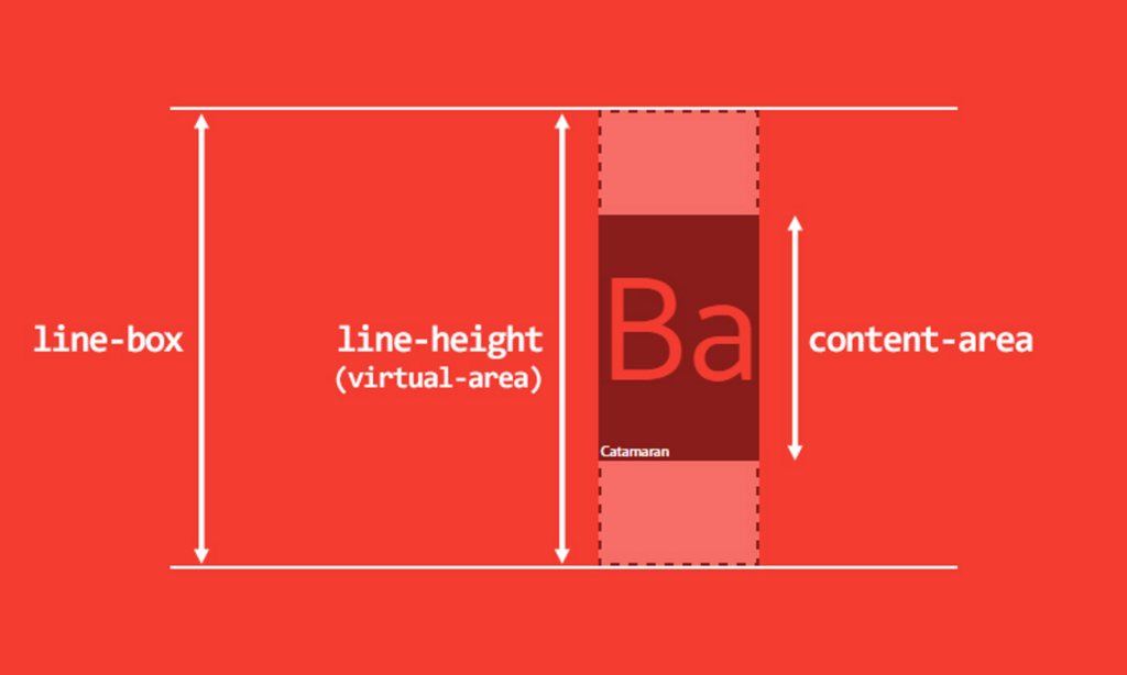
Another method for achieving vertical alignment in CSS is using the “line-height” property. Line-height specifies the height of each line of text within an element. By setting an element’s “line-height” property equal to its height, you can css vertical align text vertically within the element.
Advantages and disadvantages of using line-height for vertical alignment:
| Advantages | Disadvantages |
|---|---|
| Can be more flexible than table display for complex layouts | Can be more difficult to use for images and other non-text elements |
| More semantic than table display for layout purposes | May not work well with custom fonts or font sizes |
| Easy to maintain and update | Requires careful calculation of line-height and height values |
Here’s an example of how to use line-height to css vertical align text within a container:
<div class="line-height-container">
  <p class="line-height-element">Lorem ipsum dolor sit amet, consectetur adipiscing elit.</p>
</div>
.line-height-container {
  height: 200px;
  line-height: 200px; /* Step 1: Set line-height equal to container height */
  text-align: center; /* Step 2: Center text horizontally */
}
- We’re creating a container element with a class of “line-height-container.”
- We set its “height” property to “200px” to give it a fixed height.
- Then, we create a child element with a class of “line-height-element.” We set its “line-height” property to “200px,” which centers the text vertically within the container.
- We also set its “text-align” property to “center” to horizontally center the child element within the container.
Using line-height for vertical alignment can be a more flexible and semantic option for complex layouts. However, it may not work well with images and other non-text elements and requires careful calculation of line-height and height values. In the next section, we’ll explore another method for achieving vertical alignment using Flexbox.
Using Flexbox
After this section, you’ll stop searching css flex vertical align in Google! Flexbox is a powerful layout tool introduced in CSS3. It allows you to create flexible and responsive layouts and provides several properties for vertically and horizontally aligning elements. To use Flexbox for vertical alignment, we can use the “align-items” property. This property aligns flex items along the flex container’s cross axis, which is perpendicular to the main axis. By setting the value of “align-items” to “center,” we can center the flex items vertically within the container.
Here are the advantages and disadvantages:
| Advantages | Disadvantages |
|---|---|
| Flexible and easy to use | May not be compatible with older browsers |
| Allows for easy horizontal and vertical alignment | May require additional markup for more complex layouts |
| Responsive design |
Here’s an example of how to use Flexbox for vertical alignment:
<div class="flex-container">
  <div class="flex-item">
    <img src="example-image.jpg" alt="Example Image">
    <p>Lorem ipsum dolor sit amet, consectetur adipiscing elit.</p>
  </div>
</div>
.flex-container {
  display: flex;
  height: 200px;
  align-items: center; /* Step 1: Center flex items vertically */
  justify-content: center; /* Step 2: Center flex items horizontally */
}
- Create a container element with a class of “flex-container.”
- Then, set its “display” property to “flex” to make it a Flexbox container. We also set its “height” property to “200px” to give it a fixed height.
- Create a child element with a class of “flex-item.” By default, Flexbox items align along the main axis, so we don’t need to set any properties to center them horizontally. Instead, we set the “align-items” property of the container to “center” to center the items vertically within the container.
Using Flexbox for vertical alignment is a flexible and easy-to-use option that allows for both horizontal and vertical alignment. However, it may not be compatible with older browsers and require additional markup for more complex layouts.
CSS Vertical Align vs Flexbox: Which One Should You Use?
When it comes to vertical alignment in CSS, there are several methods you can use. However, two of the most common methods are CSS Vertical Align and Flexbox. Both approaches have advantages and disadvantages, and choosing which one to use ultimately depends on your needs. CSS Vertical Align is a straightforward method that works well for basic layouts. It’s supported by all major browsers and requires no additional markup. However, it can be limited in terms of flexibility and can sometimes result in unexpected behavior, especially when used with inline elements.
On the other hand, Flexbox is a powerful and flexible layout tool that provides several properties for horizontal and vertical alignment. It’s great for creating complex layouts and responsive designs and allows for easy centering of horizontal and vertical elements. However, it may not be compatible with older browsers and require additional markup for more complex layouts.
If you’re working with a simple layout or need to align elements within a block-level element, CSS Vertical Align is a good choice. If you’re working with a more complex layout or need to align elements within a Flexbox container, Flexbox is the better option.
It’s also worth noting that while Flexbox is a more modern approach to layout, it’s only sometimes necessary to use it for simple vertical alignment. In many cases, CSS Vertical Align can get the job done just fine. As with all things in CSS, the best approach depends on your specific needs and project requirements.
Using CSS Grid
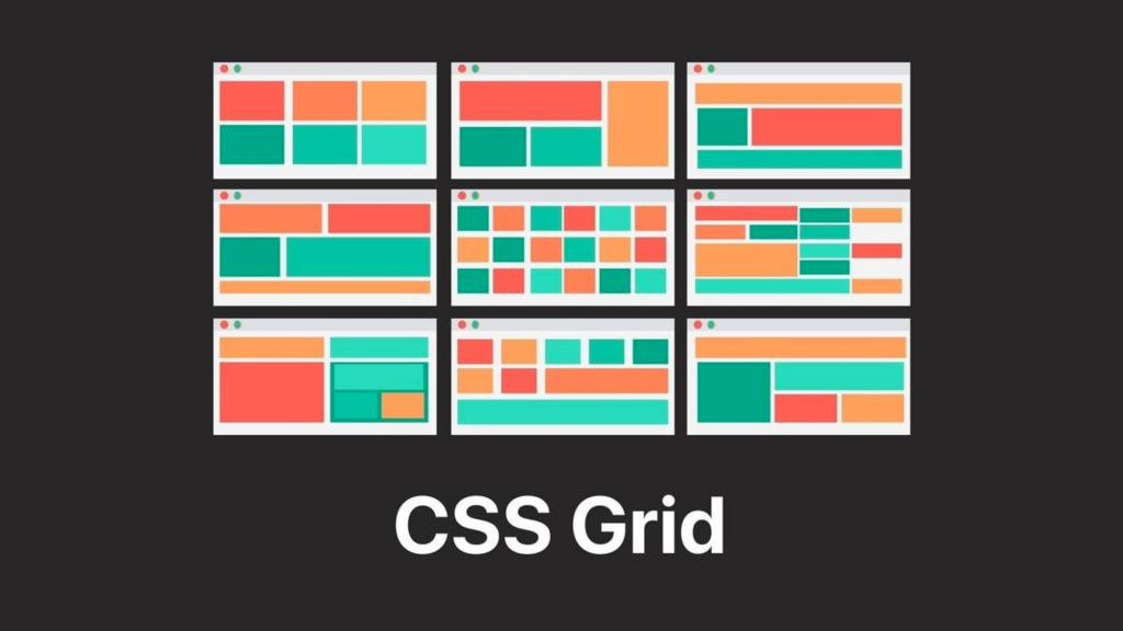
CSS Grid is another powerful layout tool that can be used for vertical alignment. While it’s primarily used for creating complex grid layouts, it can also be used for aligning elements both horizontally and vertically.
Here are the pros and cons:
| Advantages | Disadvantages |
|---|---|
| Can be used for both horizontal and vertical alignment | Requires additional markup for grid layout |
| Provides powerful layout capabilities | May not be compatible with older browsers |
| Allows for complex layouts and responsive design |
To use CSS Grid for vertical alignment, you can define a grid container and then use the align-items property to align the contents vertically. Here’s an example of how to do this:
.grid-container {
  display: grid;
  align-items: center;
  justify-content: center;
  height: 100vh;
}

.grid-item {
  align-self: center;
  justify-self: center;
}
Here’s a breakdown of what’s happening in this example:
- We define a
.grid-containerclass and set itsdisplayproperty togrid. This turns the element into a grid container. - We set the
align-itemsproperty tocenter, which aligns the contents of the container vertically to the center of the grid. - We set the
justify-contentproperty tocenter, which aligns the contents of the container horizontally to the center of the grid. - We define a
.grid-itemclass and set itsalign-selfandjustify-selfproperties tocenter. This centers the item both vertically and horizontally within the grid cell.
With this approach, you can create complex grid layouts that are both responsive and easy to align both horizontally and vertically.
Using Position and Transform Properties
Another way to vertically align an element is by using the position and transform properties in CSS. This method works by positioning the element absolutely within its parent container and then using the transform property to center it both vertically and horizontally.
Pros and Cons:
| Advantages | Disadvantages |
|---|---|
| Works well for single elements | Can be tricky to position elements correctly |
| Requires minimal markup | May not work well with complex layouts |
| Compatible with older browsers |
Here’s an example of how to do this:
.parent {
  position: relative;
}

.child {
  position: absolute;
  top: 50%;
  left: 50%;
  transform: translate(-50%, -50%);
}
Here’s a breakdown of what’s happening in this example:
- We define a
.parentclass and set itspositionproperty torelative. This makes it the containing block for the child element. - We define a
.childclass and set itspositionproperty toabsolute. This positions the element absolutely within its parent container. - We set the
topproperty to50%, which positions the element halfway down the parent container. - We set the
leftproperty to50%, which positions the element halfway across the parent container. - We use the
transformproperty to translate the element back up and to the left by 50% of its own width and height, respectively. This centers the element both vertically and horizontally within its parent container.
Using the position and transform properties to center an element is a quick and easy method for vertical alignment that works well for single elements. However, it can be tricky to position elements correctly and may not work well with more complex layouts.
Using display: table-cell
Another method for vertically aligning elements in CSS is by using the display property with a value of table-cell. This method works by setting the parent container to act like a table and the child elements to act like table cells. By doing this, we can use the vertical-align property to align the child elements within the parent container. Here are the advantages and disadvantages:
| Advantages | Disadvantages |
|---|---|
| Easy to use and understand | May not work well with complex layouts |
| Compatible with older browsers | Can affect the layout of other elements |
Here’s an example of how to do this:
.parent {
  display: table;
}

.child {
  display: table-cell;
  vertical-align: middle;
}
Here’s a breakdown of what’s happening in this example:
- We define a
.parentclass and set itsdisplayproperty totable. This sets the parent container to act like a table. - We define a
.childclass and set itsdisplayproperty totable-cell. This sets the child element to act like a table cell. - We set the
vertical-alignproperty tomiddle, which vertically centers the child element within the parent container.
Using display: table-cell to vertically align elements is an easy-to-use method that works well with simple layouts. However, it may not work well with more complex layouts and can affect the layout of other elements.
Using CSS Frameworks like Bootstrap or Foundation
Another option for vertical alignment in CSS is to use CSS frameworks like Bootstrap or Foundation. These frameworks provide pre-built CSS classes and utilities that can be used to align elements vertically easily. Some pros and cons:
| Advantages | Disadvantages |
|---|---|
| Easy to use and understand | Adds extra overhead to your code |
| Provides a range of pre-built utilities for vertical alignment | May not be flexible enough for complex layouts |
For example, Bootstrap provides the .d-flex and .align-items-center classes that can be used to create a flex container and vertically center its child elements. Here’s an example of how to do this:
<div class="d-flex align-items-center">
  <p>This element is vertically centered</p>
</div>
Here’s a breakdown of what’s happening in this example:
- We create a
divelement and add the.d-flexand.align-items-centerclasses to it. - The
.d-flexclass creates a flex container, and the.align-items-centerclass aligns the child elements vertically within the container.
CSS frameworks like Bootstrap or Foundation can be an easy and convenient way to align elements vertically. However, it does add extra overhead to your code and may not be flexible enough for complex layouts.
Using JavaScript to Calculate Element Height and Adjust Position
In some cases, it may be necessary to use JavaScript to calculate the height of elements and adjust their position accordingly. This method can be helpful when dealing with dynamic content or when no other CSS methods suit your specific use case.
| Advantages | Disadvantages |
|---|---|
| Can handle dynamic content | Adds extra complexity to your code |
| Provides precise control over element position | Requires JavaScript |
Here’s an example of how to use JavaScript to calculate the height of an element and center it vertically within its parent container:
const parent = document.querySelector('.parent');
const child = document.querySelector('.child');

const parentHeight = parent.offsetHeight;
const childHeight = child.offsetHeight;

child.style.marginTop = (parentHeight - childHeight) / 2 + 'px';
Here’s a breakdown of what’s happening in this example:
- We use JavaScript to select the parent and child elements using
document.querySelector. - We use the
offsetHeightproperty to get the height of both the parent and child elements. - We use the formula
(parentHeight - childHeight) / 2to calculate the margin-top value that will vertically center the child element within the parent container. - We set the
margin-topproperty of the child element to the calculated value.
Using JavaScript to calculate the height of elements and adjust their position can provide precise control over element position and can handle dynamic content. However, it does add extra complexity to your code and requires JavaScript to be enabled in the user’s browser.
Comparison and Recommendations
After going through the different methods for vertical align in CSS, it’s clear that each method has its advantages and disadvantages. In this section, we’ll compare the various methods and provide recommendations on which method to use based on different use cases.
Comparison
| Method | Advantages | Disadvantages |
|---|---|---|
| vertical-align | Simple to use | Limited to table cells and inline elements |
| line-height | Simple to use | Only works for single-line text |
| display: flex | Flexible and powerful | Complex syntax |
| display: grid | Flexible and powerful | Complex syntax |
| display: table-cell | Simple to use | Limited to table layout |
| position + transform | Works with any element | Requires explicit height and width |
| CSS frameworks (e.g. Bootstrap, Foundation) | Provides pre-built utilities | Adds additional code bloat |
| JavaScript | Can handle dynamic content | Adds complexity to your code |
Recommendations
When it comes to vertical alignment in CSS, there are many different methods to choose from, each with its strengths and weaknesses. To decide which way to use, consider the specific needs of your project and select the method that best fits those needs. Here are some general recommendations based on the advantages and disadvantages of each method:
- If you’re working with table cells or inline elements,
vertical-alignis a simple and effective option. - For single-line text,
line-heightis a quick and easy solution. - If you need more flexibility and control over the layout of your elements,
display: flexordisplay: gridare powerful options that can handle complex layouts. - If you’re working with a traditional table layout,
display: table-cellis a straightforward option. - For centering any element on the page,
positionandtransformcan be a useful solution. - If you’re using a CSS framework like Bootstrap or Foundation, take advantage of the pre-built utilities they provide for vertical alignment.
- If you need to handle dynamic content, JavaScript can be a good option for calculating element heights and adjusting their positions accordingly.
Remember that there’s no one-size-fits-all solution when it comes to vertical alignment. Experiment with different methods and choose the best one for your specific needs.
How do I align text vertically and horizontally in CSS?
To align text both vertically and horizontally in CSS, you can use a combination of properties and techniques. Here are some common methods:
- Using
text-align: centerto center horizontally andline-heightto center vertically for a single line of text. - Using
display: flexon a container andjustify-content: centerandalign-items: centerto center horizontally and vertically. - Using
position: absoluteandtransform: translateproperties to position the text at the center of its container. - Using
display: table-cell,vertical-align: middle, andtext-align: centerto center text both vertically and horizontally.
Remember that the best method for aligning text vertically and horizontally will depend on your project’s specific layout and design. You can find the one that works best by experimenting with different methods.
Let’s say you have a banner image with some text overlay that you want to center both horizontally and vertically. Here’s the HTML code for that:
<div class="banner">
  <img src="banner-image.jpg" alt="Banner Image">
  <h1>Welcome to My Website</h1>
</div>
To center the text, you can use the following CSS:
.banner {
  position: relative;
}

.banner h1 {
  position: absolute;
  top: 50%;
  left: 50%;
  transform: translate(-50%, -50%);
  text-align: center;
}
The position: relative on the .banner container creates a reference point for the absolutely positioned text. The position: absolute on the h1 element takes it out of the normal document flow and positions it relative to the nearest positioned ancestor, in this case the .banner container.
The top: 50% and left: 50% properties move the text halfway down and halfway across the container respectively, but it’s not centered yet because it’s positioned based on the top-left corner of the text element.
The transform: translate(-50%, -50%) property adjusts the position of the text element by 50% of its own height and width, respectively, centering it both horizontally and vertically within the .banner container.
Finally, text-align: center centers the text horizontally within the container.
The text is now centered both horizontally and vertically over the banner image, creating a clean and professional design.
Create a Professional Looking Design with Vertical Align
Vertical alignment is an essential aspect of web design that can significantly impact the appearance and functionality of your website. Whether you’re working with tables, grids, or complex layouts, various CSS methods are available to help you achieve the desired vertical alignment for your elements. By understanding the advantages and disadvantages of each method, you can choose the one that best fits your specific needs and create a clean and professional design. So don’t hesitate to experiment with different methods and find the best one. Remember, mastering vertical alignment is just one step towards becoming a better web designer. Keep learning and honing your skills, and you’ll be able to create visually appealing and user-friendly websites.
Related Articles
-
 Uncategorized
Learn TypeScript Map Thoroughly and Make Your App 3x Better
Is there a map in TypeScript? Have you ever needed to store key-value pairs in your web application? If so, you've likely encountered the JavaScript object as a standard solution. However, as your application grows, the limitations of the object…
February 22, 2023 -
Uncategorized
How to Develop an App Faster and Be a Prototype Wizard
Introduction Creating a prototype of your next web application can be daunting, especially if you are short on time. However, several tried and true methods can help you develop a functional prototype faster. This article will explore some of the…
January 1, 2023

