 February 22, 2023
  copycat


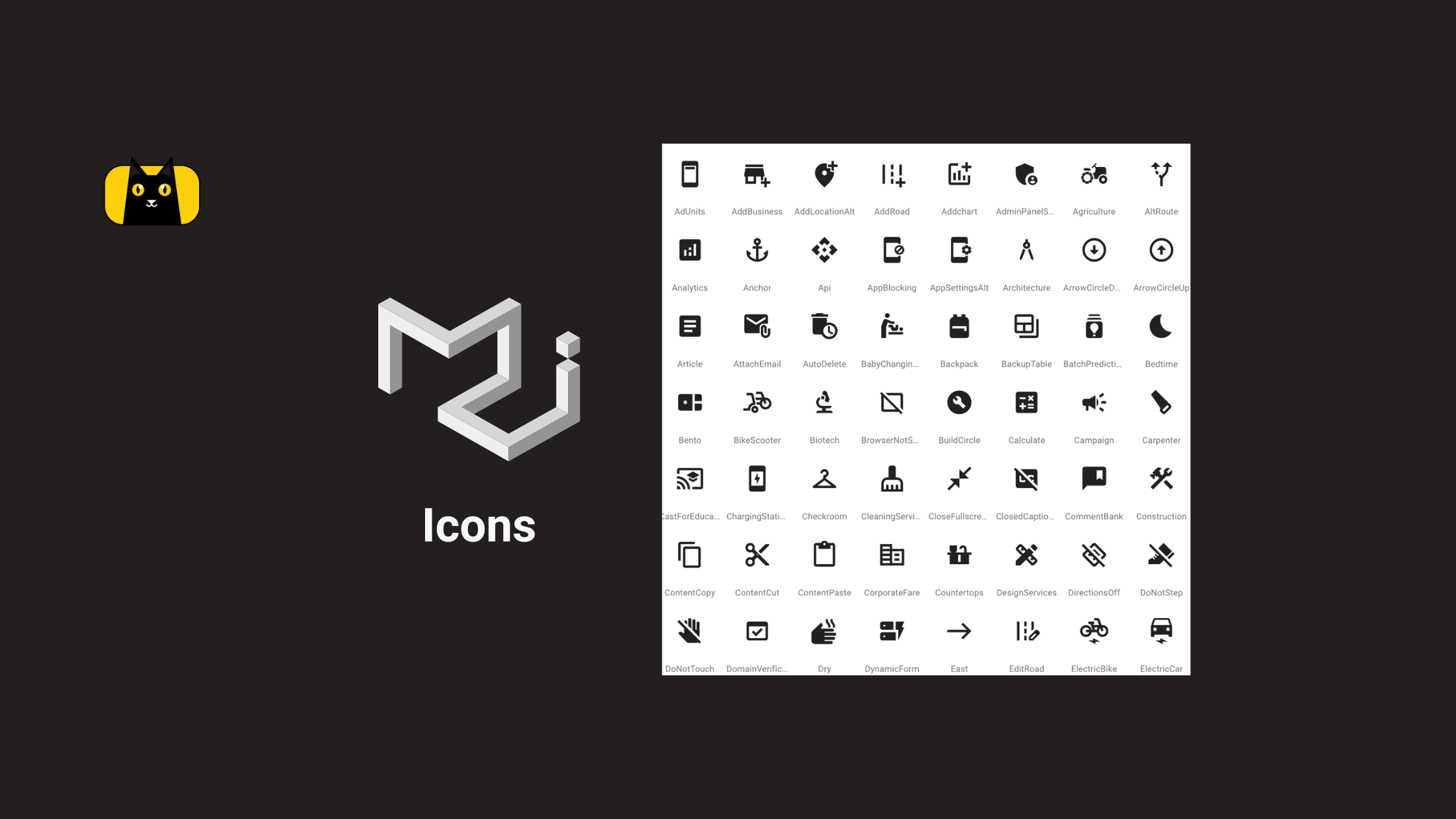
What are Material UI Icons?
Material UI icons (mui icons) are essential to modern web development, providing designers and developers with a vast library of scalable and customizable icons to use in their projects. While the default Material UI icons are a great starting point, customizing them can help your website or application stand out and give it a unique and professional look.
In this article, we’ll explore how to customize Material UI icons, from understanding their components to using and customizing them in web development projects. We’ll also cover best practices for creating cohesive and effective icons and discuss how customized Material UI icons are used in React applications. Whether you’re a seasoned web developer or just getting started, this article will provide the knowledge and tools to make the most of Material UI icons and take your web development projects to the next level.
Understanding Material UI Icons
Material UI icons are scalable and customizable vector icons used in web development projects. They are a part of the Material UI library, a popular and widely used UI framework for building web applications. Material UI icons provide designers and developers with an extensive collection of high-quality icons that easily integrate into their projects.
What are the components of Material UI icons?
Material UI icons have three main components: shape, size, and color. The shape of the icon is defined by the SVG path data, which determines the outline of the icon. You can view the design guidelines from Google for more information. The size of the icon can be customized by setting the width and height properties of the icon component. The color of the icon can also be customized using the color property. We will discuss customization in the next section.
What is the size of icons in MUI?
The default size of icons in Material-UI (MUI) is 24px. However, the size of icons can be easily adjusted using the fontSize property in your CSS or theme file. You can set a fixed size by using a specific number value, or use one of the available size options such as
"small""medium""large""inherit""default"
Additionally, the size of icons can also be adjusted using the fontSize property of the IconButton component, which allows you to specify the size of the icon within the button itself. We will discuss that in a later section.
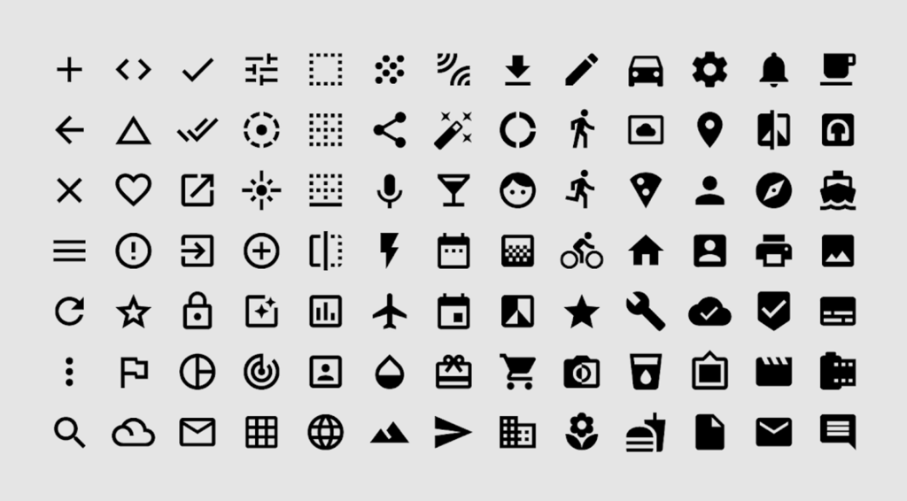
Benefits of using MUI icons
There are several benefits to using Material UI icons in web development projects. One of the main benefits is their scalability. Since MUI icons are vector-based, they can be scaled up or down without losing quality or clarity. This makes them ideal for responsive web design, where icons may need to be resized depending on the device or screen size.
Another benefit of Material UI icons is their consistency. Since the icons are designed according to the Material Design guidelines, they have a consistent look and feel across different applications and platforms. This helps create a cohesive user experience for users familiar with Material Design.
Differences between MUI icons and other icon libraries
While several icon libraries are available for web developers, Material UI icons have some unique features that set them apart from other libraries. For example, Material UI icons are explicitly designed for use with the Material UI library, which means they integrate seamlessly with other Material UI components. In addition, the Material UI team constantly updates and maintains Material UI icons, ensuring they are always up-to-date and compatible with the latest version of the framework.
Here’s a quick comparison between the popular icon libraries:
Icon Library Table
| Icon Library | Pros | Cons | Unique Features |
| Material UI icons | – Designed specifically for use with Material UI – Scalable and customizable – Consistent look and feel | – Limited number of icons compared to other libraries | – Integrates seamlessly with other Material UI components – Maintained by Material UI team – Designed according to Material Design guidelines |
| FontAwesome | – Large collection of icons – Icon styles and themes available | – Non-vector-based icons can lose quality when scaled – Icon styles and themes can be overwhelming | – Icon search functionality – Icon stacking and layering – Available in both free and paid versions |
| Feather | – Light-weight and minimalistic icons – Easy to use and customize | – Limited number of icons compared to other libraries – Non-vector-based icons can lose quality when scaled | – Designed with simplicity and consistency in mind – Free to use and open source |
| Ionicons | – Large collection of icons – Consistent look and feel – Scalable and customizable | – Non-vector-based icons can lose quality when scaled | – Designed according to iOS and Material Design guidelines – Available in both free and paid versions |
| Open Iconic | – Large collection of icons – Scalable and customizable | – Non-vector-based icons can lose quality when scaled – Consistent look and feel can be limiting | – Designed to be simple and straightforward – Open source and free to use |
You might wonder which icon library is the best? Well, that depends on what you are looking to use it for. But you might be interested in another expert’s opinion.
In summary, Material UI icons are versatile and customizable icons used in web development projects to create a cohesive and professional look. By understanding the components of MUI icons and their benefits and differences from other icon libraries, web developers can make informed decisions about using them in their projects.
How do I customize material UI icons?

Onto the bread and butter! While Material UI icons have a consistent look and feel, they can still be customized to fit the specific needs of a web development project. Customizing Material UI icons involves modifying the icon’s shape, size, and color to create a unique look.
How to Customize Material Icon Shape
Material UI icons React are vector-based, meaning SVG path data define their shapes. This means you can modify an icon’s shape by changing its path data.
To customize the shape of a Material UI icon, follow these steps:
- Find the icon component you want to customize in the Material UI documentation.
- Identify the
pathproperty of the icon component. This property contains the SVG path data that defines the shape of the icon. - Copy the path data and modify it to create the desired shape.
- Pass the modified path data to the icon component as a prop.
Here’s an example of how to customize the shape of a Material UI icon:
import { Favorite } from '@material-ui/icons';

const CustomFavorite = () => {
  const customPath = 'M12,20.4L10.6,19C6.9,15.4,4,13.1,4,10c0-2.8,2.2-5,5-5c1.7,0,3.2,0.8,4,2c0.8-1.2,2.3-2,4-2c2.8,0,5,2.2,5,5c0,3.1-2.9,5.4-6.6,9L12,20.4z';
  return (
    <Favorite path={customPath} />
  );
};
Here’s how the code works:
- First, we import the
Favoriteicon component from Material UI. - We create a new component called
CustomFavorite. - Inside the component, we define a variable called
customPaththat contains a modified SVG path data for the icon. - We use the
pathproperty of theFavoritecomponent and pass in thecustomPathvariable as its value. - Finally, we return the
Favoritecomponent with the customized path data.
In this example, we modified the path data of the Favorite icon to create a heart shape. You can modify the path data in the same way to create any shape you like.
How to Customize Material Icon Size
To customize the size of Material UI icons, you can use the style property to add a custom CSS font-size value.
Here’s an example:
javascriptCopy code
import { ShoppingCart } from '@material-ui/icons';

const CustomCart = () => {
  return (
    <ShoppingCart style={{ fontSize: '2rem' }} />
  );
};
Here’s how the code works:
- First, we import the
ShoppingCarticon component from Material UI. - We create a new component called
CustomCart. - Inside the component, we use the
styleproperty to add a custom CSSfont-sizevalue of2remto the icon. - Finally, we return the
ShoppingCartcomponent with the custom size style.
You can change the value of fontSize to any valid CSS value to customize the size of the icon.
How to Customize Material Icon Color
To customize the color of Material UI icons, you can use the style property to add a custom CSS color value. Here’s an example:
javascriptCopy code
import { Home } from '@material-ui/icons';

const CustomHome = () => {
  return (
    <Home style={{ color: 'purple' }} />
  );
};
Here’s how the code works:
- First, we import the
Homeicon component from Material UI. - We create a new component called
CustomHome. - Inside the component, we use the
styleproperty to add a custom CSScolorvalue ofpurpleto the icon. - Finally, we return the
Homecomponent with the custom color style.
You can change the value of color to any valid CSS color value to customize the color of the icon.
Using custom mui icon sets
In addition to customizing Material UI icons, web developers can use custom icon sets in their projects. Custom icon sets are collections of icons not included in the Material UI library. Still, you can easily integrate them into a project by importing the icon set and using the icon components provided by the set. Some popular custom icon sets used with Material UI include Font Awesome, Feather, and Ionicons. These icon sets to provide additional options for web developers who need a wider variety of icons for their projects.
How do I make cohesive icons?

When customizing Material UI icons or using custom icon sets, it’s important to create cohesive icons that fit the overall look and feel of the project. However, that’s easier said than done. Here are some tips for creating cohesive icons:
Use a consistent design style:
When creating icons, using a consistent design style, such as flat or 3D, is essential. This will help your icons look cohesive and like they belong together.
Challenges: Choosing a consistent design style can be challenging, primarily if multiple designers work on the same set of icons.
Solutions: One solution is to establish a design style guide that outlines the icons’ specific design rules and guidelines. This includes color palette, line thickness, and shading techniques.
Stick to a limited color palette:
A limited color palette can help your icons look more cohesive and make them look more relaxed and manageable.
Challenges: Choosing a color palette can be complex, and finding colors that work well together can be challenging.
Solutions: One solution is to use a tool like Coolors or Adobe Color to help you choose a color palette. These tools can generate color schemes based on a single color or a photo.
Maintain consistent proportions:
When creating a set of icons, it’s crucial to maintain consistent proportions to look like they belong together.
Challenges: Maintaining consistent proportions can be challenging, especially if different designers work on various icons.
Solutions: One solution is to establish a set of proportions that all the icons should adhere to. For example, you could decide that all icons should be 24×24 pixels or that all icons should have a specific aspect ratio.
Use consistent line thickness:
A consistent line thickness can help your icons look more cohesive and prevent them from looking too busy or cluttered.
Challenges: Maintaining a consistent line thickness can be challenging, especially if different designers work on different icons.
Solutions: One solution is establishing a set of line thicknesses that all the icons should adhere to. For example, all icons should have a stroke width of 2 pixels.
Keep it simple:
When creating icons, it’s important to keep them simple and easy to understand. This will make them more usable and help prevent confusion.
Challenges: It can be tempting to add too much detail to an icon, making it look cluttered and hard to understand.
Solutions: One solution is to start with a simple design and gradually add detail as needed. You can also get feedback from users to see if they need clarification or help to understand the icon.
By following these tips, you can create a set of cohesive icons that look great and work well together.
Here is the information presented in a table for easy-viewing:
| Tip | Challenge | Solution |
| Start with a clear design style | Inconsistent design style | Use a style guide to establish a consistent design |
| Keep icon design simple and scalable | Overly complex icons | Use simple shapes and limit detail for scalability |
| Pay attention to icon proportions and spacing | Disproportional or cluttered icons | Use a grid system for spacing and maintain proportion |
| Ensure icons have sufficient contrast and legibility | Icons that are difficult to see or understand | Use contrasting colors and avoid excessive detail |
| Test icons at different sizes and contexts | Icons that are unclear or difficult to interpret | Test icons across different devices and contexts |
How do I use material UI icons?
Once you have customized your Material UI icons to your liking, you can easily use them in your React application. Here are the steps to use customized Material UI icons in React:
1. Import the Icon: To use a customized Material UI icon in your React application, you need to first import the icon.
import { MyCustomIcon } from './MyCustomIcon';
2. Use the Icon Component: Once you have imported the icon, you can use it in your application by rendering the icon component.
import { MyCustomIcon } from './MyCustomIcon';

function MyComponent() {
  return (
    <div>
      <MyCustomIcon />
    </div>
  );
}
3. Pass Props to the Icon Component: You can pass props to the icon component to further customize its appearance.
import { MyCustomIcon } from './MyCustomIcon';

function MyComponent() {
  return (
    <div>
      <MyCustomIcon color="primary" fontSize="large" />
    </div>
  );
}
In the above example, we have passed color and fontSize props to the MyCustomIcon component.
4. Using Custom Icon as an SVG Icon Component: In addition to the above method, you can also create a customized SVG icon component in Material UI and use it in your React application.
import SvgIcon from '@material-ui/core/SvgIcon';

function MyCustomIcon(props) {
  return (
    <SvgIcon {...props}>
      <path d="M6 6h12v12H6z" />
    </SvgIcon>
  );
}

export default MyCustomIcon;
In the above example, we have created a custom SVG icon component MyCustomIcon that takes props as input and renders an SVG path as output. The SvgIcon component is provided by Material UI and is used to create custom SVG icons.
By following these steps, you can easily use customized Material UI icons in your React application. This allows you to maintain a consistent look and feel in your application while also customizing the icons to your specific needs.
Here is a video tutorial on how to use Material UI Icons in React:
Common Mistakes to Avoid when Customizing Material UI Icons

Customizing Material UI icons can be a great way to give your application a unique and consistent look and feel. However, there are some common mistakes that you should avoid when customizing Material UI icons. Here are some of the most common mistakes and how to avoid them:
Over-customization:
One of the most common mistakes when customizing Material UI icons is over-customization. Over-customization can make your icons look inconsistent and confusing to users. To avoid this mistake, stick to a consistent design language, and use customization sparingly.
Ignoring Accessibility:
Accessibility is essential when designing and customizing Material UI icons. Ignoring accessibility can make interacting with your application difficult for some users. To avoid this mistake, ensure your customized icons are accessible and adhere to accessibility guidelines.
Misusing Icons:
Another common mistake when customizing Material UI icons is misusing icons. Misusing icons can lead to confusion and make it difficult for users to understand the purpose of your application. To avoid this mistake, ensure your icons have a clear and concise meaning and use them consistently throughout your application.
Inconsistent Sizing:
Inconsistent sizing is a common mistake when customizing Material UI icons and can make your icons look unprofessional and unpolished. Ensure your icons are consistently sized throughout your application to avoid this mistake.
Forgetting to Test:
Failing to test your customized Material UI icons is a big no-no! But, many skip it thinking their code is okay. Testing is an integral part of the customization process, allowing you to catch any issues before they go live. Test your icons on multiple devices and platforms to ensure they work correctly across various settings. Make any necessary adjustments before launching your application. Testing can take time, but it’s worth the effort to create customized Material UI icons that are polished and professional.
Customizing Material UI icons React can be a rewarding experience, allowing you to create a unique and consistent look for your application. However, it’s important to be mindful of the common mistakes that can arise during the customization process. By avoiding over-customization, prioritizing accessibility, using icons effectively, maintaining consistent sizing, and testing thoroughly, you can create customized Material UI icons that add value to your application and delight your users.
Get Customizing!
Customizing Material UI icons is an exciting and creative way to add a personal touch to your application. With some knowledge and effort, you can create customized icons that are aesthetically pleasing and functional. Using the tips and techniques outlined in this article, you can avoid common mistakes and create icons that represent your brand and enhance the user experience. So why not get started on customizing your Material UI icons today? With some inspiration and creativity, you can take your application’s visual design to the next level and create a unique user experience.
Related Articles
-
 React.js
Complete Guide On How To Use React Beautiful Drag And Drop
Introduction Drag and Drop refers to the software's ability to trigger a callback when one component is dragged over another. It's an interaction that enables someone to click on something, drag it to another location, and dump it there, often…
December 23, 2022 -
React.js
Building Maps in React with react-leaflet Library
Make your developers' lives easier by using CopyCat, an AI that can convert your Figma designs into React, Tailwind, Bootstrap, and other popular CSS frameworks. Click here to check out the CopyCat plugin for Figma. Convert Design to Code with…
December 20, 2022


