 December 6, 2022
  Uncle Big Bay


- Introduction
- What is React-Tooltip Library?
- Setting Up a New React App
- Installing React Tooltip Package
- Rendering React Tooltip Component
- Hide Tooltip Components After Show
- react-tooltip Positioning
- react-tooltip Multi-line Content
- How to Fix Tooltip Pointer Tail Covering Content
- Customizing Tooltip in React
- Wrapping Up
Introduction
Tooltips are user-triggered components that appear alongside their paired element in a web application. They provide the users with brief information about an element such as a button, icon, text, equation, symbol, and, so on.
In this tutorial, we’ll learn how to build tooltips in React by utilizing the react-tooltip library.
Do you want to be more efficient? Consider CopyCat, an AI-powered plugin that will convert your Figma design to UI code, allowing you to concentrate on the app’s business logic.
What is React-Tooltip Library?
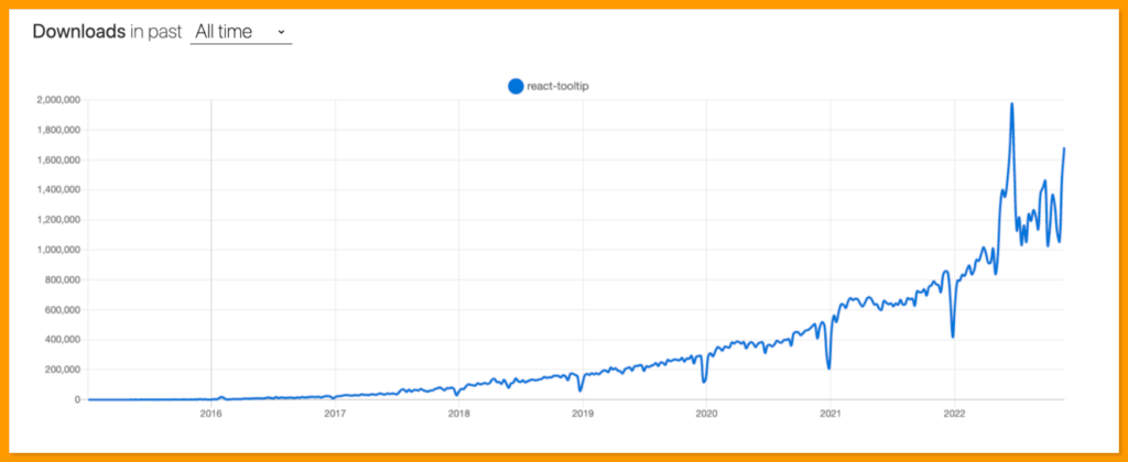
The react-tooltip is an open-source React library that allows you to create tooltips in your React application. React tooltip has grown in popularity among React developers, with over 1.4 million weekly downloads on npm, over 6 million weekly downloads on yarn, and over 2.5k stars on GitHub.
Setting Up a New React App
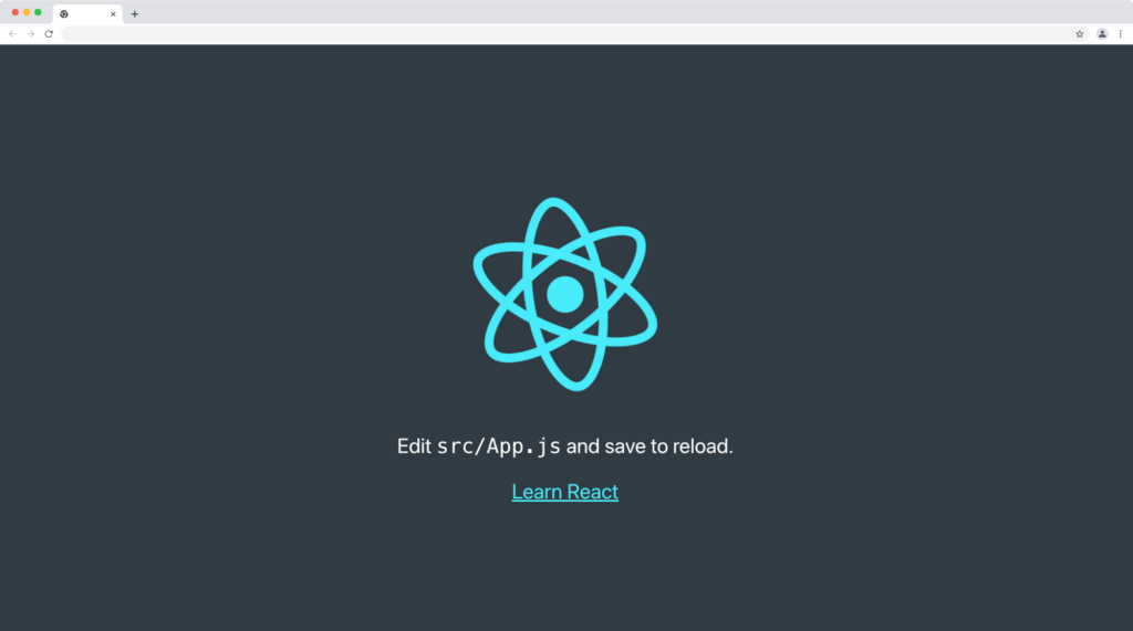
Use the following command to create a new react application:
npx create-react-app my-app
Next, run the following command to navigate to your newly generated app directory:
cd my-app
Then run the following command to start your React server:
yarn start
Or using npm:
npm start
Your server should launch in your browser at http://localhost:3000/, as shown below:
Installing React Tooltip Package
The react-tooltip is available on both npm and yarn package managers.
Run the command below to install react-tooltip with npm:
npm install react-tooltip
Or yarn:
yarn add react-tooltip
Rendering React Tooltip Component
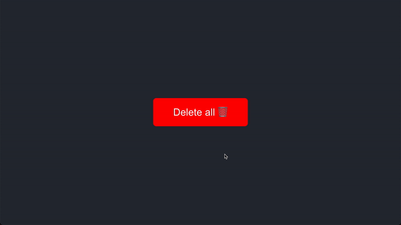
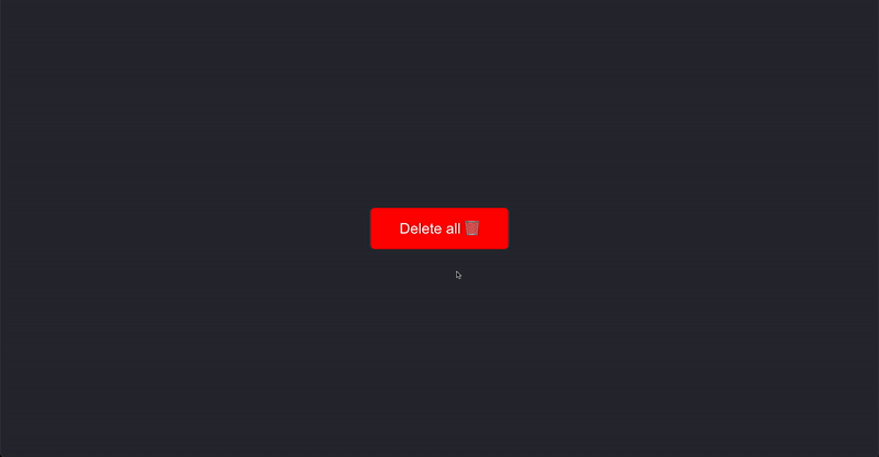
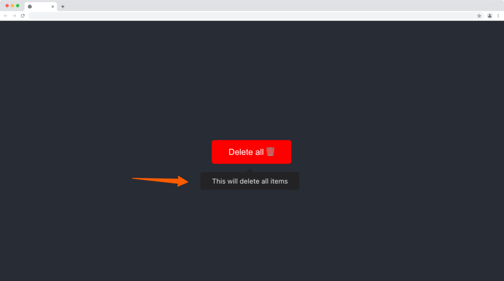
Let’s create a simple button with a “Delete all 🗑” label that will display a tooltip text “This will delete all items” on hover.
Update your App.js file with the following code:
import "./App.css";
import React, { useEffect } from "react";
import ReactTooltip from "react-tooltip";

function App() {
  useEffect(() => {
    ReactTooltip.rebuild();
  }, []);

  return (
    <React.Fragment>
      <div className='App'>
        <button data-tip data-for='delete-btn'>
          Delete all 🗑
        </button>
        <ReactTooltip id='delete-btn'>
          This will delete all items
        </ReactTooltip>
      </div>
    </React.Fragment>
  );
}

export default App;
From the code above:
- We import React Tooltip component.
- We initialize the ReactTooltip rebuild() method in useEffect to rebind all tooltips, this is optional if you have a useEffect already in the component.
- We created a button with a data-tip prop for ReactTooltip to find all tooltip elements and data-for custom attribute to bind a specific tooltip manually (on hover) to their React Tooltip component by id value i.e “delete-btn”.
- Lastly, we rendered the ReactTooltip component with an id of “delete-btn”. Ensure the id attribute data for corresponds are the same as the value provided for the data-for attribute.
Add the following button styles to your App.css file to have the same output as this tutorial:
button{
  padding: 12px 32px;
  font-size: 16px;
  cursor: pointer;
  border: none;
  border-radius: 5px;
  background-color: #ff0000;
  color: #ffffff
}
Our button and tooltip should function and look something like this:
You can also directly display raw HTML or JSX in the tooltip content, read more about it here.
Hide Tooltip Components After Show
You can declare the duration you want the tooltip element to stay visible using the afterShow tooltip event to execute a function after the tooltip is triggered, we’ll then make use of the setTimeout callback to hide the tooltip as follows:
<ReactTooltip
  afterShow={() => setTimeout(ReactTooltip.hide, 2000)}
>
  This will delete all items
</ReactTooltip>
This will hide the tooltip after 2 seconds of the display as demonstrated below:
You can check out this table for full options to control the tooltip’s behavior and custom event’s propagation mode in a react component.
react-tooltip Positioning
The react tooltip components are positioned at the top of their elements by default, we can replace the tooltip’s position with the position prop set to either top, right, center, or bottom value.
Tooltip Position Top
Set the place prop to the top to display the tooltip at the top of the HTML element:
import "./App.css";
import React, { useEffect } from "react";
import ReactTooltip from "react-tooltip";

function App() {
  useEffect(() => {
    ReactTooltip.rebuild();
  }, []);

  return (
    <React.Fragment>
      <div className='App'>
        <button data-tip data-for='delete-btn'>
          Delete all 🗑
        </button>
        <ReactTooltip id='delete-btn' place='top'>
          This will delete all items
        </ReactTooltip>
      </div>
    </React.Fragment>
  );
}

export default App;
Output:
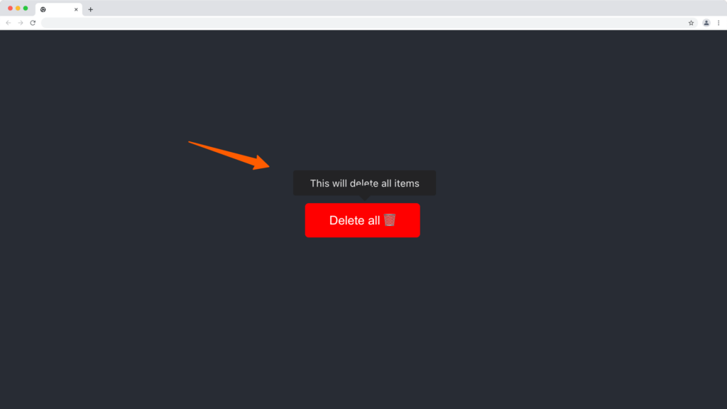
Tooltip Position Right
Set the place prop to the right to display the tooltip on the right side of the HTML element:
import "./App.css";
import React, { useEffect } from "react";
import ReactTooltip from "react-tooltip";

function App() {
  useEffect(() => {
    ReactTooltip.rebuild();
  }, []);

  return (
    <React.Fragment>
      <div className='App'>
        <button data-tip data-for='delete-btn'>
          Delete all 🗑
        </button>
        <ReactTooltip id='delete-btn' place='right'>
          This will delete all items
        </ReactTooltip>
      </div>
    </React.Fragment>
  );
}

export default App;
Output:
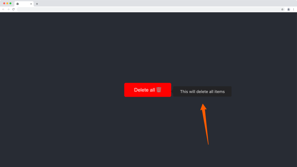
Tooltip Position Left
Set the place prop to left to display the tooltip on the right side of the HTML element:
import "./App.css";
import React, { useEffect } from "react";
import ReactTooltip from "react-tooltip";

function App() {
  useEffect(() => {
    ReactTooltip.rebuild();
  }, []);

  return (
    <React.Fragment>
      <div className='App'>
        <button data-tip data-for='delete-btn'>
          Delete all 🗑
        </button>
        <ReactTooltip id='delete-btn' place='left'>
          This will delete all items
        </ReactTooltip>
      </div>
    </React.Fragment>
  );
}

export default App;
Output
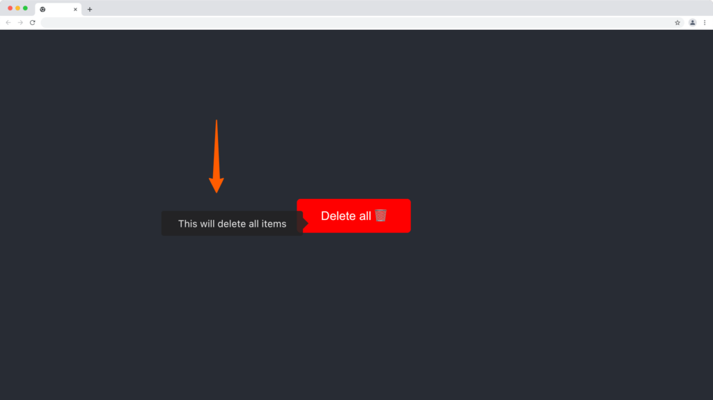
Tooltip Position Bottom
import "./App.css";
import React, { useEffect } from "react";
import ReactTooltip from "react-tooltip";

function App() {
  useEffect(() => {
    ReactTooltip.rebuild();
  }, []);

  return (
    <React.Fragment>
      <div className='App'>
        <button data-tip data-for='delete-btn'>
          Delete all 🗑
        </button>
        <ReactTooltip id='delete-btn' place='bottom'>
          This will delete all items
        </ReactTooltip>
      </div>
    </React.Fragment>
  );
}

export default App;
Output:
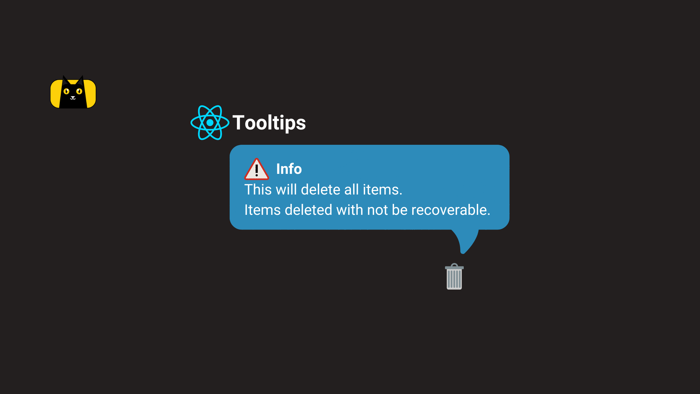
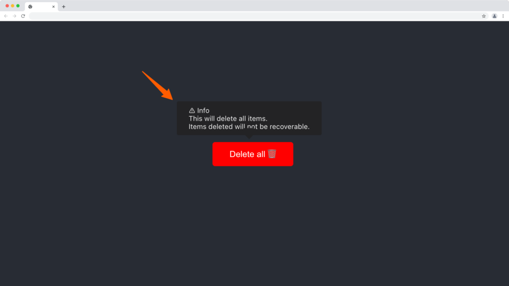
react-tooltip Multi-line Content
Make use of the <br> tag in HTML and <br /> element in JSX to create multi-line content within the tooltip component.
import "./App.css";
import React, { useEffect } from "react";
import ReactTooltip from "react-tooltip";

function App() {
  useEffect(() => {
    ReactTooltip.rebuild();
  }, []);

  return (
    <React.Fragment>
      <div className='App'>
        <button data-tip data-for='delete-btn'>
          Delete all 🗑
        </button>
        <ReactTooltip id='delete-btn'>
          ⚠️ Info
          <b />
          This will delete all items.
          <br />
          Items deleted will not be recoverable.
        </ReactTooltip>
      </div>
    </React.Fragment>
  );
}

export default App;
Output:
You can also check out the overridePosition option to replace the tooltip position.
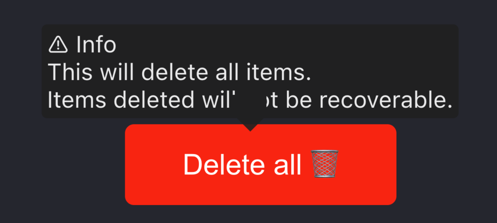
How to Fix Tooltip Pointer Tail Covering Content
If you look closely at all the tooltips positioned at the top of the elements, you’d notice the pointer tail is covering part of the text closer to it.
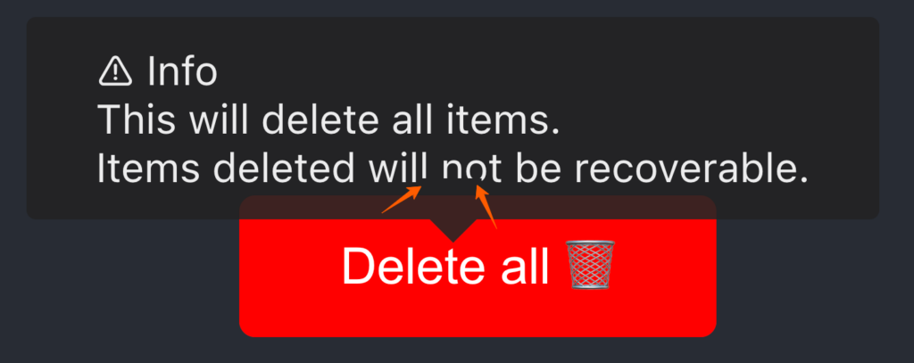
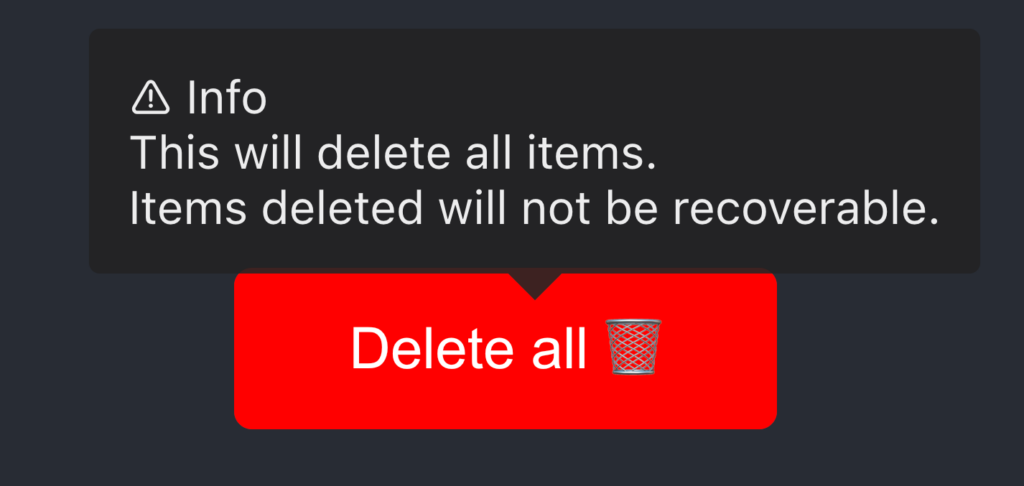
We can fix this with the padding prop as shown below:
import "./App.css";
import React, { useEffect } from "react";
import ReactTooltip from "react-tooltip";

function App() {
  useEffect(() => {
    ReactTooltip.rebuild();
  }, []);

  return (
    <React.Fragment>
      <div className='App'>
        <button data-tip data-for='delete-btn'>
          Delete all 🗑
        </button>
        <ReactTooltip id='delete-btn' multiline padding='10px'>
          ⚠️ Info
          <br />
          This will delete all items.
          <br />
          Items deleted will not be recoverable.
        </ReactTooltip>
      </div>
    </React.Fragment>
  );
}

export default App;
Output:
If you provide a value lesser value to the padding say 2px you’ll see the pointer tail obviously covering the content.
Customizing Tooltip in React
By default the tooltip component is dark and you can customize the react-tooltip component using the type prop with any dark, success, warning, error, info, or light type.
Dark Tooltip (Default)
This is the default theme of the react-tooltip component and can be declared by setting the type prop to dark. It is useful for dark-mode applications.
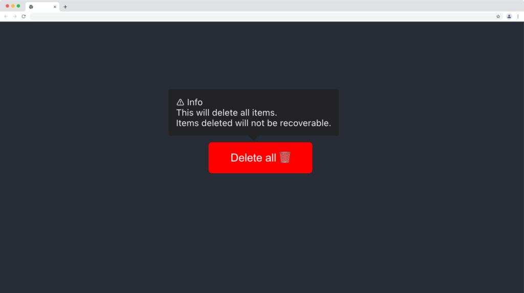
Source Code:
import "./App.css";
import React, { useEffect } from "react";
import ReactTooltip from "react-tooltip";

function App() {
  useEffect(() => {
    ReactTooltip.rebuild();
  }, []);

  return (
    <React.Fragment>
      <div className='App'>
        <button data-tip data-for='delete-btn'>
          Delete all 🗑
        </button>
        <ReactTooltip id='delete-btn' padding='10px' type='dark'>
          ⚠️ Info
          <br />
          This will delete all items.
          <br />
          Items deleted will not be recoverable.
        </ReactTooltip>
      </div>
    </React.Fragment>
  );
}

export default App;
Success Tooltip Type
This is a green theme tooltip component and it’s useful for displaying success descriptions to the user.
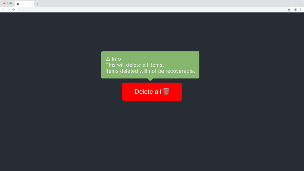
Source code:
import "./App.css";
import React, { useEffect } from "react";
import ReactTooltip from "react-tooltip";

function App() {
  useEffect(() => {
    ReactTooltip.rebuild();
  }, []);

  return (
    <React.Fragment>
      <div className='App'>
        <button data-tip data-for='delete-btn'>
          Delete all 🗑
        </button>
        <ReactTooltip id='delete-btn' padding='10px' type='success'>
          ⚠️ Info
          <br />
          This will delete all items.
          <br />
          Items deleted will not be recoverable.
        </ReactTooltip>
      </div>
    </React.Fragment>
  );
}

export default App;
Warning Tooltip Type
This is a yellow theme tooltip component and it’s useful for displaying warning content to the user.
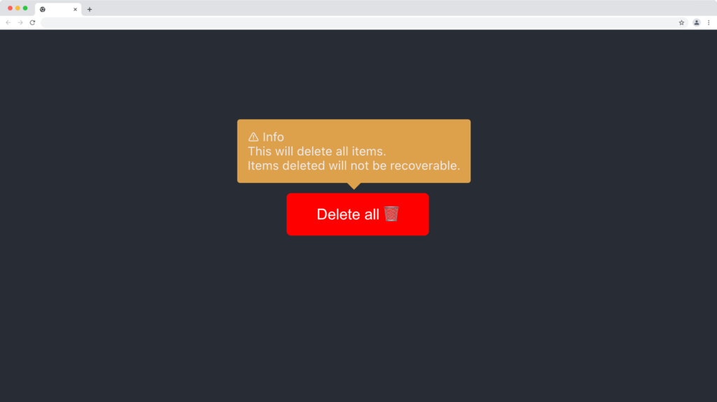
Source Code:
import "./App.css";
import React, { useEffect } from "react";
import ReactTooltip from "react-tooltip";

function App() {
  useEffect(() => {
    ReactTooltip.rebuild();
  }, []);

  return (
    <React.Fragment>
      <div className='App'>
        <button data-tip data-for='delete-btn'>
          Delete all 🗑
        </button>
        <ReactTooltip id='delete-btn' padding='10px' type='warning'>
          ⚠️ Info
          <br />
          This will delete all items.
          <br />
          Items deleted will not be recoverable.
        </ReactTooltip>
      </div>
    </React.Fragment>
  );
}

export default App;
Error Tooltip Type
This is a red theme tooltip component and it’s useful for displaying error messages to the user.
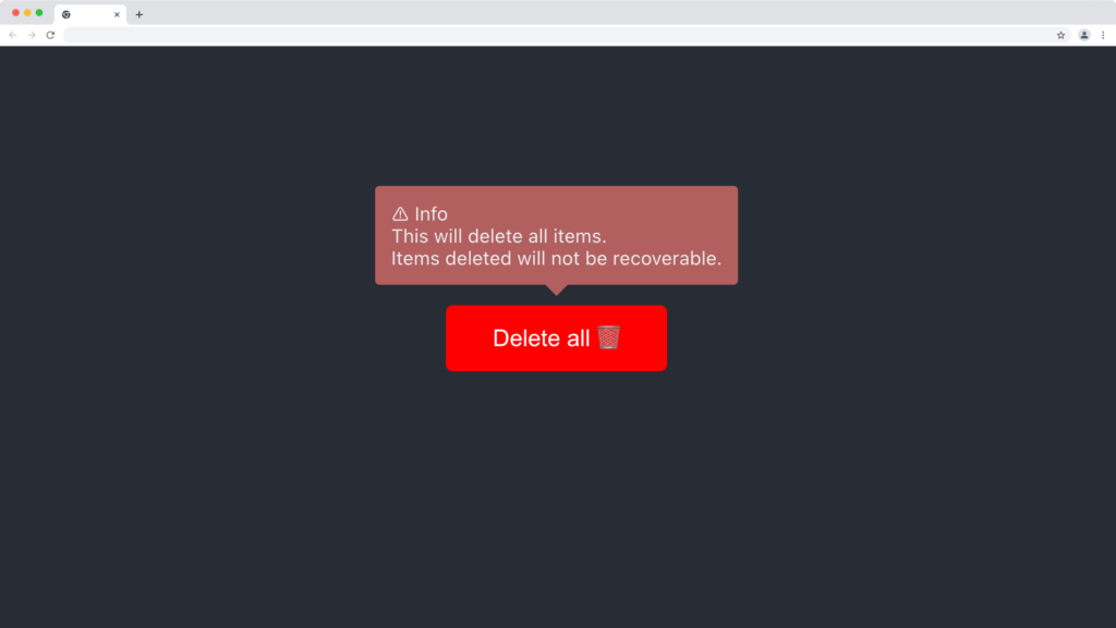
Source code:
import "./App.css";
import React, { useEffect } from "react";
import ReactTooltip from "react-tooltip";

function App() {
  useEffect(() => {
    ReactTooltip.rebuild();
  }, []);

  return (
    <React.Fragment>
      <div className='App'>
        <button data-tip data-for='delete-btn'>
          Delete all 🗑
        </button>
        <ReactTooltip id='delete-btn' padding='10px' type='error'>
          ⚠️ Info
          <br />
          This will delete all items.
          <br />
          Items deleted will not be recoverable.
        </ReactTooltip>
      </div>
    </React.Fragment>
  );
}

export default App;
Info Tooltip Type
This is a blue theme tooltip component and it’s useful for displaying information and neutral messages to the user.
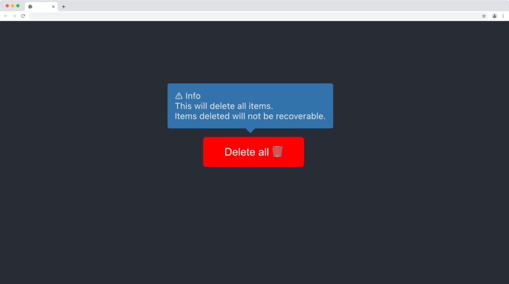
Source code:
import "./App.css";
import React, { useEffect } from "react";
import ReactTooltip from "react-tooltip";

function App() {
  useEffect(() => {
    ReactTooltip.rebuild();
  }, []);

  return (
    <React.Fragment>
      <div className='App'>
        <button data-tip data-for='delete-btn'>
          Delete all 🗑
        </button>
        <ReactTooltip id='delete-btn' padding='10px' type='info'>
          ⚠️ Info
          <br />
          This will delete all items.
          <br />
          Items deleted will not be recoverable.
        </ReactTooltip>
      </div>
    </React.Fragment>
  );
}

export default App;
Light Tooltip Type
This is a light theme tooltip component and it’s useful for both dark and light applications.
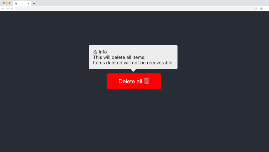
Source code:
import "./App.css";
import React, { useEffect } from "react";
import ReactTooltip from "react-tooltip";

function App() {
  useEffect(() => {
    ReactTooltip.rebuild();
  }, []);

  return (
    <React.Fragment>
      <div className='App'>
        <button data-tip data-for='delete-btn'>
          Delete all 🗑
        </button>
        <ReactTooltip id='delete-btn' padding='10px' type='light'>
          ⚠️ Info
          <br />
          This will delete all items.
          <br />
          Items deleted will not be recoverable.
        </ReactTooltip>
      </div>
    </React.Fragment>
  );
}

export default App;
Wrapping Up
Tooltips are very useful components of a front-end application, and they’ll be appreciated by your users if used correctly.
In this article, we discussed and demonstrated how to build different types of tooltips in a React application using the react-tooltip library.
Finally, more articles like this can be found on our CopyCat blog. CopyCat converts your Figma files into a ready-to-use React project, saving you over 35% of development time. You can check out CopyCat here.
Interesting Reads From Our Blogs
- A Great Guide To Using Material UI Textfield Efficiently
- Material UI Grid: The Ultimate Guide to Building Responsive Web Layout in React
- Complete Guide to Using Material UI Button in React
Happy Coding 👨🏽💻
Related Articles
-
 React.js
Creating a Dropdown Selection in React Using Material UI Select
Introduction MUI provides more than enough available styled components to assist developers in making their designs more artistic and pleasing. One of these available styled components is the Material UI Select. It is an input that comes with configurable props…
December 16, 2022 -
React.js
Ultimate Guide to Fetching Data from API using React Fetch with Clear…
Introduction to Fetching Data from API Often times, in fullstack web applications, you are required to either interact with a database; this can be a relational or non-relational database, or interact with an API. In such scenarios, you will need to…
July 20, 2022


