
 November 29, 2022
  Victor Yakubu


- Introduction
- What is Material UI Grid
- How do you use the Grid in MUI?
- Requirements
- Creating a React App
- Installing material UI
- Material UI Grid: Container and Items Layout
- Material UI Grid: Spacing (Row and Column)
- Material UI Grid: Columns
- Material UI Grid: Fluid Grids (Basic and Multiple Breakpoints)
- Material UI Grid: Autolayout
- Material UI Grid: Nested Grid
- Building a Simple Responsive Web Layout with Material UI Grid
- Limitations of Material UI Grid
- Material UI grid V2, What changed?
- Alternatives to Material UI
- FAQ about MUI Grid
- Wrapping Up
Introduction
The phrase “responsive web design” was first conceived by Ethan Marcotte in 2010. It has since become a non-negotiable part of developing web apps; developers and designers have to constantly consider different screen sizes when designing and developing web applications.
Developers use Javascript and CSS to achieve a perfect or near-perfect layout when developing apps, but over the years there have been libraries that help developers create responsive layouts in less time with fewer lines of code.
One of these component libraries is Material UI, which is a collection of prebuilt components that are designed using Google Material Design and allow for faster and easier styling of the user interface. With your basic knowledge of React, you can build web applications using components from Material UI. This will also be a nice place to mention that you can also convert Figma designs to MUI code in a few minutes using CopyCat and enjoy all the benefits of using Material UI to build your applications, which include improved aesthetics, easier code readability, and lots more.
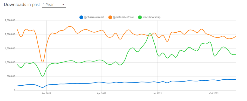
Another reason you will want to use Material UI is its popularity and community. MUI has about 2M weekly downloads through the NPM package manager and 82.8k Github stars. Here is an NPM trend comparing Material UI, Chakra UI, and Bootstrap.
However, in this article, you will be focusing on one of MUI’s layout components, the Material UI Grid. Let me also quickly say that @mui/material v5 that will be used for this article is the same as Material UI core v4, it’s just different versions.
What is Material UI Grid
This is one of the Material UI Layout components; it uses the material design grid system which provides responsive layouts, and consists of columns, margins, and gutters. Since the grid system is responsive, it automatically places components and elements to fit into various screen sizes based on the rows and columns, making it balanced.
The function of Material UI grid
The grid system included with Material UI enables web developers to develop 2-dimensional and responsive layout grid adapts to fit any screen size or orientation while maintaining content delivery between layouts.
Features of Material UI Grid
The features include:
- It uses CSS’s Flexible Box module for high flexibility.
- There are two types of layouts: containers and items.
- Items are always fluid and scaled in relation to their parent element since their widths are determined in percentages.
- Items have padding to create the spacing between individual items.
- Five grid breakpoints are available: xs, sm, md, lg, and xl. These grid breakpoints can be customized.
- When the viewport width complies with the breakpoint restrictions, each breakpoint can be assigned an integer value that indicates how many of the 12 available columns are filled by the component.
How do you use the Grid in MUI?
In this section of the article, you will be covering installation and also exploring various examples using some material UI grid components.
Requirements
It is important that you are at least familiar with Javascript and React before you dive into using React libraries like Material UI. Also, you should have an understanding of how CSS Flexbox works. You won’t be able to comprehend what most of the props are doing here unless you are familiar with Flexbox. On the other hand, you will find it easier to implement your own grid using your own CSS and work with the grid props if you’ve already mastered Flexbox or CSS Grid.
Creating a React App
This step is for those who are starting a new project; if you want to install material UI in an existing project, you should skip this step.
For a new project, what you will first want to do is navigate to your command terminal and go to a directory of your choice. After that, run the command below.
npx create-react-app mui-grid
When the above command runs successfully, you can then proceed to open your new project with your code editor, either manually or using this step.
cd mui-grid
code .
Then start the project on the React server at http://localhost:3000/
npm start
Installing material UI
Inside your project directory, either in the terminal or code editor, install Material UI in your project using the command below.
Npm:
npm install @mui/material @emotion/react @emotion/styled
Yarn:
yarn add @mui/material @emotion/react @emotion/styled
Once the installation is complete, you can now use material UI across your application. The code used in this article is available at the embedded link below.
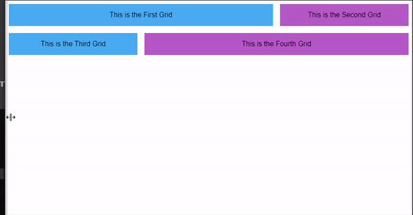
Material UI Grid: Container and Items Layout
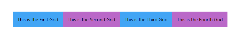
Now, the Grid component has two main variants, the grid container, and the grid item. The grid container is the parent element, just like using React.fragment to wrap your content in a React component. while the grid items are the child elements. What it then means is that a grid container contains either one or more grid items.
import { Box, Grid } from '@mui/material';

export default function MuiGrid() {
    return (
      <Grid container>
        <Grid item>
          <Box bgcolor="primary.light" p={2}>
            This is the First Grid
          </Box>
        </Grid>
        <Grid item>
          <Box bgcolor="secondary.light" p={2}>
            This is the Second Grid
          </Box>
        </Grid>
        <Grid item>
          <Box bgcolor="primary.light" p={2}>
            This is the Third Grid
          </Box>
        </Grid>
        <Grid item>
          <Box bgcolor="secondary.light" p={2}>
            This is the Fourth Grid
          </Box>
        </Grid>
      </Grid>
    );
}
Material UI Grid: Spacing (Row and Column)
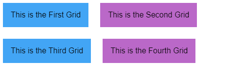
It’s also possible for you to set the spacing between items (children) in a container by using the spacing prop. The value assigned to the prop will be the spacing between each item in the container. Consider the example below.
import { Box, Grid} from '@mui/material';

export default function MuiGrid() {
    return (
      <Grid container spacing={3}>
        <Grid item>
          <Box bgcolor="primary.light" p={2}>
            This is the First Grid
          </Box>
        </Grid>
        <Grid item>
          <Box bgcolor="secondary.light" p={2}>
            This is the Second Grid
          </Box>
        </Grid>
        <Grid item>
          <Box bgcolor="primary.light" p={2}>
            This is the Third Grid
          </Box>
        </Grid>
        <Grid item>
          <Box bgcolor="secondary.light" p={2}>
            This is the Fourth Grid
          </Box>
        </Grid>
      </Grid>
    );
}
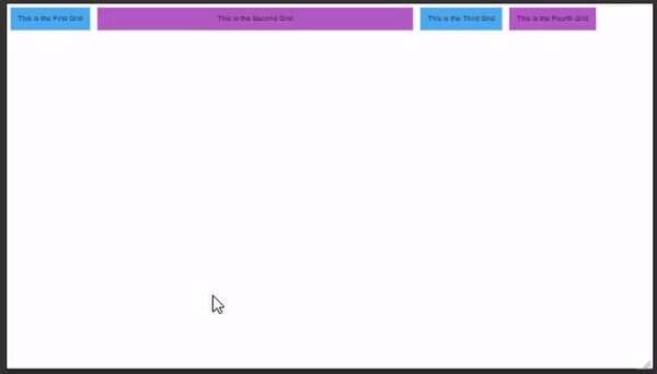
Material UI Grid: Columns
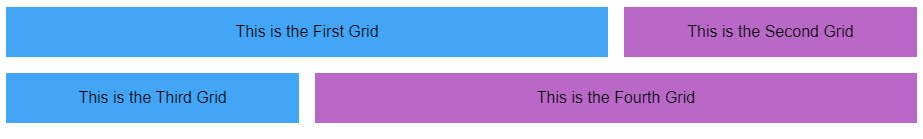
Traditionally, Material UI offers us a 12-column grid system based on Flexbox, and it’s simple to use. UI designers use the 12-column grid when designing desktop screens, which is the default grid system; you can read more on “understanding the 12-column grid.” However, when implementing designs that do not use the default 12-column grid, you can use the columns prop in the MUI grid to change the number of columns.
import { Box, Grid} from '@mui/material';

export default function MuiGrid() {
    return (
      <Grid container spacing={3} columns={16}>
        <Grid item xs={8}>
          <Box bgcolor="primary.light" p={2}>
            This is the First Grid
          </Box>
        </Grid>
        <Grid item xs={4}>
          <Box bgcolor="secondary.light" p={2}>
            This is the Second Grid
          </Box>
        </Grid>
        <Grid item xs={4}>
          <Box bgcolor="primary.light" p={2}>
            This is the Third Grid
          </Box>
        </Grid>
      </Grid>
    );
}
In the code above, the columns of the grid container were increased to 18, and 8 columns out of the 18 columns were assigned to the first grid item while the others were assigned 4 columns each. see how it renders in the browser.

Material UI Grid: Fluid Grids (Basic and Multiple Breakpoints)
Material UI grid also helps you in creating responsive designs, using breakpoints, you can develop your web applications to fit properly into different screen sizes. These breakpoints include:
- xs, extra-small: 0-599 px
- sm, small: 600px – 899px
- md, medium: 900px
- lg, large: 1200px
- xl, extra-large: 1536px
- And also customized breakpoint
Basic Grid
For a basic or single grid, you can apply a single breakpoint to each grid item in the container. Since the default column is 12, you will have to calculate how many columns each item will occupy on the screen at a particular screen size. For example, if you want two items to occupy the whole row on a screen, you will have to assign a breakpoint of 6 to each or 4 to 8, making it 12 columns altogether. When you assign 12 to any grid item, it means you want only that item to occupy the whole row. Consider the example below.
import { Box, Grid} from '@mui/material';

export default function MuiGrid() {
    return (
      <Grid container spacing={2}>
        <Grid item xs={8}>
          <Box bgcolor="primary.light" p={2}>
            This is the First Grid
          </Box>
        </Grid>
        <Grid item xs={4}>
          <Box bgcolor="secondary.light" p={2}>
            This is the Second Grid
          </Box>
        </Grid>
        <Grid item xs={4}>
          <Box bgcolor="primary.light" p={2}>
            This is the Third Grid
          </Box>
        </Grid>
        <Grid item xs={8}>
          <Box bgcolor="secondary.light" p={2}>
            This is the Fourth Grid
          </Box>
        </Grid>
      </Grid>
    );
}
Grid with Multiple Breakpoints
Typically, in a web application, you will want to have multiple breakpoints for different screen sizes.
For example, when you assign xs={12} md={6} to a particular grid item, it means that that item will occupy 6 columns when the viewport width is 900 pixels or more, and that same grid item will occupy the whole 12 columns when the viewport width is below 900 pixels.
import { Box, Grid} from '@mui/material';

export default function MuiGrid() {
    return (
      <Grid container spacing={2}>
        <Grid item xs={6} md={8}>
          <Box bgcolor="primary.light" p={2}>
            This is the First Grid
          </Box>
        </Grid>
        <Grid item xs={6} md={4}>
          <Box bgcolor="secondary.light" p={2}>
            This is the Second Grid
          </Box>
        </Grid>
        <Grid item xs={6} md={4}>
          <Box bgcolor="primary.light" p={2}>
            This is the Third Grid
          </Box>
        </Grid>
        <Grid item xs={6} md={8}>
          <Box bgcolor="secondary.light" p={2}>
            This is the Fourth Grid
          </Box>
        </Grid>
      </Grid>
    );
}
Material UI Grid: Autolayout
The grid items can automatically resize and fill the available space thanks to the auto-layout feature, which eliminates the need to specify an item’s width. The child items would automatically resize and share the available space if the width of one of the items was set to a fixed value.
From the example below, set one of the items in the container to xs={6} and see how the other items auto-resize when the viewport width is below 900 pixels.
import { Box, Grid} from '@mui/material';

export default function MuiGrid() {
    return (
      <Grid container spacing={2}>
        <Grid item>
          <Box bgcolor="primary.light" p={2}>
            This is the First Grid
          </Box>
        </Grid>
        <Grid item xs={6}>
          <Box bgcolor="secondary.light" p={2}>
            This is the Second Grid
          </Box>
        </Grid>
        <Grid item>
          <Box bgcolor="primary.light" p={2}>
            This is the Third Grid
          </Box>
        </Grid>
        <Grid item>
          <Box bgcolor="secondary.light" p={2}>
            This is the Fourth Grid
          </Box>
        </Grid>
      </Grid>
    );
}
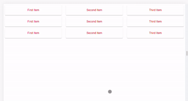
Material UI Grid: Nested Grid
Both grid container and items are independent properties in the material UI grid component, but they can be combined to make a grid component act as both a flex container and a child.
import Paper from "@mui/material/Paper";
import Grid from "@mui/material/Grid";

const classes = {
  root: {
    flexGrow: 1
  },
  paper: {
    padding: 20,
    textAlign: "center",
    color: "red"
  }
};
function NestedGrid() {
  return (
    <>
      <Grid item xs={4}>
        <Paper style={classes.paper}>First Item</Paper>
      </Grid>
      <Grid item xs={4}>
        <Paper style={classes.paper}>Second Item</Paper>
      </Grid>
      <Grid item xs={4}>
        <Paper style={classes.paper}>Third Item</Paper>
      </Grid>
    </>
  );
}
export default function MuiGrid() {
  return (
    <div style={classes.root}>
      <Grid container spacing={1}>
        <Grid container item xs={12} spacing={3}>
          {/*Render the InnerGrid as a child item */}
          <NestedGrid />
        </Grid>
        <Grid container item xs={12} spacing={3}>
          <NestedGrid />
        </Grid>
        <Grid container item xs={12} spacing={3}>
          <NestedGrid />
        </Grid>
      </Grid>
    </div>
  );
}
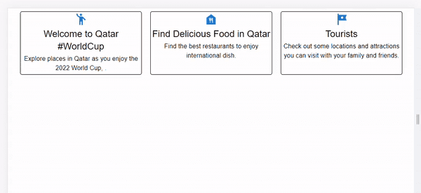
Building a Simple Responsive Web Layout with Material UI Grid
To summarise what you have learned, the card layout that is shown below can be used in web applications. You can check the code and edit it by clicking the Sandbox link embedded below.
Limitations of Material UI Grid
Some of the limitations of using material UI grid include:
white-Space: nowrap
The material UI grid has the min-width property set to auto by default, so using the white-space: nowrap property will cause a positioning conflict.
direction: column | column-reverse
The column width features such as the xs, sm, md, lg, and xl props are not supported when direction= ” column” and direction=”column-reverse” are used in a grid container.
Negative Margin
A negative margin is used by MUI to add space between grid items. This might cause unanticipated behaviours. For instance, you will have to set the parent grid to display: flex in order to apply a background colour.
Material UI grid V2, What changed?
At the time of writing this article, Material UI has released a new version of the Grid layout (Grid v2). For Grid v2, the material UI team built the grid component completely from scratch for them to:
- Fix known issues.
- By removing unnecessary item props and reducing CSS specificity, we are able to simplify the logic with CSS variables.
- Switch between negative margin approaches to prevent a scrollbar.
- By default, the grid container has equal negative margins on all sides.
Alternatives to Material UI
As stated earlier, the tech ecosystem has experienced significant growth in the number of alternatives available for achieving the same or nearly the same goal. So although Material UI is one of the most popular UI component libraries, there are still some other great alternatives worthy of note.
FAQ about MUI Grid
Does material UI have a Grid system?
Yes, it uses the material design grid system. The grid system ensures flexibility across a variety of screen designs while also maintaining visual consistency between layouts.
Is the Material UI grid Responsive?
Yes, it is responsive. One of the important features of Material UI is its grid system, which helps developers create responsive layouts in less time. Meaning, the responsive layout grid adapts to fit any screen size. It uses the Material Design System, which maintains consistency across different screen sizes. Even without assigning breakpoints, the grid component fits automatically to any viewpoint width.
Is the Grid component similar to the Data grid?
The Material UI grid component should not be mistaken for the Data grid they are different. The grid component is more similar to a layout grid.
Does Material UI Grid use the CSS Grid?
The answer is no. The CSS Flexbox layout, which implements vertical alignment, horizontal alignment, and other CSS Flexbox features, is used to build the material UI grid system layout. Additionally, they both use a wrapping container with a 12-column system.
You can learn more about CSS Grid from this complete guide by CSSTricks.
Wrapping Up
Building responsive design is an important quality of a frontend developer, and knowing how to use the material UI grid is an important advantage when developing web applications. In this article, you have been able to cover various features of the material UI grid.
Learn more about the Material UI Grid system and layout using the recommended resources below:
Lastly, you can also save yourself a tonne of time when developing web applications by using CopyCat. You can easily convert your Figma designs straight to MUI codes, which, if you ask me, is a superpower. You can check it out now!
Other Interesting Articles from CopyCat Blog
The CopyCat blog has lots of amazing articles that will help you understand programming concepts, libraries, and tools better. Here are some that you can check out:
- How to build powerful tables with the React-table library
- How to use ReactRouter Redirect in your application
- Vue vs React
- Complete guide to using material UI button
Related Articles
-
 React.js
Building Maps in React with react-leaflet Library
Make your developers' lives easier by using CopyCat, an AI that can convert your Figma designs into React, Tailwind, Bootstrap, and other popular CSS frameworks. Click here to check out the CopyCat plugin for Figma. Convert Design to Code with…
December 20, 2022 -
React.js
Your Guide To The React Context API
Introduction More often than not, building React applications involves consuming data of different forms for our use. Primarily, data management in React applications is via props; and sometimes, that’s just all we need. However, as our application grows larger and…
August 26, 2022


