
 November 29, 2022
  Victor Yakubu


- Introduction
- What is Material UI?
- What is Material UI Textfield?
- Uses of Material UI Textfield?
- Features of Material UI Textfield?
- Creating a React Application
- Installing Material UI
- Importing the Textfield component
- Textfield component Props
- Textfield component Props: Label
- Textfield component Props: Variants (Outlined, Filled, and Standard)
- Props: Size
- Props: Margin
- Props: Colors
- Form Props: Required
- Form Props: Helper text
- Form Props: Type
- Form Props: Multi line text field
- Form Props: Disabled state
- Input Props: Read-only
- Input Props: Adornment
- Form Props: Error
- Form Props: Select
- Controlled Vs Uncontrolled Text field
- Alternative to Material UI Textfield
- Other Relevant Materials on Material UI Textfield
- Wrapping Up
- Other Interesting Articles in our Blog

Introduction
We use TextFields everywhere across different parts of web applications, whether it is when filling out a form, a message box, or areas that allow users to enter and edit text. And depending on the areas where a TextField is required, you might also need to add extra features like limiting the amount of input text, displaying error messages, and a lot more. In this article, you will learn about some of the extra features that are possible with the Material UI TextField.
What is Material UI?
Material UI is one of the most popular UI frameworks for React. It is an open-source library with an MIT license that gives you the ability to implement a design system for your application. The Material UI library implements Material Design which is a design system from Google that provides guidelines and specifications for everything needed in your application, including buttons, typography, spacing, and a lot more.
The Material UI library implements those guidelines, creating ready-to-use React components that you can easily hook into your React applications just by simply installing Material UI and importing the necessary components you need.
It is also important to state here that you can easily convert your Figma designs to Material UI code with CopyCat, thereby saving you lots of valuable time.
Over the eight years, it has been in existence, material UI has experienced a great deal of adoption by developers across the board. Here is a stat from npm trends showing the number of downloads in the last year.
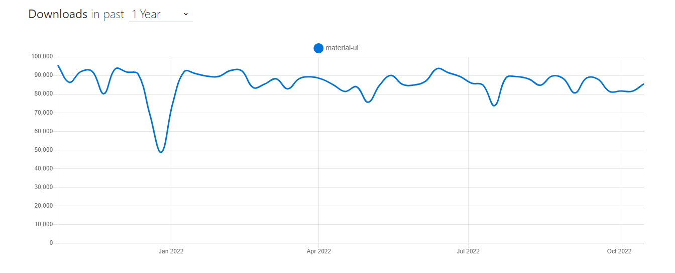
with over 82.2k Github stars and 1.9M weekly downloads on the Material UI npm package manager.
What is Material UI Textfield?
As stated earlier, the Material UI library contains ready-to-use UI components; one of these components is the Material UI text field, a text field where users enter and edit required information in different formats (text, number, etc). But aside from that, it also comes with specific props that are useful in certain use cases. Just like we have Angular Material for Angular and Vuetify for Vue, Material UI is for React.
Uses of Material UI Textfield?
We use Material UI text fields for users to enter specific data. We can implement text fields easily across your applications with just a few lines of code, and they help you maintain consistent behavior throughout your application. It is a great UI component that typically appears in forms and dialogs.
Features of Material UI Textfield?
- It follows the Google Material Design guidelines
- It presents a consistent look across various applications
- Easy to set up and use
- It is easily customized
- It has a disabled state (with a dotted underline)
- Pure Javascript implementation
- Character counter number
- Animation duration disabled state and android animated state transitions
- Events like the onBlur (blur callback function), onFocus (focus callback function) and the input accessory view function are inbuilt.
- Boolean true multiline text
- Customizable font size
Creating a React Application
To proceed, you will need to create a new project using the Create React App. If you are using a material UI text field in an existing project, you can skip this step; otherwise, run the command below.
npx create-react-app mui-texfield
When that is successful, run the command below to navigate to the newly created React app directory.
cd mui-textfield
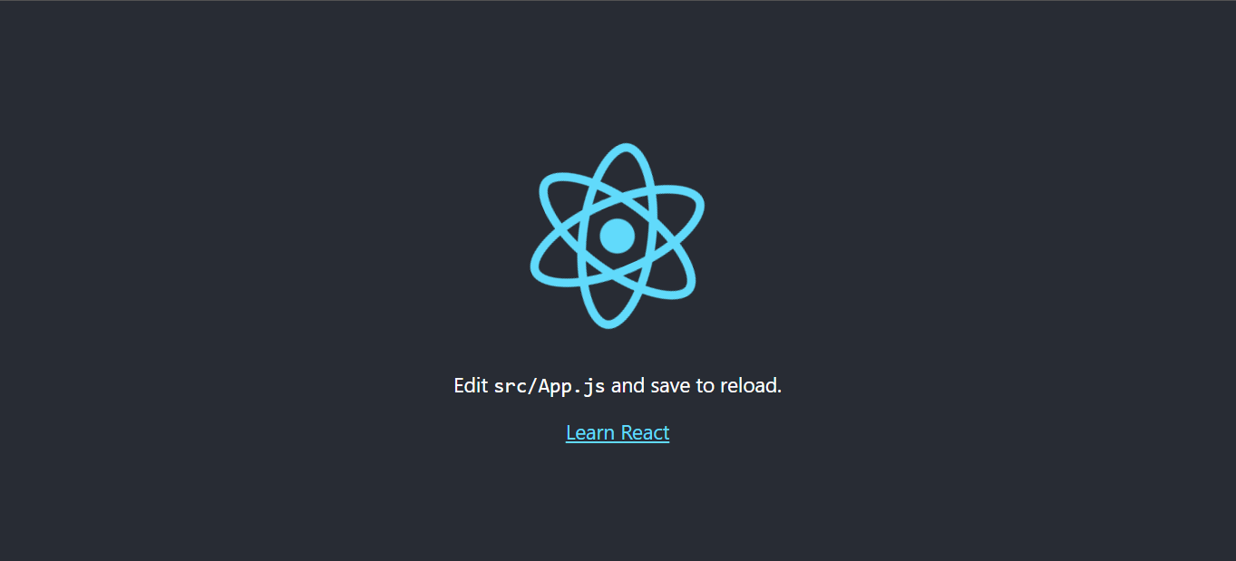
You can then proceed to open the folder in your choice of code editor. After which you will run the command below to start your React server using yarn or npm.
npm start
OR
yarn start
The server will launch in your browser at http://localhost:3000, as shown below.
Installing Material UI
Now that you have your React project running, it’s time to install the Material UI package. You can do this either using the npm or yarn package managers.
Run the command below to install Material UI using npm:
npm install @mui/material @emotion/react @emotion/styled
Or install Material UI using yarn:
yarn add @mui/material @emotion/react @emotion/styled
@mui/material is the core material UI library that provides us with ready-to-use UI components. @emotion is a library designed for writing CSS styles with JavaScript and it’s the default styling used in Material UI v5.
Importing the Textfield component
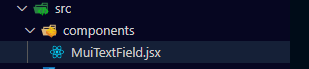
Now that you have Material UI installed in your project, what you need to do is create a components folder. And then proceed to create a component file in the component folder called MuiTextField.jsx.
After that, proceed to do a cleanup in App.js and also import and render the MuiTextField.jsx component.
import MuiTextField from './components/MuiTextField';
import './App.css';

function App() {
  return (
    <div className="App">
     <MuiTextField />
    </div>
  );
}
export default App;
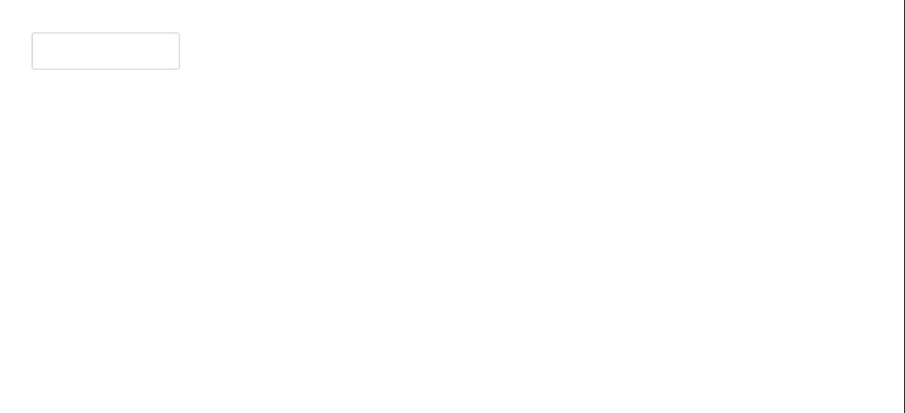
Back in MuiTextField.jsx, import TextField, render it, and see how it displays on the browser
import React from 'react'
import {TextField} from '@mui/material'

function MuiTextField() {
  return (
    <div>
        <TextField />
    </div>
  )
}

export default MuiTextField
Textfield component Props
In this section, you will be looking at different props used with the TextField component. This prop can come in handy when you are implementing different options or features in your text fields.
The code used for each Textfield component article is here:
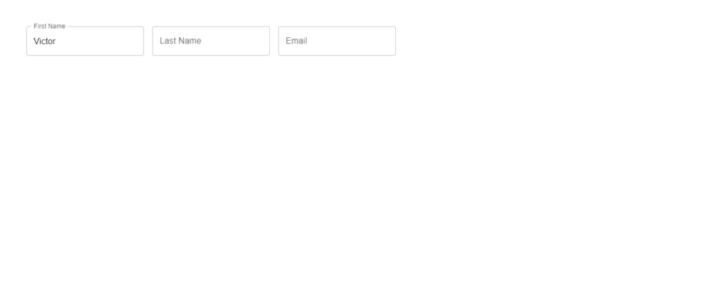
Textfield component Props: Label
We use the label often in the TextField component to give a description. It helps with the user experience to let the users know what is expected of them in that text field, they typically appear in forms. To achieve this with material UI, all you have to do is pass the label prop to the TextField component and specify the label content.
import React from 'react'
import {TextField} from '@mui/material'

function MuiTextField() {
  return (
        <>
	  <TextField label='First Name'/>
          <TextField label='Last Name' />
          <TextField label='Email' />
  	</>
)
}

export default MuiTextField
When you click on the input field, the label automatically becomes a floating label with a smooth transition. input accessory view function.
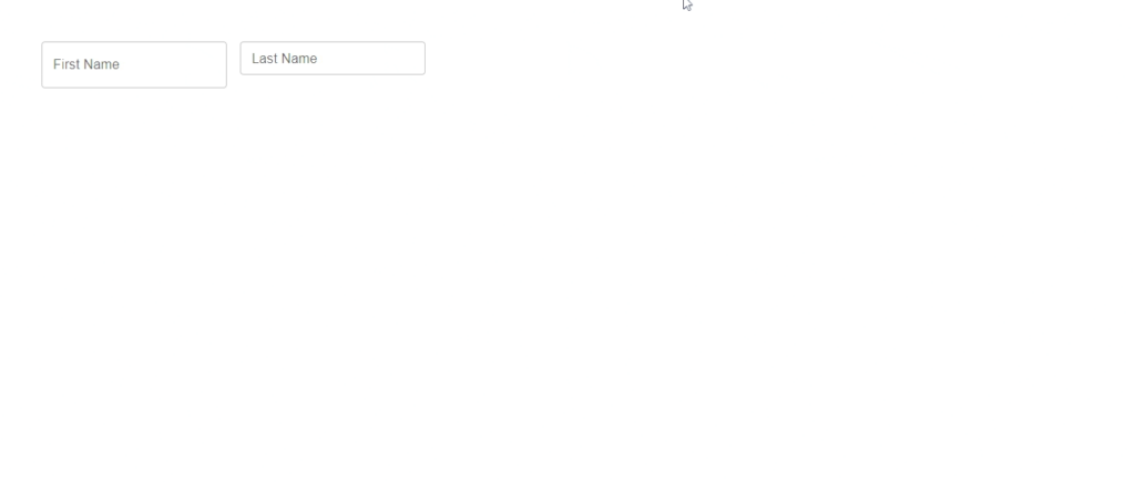
Textfield component Props: Variants (Outlined, Filled, and Standard)
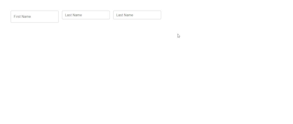
There are three variants (Outlined, Standard, and Filled fields), and the outlined text field is the default variant. The variant basically specifies the text field style that is to be applied when a specific variant prop value is passed or applied to the text field component.
Consider the example below:
import React from 'react'
import {TextField} from '@mui/material'

function MuiTextField() {
  return (
     <>
 	<TextField label='First Name' variant='outlined'/>
        <TextField label='Last Name' variant='filled' />
        <TextField label='Email' variant='standard'/>
    </>
  )
}

export default MuiTextField
Props: Size
The size prop, which can either be small or medium, determines the size of the text field. Medium is the text field size by default.
import React from 'react'
import {TextField} from '@mui/material'

function MuiTextField() {
  return (
	<>
	 <TextField label='First Name' size='medium'/>
         <TextField label='Last Name' size='small' />
	</>
  )
}

export default MuiTextField
Notice the different text field sizes on the browser
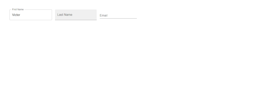
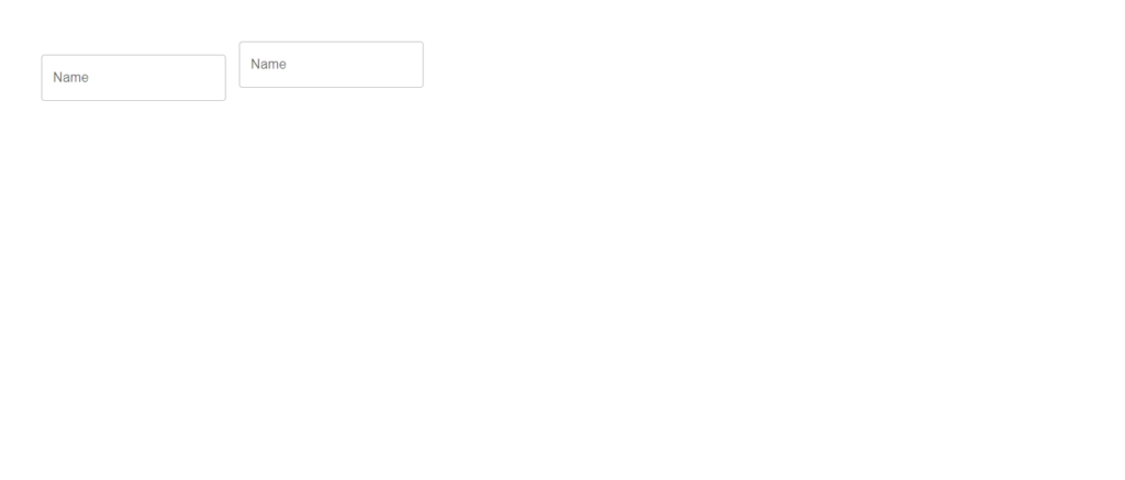
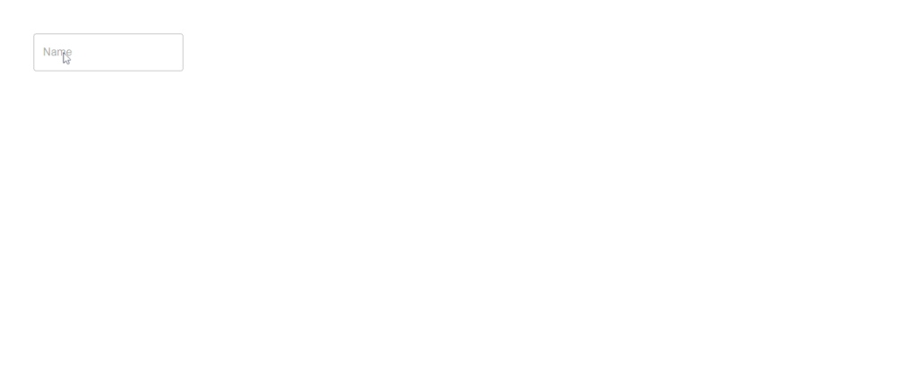
Props: Margin
The Margin prop is used to create space around the text component object. So whenever you want to alter the vertical spacing of the text field, By default, no margin is applied to the text field component. You can apply margin by using either dense or normal. See how they are used in the code below.
import React from "react";
import { TextField } from "@mui/material";

function MuiTextField() {
  return (
    <>
      <TextField label="Name" margin="normal" />
      <TextField label="Name" margin="dense" />
    </>
  );
}

export default MuiTextField;
Props: Colors
Colors can be any of the predefined colors from the theme palette. By default, the text field uses the primary color, but there are others available like the secondary color, success, error, etc. You can choose any of the colors based on your UI design.
import React from "react";
import { TextField } from "@mui/material";

function MuiTextField() {
  return (
    <>
      <TextField label="First Name" size="medium" color="success" />
      <TextField label="Last Name" size="small" color="secondary" />
      <TextField label="Last Name" size="small" color="error" />
    </>
  );
}

export default MuiTextField;
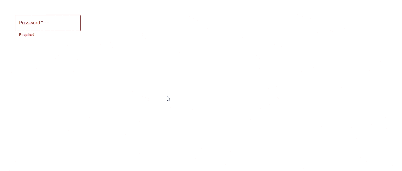
Form Props: Required
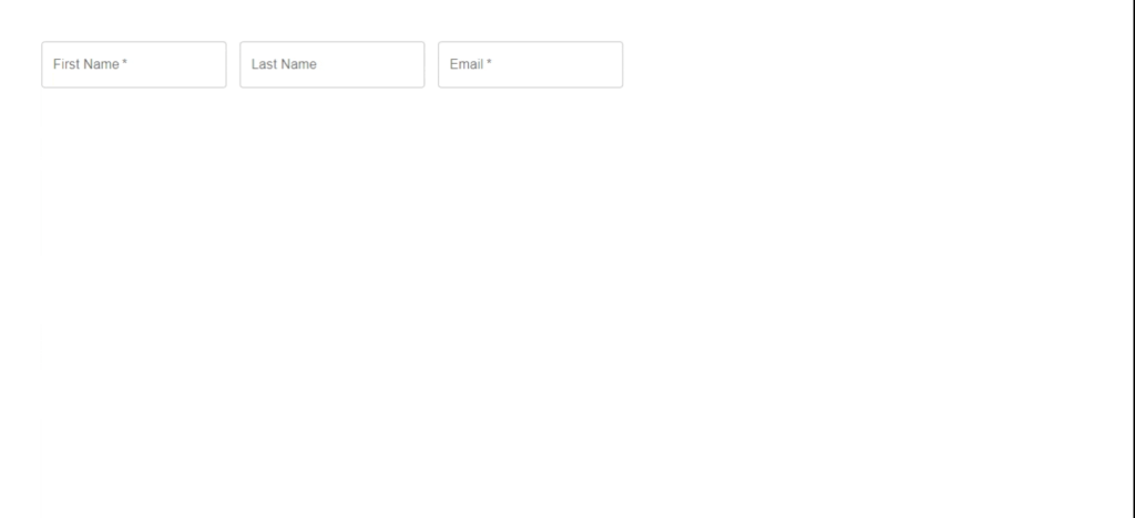
Since text fields typically appear in forms, you will explore some important form props. An important one is the required props.
As the name implies, this prop is assigned to any text field component that must be filled in a form, and it adds an asterisk to the label. For example, you can choose to make the “First Name” field required, and you can prevent the form from submitting until the user fills out that field. In the code below, the Required prop was added to the “First Name and Email” text field.
import React from 'react'
import {TextField} from '@mui/material'

function MuiTextField() {
  return (
     <>
	<TextField label='First Name' required/>
     	<TextField label='Last Name' />
     	<TextField label='Email' required/>
     </>
  )
}

export default MuiTextField
Form Props: Helper text
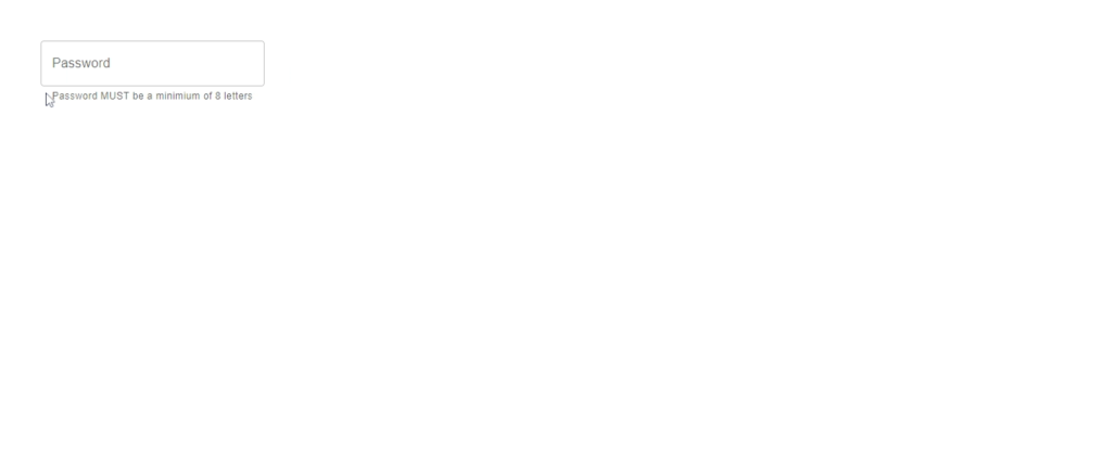
Helper text is used to give more clarity to instructions; in other words, it gives users more context about their usage and what is expected of them (e.g., for a password text field, you might need to tell the user the number of characters expected or the type of characters that are accepted).
import React from 'react'
import {TextField} from '@mui/material'

function MuiTextField() {
  return (
	<TextField label='password' helperText='Password MUST be a
	minimium of 8 letters'  type='password'/>
  )
}

export default MuiTextField
Form Props: Type
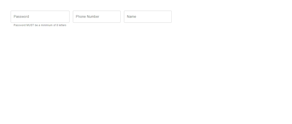
The Type prop can be used to specify the type of input a text field can accept. for example, if you specify the Type to be a number, then only numbers can be typed inside the field; other types which are not the right input, like text will not be accepted.
import React from 'react'
import {TextField} from '@mui/material'

function MuiTextField() {
  return (
	<>
	 <TextField label='password' helperText='Password MUST be a
	 minimium of 8 letters'  type='password'/>
	 <TextField label='Phone Number' type='number'/>
         <TextField label='Name' type='text'/>
	</>
  )
}

export default MuiTextField
Form Props: Multi line text field
The Multiline Prop is used to transform a text field in the material UI into a Textarea Autosize. When you use the multiline prop, the text field will automatically update as users enter text into the field. Unless you define rows using the maxRows and minRows props, the height of the text field will continue to increase to match the content being typed.
import React from "react";
import { TextField } from "@mui/material";

function MuiTextField() {
  return (
	<>
        <TextField label="Short Essay" multiline minRows={3} />
        <TextField label="Long Essay" multiline maxRows={4} />
  	</>
 );
}

export default MuiTextField;
Form Props: Disabled state
Using this prop will grey out the text field, setting it in an inactive state, and making it impossible for users to enter text into a UI. One possible use case for this is when you want users to be unable to edit a particular text field until a condition is met.
import React from 'react'
import {TextField} from '@mui/material'

function MuiTextField() {
  return (
        <TextField label='Name' type='text' disabled/>
  )
}
export default MuiTextField
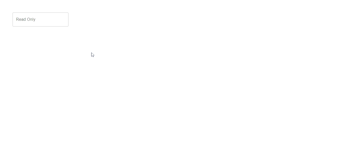
Input Props: Read-only
This is used when you don’t want to disable the field but also don’t want to allow users to be able to edit the input element in the field. The text field will look active, but it won’t accept any input to achieve that. You can achieve this by using the textfield InputProps prop.
import React from 'react'
import {TextField} from '@mui/material'

function MuiTextField() {
  return (
        <TextField label='Read Only' InputProps={{readOnly: true}}/>
  )
}

export default MuiTextField
When you check the browser, you will notice that you can focus on the input
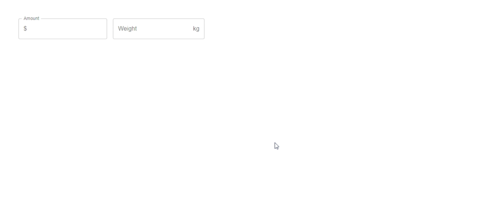
Input Props: Adornment
This prop is used to add prefixes and suffixes to an input container view object. You can also add actions to an input field.
To achieve this, you will first need to import the InputAdornment component from Material UI.
From the example below, a text field prefix and suffix were added to the text field component
import React from "react";
import { InputAdornment, TextField } from "@mui/material";

function MuiTextField() {
  return (
	<>
        <TextField
          label="Amount"
          InputProps={{
            startAdornment:
		<InputAdornment position="start">$</InputAdornment>
          }}
        />
        <TextField
          label="Weight"
          InputProps={{
            endAdornment:
		<InputAdornment position="end">kg</InputAdornment>
          }}
        />
 	</>
 );
}

export default MuiTextField;
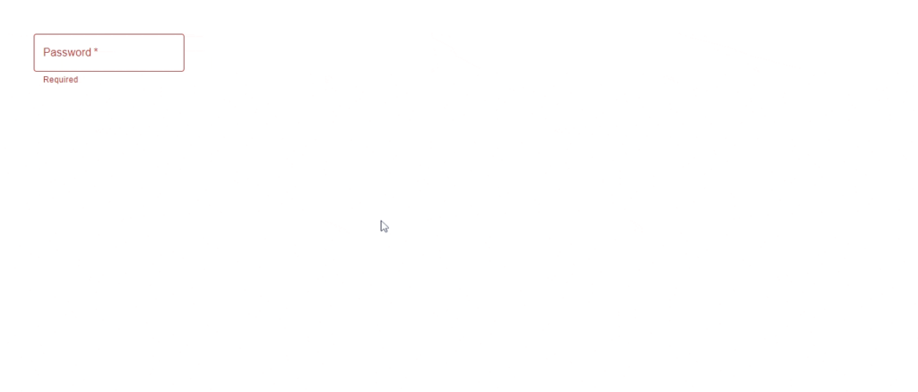
Form Props: Error
The Error prop is used to toggle the error state. When you set the error prop in a text field, it will notice the color of the text field changes to red. You can use the error prop together with the helper text to provide feedback validation messages to the user.
An example considered below is when you want to implement an error state only when the text field is empty, but when the user begins to type into the text field, the error state should be removed. Consider the code below:
import React, { useState } from "react";
import { TextField } from "@mui/material";

function MuiTextField() {
  const [value, setValue] = useState("");
  return (
        <TextField
          label="Password"
          required
          value={value}
          type="password"
          onChange={(e) => setValue(e.target.value)}
          error={!value}
          helperText={!value ? "Require" : "Do not share your password"}
        />
  );
}

export default MuiTextField;
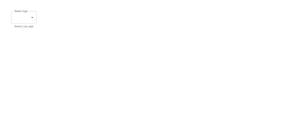
Form Props: Select
The select prop is used to add a dropdown to a text field. This prop automatically makes use of the material UI select component, which allows you to collect user information from a list of options, as shown in the example below.
import React from "react";
import { TextField } from "@mui/material";

function MuiTextField() {
  const age = [
    {
      value: "Five",
      label: "5",
    },
    {
      value: "Ten",
      label: "10",
    },
  ];
  return (
        <TextField
          label="Select Age"
          select
          value={age}
          helperText="Select you age"
        >
          {age.map((option) => (
            <option key={option.value} value={option.value}>
              {option.label}
            </option>
          ))}
        </TextField>
  );
}

export default MuiTextField;
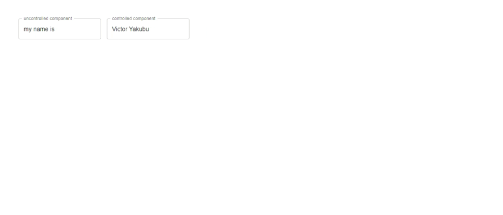
Controlled Vs Uncontrolled Text field
A text field’s default input can be controlled or uncontrolled. Consider the example below.
For controlled input, you can automatically set the default value visibility text using the useState hook.
For uncontrolled input, the default value is passed directly to the text field component.
import React, { useState } from "react";
import {TextField } from "@mui/material";

function MuiTextField() {
  const [value, setValue] = useState("Victor Yakubu");
  const onChange = (e) => {
    setValue(e.target.value);
  };
  return (
        <TextField label="uncontrolled component"
		defaultValue="my name is"
	/>
        <TextField
          label="controlled component"
          value={value}
          onChange={onChange}
        />
  );
}

export default MuiTextField;
Alternative to Material UI Textfield
If you are looking to explore other React text fields and input component libraries, you can try any of these alternatives:
Other Relevant Materials on Material UI Textfield
Though you covered most of the material UI text field props and possible use cases, however, there is still more that the material UI text field component and even the material UI library have to offer. Here are some materials you can check to learn more:
Wrapping Up
Happy that you were able to stick to the end of this article. To recap, through the course of the article, you have learned about the text field component and some of the various Props you can use in the component, and some of their use cases.
The CopyCat blog has amazing articles on React and various React libraries, you should check it out.
Other Interesting Articles in our Blog
Finally, Are you looking for ways to save yourself and your team valuable time when building UIs? Then use CopyCat, it is a tool that helps you convert Figma design to MUI code in a few minutes, check it out.
Related Articles
-
 React.js
React Calendar: How to Build a Reusable Calendar Component
Often, you want to manage and manipulate dates in your web app. These may include adding events or setting reminders, and a date picker for selecting dates in modern applications. Having a calendar in your web application is a way…
August 23, 2022 -
React.js
Your Comprehensive Guide To Bootstrap Forms
Introduction Bootstrap is not foreign regarding better and easier styling alternatives to CSS. The tool, initially named Twitter Blueprint, was created at Twitter by Mark Otto and Jacob Thornton as a framework to promote uniformity across internal products. Officially made…
October 31, 2022


