 December 20, 2022
  Uncle Big Bay


- Introduction
- Overview
- What is Bootstrap Alert?
- Setting Up Bootstrap
- Creating alerts in Bootstrap
- Types of Bootstrap Alerts
- Styling Bootstrap Alerts
- Closing Alerts via Data Attributes
- Bootstrap Alert Examples
- Add icons to Bootstrap Alerts
- Additional Content Inside Bootstrap Alerts
- Adding Link in Bootstrap Alert
- Matching Links Color inside Alerts
- Wrapping Up
Introduction
Bootstrap is one of the most popular CSS (Cascading Style Sheet) frameworks for developing responsive websites. Bootstrap helps to design and customize mobile-first websites quickly.
The package includes various free tools that enable designers to create both more responsive and more common website interface elements, increasing the framework’s adaptability.
The latest version of Bootstrap as of the time of writing this article is Bootstrap v5.0.
If you want to increase your productivity, try CopyCat, an AI that can convert your Figma designs into React, Tailwind, Bootstrap, and other popular CSS frameworks. Click here to check out the CopyCat plugin for Figma.
Overview
In this article, we will look at what bootstrap alert is, its proper behavior, and how it provides contextual feedback messages to the user.
We will look at the different classes, like the alert link class for web links. We will also look at alert styles and adding proper alert messages to the alert element, adding buttons for closing alerts, and how to use javascript to make alerts automatically disappear, among other things.
What is Bootstrap Alert?
The bootstrap alert plugin creates predefined alert messages and styles, for typical user actions to provide appropriate feedback messages for typical user actions.
In the way alert works, this feedback is provided based on eight predefined alert inline classes. The contextual classes are alert-secondary, alert-success, alert-danger, alert-warning, alert-info, alert-light, and alert-dark.
For example alert for deletion should be alert-danger or alert-warning. An alert javascript plugin also gives more functionality. The most appropriate location for alerts is at the top of the screen
Setting Up Bootstrap
The first step to using alert in Bootstrap is adding it to your project. There are two ways:
- Installing via package manager using npm
npm install bootstrap@5.2.3
- Including via CDN (Content delivery network)
<!DOCTYPE html>
<html lang="en">
  <head>
    <meta charset="UTF-8" />
    <meta http-equiv="X-UA-Compatible" content="IE=edge" />
    <meta name="viewport" content="width=device-width, initial-scale=1.0" />
    <title>Document</title>
    <!-- CSS only -->
    <link
      href="https://cdn.jsdelivr.net/npm/bootstrap@5.2.3/dist/css/bootstrap.min.css"
      rel="stylesheet"
      integrity="sha384-rbsA2VBKQhggwzxH7pPCaAqO46MgnOM80zW1RWuH61DGLwZJEdK2Kadq2F9CUG65"
      crossorigin="anonymous"
    />

    <!-- JavaScript Bundle with Popper -->
    <script
      src="https://cdn.jsdelivr.net/npm/bootstrap@5.2.3/dist/js/bootstrap.bundle.min.js"
      integrity="sha384-kenU1KFdBIe4zVF0s0G1M5b4hcpxyD9F7jL+jjXkk+Q2h455rYXK/7HAuoJl+0I4"
      crossorigin="anonymous"
    ></script>
  </head>
  <body class="p-4"></body>
</html>
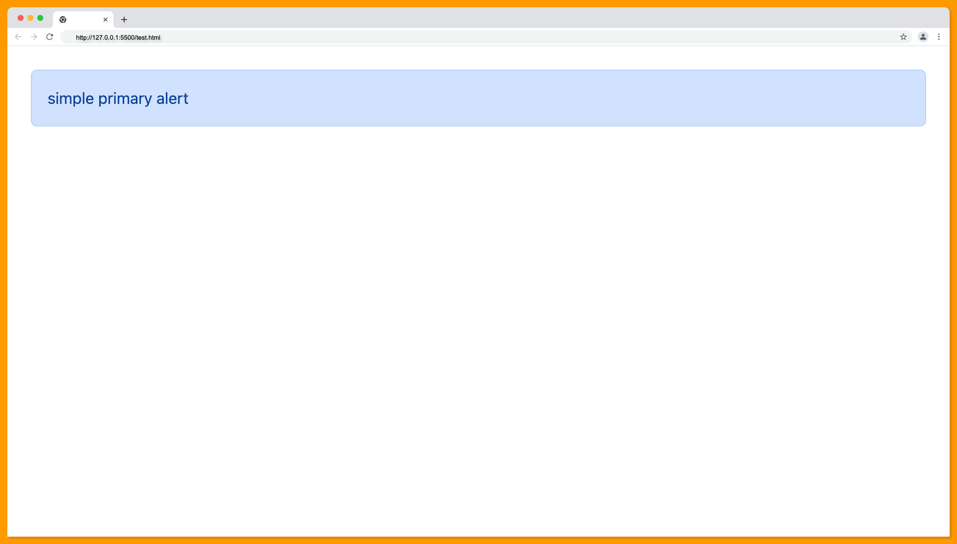
Creating alerts in Bootstrap
After adding bootstrap to your project using either of the methods mentioned above, the next thing is to add the alert class you intend to use. This will be determined by the type of alert you wish to display, be it a success or warning type.
The first step is to add a div tag. A div tag defines a division or a section in an HTML document. It can also be used as a container for other HTML elements.
After adding the div, the next thing is to add the class alert which signifies that the alert is to be used here. Then, you add the type of alert you want to use. Like it was stated above, it could be a success alert, danger alert, warning alert, etc.
Then you specify the role, which will also be an “alert” value. After that, you can add the text to display within the alert, it could range from “user logged in” to “contact deleted”.
For proper styling, it is advisable to use contextual classes that convey the appropriate message.
The following code translates the above explanation:
<div class="alert alert-primary" role="alert">
    simple primary alert
</div>
The code above will produce the following output:
Types of Bootstrap Alerts
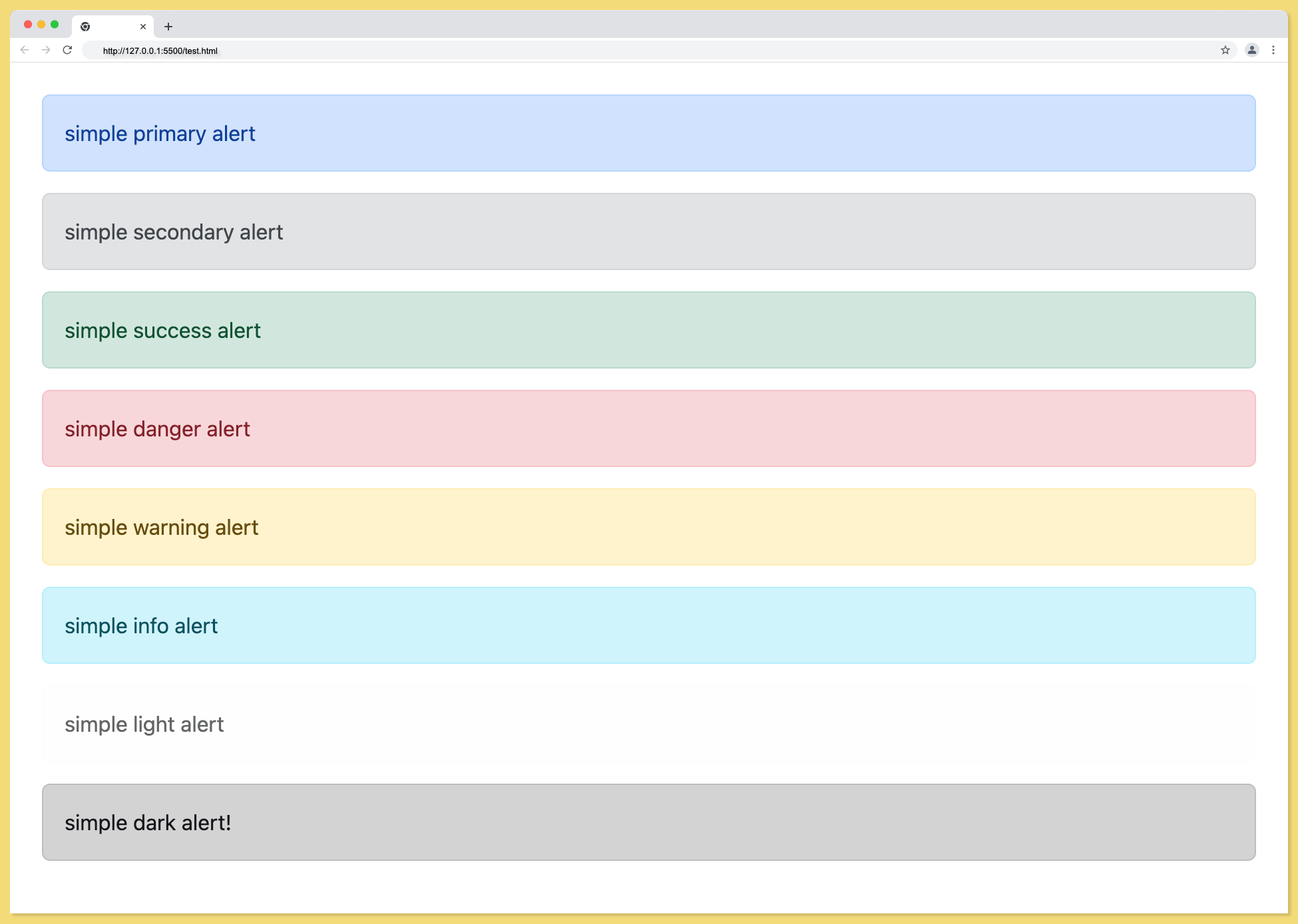
There are eight (8) contextual classes of alert;
- alert-primary
- alert-secondary
- alert-success
- alert-danger
- alert-warning
- alert-info
- alert-light
- alert-dark
They are expected to be used based on the type of message displayed on the UI. It is advisable to use the class that compliments the action and the expected feedback.
This can not be overemphasized. An example of the 8 classes is below.
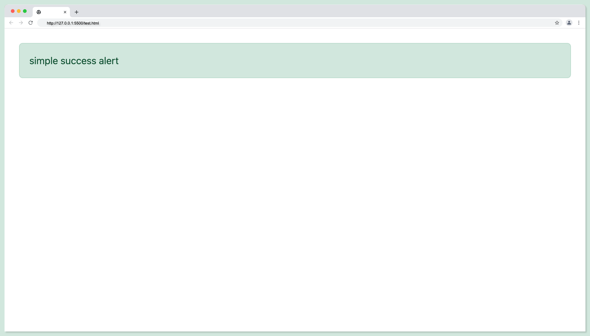
Alert Alert-success Type
The alert alert-success classes are for indicating a successful or positive action. For example, when a user successfully signs up.
<div class="alert alert-success" role="alert">
simple success alert
</div>
The success alert type will look something like this:
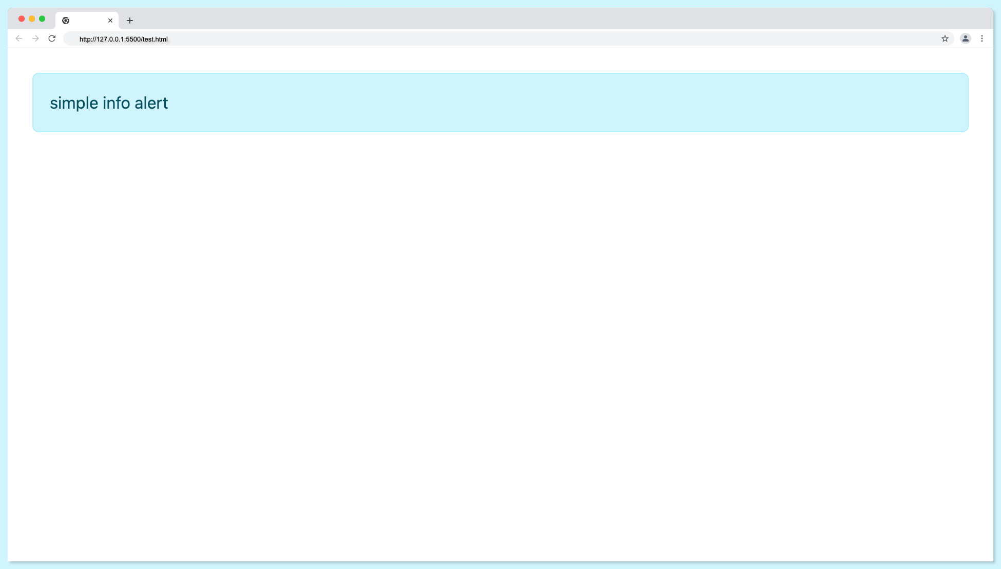
Alert Alert-info Type
The alert alert-info classes should be used to indicate a neutral or informative change or action.
<div class="alert alert-info" role="alert">
simple info alert
</div>
The info alert type will look something like this:
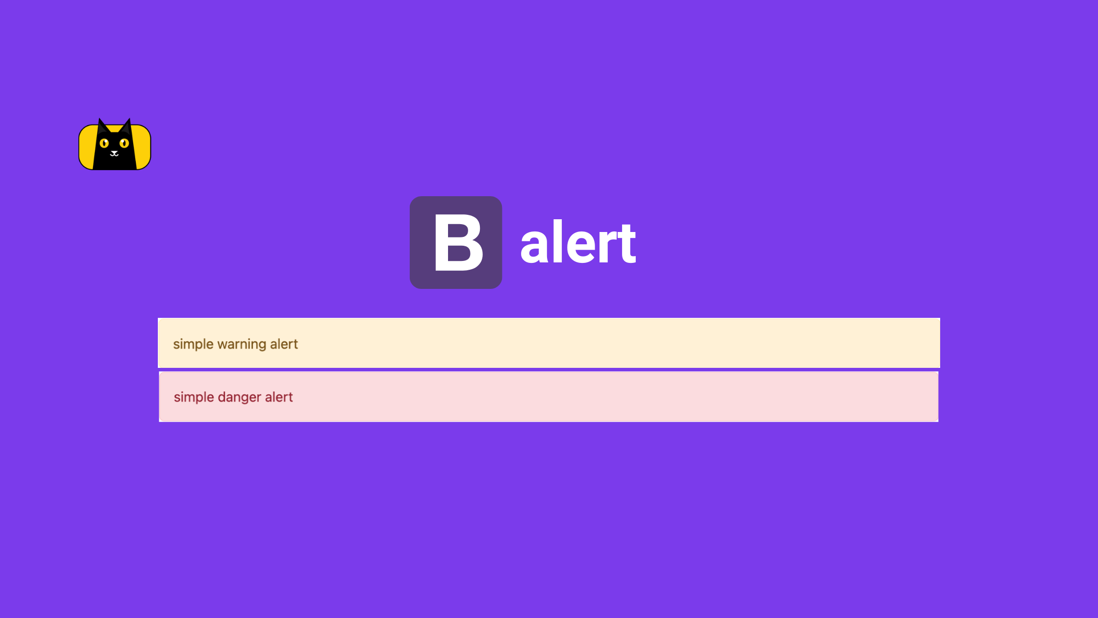
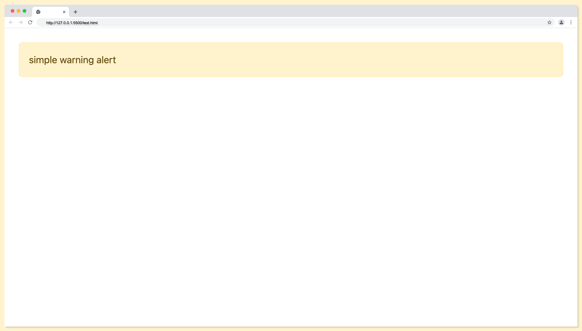
Alert Alert-warning Type
The alert alert-warning should be used to indicate a warning that might need attention.
<div class="alert alert-warning" role="alert">
simple warning alert
</div>
The warning alert type will look something like this:
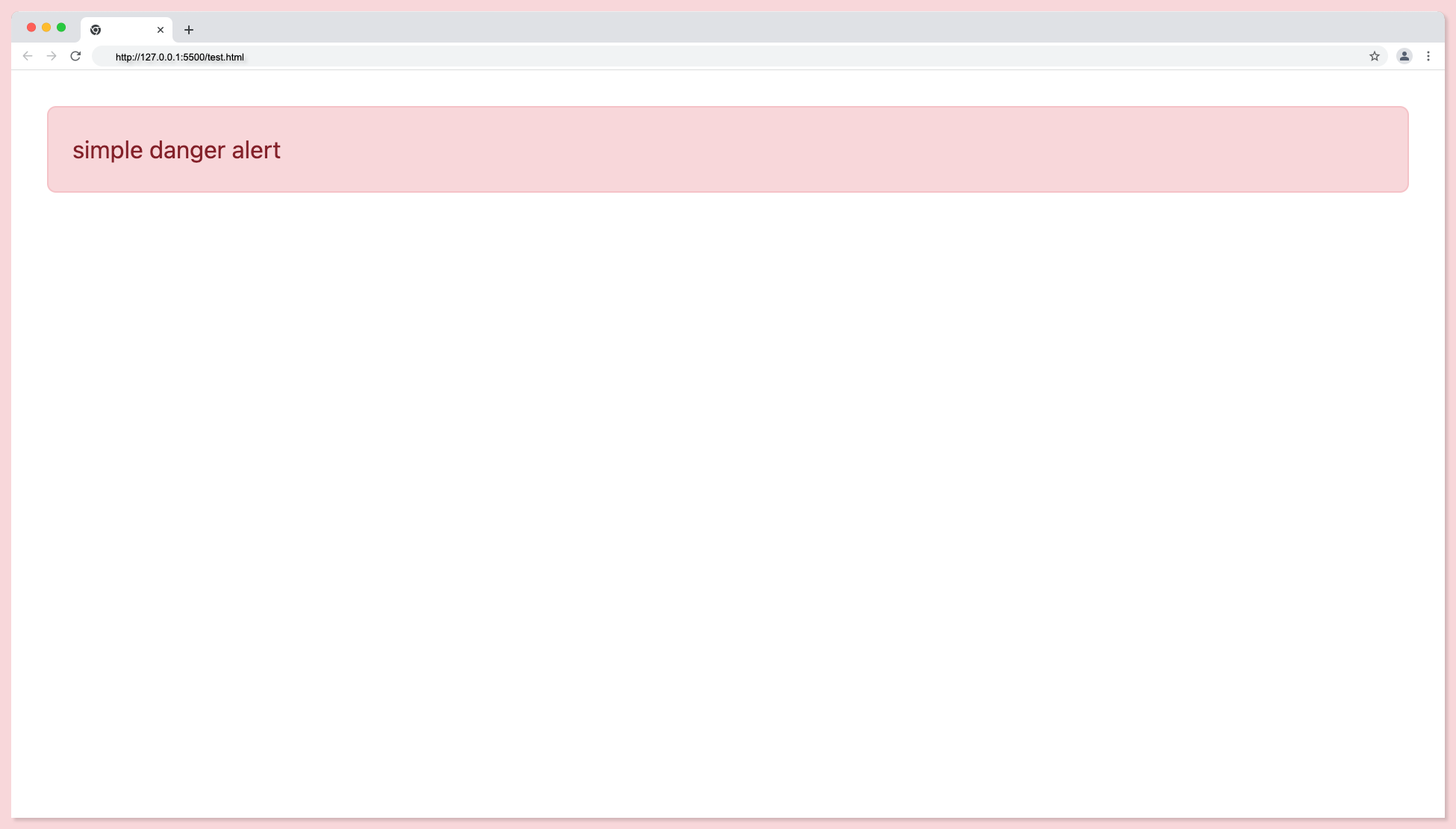
Alert Alert-danger Type
The alert alert-danger indicates a dangerous or potentially negative action.
<div class="alert alert-danger" role="alert">
simple danger alert
</div>
The danger alert type will look something like this:
The following are the full bootstrap alert types code snippet:
<div class="alert alert-primary" role="alert">
simple primary alert
</div>

<div class="alert alert-secondary" role="alert">
simple secondary alert
</div>

<div class="alert alert-success" role="alert">
simple success alert
</div>

<div class="alert alert-danger" role="alert">
simple danger alert
</div>

<div class="alert alert-warning" role="alert">
simple warning alert
</div>

<div class="alert alert-info" role="alert">
simple info alert
</div>

<div class="alert alert-light" role="alert">
simple light alert
</div>

<div class="alert alert-dark" role="alert">
simple dark alert!
</div>
Output:
How do I make bootstrap alerts automatically disappear?
Alert is not meant to stay on the screen forever. This section will deal with closing the alert automatically by using the alert dismissible class.
The first step is to add jquery to the index.html file, this will give access to the javascript functionality. Add the script tag below to the head tag of your file.
<script src="https://ajax.googleapis.com/ajax/libs/jquery/1.12.4/jquery.min.js"></script>
Next is to create the bootstrap alert component like it was done earlier. This time the class alert-info is used. It is not compulsory to make use of alert-info, any of the alert classes stated earlier can be used.
<div class="alert alert-info" role="alert">
    <h4 class="alert-heading">Cost</h4>
    $10,000
</div>
<div class="alert alert-secondary" role="alert">
    <h4 class="alert-heading">Cost</h4>
    $40,000
</div>
Now is the time to add some code snippets for the alert function that will add the auto-disappear needed. At the bottom of the file, just after the body closing tag, add the code below.
<script type="text/javascript">
$(document).ready(function () {
    window.setTimeout(function () {
    $(".alert")
        .fadeTo(1000, 0)
        .slideUp(1000, function () {
        $(this).remove();
        });
    }, 5000);
});
</script>
The above code will dismiss the alert after five (5) seconds as demonstrated below:

Styling Bootstrap Alerts
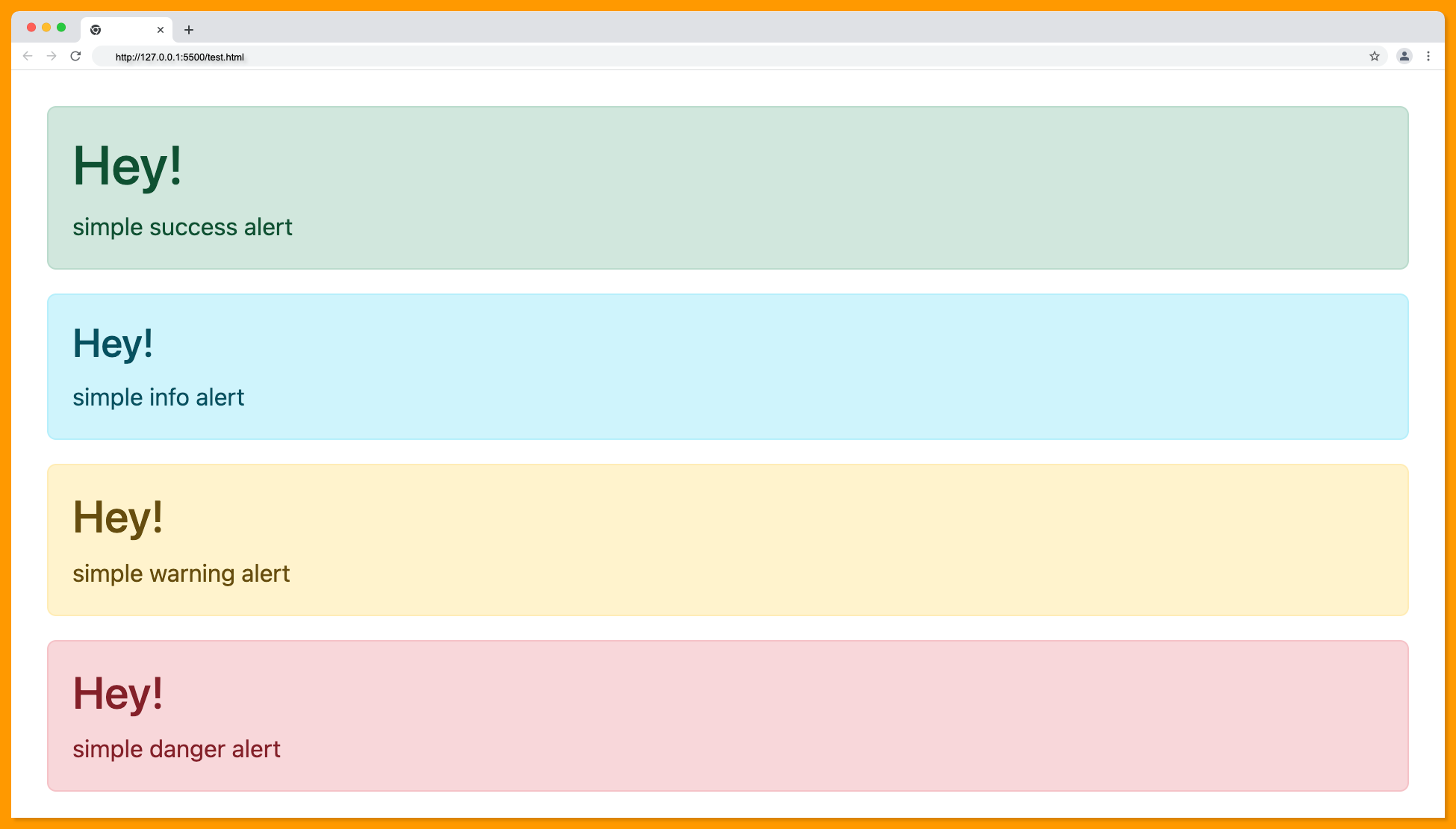
When you need to show the important alert message you might need to style them to give it better visibility. This can be done via in-line styles, bootstrap predefined classes, or a style sheet. The example in this section demonstrates alert styles using a style sheet.
First, create the style sheet and link to the HTML file using the link tag. The path should point to the exact location of the stylesheet.
<link rel="stylesheet" href="style.css" />
The simple HTML code structure below should do for this demonstration:
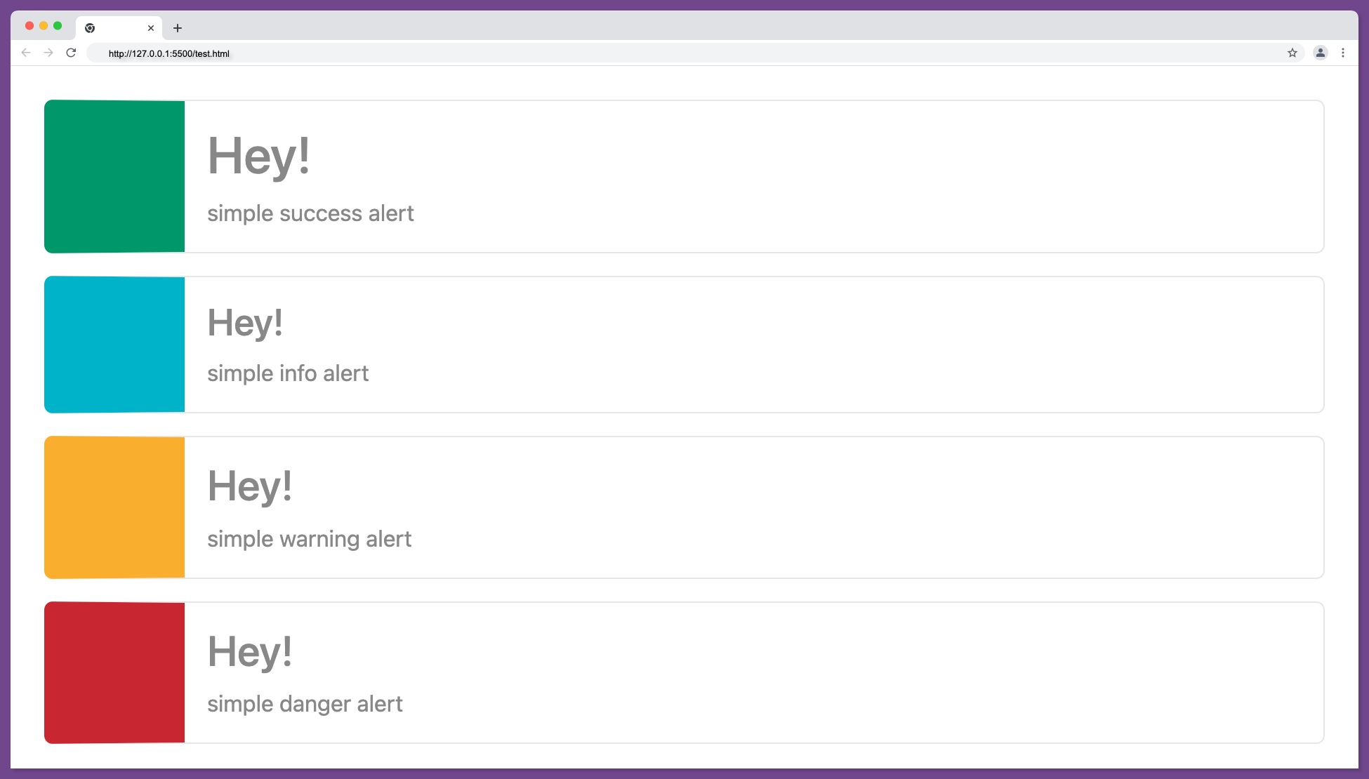
<div class="alert alert-success" role="alert">
    <h1>Hey!</h1>
    simple success alert
</div>
<div class="alert alert-info" role="alert">
    <h3>Hey!</h3>
    simple info alert
</div>
<div class="alert alert-warning" role="alert">
    <h2>Hey!</h2>
    simple warning alert
</div>
<div class="alert alert-danger" role="alert">
    <h2>Hey!</h2>
    simple danger alert
</div>
The default output of the above HTML code is as follows:
You can add styles according to your needs using the alert type classes as shown below. Copy the code below into your style.css file:
.alert-success {
  border-color: #e6e6e6;
  border-left: 100px solid #00986a;
  background-color: #fff;
  color: #888;
}

.alert-info {
  border-color: #e6e6e6;
  border-left: 100px solid #00b3c8;
  background-color: #fff;
  color: #888;
}

.alert-warning {
  border-color: #e6e6e6;
  border-left: 100px solid #f9af2c;
  background-color: #fff;
  color: #888;
}

.alert-danger {
  border-color: #e6e6e6;
  border-left: 100px solid #c82630;
  background-color: #fff;
  color: #888;
}
The output with the custom CSS styles will look something like this:
Closing Alerts via Data Attributes
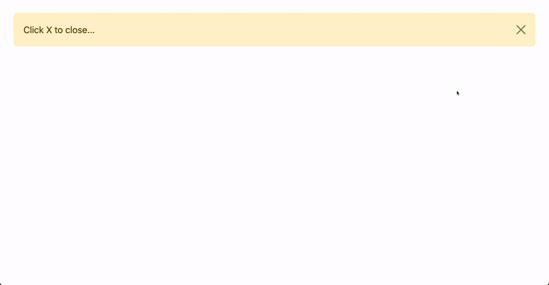
As stated earlier, an alert is not meant to stay on the screen forever. It can also be closed via a click event this will involve adding a button component and some additional contextual classes e.g alert-dismissible.
The code below adds a close button to the regular alert that makes the alert close when the button is clicked.
<div class="alert alert-warning alert-dismissible fade show">
    Click X to close...
    <button
    type="button"
    class="btn-close"
    data-bs-dismiss="alert"
    aria-label="Close"
    ></button>
</div>
The above code will function as follows:
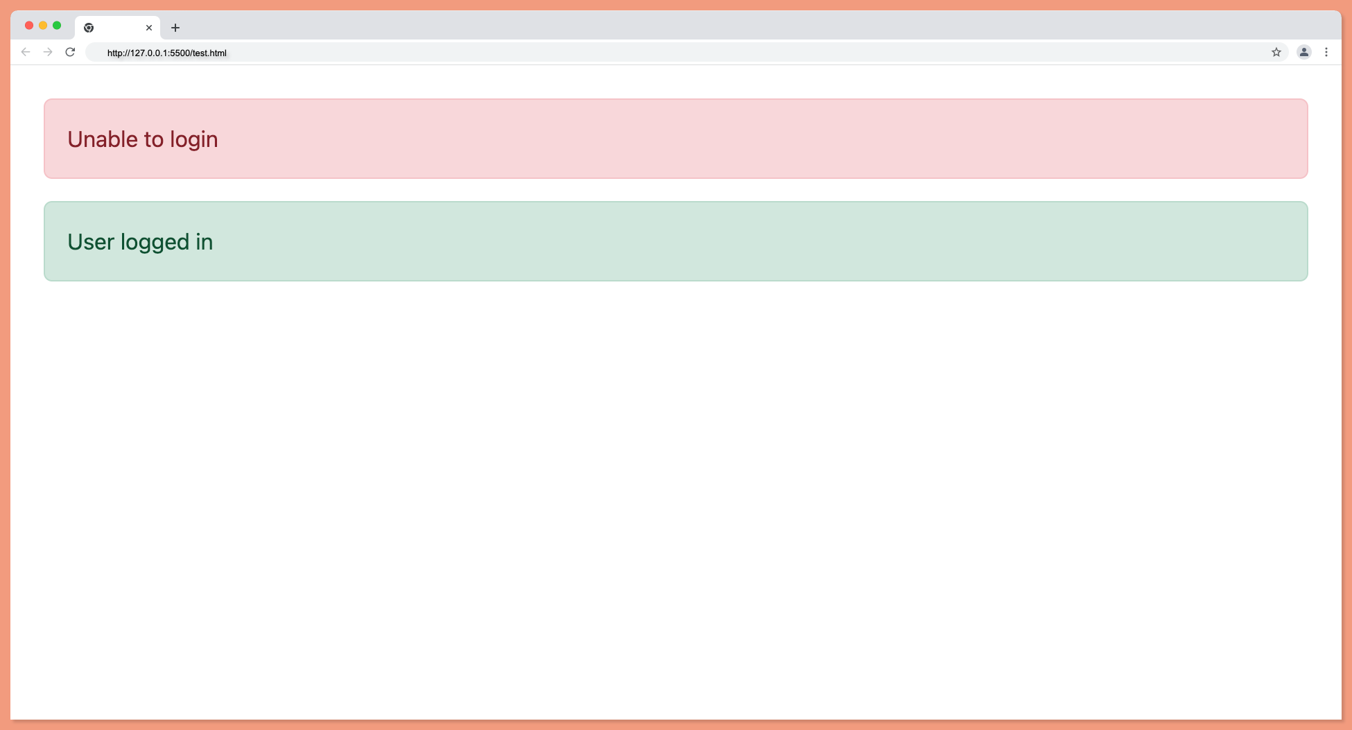
Bootstrap Alert Examples
This time around, we will look into a typical alert example. Several examples have been given above, but this will shed more light.
When using an alert, the most appropriate element should be used. The color of the alert must carry a clear interpretation of the action.
For example alert for successful action should be green, failed action should be red.
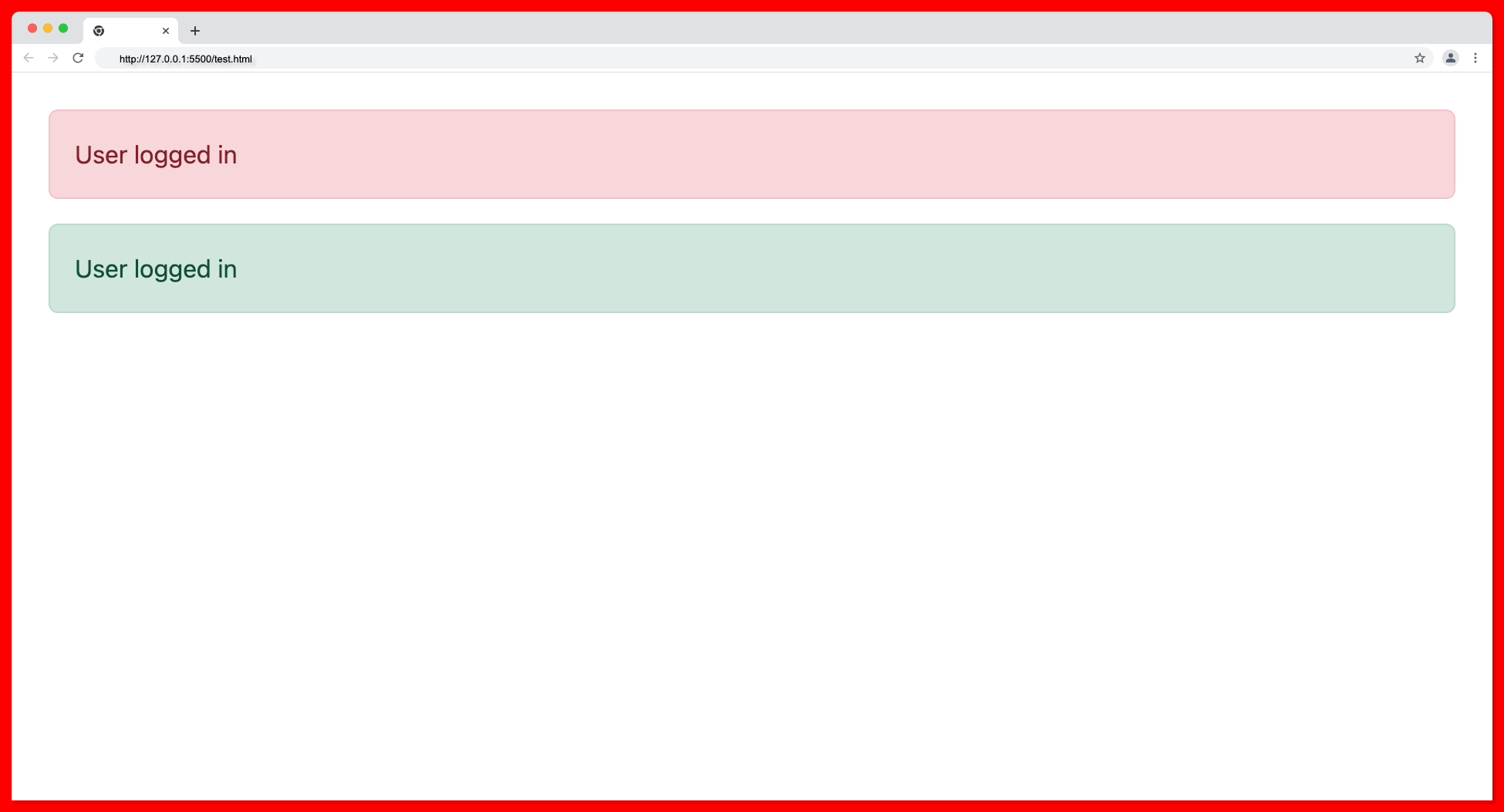
From the image above, it is obvious the alert with green background is the most appropriate element for the success message since it carries a clear interpretation.
Below is an appropriate use of the alert type on a failed and a successful action as follows:
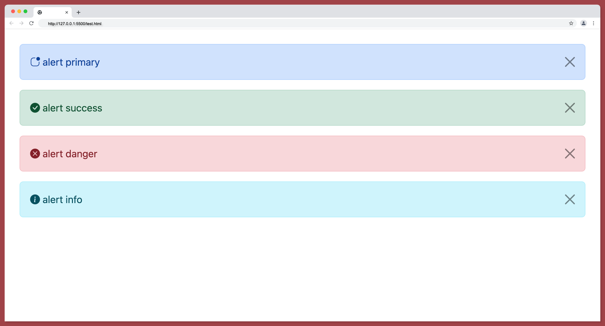
Add icons to Bootstrap Alerts
Icons can make alerts more descriptive and in some cases, it’s advisable to use them. Bootstrap supports a large number of icon sets as given below:
Bootstrap team has introduced over 1,800 icons that are free and high quality, you no longer have to use font awesome or something like that, you can just stick to the bootstrap font pack.
You can install these icons either through NPM, manual download, or CDN. The example below shows how to add bootstrap icons to bootstrap alerts using CDN.
The first step is to add the CDN link in the head tag:
<link rel="stylesheet" href="https://cdn.jsdelivr.net/npm/bootstrap-icons@1.8.3/font/bootstrap-icons.css"/>
Add the following code within your HTML body:
<div class="alert alert-primary alert-dismissible fade show" role="alert">
    <i class="bi bi-app-indicator"></i>

    alert primary

    <button
    type="button"
    class="btn-close"
    data-bs-dismiss="alert"
    aria-label="Close"
    ></button>
</div>
<div class="alert alert-success alert-dismissible fade show" role="alert">
    <i class="bi bi-check-circle-fill"></i>

    alert success

    <button
    type="button"
    class="btn-close"
    data-bs-dismiss="alert"
    aria-label="Close"
    ></button>
</div>
<div class="alert alert-danger alert-dismissible fade show" role="alert">
    <i class="bi bi-x-circle-fill"></i>

    alert danger

    <button
    type="button"
    class="btn-close"
    data-bs-dismiss="alert"
    aria-label="Close"
    ></button>
</div>
<div class="alert alert-info alert-dismissible fade show" role="alert">

    <i class="bi bi-info-circle-fill"></i>

    alert info

    <button
    type="button"
    class="btn-close"
    data-bs-dismiss="alert"
    aria-label="Close"
    ></button>
</div>
The above code will add icons to the alert component as shown below:
You can check out the complete bootstrap icons here.
Additional Content Inside Bootstrap Alerts
On some websites, we regularly come across particular alerts either before or after executing an activity. These bootstrap alert messages are highlighted text that has to be considered when carrying out an activity. These alerts may appear with contextual feedback messages.
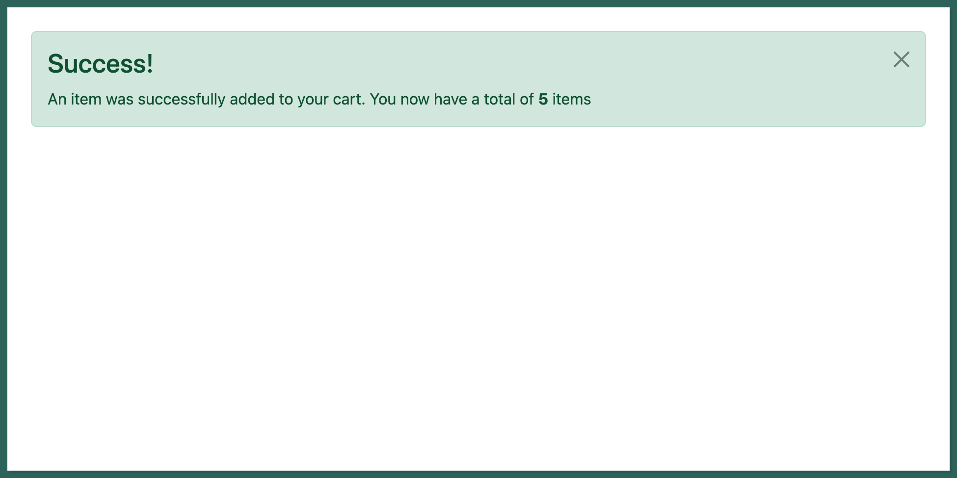
For example, while shopping for items online, if an item was added to the cart or a purchase was made, it would be nice to get a confirmation alert that the action was successful, default notifications with alert primary, or failure which can be achieved with a simple danger alert.
The example above is achieved with the code below:
- For adding to the cart
<div class="alert alert-success alert-dismissible fade show" role="alert">
    <h3>Success!</h3>
    An item was successfully added to your cart. You now have a total of
    <strong>5</strong>
    items
    <button
    type="button"
    class="btn-close"
    data-bs-dismiss="alert"
    aria-label="Close"
    ></button>
</div>
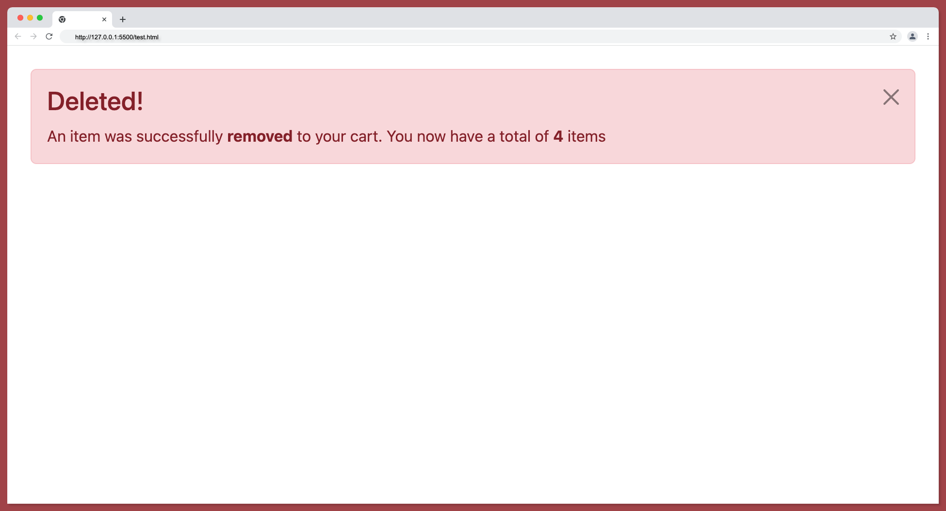
- For removing items from the cart
<div class="alert alert-danger alert-dismissible fade show" role="alert">
    <h3>Deleted!</h3>
    An item was successfully <strong>removed</strong> to your cart. You now
    have a total of
    <strong>4</strong>
    items
    <button
    type="button"
    class="btn-close"
    data-bs-dismiss="alert"
    aria-label="Close"
    ></button>
</div>
- Output:

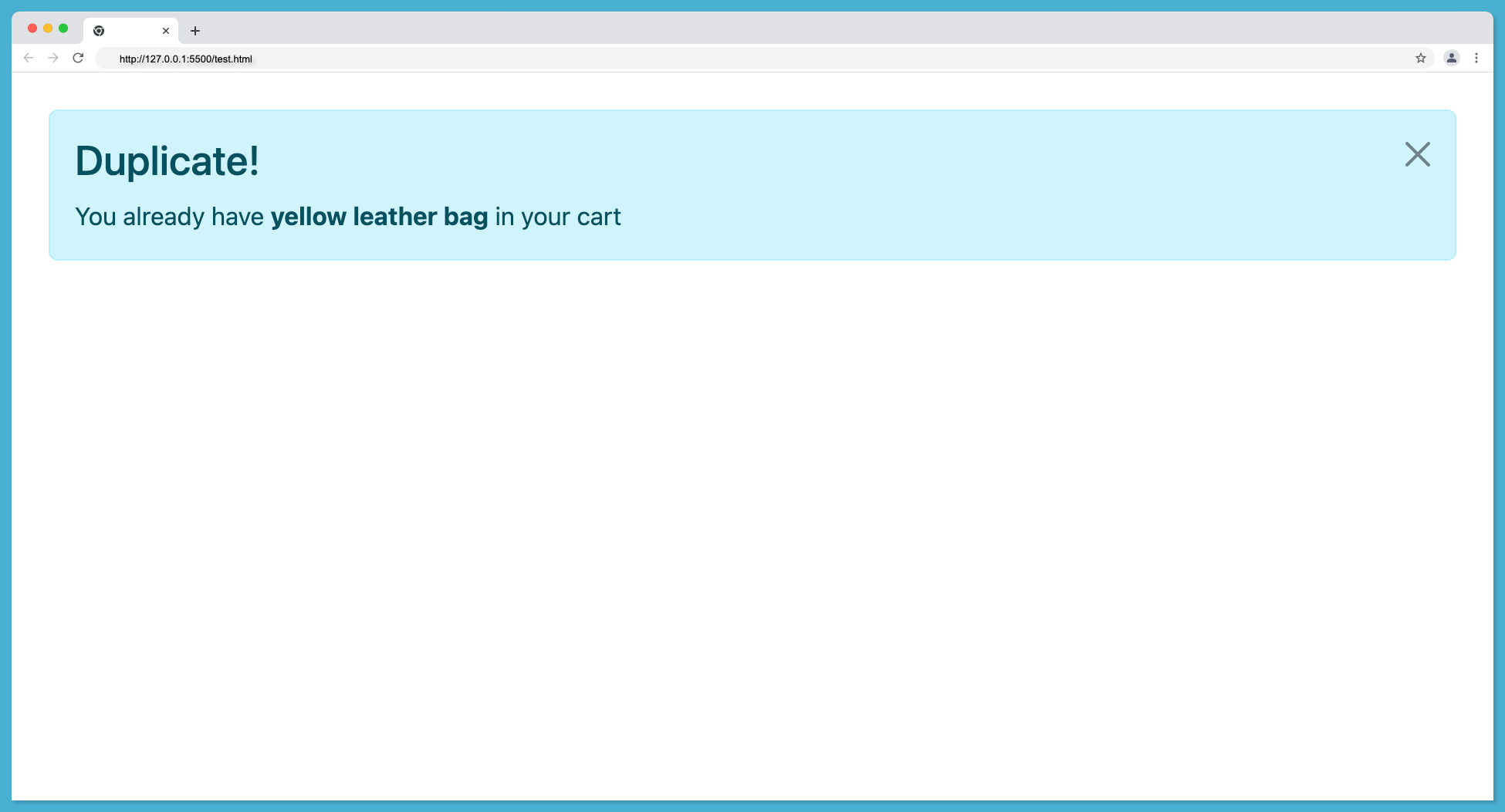
- For duplicate items
<div class="alert alert-info alert-dismissible fade show" role="alert">
    <h3>Duplicate!</h3>
    You already have <strong>yellow leather bag</strong> in your cart
    <button
    type="button"
    class="btn-close"
    data-bs-dismiss="alert"
    aria-label="Close"
    ></button>
</div>
- Output:
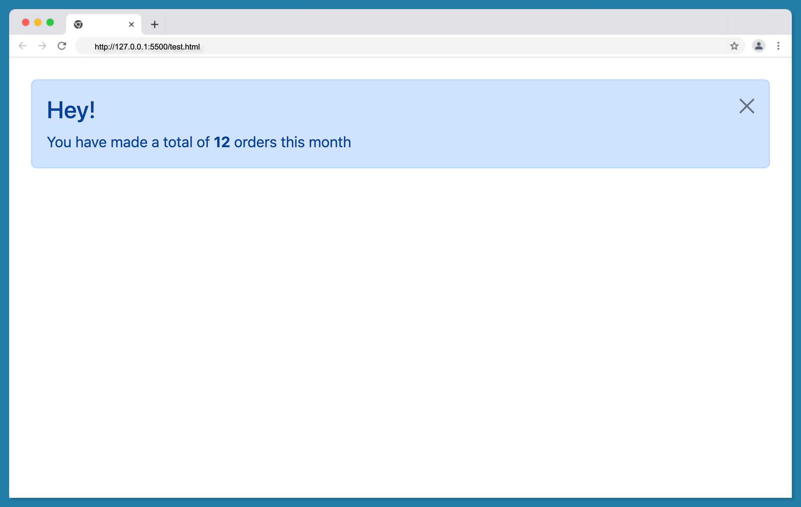
- For displaying the total in the cart
<div class="alert alert-primary alert-dismissible fade show" role="alert">
    <h3>Hey!</h3>
    You have made a total of <strong>12</strong> orders this month
    <button
    type="button"
    class="btn-close"
    data-bs-dismiss="alert"
    aria-label="Close"
    ></button>
</div>
- Output:
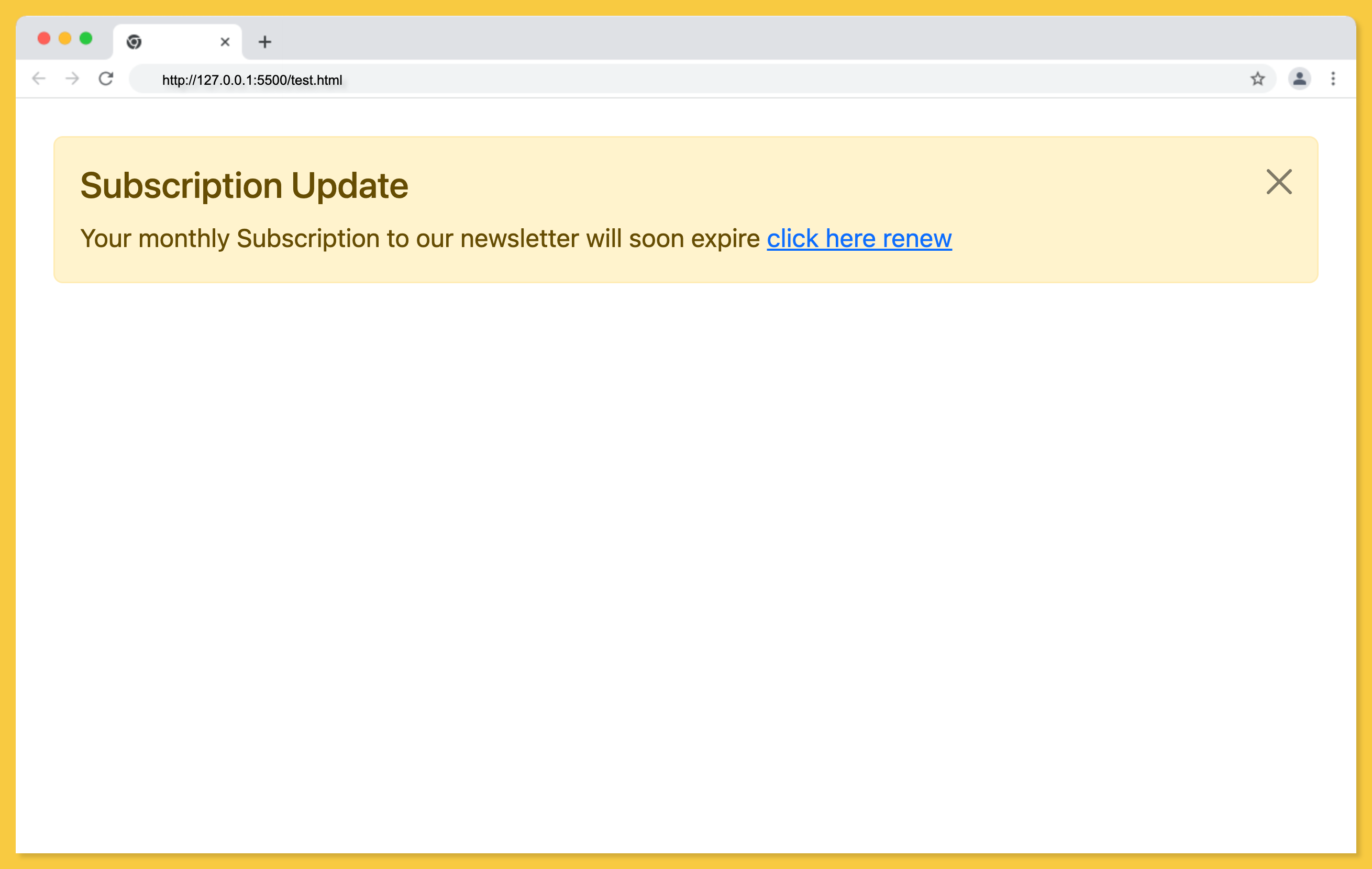
Adding Link in Bootstrap Alert
In some cases, alerts might need to have internal or external links embedded into them. Maybe the alert is for a new policy change and you need to provide a link to the policy document, or you want to inform the user that their subscription is about to expire and you want to provide a link to the subscription page then you need to embed the link in the alert element.
A simple warning alert with a link may go as follows:
<div class="alert alert-warning alert-dismissible fade show" role="alert">
    <h4>Subscription Update</h4>
    Your monthly Subscription to our newsletter will soon expire
    <a href="#">click here renew</a
    ><button
    type="button"
    class="btn-close"
    data-bs-dismiss="alert"
    aria-label="Close"
    ></button>
</div>
Output:
A simple primary alert with a link:
<div class="alert alert-primary alert-dismissible fade show" role="alert">
    <h4>Policy Update</h4>
    We updated our company policy,
    <a href="#">click here to read more</a
    ><button
    type="button"
    class="btn-close"
    data-bs-dismiss="alert"
    aria-label="Close"
    ></button>
</div>
Output:
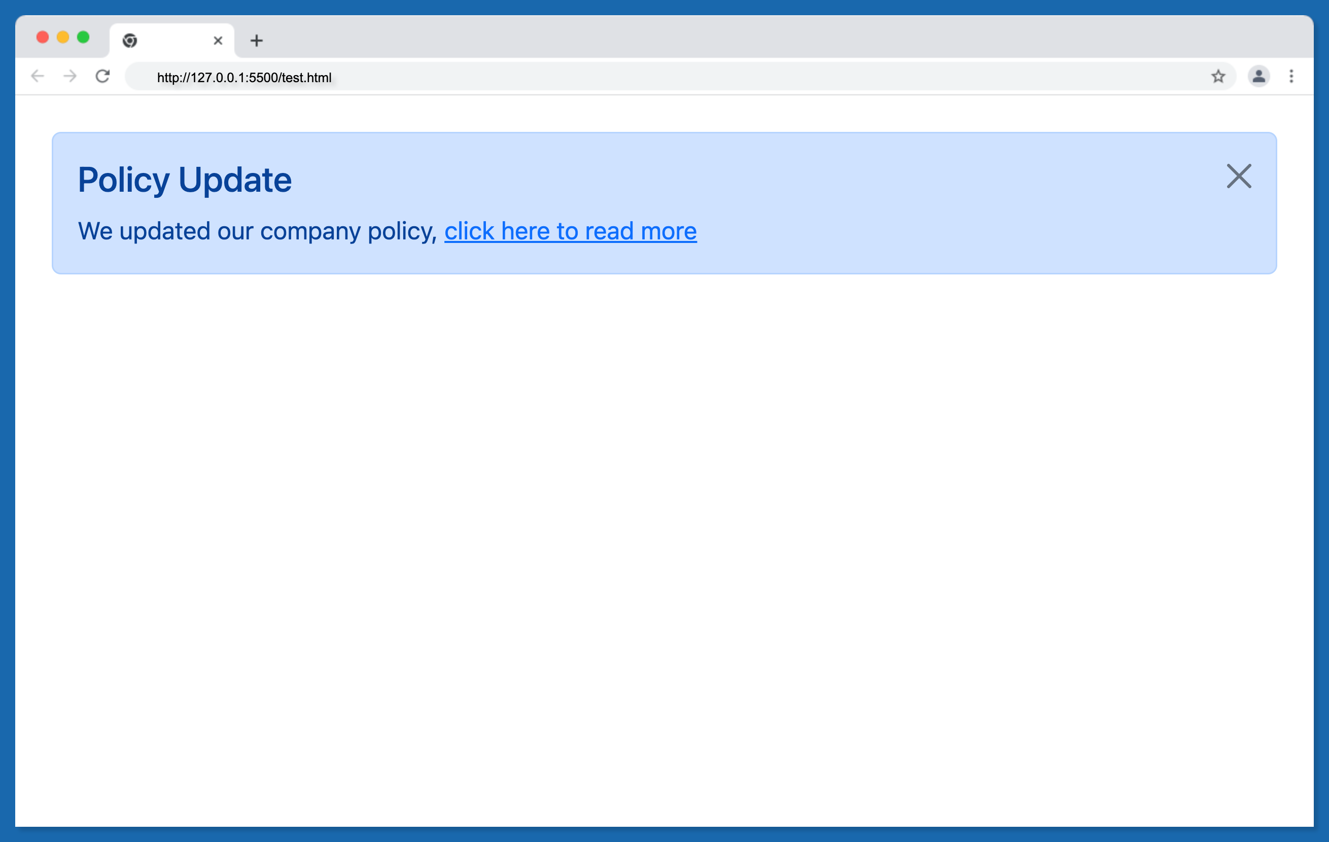
In the two examples above, links are easily embedded in an alert element. But there is a problem, the link is not taking the style of the alert element, which will be discussed in the next section.
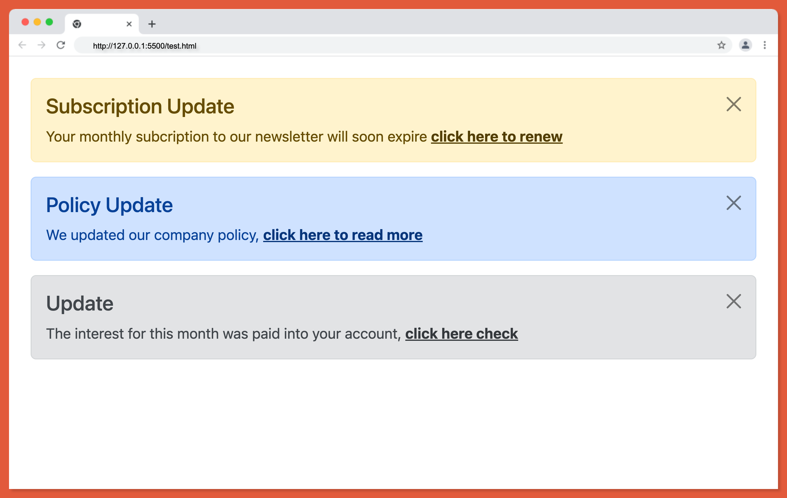
Matching Links Color inside Alerts
To provide matching colored links within any alert, use the alert-link utility class. This ensures that the color of the link matches the color of the alert. This in turn gives the alert a better feel.
The example below transforms the previous examples into appropriate colors:
<div class="alert alert-warning alert-dismissible fade show" role="alert">
    <h4>Subscription Update</h4>
    Your monthly subcription to our newsletter will soon expire
    <a href="#" class="alert-link">click here to renew</a
    ><button
    type="button"
    class="btn-close"
    data-bs-dismiss="alert"
    aria-label="Close"
    ></button>
</div>
<div class="alert alert-primary alert-dismissible fade show" role="alert">
    <h4>Policy Update</h4>
    We updated our company policy,
    <a href="#" class="alert-link">click here to read more</a
    ><button
    type="button"
    class="btn-close"
    data-bs-dismiss="alert"
    aria-label="Close"
    ></button>
</div>
<div class="alert alert-secondary alert-dismissible fade show" role="alert">
    <h4>Update</h4>
    The interest for this month was paid into your account,
    <a href="#" class="alert-link">click here check</a
    ><button
    type="button"
    class="btn-close"
    data-bs-dismiss="alert"
    aria-label="Close"
    ></button>
</div>
Output:
Wrapping Up
With Bootstrap alert, developers can easily use predesigned responsive alerts for push notifications without having to write the code from scratch. This will allow for maintaining consistency among projects when using multiple developer teams.
Additionally, due to the many customization options, alerts may simply be adjusted to match the majority of UI styles.
Watch the video tutorial below to learn more about how to create a real-world Bootstrap alert application.
Finally, more articles like this are on our CopyCat blog. CopyCat converts your Figma files into a ready-to-use React project, saving you over 35% of development time. You can check out CopyCat here.
Interesting Reads From Our Blogs
- How to Create an Amazing Bootstrap Navbar Complete Guide
- Understanding Bootstrap Colors in Full
- Use Bootstrap Flex in Your React Projects for Great Web Design
- A Complete Guide On How to Use Bootstrap Breakpoints
Happy Coding 👨🏽💻
Related Articles
-
React.js
All You Need to Know About Working With React Suspense
Handling data fetching can be tedious with a lot of loading states to manage in a React component, and most of the time, they’re not implemented properly which might cause the app to crash. To address this issue, the React…
August 4, 2022 -
React.js
Why Server Side Rendering is Better Than Client Side Rendering
Server Side Rendering in React https://www.debugbear.com/blog/server-side-rendering We're officially in the age of server-side rendered React apps. Companies like Netflix, Airbnb, and Uber have already adopted server-side rendering (SSR) as a powerful technique for building high-performance and secure React applications. In…
February 28, 2023


