 November 24, 2022
  Uncle Big Bay


Introduction
The Bootstrap navbar or navigation bar is an essential component of a website. It allows the user to scroll from one section of a webpage to another, or navigate to a different web page entirely.
In this post, we’ll look at how to design a responsive navigation header using bootstrap, a popular CSS mobile-first framework.
Demo 📺
This article also contains bootstrap code samples that you can easily copy and paste as templates to develop bootstrap navbars for your project.
If you’re looking for a tool that can help you convert your Figma designs into React components, check out the CopyCat plugin.
How Navbar Works in Bootstrap
Before we dive into creating navigation bars with bootstrap, let’s take a look at how the navbar component works in bootstrap.
The bootstrap navbar must have the following attributes according to the official documentation:
- The navbar container requires a class of .navbar.
- To control the responsive collapsing of the navigation bar items, the navbar container must have the class of .navbar-expand-{-breakpoint} where the breakpoint can be any of sm, md, lg, xl, and xxl.
- Make use of the bootstrap margin and padding utility classes to add space within and around the navbar container and use the flexbox classes to align the navbar items.
- Bootstrap navbars are responsive by default.
- To add accessibility to your navigation bar, make use of the nav tag or add the role=”navigation” attribute to the navbar container.
- Always indicate the current page by using the aria-current=”page” attribute or aria-current=”true” for the current item in a navbar set.
Now that we have a guide on how navbar works in bootstrap, we’ll start creating navbars in bootstrap in the next section.
Setting Up Bootstrap
There are several ways of setting up bootstrap in a frontend project. We’ll make use of the CDN method in this article.
First, create an index.html file with the following code:
<!DOCTYPE html>
<html lang="en">
<head>
<meta charset="utf-8" />
<meta name="viewport" content="width=device-width, initial-scale=1" />
<title>Bootstrap Navbar Samples</title>
<!-- Bootstrap CSS CDN -->
<link
href="<https://cdn.jsdelivr.net/npm/bootstrap@5.2.2/dist/css/bootstrap.min.css>"
rel="stylesheet"
integrity="sha384-Zenh87qX5JnK2Jl0vWa8Ck2rdkQ2Bzep5IDxbcnCeuOxjzrPF/et3URy9Bv1WTRi"
crossorigin="anonymous"
/>
</head>
<body>
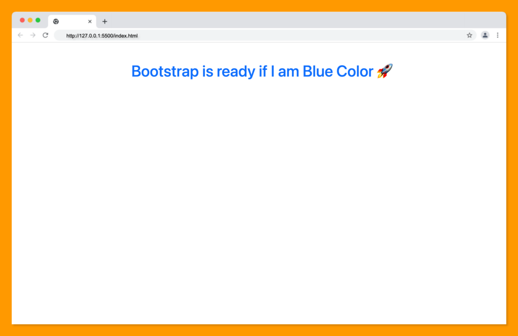
<h1 class="text-center text-primary mt-5">
Bootstrap is ready if I am Blue Color 🚀
</h1>
<!-- Bootstrap JavaScript CDN -->
<script
src="<https://cdn.jsdelivr.net/npm/bootstrap@5.2.2/dist/js/bootstrap.bundle.min.js>"
integrity="sha384-OERcA2EqjJCMA+/3y+gxIOqMEjwtxJY7qPCqsdltbNJuaOe923+mo//f6V8Qbsw3"
crossorigin="anonymous"
></script>
</body>
</html>
Next, to know if bootstrap is properly set up, open your index.html file on your browser.
The text displayed should be blue in color and aligned to the center, as shown below:
With this setup, we can now proceed to create our navigation bars.
Creating navbars with bootstrap is quite easy. We can develop different types of navbars such as navbars that are fixed to the top or fixed to the bottom of the page, navbars with forms, and navbars with brand logos within them.
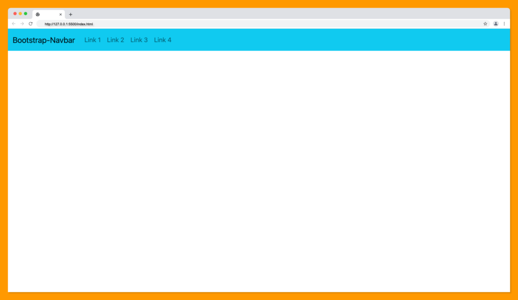
A basic bootstrap navbar code can be written as followings:
<nav class="navbar navbar-expand-lg bg-info">
      <div class="container-fluid">
        <!-- Navbar title -->
        <a class="navbar-brand" href="#">Bootstrap-Navbar</a>

        <!-- Navbar mobile Hamburger -->
        <button
          class="navbar-toggler"
          type="button"
          data-bs-toggle="collapse"
          data-bs-target="#navbarSupportedContent"
          aria-controls="navbarSupportedContent"
          aria-expanded="false"
          aria-label="Toggle navigation"
        >
          <span class="navbar-toggler-icon"></span>
        </button>

        <!-- Navbar Items -->
        <div class="collapse navbar-collapse" id="navbarSupportedContent">
          <ul class="navbar-nav me-auto mb-2 mb-lg-0">
            <li class="nav-item">
              <a class="nav-link" href="#">Link 1</a>
            </li>
            <li class="nav-item">
              <a class="nav-link" href="#">Link 2</a>
            </li>
            <li class="nav-item">
              <a class="nav-link" href="#">Link 3</a>
            </li>
            <li class="nav-item">
              <a class="nav-link" href="#">Link 4</a>
            </li>
          </ul>
        </div>
      </div>
    </nav>
When you add the above bootstrap navigation bar code within the body tag in your index.html file, your page should look something like this:
You can change the color of the navbar text with the bootstrap [text-color utility classes]
(https://getbootstrap.com/docs/5.2/customize/color/).
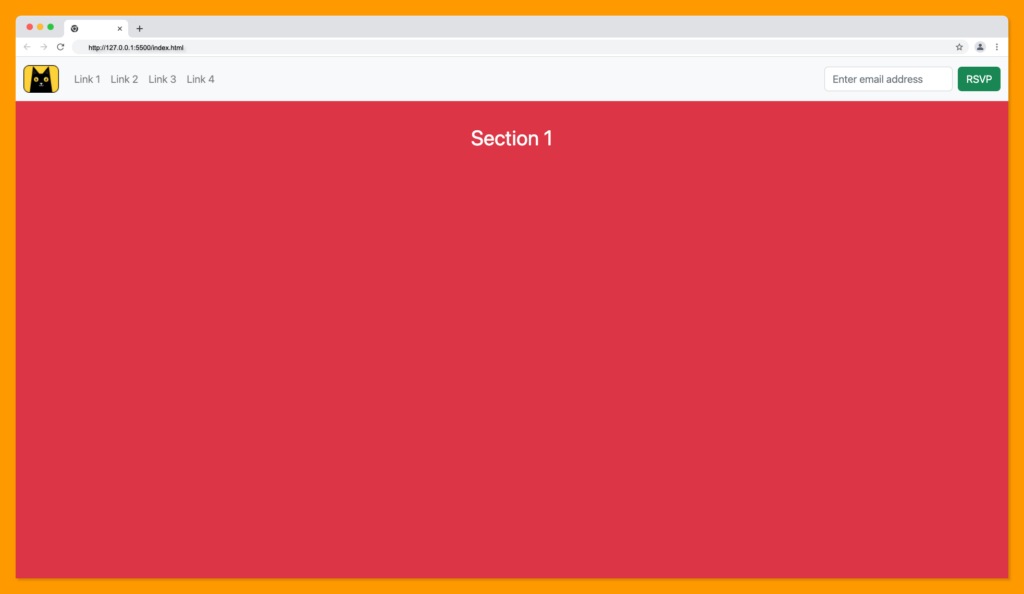
Creating Fixed Top Navbars with Bootstrap
Fixed nav bars are navigation bars that remain at the top of the page even when the user scrolls down the page.
The fixed top navbar will look something like this:
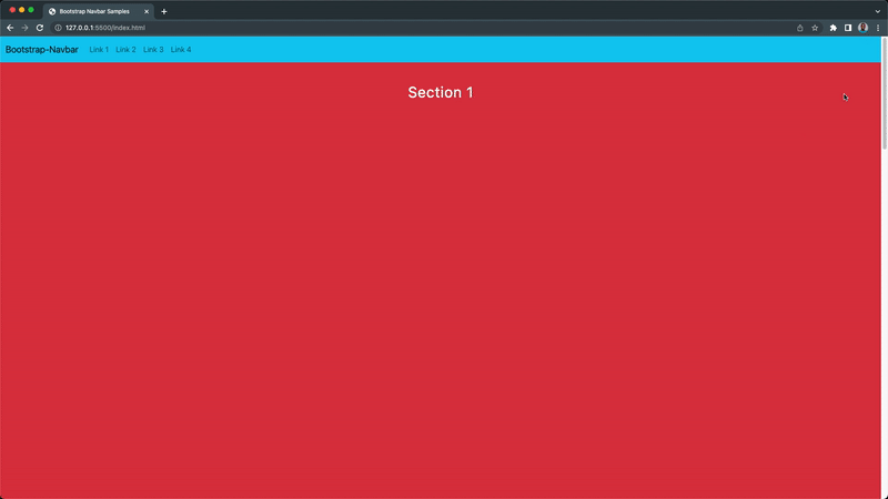
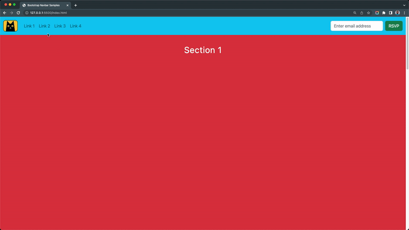
A fixed-top navbar can be created by adding the fixed-top utility class to the navbar container as shown in the following code example:
<nav class="navbar navbar-expand-lg bg-info fixed-top">
    <div class="container-fluid">
    <!-- Navbar title -->
    <a class="navbar-brand" href="#">Bootstrap-Navbar</a>

    <!-- Navbar mobile Hamburger -->
    <button
        class="navbar-toggler"
        type="button"
        data-bs-toggle="collapse"
        data-bs-target="#navbarSupportedContent"
        aria-controls="navbarSupportedContent"
        aria-expanded="false"
        aria-label="Toggle navigation"
    >
        <span class="navbar-toggler-icon"></span>
    </button>

    <!-- Navbar Items -->
    <div class="collapse navbar-collapse" id="navbarSupportedContent">
        <ul class="navbar-nav me-auto mb-2 mb-lg-0">
        <li class="nav-item">
            <a class="nav-link" href="#section-1">Link 1</a>
        </li>
        <li class="nav-item">
            <a class="nav-link" href="#section-2">Link 2</a>
        </li>
        <li class="nav-item">
            <a class="nav-link" href="#section-3">Link 3</a>
        </li>
        <li class="nav-item">
            <a class="nav-link" href="#section-4">Link 4</a>
        </li>
        </ul>
    </div>
    </div>
</nav>

<main class="pt-5">
    <section
    id="section-1"
    class="vh-100 text-center p-5 fs-2 text-white bg-danger"
    >
    Section 1
    </section>
    <section
    id="section-2"
    class="vh-100 text-center p-5 fs-2 text-white bg-warning"
    >
    Section 2
    </section>
    <section
    id="section-3"
    class="vh-100 text-center p-5 fs-2 text-white bg-success"
    >
    Section 3
    </section>
    <section
    id="section-4"
    class="vh-100 text-center p-5 fs-2 text-white bg-info"
    >
    Section 4
    </section>
</main>
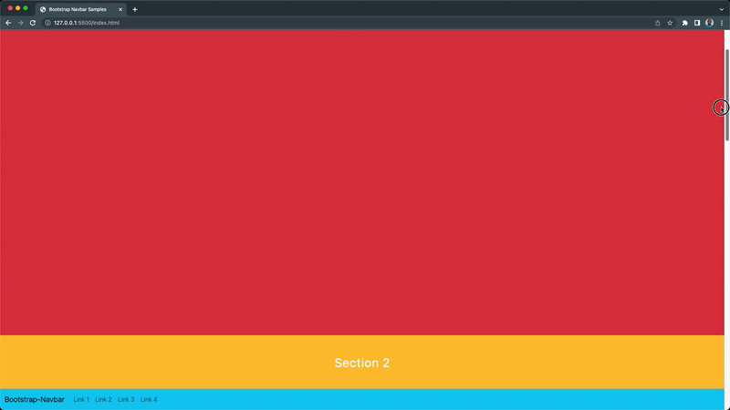
Creating Fixed Bottom Navbars with Bootstrap
If you want your navigation bar to be at the bottom of your page, you can add the fixed-bottom utility class as follows:
<nav class="navbar navbar-expand-lg bg-info fixed-bottom">
    <div class="container-fluid">
    <!-- Navbar title -->
    <a class="navbar-brand" href="#">Bootstrap-Navbar</a>

    <!-- Navbar mobile Hamburger -->
    <button
        class="navbar-toggler"
        type="button"
        data-bs-toggle="collapse"
        data-bs-target="#navbarSupportedContent"
        aria-controls="navbarSupportedContent"
        aria-expanded="false"
        aria-label="Toggle navigation"
    >
        <span class="navbar-toggler-icon"></span>
    </button>

    <!-- Navbar Items -->
    <div class="collapse navbar-collapse" id="navbarSupportedContent">
        <ul class="navbar-nav me-auto mb-2 mb-lg-0">
        <li class="nav-item">
            <a class="nav-link" href="#section-1">Link 1</a>
        </li>
        <li class="nav-item">
            <a class="nav-link" href="#section-2">Link 2</a>
        </li>
        <li class="nav-item">
            <a class="nav-link" href="#section-3">Link 3</a>
        </li>
        <li class="nav-item">
            <a class="nav-link" href="#section-4">Link 4</a>
        </li>
        </ul>
    </div>
    </div>
</nav>

<main class="pb-5">
    <section
    id="section-1"
    class="vh-100 text-center p-5 fs-2 text-white bg-danger"
    >
    Section 1
    </section>
    <section
    id="section-2"
    class="vh-100 text-center p-5 fs-2 text-white bg-warning"
    >
    Section 2
    </section>
    <section
    id="section-3"
    class="vh-100 text-center p-5 fs-2 text-white bg-success"
    >
    Section 3
    </section>
    <section
    id="section-4"
    class="vh-100 text-center p-5 fs-2 text-white bg-info"
    >
    Section 4
    </section>
</main>
The output of the fixed bottom navigation will be as demonstrated below:
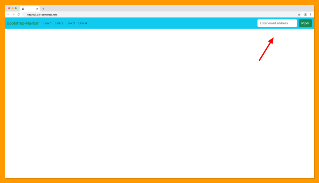
Creating Bootstrap Navbar Forms
Forms are one of the components of a navbar and it’s a popular design that can be very helpful for adding global search functionality on the website or for collecting data from the user for authentication or other purposes.
You can add a horizontal form with flex inside the navbar-collapse container as follows:
<nav class="navbar navbar-expand-lg bg-info">
    <div class="container-fluid">
    <!-- Navbar title -->
    <a class="navbar-brand text-success" href="#">Bootstrap-Navbar</a>

    <!-- Navbar mobile Hamburger -->
    <button
        class="navbar-toggler"
        type="button"
        data-bs-toggle="collapse"
        data-bs-target="#navbarSupportedContent"
        aria-controls="navbarSupportedContent"
        aria-expanded="false"
        aria-label="Toggle navigation"
    >
        <span class="navbar-toggler-icon"></span>
    </button>

    <!-- Navbar Items -->
    <div class="collapse navbar-collapse" id="navbarSupportedContent">
        <ul class="navbar-nav me-auto mb-2 mb-lg-0">
        <li class="nav-item">
            <a class="nav-link" href="#section-1">Link 1</a>
        </li>
        <li class="nav-item">
            <a class="nav-link" href="#section-2">Link 2</a>
        </li>
        <li class="nav-item">
            <a class="nav-link" href="#section-3">Link 3</a>
        </li>
        <li class="nav-item">
            <a class="nav-link" href="#section-4">Link 4</a>
        </li>
        </ul>

        <!-- Navbar form -->
        <form class="d-flex">
        <input
            class="form-control me-2"
            type="email"
            placeholder="Enter email address"
        />
        <button class="btn btn-success" type="submit">RSVP</button>
        </form>
    </div>
    </div>
</nav>
The form will be displayed on the navigation bar as shown in the screenshot below:
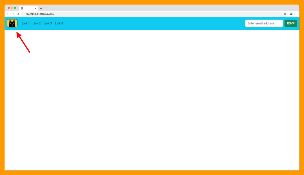
Creating Bootstrap Navbars with Logo
A logo is a website’s brand, and a navbar is an ideal place for displaying a website logo or name to visibly showcase its brand to the user.
Brands are usually at the left side of the navbar and should be placed immediately after the container-fluid container.
The website brand can be a logo or text, and the tag containing the brand should have a class of navbar-brand as shown below:
<nav class="navbar navbar-expand-lg bg-info">
    <div class="container-fluid">

    <!-- Navbar Logo -->
    <img
        class="navbar-brand text-success"
        src="data:image/png;base64,iVBORw0KGgoAAAANSUhEUgAAADYAAAAqCAYAAAD4Uag9AAAACXBIWXMAAAsTAAALEwEAmpwYAAAAAXNSR0IArs4c6QAAAARnQU1BAACxjwv8YQUAAAbFSURBVHgBzVp9TBRHFP/dHsfpISigtYrg1VStJiqFNv7RWDBq2iZNNTYmtaZpjbUW0xBNY4pN/Ag2tbUBayMRkRZtC36kFc/U1lQq2LSJxhYRFIt8HQgHyqEICNwHu523e4eAB7ezgvBLJne3O/v2/Wbee/PezAG+Ec9aFmvVrEmjtF3x6LjCFwFdv99m6hz3ghC/fLEe1MxTdRiNuFomoahMRHK6C1abZGWXFrNm9d7vrXV0aIguf/uGgAmJawL8yUXK9250dALbNvjvy4vT+d345c9uZOwIVNX/m2w3kg+6W+61SkSuiK4JnntmIvXHIaMqUoSGJgk7D7hwMq8bQ4nKOgnvbXPieqWk+hnSmXQnDlCsroeYPFMLZqs3uxqbKH+SEuU16pUYDM0tEl75wIH77eCWSboTByh+JxNbwfzIrHamvLjmGdEHzBxfTXCg/s7jk1uT5ES1TZHTfF9ClwNcIA4UH9jXeJnY9g/5/aSuUUJQUBB0Oh05L97c7IQoQjO27Xfh3EURer0eJpNJvlbbwC+QAh7Du0RswYLZAtfD99sldHQBBoMBISEh8rXL10Vs/soFLcg65cbnmW75e2hoKARB0aewjN8KPMTkGYuO5iRmrVdeSAqMGzcORqNR/r3/qBt7stxcskqZSSd8pgyIV5aXWK2Nf8Y8y5OZj5EHJeUKMTIbQlhYWM/3rftcyLuoLlLeui3h9Y8ccLmV2R8/fnwfuXW3tfutJmK2pr7EaIQnTpzY81sOAvWDK0X+uHKTEzUNkvx8eHh4z72AAMXnK2qhGZqINTYrJkKBo7cyXnL2FmDZeoccvgfCpj0uFN5Q5BAp76B4ZRGuV2qPRpqIVbNFlEh5fcELUs6rJIXttz9xoqVNeqSlsqwl7Zjii+RXJEfsFVLpN8mnJKBbIzdN+dC1CqmHlNvtRnt7Ozo7O/soR8i7JCJ8UdegsuhZarIybKaIKC0jgYGBcDgczOxFRE7mH39NxOrZSJISbW1taG1txVCBBqmlpUUmRMGEPktuSowYuMFNjCWa7IXkX075xcMBmn2vRZTXaouM3HNM/kWQpKHJDweC16xtd54QsZKKx8ibNMBqe0LEfI0gpWQ5e8biam4wDu404Zlp6sU+GyXg0C4TCk8G43iqCS/H6vvcL76pbSC5iTU29yW2cL4el7KDsHKJAU1dC7F+ezMKzuyAOcK/6OdmCCj8ex/WfdoEe0cslscFIC/DhNWvGXr60AKuBdzEqur6vij1YyOLQBJ+OutEliWcBZUxiIiYji3rjH5lfb3VhKCQOdAJJhw5Mxk/WpwQmO9+kRgI79rvcGLQhX4gcBMr7VfZxszRs/0FiaU/InJPnkD23plw1W3Golj/AffFeXo4rW/h290zkPvzCSZDyTGnPqXDpAkPs5obVcNMjAJh/4LSzkZTpCzfpIOBcRkj2KgnGpv8K9N8j/WR3Bijvy0/GxIsQBJ06JYEtHU87Fdaxe9nXMSoqnX1q0oyc10Qmd0sXxaI5+fqsXih4h8/nHb6lXfgmLIOLnvJgPmzBKxgMkSdgKNnXeh0PByYOg0hn2uBrvSxWCanOxAxRY933gjEb5nj5FndndGlitjeIw5MY+lSwmojfj8cLF87XeDCpi/7pmH1jfzEyJCl7qKxqjpnWdx4f4fvKnna0wJmTRdQXNYtmycPJoXpMG+mHpW3xJ5Not6ImSvgco7/YOSFPrqTb8bqByn86hpFuWlB010J5y8NXHmX1wyzj/Vfw9SASn2LxYLq6mq5FRcXw2w284hA2wPaDeN7NxexCg0JKSXKCQkJcuYeGRmJxMREWK1W8II3GeYi9p+G9YRgs9mwatUqpKSkoKCgAFpANSAPVBOjZLvBzic8JiYGSUlJcu0WFxeHqKgouYBcunQpNm7cyCWLd49RNTGKdG7ObfrCwkLY7Xakp6fLRWlOTg7S0tIQGxuLzMxMLlkNTXyDqjrc/3VFRNza4Sks1YBtXeN8prqQT+Fe9YzdqHqydVh/lFbx+5jVqmLHlde/hhp2llc6VeygXy2TuRQRsQuWfBXEmkaWGKVqt1QkAEXKfr9M7LAl339UKLOOLDFCiYqQT0e3DKeIWMGFf8SCfdmDHybcHAXEqOYbDMTBcx5t8QaPtbvYGa7HPh8Bhfk7d0eeWKN94Ht02E4coByy90RFKx1ML1nvaPE1c0Sqe2SDooyB0irSmXT3HK5bffUxs1bNzpik75IN0r/HjbTGSecyAof7PxuqWtQUnawPtcpfjVLqFoPE1je6l+/R3S/oTyGHofxJZFSQ8tGqoRykx/si8D929mPF2R4CBwAAAABJRU5ErkJggg=="
    />

    <!-- Navbar mobile Hamburger -->
    <button
        class="navbar-toggler"
        type="button"
        data-bs-toggle="collapse"
        data-bs-target="#navbarSupportedContent"
        aria-controls="navbarSupportedContent"
        aria-expanded="false"
        aria-label="Toggle navigation"
    >
        <span class="navbar-toggler-icon"></span>
    </button>

    <!-- Navbar Items -->
    <div class="collapse navbar-collapse" id="navbarSupportedContent">
        <ul class="navbar-nav me-auto mb-2 mb-lg-0">
        <li class="nav-item">
            <a class="nav-link" href="#section-1">Link 1</a>
        </li>
        <li class="nav-item">
            <a class="nav-link" href="#section-2">Link 2</a>
        </li>
        <li class="nav-item">
            <a class="nav-link" href="#section-3">Link 3</a>
        </li>
        <li class="nav-item">
            <a class="nav-link" href="#section-4">Link 4</a>
        </li>
        </ul>
        <!-- Navbar form -->
        <form class="d-flex">
        <input
            class="form-control me-2"
            type="email"
            placeholder="Enter email address"
        />
        <button class="btn btn-success" type="submit">RSVP</button>
        </form>
    </div>
    </div>
</nav>
The above code will produce the following result:
Bootstrap Responsive Navbar
Bootstrap navbars are responsive by default, we can control when their contents should be collapsed using the following utility classes:
- .navbar-toggler for the hamburger button.
- .navbar-collapse to control the visibility of the navbar items.
- .navbar-expand{-sm|-md|-lg|-xl|-xxl} to determine the breakpoint at which the hamburger should be visible and the navbar items should be hidden.
By combining the three utilities classes together, we’re able to make our bootstrap navbar responsive as follows:
You can go ahead and play with the utility classes to make the bootstrap navbar below responsive:
Bootstrap Navbar Color Scheme
Bootstrap navbar theming makes it easier to apply several color schemes to our navbar. Under the hood, bootstrap uses Sass and CSS variables to achieve the color scheme.
Below are some of the color schemes that you can apply to your bootstrap navbar:
Light Theme (default)
We can make our navbar a light theme by adding the navbar-light and bg-light classes to the navbar container:
<nav class="navbar navbar-light bg-light"></nav>
Which will produce the following color scheme:
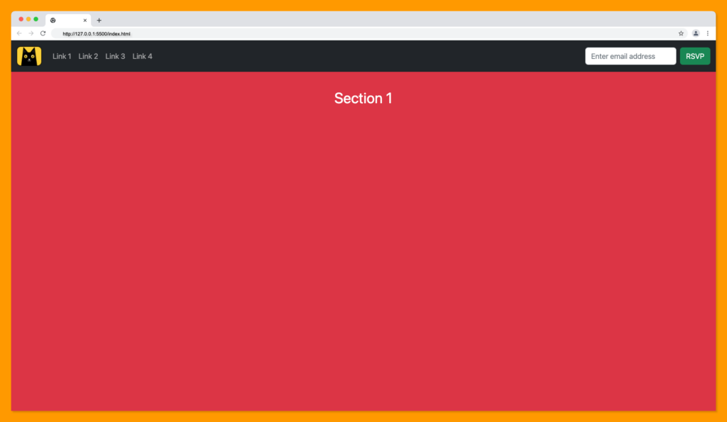
Dark Theme
The dark mode is a popular color scheme on websites, we can make a dark theme navbar by adding the navbar-dark and bg-dark classes to the navbar container:
<nav class="navbar navbar-dark bg-dark"></nav>
The navbar dark theme will look something like this:
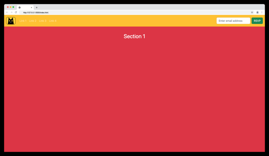
We can also combine any of navbar-dark and navbar-light with any bootstrap background utility classes such as bg-success, bg-warning, etc.
Some customization might require custom CSS, you can also combine navbar-dark and bg-warning classes to produce the following navbar theme:
Collapsing the Navigation Bar
Collapsing the navbar is the ability to hide the navbar items and display the hamburger button at the specified breakpoint when there’s limited space.
The bootstrap has a custom attribute data-bs-toggle which is set to the hamburger button name with a value of collapse. This attribute allows the button to hide and display the items when toggled.
<!-- Navbar mobile Hamburger -->
<button
    data-bs-toggle="collapse"
    class="navbar-toggler"
    type="button"
    data-bs-target="#navbarSupportedContent"
    aria-controls="navbarSupportedContent"
    aria-expanded="false"
    aria-label="Toggle navigation"
>
    <span class="navbar-toggler-icon"></span>
</button>
To specify the items to collapse when the hamburger button is been toggled, we add the collapse and navbar-collapse classes to the parent container of the navbar item, as follows:
<!-- Navbar Items Container-->
<div class="collapse navbar-collapse" id="navbarSupportedContent">
    <ul class="navbar-nav me-auto mb-2 mb-lg-0">
	    <li class="nav-item">
        <a class="nav-link" href="#section-1">Link 1</a>
	    </li>
    </ul>
</div>
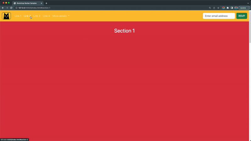
Navigation Bars with Dropdown Menus
Dropdowns are the popular implementation for hiding navbar contents such as links or text and will be made visible when the user clicked the dropdown button.
We can make use of the dropdown utility classes in bootstrap to achieve this. Copy and paste the following nav item in the navbar nav container.
<li class="nav-item dropdown">
    <a
    class="nav-link dropdown-toggle"
    href="#"
    role="button"
    data-bs-toggle="dropdown"
    aria-expanded="false"
    >
    More details
    </a>
    <ul class="dropdown-menu dropdown-menu-dark">
    <li><a class="dropdown-item" href="#">Link 5</a></li>
    <li><a class="dropdown-item" href="#">Link 6</a></li>
    <li>
        <hr class="dropdown-divider" />
    </li>
    <li><a class="dropdown-item" href="#">Link 7</a></li>
    <li><a class="dropdown-item" href="#">Link 8</a></li>
    <li><a class="dropdown-item" href="#">Link 9</a></li>
    <li><a class="dropdown-item" href="#">Link 10</a></li>
    </ul>
</li>
The above dropdown code snippet will produce the following:
Wrapping Up
Bootstrap is one of the most powerful CSS frameworks available with highly customizable components. We covered the anatomy of how to construct a responsive navbar using bootstrap in this article.
Finally, you can find more incredible articles like this on our blog at CopyCat. CopyCat is a tool that saves you about 35% of development time by converting your Figma files to an up-and-running React project. Check it out here.
Interesting Reads From Our Blogs
- 10 CSS Frameworks for Frontend Developers in 2022
- Your Introductory Guide to React Intl
- The Top 16 Design System Examples
Check out the CopyCat plugin for React if you’re seeking for amazing React tools to help you build component code faster and be production ready sooner than your competition!
Happy Coding!
Related Articles
-
 React.js
Complete Guide to React Lazy Loading and Code Splitting
What is lazy loading in React? Lazy loading in React is an optimization technique for websites or web applications. It is also known as on-demand loading because it only loads content visible on users' screens. What does optimization mean? Web…
June 9, 2022 -
React.js
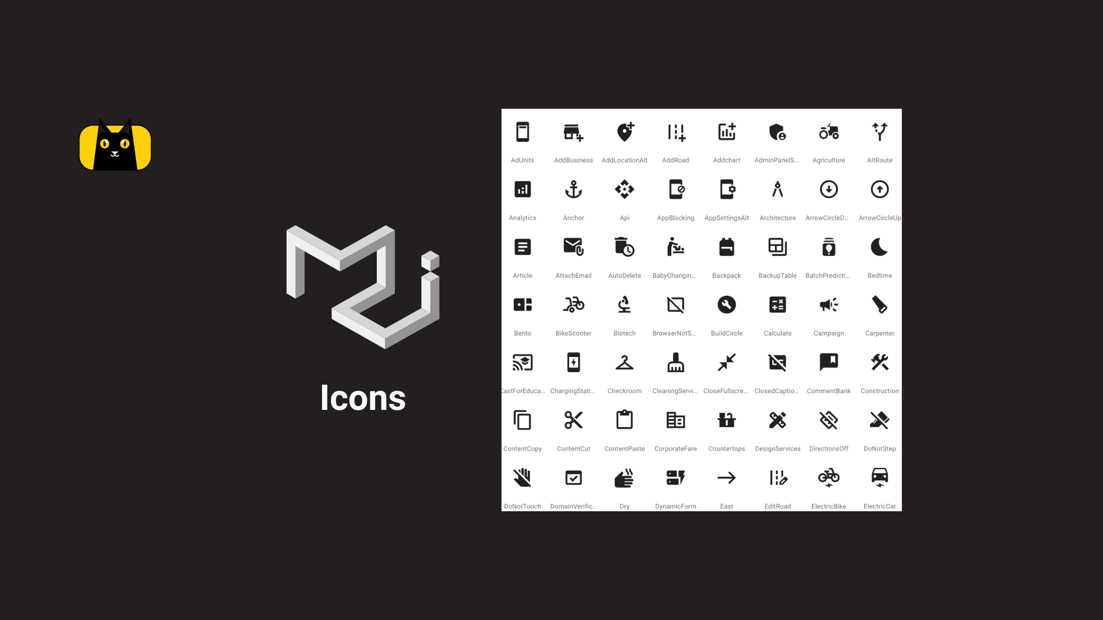
Material UI Icons: Your Secret Weapon for Better Web Design
What are Material UI Icons? Material UI icons (mui icons) are essential to modern web development, providing designers and developers with a vast library of scalable and customizable icons to use in their projects. While the default Material UI icons…
February 22, 2023

