
 November 29, 2022
  Faith Ajayi


- Prerequisites
- What are the breakpoints for Bootstrap?
- Screen proportion and media queries
- 1. Bootstrap Minimum width (Min width)
- 2. Bootstrap Maximum width (Max width)
- 3. Single Breakpoint
- 4. Between Breakpoint
- Comparison of Bootstrap versions
- What is the Bootstrap 5 breakpoint?
- What is the Bootstrap 4 breakpoint?
- Conclusion
- Interesting Reads from our Blog.

Bootstrap breakpoints are resizable widths that control how your responsive layout functions in the different viewport or device sizes. In general, the fundamental idea behind Bootstrap is to organize the countless different device screen widths (or viewports), group them into a few ranges, and then style and rearrange the content in accordance.
It is therefore important that software developers, especially frontend web developers, gain knowledge on Bootstrap breakpoints, its applications and importance. This article is a quick beginner-friendly tutorial. It intends to introduce and teach you the basics, applications, core concepts breakpoints, and importance of Bootstrap breakpoints.
Before we continue, check out our Copycat tool, which helps you build UI faster than your competition. The Copycat Figma Bootstrap plugin converts your Figma designs into fully supported production-ready Bootstrap and React.js codes.
Prerequisites
To benefit more from this article you must have;
- Knowledge of HTML/CSS.
- Knowledge of Bootstrap framework.
What are the breakpoints for Bootstrap?
Every web developer is always concerned with making sure users have a great user experience while using the website. Building a one hundred percent responsive website is imperative when it comes to making sure users have a great experience.
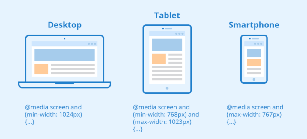
However, Bootstrap features six default breakpoints that may be customized from the source Sass files of the framework in order to build breakpoints that make sense for our layouts and user interfaces because it was designed with mobile devices in mind.
Each breakpoint was set to accommodate containers with widths that are multiples of 12 without discomfort. Breakpoints don’t particularly target any one use case or device; instead, they reflect a subset of typical device sizes and viewport dimensions. The ranges offer a solid and reliable base to build for almost any device.
The available breakpoints in bootstrap include:
- X-small devices (`None <576px`)
- Small devices (`sm ≥576px`)
- Medium devices (`md ≥768px` )
- Large devices (`lg ≥992px`)
- Extra large devices (`xl ≥1200px`)
- Extra extra large devices (`xxl ≥1400px`)
For every breakpoint class, infix dimensions above represent and span multiple breakpoint widths and screen sizes.
Screen proportion and media queries
CSS Media queries allow you to target a browser based on specific traits, functions, and user preferences. Then, you can apply styles or run other code based on those characteristics, features, or preferences. One of the most popular media queries in the community is those that target specific viewport ranges and apply custom styles, which gave rise to the concept of responsive design.
Moreover as previously said, bootstrap leverages a few media queries to generate logical breakpoints for our layouts and interfaces because it was designed with mobile devices in mind. These breakpoints allow us to scale up elements when the viewport changes and are mostly dependent on minimum viewport widths.
In this article we would be discussing the following bootstrap media queries and screen proportions;
- Bootstrap Minimum width (Min width)
- Bootstrap Maximum width (Max width)
- Single Breakpoint
- Between Breakpoints
1. Bootstrap Minimum width (Min width)
This media query determines if the width of the viewports is equal to or greater than the minimum width variable value of the specified breakpoint.
For its layout, grid system, and components, Bootstrap primarily employs the following media query ranges or breakpoints in its source SASS files. See the example below:
// Source mixins

// No media query necessary for xs breakpoint as it's effectively `@media (min-width: 0) { ... }`
@include media-breakpoint-up(sm) { ... }
@include media-breakpoint-up(md) { ... }
@include media-breakpoint-up(lg) { ... }
@include media-breakpoint-up(xl) { ... }
@include media-breakpoint-up(xxl) { ... }
The above SASS mixins translate sensible breakpoints in Bootstrap. For example;
Hiding a div element starting at min width of 0 (zero) and then showing it at the sm breakpoint which is greater than or equal to `576-pixel` screen sizes can be implemented in the way below:
.custom-class {
  display: none;
}
@include media-breakpoint-up(sm) {
  .custom-class {
    display: block;
  }
}
The values declared in these SASS mixins’ SASS are translated into Bootstrap’s generated CSS. For example:
// X-Small devices (portrait phones, less than 576px)
// No media query for `xs` since this is the default in Bootstrap

// Small devices (landscape phones, 576px and up)
@media (min-width: 576px) { ... }

// Medium devices (tablets, 768px and up)
@media (min-width: 768px) { ... }

// Large devices (desktops, 992px and up)
@media (min-width: 992px) { ... }

// X-Large devices (large desktops, 1200px and up)
@media (min-width: 1200px) { ... }

// XX-Large devices (larger desktops, 1400px and up)
@media (min-width: 1400px) { ... }
2. Bootstrap Maximum width (Max width)
This media query also determines if the width of the viewports is equal to or greater than the maximum width variable value of the specified breakpoint.
However, the following media query ranges or breakpoints are mostly used by Bootstrap for its layout, grid system, and components in its source SASS files. See the code illustration below:
// No media query necessary for xs breakpoint as it's effectively `@media (max-width: 0) { ... }`
@include media-breakpoint-down(sm) { ... }
@include media-breakpoint-down(md) { ... }
@include media-breakpoint-down(lg) { ... }
@include media-breakpoint-down(xl) { ... }
@include media-breakpoint-down(xxl) { ... }

// Example: Style from medium breakpoint and down
@include media-breakpoint-down(md) {
  .custom-class {
    display: block;
  }
}
These mixins use the declared breakpoints as the Bootstrap’s maximum width values after deducting.02 pixels from them. For instance:
// X-Small devices (portrait phones, less than 576px)
@media (max-width: 575.98px) { ... }

// Small devices (landscape phones, less than 768px)
@media (max-width: 767.98px) { ... }

// Medium devices (tablets, less than 992px)
@media (max-width: 991.98px) { ... }

// Large devices (desktops, less than 1200px)
@media (max-width: 1199.98px) { ... }

// X-Large devices (large desktops, less than 1400px)
@media (max-width: 1399.98px) { ... }

// XX-Large devices (larger desktops)
// No media query since the xxl breakpoint has no upper bound on its width
3. Single Breakpoint
Bootstrap’s media queries are so precisely targeted that using the minimum and maximum breakpoint widths, it took care of targeting a single range of screen sizes. Comparison of Bootstrap versions. See the code illustration below;
@include media-breakpoint-only(xs) { ... }
@include media-breakpoint-only(sm) { ... }
@include media-breakpoint-only(md) { ... }
@include media-breakpoint-only(lg) { ... }
@include media-breakpoint-only(xl) { ... }
@include media-breakpoint-only(xxl) { ... }
If we are to relate or experiment with one of the SASS mixins above using custom CSS to target a single range of screen sizes we would have the following below;
In this case, we would take `@include media-breakpoint-only(md) { … }` as an example.
This will give us;
@media (min-width: 768px) and (max-width: 991.98px) { ... }
4. Between Breakpoint
With the help of the minimum and maximum breakpoint widths, Bootstrap’s media queries were able to target multiple ranges of screen sizes. For example;
If we would want a div element to be visible on devices that span across medium screens and maximum screen sizes, we would have the following code illustration;
@include media-breakpoint-between(md, xl) { ... }
The above SASS mixins in traditional CSS will be implemented as illustrated below;
// Example
// Apply styles starting from medium devices and up to extra large devices
@media (min-width: 768px) and (max-width: 1199.98px) { ... }
Comparison of Bootstrap versions
In order to make it easier for developers to easily customize web pages, Bootstrap has been working nonstop to improve the developer experience. Both minor and major versions have been made available. However, the most widely used major releases are Bootstrap v4.x and Bootstrap v5.x.
In comparison to the previous versions, Bootstrap 4 was greatly improved when it was released back in January 2018. The bootstrap 4 release has made advancements by introducing new device widths to expand support from tablets to smaller devices. The new grid tiers specified the following device widths;
- sm: 576px and up
- md: 768px and up
- lg: 992px and up
- xl: 1200px and up
Bootstrap 5 went into effect in May 2021. Although it retains the grid system from bootstrap 4. However, an additional grid tier `xxl` has been added to reduce the effort required to make the pages responsive on higher-resolution displays.
What is the Bootstrap 5 breakpoint?
As previously discussed in this article, Bootstrap 5 breakpoint is the most recent upgrade. With this upgrade, bootstrap’s CSS aims to cover a wide range of display sizes, from small devices to extra-extra-large devices using its grid tiers. In this section, we will look at and discuss how to use the Bootstrap 5 breakpoint.
How to use Bootstrap 5 breakpoint
Let’s imagine we have a website that has a row and column of boxes, for example:
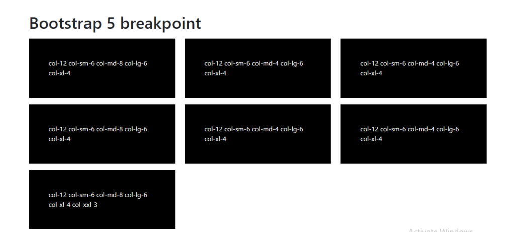
As seen in the image above, the current display is on a desktop display, however, a good developer would be concerned about how these boxes would appear on tablets, and mobile screens, thanks to Bootstrap breakpoints, with its help, the concerns for responsiveness can be solved. Now let’s take a look below at what the above image would look like without Bootstrap 5 breakpoints;
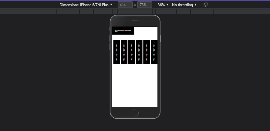
As seen in the image above the good-looking black boxes are now squeezed together and also have extra width to the sides which is already a bad user experience. Let’s try out the Bootstrap 5 breakpoints with the lines of code below to make the above view beautiful and responsible across different screen sizes;
<div class="container my-5">
    <h1>Bootstrap 5 breakpoint</h1>
    <div class="row">
        <div class="col-12 col-sm-6 col-md-8 col-lg-6 col-xl-4 col-xxl-3">
            <div class="box bg-black text-white my-2 p-5">col-12 col-sm-6 col-md-8 col-lg-6 col-xl-4 col-xxl-3</div>
        </div>
        <div class="col-12 col-sm-6 col-md-4 col-lg-6 col-xl-4 col-xxl-3">
            <div class="box bg-black text-white my-2 p-5">col-12 col-sm-6 col-md-4 col-lg-6 col-xl-4 col-xxl-3</div>
        </div>
        <div class="col-12 col-sm-6 col-md-4 col-lg-6 col-xl-4 col-xxl-3">
            <div class="box bg-black text-white my-2 p-5">col-12 col-sm-6 col-md-4 col-lg-6 col-xl-4 col-xxl-3</div>
        </div>
        <!-- xxl -->
        <div class="col-12 col-sm-6 col-md-8 col-lg-6 col-xl-4 col-xxl-3">
            <div class="box bg-black text-white my-2 p-5">col-12 col-sm-6 col-md-8 col-lg-6 col-xl-4 col-xxl-3</div>
        </div>
    </div>
</div>
Understanding the code logic
In the above lines of code, it is seen that there are divs with classes like;
class="col-12 col-sm-6 col-md-8 col-lg-6 col-xl-4 col-xxl-3"
In Bootstrap, the numbers are from a range of 1-12, these numbers represent the portion of the total width of any div, and each divs are divided into 12 columns. What this means is that
col-sm-6
spans 6(50%) of 12(100%) columns (half the width) on small devices and landscape phones that are greater than or equal to 576px. This means that the div should take half width of the div on small screen sizes. Also in the code implementation above, there are divs with different portion measurements on medium screen sizes, for example;
<!-- 2nd div -->
   class="col-12 col-sm-6 col-md-4 col-lg-6 col-xl-4 col-xxl-3"
<!-- 7th div -->
   class="col-12 col-sm-6 col-md-8 col-lg-6 col-xl-4 col-xxl-3"
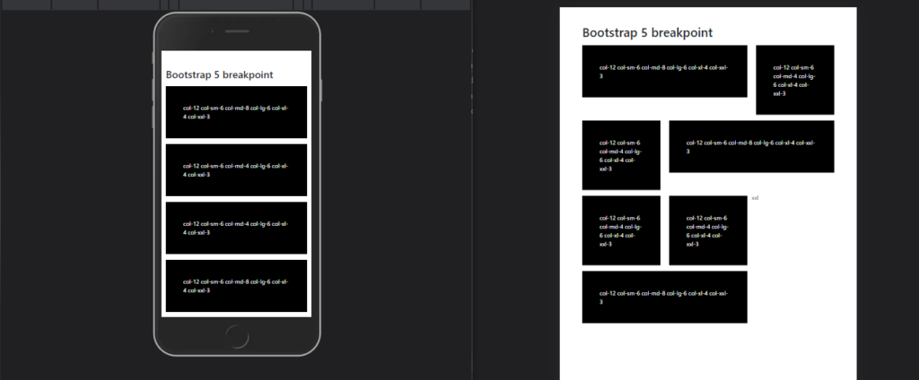
What this means is that for screen sizes that are greater than or equal to 768px, the divs should take unequal column width, the 2nd div should take 4 of 12 columns on medium screen size and the 7th div should take 8 of 12 columns on medium screen size. See the result below;
Result
What is the Bootstrap 4 breakpoint?
Bootstrap 4 and Bootstrap 5 breakpoints maintain the same grid system with the exception that Bootstrap 4 does not cover `xxl` screen sizes that are greater than or equal to 1,400px. However, in this section, we would go over how to change and control the way our user interfaces are viewed on different screen sizes.
How to use Bootstrap 4 breakpoint.
As discussed earlier in this article bootstrap 4 comes with `sm, md, lg`, and `xl` grid tiers with these tiers we can control how elements are rendered across different screen sizes. what this means is that widths, font sizes, displays, etc can be controlled using the bootstrap 4 grid tier.
For instance, controlling the visibility of a page can achieve with the following line of code;
<div class="d-block d-md-none" > </div>
The above line of code renders the div visible on default but hides it by setting its display to none on medium screen sizes that are 768px and more.
Other grid tiers can be applied to this, for example, hiding the div on default and showing it only on small devices of 576px and above can be achieved with the following line of code;
<div class="d-none d-sm-block" > </div>
With these it is seen that so far the grid tiers are applied correctly we can control and achieve 100% responsiveness using the bootstrap 4 breakpoint.
Conclusion
In this article, we explained Bootstrap breakpoints, their importance, and how to use Bootstrap 4 breakpoints and Bootstrap 5 breakpoints in making a 100% responsive web page. We also compared the Bootstrap 4 and Bootstrap 5 breakpoints.
Do you know that our Copycat plugin tool helps you save 35% on development by converting your Figma designs into up-and-running React projects? You can also find more interesting reads from our blog at Copycat click here.
Interesting Reads from our Blog.
- How to use Bootstrap card to responsively layout contents in your React app
- A comprehensive guide to Bootstrap forms
- All you need to know about React props
- React Query Tutorial: Getting Started w/ Examples
Related Articles
-
 React.js
Vue vs React: What Tool Is Right For Your Project?
Introduction Front-end development is one of the most dynamic subfields in software development, and for this reason, it can be challenging to keep up with all of its emerging trends and tools. However, whether you're a beginner or a pro frontend…
October 17, 2022 -
React.js
Top 33 Free React Charts (Libraries)
Data has become an important part of our lives. Graphs and charts are useful for displaying statistical data gained from the databases meaningfully. There are many open-source libraries helping to portray data in different graphs and charts. The first step…
September 21, 2022


