
 November 29, 2022
  Temitope Asama


- Introduction
- What is Bootstrap Flex?
- What is Flexbox?
- Basic Bootstrap 5 Flexbox Illustration
- Flex Behaviors and Direction in Bootstrap
- Bootstrap: Justify-Content
- Bootstrap: Align Items
- Bootstrap: Align Content
- Bootstrap: Align Self
- Flex-Fill, Flex-Grow and Flex-Shrink in Bootstrap
- Bootstrap: Auto Margins
- Bootstrap: Flex Order
- Conclusion
Introduction
A major aspect of modern web development in Bootstrap is responsive web design. Responsive web design implies that, depending on the screen size, platform, and orientation, design and development should adapt to the user’s behavior and surrounding conditions. The technique combines adaptable grids and layouts, graphics, relative units, and a clever application of CSS media queries.
In this article, we’ll discuss one of such responsive web design techniques in Bootstrap, which is known as Bootstrap Flex.
However, before we proceed, I’d like to introduce you to a cool plugin for your React projects. Copycat cuts down your development time by almost 35% by converting your Figma files to up-and-running React projects! Not only that, but it also has support for your favorite tools like Typescript, Bootstrap, and TailwindCSS, amongst others! Check it out here!
Moving on, let’s start by defining Bootstrap’s flex utility.
What is Bootstrap Flex?
Just in case you need a brief introduction to Boostrap before continuing, check out the following resources;
- Reactjs Bootstrap: How To Use Bootstrap In React.js?
- Youtube Video: https://www.youtube.com/watch?v=4sosXZsdy-s
Bootstrap’s flex utility was introduced with version 4, an upgrade from Bootstrap 3 which used floats to design layouts.
This flex utility was built upon the CSS Flexbox model and was designed to create responsive and intricate layout designs even easier. To understand how this works, we must first understand the basics of the flexbox model.
What is Flexbox?
The Flexible Box Layout Model, more often known as flexbox, was created as a one-dimensional layout model and as a way to distribute space among elements in an interface while still having strong alignment capabilities. It excels at returning the optimal arrangement for a number of items with varying sizes.
Flexbox works with the layout in one dimension at a time, either as a row or a column, which is what we mean when we say it is one-dimensional. This is in contrast to CSS Grid Layout’s two-dimensional model, which handles columns and rows simultaneously.
Learn more about Flexbox with interactive examples in this MDN article.
Basic Bootstrap 5 Flexbox Illustration
Bootstrap has two classes to instantiate a flex container;
- d-flex
- d-inline-flex
The d-flex class turns any element it is applied on to a simple flex container.
<div class="d-flex"></div>
The d-flex-inline turns any element it is applied on to an inline flexbox container.
<div class="d-inline-flex"></div>
Now, the difference between a normal flex container and an inline flexbox container is that the outer display of the former is block while that of the latter is inline. Check out this awesome article for better perspective.
Note: All Bootstrap breakpoints (sm, md, lg, xl) may be applied with .d-flex and .d-inline-flex. For example, .d-sm-flex or .d-sm-inline-flex etc.
Flex Behaviors and Direction in Bootstrap
The Flex utility has a set of behaviors and directions controlled by certain helper classes.
We can demonstrate this using the example code below:
export default function App() {
  return (
    <div className="App">
        <div class = "container">
         <h2>Flex Behavior</h2>
         <div class = "d-flex p-2 bg-primary">
            This flex container uses the 'd-flex' class and takes the full width of the page like a block element.
         </div>
         <br />

         <div class = "d-inline-flex p-2 bg-primary">
            This flex container uses the 'd-inline-flex' class and behaves like an inline element, only taking as much space as it needs.
         </div>
         <br />
         <br />
         <br />

         <h2>Flex Direction</h2>
         <h4>Horizontal Axis</h4>
         <div class = "d-flex flex-row bg-primary mb-3">
            <div class = "p-2 border border-dark">flex-row: Item 1</div>
            <div class = "p-2 border border-dark">flex-row: Item 2</div>
            <div class = "p-2 border border-dark">flex-row: Item 3</div>
         </div>
         <div class = "d-flex flex-row-reverse bg-primary">
            <div class = "p-2 border border-dark">flex-row-reverse: Item 1</div>
            <div class = "p-2 border border-dark">flex-row-reverse: Item 2</div>
            <div class = "p-2 border border-dark">flex-row-reverse: Item 3</div>
         </div>
         <br/>

         <h4>Vertical Axis</h4>
         <div class = "d-flex flex-column bg-primary mb-3">
            <div class = "p-2 border border-dark">flex-column: Item 1</div>
            <div class = "p-2 border border-dark">flex-column: Item 2</div>
            <div class = "p-2 border border-dark">flex-column: Item 3</div>
         </div>
         <div class = "d-flex flex-column-reverse bg-primary">
            <div class = "p-2 border border-dark">flex-column-reverse: Item 1</div>
            <div class = "p-2 border border-dark">flex-column-reverse: Item 2</div>
            <div class = "p-2 border border-dark">flex-column-reverse: Item 3</div>
         </div>
      </div>
    </div>
  );
}
The output of the code above looks like this:
Check out the live demo here:
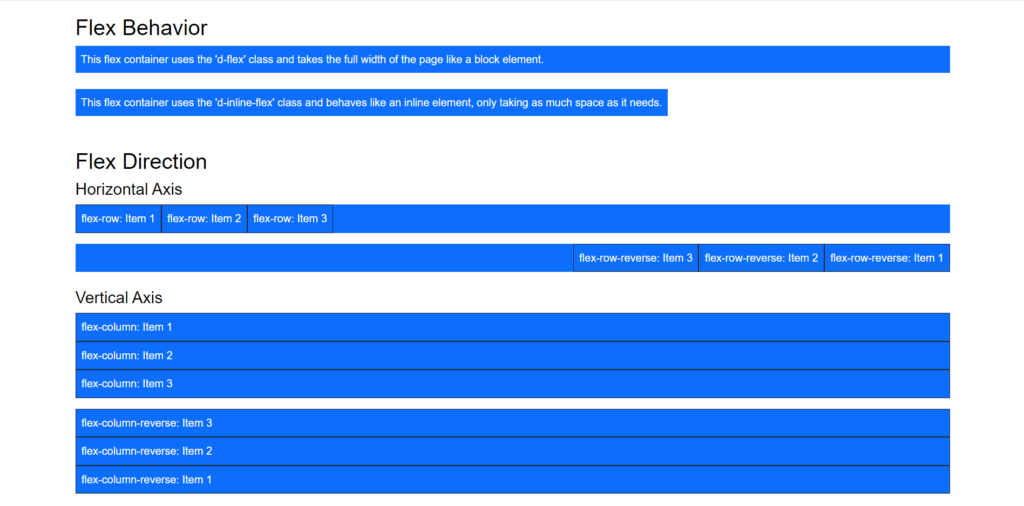
Flex Behaviors in Bootstrap
The flex utilities, d-flex and d-inline-flex, turn any element into a flexbox container and its children components into flex items.
However, the flex container’s behaviour differs based on the class applied.
FLEX
With d-flex, the flex container behaves like a block element, stretching to fill the screen width.
INLINE-FLEX
With d-inline-flex, the behavior is different as the flex container behaves like an inline element, only taking up as much space as its content requires.
A pictorial representation of both behaviors is as below:
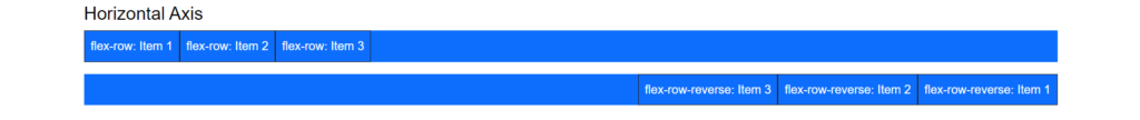
Flex Direction in Bootstrap
The Bootstrap flex utility also allows us to align items in either vertical or horizontal axes or directions with the help of certain classes.
ROW: HORIZONTAL DIRECTION
The .flex-row utility aligns children items in a horizontal row and is the default flex-direction.
There’s also the .flex-row-reverse which displays children items in the horizontal direction from the opposite end.
A pictorial representation of the workings of these classes is as below:
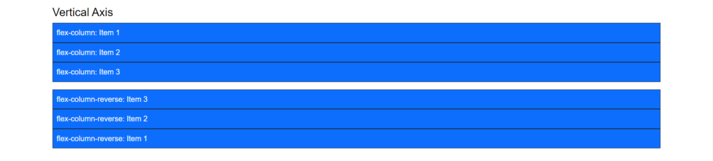
COLUMN: VERTICAL DIRECTION
The .flex-column aligns children items in a vertical column and is the default flex-direction.
Just like .flex-row, there’s also the .flex-column-reverse to display vertical direction from the opposite end.
A pictorial representation of these classes at work are as below:
Here’s also a cool video on how Flex works in Bootstrap 5:
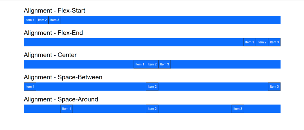
Bootstrap: Justify-Content
We can also play around and place flex children in whatever position we want. One way to do this is by using the justify-content-* class.
This class allows us to position or align items along the main axis.
Note: The main axis is horizontal if our direction is row or row-reverse. It becomes vertical when our flex-direction is column or column-reverse.
In this case, we may position children items at the flex container’s start (default position), end, center, with space around each item and space between items.
We can demonstrate this thus:
export default function App() {
  return (
    <div className="App">
      <div class = "container">
         <h2>Alignment - Flex-Start</h2>
         <div class = "d-flex justify-content-start bg-primary">
            <div class = "p-2 border border-dark">Item 1</div>
            <div class = "p-2 border border-dark">Item 2</div>
            <div class = "p-2 border border-dark">Item 3</div>
         </div>
         <br />

         <h2>Alignment - Flex-End</h2>
         <div class = "d-flex justify-content-end bg-primary">
            <div class = "p-2 border border-dark">Item 1</div>
            <div class = "p-2 border border-dark">Item 2</div>
            <div class = "p-2 border border-dark">Item 3</div>
         </div>
         <br />

         <h2>Alignment - Center</h2>
         <div class = "d-flex justify-content-center bg-primary">
            <div class = "p-2 border border-dark">Item 1</div>
            <div class = "p-2 border border-dark">Item 2</div>
            <div class = "p-2 border border-dark">Item 3</div>
         </div>
         <br />

         <h2>Alignment - Space-Between</h2>
         <div class = "d-flex justify-content-between bg-primary">
            <div class = "p-2 border border-dark">Item 1</div>
            <div class = "p-2 border border-dark">Item 2</div>
            <div class = "p-2 border border-dark">Item 3</div>
         </div>
         <br />

         <h2>Alignment - Space-Around</h2>
         <div class = "d-flex justify-content-around bg-primary">
            <div class = "p-2 border border-dark">Item 1</div>
            <div class = "p-2 border border-dark">Item 2</div>
            <div class = "p-2 border border-dark">Item 3</div>
         </div>
      </div>

    </div>
  );
}
The output of the code above would look like the following;
Check out the live demo here:
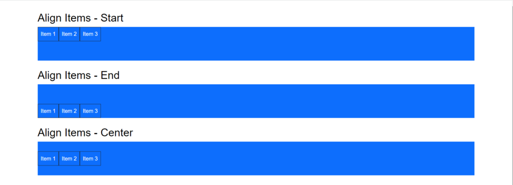
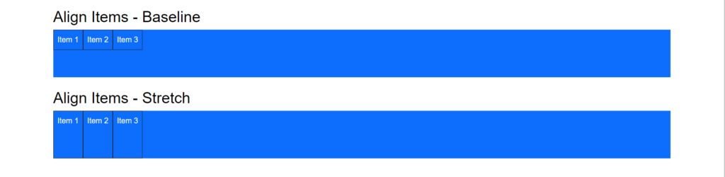
Bootstrap: Align Items
Just like we can position items on the main axis, we can also do the same on the cross axis using the align-items-* class.
Note: As opposed to the main axis, The cross axis is vertical if our direction is row or row-reverse. It becomes horizontal when our flex-direction is column or column-reverse.
We can align items at the container’s start, end, center or baseline and even stretch the children items so they span the entire axis.
We can demonstrate all of these below:
export default function App() {
  return (
    <div className="App">
      <div class = "container">
         <h2>Align Items - Start</h2>
         <div class = "d-flex align-items-start bg-primary" style = {{height: 100}}>
            <div class = "p-2 border border-dark">Item 1</div>
            <div class = "p-2 border border-dark">Item 2</div>
            <div class = "p-2 border border-dark">Item 3</div>
         </div>
         <br />

         <h2>Align Items - End</h2>
         <div class = "d-flex align-items-end bg-primary" style = {{height: 100}}>
            <div class = "p-2 border border-dark">Item 1</div>
            <div class = "p-2 border border-dark">Item 2</div>
            <div class = "p-2 border border-dark">Item 3</div>
         </div>
         <br />

         <h2>Align Items - Center</h2>
         <div class = "d-flex align-items-center bg-primary" style = {{height: 100}}>
            <div class = "p-2 border border-dark">Item 1</div>
            <div class = "p-2 border border-dark">Item 2</div>
            <div class = "p-2 border border-dark">Item 3</div>
         </div>
         <br />

         <h2>Align Items - Baseline</h2>
         <div class = "d-flex align-items-baseline bg-primary" style = {{height: 100}}>
            <div class = "p-2 border border-dark">Item 1</div>
            <div class = "p-2 border border-dark">Item 2</div>
            <div class = "p-2 border border-dark">Item 3</div>
         </div>
         <br />

         <h2>Align Items - Stretch</h2>
         <div class = "d-flex align-items-stretch bg-primary" style = {{height: 100}}>
            <div class = "p-2 border border-dark">Item 1</div>
            <div class = "p-2 border border-dark">Item 2</div>
            <div class = "p-2 border border-dark">Item 3</div>
         </div>
         <br />
      </div>

    </div>
  );
}
The output, therefore, looks like this;
For flex-start, flex-end and center,
While for baseline and stretch,
Check out the live demo here:
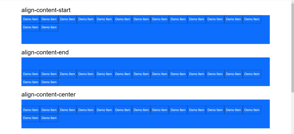
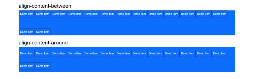
Bootstrap: Align Content
In the same way, as justify-content aligns individual items inside the main axis, the align-content-* class assists in aligning the lines within a flex container when there is additional space in the cross-axis.
Please note that this class has no effect if the flexbox has one line.
Example;
export default function App() {
  return (
    <div className="App">
      <div class = "container">
         <h2>align-content-start</h2>
         <div class = "d-flex bg-primary align-content-start flex-wrap" style = {{height: 150}}>
            <div class = "p-2 border border-dark">Demo Item</div>
            <div class = "p-2 border border-dark">Demo Item</div>
            <div class = "p-2 border border-dark">Demo Item</div>
            <div class = "p-2 border border-dark">Demo Item</div>
            <div class = "p-2 border border-dark">Demo Item</div>
            <div class = "p-2 border border-dark">Demo Item</div>
            <div class = "p-2 border border-dark">Demo Item</div>
            <div class = "p-2 border border-dark">Demo Item</div>
            <div class = "p-2 border border-dark">Demo Item</div>
            <div class = "p-2 border border-dark">Demo Item</div>
            <div class = "p-2 border border-dark">Demo Item</div>
            <div class = "p-2 border border-dark">Demo Item</div>
            <div class = "p-2 border border-dark">Demo Item</div>
            <div class = "p-2 border border-dark">Demo Item</div>
            <div class = "p-2 border border-dark">Demo Item</div>
         </div>
         <br />

         <h2>align-content-end</h2>
         <div class = "d-flex bg-primary align-content-end flex-wrap" style = {{height: 150}}>
            <div class = "p-2 border border-dark">Demo Item</div>
            <div class = "p-2 border border-dark">Demo Item</div>
            <div class = "p-2 border border-dark">Demo Item</div>
            <div class = "p-2 border border-dark">Demo Item</div>
            <div class = "p-2 border border-dark">Demo Item</div>
            <div class = "p-2 border border-dark">Demo Item</div>
            <div class = "p-2 border border-dark">Demo Item</div>
            <div class = "p-2 border border-dark">Demo Item</div>
            <div class = "p-2 border border-dark">Demo Item</div>
            <div class = "p-2 border border-dark">Demo Item</div>
            <div class = "p-2 border border-dark">Demo Item</div>
            <div class = "p-2 border border-dark">Demo Item</div>
            <div class = "p-2 border border-dark">Demo Item</div>
            <div class = "p-2 border border-dark">Demo Item</div>
            <div class = "p-2 border border-dark">Demo Item</div>
         </div>
         <br />

         <h2>align-content-center</h2>
         <div class = "d-flex bg-primary align-content-center flex-wrap" style = {{height: 150}}>
            <div class = "p-2 border border-dark">Demo Item</div>
            <div class = "p-2 border border-dark">Demo Item</div>
            <div class = "p-2 border border-dark">Demo Item</div>
            <div class = "p-2 border border-dark">Demo Item</div>
            <div class = "p-2 border border-dark">Demo Item</div>
            <div class = "p-2 border border-dark">Demo Item</div>
            <div class = "p-2 border border-dark">Demo Item</div>
            <div class = "p-2 border border-dark">Demo Item</div>
            <div class = "p-2 border border-dark">Demo Item</div>
            <div class = "p-2 border border-dark">Demo Item</div>
            <div class = "p-2 border border-dark">Demo Item</div>
            <div class = "p-2 border border-dark">Demo Item</div>
            <div class = "p-2 border border-dark">Demo Item</div>
            <div class = "p-2 border border-dark">Demo Item</div>
            <div class = "p-2 border border-dark">Demo Item</div>
         </div>
         <br />

         <h2>align-content-between</h2>
         <div class = "d-flex bg-primary align-content-between flex-wrap" style = {{height: 150}}>
            <div class = "p-2 border border-dark">Demo Item</div>
            <div class = "p-2 border border-dark">Demo Item</div>
            <div class = "p-2 border border-dark">Demo Item</div>
            <div class = "p-2 border border-dark">Demo Item</div>
            <div class = "p-2 border border-dark">Demo Item</div>
            <div class = "p-2 border border-dark">Demo Item</div>
            <div class = "p-2 border border-dark">Demo Item</div>
            <div class = "p-2 border border-dark">Demo Item</div>
            <div class = "p-2 border border-dark">Demo Item</div>
            <div class = "p-2 border border-dark">Demo Item</div>
            <div class = "p-2 border border-dark">Demo Item</div>
            <div class = "p-2 border border-dark">Demo Item</div>
            <div class = "p-2 border border-dark">Demo Item</div>
            <div class = "p-2 border border-dark">Demo Item</div>
            <div class = "p-2 border border-dark">Demo Item</div>
         </div>
         <br />

         <h2>align-content-around</h2>
         <div class = "d-flex bg-primary align-content-around flex-wrap" style = {{height: 150}}>
            <div class = "p-2 border border-dark">Demo Item</div>
            <div class = "p-2 border border-dark">Demo Item</div>
            <div class = "p-2 border border-dark">Demo Item</div>
            <div class = "p-2 border border-dark">Demo Item</div>
            <div class = "p-2 border border-dark">Demo Item</div>
            <div class = "p-2 border border-dark">Demo Item</div>
            <div class = "p-2 border border-dark">Demo Item</div>
            <div class = "p-2 border border-dark">Demo Item</div>
            <div class = "p-2 border border-dark">Demo Item</div>
            <div class = "p-2 border border-dark">Demo Item</div>
            <div class = "p-2 border border-dark">Demo Item</div>
            <div class = "p-2 border border-dark">Demo Item</div>
            <div class = "p-2 border border-dark">Demo Item</div>
            <div class = "p-2 border border-dark">Demo Item</div>
            <div class = "p-2 border border-dark">Demo Item</div>
         </div>
         <br />
      </div>
    </div>
  );
}
The code above outputs to give the following;
For start, end and center properties;
While for between and around properties;
Check out the live demo here:
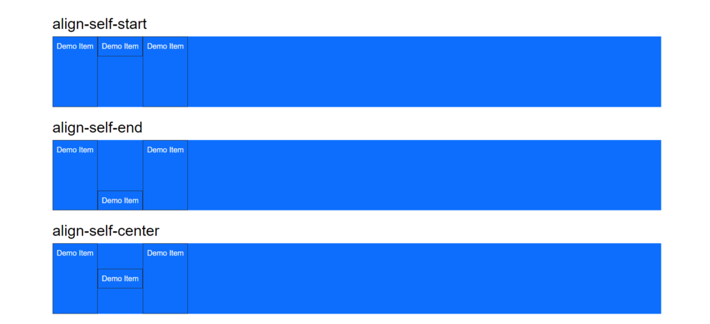
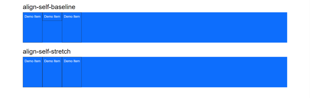
Bootstrap: Align Self
The .align-self-* classes allow you to modify a flex item’s vertical alignment. .align-self-start, .align-self-end, .align-self-center, .align-self-baseline, and .align-self-stretch (default) are all acceptable classes.
Example:
export default function App() {
  return (
    <div className="App">
      <div class = "container">
         <h2>align-self-start</h2>
         <div class = "d-flex bg-primary flex-wrap" style = {{height: 150}}>
            <div class = "p-2 border border-dark">Demo Item</div>
            <div class = "p-2 border align-self-start border-dark">Demo Item</div>
            <div class = "p-2 border border-dark">Demo Item</div>
         </div>
         <br />

         <h2>align-self-end</h2>
         <div class = "d-flex bg-primary flex-wrap" style = {{height: 150}}>
            <div class = "p-2 border border-dark">Demo Item</div>
            <div class = "p-2 border align-self-end border-dark">Demo Item</div>
            <div class = "p-2 border border-dark">Demo Item</div>
         </div>
         <br />

         <h2>align-self-center</h2>
         <div class = "d-flex bg-primary flex-wrap" style = {{height: 150}}>
            <div class = "p-2 border border-dark">Demo Item</div>
            <div class = "p-2 border align-self-center border-dark">Demo Item</div>
            <div class = "p-2 border border-dark">Demo Item</div>
         </div>
         <br />

         <h2>align-self-baseline</h2>
         <div class = "d-flex bg-primary flex-wrap" style = {{height: 150}}>
            <div class = "p-2 border border-dark">Demo Item</div>
            <div class = "p-2 border align-self-baseline border-dark">Demo Item</div>
            <div class = "p-2 border border-dark">Demo Item</div>
         </div>
         <br />

         <h2>align-self-stretch</h2>
         <div class = "d-flex bg-primary flex-wrap" style = {{height: 150}}>
            <div class = "p-2 border border-dark">Demo Item</div>
            <div class = "p-2 border align-self-stretch border-dark">Demo Item</div>
            <div class = "p-2 border border-dark">Demo Item</div>
         </div>
         <br />
      </div>
    </div>
  );
}
The output of the code above should be;
For start, end and center properties;
While for baseline and stretch properties;
Check out the live demo here:
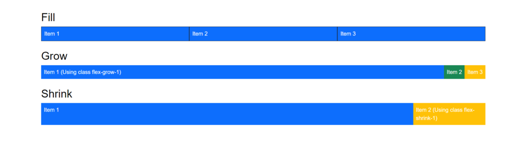
Flex-Fill, Flex-Grow and Flex-Shrink in Bootstrap
By utilizing the .flex-fill class, the components may be presented with equal widths on a horizontal plane. Using the .flex-grow-* class, the flex item will expand if there is room for it, while using the .flex-shrink-*, the flex item will shrink if required.
The usage of the aforementioned classes is shown in the example below;
export default function App() {
  return (
    <div className="App">
<div class = "container">
         <h2>Fill</h2>
         <div class = "d-flex bg-primary">
            <div class = "p-2 flex-fill border border-dark">Item 1</div>
            <div class = "p-2 flex-fill border border-dark">Item 2</div>
            <div class = "p-2 flex-fill border border-dark">Item 3</div>
         </div>
         <br />

         <h2>Grow</h2>
         <div class = "d-flex bg-info">
            <div class = "p-2 flex-grow-1 bg-primary">Item 1 (Using class flex-grow-1)</div>
            <div class = "p-2 bg-success">Item 2</div>
            <div class = "p-2 bg-warning">Item 3</div>
         </div>
         <br />

         <h2>Shrink</h2>
         <div class = "d-flex bg-info">
            <div class = "p-2 w-100 bg-primary">Item 1</div>
            <div class = "p-2 flex-shrink-1 bg-warning">Item 2 (Using class flex-shrink-1)</div>
         </div>
      </div>
    </div>
  );
}
And now, the output should look like this;
Check out the live demo here:
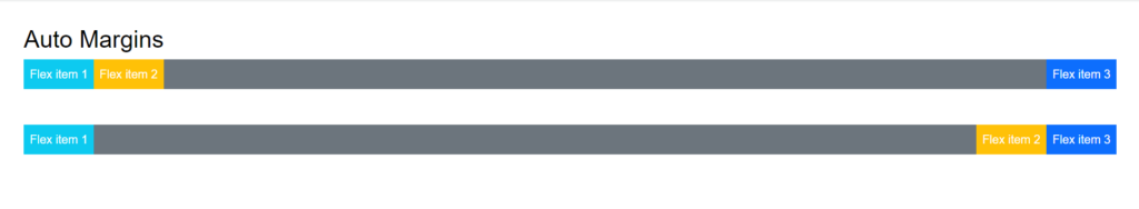
Bootstrap: Auto Margins
Auto margins force the flex item to whatever side (left, right, top and bottom) is specified and push the flex items towards that side until no space is left.
By utilizing the .ms-auto (pushes items to the right) and .me-auto (pushes items to the left) classes, the flex utility offers auto margin functionality on the flex items.
The usage of the aforementioned classes is shown in the example below;
export default function App() {
  return (
    <div className="App">
         <h2>Auto Margins</h2>
         <div class="d-flex bg-secondary">
            <div class="p-2 me-auto bg-info">Flex item 1</div>
            <div class="p-2 bg-warning">Flex item 2</div>
            <div class="p-2 bg-primary">Flex item 3</div>
          </div>

          <br />
          <br/>

          <div class="d-flex bg-secondary">
            <div class="p-2 bg-info">Flex item 1</div>
            <div class="p-2 bg-warning">Flex item 2</div>
            <div class="p-2 ms-auto bg-primary">Flex item 3</div>
          </div>
    </div>
  );
}
The output of the code above is;
Check out the live demo here:
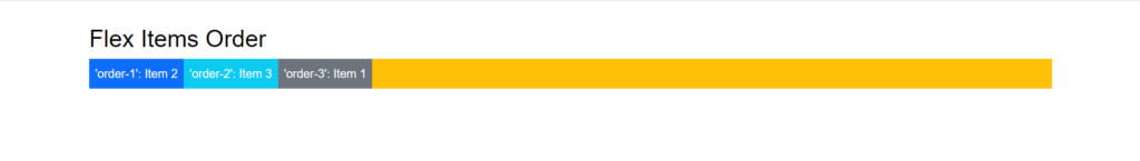
Bootstrap: Flex Order
As seen in the following example, flex employs order utilities to switch the order of flex elements within a container.
export default function App() {
  return (
    <div className="App">
         <div class = "container">
         <h2>Flex Items Order</h2>
         <div class = "d-flex flex-nowrap bg-warning">
            <div class = "order-3 p-2 bg-secondary">'order-3': Item 1</div>
            <div class = "order-1 p-2 bg-primary">'order-1': Item 2</div>
            <div class = "order-2 p-2 bg-info">'order-2': Item 3</div>
         </div>
      </div>
    </div>
  );
}
The output of this code would be;
Check out the live demo here:
Conclusion
Bootstrap offers solid solutions to numerous styling and markup problems, and Bootstrap Flex is one of these solutions. These flex classes allow us to style and design our layout fast and easily.
We at CopyCat have a robust collection of easy-to-grasp React and Bootstrap articles to aid your development.
A few of them are;
- Most Accessible Guide To Using React Bootstrap Button
- Your Comprehensive Guide To Bootstrap Forms
- Reactjs Bootstrap: How To Use Bootstrap In React.js?
Check them all out here.
Related Articles
-
 React.js
A Complete Guide On How to Use Bootstrap Breakpoints
Breakpoint Illustration Bootstrap breakpoints are resizable widths that control how your responsive layout functions in the different viewport or device sizes. In general, the fundamental idea behind Bootstrap is to organize the countless different device screen widths (or viewports), group…
November 29, 2022 -
React.js
Material UI Icons: Your Secret Weapon for Better Web Design
What are Material UI Icons? Material UI icons (mui icons) are essential to modern web development, providing designers and developers with a vast library of scalable and customizable icons to use in their projects. While the default Material UI icons…
February 22, 2023

