 March 17, 2023
  copycat


Have you ever struggled to create a responsive website layout that works seamlessly across different screen sizes and devices? As a web designer or developer, you know that achieving a perfect layout can be challenging, especially when you need to consider different aspect ratios, pixel densities, and font sizes.
Imagine this: you’ve just finished designing a new website layout that looks great on your desktop computer. You excitedly open the same page on your mobile device, only to find the layout completely broken. The text needs to be bigger, the images are misplaced, and the buttons need to be more clickable. You scratch your head, wondering how to fix the problem without resorting to time-consuming and tedious manual adjustments.
This is where calc comes in handy. With it, you can create flexible and dynamic layouts that adapt to different screen sizes and resolutions without relying on hard-coded values or complicated JavaScript code. In this article, we’ll explore the power of CSS Calc and share tips and techniques for improving your website layouts and performance.
What is Calc in CSS?
CSS Calc is a built-in function in CSS that allows you to perform calculations within a style property. With Calc, you can dynamically calculate values for CSS properties such as width, height, margin, padding, font-size, and more.
The syntax is simple: you start with the CSS calc() function followed by the mathematical expression you want to calculate. For example:
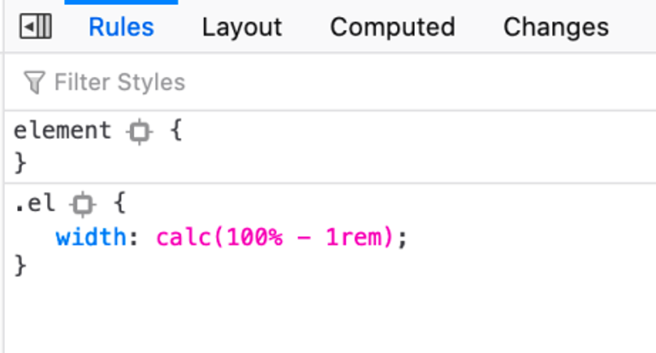
width: calc(100% - 50px);
This calculates the width property as 100% of the container width minus 50 pixels.
Calc() in CSS is mighty because it allows you to create complex layouts and responsive designs with minimal code. Instead of hardcoding values for different screen sizes, you can use it to calculate values dynamically based on the current viewport size. This makes your code more flexible, maintainable, and easier to update in the future.
Learn how to use it in 6 minutes:
Using the CSS Calc Function
The CSS calc function allows you to perform calculations to determine the value of a property. This is particularly useful for setting the width and height of elements, as you can use it to create responsive layouts that adjust based on the viewport size.
Syntax
The syntax for the calc() function is as follows:
calc(expression)
Where expression is a mathematical expression that can include addition (+), subtraction (-), multiplication (*), and division (/), as well as parentheses for grouping.
Examples
Here’s how to:
- set element width
- set element height
Setting the Width of an Element with calc()
To set the width of an element using calc(), you can use a mathematical expression that includes both fixed and variable values. For example:
width: calc(50% - 20px);
This would set the element’s width to be 50% of its container width minus 20 pixels. This is a quick way to get css width calc.
Setting the Height of an Element with calc()
You can also use calc() to set the height of an element using a similar approach. For example:
height: calc(100vh - 100px);
This would set the element’s height to be 100% of the viewport height, minus 100 pixels, for its css calc height.
Now that you know the basics, how can we use calc better?
But first, here’s a table that summarizes some of the key syntax and properties related to CSS Calc. Bookmark for easy reference:
| Syntax/Property | Description |
|---|---|
calc() | Function that performs calculations in CSS |
+, -, *, / | Mathematical operators that can be used within calc() |
% | Unit that represents a percentage of a value |
vw, vh | Units that represent a percentage of the viewport width or height |
min() | Function that calculates the minimum value between two or more expressions |
max() | Function that calculates the maximum value between two or more expressions |
clamp() | Function that restricts a value to a range between two other values |
flex-basis | Property that sets the initial size of a flex item |
grid-template-columns | Property that defines the columns of a grid container |
grid-template-rows | Property that defines the rows of a grid container |
gap | Property that sets the gap between grid items |
transform | Property that applies transformations to an element, such as scaling, rotating, or translating |
transition | Property that specifies the transition effects for an element, such as its duration and timing function |
Using CSS Calc for Better Layouts: 5 Creative Ways
Calc in CSS is a powerful tool that allows web designers and developers to create flexible and responsive layouts that adapt to different screen sizes and resolutions. In this section, we’ll explore five creative ways to use calc() for better website layouts:
- Creating fluid grids
- Resizing images and other elements
- Creating responsive typography
- Adjusting spacing and margins
- Creating unique shapes and layouts
Fluid Grids
One of the most popular uses of calc is to create fluid grids that adjust to the screen size. By using Calc to set the width of your grid columns and gutters as a percentage of the viewport width, you can ensure that your layout looks great on any device. For example, you could set your column width to calc((100% - 2rem) / 3) to create a three-column grid with a 2rem margin between each column.
.grid {
  display: grid;
  grid-template-columns: repeat(3, calc((100% - 2rem) / 3));
  grid-gap: 2rem;
}
Resizing Images and Other Elements
Resize images and other elements based on the size of the screen. This can be especially useful when you want to display images at different sizes on desktop and mobile devices. For example, you could use the calc() function to set the max-width of an image to calc(100vw - 2rem) to ensure that it never exceeds the width of the screen, but still leaves room for a margin.
img {
  max-width: calc(100vw - 2rem);
}
Responsive Typography
Create responsive typography that adapts to different screen sizes and resolutions. By setting CSS font sizes as a percentage of the viewport css calc height or width, you can ensure that your text remains legible on any device. For example, you could set the font size of your headings to calc(1.5rem + 2vw) to increase the font size by 2% for every 1vw increase in screen width.
h1 {
  font-size: calc(1.5rem + 2vw);
}
Adjusting Spacing and Margins
Adjust spacing and margins in a flexible and dynamic way. For example, you could use calc() to set the padding or margin of an element to a percentage of the viewport width or height. This allows your spacing to adjust automatically as the screen size changes without requiring any additional media queries or calculations.
.box {
  padding: calc(2rem + 2vw);
  margin: calc(1rem + 1vh) auto;
}
Creating Unique Shapes and Layouts
Finally, calc can be used create unique shapes and layouts that would be difficult or impossible to achieve with fixed values. For example, you could use calc() to set the CSS border radius (border-radius ) of an element to a percentage of the viewport width, creating a circular shape that adapts to the screen size. Similarly, you could use calc() to set the transform property of an element to create interesting and dynamic animations or transitions.
.circle {
  border-radius: calc(50vw + 50vh);
  transform: rotate(calc(30deg + 2 * var(--rotate)));
  /* add "--rotate" custom property to HTML for animation */
}
By using CSS Calc in these creative ways, you can create website layouts that are flexible, responsive, and visually engaging. You can learn more about the magic calc let’s you do here:
Debugging Common Issues with CSS Calc

While CSS Calc is a powerful tool, getting the desired result can sometimes be tricky. This section will explore some common issues you may encounter when using Calc and how to debug them. Including:
- Syntax errors
- Calculation errors
- Performance issues
- Inconsistent behavior across browsers
- Division by Zero
- Mixing Units
- Rounding Errors
- Nested Calculations
Syntax Errors
One common issue is syntax errors. These can occur if you don’t follow the correct syntax for using it. For example, you will encounter a syntax error if you forget to include the “calc()” function or close parentheses. To avoid syntax errors, it’s important to carefully check your code and ensure that all syntax is correct. For example:
/* This will produce a syntax error */
width: calc(100% - 20px;

/* This will work as expected */
width: calc(100% - 20px);
Calculation Errors
Another issue is calculation errors. These can occur if you don’t perform the correct calculations or if you don’t take into account the order of operations. To avoid calculation errors, it’s important to check your calculations and ensure they are correct carefully. For example:
/* This will not work as expected */
width: calc(100% - 50px * 2);

/* This will work as expected */
width: calc(100% - (50px * 2));
Performance Issues
It can sometimes lead to performance issues, primarily if you use it extensively in your layout. This can cause your website to load slower or feel sluggish. To avoid performance issues, it’s important to use it sparingly and to optimize your code as much as possible. For example, consider using fixed values instead of calculations wherever possible or caching the results of your calculations.
Compatibility with Older Browsers
Finally, one issue with Calc is compatibility with older browsers. While most modern browsers support it, some older browsers may not or may not support it differently. To ensure compatibility with older browsers, it’s essential to test your website in multiple browsers and to provide fallback styles for older browsers that don’t support Calc. For example:
/* Fallback styles for browsers that don't support CSS Calc */
width: 80%;
width: -moz-calc(80%);
width: -webkit-calc(80%);
Division by Zero
One common issue with Calc is division by zero. This occurs when you divide a value by zero, either explicitly or as a result of a calculation. Division by zero can cause unexpected results or even break your layout. To avoid division by zero errors, it’s important to check your math carefully and ensure you’re not dividing by zero. For example:
/* This will cause a division by zero error */
width: calc(100% / 0);

/* This will not cause a division by zero error */
width: calc(100% / 2);
Mixing Units
Another issue with Calc is mixing units. While Calc allows you to mix units in a calculation, it can sometimes lead to unexpected results or layout issues. For example, if you add a fixed value and a percentage value, the resulting width may differ from what you expect. To avoid issues with mixing units, it’s important to stick to consistent units within a calculation. For example:
/* This will not work as expected */
width: calc(100% - 20px);

/* This will work as expected */
width: calc(100% - 10%);
Rounding Errors
Calc can sometimes produce rounding errors, especially when working with fractions or decimals. This can cause elements to be misaligned or not line up properly. To avoid rounding errors, it’s important to be aware of the precision of your calculations and use rounding functions like round(), ceil(), or floor() where appropriate. For example:
/* This may produce rounding errors */
width: calc(33.33% * 3);

/* This will round the result to the nearest pixel */
width: calc(round(33.33%) * 3);
Nested Calculations
Calc allows you to nest calculations inside other calculations, which can be a powerful way to create complex layouts. However, it can also make your code more difficult to read and debug. To avoid issues with nested calculations, it’s important to be careful with your syntax and ensure that all parentheses are properly matched. For example:
/* This will not work as expected */
width: calc(100% - calc(50% - 10px));

/* This will work as expected */
width: calc(100% - (50% - 10px));
By being aware of these common issues and taking steps to debug and avoid them, you can use it to create flexible and responsive website layouts that look great on any device.
Advanced Techniques for Using CSS Calc in Responsive Design

While CSS Calc is an excellent tool for creating flexible and responsive layouts, some advanced techniques can take your responsive design to the next level. This section will explore some advanced techniques for using it in responsive design. Use CSS Calc With…
- viewport units
- css grid
- flexbox
- media queries
Viewport Units
Viewport units are a powerful tool for creating responsive designs. For example, you could use css calc height to set the height of an element to be a percentage of the viewport height minus a fixed amount of pixels.
/* Set the height of an element to be 80% of the viewport height, minus 100px */
height: calc(80vh - 100px);
CSS Grid
CSS Grid is another powerful tool for creating flexible layouts and with calc it can be used to create even more dynamic grids. You could use it to set the size of grid columns to be a percentage of the available grid space.
/* Create a grid with two columns, where each column is 50% of the available grid space */
grid-template-columns: calc(50% - 20px) calc(50% - 20px);
Flexbox
Flexbox is another tool for creating flexible layouts, and Calc can be used to make your flexbox layouts even more dynamic. Use it to set the flex-basis property of a flex item to be a percentage of the available space.
/* Create a flex container with three items, where each item takes up 33.33% of the available space */
flex-basis: calc(33.33% - 20px);
Media Queries
Calc and media queries together can be used to create even more dynamic media queries. You could use it to set the width of an element to be a percentage of the viewport width, but only if the viewport width is greater than a certain value.
/* Set the width of an element to be 50% of the viewport width, but only if the viewport width is greater than 800px */
@media (min-width: 800px) {
  width: calc(50vw - 20px);
}
Using these advanced techniques in conjunction with Calc, you can create even more flexible and dynamic layouts that adapt to any device and screen size.
Improving Website Performance with CSS Calc
Calc in CSS is a powerful tool that can help you create more flexible and dynamic layouts and improve your website’s performance. This section will explore how calc can reduce the number of styles, simplify code, and improve website performance.
Reducing Styles and Simplifying Code
One of the ways that Calc can improve website performance is by reducing the number of styles needed to achieve a desired layout. By using Calc to perform calculations, you can often execute the same effect with fewer lines of code. This makes your code easier to manage and reduces the work the browser needs to do to render your site.
- For example, let’s say you want to create a container centered on the page that takes up 80% of the available width. Without Calc, you might write code like this:
.container {
  width: 80%;
  margin-left: auto;
  margin-right: auto;
}
With Calc, you can simplify this code to just one line:
.container {
  width: calc(80% - 20px);
  margin: 0 auto;
}
In this example, we subtract 20 pixels from the 80% width. This achieves the same effect as the previous code, but with one less style.
Here’s another example:
- Let’s say you want to create a navigation bar that spans the full width of the page and contains five equally spaced links. Without it, you might write code like this:
.nav {
  display: flex;
  justify-content: space-between;
  width: 100%;
}

.nav a {
  width: calc(100% / 5);
}
In this example, we divide the width of the navigation bar by the number of links to ensure that each link takes up an equal amount of space.
- However, we can optimize this code even further. Instead of using Calc to calculate the width of each link, we can use the
flex-basisproperty to achieve the same effect with less code:
.nav {
  display: flex;
  justify-content: space-between;
  width: 100%;
}

.nav a {
  flex-basis: calc(100% / 5);
}
By using flex-basis with calc in CSS, we’ve eliminated the need for an additional style and reduced the amount of work the browser needs to do to render the navigation bar. This not only simplifies our code, but also improves website performance.
Let CSS Calc Help You
We’ve seen how CSS Calc can revolutionize how we write CSS code. Calcin CSS has proven an invaluable tool for web developers, from simplifying complex calculations to creating responsive layouts. With Calc in our toolbox, we can now easily tackle even the most complex design challenges. So the next time you’re struggling with CSS math, remember that there’s a little function called Calc that’s got your back. Happy coding!
Related Articles
-
 Uncategorized
React localStorage: set and get items with hooks
Introduction There are two main web storage mechanisms: React localStorage and sessionStorage. These storage types are similar to persistent cookies and session cookies respectively. Local storage and sessionStorage both maintain a separate storage area for each given origin that's available…
April 28, 2022 -
Uncategorized
Learn TypeScript Map Thoroughly and Make Your App 3x Better
Is there a map in TypeScript? Have you ever needed to store key-value pairs in your web application? If so, you've likely encountered the JavaScript object as a standard solution. However, as your application grows, the limitations of the object…
February 22, 2023


