
 October 1, 2022
  Uncle Big Bay


React is without a doubt the best JavaScript frontend library, powering over 10 million websites on the internet. Because React is the most popular UI library, many UI component libraries have been created to help developers in creating visually attractive web apps and solve UI-related issues with React.
This article will look at the top 15 React UI component libraries, including their features, statistics, installation, and code samples.
What is a React Component Library?
React UI component libraries are collections of UI elements, guidelines, resources, or components, that you can readily use in your React project to suit your UI development requirement.
Developing pixel-perfect U.I. takes too much time in this day and age of A.I. Copycat is developed to remove the pain of having to write redundant UI boilerplate, layout, and atomic code so that you can focus on building truly remarkable apps faster.
Check out the CopyCat plugin for React if you’re seeking for amazing React tools to help you build component code faster and be production ready sooner than your competition!
The top 15 React UI component libraries:
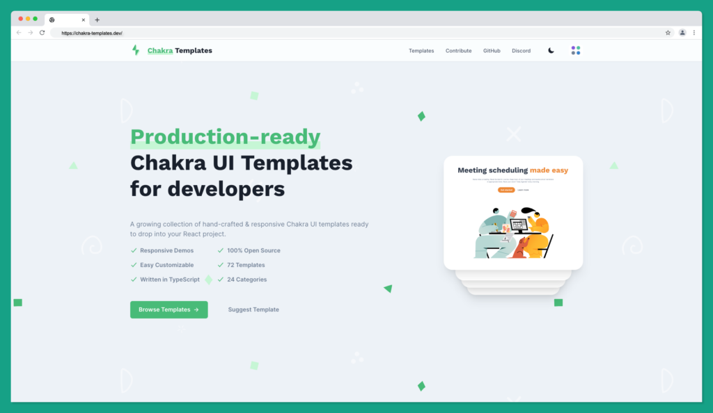
Chakra UI
Less code. More speed – Chakra UI
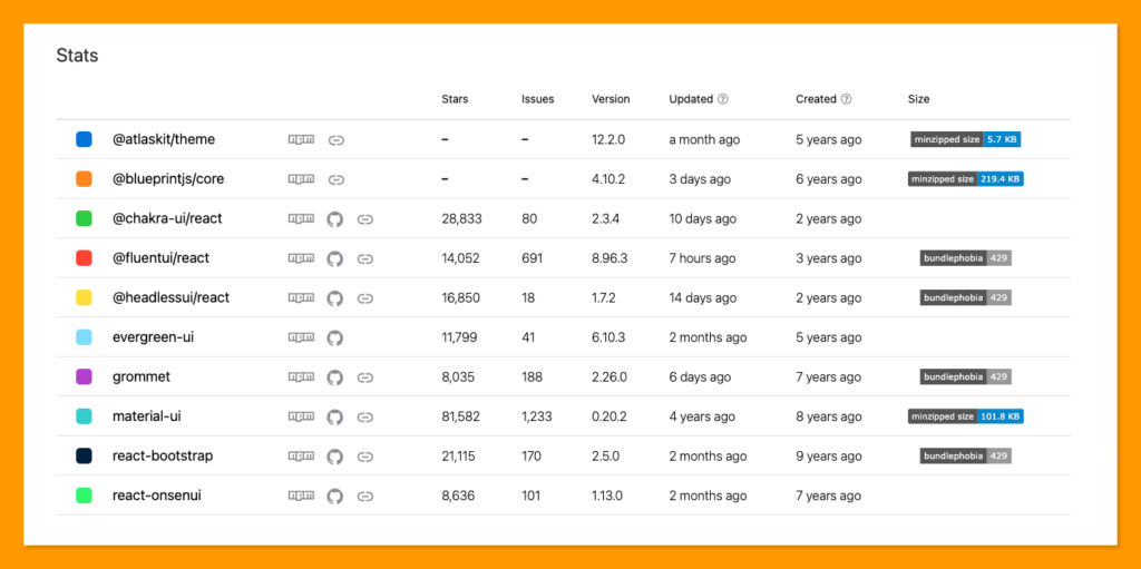
Chakra UI is one of the most used React UI libraries with over 355k weekly downloads on npm and over 28k stars on GitHub with only 10 core contributors as of writing this article.

This library focuses on offering an easy-to-use, modular and accessible component library that gives you the building blocks you need to build your React applications. Chakra UI allows you to focus more on the user experience and spend less time writing UI code.
Chakra UI Features 🚀
- Easy to style
- Accessible components
- Flexible and composable
- Dark mode 🌓
Installing Chakra UI
To use the Chakra UI library, you need to install the @chakra-ui/react package and its peer dependencies into your project.
Chakra UI is available via npm and yarn package manager. Run the command below to install the Chakra UI using the npm package manager:
$ npm i @chakra-ui/react @emotion/react@^11 @emotion/styled@^11 framer-motion@^6
Or run the command below to install Chakra UI with the yarn package manager:
$ yarn add @chakra-ui/react @emotion/react@^11 @emotion/styled@^11 framer-motion@^6
After installation, you’re required to wrap your App child component with the ChakraProvider component provided by @chakra-ui/react.
import { ChakraProvider } from "@chakra-ui/react"

// Do this at the root of your application
function App({ children }) {
  return <ChakraProvider>{children}</ChakraProvider>
}
After this, you can now use Chakra UI components in your React application 🎉
Chakra UI Templates
Chakra UI provides dozens of production-ready Chakra UI templates for your project. Check out the Chakra UI here.
Learning Chakra UI
Chakra UI also provides a free crash course to learn how to use Chakra UI like a Pro! This lesson is a good start for anyone who’s getting started with Chakra UI.
Chakra UI is proudly made in Nigeria by Segun Adebayo.
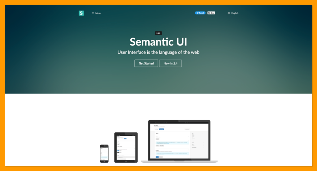
Semantic UI React
Semantic UI React is the react-compatible version of the Semantic UI CSS framework. It is 100% JQuery free to make it well integrated into React Virtual DOM principle.
Semantic UI React has over 238k weekly downloads on npm with 12.9k stars on GitHub.
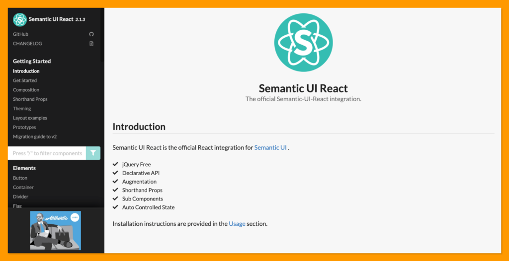
The Semantic UI CSS framework is a ready-to-use and responsively designed theme that allows your website to scale across multiple devices.
The Semantic UI React also enables you to use the Semantic UI CSS framework in your React application.
Semantic UI components are grouped into six components; Elements, Views, Addons, Collections, Modules, and Behaviours.
Semantic UI React Features 🚀
- Flexbox friendly
- Accessible
- Complete keyboard support
- Shorthand props
- Auto controlled state
- Augmentation
Installing Semantic UI React
You can install Semantic UI React via the npm package manager:
npm install semantic-ui-react semantic-ui-css
Or yarn package manager:
yarn add semantic-ui-react semantic-ui-css
After installation, import the minified CSS file into your application:
import 'semantic-ui-css/semantic.min.css'
After this, you can now use the Semantic UI CSS framework in your React application 🎉
Learning Semantic UI React
Check out the introduction to Semantic UI React below. This video introduces React Semantic UI, takes you through the installation steps, and guides you through using 3 React Semantic UI Components.
MUI (formerly Material-UI)
MUI (formerly Material-UI) or Google’s material design is the number 1 most popular React UI library with 81.4k GitHub stars and 7.6 million weekly downloads on npm package manager.
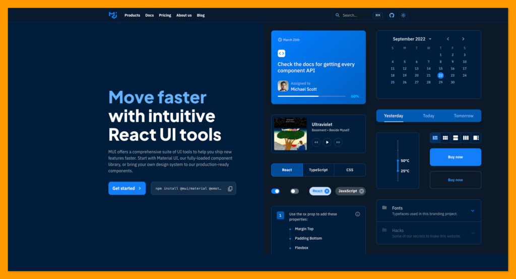
The world’s most popular React UI framework, MUI, was developed by Google developers using the Material design principle and was released on June 25, 2014.
The world’s best product team that uses MUI includes Nasa, Netflix, Spotify, Amazon, etc.
Advantages of MUI 🚀
- Highly Customizable components
- Cross-team collaboration (designers and developers)
- Beautiful by default
- MUI team ships faster
- Trusted by thousands of organizations
Installing MUI
MUI is available on the npm and yarn package manager.
Run the command below to install the MUI package manager into your React project:
Using npm package:
npm install @mui/material @emotion/react @emotion/styled
Or using the yarn package:
yarn add @mui/material @emotion/react @emotion/styled
After the installation, MUI will be ready to be used in your React project 🎉
Learning Material UI
This video will help you to get started quickly with Material UI, it’s a one-hour Material UI Crash Course.
Check out this article at CopyCat on Material UI Table.
React-Bootstrap
React-Bootstrap is a bootstrap-compatible version for react.js without bootstrap native javascript and jQuery dependencies. Bootstrap is one of the top CSS frameworks in the frontend ecosystem with a mobile-first principle.
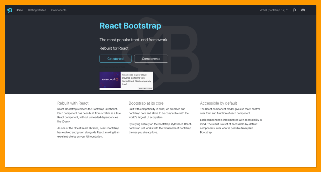
React-Bootstrap has over 21k stars on GitHub and over 1.7 million weekly downloads on npm as of writing this article.
React-Bootstrap Features 🚀
- Server-side rendering
- React-Bootstrap works without native bootstrap bootstrap.js or jQuery dependencies
- Huge community
- Support a11y (Accessibility)
- Thousands of themes
Installing React-Bootstrap
According to the official React-Bootstrap documentation, the best way to consume React-Bootstrap is via the npm package which you can install with npm:
npm install react-bootstrap bootstrap
Or yarn, if you prefer:
yarn add react-bootstrap bootstrap
Now, you can start using the React-Bootstrap components in your React web development project 🎉
Learning React-Bootstrap
This React Bootstrap tutorial will cover how to install react-bootstrap in React using a basic create react application.
Reactstrap
Reactstrap is a React component library for Bootstrap, similar to React-Bootstrap, it allows you to use the Bootstrap library component in your React application.
This library has over 10k GitHub stars and 539k weekly downloads on reactstrap npm package.
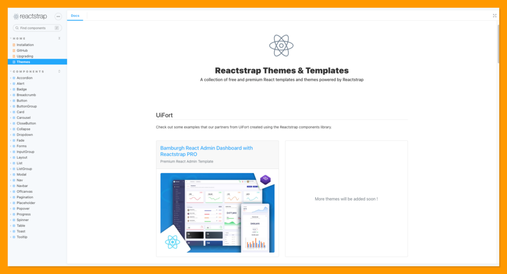
Reactstrap also depends on the Bootstrap CSS framework for its styles and theme allowing you to have consistent styles across your React-based components.
Installing Reactstrap
Reactstrap currently requires React 16.8 or higher.
You can install Reactstrap using npm package manager:
npm install reactstrap react react-dom
Or yarn package manager:
yarn add reactstrap react react-dom
You can start using the Reactstrap components in your React project after the installation 🎉
Learning Reactstrap
Learn more about the application and features of Reactstrap from the tutorial series below:
Onsen UI
Onsen UI is a mobile-first UI library that provides your website with a mobile appearance. It includes over 100 components that are similar to those found in Android and iOS devices.
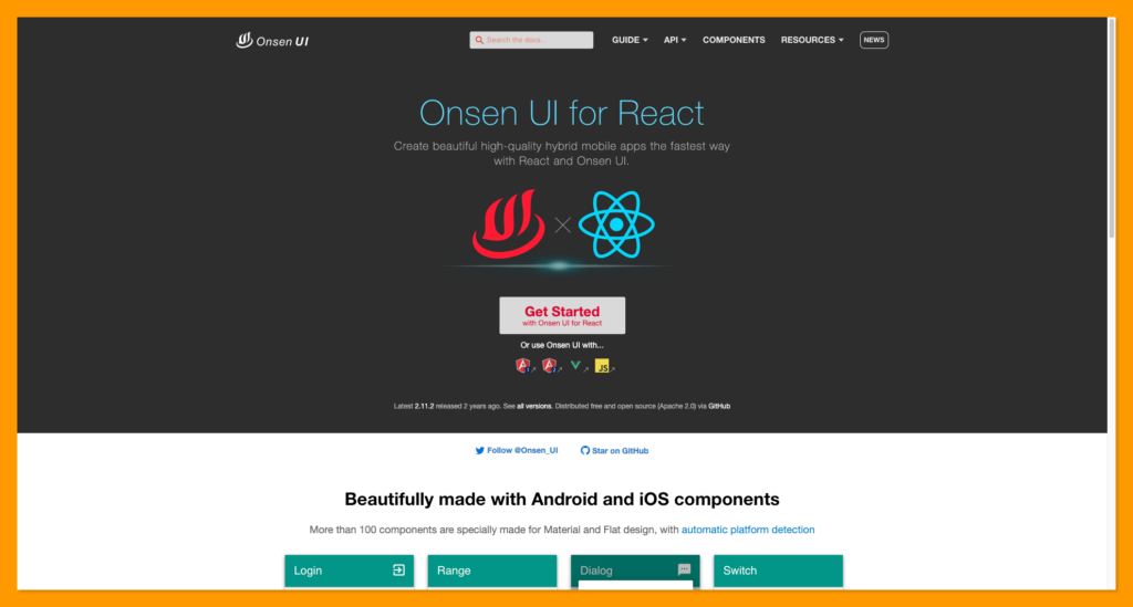
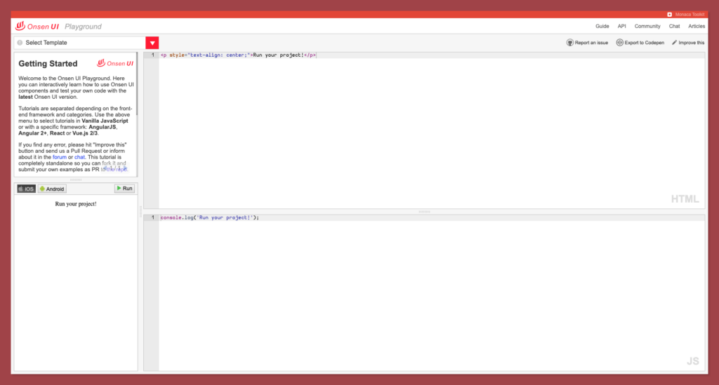
Onsen UI has 8.6k stars on Github and over 39k weekly downloads on npm. It also provides a playground where you can develop both iOS and Android components directly from your browser. Check out the Onsen UI Playground here.
Installing Onsen UI
Under the hood, Onsen UI consists of three layers:
- CSS Components: This is written in cssnext, the next generation of CSS.
- Web Components: This is written in native JavaScript to support ALL frameworks.
- Framework Bindings: This is created for tighter integration with popular frameworks such as Vue.js, AngularJS 1, Angular 2+, React, etc.
We’ll use the React Framework Bindings. Onsen UI React bindings are distributed in the [react-onsenui package](https://www.npmjs.com/package/react-onsenui). You can download it via npm package manager:
npm install onsenui react-onsenui --save
Or use the Onsen CDN.
You can check out the hello world tutorial on getting started with the Onsen UI library.
Installing Onsen UI
Checkout the official introduction to Onsen UI below:
Blueprint UI
Blueprint is an open-source React-based frontend application development toolkit with a specialization in building React UI for complex, data-dense interfaces desktop apps.
The Blueprint UI library has over 19k GitHub stars and 219k weekly downloads on the npm package.
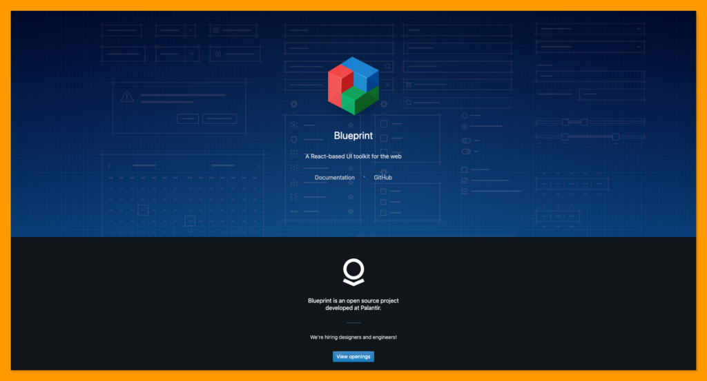
Blueprint UI is not entirely mobile-friendly because its main focus is providing components for complex, data-dense desktop apps.
Blueprint UI components are categorized into six components:
- Core components
- Datetime components
- Select components
- Table component
- Timezone component
- Icon components
Installing Blueprint UI
Blueprint UI package is available via npm and yarn package manager:
yarn add @blueprintjs/core react react-dom
Install Blueprint UI using npm:
npm install @blueprintjs/core react react-dom
Blueprint UI Code Sandbox Playground
Headless UI
Headless UI is one of the best react component libraries made by Tailwind labs. Tailwind is the second most popular CSS framework after Bootstrap.
Tailwind CSS is provided out-of-the-box in Headless UI to fit your specific project requirements and can be utilized to style Tailwind components such as Toggle Switch, Dialog, and Modal.
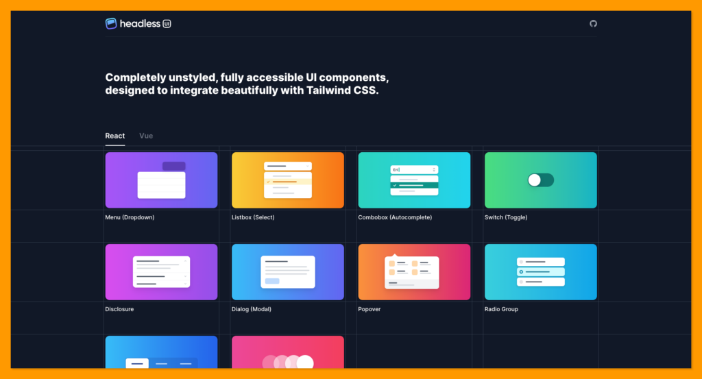
Headless UI has over 16k stars on Github and 665k weekly downloads on npm package manager.
Features of Headless UI 🚀
- Accessible components
- Support transition out of the box
- Flexible
Installing Headless UI
To get started, install Headless UI via npm:
npm install @headlessui/react
Learning Headless UI
The video below will walk you through the steps to build a fully accessible command palette using Tailwind CSS, React, and the new combo box component in Headless UI.
Theme UI
Theme UI is one of the finest React UI component libraries that allows you to build custom component libraries, design systems, web applications, Gatsby themes, and more with a flexible API.
This UI library has over 4k GitHub stars and 113k weekly downloads on npm package manager.
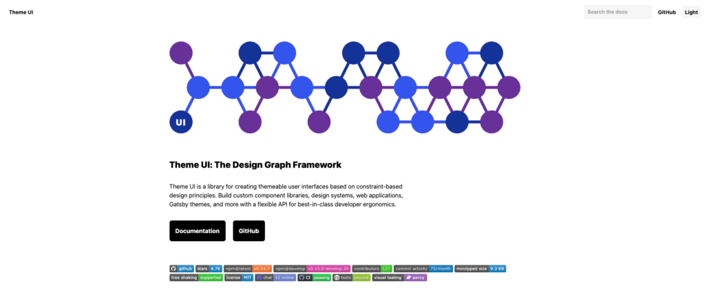
Theme UI provides a number of built-in UI components such as layouts, grids, buttons, form elements, and more.
Features of Theme UI 🚀
- Easy, mobile-first responsive styles
- Built-in dark mode 🌗
- Easy to use
- Robust theming API
- Backed with a Theme Specification
- Style with or without creating components
- Use Typography.js themes
Installing Theme UI
Installing the Theme UI package is very simple. Install theme-ui using npm:
npm install theme-ui @emotion/react
Or with yarn:
yarn add theme-ui @emotion/react
Fluent UI
Fluent UI is the Microsoft official open-source React front-end framework. It was created to provide user interfaces that smoothly integrate with a variety of Microsoft applications.
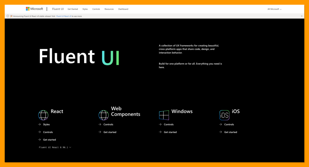
A collection of UX frameworks that can be used to build stunning, cross-platform apps that share code, design, and interaction style.
Features of Fluent UI 🚀
- Accessible components
- Highly customizable using CSS-in-JS
Installing Fluent UI React
Fluent UI React is available via the @fluentui/react npm package:
Install Fluent UI with npm:
npm install @fluentui/react```
Install Fluent UI with yarn:
yarn add @fluentui/react
⚠️ You should also have react@16.8.0 and react-dom@16.8.0 or higher versions.
Learning Fluent UI React
In this video tutorial, Bijay explained what is Fluent UI react with a beginner-friendly tutorial on how to implement react controls in react applications.
Evergreen
Evergreen is developed by Segment, a solution that allows you to collect, transform, send, and archive your first-party customer data.
This library is a React UI framework that allows you to create polished, flexible, and composable React UI components for enterprise-grade apps.
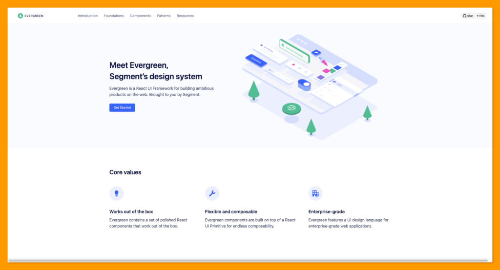
Features of Evergreen 🚀
- Design system for enterprise level
- Flexible and composable
- Sensible Defaults
- Contributor-Friendly
Installing Evergreen
Install evergreen-ui using npm:
npm install evergreen-ui
Install evergreen-ui using yarn:
yarn add evergreen-ui
Learning Evergreen
Check out the evergreen UI introduction from the video below:
Grommet
Grommet is a lightweight theming tool with over 8k GitHub stars. It is an alternative to Material UI and Ant UI. It provides accessibility, responsiveness, and modularity in its kit.
Grommet is used by Netflix, Uber, Sony, Boeing, etc. Grommet’s powerful theming tool enables developers to customize components’ colors, types, and layouts to their preferences.

Features of Grommet 🚀
- Accessibility
- Mobile first
- Responsive by default
- Beginner friendly
- Powerful theming tool
Installing Grommet
You can clone the Grommet starter repository or install it with npm:
npm install grommet styled-components --save
Or yarn:
yarn add grommet styled-components
Reakit
Reakit is a lower-level react component library for building accessible high-level UI libraries, design systems, and applications with React.
This library has over 6k GitHub stars and over 186k weekly downloads on the npm package manager.
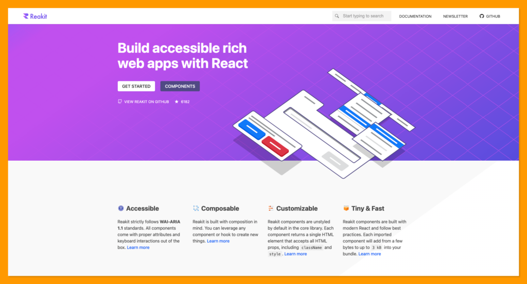
Features of Reakit 🚀
- Accessible
- Server-side rendering
- Composable
- Customizable component library
- Tiny & Fast
Installing Reakit
Install the reakit UI library with npm using the command below:
npm install reakit
Rebass
Rebass is a quick, mobile-first responsive style with array-based syntax. It is one of the best React component libs out there.
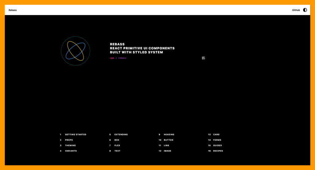
Features of Rebass 🚀
- Theming
- Composition
- Variant prop
- Extending
Installing Rebass
Install the core Rebass package from npm using the command below:
npm i rebass
Atlaskit
Atlaskit is Atlassian’s official UI library, built according to the Atlassian design system. It is an end-to-end design language to create simple, intuitive, and beautiful experiences.
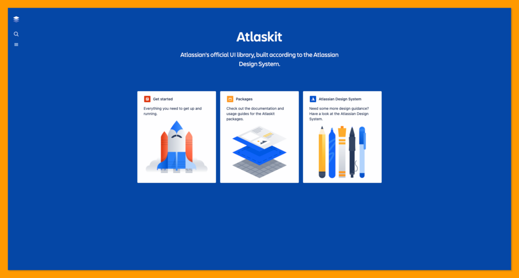
Atlaskit, which includes the Atlassian Design System, Atlassian Editor, Atlassian Media, and other packages, is a collection of reusable packages created for Atlassian products and experiences.
Installing Atlaskit
Run the command below to install atlaskit and checkout its peer dependencies.
Using npm:
npm i react@^16.8.0 react-dom@^16.8.0 styled-components@^3.2.0
Using yarn:
yarn add react@^16.8.0 react-dom@^16.8.0 styled-components@^3.2.0
Wrapping Up
It is necessary to conduct UI library research in order to select the one that best meets your requirements. I hope this article assists you in selecting the best UI library for your React projects.
In this article, we reviewed and learned about the top 15 best React UI component libraries, including their features, popularity, and installation instructions.
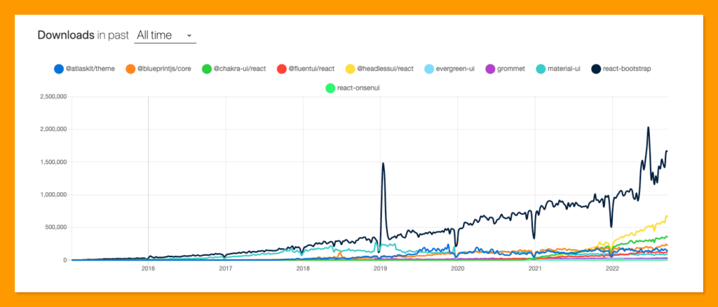
NPM trends is a great place to check the stats and downloads of any npm package such as React UI component library before making your final decision on selecting a well-suited UI library for your project.
Finally, you can find more awesome articles like this on our blog at CopyCat. CopyCat is a tool that saves you about 35% of development time by converting your Figma files to an up-and-running React project. Check it out here.
Interesting Reads From Our Blogs
- 10 CSS Frameworks for Frontend Developers in 2022
- Your Introductory Guide to React Intl
- The Top 16 Design System Examples
Related Articles
-
 React.js
A-Z Guide: All You Need to Know About Reactjs Components
Introduction One of the most widely used and robust single-page application libraries in the market today is React.js. It helps create interactive UI elements and render them efficiently with faster page loading time. React components help developers break the UI…
February 17, 2022 -
React.js
React Strict Mode: A Guide on Using it in your Application
Introduction React Strict Mode is a developer tool that has been around in React from version 16.3. But, if you are like me, you might be seeing it in your index.js file without giving it a thought about why it has been there (if…
September 14, 2022

