
 December 23, 2022
  Faith Ajayi


- Introduction
- What is Material UI Checkbox Component?
- Implementing Material UI Checkbox Component
- Material UI Checkbox Label and Placement
- How to Customize Material UI checkbox Colors
- How to Customize MUI Checkbox Sizes
- Setting Material UI checkbox state with React useState Hook
- Making Material UI Checkbox checked by default
- How to use Material UI disabled prop?
- Material UI Checkbox component as Icons
- Understanding and Application of The MUI Checkbox component Indeterminate prop
- When to use Checkbox Over Radio buttons
- Conclusion
Introduction
Checkboxes are form elements that allow the user to choose one or more options from a list. They’re frequently used in web forms to let users select multiple options. Such as multiple items in a shopping cart or multiple preferences in a survey.
A checkbox is typically represented as a small square box that is either checked (indicating that the option is selected) or unchecked (indicating that it is not selected). When a user clicks on a checkbox, it is checked or unchecked, depending on its current state.
Also, Material-UI is an open-source library of React components that implement Google’s Material Design guidelines. It is important to React developers because it provides a consistent, customizable, and easy-to-use set of components that can be used to build user interfaces quickly and efficiently.
However, in this article, we would look deeply into understanding, customizing, and implementing the material UI checkbox component.
To get the most out of this article, you must have the knowledge and hands-on experience with the following:
It is also crucial to note that with CopyCat, you can quickly turn your Figma designs into Material UI code, saving you a ton of time.
What is Material UI Checkbox Component?
The popular React UI library Material-UI offers a variety of pre-built components for creating user interfaces. One of these components is the checkbox, enabling users to choose one or more options from a list of options. It is frequently employed in forms or other input fields where a user must choose several items from a list.
The Checkbox component is styled in accordance with Google’s Material Design principles. These design principles were developed to ensure that all of the products offered to users were consistent and user-friendly.
In the section after this, we’ll implement and import the Material UI checkbox component in a React application.
Implementing Material UI Checkbox Component
Installing the Material-UI library and its dependencies using npm or yarn is the first step in using the Material-UI Checkbox component in a React application.
An npm example is provided below for installation:
npm install @material-ui/core // using npm
yarn add @material-ui/core // using yarn
Once the library is installed, you can use the Checkbox component from the @material-ui/core package in your application by importing it. Here’s an illustration:
import React from 'react';
import { Checkbox } from '@material-ui/core';

function App() {
  return (
    <Checkbox
      defaultChecked
      color="primary"
      inputProps={{ 'aria-label': 'primary checkbox' }}
    />
  );
}
export default App
This example makes a simple checkbox with a primary color and it’s checked by default. By giving the Checkbox component more props, you can alter the checkbox’s appearance. We would walk through these processes in the cause of this article for more details.
Material UI Checkbox Label and Placement
The user can choose the action described in the label prop, the text that is shown next to the Checkbox. Depending on how the form or survey is constructed, the label can be positioned either to the left or right of the Checkbox component.
However, using the FormControlLabel component from the Material-UI library, pass the Checkbox component as the control prop and the label text as the label prop to align the label with the checkbox, the code illustration to this can be seen below;
import React from "react";
import { Checkbox } from "@material-ui/core";
import { FormControlLabel } from "@material-ui/core";

const MuiCheckbox = () => {
  return (
    <div>
       <FormControlLabel control={<Checkbox />} label="Option 1" />

    </div>
  );
};

export default MuiCheckbox;
It is important to note, however, that you can use the Material-UI library’s FormGroup component and pass the FormControlLabel component as a child to ensure that there is enough space between the label and the checkbox. Consider the following example:
import React from "react";
import { Checkbox } from "@material-ui/core";
import { FormControlLabel } from "@material-ui/core";
import { FormGroup } from "@material-ui/core";

const MuiCheckbox = () => {
  return (
    <div>
        <FormGroup>
            <FormControlLabel
                control={<Checkbox name="checkedA" />}
                label="Secondary"
            />
        </FormGroup>

    </div>
  );
};

export default MuiCheckbox;
Also, the labelPlacement prop is used to adjust the location of the label. It can be either start or end. Start is the default value, and the end is the other value, and it is used as follows:
 <FormControlLabel
   control={<Checkbox name="checkedA" />}
   label="Secondary"
   labelPlacement="end"
 />
You may utilize and appropriately place the Material-UI Checkbox in your React component by following these steps.
How to Customize Material UI checkbox Colors
Color is an important part of web design that can aid in the creation of a pleasant and effective user experience, the establishment of a strong brand identity, and the direction of the user’s attention on the page.
The color property, which accepts a string value describing the color you wish to use, can be used to change the color of an MUI checkbox.
You could, for instance, set the color property to “primary” to use the theme’s primary color or “secondary” to use the secondary color. To specify a unique color, you can either use a hexadecimal color code or a CSS color name.
Here is an illustration of how you could change a Material UI checkbox’s color:
import React from 'react';
import { Checkbox } from '@material-ui/core';

function App() {
  return (
  <FormControlLabel
     control={<Checkbox name="checkedA" />}
     color="secondary"
   />
  );
}
export default App
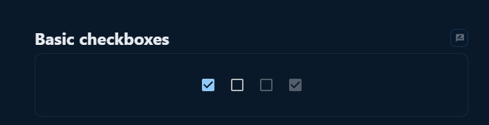
Additionally, you can alter the checkbox default styles by using a custom styles object created with the help of the Material UI makeStyles hook. This gives you more precise control over how the checkbox looks.
Here is an illustration of how the makeStyles hook could be used to develop a special styles object for a Material UI checkbox:
import React from 'react';
import { makeStyles } from '@material-ui/core/styles';
import Checkbox from '@material-ui/core/Checkbox';

const useStyles = makeStyles({  // This is a function that returns an object.
    root: {
        color: 'green',
        '&$checked': {
            color: 'green',
        },
    },
    checked: {},
});

const MuiCheckbox = () => {
    const classes = useStyles();

    return (
        <Checkbox
            defaultChecked
            classes={{ root: classes.root, checked: classes.checked }}
            inputProps={{ 'aria-label': 'primary checkbox' }}
        />
    );
};

export default MuiCheckbox;
The result of the above color implementation can be examined below;

How to Customize MUI Checkbox Sizes
You can alter the checkbox size using the size prop that is a part of the MUI Checkbox component. The sizes “small” and “medium” are available as values for this prop, which accepts a string as input.
Here is an illustration of how you could alter the size of a Material UI Checkbox using the size prop:
import Checkbox from '@material-ui/core/Checkbox';

// Use the 'size' prop to specify the size you want to use
<Checkbox size="small" />
A custom style object that you can use to alter the checkbox default styles can be created using the makeStyles hook from Material UI in addition to the size argument. This gives you more precise control over the checkbox size.
Here is an illustration of how the makeStyles hook could be used to develop a special styles object for a Material UI Checkbox component:
import { makeStyles } from '@material-ui/core/styles';

// Create a custom styles object
const useStyles = makeStyles({
  root: {
    // Specify your custom styles here
    width: 24,
    height: 24,
  },
});

// Use the custom styles object to override the default styles of the checkbox
<Checkbox classes={useStyles()} />
Setting Material UI checkbox state with React useState Hook
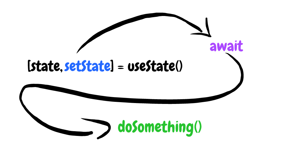
The checked prop can be used to specify the checkbox’s initial checked state and the onChange event handler to update the checked state when the user interacts with the checkbox when using the React useState hook to set the state of a Material UI Checkbox component.
Here is an illustration of how to set the state of a Material UI checkbox using the useState hook, the checked and onChange props:
import Checkbox from '@material-ui/core/Checkbox';

// Define a state variable to track the checked state of the checkbox
const [checked, setChecked] = useState(false);

// Define the onChange event handler
const handleChange = (event) => {
  setChecked(event.target.checked);
};

// Use the 'checked' prop and the 'onChange' event handler to set the state of the checkbox
<Checkbox checked={checked} onChange={handleChange} />
In this code illustration, the checked state variable is defined using the useState hook and given the initial false value. It is passed to the checked prop of the checkbox. When the user interacts with the checkbox, the handleChange event handler is utilized to update the checked state variable. This causes the checkbox to update its checked state appropriately.
Making Material UI Checkbox checked by default
You can use the defaultChecked prop to set a Material-UI Checkbox component to be checked by default. The checked value is set as the checkbox default value by the defaultChecked prop.
Using a Material-UI Checkbox and the defaultChecked prop, for instance, looks like this:
import React from 'react';
import { Checkbox } from '@material-ui/core';

function MyCheckbox() {
  return <Checkbox defaultChecked />;
}
The checkbox will be checked by default when the component is rendered in this example because the defaultChecked prop is set to true.
The defaultChecked prop also works similarly with the Material-UI checkbox groups. Here’s an illustration:
import React from 'react';
import { Checkbox, FormGroup, FormControlLabel } from '@material-ui/core';

function MyCheckboxGroup() {
  return (
    <FormGroup>
      <FormControlLabel
        control={<Checkbox defaultChecked />}
        label="Option 1"
      />
      <FormControlLabel
        control={<Checkbox defaultChecked />}
        label="Option 2"
      />
    </FormGroup>
  );
}
In this example, the defaultChecked prop is set to true for both Checkbox components, so both checkboxes in the group will be checked by default when the component is rendered.
How to use Material UI disabled prop?
If a button or form input should be disabled, it can be specified using the disabled prop in the Material-UI framework. When an element is disabled, the user is unable to interact with it and it is typically displayed in a faded or greyed-out style.
Here is an illustration of how to combine a Material-UI checkbox with a disabled prop:
import React from 'react';
import { Checkbox } from '@material-ui/core';

function MyCheckbox(props) {
  return <Checkbox disabled={props.disabled} />;
}
The disabled prop is passed down to the Checkbox component from the parent component in this example. The checkbox will be disabled if props disabled are set to true. Otherwise, it will be activated.
Similarly, you can use the disabled prop with Material-UI checkbox groups. Here’s an illustration:
import React from 'react';
import { Checkbox, FormGroup, FormControlLabel } from '@material-ui/core';

function MyCheckboxGroup(props) {
  return (
    <FormGroup>
      <FormControlLabel
        control={<Checkbox disabled={props.disabled} />}
        label="Option 1"
      />
      <FormControlLabel
        control={<Checkbox disabled={props.disabled} />}
        label="Option 2"
      />
    </FormGroup>
  );
}
In this illustration, each Checkbox component receives the disabled prop from the parent component. Both of the checkboxes in the group will be disabled if their disabled props are set to true. If not, they will be made available.
Material UI Checkbox component as Icons
Checkboxes can be displayed as icons rather than their standard rectangular shape using the Material UI checkbox component. This helps you make your design more visually appealing and compact. It can also give your checkboxes a more distinct and individual appearance.
The icon prop defines the icon you want to use when displaying a Material UI checkbox as an icon. This attribute takes a React element, so you may use whatever icon component you want, such as the Material UI Icon component or an icon library from a third party.
As an illustration, consider using the icon prop to show a Material UI checkbox as an icon:
import React from 'react';
import { Checkbox, Icon } from '@material-ui/core';

const MuiCheckbox = () => {
return (
        <div>
         {/* Using Icons as checkbos */}
            <Checkbox
                icon={<Icon>{svgIcon}</Icon>}
                checkedIcon={<Icon>{svgIcon}</Icon>}
                defaultChecked
                color="primary"
                inputProps={{ 'aria-label': 'primary checkbox' }}
             />
        </div>
    );
};

export default MuiCheckbox;
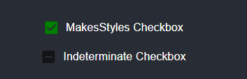
Understanding and Application of The MUI Checkbox component Indeterminate prop
The Material UI Checkbox component’s indeterminate prop, a boolean property, defines whether the checkbox is in an indeterminate state or not. The checkbox will be rendered as a horizontal line if the indeterminate prop is set to true, denoting that it is neither checked nor unchecked.
When a checkbox designates a collection of things but only some of those items are checked, it can be advantageous to have this uncertain condition. You could use the indeterminate prop to display the checkbox in an indeterminate state to show the user that some but not all of the items in a list it represents are checked, for instance, if you have a checkbox that represents a list of items and some but not all of the items in the list are checked.
A Material UI checkbox might be displayed in an uncertain state using the indeterminate prop, as shown in the following example:
FormControlLabel
   control={
      <Checkbox
         indeterminate
         inputProps={{ 'aria-label': 'indeterminate checkbox' }}
        />
      }
     label="Indeterminate Checkbox"
  />
You could check out the result of the above implementation in the image below:
When to use Checkbox Over Radio buttons
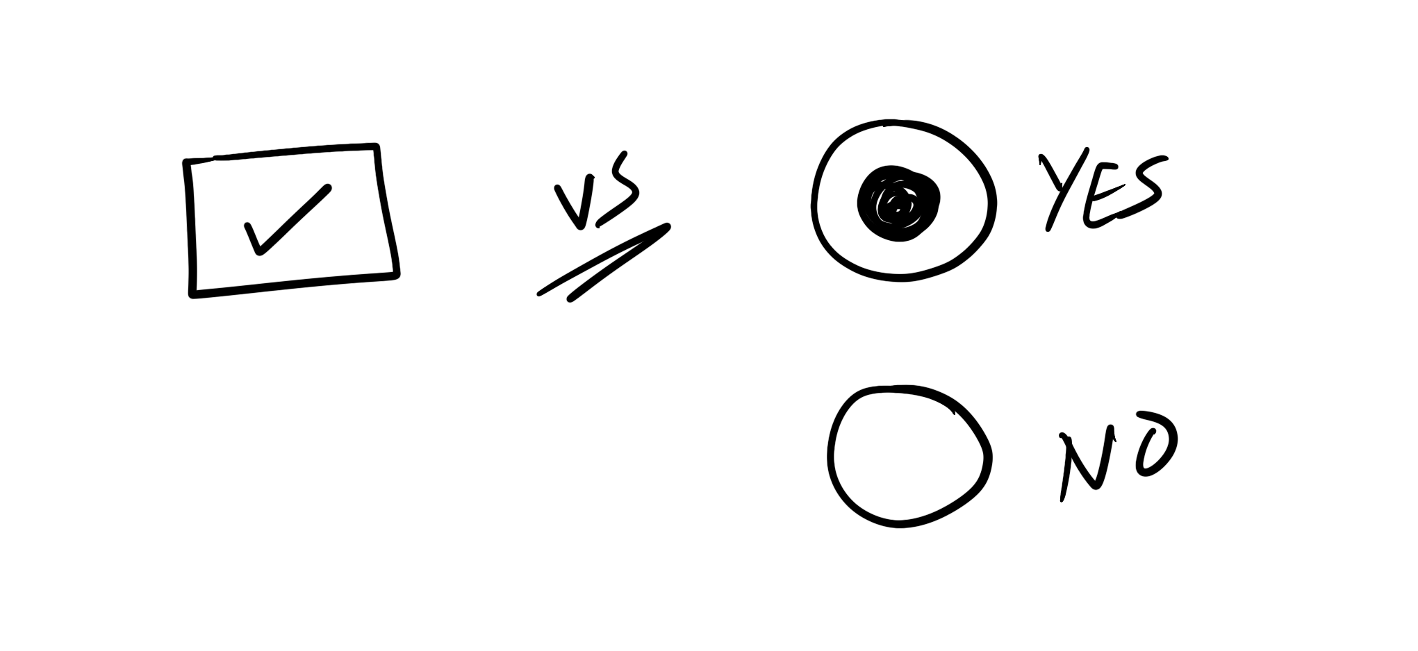
The user can choose one or more options from a list of options by using checkboxes or radio buttons. However, they frequently have different functions and are applied in various contexts.
When a user must choose one or more options from a list of mutually exclusive alternatives, checkboxes are used. Use checkboxes to enable the user to select multiple options from a list of fruits. For instance, if you were designing a survey to gather information about the fruits that people prefer. The user could choose as many options as they wanted in this situation. There is no restriction on how many options they can select.
On the other hand, radio buttons are used when a user must choose just one item from a list of mutually exclusive alternatives. For instance, radio buttons could be used to allow a user to choose one option from a list of two options on a form that was designed to collect information about their gender (e.g., Male or Female). The user is limited to choosing one option in this situation and cannot choose more than one option at once.
However, checkboxes are typically used when a user needs to choose several options from a list. Radio buttons are typically used when a user only needs to choose one option. However, the choice of input control must be made by the designer based on the application’s requirements and the particular context.
Conclusion
Without a doubt, we have been able to look at what the Material UI Checkbox component is and how to implement it in React applications, and what Material UI Checkbox placement and label is. Also, we looked at how to customize colors, and sizes in Material UI Checkbox, and how to set the Material UI Checkbox using React useState Hook but to mention a few.
I’m sure that with this article, working with Material UI Checkbox is now made easy.
With CopyCat, you can create UI more quickly than your rivals. By using CopyCat AI to generate production-ready code directly from Figma drawings, you can concentrate on creating interactions, animations, networking, and everything else that will set your work apart. Using CopyCat, you can excel as a front-end developer who creates user interfaces quickly.
To find more intriguing reads check out our blog at CopyCat here, examples of interesting reads from our blog;
- A great guide to using Material UI Textfield efficiently
- Material UI Grid: The ultimate guide to building responsive web layout in React
- Vue vs React
- Complete Guide to Using Material UI Button in React
Related Articles
-
 React.js
The Complete Basics of Typescript Record
Introduction When attempting to incorporate more sophisticated types of data, TypeScript Records are an excellent technique to guarantee consistency. They allow you to provide unique interfaces for the values while enforcing important values. When used to its full potential, TypeScript…
December 24, 2022 -
React.js
Your Guide To The React Context API
Introduction More often than not, building React applications involves consuming data of different forms for our use. Primarily, data management in React applications is via props; and sometimes, that’s just all we need. However, as our application grows larger and…
August 26, 2022


