
 August 23, 2022
  Shaydee Coder


- What is React Calendar?
- Creating a React Project
- Installing React Calendar Library
- Adding a Calendar with React-Calendar Container Element
- Using the Calendar Component from React-Calendar
- Styling your React calendar
- How to Customize React-Calendar with Custom CSS?
- CSS Source Order
- Selecting a Date Range
- Customizing the React Calendar
- Click events in React-Calendar
- Recommended Resources
- Conclusion
- Easily Convert Figma Design to Code
- Interesting Reads From Our Blogs
Often, you want to manage and manipulate dates in your web app. These may include adding events or setting reminders, and a date picker for selecting dates in modern applications. Having a calendar in your web application is a way to implement this.
This tutorial will show you how to create a simple reusable calendar component that you can use on your calendar page in any React application using React-Calendar.
What is React Calendar?
React-Calendar is a React library that enables you to easily create calendar components with the ability to pick days, months, years or even decades. The calendar component from the library also supports date range selection.
Creating a React Project
Let’s use Create React App to start a new React project for this tutorial. Make sure you have Node.js ≥v10.16 and npm ≥v5.6 installed on your machine.
To create a new project, run the following command:
$ npx create-react-app calendar-example
Installing React Calendar Library
Next, let’s add the library to our project using npm:
$ npm install react-calendar
Adding a Calendar with React-Calendar Container Element
Now that we have a bare-minimum setup, let’s remove the basic boilerplate code added by Create React App and let’s add the calendar to our React app by importing <Calendar /> from react-calendar to the App.js file.
// App.js

// Add Calendar
import Calendar from 'react-calendar';
import './App.css';
Using the Calendar Component from React-Calendar
Let’s see our we can use the <Calendar /> imported from the react-calendar library in practice. Add the code snippet below to the App.js file like this:
// App.js

import Calendar from 'react-calendar';
import './App.css';

function App() {
  return (
    <div className='app'>
      <h1 className='text-center'>React Calendar</h1>
      <div className='calendar-container'>
        <Calendar />
      </div>
    </div>
  );
}

export default App;
Here, we added a <Calendar /> component to our App.js file. But we need to create a state to store our date data and pass the JavaScript Date object representing the current date as its initial value.
// App.js

import { useState } from 'react';
import Calendar from 'react-calendar';
import './App.css';

function App() {
  const [date, setDate] = useState(new Date());

  return (
    <div className='app'>
      <h1 className='text-center'>React Calendar</h1>
      <div className='calendar-container'>
        <Calendar />
      </div>
    </div>
  );
}

export default App;
Now, let’s pass the JavaScript date objects stored in our date state as a value to the <Calendar /> component and setDate to the onChange prop.
// App.js

import { useState } from 'react';
import Calendar from 'react-calendar';
import './App.css';

function App() {
  const [date, setDate] = useState(new Date());

  return (
    <div className='app'>
      <h1 className='text-center'>React Calendar</h1>
      <div className='calendar-container'>
        <Calendar onChange={setDate} value={date} />
      </div>
    </div>
  );
}

export default App;
Let’s add some text that will we use to show which date was selected on the calendar.
// App.js

import { useState } from 'react';
import Calendar from 'react-calendar';
import './App.css';

function App() {
  const [date, setDate] = useState(new Date());

  return (
    <div className='app'>
      <h1 className='text-center'>React Calendar</h1>
      <div className='calendar-container'>
        <Calendar onChange={setDate} value={date} />
      </div>
      <p className='text-center'>
        <span className='bold'>Selected Date:</span>{' '}
        {date.toDateString()}
      </p>
    </div>
  );
}

export default App;
With this basic structure ready, our initial calendar will look similar to this:
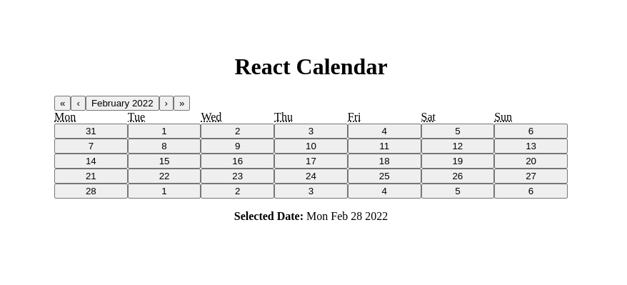
If you check the code of the App.js file, we created a state named date and passed it to the value prop on the <Calendar /> component. Then we passed the setState function to another prop called onChange on the <Calendar /> component, which sets the date state to the value clicked by the user.
You’ll notice that the initial value passed to the calendar is the present date. But when a user clicks the calendar, its value will be set to whatever date the user clicks. For this application, we are printing the date value below our calendar so we know what date the user selected from the calendar.
Styling your React calendar
Now that we’re done with the very basic calendar implementation, let’s add some styling to it so it doesn’t look pretty boring as shown in the image above.
React-Calendar provides some default calendar styles which you can apply by importing its stylesheet by adding the following line of code from the code snippet below to your App.js file:
import 'react-calendar/dist/Calendar.css';
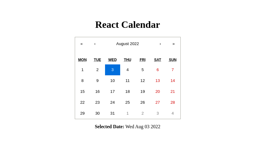
If you want to add your own styling, you can override these classes and add your custom CSS properties.
How to Customize React-Calendar with Custom CSS?
The custom styles of React-Calendar look great, right? Now our calendar doesn’t look boring anymore. But there’s an issue with using the default calendar style that React calendar provides for us. We always want our components to be consistent with the overall style of our product or application.
So, how can we maintain the consistency of the overall style of our application? The elements of React-Calendar already have some classes applied to them, we can leverage these classes, and use them to add your custom styles.
The best way to apply your styling is by overriding Calendar.css. So how do we override a style that wasn’t written by us?
CSS Source Order
Well! In CSS, we can override CSS rules with something called source order. CSS rules always prioritize from left to right, then from top to bottom, so all we have to do to override the default styling is by importing just one marking style sheet file just below where the default styling was imported in the App.js file like this:
// App.js
import { useState } from "react";
import Calendar from "react-calendar";
import "react-calendar/dist/Calendar.css";
import "./App.css";
Learning how CSS work behind the scenes would help you understand the different methods with which you can use to override CSS rules when working on a project.
Now let’s change some default font colours and background colours of the calendar with some border radius to the range selection so we’d know if our CSS source order is working fine. Here, I overrode some classes and added my custom styles to get a result similar to this:
.react-calendar {
  width: 400px;
  max-width: 100%;
  background-color: #fff;
  color: #222;
  border-radius: 8px;
  box-shadow: 0 12px 24px rgba(0, 0, 0, 0.2);
  font-family: Arial, Helvetica, sans-serif;
  line-height: 1.125em;
}

.react-calendar__navigation button {
  color: #d4a713;
  min-width: 44px;
  background: none;
  font-size: 16px;
  margin-top: 8px;
}

.react-calendar__navigation button:enabled:hover,
.react-calendar__navigation button:enabled:focus {
  background-color: #f8f8fa;
}
.react-calendar__navigation button[disabled] {
  background-color: #f0f0f0;
}
abbr[title] {
  text-decoration: none;
}

/* .react-calendar__month-view__days__day--weekend {
  color: #d10000;
 } */

.react-calendar__tile:enabled:hover,
.react-calendar__tile:enabled:focus {
  background: #f8f8fa;
  color: #d4a713;
  border-radius: 6px;
}

.react-calendar__tile--now {
  background: #d4a71333;
  border-radius: 6px;
  font-weight: bold;
  color: #d4a713;
}

.react-calendar__tile--now:enabled:hover,
.react-calendar__tile--now:enabled:focus {
  background: #d4a71333;
  border-radius: 6px;
  font-weight: bold;
  color: #d4a713;
}

.react-calendar__tile--hasActive:enabled:hover,
.react-calendar__tile--hasActive:enabled:focus {
  background: #f8f8fa;
}

.react-calendar__tile--active {
  background: #d4a713;
  border-radius: 6px;
  font-weight: bold;
  color: white;
}

.react-calendar__tile--active:enabled:hover,
.react-calendar__tile--active:enabled:focus {
  background: #d4a713;
  color: white;
}

.react-calendar--selectRange .react-calendar__tile--hover {
  background-color: #f8f8fa;
}

.react-calendar__tile--range {
  background: #f8f8fa;
  color: #d4a713;
  border-radius: 0;
}

.react-calendar__tile--rangeStart {
  border-top-right-radius: 0;
  border-bottom-right-radius: 0;
  border-top-left-radius: 6px;
  border-bottom-left-radius: 6px;
  background: #d4a713;
  color: white;
}

.react-calendar__tile--rangeEnd {
  border-top-left-radius: 0;
  border-bottom-left-radius: 0;
  border-top-right-radius: 6px;
  border-bottom-right-radius: 6px;
  background: #d4a713;
  color: white;
}
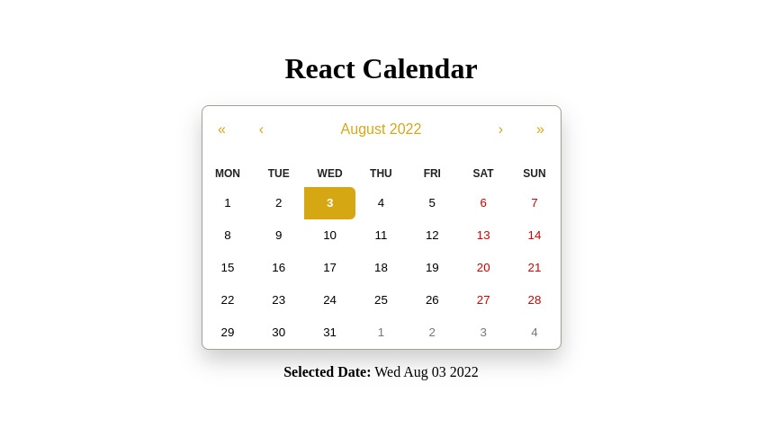
The code above will also help us create a custom date range with our own custom CSS. Now, let’s create a date range with this custom CSS that we have created.
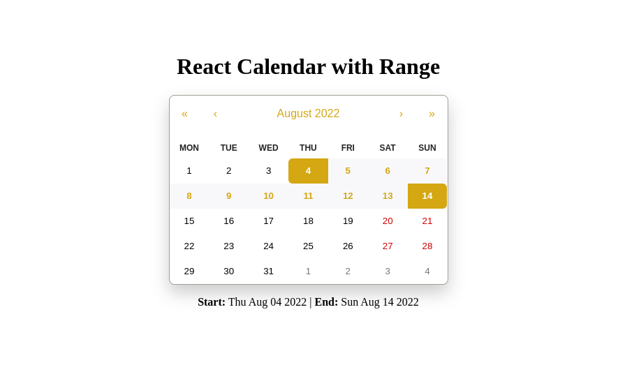
Selecting a Date Range
Let’s also consider a scenario where you need to provide some data or information between a custom range of dates that enables users to select their desired range of dates, which you can then use for the rest of the operations.
The date range is a number of dates that includes a particular start and finish date and all dates in between. React-Calendar supports this feature very effectively.
Let’s use this case scenario and improve our application to select the range of dates. We will print the start and end of the range at the bottom of the calendar.
The modified App.js file will look like this:
// App.js
import { useState } from 'react';
import Calendar from 'react-calendar';
import 'react-calendar/dist/Calendar.css';
import './App.css';
function App() {
const [date, setDate] = useState(new Date());
return (
<div className='app'>
<h1 className='text-center'>React Calendar with Range</h1>
<div className='calendar-container'>
<Calendar
onChange={setDate}
value={date}
selectRange={true}
/>
</div>
{date.length > 0 ? (
<p className='text-center'>
<span className='bold'>Start:</span>{' '}
{date[0].toDateString()}
|
<span className='bold'>End:</span> {date[1].toDateString()}
</p>
) : (
<p className='text-center'>
<span className='bold'>Default selected date:</span>{' '}
{date.toDateString()}
</p>
)}
</div>
);
}
export default App;
To enable a date range feature, we need to pass the selectRange prop to our <Calendar /> component. The selectRange value is always false by default. After enabling this prop, React-Calendar will return an array with two dates: the start date and end date. The selected range with the start and end date is highlighted to make the user understand the selection.
After adding a date range, the <Calendar /> component will look like this:
Customizing the React Calendar
Next, let’s see how we can customize the React calendar component. The components provide props which we can use to configure or customize the component to suit our needs. Let’s dive deeper into the different props which we can use to customize the calendar component:
Default View
This prop is used to set the date view of the calendar. By default, it is set to month. So if this prop is missing, the calendar shows you a monthly view.
It determines which calendar view shall be opened initially. It does not disable navigation. defaultView provides four options as strings:
- month
- year
- decade
- century
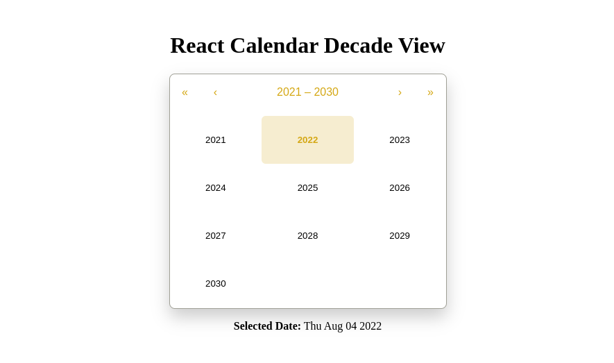
Even if this prop is set to some value, you can still navigate between different dates/months. Here’s how to implement defaultView:
<Calendar
  onChange={setDate}
  selectRange={true}
  defaultView='decade'
/>
This prop will change the initial rendering of the calendar, making it look something like this:
Default Value
The defaultValue prop enables you to set a default selected value. This value can be either one value for a single date selection or an array of two values for a date range selection.
- Date for single date selection: new Date()
- An array of dates for date range selection: [new Date(2017, 0, 1), new Date(2017, 7, 1)]
You can add defaultValue like this:
// App.js

function App() {
  const [date, setDate] = useState([
    new Date(2021, 6, 1),
    new Date(2021, 6, 10),
  ]);

  return (
    <div className='app'>
      <h1 className='text-center'>React Calendar with Range</h1>
      <div className='calendar-container'>
        <Calendar
          onChange={setDate}
          selectRange={true}
          defaultValue={date}
        />
      </div>
    </div>
  );
}
Next and Prev Labels
The Next and Prev labels will enable you to define the names of the buttons that users can use to navigate between views on the calendar. This can also be accessed using the aria-label attributes.
The props available for changing the next values are nextLabel, nextAriaLabel, next2Label, and next2AriaLabel. Any string value can be added to this, but setting the value explicitly to null will hide the icon.
These properties are similar for all the prev buttons except that prev is a prefix — e.g., prevLabel, prevAriaLabel, prev2Label, prev2AriaLabel, etc.
After adding the Next and Prev labels, the code will look like this:
<Calendar
  onChange={setDate}
  value={date}
  nextLabel='month>>'
  nextAriaLabel='Go to next month'
  next2Label='year>>'
  next2AriaLabel='Go to next year'
  prevLabel='<<month'
  prevAriaLabel='Go to prev month'
  prev2Label='<<year'
  prev2AriaLabel='Go to prev year'
/>
MaxDate and MinDate
You can limit the date users can choose from, for example, you can set a maximum date if you don’t want the users to select a date after a certain day. You can do this by adding a maxDate prop to the calendar. And a minDate prop if you want to set a limit to the start date that users are allowed to pick.
With the maxDate and minDate props, users won’t be able to select any date that is later than the maximum date specified in the maxDate prop, and any date earlier than the minimum date specified in the minDate prop.
// calendar component

<Calendar
  onChange={setDate}
  value={date}
  maxDate={new Date()} // will not allow date later than today
  minDate={new Date(2015, 6, 1)} // will not allow date before 1st July 2015
/>
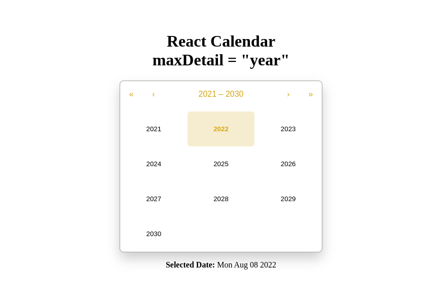
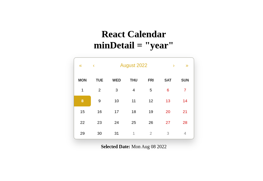
MaxDetail and MinDetail
maxDetail is the most detailed view that the user will see. View defined here also becomes the one on which clicking an item will select a date and pass it to onChange. It can be either “month”, “year”, “decade” or “century”. The default value for maxDetail is “month”.
minDetail is the least detailed view that the users will see. It can also be either “month”, “year”, “decade” or “century”. The default value for minDetail is “century”.
Below is an example of maxDetail and minDetail:
// calendar with maxDetail

<Calendar
  onChange={setDate}
  value={date}
  maxDetail='year'
/>
// calendar with minDetail

<Calendar
  onChange={setDate}
  value={date}
  minDetail='year'
/>
Click events in React-Calendar
React-Calendar supports a wide range of click events. React-Calendar has the most effective props that you can use to trigger some function calls based on the user’s action. Here are some of the most widely used events.
OnViewChange
The onViewChange prop accepts a function that is called when users navigate from one view to another using drill up button or by clicking a tile.
The action in the object passed as a parameter to the onViewChange function signifies the reason for view change and can be one of the following values: “prev”, “prev2”, “next”, “next2”, “drillUp”, “drillDown”, “onChange”. Here’s an example of how the function looks:
({ action, activeStartDate, value, view }) => alert('New view is: ', view)
OnClickDay
The onClickDay prop accepts a function called only when the user clicks a day. Here’s an example of how the function looks:
(value, event) => alert('Clicked day: ', value)
Just like onClickDay, React-Calendar also supports the following events:
- onClickDecade
- onClickMonth
- onClickYear
- onClickWeekNumber, etc.
OnChange
The onChange prop also accepts a function that is only called when the user clicks an item (day on month view, month on year view and so on) on the most detailed view available. We can receive user selection with the help of this in the following way:
(value, event) => alert('New date is: ', value)
Recommended Resources
Finally, we’re at the end of the article but there’s always more to learn, so if you’d like to learn more about how to build a base calendar component in React, and how you should be displaying data loading indicator for your calendar components. I’d recommend you look up the resources below:
Conclusion
React-Calendar provides a lot of flexibility which makes its implementation very easy. It is highly customizable and dependent on the native JavaScript Date object, which makes it much easier to use.
Although react-calendar is not the only library that can be used to build a calendar in React. There are other libraries you can also use to build a calendar component in React such as react-big-calendar. You can also decide to build a calendar component from scratch yourself without using any library.
I hope this tutorial leaves you with the foundational knowledge you need to implement and customize the Calendar library to suit your app and its audience.
If you have any questions about using React-Calendar, feel free to ask them in the comment below.
Easily Convert Figma Design to Code
You can build UI faster than your competition with CopyCat. Just copy production-ready code generated directly from Figma designs using CopyCat AI. As a result, you can focus on building interactions, animations, networking, and everything else that will make you stand out. You can be an exceptional front-end developer who develops UI quickly using CopyCat.
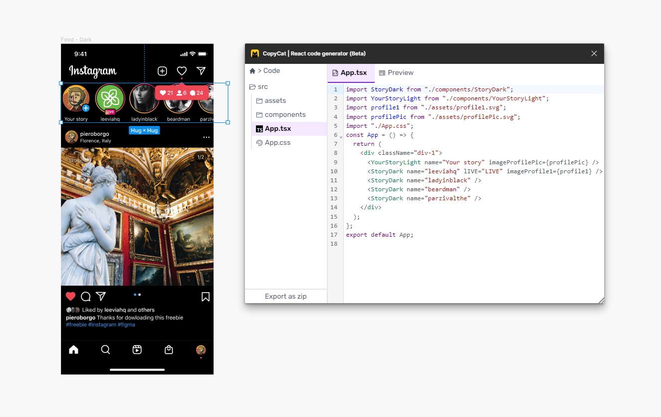
This tool can also help you convert figma designs to tailwind-css projects and react low code if you’re working on an application.
You’ll be 2X faster at developing UI. You’ll meet your deadlines and spend your time solving exciting challenges, too! Best of all, you’ll eliminate sprint delays and design inconsistencies.
Interesting Reads From Our Blogs
- React Draggable Components
- React useState Hook
- How to Convert Figma to React
- React Fetch: Guide to Fetching Data from API and Examples
- React Proptypes: A Comprehensive Guide
- Why and How to Use React useState Hook
Related Articles
-
 React.js
Everything You Need to Know about Typescript Class
Microsoft created and maintains the well-known programming language known as Typescript. It is a tight superset of JavaScript in terms of syntax and gives the language the option of static typing. Classes, which gives you a mechanism to build reusable…
December 20, 2022 -
React.js
Popular React Dropdown Libraries – Creating Dropdowns with Bootstrap
Consider CopyCat, an AI-powered plugin that can convert your Figma designs to production-ready UI code, freeing up your time to focus on the app's business logic. Convert Design to Code with CopyCat Introduction Dropdowns are useful components that allow users…
December 23, 2022

