 December 23, 2022
  Uncle Big Bay


- Introduction
- What is a Dropdown in React?
- React Dropdown Libraries
- react-select
- Downshift
- react-dropdown
- rc-dropdown
- react-menu
- react-select-search
- Bootstrap Dropdowns
- Setting Up a New React App
- Installing Bootstrap
- Building a Custom Dropdown Menu Component with Bootstrap
- Bootstrap Dropdown Variant Color
- Dark Mode Dropdown
- Drop Direction
- Wrapping Up
- What's Next?
- Interesting Reads From Our Blogs
Consider CopyCat, an AI-powered plugin that can convert your Figma designs to production-ready UI code, freeing up your time to focus on the app’s business logic.
Introduction
Dropdowns are useful components that allow users to choose from a list of related items or options rather than scrolling through them individually on the page.
The dropdown component can be used to improve a congested user interface by grouping items in the same category together and allowing the user to select one or more options from the list.
In this tutorial, we’ll go over how dropdowns work, how to make a custom dropdown, and which libraries to use to make dropdowns in a React application.
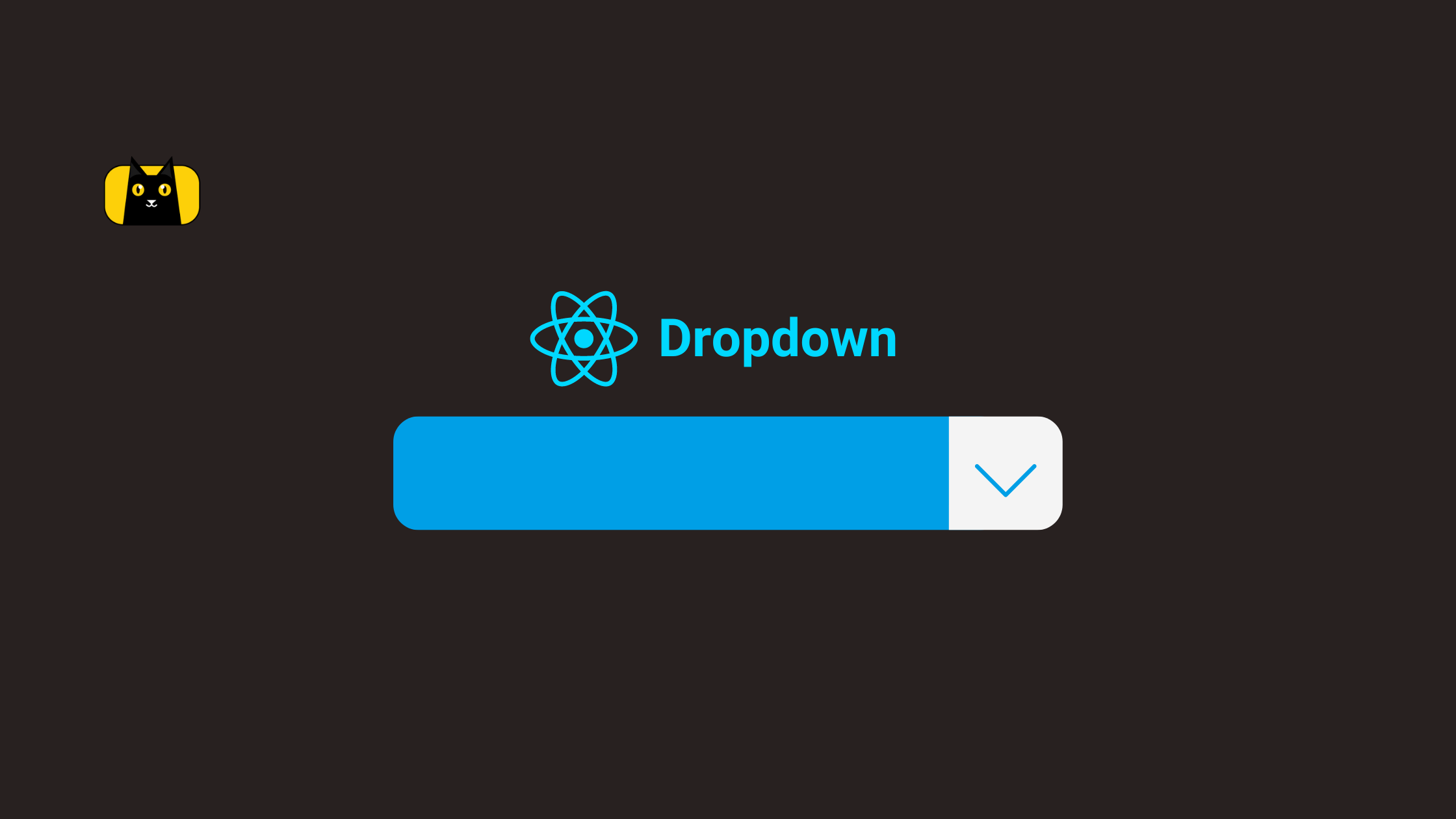
What is a Dropdown in React?
Dropdowns are React components that allow users to choose from a list of possible options rendered as a dropdown list. They can be created using a library or built from the ground up as a custom dropdown.
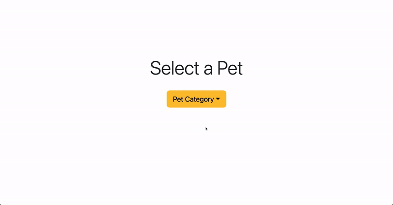
The most popular use case of the dropdown is the dropdown menu to select an option from a list category, and it’s demonstrated below:
React Dropdown Libraries
React is a library itself, so it’s easier to plug in other libraries to build faster. We don’t have to create a dropdown from scratch; instead, we can use a UI library or a dedicated dropdown library to create our dropdowns.
Below are lists of React dropdown libraries:
react-select
The react-select library is the most used react dropdown library with over 4 million weekly downloads on npm and over 25k stars on GitHub.
According to the creator of react-select: React Select helps you develop powerful select components that just work out of the box, without stopping you from customizing the parts that are important to you.
Run the command below to install react-select library using yarn:
yarn add react-select
Downshift
Downshift is a powerful and widely used dropdown library for creating dropdowns with accessibility, autocomplete, and support the standard ARIAL design for Combobox, and select dropdown components.
It offers easy-to-use hooks for building dropdown components. It has over 1 million weekly downloads on npm and over 11k stars on GitHub.
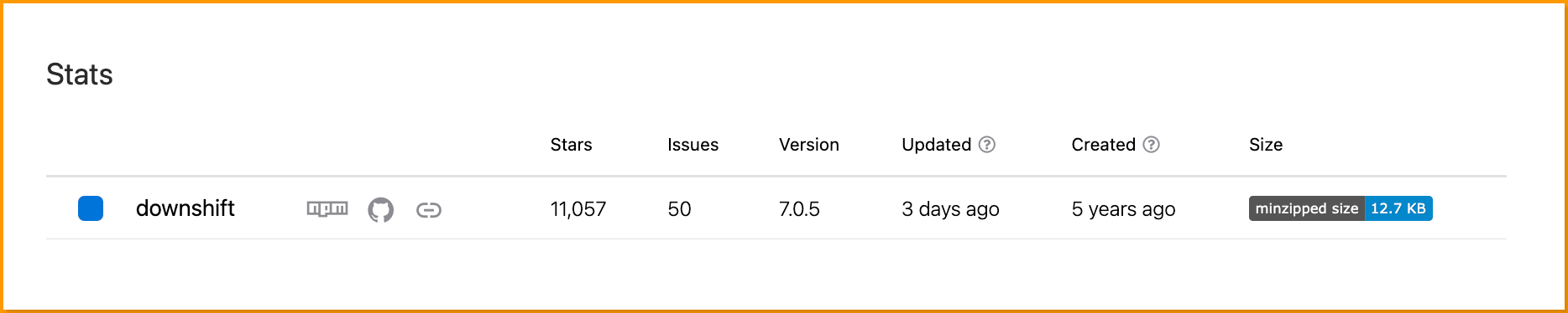
Run the command below to install downshift library using npm:
npm i downshift
react-dropdown
This library is inspired by react-select a popular and useful dropdown component. It has over 82k weekly downloads on npm and close to 1k stars on GitHub.
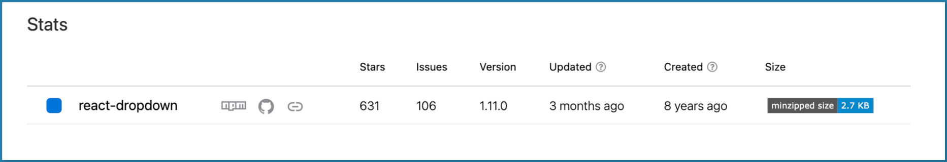
Run the command below to install react-dropdown library using npm:
npm i react-dropdown
rc-dropdown
The React component dropdown is a popular open-source library for building dropdowns with over 855k weekly downloads on npm with an interactive playground.
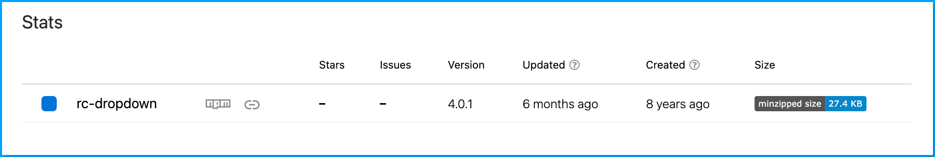
Run the command below to install rc-dropdown library using npm:
npm i rc-dropdown
react-menu
React-menu is an accessible dropdown library that supports unlimited levels of submenus and flexible positioning. It has over 37k weekly downloads on npm and close to 1k stars on GitHub
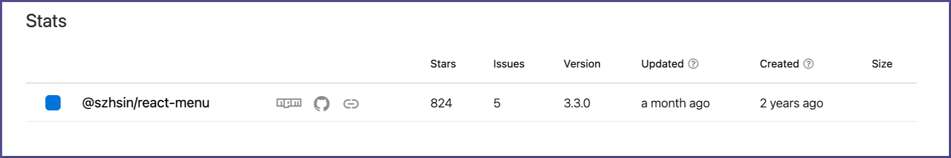
Run the command below to install @szhsin/react-menu library using npm:
npm i @szhsin/react-menu
react-select-search
The react-select-search is a simple, lightweight dropdown component that supports search and filter options right out of the box.
It has over 1k stars on GitHub and over 22k weekly downloads on npm.
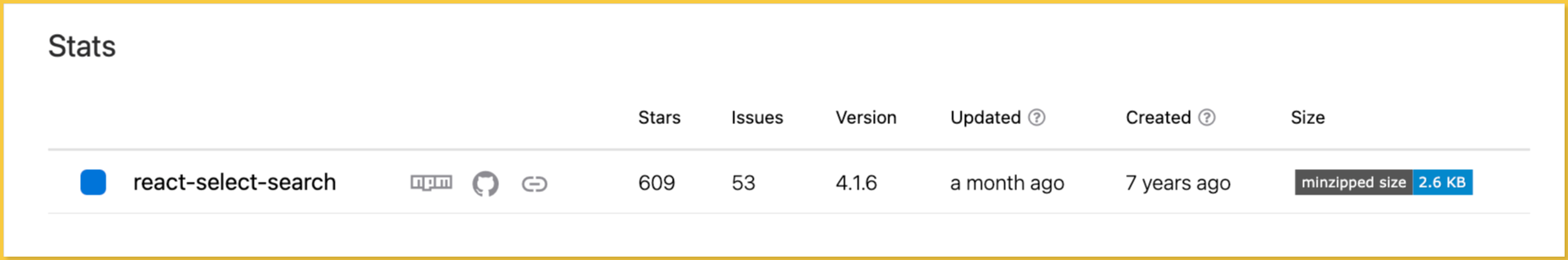
Run the command below to install react-select-search library using npm:
npm i react-select-search
Bootstrap Dropdowns
Bootstrap is a popular CSS framework in the frontend field; we’ll look at the dropdown component, how to use it, and what it has to offer.
Though Bootstrap is not a dedicated dropdown library, it does provide extensive features, functionality, and customization for its dropdown component.
Setting Up a New React App
Use the following command to create a new react application:
npx create-react-app my-app
Next, run the following command to navigate to your newly generated app directory:
cd my-app
Then run the following command to start your React server:
yarn start
Or using npm:
npm start
Your server should launch in your browser at http://localhost:3000/, as shown below:
Installing Bootstrap
Run the command below to install bootstrap and its react-bootstrap dependency:
With npm:
npm install react-bootstrap bootstrap
With yarn:
yarn add react-bootstrap bootstrap
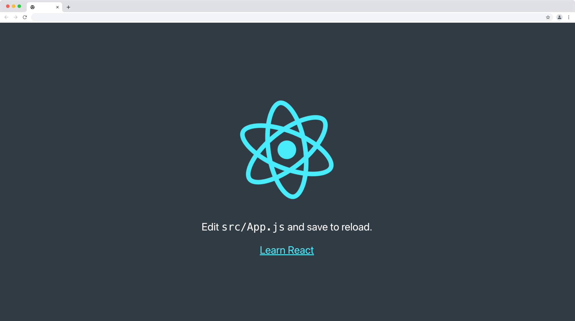
Next, we’ll import the bootstrap style in our App.js file. Update your App.js file with the code below:
import logo from "./logo.svg";
import "./App.css";
import "bootstrap/dist/css/bootstrap.min.css";

function App() {
  return (
    <div className='App'>
      <header className='App-header'>
        <img src={logo} className='App-logo' alt='logo' />
        <p>
          Edit <code>src/App.js</code> and save to reload.
        </p>
        <a
          className='App-link btn btn-success'
          href='https://reactjs.org'
          target='_blank'
          rel='noopener noreferrer'
        >
          Learn React
        </a>
      </header>
    </div>
  );
}

export default App;
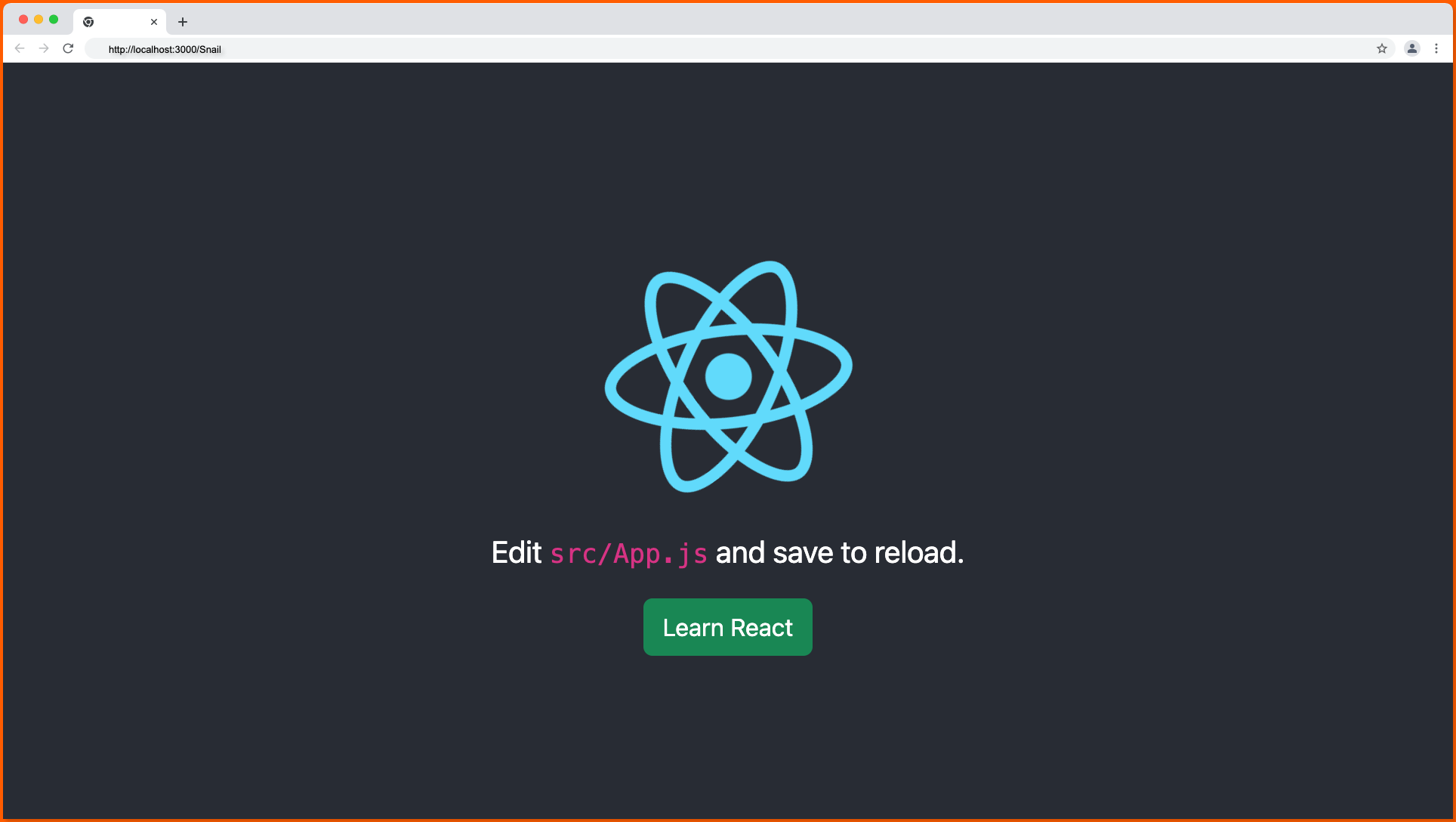
If your React app appears as shown below in your browser, then Bootstrap is successfully installed in your project:
Building a Custom Dropdown Menu Component with Bootstrap
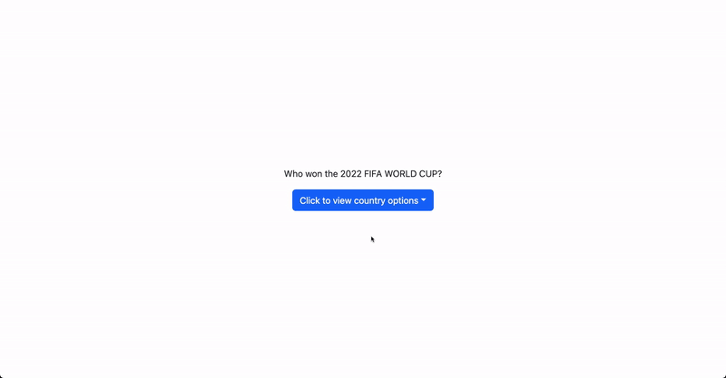
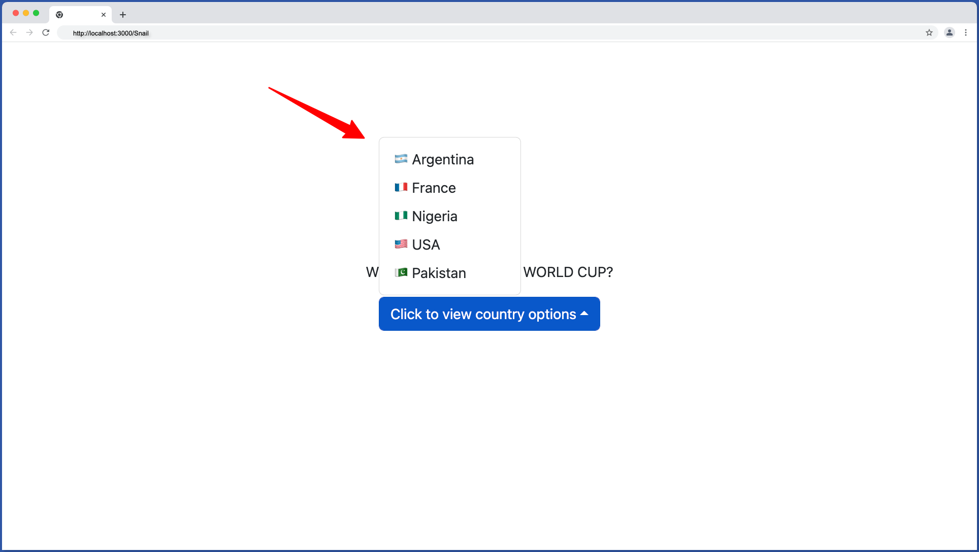
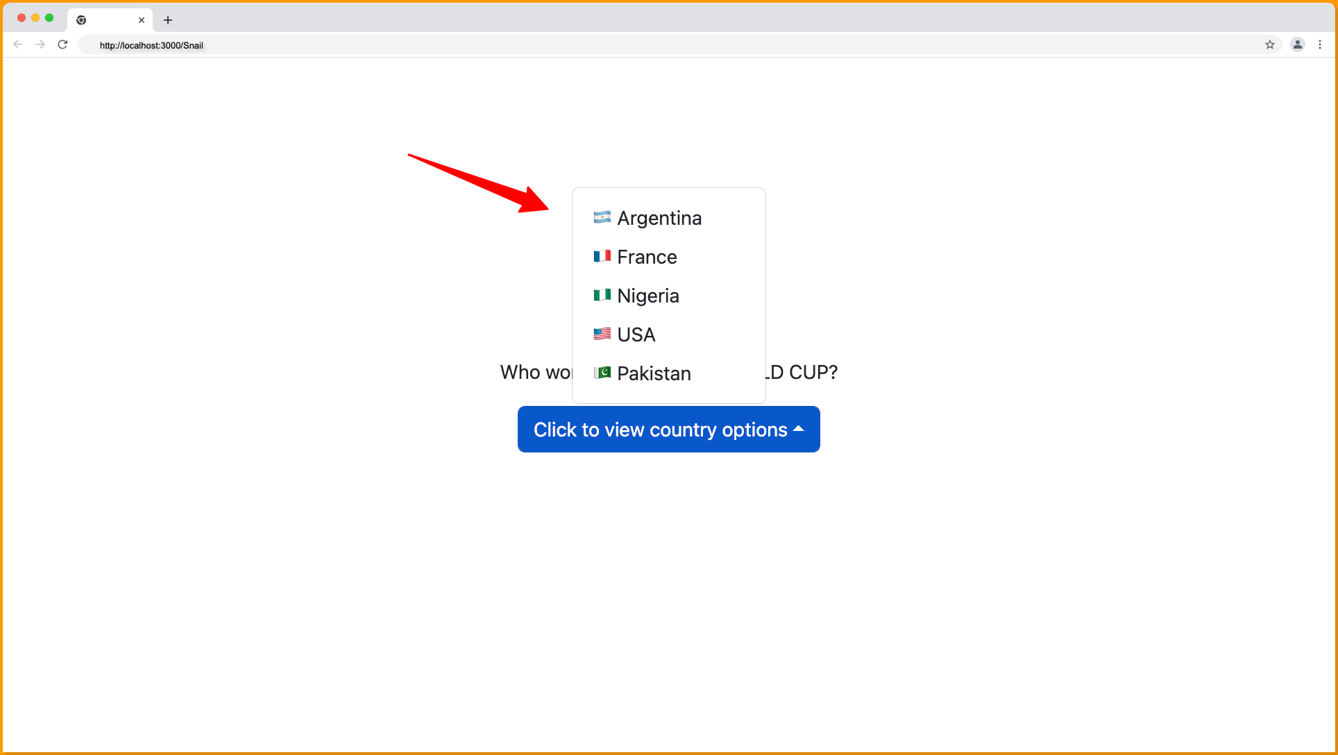
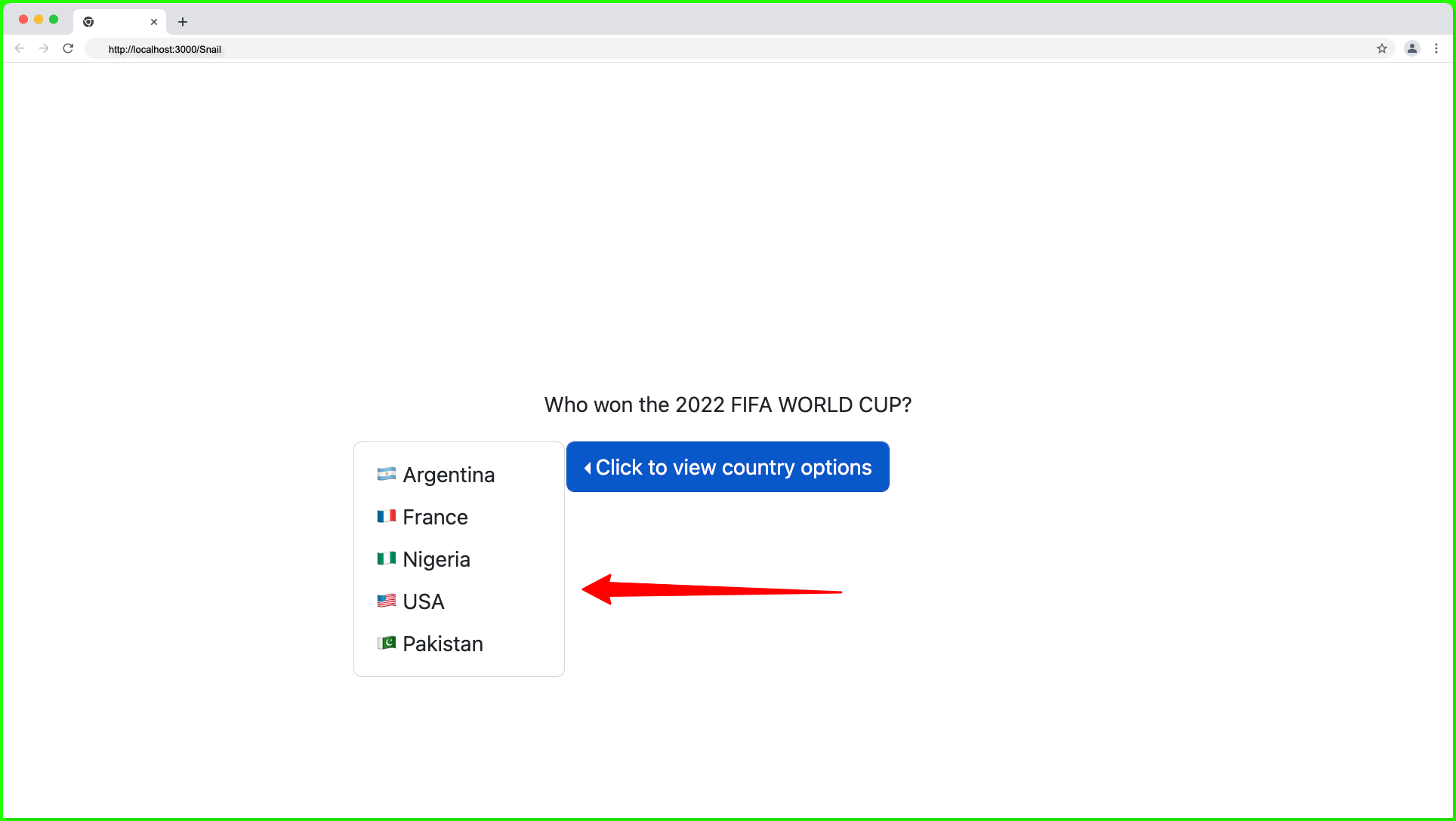
Given that we’re to build a dropdown to select the country that won the 2022 FIFA world cup, which has two options; Argentina, France, Nigeria, USA, and Pakistan in the dropdown. We can easily build this using the bootstrap Dropdown component.
- Create a new
componentfolder in thesrcfolder. - Next, create a new
DropdownMenu.jsxfile in thecomponentfolder with the following code:
import React from "react";
import Dropdown from "react-bootstrap/Dropdown";

export const DropdownMenu = () => {
  return (
    <Dropdown>
      <Dropdown.Toggle>Click to view country options</Dropdown.Toggle>
      <Dropdown.Menu>
        <Dropdown.Item>🇦🇷 Argentina</Dropdown.Item>
        <Dropdown.Item>🇫🇷 France</Dropdown.Item>
        <Dropdown.Item>🇳🇬 Nigeria</Dropdown.Item>
        <Dropdown.Item>🇺🇸 USA</Dropdown.Item>
        <Dropdown.Item>🇵🇰 Pakistan</Dropdown.Item>
      </Dropdown.Menu>
    </Dropdown>
  );
};
Dropdown Menu Toggle Component
The Dropdown.Toggle component is an element that is used to trigger the dropdown item opened, by default the Dropdown.Toggle component will render a Button component, which can be changed to any other custom element, such as the select tag, using the as prop.
Dropdown Menu Item Component
The Dropdown.Menu is the parent wrapper of the Dropdown.Item component that contains the options that will be displayed when the dropdown is toggled. We can also set custom elements such as Link in the Dropdown.Item component using the as prop.
The Dropdown.Item component is the option to be displayed in the dropdown menu when opened.
Next, render the DropdownMenu component in the App.js file as shown below:
import "bootstrap/dist/css/bootstrap.min.css";
import { DropdownMenu } from "./components/DropdownMenu";

function App() {
  return (
    <div className='d-flex flex-column justify-content-center align-items-center vh-100'>
      <p>Who won the 2022 FIFA WORLD CUP?</p>
      <DropdownMenu />
    </div>
  );
}

export default App;
Our dropdown component should function and look something as below:
Bootstrap Dropdown Variant Color
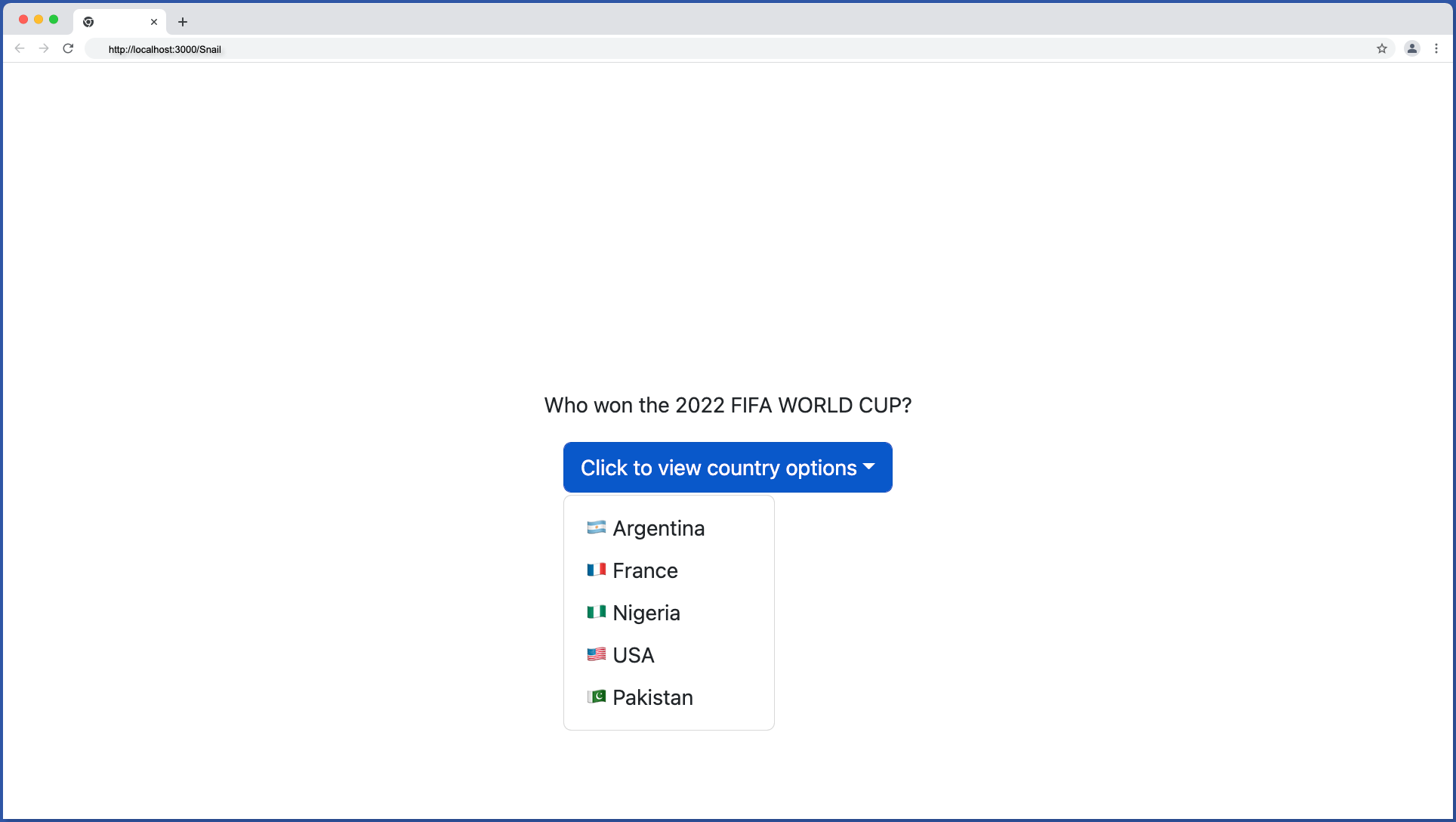
We can make use of the variant prop in the Dropdown.Toggle to change the color of the dropdown button. The variant prop accept all the valid bootstrap color values; primary, success, danger, info, and warning.
<Dropdown.Toggle variant='primary|success|danger|info|warning'>
    Click to view country options
</Dropdown.Toggle>
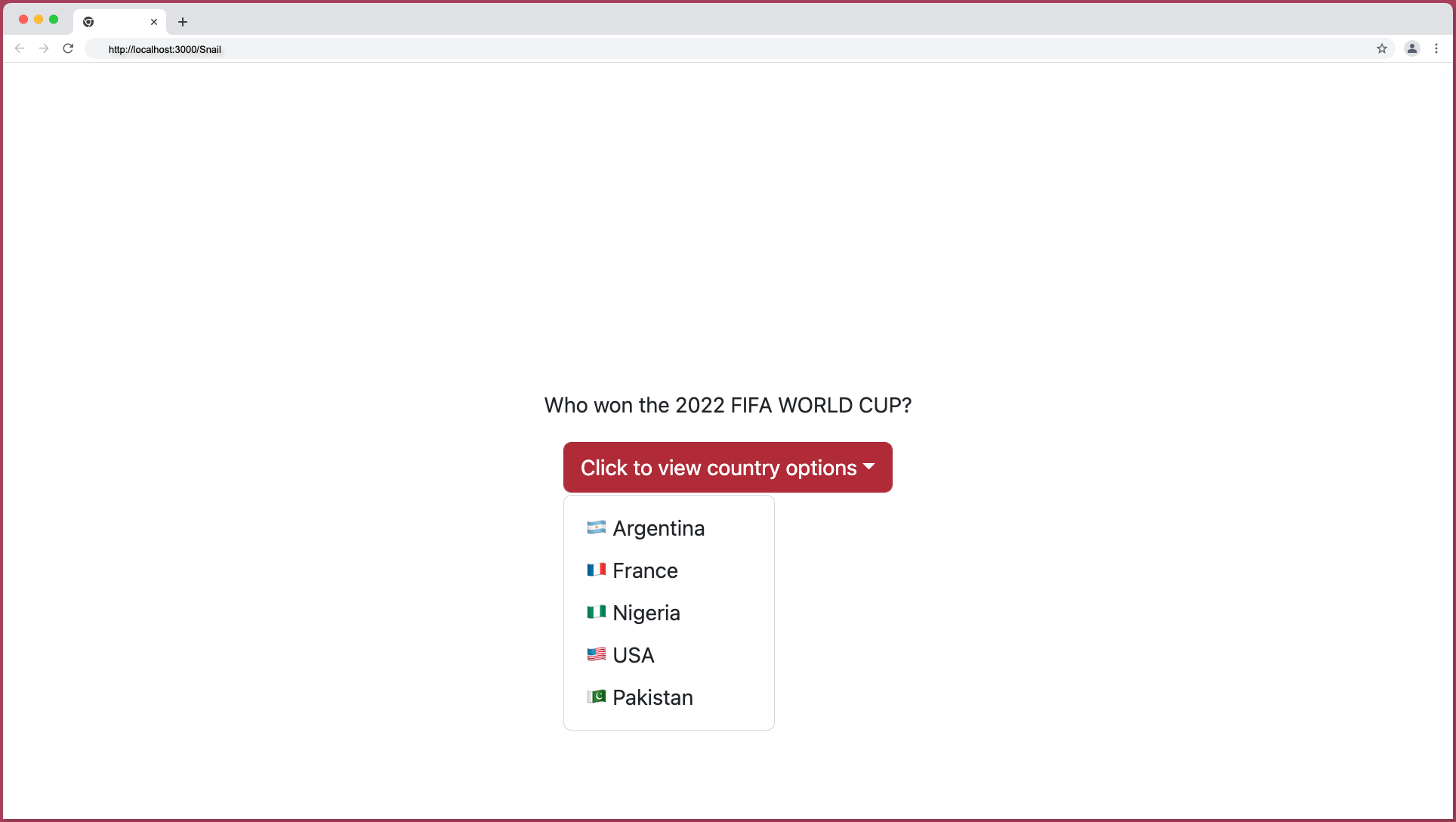
Dropdown Variant – Primary
By default, the Dropdown.Toggle has a primary variant color that renders a blue button as shown below:
Below is the code snippet for a primary toggle component:
import React from "react";
import Dropdown from "react-bootstrap/Dropdown";

export const DropdownMenu = () => {
  return (
    <Dropdown>
      <Dropdown.Toggle variant='primary'>
        Click to view country options
      </Dropdown.Toggle>
      <Dropdown.Menu>
        <Dropdown.Item>🇦🇷 Argentina</Dropdown.Item>
        <Dropdown.Item>🇫🇷 France</Dropdown.Item>
        <Dropdown.Item>🇳🇬 Nigeria</Dropdown.Item>
        <Dropdown.Item>🇺🇸 USA</Dropdown.Item>
        <Dropdown.Item>🇵🇰 Pakistan</Dropdown.Item>
      </Dropdown.Menu>
    </Dropdown>
  );
};
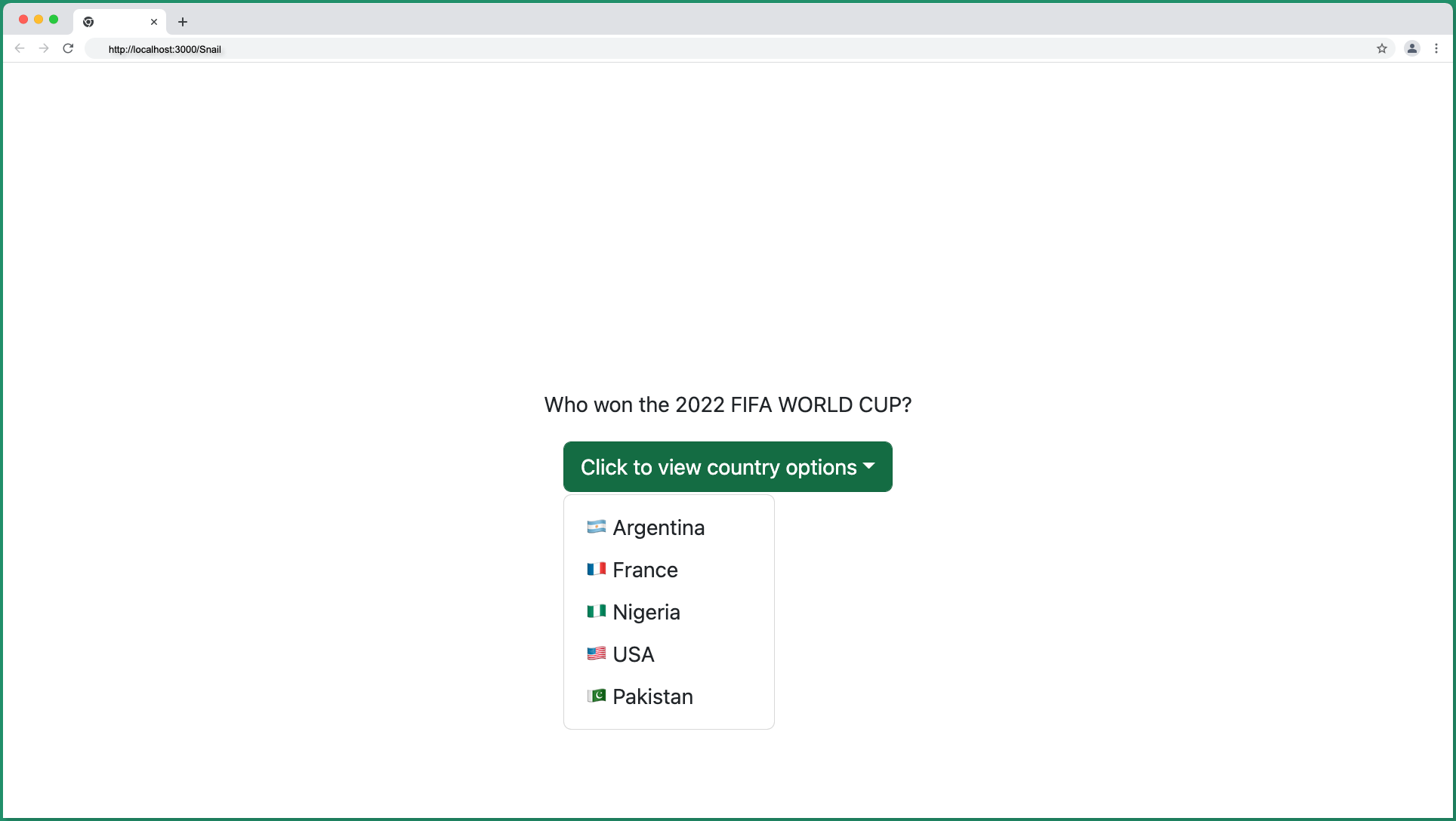
Dropdown Variant – Success
Set the Dropdown.Toggle variant prop to success color:
import React from "react";
import Dropdown from "react-bootstrap/Dropdown";

export const DropdownMenu = () => {
  return (
    <Dropdown>
      <Dropdown.Toggle variant='success'>
        Click to view country options
      </Dropdown.Toggle>
      <Dropdown.Menu>
        <Dropdown.Item>🇦🇷 Argentina</Dropdown.Item>
        <Dropdown.Item>🇫🇷 France</Dropdown.Item>
        <Dropdown.Item>🇳🇬 Nigeria</Dropdown.Item>
        <Dropdown.Item>🇺🇸 USA</Dropdown.Item>
        <Dropdown.Item>🇵🇰 Pakistan</Dropdown.Item>
      </Dropdown.Menu>
    </Dropdown>
  );
};
This will produce a green button as shown below:
Dropdown Variant – Danger
When you set the Dropdown.Toggle to danger:
import React from "react";
import Dropdown from "react-bootstrap/Dropdown";

export const DropdownMenu = () => {
  return (
    <Dropdown>
      <Dropdown.Toggle variant='danger'>
        Click to view country options
      </Dropdown.Toggle>
      <Dropdown.Menu>
        <Dropdown.Item>🇦🇷 Argentina</Dropdown.Item>
        <Dropdown.Item>🇫🇷 France</Dropdown.Item>
        <Dropdown.Item>🇳🇬 Nigeria</Dropdown.Item>
        <Dropdown.Item>🇺🇸 USA</Dropdown.Item>
        <Dropdown.Item>🇵🇰 Pakistan</Dropdown.Item>
      </Dropdown.Menu>
    </Dropdown>
  );
};
It produces a red button as shown below:
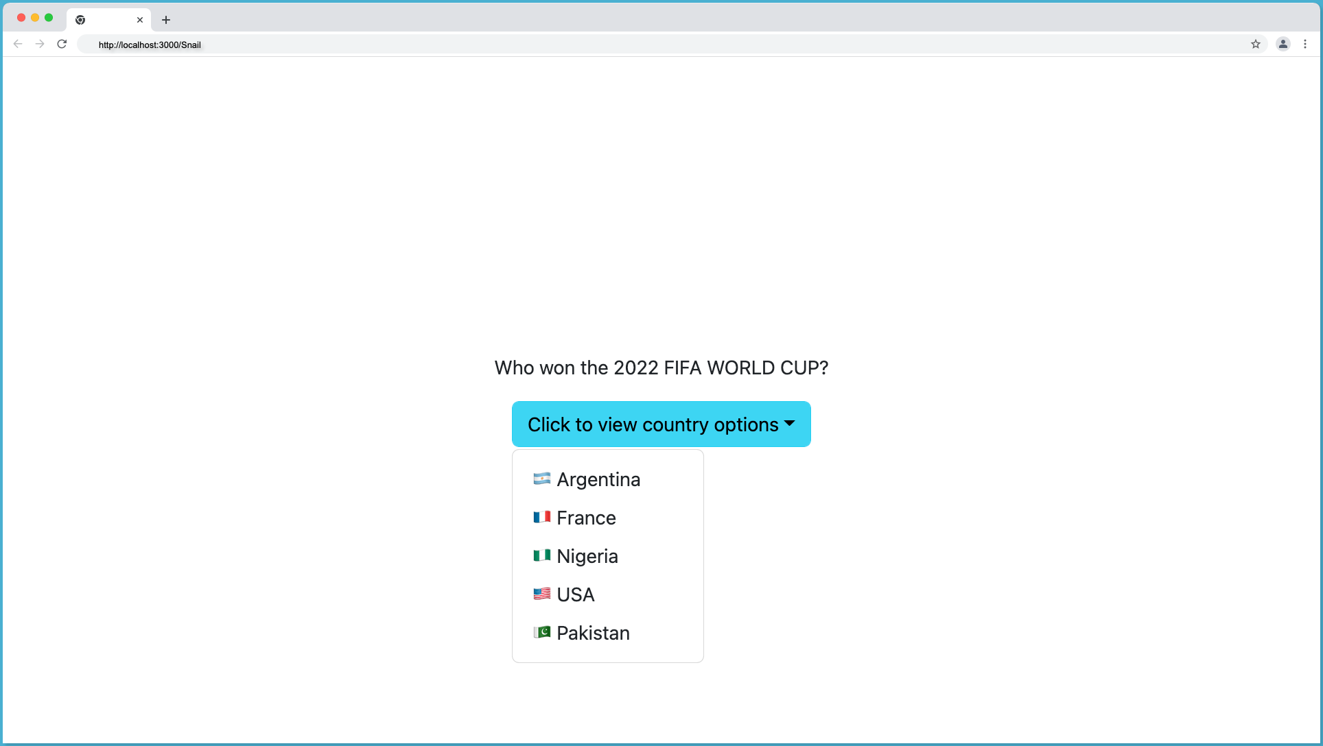
Dropdown Variant – Info
The info variant color will render a light-blue Dropdown.Toggle button as shown below:
Below is the code snippet for info variant:
import React from "react";
import Dropdown from "react-bootstrap/Dropdown";

export const DropdownMenu = () => {
  return (
    <Dropdown>
      <Dropdown.Toggle variant='info'>
        Click to view country options
      </Dropdown.Toggle>
      <Dropdown.Menu>
        <Dropdown.Item>🇦🇷 Argentina</Dropdown.Item>
        <Dropdown.Item>🇫🇷 France</Dropdown.Item>
        <Dropdown.Item>🇳🇬 Nigeria</Dropdown.Item>
        <Dropdown.Item>🇺🇸 USA</Dropdown.Item>
        <Dropdown.Item>🇵🇰 Pakistan</Dropdown.Item>
      </Dropdown.Menu>
    </Dropdown>
  );
};
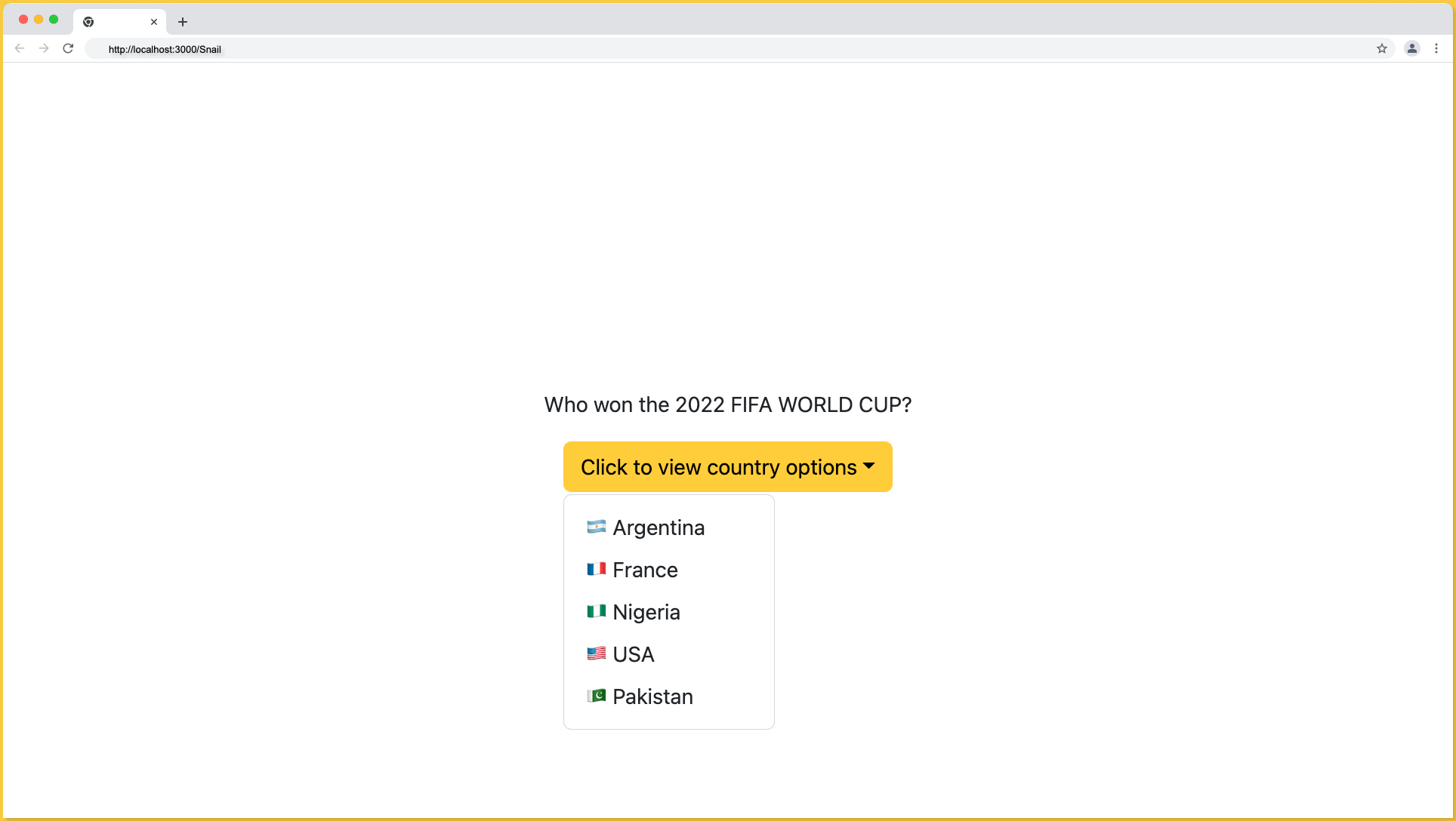
Dropdown Variant – Warning
The warning variant color will render a yellow button as shown below:
Below is the code snippet for warning variant:
import React from "react";
import Dropdown from "react-bootstrap/Dropdown";

export const DropdownMenu = () => {
  return (
    <Dropdown>
      <Dropdown.Toggle variant='warning'>
        Click to view country options
      </Dropdown.Toggle>
      <Dropdown.Menu>
        <Dropdown.Item>🇦🇷 Argentina</Dropdown.Item>
        <Dropdown.Item>🇫🇷 France</Dropdown.Item>
        <Dropdown.Item>🇳🇬 Nigeria</Dropdown.Item>
        <Dropdown.Item>🇺🇸 USA</Dropdown.Item>
        <Dropdown.Item>🇵🇰 Pakistan</Dropdown.Item>
      </Dropdown.Menu>
    </Dropdown>
  );
};
Note: The Dropdown.Menu color cannot be changed using the variant prop, it will always maintain its white color. However, we can use the dark variant color on the Dropdown.Menu to create a dark theme dropdown.
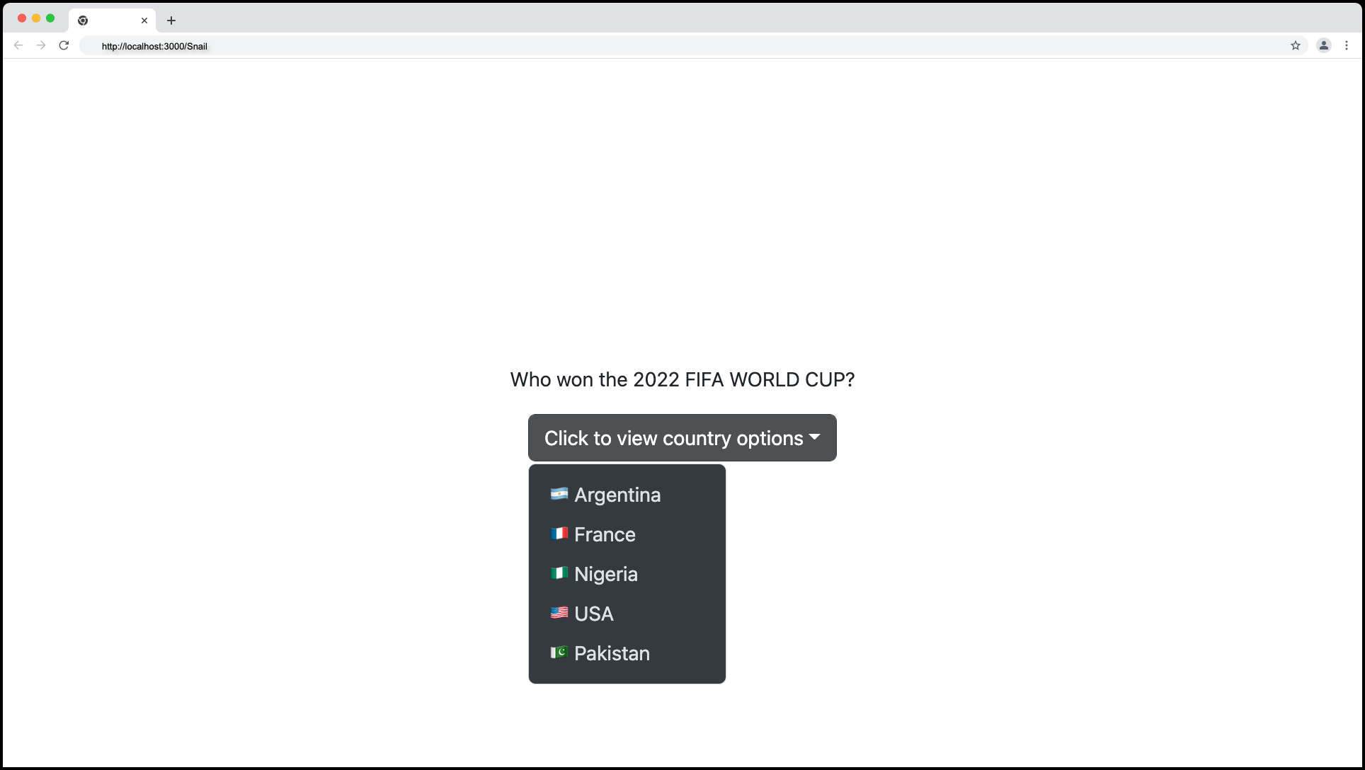
Dark Mode Dropdown
Bootstrap supports a dark theme for both the Dropdown.Toggle and the Dropdown.Menu component. Set the variant color of the Dropdown.Toggle and the Dropdown.Menu component to dark as shown below:
import React from "react";
import Dropdown from "react-bootstrap/Dropdown";

export const DropdownMenu = () => {
  return (
    <Dropdown>
      <Dropdown.Toggle variant='dark'>
        Click to view country options
      </Dropdown.Toggle>
      <Dropdown.Menu variant='dark'>
        <Dropdown.Item>🇦🇷 Argentina</Dropdown.Item>
        <Dropdown.Item>🇫🇷 France</Dropdown.Item>
        <Dropdown.Item>🇳🇬 Nigeria</Dropdown.Item>
        <Dropdown.Item>🇺🇸 USA</Dropdown.Item>
        <Dropdown.Item>🇵🇰 Pakistan</Dropdown.Item>
      </Dropdown.Menu>
    </Dropdown>
  );
};
This will produce the following dark theme output:
Drop Direction
We can define the direction of the menu when it collapses using the drop prop, possible directions include up, up-centered, down, down-centered, start, and end.
Drop Menu Direction – Up
Set the drop prop to up to make the dropdown menu appear at the top of the toggle button. Use the code below to achieve the drop menu with up direction:
import React from "react";
import Dropdown from "react-bootstrap/Dropdown";

export const DropdownMenu = () => {
  return (
    <Dropdown drop='up'>
      <Dropdown.Toggle>
        Click to view country options
      </Dropdown.Toggle>
      <Dropdown.Menu>
        <Dropdown.Item>🇦🇷 Argentina</Dropdown.Item>
        <Dropdown.Item>🇫🇷 France</Dropdown.Item>
        <Dropdown.Item>🇳🇬 Nigeria</Dropdown.Item>
        <Dropdown.Item>🇺🇸 USA</Dropdown.Item>
        <Dropdown.Item>🇵🇰 Pakistan</Dropdown.Item>
      </Dropdown.Menu>
    </Dropdown>
  );
};
The above code will produce a drop menu with up directions as follows:
Drop Menu Direction – Up Centered
Set the drop prop to up-centered to place the drop at the top center of the toggle button.
import React from "react";
import Dropdown from "react-bootstrap/Dropdown";

export const DropdownMenu = () => {
  return (
    <Dropdown drop='up-centered'>
      <Dropdown.Toggle>Click to view country options</Dropdown.Toggle>
      <Dropdown.Menu>
        <Dropdown.Item>🇦🇷 Argentina</Dropdown.Item>
        <Dropdown.Item>🇫🇷 France</Dropdown.Item>
        <Dropdown.Item>🇳🇬 Nigeria</Dropdown.Item>
        <Dropdown.Item>🇺🇸 USA</Dropdown.Item>
        <Dropdown.Item>🇵🇰 Pakistan</Dropdown.Item>
      </Dropdown.Menu>
    </Dropdown>
  );
};
The up-centered direction will look something like this:
Drop Menu Direction – Down
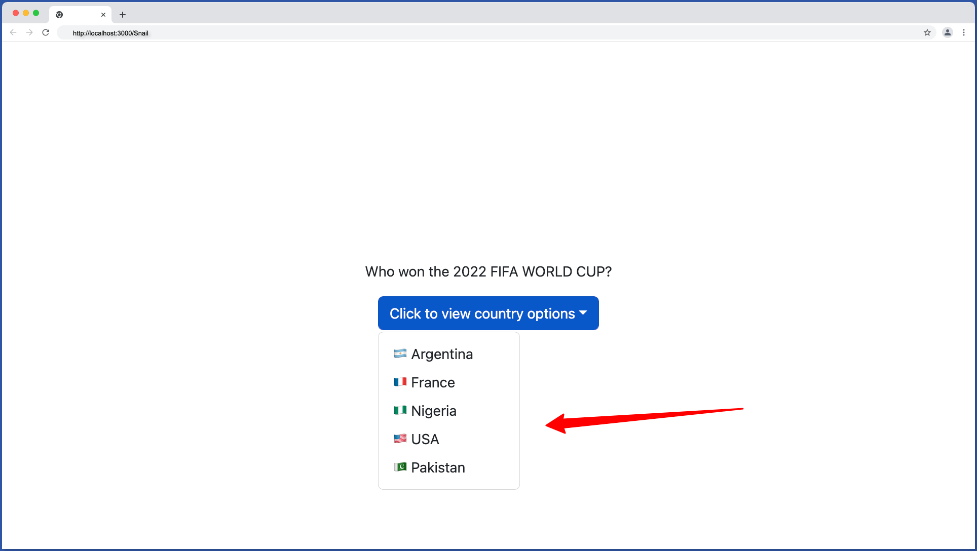
This is the default direction of the bootstrap drop menu and it’s the most common direction -dropdown. We can make a drop menu displayed in a downward direction by setting the drop to down:
import React from "react";
import Dropdown from "react-bootstrap/Dropdown";

export const DropdownMenu = () => {
  return (
    <Dropdown drop='down'>
      <Dropdown.Toggle>Click to view country options</Dropdown.Toggle>
      <Dropdown.Menu>
        <Dropdown.Item>🇦🇷 Argentina</Dropdown.Item>
        <Dropdown.Item>🇫🇷 France</Dropdown.Item>
        <Dropdown.Item>🇳🇬 Nigeria</Dropdown.Item>
        <Dropdown.Item>🇺🇸 USA</Dropdown.Item>
        <Dropdown.Item>🇵🇰 Pakistan</Dropdown.Item>
      </Dropdown.Menu>
    </Dropdown>
  );
};
The down direction will look something as follow:
Drop Menu Direction – Down Centered
Set the drop prop to down-centered to place the drop menu at the down center of the toggle button:
import React from "react";
import Dropdown from "react-bootstrap/Dropdown";

export const DropdownMenu = () => {
  return (
    <Dropdown drop='down-centered'>
      <Dropdown.Toggle>Click to view country options</Dropdown.Toggle>
      <Dropdown.Menu>
        <Dropdown.Item>🇦🇷 Argentina</Dropdown.Item>
        <Dropdown.Item>🇫🇷 France</Dropdown.Item>
        <Dropdown.Item>🇳🇬 Nigeria</Dropdown.Item>
        <Dropdown.Item>🇺🇸 USA</Dropdown.Item>
        <Dropdown.Item>🇵🇰 Pakistan</Dropdown.Item>
      </Dropdown.Menu>
    </Dropdown>
  );
};
The down-centered direction will look something like this:
Drop Menu Direction – Start
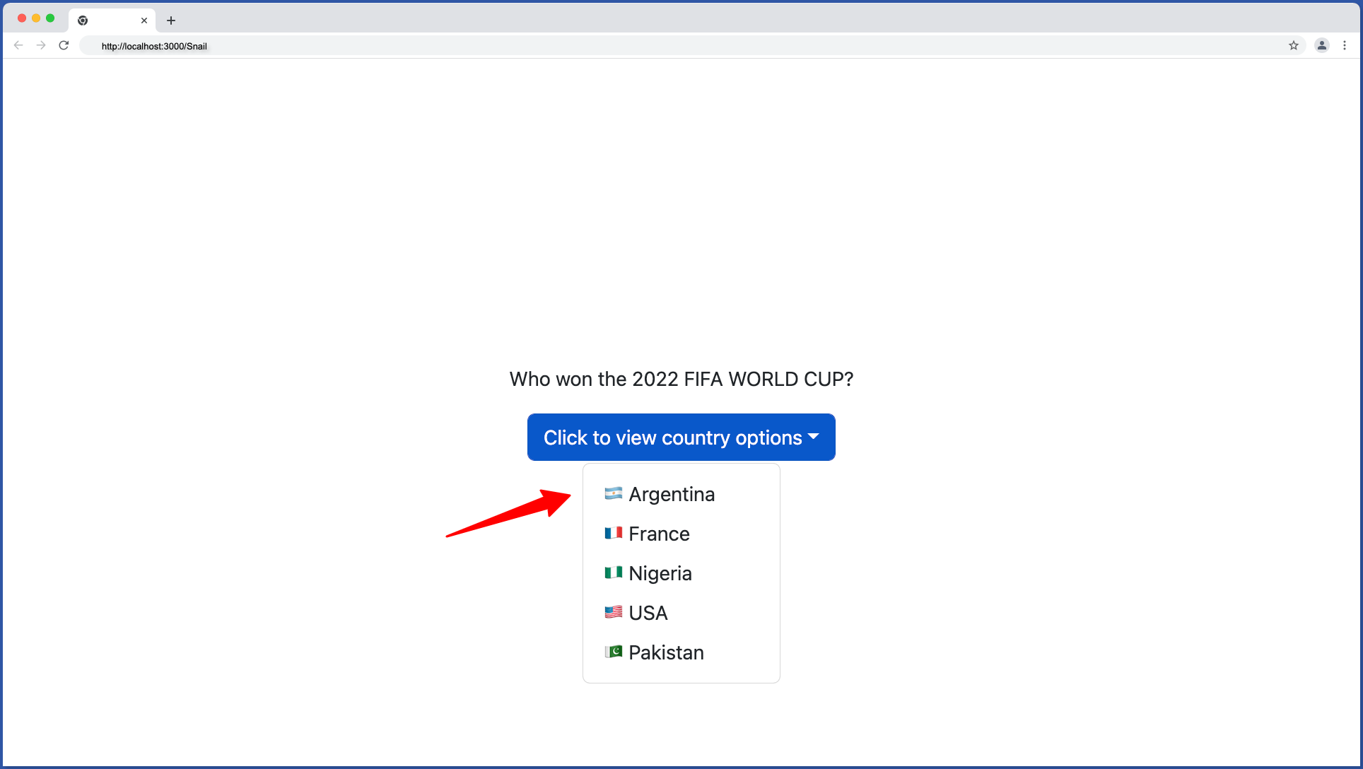
Set the drop prop to start to place the drop menu at the left side of the toggle button:
import React from "react";
import Dropdown from "react-bootstrap/Dropdown";

export const DropdownMenu = () => {
  return (
    <Dropdown drop='start'>
      <Dropdown.Toggle>Click to view country options</Dropdown.Toggle>
      <Dropdown.Menu>
        <Dropdown.Item>🇦🇷 Argentina</Dropdown.Item>
        <Dropdown.Item>🇫🇷 France</Dropdown.Item>
        <Dropdown.Item>🇳🇬 Nigeria</Dropdown.Item>
        <Dropdown.Item>🇺🇸 USA</Dropdown.Item>
        <Dropdown.Item>🇵🇰 Pakistan</Dropdown.Item>
      </Dropdown.Menu>
    </Dropdown>
  );
};
The start direction will look something like this:
Drop Menu Direction – End
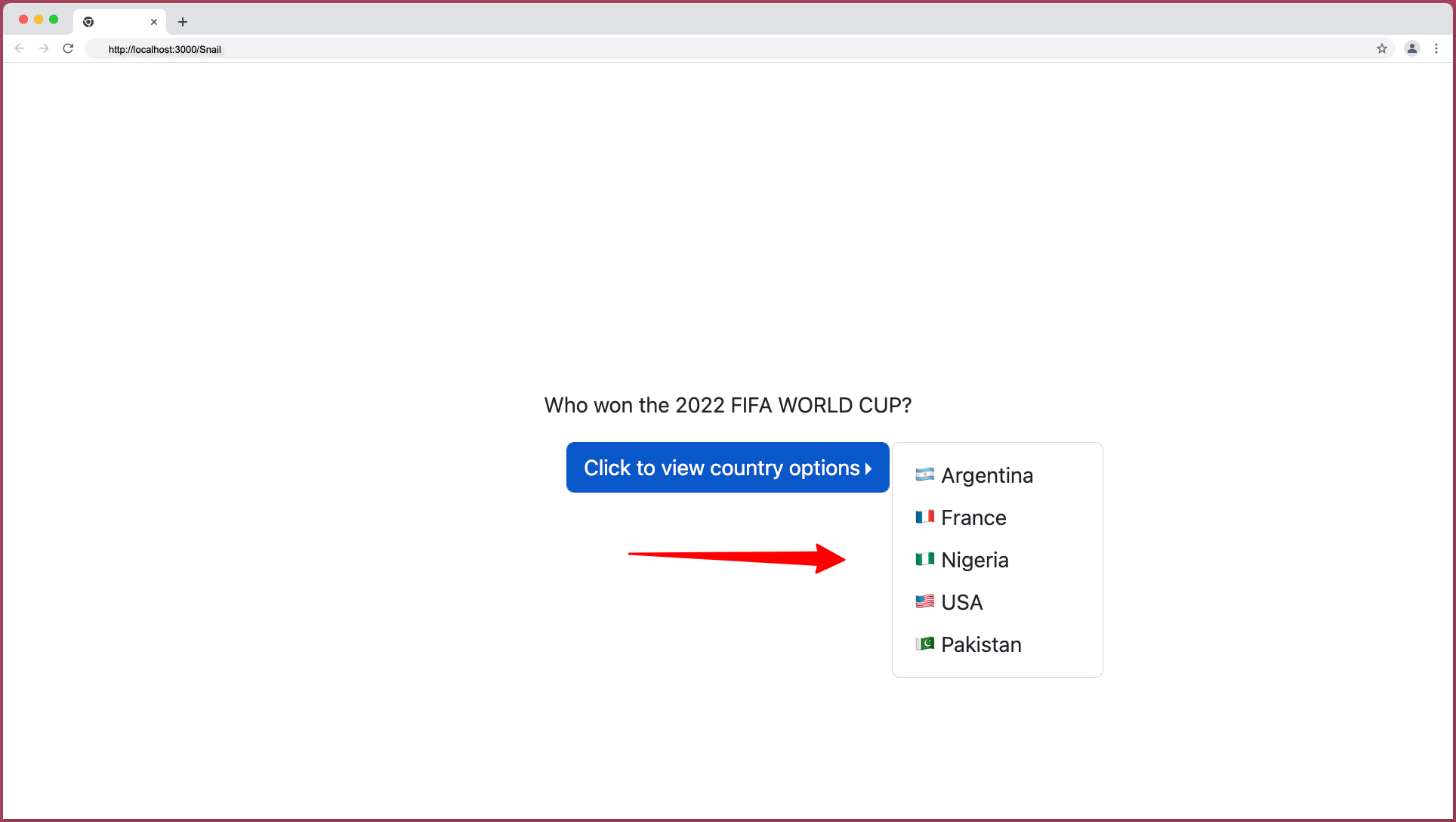
Set the drop prop to end to place the drop menu at the right side of the toggle button:
import React from "react";
import Dropdown from "react-bootstrap/Dropdown";

export const DropdownMenu = () => {
  return (
    <Dropdown drop='end'>
      <Dropdown.Toggle>Click to view country options</Dropdown.Toggle>
      <Dropdown.Menu>
        <Dropdown.Item>🇦🇷 Argentina</Dropdown.Item>
        <Dropdown.Item>🇫🇷 France</Dropdown.Item>
        <Dropdown.Item>🇳🇬 Nigeria</Dropdown.Item>
        <Dropdown.Item>🇺🇸 USA</Dropdown.Item>
        <Dropdown.Item>🇵🇰 Pakistan</Dropdown.Item>
      </Dropdown.Menu>
    </Dropdown>
  );
};
The end direction will look something like this:
Wrapping Up
Building dropdowns can be quite tasking if you’re building it from scratch, you can speed up your development by making use of a dropdown component library like bootstrap, RC-dropdown, and other libraries discussed in this article.
In this article, you learned about component libraries that can be used to create accessible and rich dropdowns, as well as how to use the bootstrap dropdown components.
What’s Next?
If you prefer a video tutorial on building dropdowns with Bootstrap, watch the tutorial by The Net Ninja below:
Finally, more articles like this can be found on our CopyCat blog. CopyCat converts your Figma files into a ready-to-use React project, saving you over 35% of development time. You can check out CopyCat here.
Interesting Reads From Our Blogs
- What is TypeScript: A Beginner’s Guide
- Your Complete Guide To Bootstrap Grid
- Creating a Dropdown Selection in React Using Material UI Select
Happy Coding 👨🏽💻
Related Articles
-
 React.js
How to use React Player in React Applications
Introduction A video on a website adds to the static content there, giving the user an engaging experience by supplementing it. Building enduring relationships with web visitors is easy with the help of videos. According to statistics, viewers are more…
December 24, 2022 -
React.js
How to Build a Good React Modal
How to Build a React Modal. A modal(also known as a modal window or lightbox) is a web page element that shows in front of and disables all other page content. The user must interact with the modal either by…
November 29, 2022

