 October 14, 2022
  Uncle Big Bay


- Introduction to Toast Notifications
- What is React Toastify?
- Uses of React Toastify?
- Features of React Toastify?
- Creating a React App
- Setting up React Toastify
- React Toastify - Toast Type
- React Toastify - Toast Position
- React Toastify - Toast Theme
- How to Customize rtl Support Swipe?
- Alternatives to React Toastify Library
- Wrapping Up
Introduction to Toast Notifications
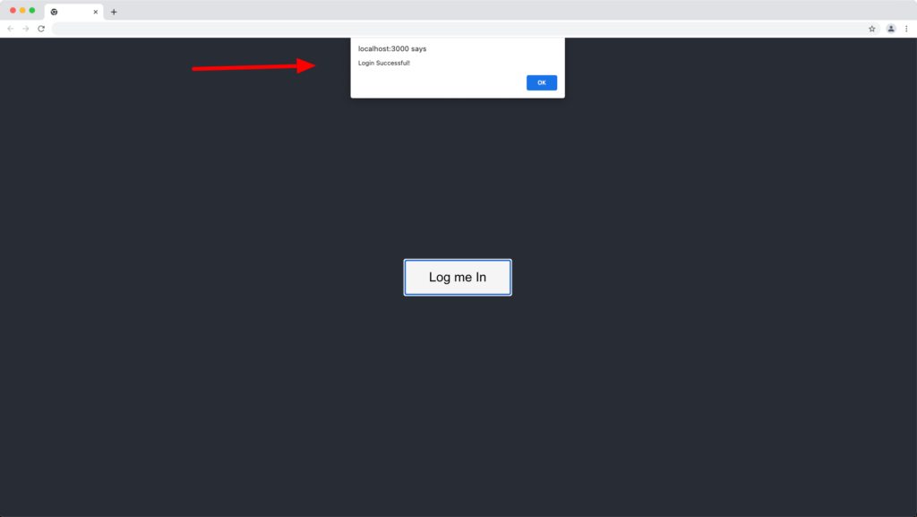
Notifications are ways to keep a user aware of the success or failure of their activity on a website and if not done correctly, the user may find your website overly uninteresting or have an unpleasant user experience. Do you still use JavaScript alert for notifications?
If you wish to upgrade from the native browser alert notification:
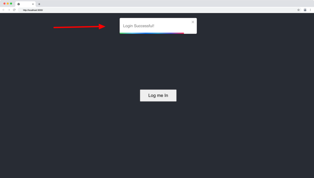
To this fancy toast notification below, then this article is for you.
Check out the CopyCat plugin for React if you’re seeking for amazing React tools to help you build component code faster and be production ready sooner than your competition!
What is React Toastify?
React toastify is a lightweight toast notification library that allows you to create user-friendly and engaging notification components for your React application.
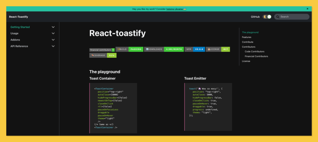
React toastify package has over 1.1 million weekly downloads on the npm package manager and 9.8k GitHub stars.
Uses of React Toastify?
React toastify can be used to replicate a mobile device’s push notification. It’s a great notification library for creating toast notifications that draw a user’s attention to a recent activity or the result of an action on a website.
Features of React Toastify?
- Easy to set up and use.
- Easy to customize (color, position, and type).
- Has the onOpen and onClose hooks to execute a function when the toast notification is opened or closed respectively. This can be passed to a React component rendered inside the toast and can access the props passed to the component.
- Swipe direction and close support.
- Theming (light/dark mode).
- Programmatically removing toasts based on condition.
- Pause toast notification when the page loses focus (prevents users from missing notifications).
- Ability to render React components as a toast notification, etc.
Creating a React App
Skip this section if you want to set up toastify notifications in an existing React application.
Or use the following command to create a new react application:
npx create-react-app my-app
Next, run the following command to navigate to your newly generated app directory:
cd my-app
Then run the following command to start your React server:
yarn start // or npm start
Your server should launch in your browser at http://localhost:3000/, as shown below:
Installing Toastify Package
The toastify package for React is available through the npm and yarn package managers.
Run the command below to install react-toastify into your React project using yarn:
yarn add react-toastify
Or install react-toastify using npm:
npm i react-toastify
Setting up React Toastify
React toastify is quite simple to set up and use. There are three important things to successfully configure the toast notification in our React application; the ToastContainer component, the ReactToastify.css file, and the toast emitter.
We’ll go over the three concepts below:
React Toastify – ToastContainer
The toastify ToastContainer is a simple React component that rendres the toast notification within our React app.
The ToastContainer component from the react-toastify library imports into your component as follows:
import { ToastContainer } from "react-toastify";
And is rendered like this:
<ToastContainer />
The ToastContainer component has the following props (default props value):
- position=”top-right”
- autoClose={5000}
- hideProgressBar={false}
- newestOnTop={false}
- closeOnClick
- rtl={false}
- pauseOnFocusLoss
- draggable
- pauseOnHover
- theme=”light”
The default props and values of ToastContainer component are as shown below:
<ToastContainer
position="top-right"
autoClose={5000}
hideProgressBar={false}
newestOnTop={false}
closeOnClick
rtl={false}
pauseOnFocusLoss
draggable
pauseOnHover
theme="light"
/>
React Toastify – ReactToastify.css File
The react-toastify library has a CSS file for its toast notification component, and it must be imported to apply the default styling to the toasts.
You can import the ReactToastify.css into your app by doing the following:
import "react-toastify/dist/ReactToastify.css";
The ToastContainer is hidden by default in the ReactToastify.css file until a toast is emitted.
React Toastify – Toast Emitter
Toast emitter is a method in the react-toastify library that triggers the toast notification and displays the ToastContainer component to the user.
The toast method from the react-toastify library imports into your component as follows:
import { toast } from "react-toastify";
The toast method can then be called from any function, as shown below:
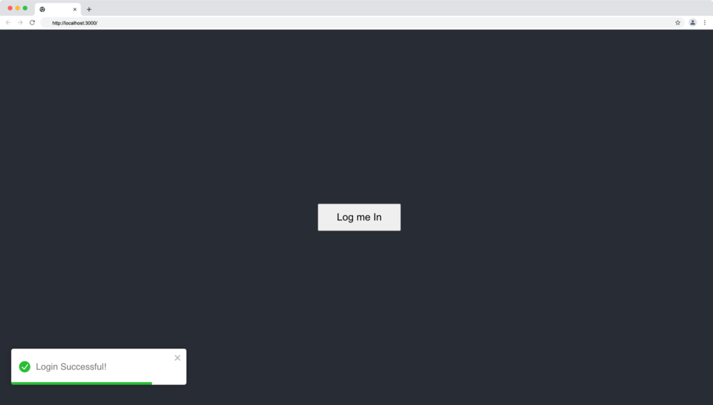
const displayLoginNotification = () => {
    toast.success("LoggedIn Successful");
  };
We can also define the toast notification properties in the toast method, as seen below:
toast.warn('👋 Welcome to Copycat!', {
position: "top-right",
autoClose: 5000,
hideProgressBar: false,
closeOnClick: true,
pauseOnHover: true,
draggable: true,
progress: undefined,
theme: "light",
});
This approach is useful when we want to add a specific property to a toast or when we want to override the props supplied to ToastContainer, we can then define behavior per toast programmatically in the toast method.
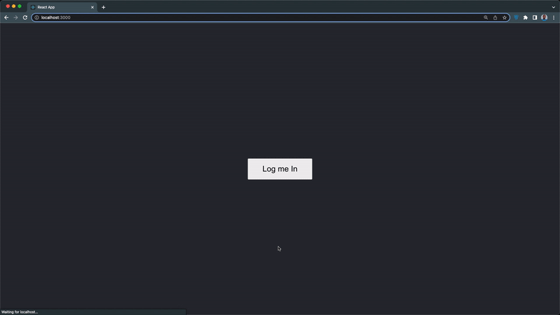
When we put what we’ve learned so far together, our App.js component should look like this:
import "./App.css";
import { toast, ToastContainer } from "react-toastify";
import "react-toastify/dist/ReactToastify.css";

function App() {
  const displayLoginNotification = () => {
    toast.success("LoggedIn Successful");
  };

  return (
    <div className='App'>
      <ToastContainer
        position='top-right'
        autoClose={5000}
        hideProgressBar={false}
        newestOnTop={false}
        closeOnClick
        rtl={false}
        pauseOnFocusLoss
        draggable
        pauseOnHover
        theme='light'
      />

      <button onClick={displayLoginNotification}>Log me In</button>
    </div>
  );
}

export default App;
From the above code:
- We created a “Log me In” button to invoke the displayLoginNotification function
We want the above code to display a login success notification when we click the “Log me In” button.
Next, update your App.css file with the following lines of CSS:
.App {
  background-color: #282c34;
  min-height: 100vh;
  display: flex;
  flex-direction: column;
  align-items: center;
  justify-content: center;
}

button{
  padding: 12px 32px;
  font-size: large;
  cursor: pointer;
}
Our app toast notification component should function like the below demonstration:
Styling React Toastify
React toast is highly customizable, allowing us to determine the type of toast, as well as the position and theme of the toast container.
We’ll look at the type, position, and theme customization below:
React Toastify – Toast Type
There are five types of toast in React toastify to indicate the nature of the notification you’re displaying to the user and they are toast programmatically define behavior.
The toast types are default, success, warning, error, and info. The default type will be used when no type is defined for the toast method.
1. Toast Default Type
The default toast type is below:
const displayLoginNotification = () => {
    toast("Login Success"); // default type
  };
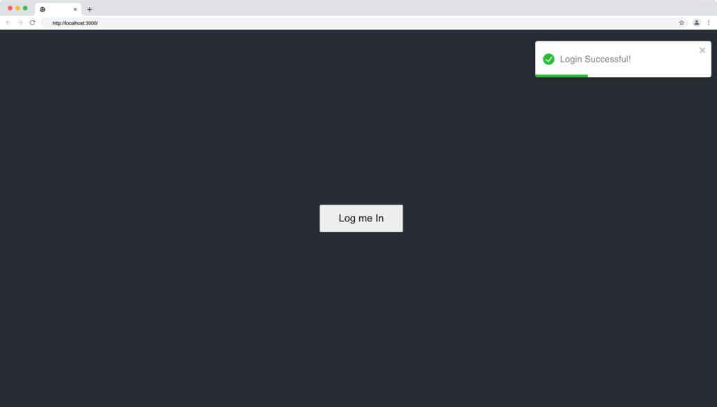
The toastify default notification type is useful for showing successful messages to the user, and it looks like this:

2. Toast Success Type
The success toast type can be written as below:
const displayLoginNotification = () => {
    toast.success("Login Success"); // type success
  };
The toastify success notification type is great for showing successful messages to the user, it has a green check icon with a green progress bar and it looks like this:

3. Toast Info Type
The info toast notification type is written below:
const displayLoginNotification = () => {
    toast.info("Too many attempts. Login in 30 minutes!"); // type info
  };
The toastify info notification type is useful for showing information messages to the user, and it looks like this:

4. Toast Warning Type
The warning or warn toast notification type is written below:
const displayLoginNotification = () => {
    toast.warning("Username and password incorrect!"); // type warning or warn
  };
The toastify warning notification type is ideal for providing the user with caution prompt messages that look like the toast displayed below:
5. Toast Error Type
The error toast notification type is written below:
const displayLoginNotification = () => {
    toast.error("Something went wrong!"); // type error
  };
The toastify warning notification type is great for providing the user with system error messages that look like this:

React Toastify – Toast Position
React toastify allows us to easily define the position of the toast on the UI. The supported positions of the toast include:
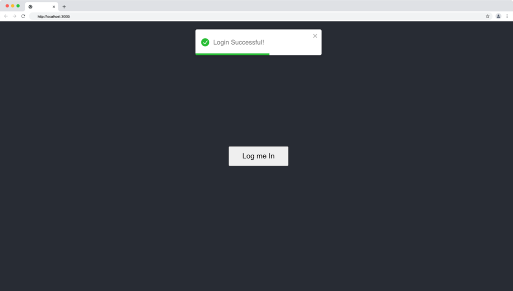
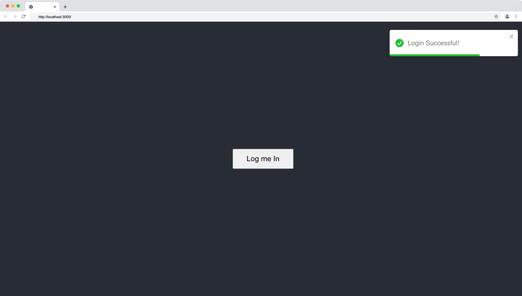
1. Top-right Position (default)
const displayLoginNotification = () => {
    toast.success("Login Successful!", { position: "top-right" }); // new line
  };
The toast displays at the top right corner of the web page, like this:
2. Top-center Position
const displayLoginNotification = () => {
    toast.success("Login Successful!", { position: "top-center" }); // new line
  };
The toast displays at the top center of the web page, like this:
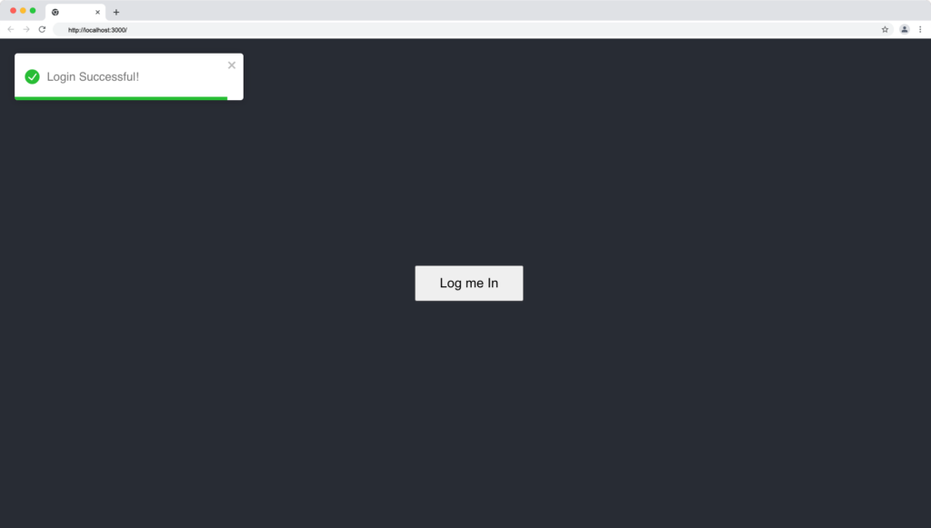
3. Top-left Position
const displayLoginNotification = () => {
    toast.success("Login Successful!", { position: "top-left" }); // new line
  };
The toast displays at the top left corner of the web page, like this:
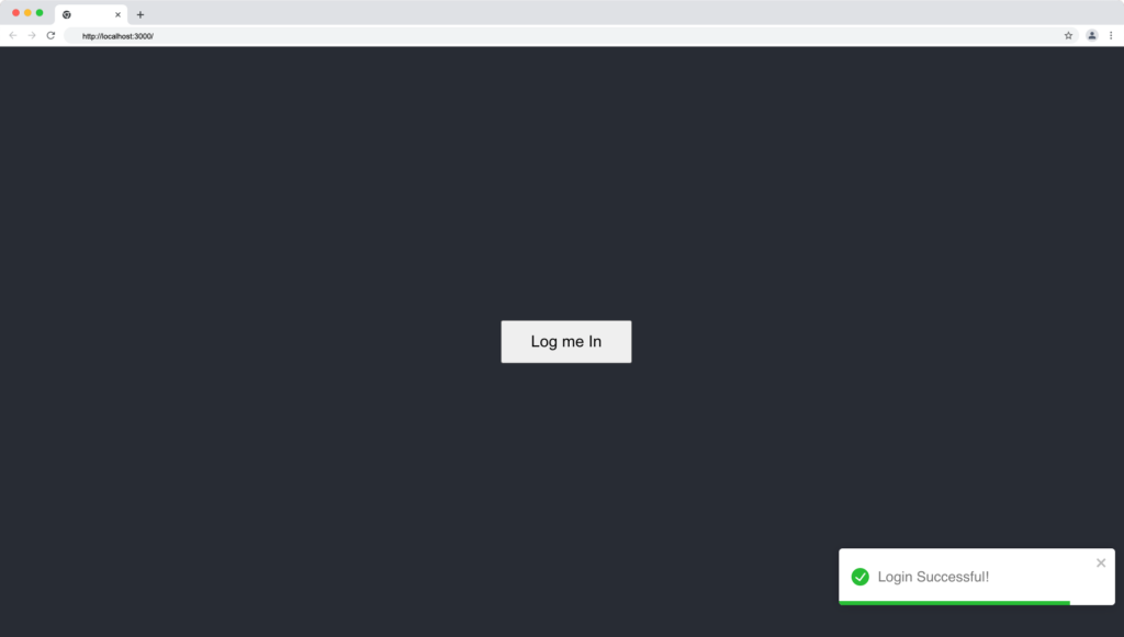
4. Bottom-right Position
const displayLoginNotification = () => {
    toast.success("Login Successful!", { position: "bottom-right" }); // new line
  };
The toast displays at the bottom right corner of the web page, like this:
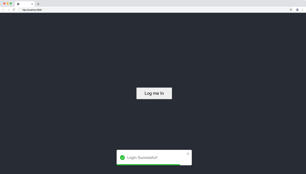
5. Bottom-center Position
const displayLoginNotification = () => {
    toast.success("Login Successful!", { position: "bottom-center" }); // new line
  };
The toast displays at the bottom center of the web page, like this:
6. Bottom-left Position
const displayLoginNotification = () => {
    toast.success("Login Successful!", { position: "bottom-left" }); // new line
  };
The toast displays at the bottom left corner of the web page, like this:
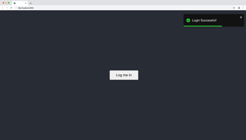
React Toastify – Toast Theme
The library comes with built-in dark and light themes, allowing us to modify the notification theme based on user system preference or to match the user’s theme settings on your website.
The toastify theme can be applied in two ways:
By specifying the theme in the ToastContainer component, like this:
<code><ToastContainer theme='dark' /> // or 'light'</code>
2. Or by setting the theme property in the toast method:
<code>const displayLoginNotification = () => { toast.success("Login Successful!", { theme: "dark", // or "light" });</code>
The light theme is the default when no theme is specified:
In dark mode, our toast notification will look like this:
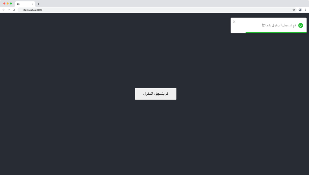
How to Customize rtl Support Swipe?
React toastify supports the right-to-left layout for languages such as Arabic and Hebrew, which reads things backward.
The RTL can be enabled in toastify by passing the rtl as a prop to the ToastContainer.
<ToastContainer rtl>
The rtl enabled toast notification will now look as follows:
Alternatives to React Toastify Library
If you want to explore more React notification libraries, below are useful tools and alternatives to the react-toastify library:
Wrapping Up
In this article, we learned about React toastify package and how we can improve the user experience with animated notifications. We also learn how to use the toastify library to create pop-up notification messages in our React apps.
Finally, you can find more incredible articles like this on our blog at CopyCat. CopyCat is a tool that saves you about 35% of development time by converting your Figma files to an up-and-running React project. Check it out here.
Interesting Reads From Our Blogs
- Impress Your Users Using The Top 8 React Animation Libraries
- Utilize React to the Max With The Top 15 React Component Libraries
- What to Read When Using Typescript In Your React App
Related Articles
-
 React.js
How To Use React Styled Components in React Efficiently
Introduction As libraries evolve and software grows bigger and more complex, the need for a better styling approach grows. Especially for styled components react. The component-driven approach to building software applications majorly influenced by modern libraries and frameworks begs for…
July 12, 2022 -
React.js
How to Work With the React onClick Event Handler in React Applications
Introduction If you think about how you got to this very page, we would agree that you made some actions. Actions like searching on the search bar, clicking on the link or subsequent links, and so on. Each of these…
December 20, 2022
