 July 12, 2022
  Temitope Asama


- Introduction
- What is styled-components?
- Why styled-components?
- How to use Styled Components in React
- Installation
- Syntax
- Creating Global Styles
- Creating Themes
- Styled-components: Styling Children Elements
- Styled-components: Dynamic Styling with Props
Passed - Inheritance: Extending Styles
- The “As” Polymorphic Prop
- Styled-components: Media queries
- Styled-components: Animations
- Styled-components: External File Structure
- Exporting Styles
- Frequently Asked Questions
- Conclusion
Introduction
As libraries evolve and software grows bigger and more complex, the need for a better styling approach grows. Especially for styled components react. The component-driven approach to building software applications majorly influenced by modern libraries and frameworks begs for better, more scalable and more usable styling methods. This has given rise to new and modularized methods of structuring and managing our styled components-scoped rather than globally-scoped. All of these styling solutions follow a single styling convention which involves generating CSS styles from Javascript. This styling convention is known as CSS-in-JS.
What is styled-components?
Using tagged template literals and arrow functions in ES6+ and CSS, styled-components is a React-specific CSS-in-JS styling solution that creates a platform for developers to write actual CSS code to style React components, as well as in React Native.
Using styled-components makes it simple to use actual CSS to style components by writing JavaScript code. These components are known as “styled components” which are, in actuality, a React component with styles.
Why styled-components?
Aside from an enhanced development experience, styled-components provides:
- On-the-fly CSS Generation — it only applies the styles of the components that are rendered on a page. The React developer tools is a great way to inspect this.
- Distinct Class Names — DOM elements are assigned a unique class name, thereby avoiding class name bugs and clashes, allowing use to build our apps without stress.
- Easy CSS Deletion — styles are attached to a single component rather than being inserted as a class name, making CSS deletion easier.
- Simple Dynamic Styling — it enables us to add styles to a component depending on props or a global theme.
- Easy and Accessible Maintenance — No matter how large your codebase is, maintenance is simple since you never have to go through many files to discover the style that affects your component.
- Automatic Vendor Prefixing – it takes care of vendor prefixing for browser support so you can write simple CSS just you know it.
- Unused CSS Cleanup: it automatically cleans up CSS declarations not in use, consequently reducing file size and bundle size.
How to use Styled Components in React
Setting up styled-components in your React project is as easy as snapping your fingers!

Installation
Installing styled-components takes a single terminal command:
npm install styled-components
With Yarn, we have;
yarn add styled-components
Simply add this to the bottom of your HTML file to use the styled-components CDN if you aren’t using a package manager like npm or yarn. Check out this cool article on setting up CDNs in React.
<script src="https://unpkg.com/styled-components/dist/styled-components.min.js"></script>
If your React project runs on Typescript, starting styled-components installation is different as styled-components does not come with built-in types.
With Typescript, we can install styled-components with types as a dev dependency like below;
## With npm

npm i --save-dev @types/styled-components
With Yarn, use the following command;
yarn add @types/styled-components --dev
And there you have it! Your React project is set to use styled-components with no need for further setup. To learn more about styled-components and its installation, check out their docs.
Tip: If you’ll be writing styled-components in VS Code, I recommend the vscode-styled-component plugin. With features like syntax highlighting, syntax error reporting, and IntelliSense, this plugin significantly improves the development experience of using styled-components in VS Code.
Syntax
The basic skeleton of any styled component is;
import styled from "styled-component";

const ComponentName = styled.DOMElementTag`
    cssProperty: cssValue
`
Where ComponentName is the name of your React component and DOMElementTag is the HTML/JSX element you will be styling.
Take a StyledButton component for instance, which simply comprises a non-active button with the text “Hello World” ;
## StyledButton.jsx

import React from "react"

const StyledButton = () => {
  return (
    <button>
      Hello World!
    </button>
  )
}
Now to style this button using styled-components.
First we have to import the styled object from the styled-components library into our file. We can do that like below;
import styled from "styled-component"
Now to declare our styles;
## StyledButton.jsx

import React from "react";
import styled from "styled-component";


## Creating a button styled-component that will render a button with some styles.

const ButtonStyles = styled.button`
    font-family: "Poppins", sans-serif;
    border: none;
    border-radius: 0;
    padding-inline: 1.75rem;
    padding-block: .75rem;
    background-color: springGreen;
    color: white;
`;


const StyledButton = () => {
  return (
    <button>
      Hello World!
    </button>
  )
}
But, our styles won’t work just yet. We need to replace the button tag with our styled component, ButtonStyles.
## StyledButton.jsx

import React from "react";
import styled from "styled-component";

## Creating a button styled-component that will render a button with some styles.

const ButtonStyles = styled.button`
    font-family: "Poppins", sans-serif;
    border: none;
    border-radius: 0;
    padding-inline: 1.75rem;
    padding-block: .75rem;
    background-color: springGreen;
    color: white;
`;

const StyledButton = () => {
  return (
    <ButtonStyles> ## Now, our styles will get applied.
      Hello World!
    </ButtonStyles>
  )
}
Voila, we’ve successfully created our first styled component.
SCSS-like Syntax: Stylis
After making your first styled component, you probably have questions like “does styled-components support SCSS?” and well, the good news is that it does!
Stylis, a light-weight CSS pre-processor allows styled-components to use SCSS-syntax and Sass features like nesting, name-spacing and more.
So for our button above, we can instantiate SCSS variables inside our styled component like so;
$bg-color: #000000
$text-color: #FFFFFF
And we can use them instead of the regular HEX codes like this;
import React from "react";
import styled from "styled-component";

## Creating a button styled-component that will render a button with some styles.

const ButtonStyles = styled.button`
    $bg-color: #000000
    $text-color: #FFFFFF
    font-family: "Poppins", sans-serif;
    border: none;
    border-radius: 0;
    padding-inline: 1.75rem;
    padding-block: .75rem;
    background-color: $bg-color; ## hex codes replaced with SCSS variables
    color: $text-color;
`;

const StyledButton = () => {
  return (
    <ButtonStyles> ## Now, our styles will get applied.
      Hello World!
    </ButtonStyles>
  )
}
Creating Global Styles
You might be wondering “Where do I declare my CSS Resets?”. Well, good news! Styled-components provides a createGlobalStyles helper function that allows you to create a special styled component where you can declare your global/base styles.
Normally, styled-components are scoped to a particular class or component but the createGlobalStyles function removes that limitation and allows whatever style you declare within it to be applied globally across your app. This serves as an opportunity for you to declare your CSS resets and base styles.
createGlobalStyles
The createGlobalStyles removes the component-scoped limitation of styling React apps and allows us to declare styles that apply to every component.
We can use createGlobalStyles as thus;
## Globals.jsx

import { createGlobalStyle } from 'styled-components'

const GlobalStyles = createGlobalStyle`
    *,
    *::before,
    *::after {
        box-sizing: border-box;
        padding: 0;
        margin: 0;
    }

    body {
        color: $bg-color;
    }

`
Then added at the top-level file/component in your app;
## app.jsx or whatever your root file is.

// Later in your app, you can go ahead to import and add the component along with every other top-level component you have in your root file/component.

<React.Fragment>
  <GlobalStyle />
  <Header /> {/* example of other top-level stuff */}
  <Body /> {/* example of other top-level stuff */}
  <Footer />{/* example of other top-level stuff */}
</React.Fragment>
And just like that, your base styles are injected into every other React component and get applied throughout your app.
Creating Themes
Styled-components also allows us to add theming to our apps. It provides the ThemeProvider helper component to achieve theming across all components in your app. This helper component functions as a context provider, allowing children React component access to the theme context.
How does the ThemeProvider work?
ThemeProvider
As described earlier, the ThemeProvider component comes right out-of-the-box with the styled-components library. According to their docs, the ThemeProvider is;
…a helper component for theming. [it] injects the theme into all components anywhere beneath it in the component tree, via the context API.
This component automatically provides every React component beneath with a theme prop that they can access contextually as a prop. We can illustrate this below;
import { ThemeProvider } from 'styled-components';

const App = () => {
  return (
    <ThemeProvider
	## the theme prop where all our theme variables are declared.
      theme={{
        colors: {
          primary: '#FFFFFF',
          secondary: 'red',
          background: '#E0E0E0',
        },
      }}
    >
      {/* all other components */}
    </ThemeProvider>
  );
};
From the code above, we see that the ThemeProvider wraps the entirety of our app, providing us access to the theme prop and the colors object.
It’s also possible for us the declare the theme object outside of the provider and reference it within it instead;
import { ThemeProvider } from 'styled-components';

const App = () => {

 ## we're declaring the theme object oustide the provider.
const theme = {
    colors: {
          primary: '#FFFFFF',
          secondary: 'red',
          background: '#E0E0E0',
        }
  }

  return (
    <ThemeProvider theme={theme}>
      {/* all other components */}
    </ThemeProvider>
  );
};
It’s important to remember that the ThemeProvider works similarly to the React Context.Provider in its Context API. Just like the Context.Provider, it resides at the top level of our application and allows every component, no matter how many levels deep, to access its context.
ThemeConsumer
The ThemeConsumer is a component that consumes the context provided by the ThemeProvider, i.e. a component that uses any of the variables declared within the theme context. The ThemeConsumer is part of the v4 of the library and it’s useful for theming when writing class-based React.
According to the docs,
It uses the render prop pattern to allow for dynamic access to the theme during rendering.
It passes the current theme (based on a ThemeProvider higher in your component tree) as an argument to the child function. From this function, you may return further JSX or nothing.
Based on a ThemeProvider, we could access the theme context like below;
import { ThemeConsumer } from 'styled-components'

export default class MyClassComponent extends React.Component {
  render() {
    return (
      <ThemeConsumer>
        {theme => <div>My primary color is {theme.primary}.</div>}
      </ThemeConsumer>
    )
  }
}
useTheme
This is a React hook used to access the current theme from a ThemeProvider.
To access the current theme or value from the ThemeProvider, we can use it as such;
function MyComponent() {
  const currentTheme = useTheme()
  console.log('The current theme is ', currentTheme)

  // the rest of your code
}
Styled-components: Styling Children Elements
You may be thinking “ What about children elements? Do they get their own styled component?”.
The answer is No.
The CSS cascade works just the same like it does in plain vanilla CSS i.e. children elements are capable of inheriting styles from their parent component. Styled-components allow nesting of styles that enable children element to be styled via their parent styled component.
A great way to show this would be the example below;
import styled from 'styled-components';


const Header = styled.header`
  display: flex;
  justify-content: space-between;
  align-items: center;
  padding: 10px 15px;
  background: #000;


  h2 {
    font-weight: 400;
    color: violet;
    font-size: 1rem;
  }


  li {
    list-style: none;
    display: inline-block;
    color: #ccc;
  }
`;

const ComponentWithChildrenElements = () => {

  return (
    <div>
        <Header> {/*styled component is referenced here.*/}
        <h2>Hello World</h2>
        <ul>
          <li>About</li>
        </ul>
      </Header>
      <main>
        <h2>I am a child element!</h2>
      </main>
    </div>
  );
};


export default ComponentWithChildrenElements;
In the example above, the header is made up of a h2 and an unordered list whose styles are nested within the Header. This feature ensures that we do not have to create a new styled component for each element in our DOM.

Styled-components: Applying Pseudo-elements and Pseudo-classes
It is possible to use CSS to style pseudo-classes like :active and pseudo-elements like ::before or ::after to a styled component. Let’s say we have a link whose color changes to blue as it is hovered over;
const Link = styled.a`
  padding: 12px;
  border: 2px solid red;
  border-radius: 5px;

  &:hover {
   color: blue;
  }

`
Notice the ampersand(&). It acts somewhat like the binding keyword, this and binds or references the pseudo-element or pseudo-class to it’s parent component. We can also use this method to style children elements with selector and combinators.
We can demonstrate this below;
const Link = styled.a`
  padding: 12px;
  border: 2px solid black;
  border-radius: 5px;

  &:hover {
    color: blue;
  }


  // the ampersand used together with selectors and combinators allows us to target specific elements.

  & > span {
    display: inline-block;
    font-size: 1rem;
  }
`;


const AmpersandComponent = () => {
  return (
    <main>
      <Link href="www.google.com">
        <span>This links to the Google Homepage</span>
      </Link>
    </main>
  );
};
Styled-components: Dynamic Styling with Props
Passed
Just like React components, styled components, utilizing the power of arrow functions in ES6+ and CSS, also have the ability to receive props and adapt styles based on props.
From our example above, we realize that our styled Link is still able to receive the href attribute as a prop and work just fine.
// we're still able to pass in the href attribute to our styled link.

const AmpersandComponent = () => {
  return (
    <main>
      <Link href="www.google.com">
        <span>This links to the Google Homepage</span>
      </Link>
    </main>
  );
};
This not only applies to links but every other element, as long as we pass props that are valid into the component, it works fine, just like a regular HTML element.
In any case, if we pass the wrong prop to our component, that prop is ignored and our React component is rendered as normal.
An example would be passing an href attribute to an styled Input.
const Input = styled.input`
  padding: 10px 15px;
  border: 2px solid violet;
  border-radius: 2px;
`;

const MyInput = () => {

  return (
      <h2>This is my form!</h2>
      <Input
        type='text'
        placeholder='Your name'
        onChange={() => changeSomething()}
        required
        href= "www.google.com"
      />
    </div>
  );
};
The above input form has the href attribute wrongly passed in alongside other valid props. All valid props in this example will be rendered, and the href ignored.
Because styled-components are functional components, we can also conditionally and dynamically style a using it’s props. Check out our article on Conditional Rendering here.
Say we’re looking to create two buttons whose background color we would like to style based their color prop;
import styled from "styled-components";

const StyledButton = styled.button`
  min-width: 100px;
  border: none;
  padding: 8px 16px;
  font-size: 10px;


  /* The resulting background color will be based on the bgColor props. */

  background-color: ${props => props.bgColor === "green" ? "green" : "red";
`;

function Profile() {
  return (
    <div>
      <StyledButton bgColor="green">Button A</StyledButton>
      <StyledButton bgColor="red">Button B</StyledButton>
    </div>
  )
}
As seen above, we use an arrow function (interpolation) to compare prop values and conditionally assign a background color to each button based on their individual props.
Therefore, based on their prop values, the first button will have a green background color while the other’s will be red.

Prop management: “attr”
The attr() constructor is a special way of targeting, assigning and updating special props or HTML attribute in our React components. It allows you to add extra props to instances of an element instead of the inefficient method of adding these props and wrappers to every instance of your component.
The styled-component docs explain that;
To avoid unnecessary wrappers that just pass on some props to the rendered component or element, you can use the .attrs constructor. It allows you to attach additional props (or “attributes”) to a component.
Take two instances of a button for example;
const Button = styled.button.attrs(props => ({
// we can define static props i.e all our buttons will have the default type of "button"

  type: "button",

// or we can define dynamic ones where we assign the button with a size prop its value // and where it has none, we assign it a 1em value.

  size: props.size || "1em",

}))`

  color: palevioletred;
  display: block;
  background-color: white;
  border: 2px solid palevioletred;
  border-radius: 3px;

  /* here we use the dynamically computed prop */
  margin: ${props => props.size};
  padding: ${props => props.size};
`;


render(
  <div>
    <Button type="submit"/>
    <br />
    <Button type="button" size="2em" />
  </div>
);
The default type for an HTML button is “submit”. However, for our button, we would like to override the default and give it a type of “button”. However, rather than assigning a type=”button” attribute to all our buttons, we could do that in one declaration using the attrs() just like above.
In the example above, we assigned type=”button” as a static prop. But we can also assign a prop to a button dynamically.
We could use the attrs() to assign our Button component a default value or its assigned value of any of its instances. Yes, it’s just as straightforward as it sounds.
## the below reads "assign a size of 1em to the button by default if it lacks the size prop"

size: props.size || "1em"
So for the instance of our Button component without a size prop, it is automatically assigned one with a value of 2em.
Inheritance: Extending Styles
Say we wanted buttons with the same styles but varying font sizes. Your first line of thought might to be create a new component and you would be correct. However, that would be duplicating previous styles and unideal.
Instead, we could leverage the ability of styled-components to extend styles and allow us reuse our CSS to restyle other styled components.
We can illustrate this below:
const StyledButton = styled.button`
  font-size: 2.5rem;
  color: white;
  background-color: #101010;
  padding: 20px 40px;
  margin: 0 auto;
`;

// Inherit styles from StyledButton in StyledSmallButton

const StyledSmallButton = styled(StyledButton)`
  font-size: 1.25rem;
`;

function BigFontButton() {
  return (
    <StyledButton>
      This is a button with bigger font
    </StyledButton>
  );
}

function SmallFontButton() {
  return (
    <StyledSmallButton>
      This is a button with smaller font
    </StyledSmallButton>
  );
}
From the example above, StyledButton extends its styles to StyledSmallButton while StyledSmallButton overrides it’s font size, allowing us to achieve the desired effect with much less code.
You may be wondering if the font-size is the only property you can override and the answer is no. You can extend a component and override as many properties as possible. Sometimes, we don’t even need to override styles, we could even add more styles attached to our new component.
Bear in mind that StyledSmallButton is a button because StyledButton extends a button component. But that doesn’t necessarily mean that the button component is unchangeable.
The “As” Polymorphic Prop
The beauty of the as prop is that it allows us to swap the end JSX element that gets rendered as a result of our extension of styles.
From our example above, a good use case for this would be when we want to extend the styles from StyledButton to a div rather than a button. To do that, we would utilize the as prop as thus;
const StyledButton = styled.button`
  font-size: 2.5rem;
  color: white;
  background-color: #101010;
  padding: 20px 40px;
  margin: 0 auto;
`;

// Inherit StyledButton in StyledSmallButton

const StyledSmallButton = styled(StyledButton)`
  font-size: 1.25rem;
`;


function SmallFontDiv() {
  return (
    <StyledSmallButton as="div">
      This is a button with smaller font
    </StyledSmallButton>
  );
}
This way, our StyledSmallButton component gets rendered as a div instead of a button.
We could also have another custom component as a value for our as prop like so;
function SmallFontDiv() {
  return (
    <StyledSmallButton as={SomeOtherStyledComponent}>
      This is a button with smaller font
    </StyledSmallButton>
  );
}
The as prop is a powerful tool in our styling arsenal because it allows us the flexibility of extending styles without having to worry about the end JSX element.
Styled-components: Media queries
Styled-components also supports responsive design by allowing us to nest media queries within our components. This ability allows for efficient separation of concerns in our code.
We can illustrate this using the following example;
const Navbar = styled.nav`
  padding: 10px;
  margin: 0 auto;
  display: flex;
  flex-direction: column;
  justify-content: space-between;

  ## we can nest a media query for navbar

  @media (min-width: 768px) {
    margin: 0;
    display: flex;
    flex-direction: row;
    justify-content: space-between;
    align-items: center;

    ul > li {
      display: block;
      margin: 0 5px;
    }
  }
`;

const MyNav = () => {

  return (
    <Navbar>
      <h2>Ages Blog</h2>
      <ul>
        <li>Home</li>
        <li>About</li>
        <li>Contact</li>
      </ul>
    </Nav
  );
};
From, the example above, we nest a media query specific to our Navbar within our Navbar component, separating its concerns from the rest of the app.
We do not need to explicitly supply a selector for the parent element when using media queries; instead, the styles that appear right after the open brace of the media query are applied to the parent element, in this example the Navbar.
Breakpoints can also be added dynamically based on either the state (read more on state and useState here) of a component or props like the example below;
const Navbar = styled.nav`
  padding: 10px;
  margin: 0 auto;
  display: flex;
  flex-direction: column;
  justify-content: space-between;


## we can dynamically assign media queries within our components.

  @media (min-width: ${(props) => (props.active ? '1200px' : '768px')}) {
    margin: 0;
    display: flex;
    flex-direction: row;
    justify-content: space-between;
    align-items: center;


    ul > li {
      display: block;
      margin: 0 5px;
    }
  }
`;

const MyNav = () => {
  return (
    <Navbar>
      <h2>Ages Blog</h2>
      <ul>
        <li>Home</li>
        <li>About</li>
        <li>Contact</li>
      </ul>
    </Navbar>
  );

};

Styled-components: Animations
The styled-components library also provides us with a keyframes helper function that makes it easier to create reusable animation keyframes. The keyframes are best separated from the styles, giving you the opportunity to export and reuse them as required.
Below is an illustration of how it works;
import styled, {keyframes} from "styled-components";


## we created a special function for the keyframes so we can export it later on, if need be

const changeBg = keyframes`
  from {
    background-color: green;
  }

  to {
    background-color: palevioletred;
  }
`;

const coloredDiv = styled.div`
  animation: ${changeBg} 0.5s linear both;
  border-radius: 5px;
  padding: 20px;
  position: fixed;
`;
If we would be needing changeBg in any other part of our app, importing it into the new file is as easy as demonstrated below;
## newfile.jsx

import { changeBg } from "./filewhereitwascreated"
And like so, we have our first animation keyframe courtesy of styled-components!

Styled-components: External File Structure
What about styled components organization?
You may choose to retain all your styles within the same file as the other React component that utilizes them, or you can choose another method of structuring your styles. Alternately, you may save all of a component’s styled elements in a separate file and import them into a specific component as needed.
Ideally, it’s best practice to put individual styled-components in a separate file and put all the files in a separate folder.
Although we are allowed to name the files containing our styles the way we want, it is conventional to save them in this format; Nameofcomponent.styled.jsx or Nameofcomponent.styled.tsx. Using the styled method of naming our files has no real-life consequence and exists just to help us to distinguish our styles from our actual components since they are both Javascript(or Typescript) files.
Exporting Styles
To make our styles available for use in other React component, it’s important to add the export keyword before our function declaration. This keyword demonstrates that our styles are available to be exported into other files.
## Navbar.styled.jsx

## the export keyword exists to show that our styles are available to be exported.

export const Navbar = styled.nav`
  padding: 10px;
  margin: 0 auto;
  display: flex;
  flex-direction: column;
  justify-content: space-between;
  `
We can import our styled component into the required files like this;
import { Header } from "./folderName/Header.styled"
In summary, regardless of the situation, it’s bad practice to save all of your styles in one file as it defeats the essence of modularization and component-based styling features that styled-components provides.
Frequently Asked Questions
Is styled-components CSS-in-JS?
A: Yes, styled-components is a CSS-in-JS library
Are styled-components React components?
A: Yes, they are React components.
Should I be using styled-components?
A: Definitely! Especially when working on a large project.
Is styled-components good for React?
A: Yes. In fact, it is a React-specific styling library and the most widely used styling solution for React and React Native by developers; P.S, here’s a great article on React and React Native. Read it to decide whehter you should use React or React Native for your next project. While it is possible to style your apps without it, it is an ideal solution to style your apps without stress.
Check out this cool tutorial on styled components in React.
Conclusion
Now that you’re aware of all the advanced styled-components capabilities while styling your project, it is important to use them wisely. In small projects, using this library might be an overkill. For what it’s worth, do not abuse this tool. Do not impose performance-heavy conditionals or create new components where you need none. Balance is key!
Also, check out CopyCat for an easy-to-use Figma to React conversion tool that helps you build products faster. Solve the problems of sprint delays, frustrating handoffs, and tedious boilerplate coded with the click of a button.
Interesting Reads From Our Blogs
- Why and How to Use React useState Hook
- React UseRef: Create Scalable Apps That Perform Like a Dream
- React Query Tutorial: Getting Started w/ Examples
Related Articles
-
 React Best Practices
How React.js CDN Makes Your Life Incredibly Easier
Introduction Setting up a React Project sometimes comes with time-consuming steps, especially when you are a beginner to the React ecosystem. You need to worry about npx, create-react-app, accurate npm version, React associated libraries, etc. However, ReactJs CDN makes your…
April 1, 2022 -
React.js
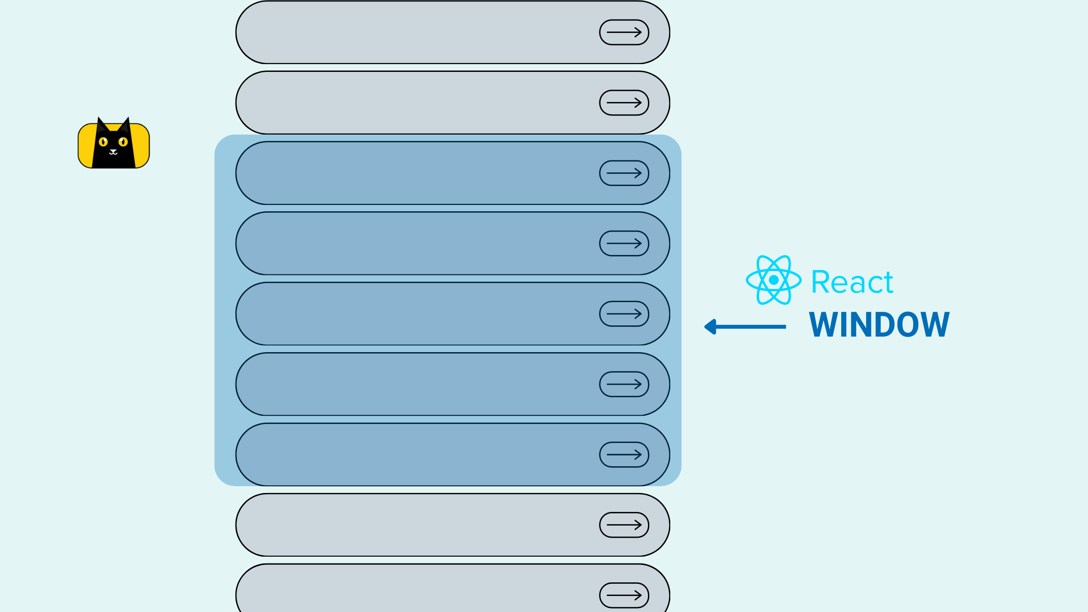
Optimize your App Performance by Large List Virtualization using React Window
Introduction Rendering a large list of data is a common feature that you might want to implement in your web application. From achieving infinite scrolls in social media feeds to product listings on e-commerce websites, the use cases are many.…
December 14, 2022

