
 December 23, 2022
  Uncle Big Bay


- Introduction
- What is a Bootstrap Tooltip?
- Bootstrap Popover vs Tooltip?
- Setting Up Bootstrap
- How to Enable Tooltip in Bootstrap 5
- How to make a Hover Tooltip in Bootstrap
- Customizing Bootstrap Tooltip
- Adding Tooltips to Disabled Elements
- Adding Tooltips to an Anchor Tag - Links
- Bootstrap Tooltip Positioning
- Wrapping Up
Do you want to be more efficient? Consider CopyCat, an AI-powered plugin that will convert your Figma design to UI code, allowing you to concentrate on the app’s business logic.
Introduction
This article will show you how to use the Bootstrap tooltip classes to add tooltips to HTML elements such as buttons, links, text, and input.
What is a Bootstrap Tooltip?
A Bootstrap tooltip is a small box with a pointer tail that appears when a user focuses on or moves their mouse over an element. In addition, the tooltip popup contains some brief information about the element to which it is attached.
Above is a bootstrap button that displays a tooltip with more information when hovered or focused.
The Bootstrap tooltip is implemented through the use of CSS and JavaScript, with CSS3 for animations and data-bs-attributes for local title storage.
Bootstrap Popover vs Tooltip?
Bootstrap tooltips are small boxes that appear beside their paired element when hovered, focused, or clicked, whereas Bootstrap popovers by default appear only when their paired element is clicked.
Given these points, below is a table showing the difference between Bootstrap popover and tooltips.
| Bootstrap Popover | Bootstrap Tooltip |
|---|---|
| Has heading title | Does not have a heading title |
| Requires tooltip plugin | It’s already a tooltip |
| Triggered on click or hover (Triggering of the tooltip by hover requires additional settings). | Triggered on hover, focus, or click. |
| Supports additional interaction such as buttons. | Does not allow additional interaction such as buttons. |
Setting Up Bootstrap
We’ll make use of the Bootstrap CDN to set up bootstrap in our project.
- Create a new
index.htmlfile. - Next, copy and paste the code below inside:
<!DOCTYPE html>
<html lang="en">
  <head>
    <meta charset="UTF-8" />
    <meta http-equiv="X-UA-Compatible" content="IE=edge" />
    <meta name="viewport" content="width=device-width, initial-scale=1.0" />

    <!-- Bootstrap CSS -->
    <link
      href="https://cdn.jsdelivr.net/npm/bootstrap@5.0.2/dist/css/bootstrap.min.css"
      rel="stylesheet"
      integrity="sha384-EVSTQN3/azprG1Anm3QDgpJLIm9Nao0Yz1ztcQTwFspd3yD65VohhpuuCOmLASjC"
      crossorigin="anonymous"
    />

    <!-- Bootstrap Bundle - JavaScript plugins and Popper -->
    <script
      src="https://cdn.jsdelivr.net/npm/bootstrap@5.0.2/dist/js/bootstrap.bundle.min.js"
      integrity="sha384-MrcW6ZMFYlzcLA8Nl+NtUVF0sA7MsXsP1UyJoMp4YLEuNSfAP+JcXn/tWtIaxVXM"
      crossorigin="anonymous"
    ></script>

    <title>Bootstrap Tooltip</title>
  </head>
  <body class="d-flex vh-100 align-items-center justify-content-center">
    <h2 class="text-primary">Hello 👋😃</h2>
  </body>
</html>
When you open index.html in a browser, your page should look something like this:
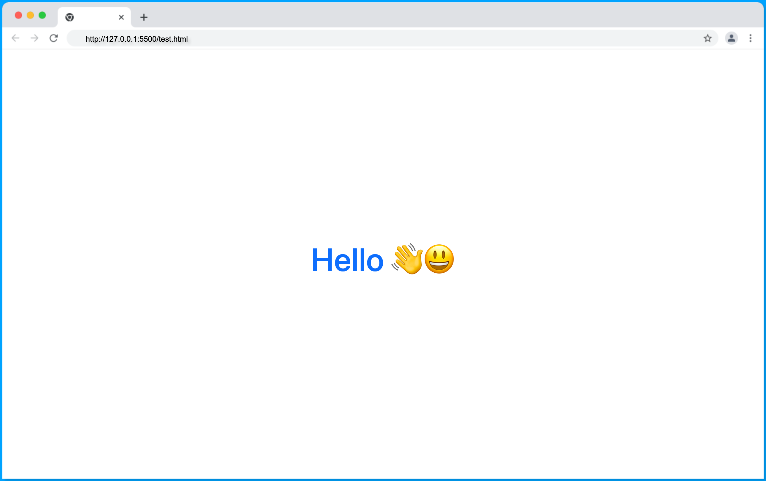
If the text is blue and centered on the page, then bootstrap is properly connected to your project.
How to Enable Tooltip in Bootstrap 5
To enable tooltip bootstrap in your project, we need a JavaScript script pre-written by the bootstrap team.
Include the <script> within the <body> tag in the index.html file as shown:
<script>
    var tooltipTriggerList = [].slice.call(
    document.querySelectorAll('[data-bs-toggle="tooltip"]')
    );
    var tooltipList = tooltipTriggerList.map(function (tooltipTriggerEl) {
    return new bootstrap.Tooltip(tooltipTriggerEl);
    });
</script>
The script above is used to select all the HTML elements with data-bs-toggle attribute with a value of tooltip. A tooltip is initialized for each matching element by the bootstrap Tooltip method.
The data-bs-toggle attribute was formerly data-toggle and was changed to be able to distinguish between bootstrap -bs- data attribute and other third-party attributes.
How to make a Hover Tooltip in Bootstrap
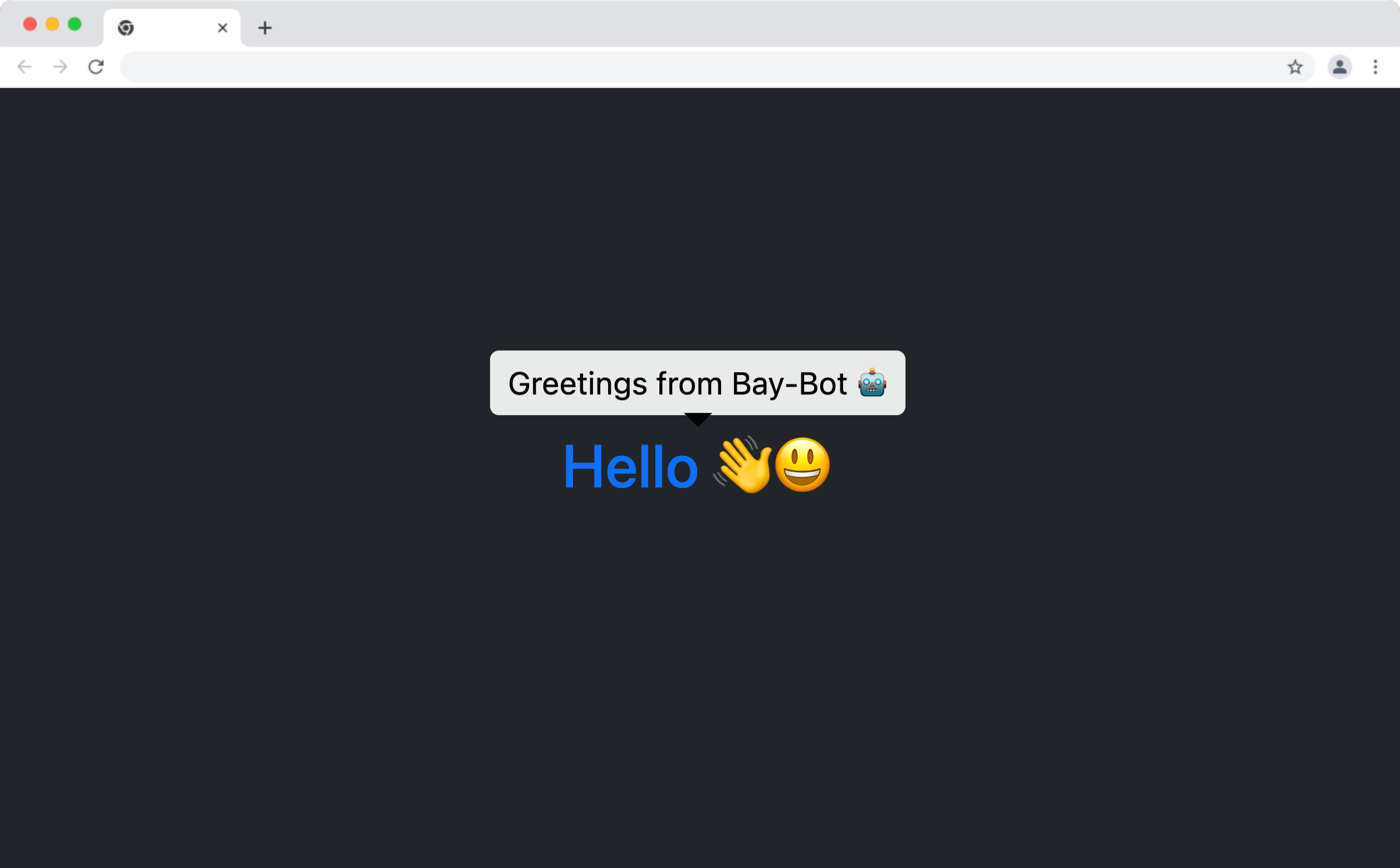
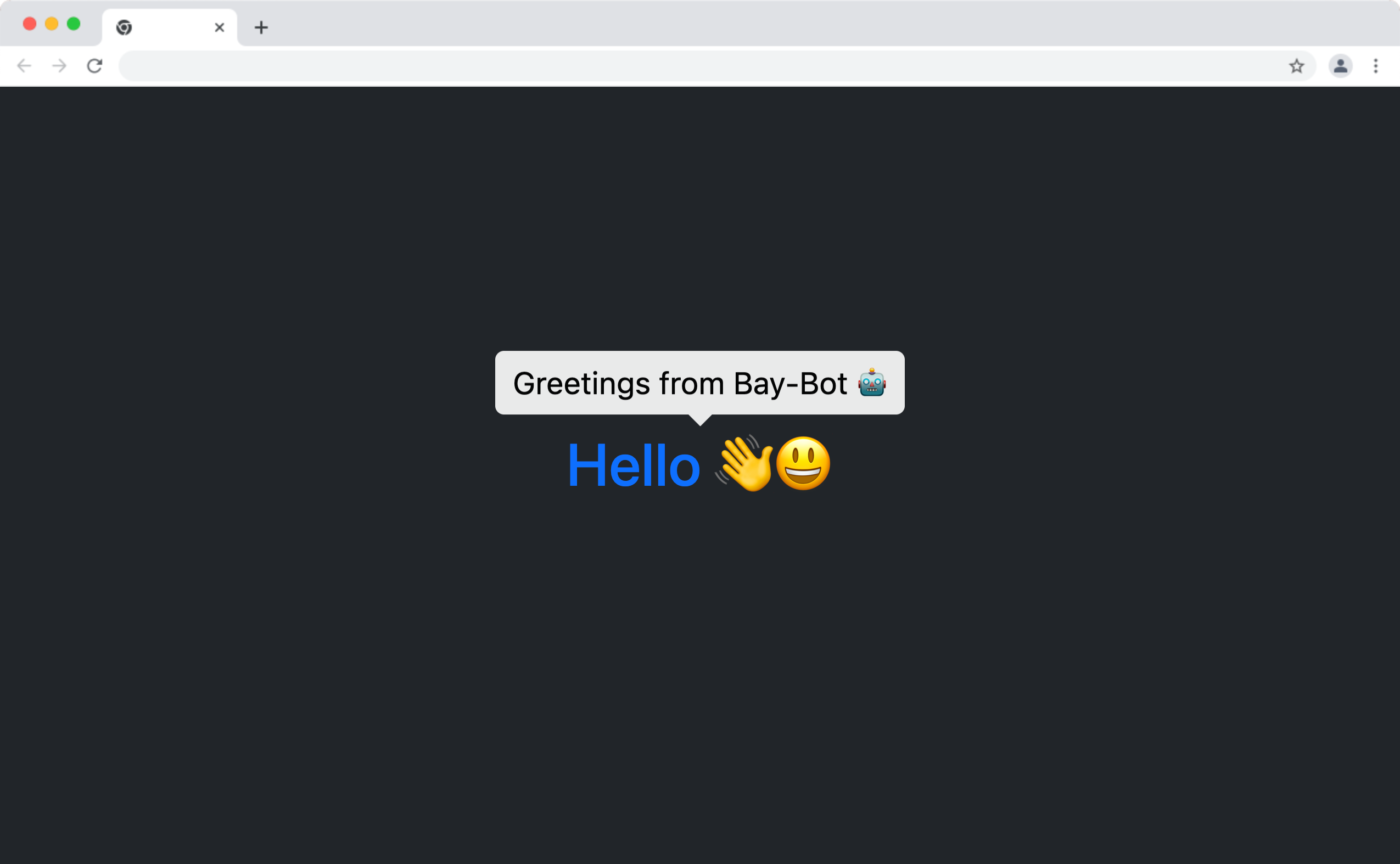
To create a tooltip for an element, the element must have a data-bs-toggle attribute so it can be selected and have a tooltip enabled by the bootstrap script discussed above. The description or tip to be displayed must then be added in the title attribute of the element.
Below is a typical structure of adding a bootstrap tooltip to an HTML element :
<h2
 class="text-primary"
 data-bs-toggle="tooltip"
 title="Greetings from Bay-Bot 🤖"
>
 Hello 👋😃
</h2>
The above markup will display “Greetings from Bay-Bot 🤖” when you hover, focus, or click on it as shown below:
Customizing Bootstrap Tooltip
The bootstrap Tooltip at its core is designed with CSS3, and we can customize any of its elements by targeting its identifiers such as class and id names and using the right CSS specificity.
In the following sections, we’ll go over how to change the background color of a bootstrap tooltip and the color of its pointer tail. You can also make use of CSS fade transition to add transition effects to bootstrap tooltips.
Changing Bootstrap Tooltip Background Color
Target the .tooltip-inner classes to change the background color of the bootstrap tooltip using CSS as follows:
.tooltip-inner {
background-color: white;
color: black;
}
The above CSS style will give the tooltip a background color of white and a color black to make the text within it visible as shown below:
However, the tooltip arrow or tail is still having the default black color, we’ll address this in the next section.
Changing Bootstrap Tooltip Arrow Tail
The tooltip arrow is the pointer tail that points toward the element that is paired to the tooltip. We can also modify the color of the arrow by targeting the .tooltip-arrow class property with higher specificity as shown below:
.bs-tooltip-top .tooltip-arrow::before,
.bs-tooltip-auto[data-popper-placement^="top"] .tooltip-arrow::before {
border-top-color: white;
}
The code above will make the tooltip arrow have a border color of white to produce the following output:
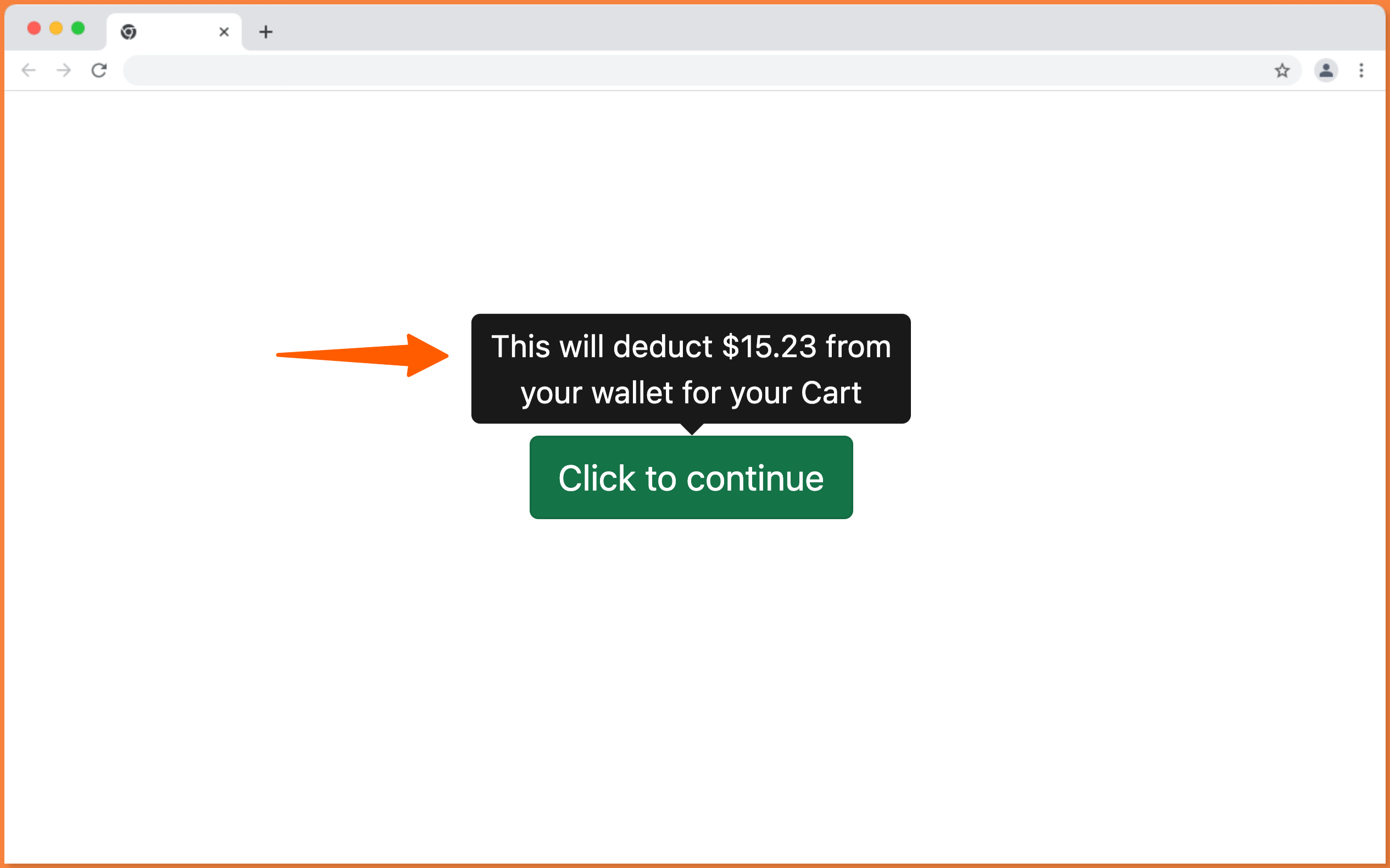
Adding Tooltips to Disabled Elements
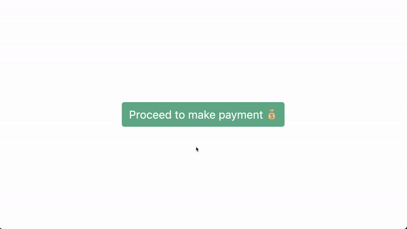
Meanwhile, adding tooltips to disabled elements is tricky as they’re not clickable, cannot be focused, and do not react to the hover effect to trigger the tooltip to appear.
Below is a disabled button with a bootstrap tooltip:
<button
    disabled
    class="btn btn-success btn-sm sm-"
    data-bs-toggle="tooltip"
    title="Fill in your card 💳 to make payment."
>
    Proceed to make payment 💰
</button>
The disabled button will not trigger the tooltip as shown below:
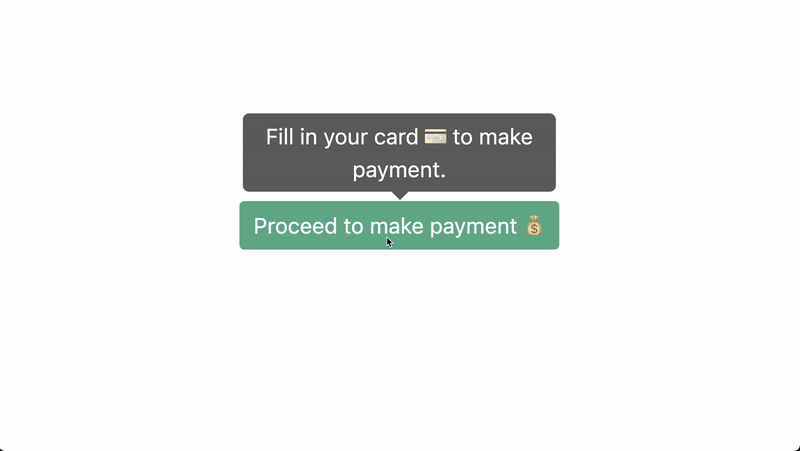
The workaround to adding tooltips to a disabled element is to use a wrapper element such as a div , section or span tag and then apply the data-bs-toggle to the parent tag as follows:
<div
    data-bs-toggle="tooltip"
    title="Fill in your card 💳 to make payment."
>
    <button disabled class="btn btn-success btn-sm">
    Proceed to make payment 💰
    </button>
</div>
The wrapper tag will serve as the element’s tooltip and displays the tooltip when the disabled element is been hovered or clicked as demonstrated below:
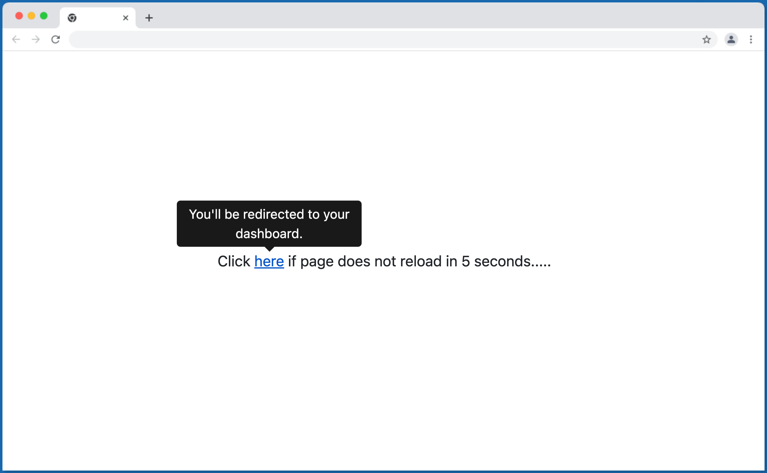
Adding Tooltips to an Anchor Tag – Links
You can also add tooltips to anchor tags as follows:
<p>
    Click
    <a
    href="#d"
    data-bs-toggle="tooltip"
    title="You'll be redirected to your dashboard."
    >here</a
    >
    if page does not reload in 5 seconds.....
</p>
The above code will produce the output below:
Bootstrap Tooltip Positioning
By default, the bootstrap Tooltips are placed at the top of their paired element and we can modify this via data attributes, by setting the data-bs-placement attribute (previously data-placement) to either top, right, left, center, or bottom to change their position to the corresponding placement.
NOTE: The tooltip will be position at the top if there’s no enough space to place it at the right/left/bottom of the screen.
The following sections will demonstrate how to position bootstrap Tooltips at the top, right, left, center and bottom.
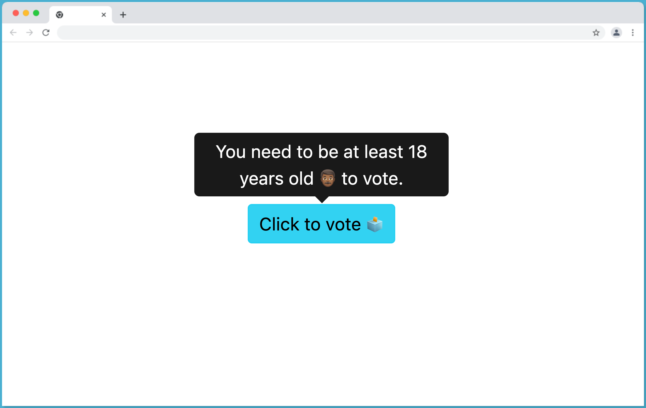
Tooltip Position Top
So this is the default position of bootstrap Tooltips, you can position a tooltip at the top of its paired element by setting the data-bs-placement to "true" as shown below:
<button
    data-bs-placement="top"
    data-bs-toggle="tooltip"
    title="You need to be at least 18 years old 👨🏾 to vote."
    class="btn btn-info btn-sm"
>
    Click to vote 🗳
</button>
This will make the Tooltip element to be displayed at the TOP of the element as follow:
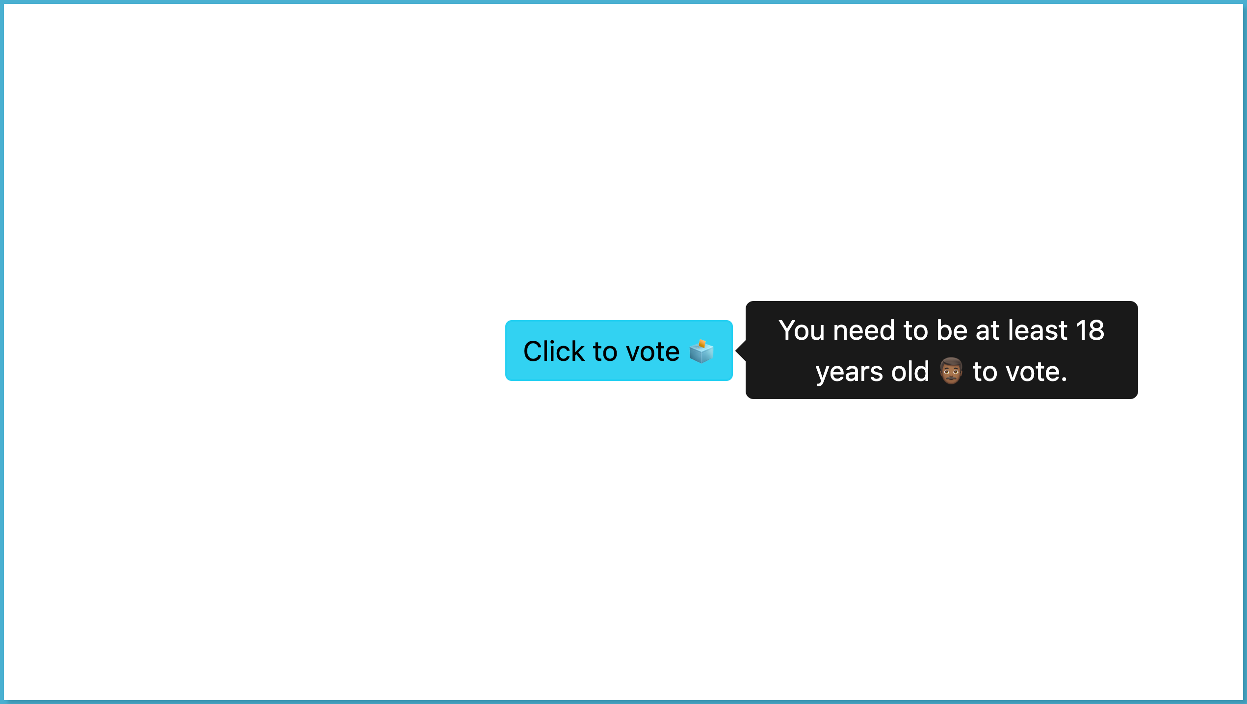
Tooltip Position Right
Set the data-bs-placement to "right" to place the Tooltip to the right position of their paired element as follows:
<button
    data-bs-placement="right"
    data-bs-toggle="tooltip"
    title="You need to be at least 18 years old 👨🏾 to vote."
    class="btn btn-info btn-sm"
>
    Click to vote 🗳
</button>
This will make the Tooltip element to be displayed at the RIGHT of the element as follow:
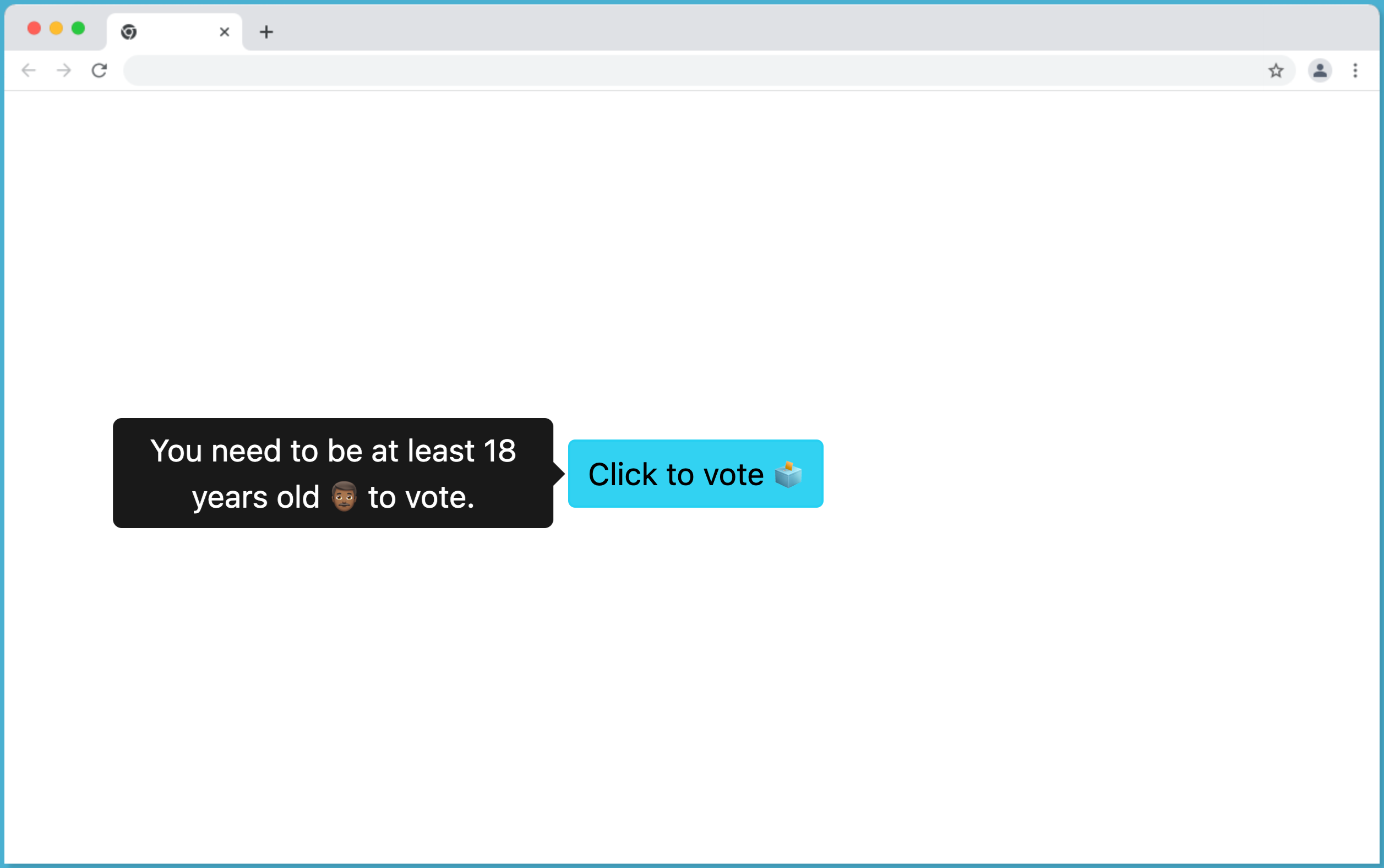
Tooltip Position Left
Set the data-bs-placement to "left" to place the Tooltip to the left position of their paired element as follows:
<button
    data-bs-placement="left"
    data-bs-toggle="tooltip"
    title="You need to be at least 18 years old 👨🏾 to vote."
    class="btn btn-info btn-sm"
>
    Click to vote 🗳
</button>
This will make the Tooltip element to be displayed at the LEFT of the element as follow:
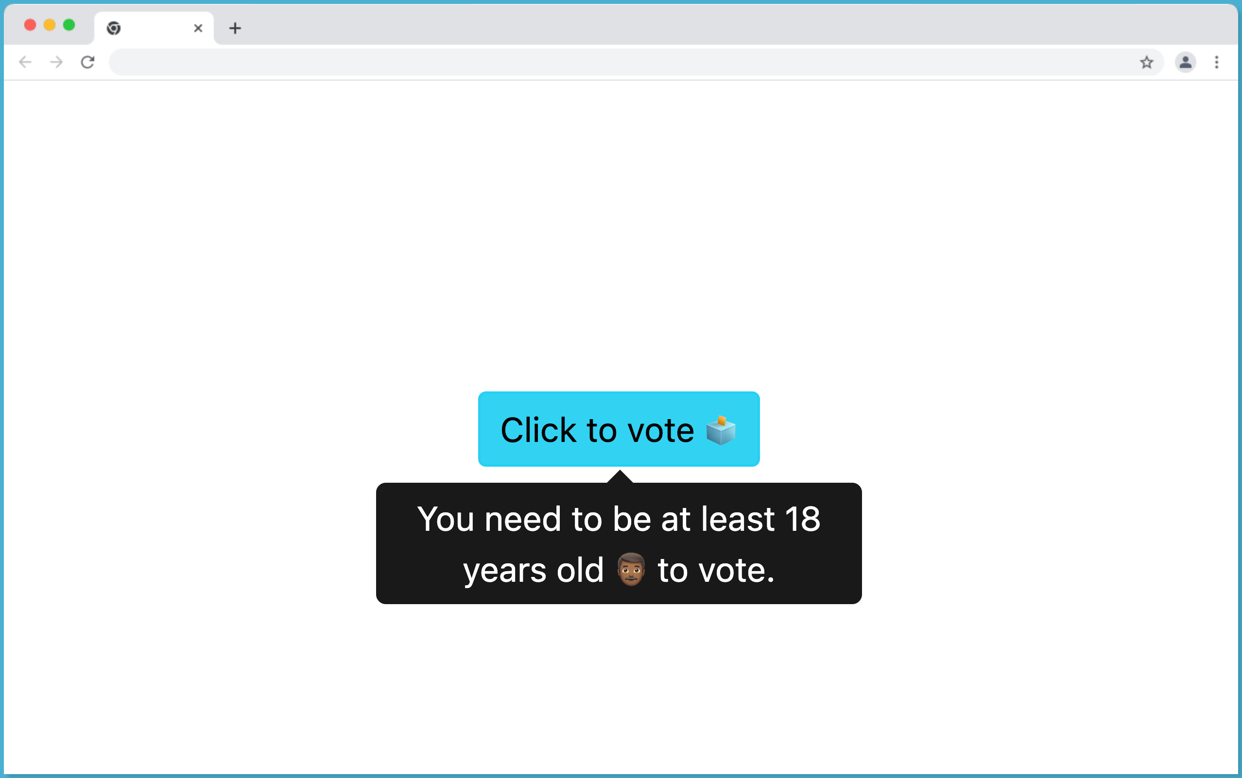
Tooltip Position Bottom
Set the data-bs-placement to "bottom" to place the Tooltip at the bottom of their paired element as follows:
<button
    data-bs-placement="bottom"
    data-bs-toggle="tooltip"
    title="You need to be at least 18 years old 👨🏾 to vote."
    class="btn btn-info btn-sm"
>
    Click to vote 🗳
</button>
This will make the Tooltip element to be displayed at the BOTTOM of the element as follow:
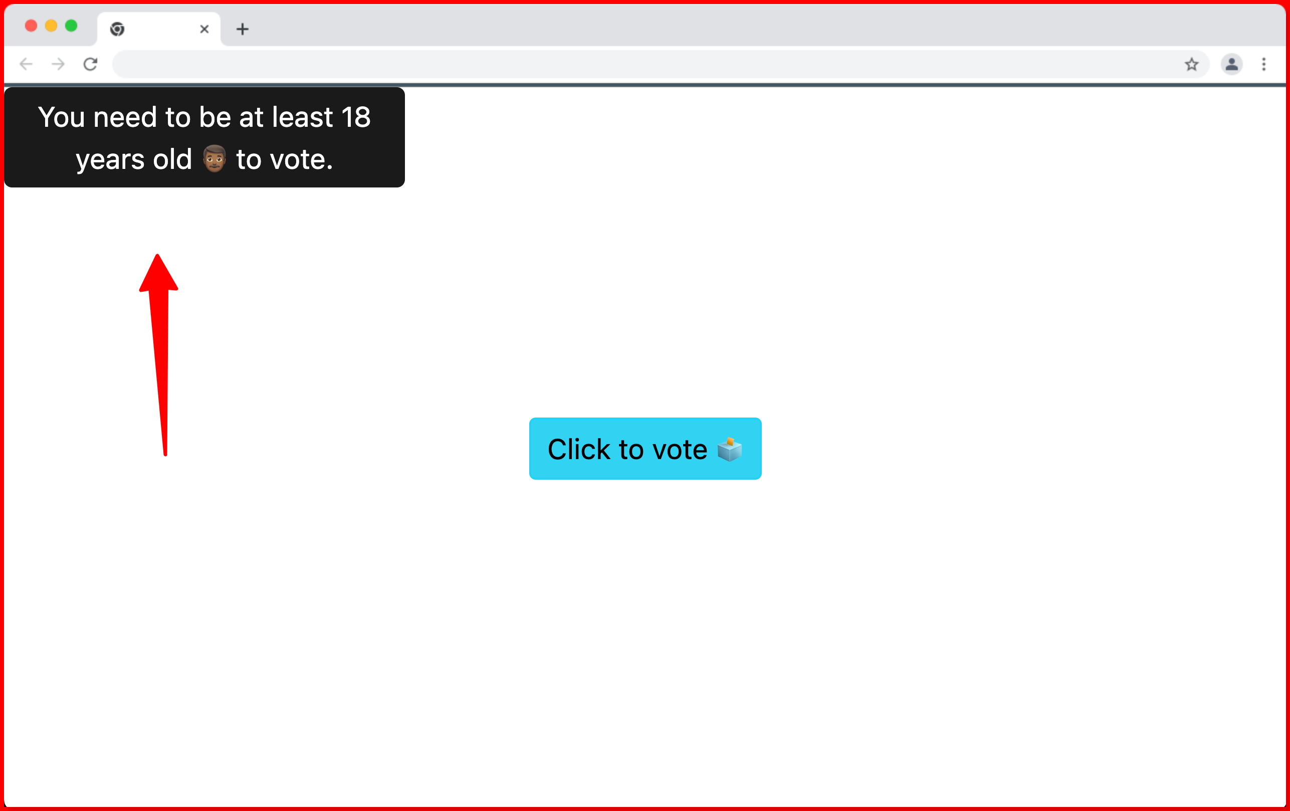
Tooltip Invalid Position
When the data-bs-placement is set to an unsupported value or placement value such as "center" the tooltip will be positioned at the top-left of the page as follows:
<button
    data-bs-placement="center"
    data-bs-toggle="tooltip"
    title="You need to be at least 18 years old 👨🏾 to vote."
    class="btn btn-info btn-sm"
>
    Click to vote 🗳
</button>
In this case the unsupported placement value will make the Tooltip element be displayed at the TOP-RIGHT of the page as follow:
Wrapping Up
In this article, we learned how to add a tooltip to an HTML element using bootstrap tooltips. We also learned how to customize tooltips and make them appear in different positions.
If you enjoy watching videos, you can also watch the Bootstrap Tooltip video tutorial below.
Finally, more articles like this can be found on our CopyCat blog. CopyCat converts your Figma files into a ready-to-use React project, undeniably saving you over 35% of development time. You can check out CopyCat here.
Interesting Reads From Our Blogs
- A Great Guide To Using Material UI Textfield Efficiently
- Material UI Grid: The Ultimate Guide to Building Responsive Web Layout in React
- Complete Guide to Using Material UI Button in React
Happy Coding 👨🏽💻
Related Articles
-
 Bootstrap
Beginner’s Guide to Working with Bootstrap Checkbox
https://images.surferseo.art/04757cc0-7743-4ec1-98ae-94eccd6a0ccc.png Introduction Checkboxes are crucial and essential html elements on websites. Without them, users would not be able to choose multiple list items or toggle options on or olff easily. As a result, customers may find it more challenging to…
December 23, 2022 -
Bootstrap
The Fastest Way to Build Professional Websites with Bootstrap CDN
Does Bootstrap have a CDN? Initially, Bootstrap was hosted on a CDN called MaxCDN, but this changed when StackPath acquired MaxCDN in 2019. The official Bootstrap website now hosts its CDN, the recommended way to use the framework. The official…
February 24, 2023
