 October 20, 2022
  Emmanuel Uchenna


Introduction
Buttons are an integral part of every website or web application. In the frontend web development aspect, designing custom buttons has been a lot easier now, all thanks to frameworks such as Bootstrap, Tailwind CSS, among others. Bootstrap, a popular CSS framework has the goal of simplifying the development of websites and web applications.
In this tutorial, you will be walked through installing and using react-bootstrap in your React application to build custom button styles, and also, introduced to the `Button` component in react-bootstrap and how you can customize it depending on the state of your application.

What Is Bootstrap
Bootstrap is an open-source, free CSS framework that is used to build responsive, mobile-first websites and web applications. Bootstrap comes with tons of custom components, such as buttons, navbar, forms, toasts, etc with which you can build upon to build your web application faster.
The Bootstrap website describes Bootstrap as
“[…] a powerful, feature-packed frontend toolkit. Build anything—from prototype to production—in minutes.”
Before you delve further, let me introduce you to CopyCat. At CopyCat, we simplify the art of building web applications by transforming your Figma designs into Bootstrap HTML and CSS codes in seconds—learn how to do this here.
Save valuable time doing things that matter and allow CopyCat handle your Figma designs to Bootstrap code conversion in seconds.
In this article, you will learn how to use Bootstrap’s custom button styles to create custom buttons, and use Bootstrap default modifier btn classes such as btn primary, btn secondary to customize your buttons.
For you to work with Bootstrap in React, you need to work without the jQuery plugin, this is because React is not aware of anything happening outside the virtual DOM. This is where react-bootstrap comes in. With react-bootstrap, you do not need to install jQuery into your application. React Bootstrap simplifies the integration of Bootstrap in your React application.
Adding Bootstrap to React
First, you need to initialize a React project. To do that, you will make use of CRA.
Installation guidelines
Run the following commands:
npx create-react-app bootstrap-btn-app
cd bootstrap-btn-app
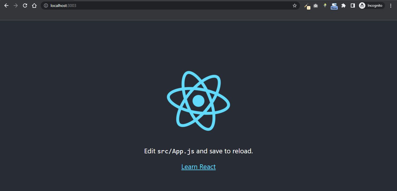
npm start
You should see similar output below in your terminal:
$ npm start
> bootstrap-btn-app@0.1.0 start
> react-scripts start
Your React app will be run on localhost:3000 by default.
For you to use Bootstrap buttons, you need to install React Bootstrap in your project. Follow the instructions below to install react-bootstrap. Run either of these commands below:
npm i bootstrap react-bootstrap
or
yarn add bootstrap react-bootstrap
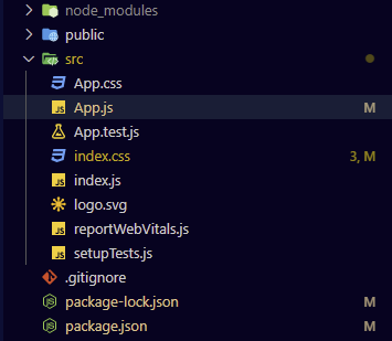
Your project src folder structure will look like this:
To create a basic button with react-bootstrap, start by importing Bootstrap files into your project in App.js. These files include the Bootstrap CSS and Button component.
The Bootstrap CSS will provide stylings while Button will provide access to the Button component.
import Button from 'react-bootstrap/Button';
import 'bootstrap/dist/css/bootstrap.min.css';
...
What the above snippet does is:
- It imports the Button component from react-bootstrap
- It imports Bootstrap minified styles from bootstrap/dist/css/bootstrap.min.css
In the App.js file, paste the following code:
import Button from "react-bootstrap/Button";
import "bootstrap/dist/css/bootstrap.min.css";

function App() {
 return (
    <div className="App">
      <Button type="submit">Submit Resume</Button>
    </div>
  );
}


export default App;

Bootstrap’s Custom Button Styles
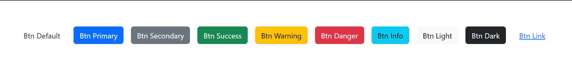
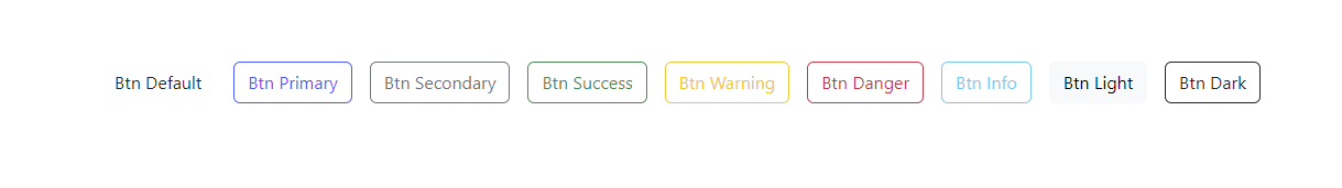
Bootstrap provides predefined variants for the Button component. You can achieve different button styles by using any of the following values for the variant property: default, primary, secondary, success, warning, danger, info, light, dark, and link.
import { ButtonToolbar, Button } from "react-bootstrap";
import "bootstrap/dist/css/bootstrap.min.css";


function App() {
  return (
    <div className="App">
      <ButtonToolbar>
        <Button variant="default">Btn Default</Button> {" "}
        <Button variant="primary">Btn Primary</Button> {" "}
        <Button variant="secondary">Btn Secondary</Button> {" "}
        <Button variant="success">Btn Success</Button> {" "}
        <Button variant="warning">Btn Warning</Button> {" "}
        <Button variant="danger">Btn Danger</Button> {" "}
        <Button variant="info">Btn Info</Button> {" "}
        <Button variant="light">Btn Light</Button> {" "}
        <Button variant="dark">Btn Dark</Button> {" "}
        <Button variant="link">Btn Link</Button> {" "}
      </ButtonToolbar>
    </div>
  );
}


export default App;
The above code will render like this:
Bootstrap also provides outlines or border color for its buttons. To use any of the outlines, simply pass any of these values to the variant property like this: outline-default, outline-primary, outline-secondary, outline-success, outline-warning, outline-danger, outline-info, outline-light, and outline-dark.
import { ButtonToolbar, Button } from "react-bootstrap";
import "bootstrap/dist/css/bootstrap.min.css";

function App() {
  return (
    <div className="App">
      <ButtonToolbar>
        <Button variant="outline-default">Btn Default</Button> {" "}
        <Button variant="outline-primary">Btn Primary</Button> {" "}
        <Button variant="outline-secondary">Btn Secondary</Button> {" "}
        <Button variant="outline-success">Btn Success</Button> {" "}
        <Button variant="outline-warning">Btn Warning</Button> {" "}
        <Button variant="outline-danger">Btn Danger</Button> {" "}
        <Button variant="outline-info">Btn Info</Button> {" "}
        <Button variant="outline-light">Btn Light</Button> {" "}
        <Button variant="outline-dark">Btn Dark</Button> {" "}
      </ButtonToolbar>
    </div>
  );
}


export default App;
Bootstrap Button Sizes
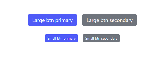
React Bootstrap also provides support for multiple sizes of buttons. Simply Add size=”lg”, size=”sm” to provide additional size for your buttons.
import "bootstrap/dist/css/bootstrap.min.css";
import Button from 'react-bootstrap/Button';


function App() {
  return (
    <>
      <div className="App">
        <div className="mb-2">
          {/* btn primary */}
          <Button variant="primary" size="lg">
            Large btn primary
          </Button>{' '}
          {/* btn secondary */}
          <Button variant="secondary" size="lg">
            Large btn secondary
          </Button>
        </div>
        <div className="mt-2">

          {/* btn primary */}
          <Button variant="primary" size="sm">
            Small btn primary
          </Button>{' '}

          {/* btn secondary */}
          <Button variant="secondary" size="sm">
            Small btn secondary
          </Button>
        </div>
      </div>
    </>
  );
}


export default App;
The snippet above demonstrates how to provide support for multiple sizes of buttons. The React Button component in Bootstrap attribute and value variant=”primary” corresponds to btn primary in regular Bootstrap, same goes with variant=”secondary” which corresponds to btn secondary.
Ways Of Using Bootstrap Buttons In React
Bootstrap buttons cannot only be used as buttons alone, but can also be used as checkboxes, radio buttons, or button groups.
Let’s dive right in …

Using Bootstrap Buttons as Checkboxes
Checkboxes are used to permit users to make multiple choices in forms or submissions. You use checkboxes to select one or several possible options from a list as opposed to radio buttons with which, you only select a single option. In this section, you will learn how to use your Bootstrap Button components as a checkbox.
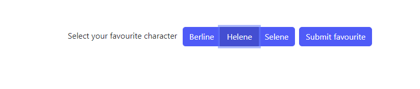
To convert the button to a checkbox, you will need to wrap your Button with ToggleButtonGroup and instead of using Button like we earlier saw, you will declare your button component with ToggleButton that would look like so:
import Button from "react-bootstrap/Button";
import ToggleButtonGroup from "react-bootstrap/ToggleButtonGroup";
import ToggleButton from "react-bootstrap/ToggleButton";
import "bootstrap/dist/css/bootstrap.min.css";


function App() {
  return (
    <div className="App">
      <form>
        <label
          className="mr-3"
          htmlFor="character"
        >
          Select your favourite characters
        </label>
        <ToggleButtonGroup type="checkbox" name="character">
          <ToggleButton
            value={"berline"}
          >
            Berline
          </ToggleButton>
          <ToggleButton
            value={"helene"}
          >
            Helene
          </ToggleButton>
          <ToggleButton
            value={"selene"}
          >
            Selene
          </ToggleButton>
        </ToggleButtonGroup>
        <Button type="submit">Submit favourite</Button>
      </form>
    </div>
  );
}

export default App;
In the snippet above, you made use of the ToggleButtonGroup component from react-bootstrap to group your form components which are the three ToggleButton components. You passed in a value to the name attribute of the ToggleButtonGroup.
The name attribute corresponds to the name attributes in regular HTML <input />. Finally, you passed in a value to the value attribute of the ToggleButton component.

Using Bootstrap Buttons as Radio Buttons
The same way you used react-bootstrap buttons as checkboxes in the code snippet above, is the same way you will implement react-bootstrap buttons as radio buttons.
The only thing that changes here is that you assign the value radio to the attribute type of the ToggleButtonGroup component.
import Button from "react-bootstrap/Button";
import ToggleButtonGroup from "react-bootstrap/ToggleButtonGroup";
import ToggleButton from "react-bootstrap/ToggleButton";
import "bootstrap/dist/css/bootstrap.min.css";


function App() {
  return (
    <div className="App">
      <form>
        <label htmlFor="character">Select your favourite character</label>
        {/* Assign value `radio` to the `type` attribute */}
        <ToggleButtonGroup type="radio" name="character">
          <ToggleButton
            value={"berline"}
          >
            Berline
          </ToggleButton>
          <ToggleButton
            value={"helene"}
          >
            Helene
          </ToggleButton>
          <ToggleButton
            value={"selene"}
          >
            Selene
          </ToggleButton>
        </ToggleButtonGroup>
        <Button type="submit">Submit favourite</Button>
      </form>
    </div>
  );
}

export default App;
Using Bootstrap Buttons Actions In Forms Dialogs
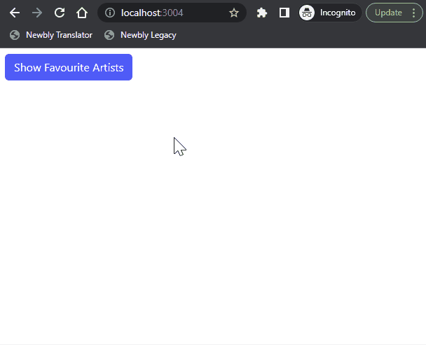
You can also use React Bootstrap buttons in actions in forms dialogs.
import React, { useState } from 'react';
import Button from 'react-bootstrap/Button';
import Modal from 'react-bootstrap/Modal';
import "bootstrap/dist/css/bootstrap.min.css";


function App() {
  const [show, setShow] = useState(false);
  const handleClose = () => setShow(false);
  const handleShow = () => setShow(true);

  return (
    <>
      <Button variant="primary" onClick={handleShow}>
        Show Favourite Artists
      </Button>
      <Modal show={show} onHide={handleClose} animation={false}>
        <Modal.Header closeButton>
          <Modal.Title>Favourite artists</Modal.Title>
        </Modal.Header>
        <Modal.Body>
          <p>
            1. Helene
          </p>
          <p>
            2. Berline
          </p>
        </Modal.Body>

        <Modal.Footer>
          <Button variant="secondary" onClick={handleClose}>
            Close
          </Button>
          <Button variant="primary" onClick={handleClose}>
            Save Changes
          </Button>
        </Modal.Footer>
      </Modal>
    </>
  );
}


export default App;
Controlling Buttons with State In React
It is good practice to use React to control the state of your forms. This allows React to be your single source of truth in your application. In the next example below, you will make use of React state by calling the useState hook to handle the state change of the favouriteArtist.
import { useState } from "react";
import ToggleButtonGroup from "react-bootstrap/ToggleButtonGroup";
import ToggleButton from "react-bootstrap/ToggleButton";
import "bootstrap/dist/css/bootstrap.min.css";
import Button from "react-bootstrap/Button";
import "bootstrap/dist/css/bootstrap.min.css";

function App() {
  const [favouriteArtist, setFavouriteArtist] = useState("");
  const handleFavouriteArtistChange = (e) => {
    setFavouriteArtist(e.target.innerText);
    console.log(favouriteArtist);
  }
  return (
    <div className="App">
      <ToggleButtonGroup
        type="checkbox"
        name="favouriteArtist"
        value={favouriteArtist}
      >
        <ToggleButton
          value={"berline"}
          onClick={e => handleFavouriteArtistChange(e)}
        >
          Berline
        </ToggleButton>
        <ToggleButton
          value={"helene"}
          onClick={e => handleFavouriteArtistChange(e)}
        >
          Helene
        </ToggleButton>
        <ToggleButton
          value={"selene"}
          onClick={e => handleFavouriteArtistChange(e)}
        >
          Selene
        </ToggleButton>
      </ToggleButtonGroup>
      <Button type="submit">Submit</Button>
    </div>
  );
}


export default App;
Loading, Active and Disabled State
You can also control the behavior of your button by adding a loading state using React useState hook. We have a guide on how to build your ReactJS custom hook. Read it here.
Adding a loading state to your button is useful in scenarios where your user needs to perform a network request. If the response is pending, then your button will be disabled pending a response from the server. This will prevent your user from resubmitting a particular request over and over again and your button will be in a disabled state.
You will expand upon the previous code sample.
import { useState, useEffect } from "react";
import Button from "react-bootstrap/Button";
import ToggleButtonGroup from "react-bootstrap/ToggleButtonGroup";
import ToggleButton from "react-bootstrap/ToggleButton";
import "bootstrap/dist/css/bootstrap.min.css";

function App() {
  const [isLoading, setIsLoading] = useState(false);
  const [favouriteArtist, setFavouriteArtist] = useState("");

  useEffect(() => {
    setIsLoading(true);
    fetch("https://api.github.com/users/eunit99/repos")
      .then((res) => res.json())
      .then((data) => {
        console.log(data);
        setIsLoading(false);
      }).catch(e => {
        console.error(e.message);
        setIsLoading(false);
      });
  }, [])

  const handleSubmit = () => {
    setIsLoading(true);
    console.log("Submit clicked!");
  }
  const handleFavouriteArtistChange = (e) => {
    setFavouriteArtist(e.target.innerText);
    console.log(favouriteArtist);
  }

  return (
    <div className="App">
      <ToggleButtonGroup
        type="checkbox"
        name="favouriteArtist"
        value={favouriteArtist}
      >
        <ToggleButton
          value={"berline"}
          onClick={e => handleFavouriteArtistChange(e)}
        >
          Berline
        </ToggleButton>
        <ToggleButton
          value={"helene"}
          onClick={e => handleFavouriteArtistChange(e)}
        >
          Helene
        </ToggleButton>
        <ToggleButton
          value={"selene"}
          onClick={e => handleFavouriteArtistChange(e)}
        >
          Selene
        </ToggleButton>
      </ToggleButtonGroup>

      <Button
        type="submit"
        disabled={isLoading}
        onClick={!isLoading ? handleSubmit : null}
      >
        {isLoading ? "Submitting" : "Submit"}
      </Button>
    </div>
  );
}

export default App;
Explanation of what the snippet does:
- You started by importing the `useState` and `useEffect` React hooks.
- You initialized the state of `isLoading` to `false` using the `useState` hook.
- You used the JavaScript fetchAPI to fetch data from the GitHub API.
- setIsLoading(true): sets isLoading to true when the useEffect hook is called which runs once when the component mounts on the page.
- setIsLoading(false): You set isLoading to false when the server sends a response.
- handleSubmit: A function called when the user clicks on the submit button. When this function is called, it is assumed that the user is submitting a form, as such, you set isLoading to true.
  <Button
        type="submit"
        disabled={isLoading}
        onClick={!isLoading ? handleSubmit : null}
      >
        {isLoading ? "Submitting" : "Submit"}
 </Button>
- You conditionally set the state of the Button component to be disabled if isLoading is true. When disabled, the user cannot click on it.

- {isLoading ? “Submitting” : “Submit”}: You display the text “Submitting” or “Submit” depending on the state of isLoading.

Interesting Reads From Our Blogs
- Setting up Tailwind CSS in React Application: Walk-through and Examples
- 10 CSS Frameworks for Frontend Developers in 2022
- All You Need to Know About React Spring Animations Jammed Into One Article
- Impress Your Users Using The Top 8 React Animation Libraries
Further readings
- How to Create a Bootstrap Button by Edureka.io
- Bootstrap Button by Tutorial Republic
- Working with React-bootstrap Buttons by Pluralsight
Videos On React Bootstrap
How To Use Tailwind CSS With React
Install Tailwind CSS for React – React Tutorial
Wrapping Up
In this article, you have looked at what Bootstrap is, and its installation into your React project using the library react-bootstrap. You were also walked through how to use the Bootstrap button and the different variants of its button.
You also learned about controlling buttons with React State.
I hope this article will help you get started with using Bootstrap buttons in React applications.
Finally, you can find more awesome articles like this on our blog. CopyCat is a tool that saves you about 35% of development time by converting your Figma files to an up-and-running React project. Try it out.
Related Articles
-
React.js
React Strict Mode: A Guide on Using it in your Application
Introduction React Strict Mode is a developer tool that has been around in React from version 16.3. But, if you are like me, you might be seeing it in your index.js file without giving it a thought about why it has been there (if…
September 14, 2022 -
React.js
Complete Guide to React Lazy Loading and Code Splitting
What is lazy loading in React? Lazy loading in React is an optimization technique for websites or web applications. It is also known as on-demand loading because it only loads content visible on users' screens. What does optimization mean? Web…
June 9, 2022

