
 December 24, 2022
  Faith Ajayi


Introduction
Material UI is a popular user interface package for React. It offers a number of components that follow Google’s material design principles. The Material UI data grid, which is used to display and work with tabular data, is one of these elements.
The Material UI DataGrid component has several capabilities, including sorting, pagination, and selection, and is very customizable. It is additionally simple to use on a number of devices thanks to built-in support for responsive design.
Before we continue, do you want to shorten the time you and your team spend making user interfaces? To quickly convert your Figma design to Material UI, use CopyCat; find out more about this tool here.
What is Material UI Data Grid Component?
A component that resembles a table and presents data in a grid is the Material UI Data Grid component. It offers a number of options for customizing the look and functionality of the grid. As a result, it enables users to browse, filter, and sort huge datasets.
The Material UI Data Grid component is constructed on top of the Material UI Table component. It makes use of the TableBody, TableCell, and TableRow components to represent the data in the grid. Additionally, it has functions like pagination, filtering, and sorting, which are done using the TablePagination, TableFilter, and TableSortLabel components, respectively.
Importance of Material UI Data Grid component

A helpful tool for efficiently and effectively managing enormous datasets is the MUI x Data Grid component. Your application’s efficiency and user experience may be enhanced. It offers a dependable, adaptable design that works well with the Material UI library.
By enabling you to show enormous datasets without degrading the speed of the page, using a data grid helps your application perform and scale better. With features like virtual scrolling and lazy loading, the Material UI Data Grid component is performance optimized and helps your application load faster and provide a better user experience.
The Material UI Data Grid component offers not only these practical advantages but also a dependable, adaptable user experience that harmonizes perfectly with the rest of the Material UI package. This can contribute to making your application’s design more unified and aesthetically pleasing.
Importing and Implementing Material UI Data Grid
Installing the @material-ui/data-grid package from npm is required in order to import and use the Material UI Data Grid component. Along with the various parts and dependencies that the Data Grid needs, this package also contains the DataGrid component.
Once, the Material UI Data Grid is confirmed successfully installed, it can then be imported so as to be able to use and render the DataGrid component to the user interface for the users.
Look at how to import the DataGrid Material UI component into a React component for integration and implementation below;
import React from 'react';
import { DataGrid } from '@material-ui/data-grid';


export default function MuiDataGrid() {
 return (
        <div style={{ height: 400, width: '100%' }}>
	  <DataGrid />
        </div>
    );
}
As said earlier, with the above implementation and integration, we have made the DataGrid component ready for use. Also, it is important to note that the above implementation does not completely make it ready for use. We will discuss and go deeply into doing that in the section below.
How to Populate and Render Material UI Data Grid to Display?
Earlier, we mentioned that the material UI Data Grid component resembles a table and presents data in a grid. However, it is also built on top of the material Ui table component itself.
This means for us to completely use the Material UI component without errors, some properties need to be provided. The Material UI Grid itself needs that columns and rows for it to appear in its basic form.
For data to be presented on the user’s interface using the Material DataGrid component, it is important that the columns and rows array are populated with data. Majorly these arrays are made of an array of objects. See the code application to populate and render the Material UI DataGrid below;
import React from 'react';
import { DataGrid } from '@material-ui/data-grid';

const columns = [
    { field: 'id', headerName: 'ID', width: 70 },
    {
        field: 'firstName',
        headerName: 'First name',
        width: 130,
        editable: true,
    },
    {
        field: 'lastName',
        headerName: 'Last name',
        width: 130,
        editable: true,
    },
    {
        field: 'age',
        headerName: 'Age',
        type: 'number',
        width: 90,
        editable: true,
    }
];

const rows = [
    { id: 1, lastName: 'Snow', firstName: 'Jon', age: 35 },
    { id: 2, lastName: 'Lannister', firstName: 'Cersei', age: 42 },
    { id: 3, lastName: 'Lannister', firstName: 'Jaime', age: 45 },
    { id: 4, lastName: 'Stark', firstName: 'Arya', age: 16 },
    { id: 5, lastName: 'Targaryen', firstName: 'Daenerys', age: null },
    { id: 6, lastName: 'Melisandre', firstName: null, age: 150 },
    { id: 7, lastName: 'Clifford', firstName: 'Ferrara', age: 44 },
    { id: 8, lastName: 'Frances', firstName: 'Rossini', age: 36 },
    { id: 9, lastName: 'Roxie', firstName: 'Harvey', age: 65 },
];

export default function MuiDataGrid() {
    const classes = useStyles();
    return (
        <div style={{ height: 400, width: '100%' }}>
            <DataGrid rows={rows} columns={columns} pageSize={5} checkboxSelection  />
        </div>
    );
}
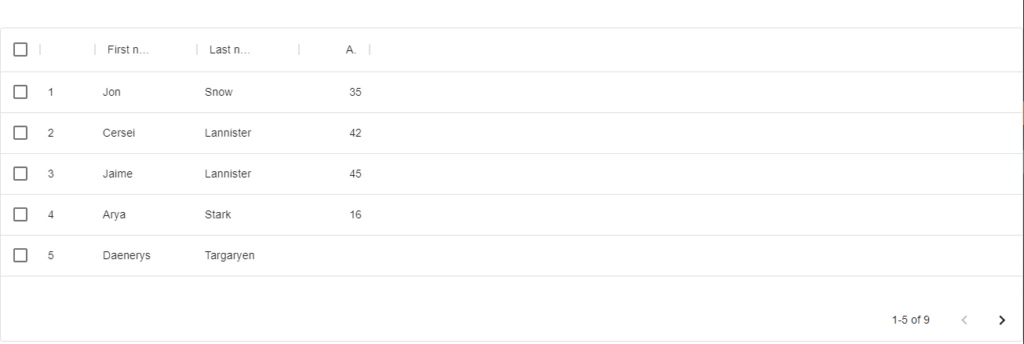
The columns and rows arrays are filled with objects and then passed as props to the DataGrid component in the code shown above. We can also see that the ‘pageSize‘ prop was passed and set to 5, limiting the length of data that users can view to five. Users must click the next button provided by the Material UI Data Grid component to view the subsequent group of data. In the image below, we can see the outcomes of the aforementioned code implementation;
Material UI Data Grid Styles
Setting the font size, row height, and column width are just a few of the many customization options available in the Material UI Data Grid component. The DataGrid component options props allow you to specify the styles you want to use.
For instance, you might use the rowHeight and headerHeight options to customize the height of the grid’s rows and headers, and the fontSize option to customize the font used for the grid’s content. The columns prop may also be used to set the width of each grid column.
Here is an illustration of how you may alter the styles of a Material UI DataGrid using the options prop:
// Import the DataGrid component from Material UI
import DataGrid from '@material-ui/data-grid';

// Define the data you want to display
const data = [
  { id: 1, name: 'John Doe', email: 'johndoe@example.com' },
  { id: 2, name: 'Jane Doe', email: 'janedoe@example.com' },
  { id: 3, name: 'Bob Smith', email: 'bobsmith@example.com' },
];

// Use the 'options' prop to customize the styles of the DataGrid component
<DataGrid
  columns={[
    { field: 'id', headerName: 'ID' },
    { field: 'name', headerName: 'Name' },
    { field: 'email', headerName: 'Email' },
  ]}
  rows={data}
  options={{
    rowHeight: 48,
    headerHeight: 56,
    fontSize: 14,
  }}
/>
In addition to utilizing the options argument, you can also construct a new styles object using the makeStyles hook from Material UI to replace the default styles.
Comparison of MIT and Commercial versions
You would definitely agree that the Material UI DataGrid is a popular component for showing tabular data in an attractive and user-friendly manner. It is a component of the Material UI library, which is a set of React components that follow Google’s material design principles.
The Material UI DataGrid component comes in two different iterations: the MIT version, which can be downloaded for free under the MIT license, and the commercial version, which can be bought from the Material-UI website.
Differences
The amount of assistance and documentation offered is one of the key distinctions between the two versions. The MIT version is a community-driven project, therefore maintaining and enhancing the component depends on the efforts of volunteers. As a result, the MIT edition’s documentation and support might not be as thorough as those for the commercial version.
Contrarily, the team at Material-UI, who are able to offer more thorough support and documentation, is behind the commercial version. This includes assistance from the team via email and their community forums, as well as thorough documentation and examples.
The variety of features and functionalities that are offered in the two versions is another significant distinction. The commercial version offers more features and improvements, including the ability to alter the DataGrid’s appearance, advanced filtering and sorting options, and built-in support for localization and internationalization.
The commercial Material UI Data Grid component is included in a subscription package that also grants access to all of the other components in the Material UI library. The price of the subscription varies according to the number of developers and the required level of support.
However, the decision between the MIT and commercial versions of the Material UI DataGrid component will rely on a number of variables, including the amount of support and documentation necessary, the scope of the project’s features and functionality requirements, and the project budget. Although the commercial edition offers extra features and support that some users may find useful, both versions have a high-quality data grid component.
Conclusion
From this article, we have been able to understand the Material UI DataGrid component in React in full. We looked at the importance of the Material UI DataGrid component which makes your application efficient. We also viewed how to import and implement Material UI Data Grid and its styles.
Check out the CopyCat plugin for React if you’re searching for a fantastic React tool to make writing component code faster and production ready. Visit the Copycat blog here to find more intriguing articles.
Interesting reads from our blog.
- Complete guide to using Material UI Button in React
- Everything you need to know about TypeScript Typeof Operator
- How to build a good React Modal
If you would also love to learn deeper about Material UI Data Grid, you can check out the video resource below;
Related Articles
-
 React.js
Make Your Website Beautiful with Tailwind Icons
Introduction Icons are a universal language that directs a website visitor in the right direction. An icon on a website can represent a link to a section, a page, or an action such as a logout sign, a delete sign,…
November 24, 2022 -
React.js
Complete Guide On How To Use React Beautiful Drag And Drop
Introduction Drag and Drop refers to the software's ability to trigger a callback when one component is dragged over another. It's an interaction that enables someone to click on something, drag it to another location, and dump it there, often…
December 23, 2022

