 November 24, 2022
  Uncle Big Bay


Introduction
Icons are a universal language that directs a website visitor in the right direction. An icon on a website can represent a link to a section, a page, or an action such as a logout sign, a delete sign, or a sign to indicate the type of a web notification.
This article will cover Tailwind Icons, dive into the fundamentals of SVG icons, and discuss how you can get started using Tailwind icons to beautify your web projects.
What are Tailwind Icons?
Tailwind Icons are over 450 free hand-crafted high-quality SVG icons for UI development. It is developed by the makers of Tailwind CSS and it’s available in Basic SVG, React, and Vue versions.
The Basic SVG Icons
SVG stands for Scalable Vector Graphics. It is an HTML element that is used to define graphics on the web using the XML format. The SVG tag is denoted as <svg> and it serves as a container for SVG graphics usable in any supporting framework.
The Basic Tailwind SVG icon is a Tailwind-ready SVG that is easy to style with Taillwind’s sizes and colour utilities classes as shown below:
<svg
  xmlns="<http://www.w3.org/2000/svg>"
  fill="none"
  viewBox="0 0 24 24"
  stroke-width="1.5"
  stroke="currentColor"
  class="w-6 h-6 text-green-700">
    <path
      stroke-linecap="round"
      stroke-linejoin="round"
      d="M14.857 17.082a23.848 23.848 0 005.454-1.31A8.967 8.967 0 0118 9.75v-.7V9A6 6 0 006 9v.75a8.967 8.967 0 01-2.312 6.022c1.733.64 3.56 1.085 5.455 1.31m5.714 0a24.255 24.255 0 01-5.714 0m5.714 0a3 3 0 11-5.714 0M3.124 7.5A8.969 8.969 0 015.292 3m13.416 0a8.969 8.969 0 012.168 4.5"
    />
</svg>
SVGs can be modified using SVG attributes to define how the graphic will be rendered, the SVG attributes can be categorized into six:
- Generic attributes
- Xlink attributes
- Presentation attributes
- Filters attributes
- Animation attributes
- Event attributes
You can also check out the A-Z supported SVG attributes from MDN here.
ℹ️ You don’t have to worry about how the SVG is constructed because you can use the Tailwind SVG Icons components.
Tailwind SVG Icons Component
Tailwind SVG Icons components are Tailwind CSS responsive icons. This set of SVG-powered icons for Tailwind Elements is free for commercial use and requires no registration.
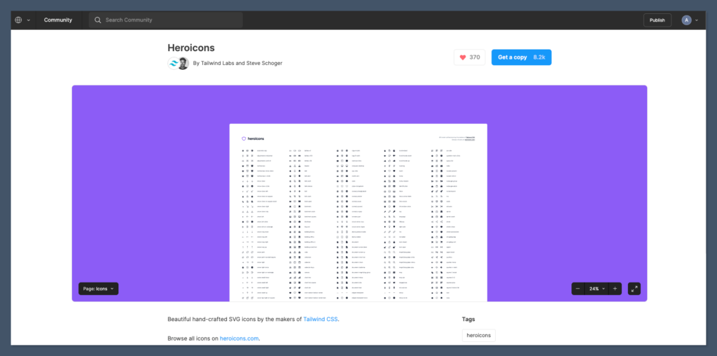
The Tailwind CSS team introduced the Heroicons web experience, a curated, searchable list of all the Tailwind CSS icons.
What is Heroicons?
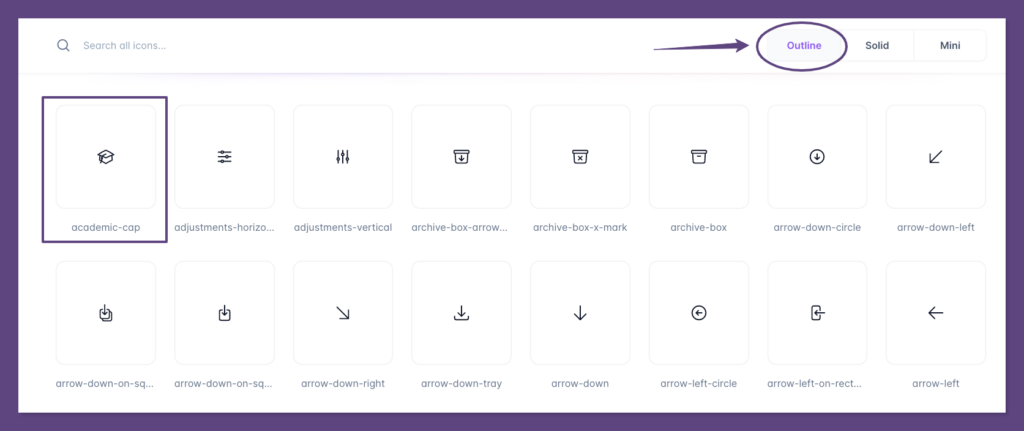
Heroicons is a web experience for all the Tailwind CSS icons. It allows you to easily see through the different collections of the icons such as the “Outlined”, “Solid” and “Mini” icons.
Heroicons has over 17k stars on GitHub.

When you hover on any of the icons on Heroicons, you’ll be able to copy the Basic SVG code snippet or copy a JXS code snippet version of the icon as demonstrated below:
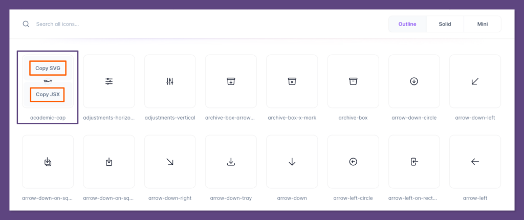
The basic SVG snippet can be used within an HTML project while the JSX version can be used within React components.
Next, we’ll discuss the three collections of the Heroicons with visuals and code samples to note their differences.
Heroicons – Outline Icons
A basic SVG code sample of an outline Heroicon SVG collection is as follows:
<svg
xmlns="<http://www.w3.org/2000/svg>"
fill="none"
viewBox="0 0 24 24"
stroke-width="1.5"
stroke="currentColor"
class="w-6 h-6">
  <path stroke-linecap="round" stroke-linejoin="round" d="M4.26 10.147a60.436 60.436 0 00-.491 6.347A48.627 48.627 0 0112 20.904a48.627 48.627 0 018.232-4.41 60.46 60.46 0 00-.491-6.347m-15.482 0a50.57 50.57 0 00-2.658-.813A59.905 59.905 0 0112 3.493a59.902 59.902 0 0110.399 5.84c-.896.248-1.783.52-2.658.814m-15.482 0A50.697 50.697 0 0112 13.489a50.702 50.702 0 017.74-3.342M6.75 15a.75.75 0 100-1.5.75.75 0 000 1.5zm0 0v-3.675A55.378 55.378 0 0112 8.443m-7.007 11.55A5.981 5.981 0 006.75 15.75v-1.5" />
</svg>
Heroicons – Solid Icons
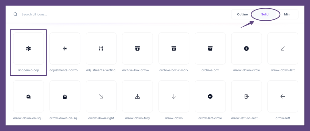
A basic SVG code sample of a solid Heroicon SVG is as follows:
<svg
xmlns="<http://www.w3.org/2000/svg>"
viewBox="0 0 24 24"
fill="currentColor"
class="w-6 h-6">
  <path d="M11.7 2.805a.75.75 0 01.6 0A60.65 60.65 0 0122.83 8.72a.75.75 0 01-.231 1.337 49.949 49.949 0 00-9.902 3.912l-.003.002-.34.18a.75.75 0 01-.707 0A50.009 50.009 0 007.5 12.174v-.224c0-.131.067-.248.172-.311a54.614 54.614 0 014.653-2.52.75.75 0 00-.65-1.352 56.129 56.129 0 00-4.78 2.589 1.858 1.858 0 00-.859 1.228 49.803 49.803 0 00-4.634-1.527.75.75 0 01-.231-1.337A60.653 60.653 0 0111.7 2.805z" />
  <path d="M13.06 15.473a48.45 48.45 0 017.666-3.282c.134 1.414.22 2.843.255 4.285a.75.75 0 01-.46.71 47.878 47.878 0 00-8.105 4.342.75.75 0 01-.832 0 47.877 47.877 0 00-8.104-4.342.75.75 0 01-.461-.71c.035-1.442.121-2.87.255-4.286A48.4 48.4 0 016 13.18v1.27a1.5 1.5 0 00-.14 2.508c-.09.38-.222.753-.397 1.11.452.213.901.434 1.346.661a6.729 6.729 0 00.551-1.608 1.5 1.5 0 00.14-2.67v-.645a48.549 48.549 0 013.44 1.668 2.25 2.25 0 002.12 0z" />
  <path d="M4.462 19.462c.42-.419.753-.89 1-1.394.453.213.902.434 1.347.661a6.743 6.743 0 01-1.286 1.794.75.75 0 11-1.06-1.06z" />
</svg>
Heroicons – Mini Icons
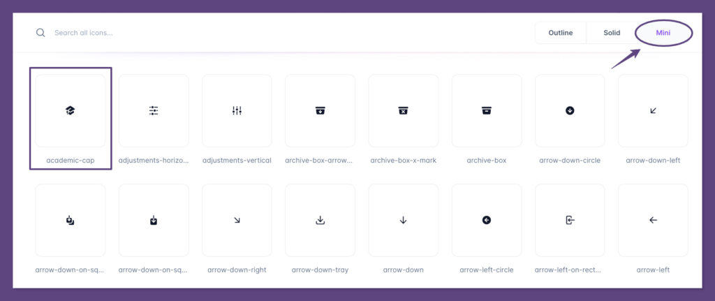
A basic SVG code sample of a mini Heroicon SVG is as follows:
<svg
xmlns="<http://www.w3.org/2000/svg>"
viewBox="0 0 20 20"
fill="currentColor"
class="w-5 h-5">
  <path fill-rule="evenodd" d="M9.664 1.319a.75.75 0 01.672 0 41.059 41.059 0 018.198 5.424.75.75 0 01-.254 1.285 31.372 31.372 0 00-7.86 3.83.75.75 0 01-.84 0 31.508 31.508 0 00-2.08-1.287V9.394c0-.244.116-.463.302-.592a35.504 35.504 0 013.305-2.033.75.75 0 00-.714-1.319 37 37 0 00-3.446 2.12A2.216 2.216 0 006 9.393v.38a31.293 31.293 0 00-4.28-1.746.75.75 0 01-.254-1.285 41.059 41.059 0 018.198-5.424zM6 11.459a29.848 29.848 0 00-2.455-1.158 41.029 41.029 0 00-.39 3.114.75.75 0 00.419.74c.528.256 1.046.53 1.554.82-.21.324-.455.63-.739.914a.75.75 0 101.06 1.06c.37-.369.69-.77.96-1.193a26.61 26.61 0 013.095 2.348.75.75 0 00.992 0 26.547 26.547 0 015.93-3.95.75.75 0 00.42-.739 41.053 41.053 0 00-.39-3.114 29.925 29.925 0 00-5.199 2.801 2.25 2.25 0 01-2.514 0c-.41-.275-.826-.541-1.25-.797a6.985 6.985 0 01-1.084 3.45 26.503 26.503 0 00-1.281-.78A5.487 5.487 0 006 12v-.54z" clip-rule="evenodd" />
</svg>
Where the width and height of the mini SVG are set to Tailwind w-5 and h-5 which is equivalent to the height and width of 1.25rem or 20px respectively.
Heroicons Installation
The Heroicons are available as basic SVG icons (no setup required) and via first-party React and Vue libraries.
You can install the Heroicon for React and Vue through the npm package manager.
Heroicons React Installation
Run the command below to install the Heroicons library for ReactJS:
npm install @heroicons/react
Check out the full installation guide for using Heroicon in ReactJS here. Learn how to use SVGs best in React here.
Heroicons Vue Installation
For the VueJS project, run the command below to install the Heroicon library:
npm install @heroicons/vue
Check out the full installation guide for using Heroicon in VueJS here.
Heroicons Figma File
The Heroicons version 2.0 has a Figma file, which you can use in your design process, this is useful for product designers and UI/UX developers for building UI mockups.
Examples of Tailwind CSS Heroicons Component
In this section, we’re going to look at some customized examples of Tailwind CSS Heroicons such as how to change an Heroicon size, colour, and background colour.
Setting Up Tailwind CSS with Play CDN
We will set up a Tailwind CSS project using the Play CDN for this tutorial.
Please note that the Play CDN is designed for development purposes only, and is not the best choice for production.
- Create a new folder named tailwind-heroicons and open it in your favorite code editor (we love VScode)
- Next, create a new index.html file inside the tailwind-heroicons folder with the following HTML snippet:
<!DOCTYPE html>
<html>
<head>
<meta charset="UTF-8" />
<meta name="viewport" content="width=device-width, initial-scale=1.0" />
<script src="<https://cdn.tailwindcss.com>"></script>
<title>Tailwind Play Ground</title>
</head>
<body class="flex justify-center items-center h-screen">
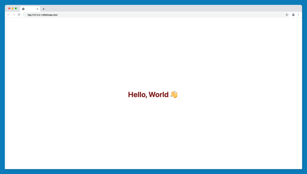
<h1 class="text-3xl font-bold text-red-900">Hello, World 👋</h1>
</body>
</html>
- Now, open your index.html file on your browser manually or by using the VScode live server extension.
If all goes well, your browser should look something like this:
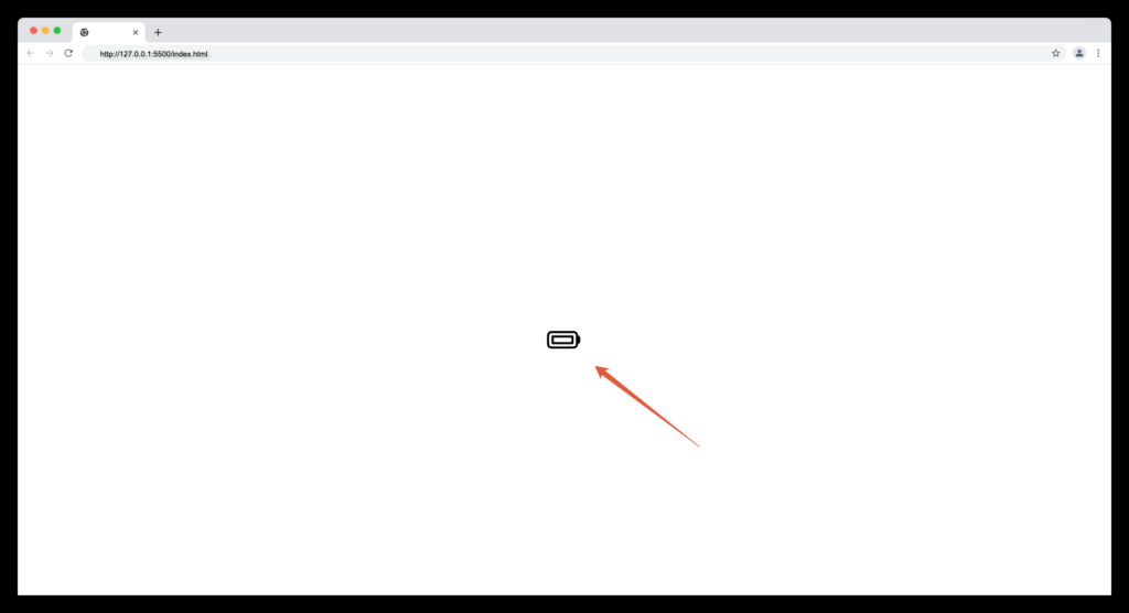
Now, replace the h1 tag with any icon of your choice from Heroicons, as follows:
<!DOCTYPE html>
<html>
  <head>
    <meta charset="UTF-8" />
    <meta name="viewport" content="width=device-width, initial-scale=1.0" />
    <script src="<https://cdn.tailwindcss.com>"></script>
    <title>Tailwind Play Ground</title>
  </head>
  <body class="flex justify-center items-center h-screen">
    <!-- Icon goes here -->
    <svg
      xmlns="<http://www.w3.org/2000/svg>"
      fill="none"
      viewBox="0 0 24 24"
      stroke-width="1.5"
      stroke="currentColor"
      class="w-6 h-6"
    >
      <path
        stroke-linecap="round"
        stroke-linejoin="round"
        d="M21 10.5h.375c.621 0 1.125.504 1.125 1.125v2.25c0 .621-.504 1.125-1.125 1.125H21M4.5 10.5H18V15H4.5v-4.5zM3.75 18h15A2.25 2.25 0 0021 15.75v-6a2.25 2.25 0 00-2.25-2.25h-15A2.25 2.25 0 001.5 9.75v6A2.25 2.25 0 003.75 18z"
      />
    </svg>
    <!-- Icon ends here -->
  </body>
</html>
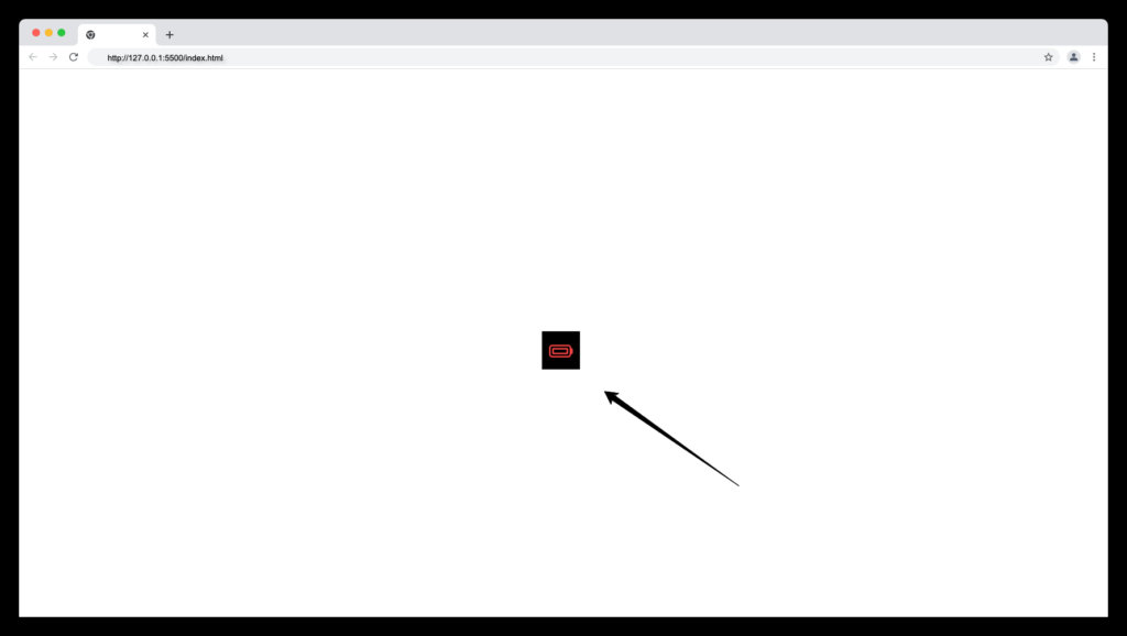
Your icon should display on your browser as shown below:
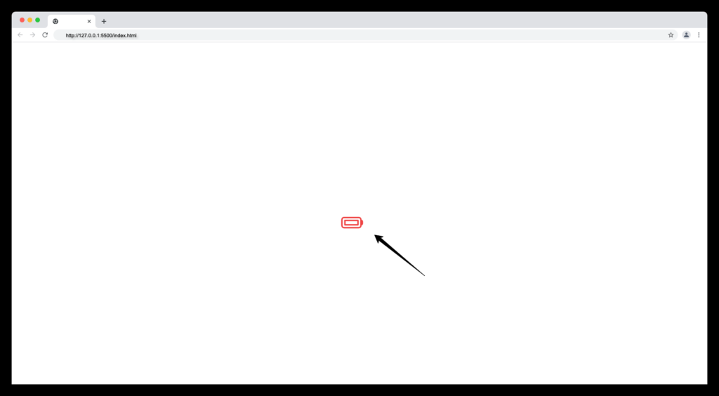
Adding Colours to Heroicons
Since all Heroicons are Tailwind-ready, we can customize the colour of the icon using the Tailwind CSS text colour utility classes to change the colour of an icon in Heroicons to our preference.
Update the class of the SVG icon with any valid Tailwind text colour utility classes i.e text-red-500, like below:
<svg
      xmlns="<http://www.w3.org/2000/svg>"
      fill="none"
      viewBox="0 0 24 24"
      stroke-width="1.5"
      stroke="currentColor"
      class="w-6 h-6 text-red-500"
    >
      <path
        stroke-linecap="round"
        stroke-linejoin="round"
        d="M21 10.5h.375c.621 0 1.125.504 1.125 1.125v2.25c0 .621-.504 1.125-1.125 1.125H21M4.5 10.5H18V15H4.5v-4.5zM3.75 18h15A2.25 2.25 0 0021 15.75v-6a2.25 2.25 0 00-2.25-2.25h-15A2.25 2.25 0 001.5 9.75v6A2.25 2.25 0 003.75 18z"
      />
    </svg>
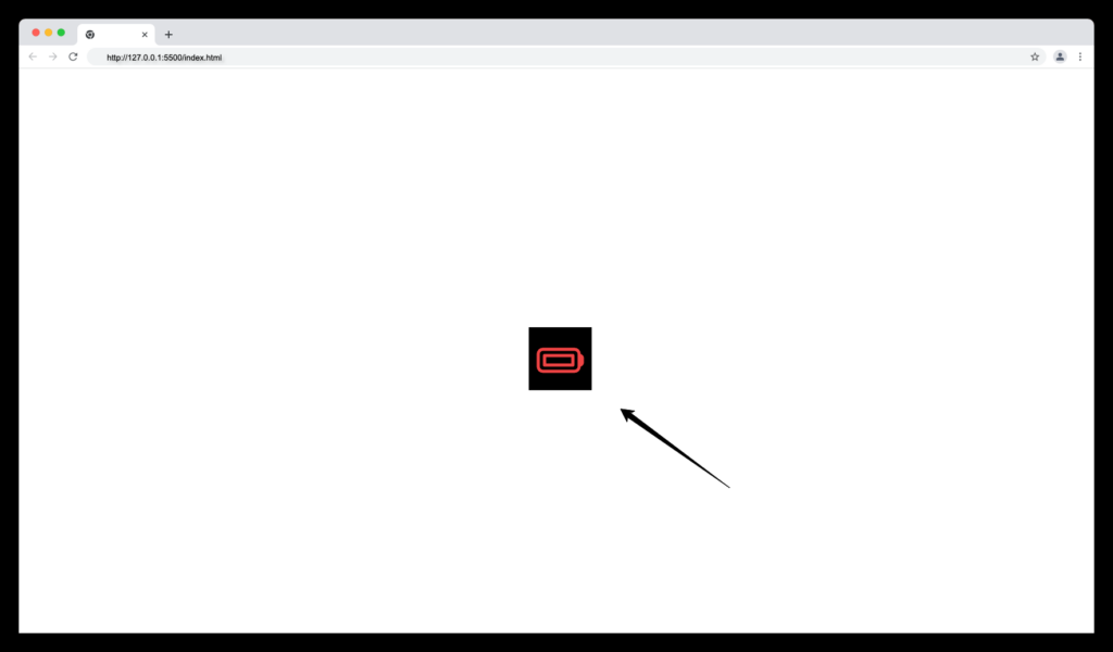
Now, our icon will have the specified colour when we check the browser:
Adding Background Colours to Heroicons
We’ll also make use of the Tailwind CSS background colour utility classes for controlling the icon’s background colour.
Update the class of the SVG icon with any Tailwind background colour utility classes i.e bg-black like below:
<svg
      xmlns="<http://www.w3.org/2000/svg>"
      fill="none"
      viewBox="0 0 24 24"
      stroke-width="1.5"
      stroke="currentColor"
      class="w-6 h-6 text-red-500 bg-black px-1"
    >
      <path
        stroke-linecap="round"
        stroke-linejoin="round"
        d="M21 10.5h.375c.621 0 1.125.504 1.125 1.125v2.25c0 .621-.504 1.125-1.125 1.125H21M4.5 10.5H18V15H4.5v-4.5zM3.75 18h15A2.25 2.25 0 0021 15.75v-6a2.25 2.25 0 00-2.25-2.25h-15A2.25 2.25 0 001.5 9.75v6A2.25 2.25 0 003.75 18z"
      />
    </svg>
PS: We add the extra px-1 class for padding spaces.
Our icon should now have a background colour of black and a text colour of red as follows:
Controlling Heroicons Width and Height
We can adjust the width and height of Heroicons in Tailwind using the sizing w and h utility classes for setting the width and height of an element in Tailwind respectively.
Update the icon class with your preferred width and height value i.e w-10 h-10 as follows:
<svg
      xmlns="<http://www.w3.org/2000/svg>"
      fill="none"
      viewBox="0 0 24 24"
      stroke-width="1.5"
      stroke="currentColor"
      class="w-10 h-10 text-red-500 bg-black px-1"
    >
      <path
        stroke-linecap="round"
        stroke-linejoin="round"
        d="M21 10.5h.375c.621 0 1.125.504 1.125 1.125v2.25c0 .621-.504 1.125-1.125 1.125H21M4.5 10.5H18V15H4.5v-4.5zM3.75 18h15A2.25 2.25 0 0021 15.75v-6a2.25 2.25 0 00-2.25-2.25h-15A2.25 2.25 0 001.5 9.75v6A2.25 2.25 0 003.75 18z"
      />
    </svg>
The width and height value from the code above will make our icon look larger as shown below:
Supporting Dark Mode for Heroicon
The dark mode is an essential feature to have in a modern website. Heroicons makes it easier to support dark mode for your icon collections in a Tailwind CSS project.
Below are examples of dark-mode Heroicons with code snippets.
Dark Mode with Outline Heroicons:
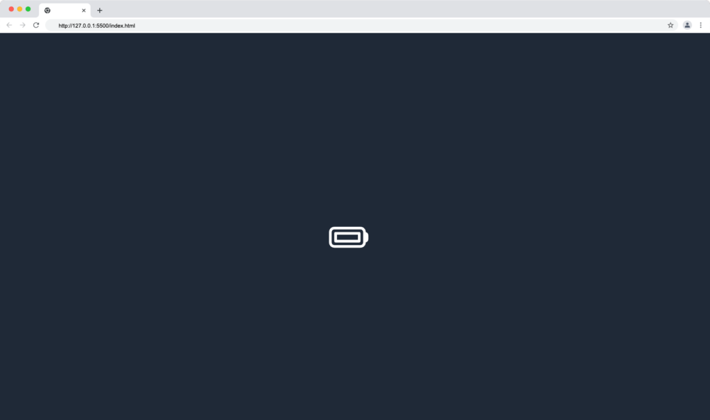
Code snippet:
<body class="bg-gray-800 flex justify-center items-center h-screen">
    <!-- Icon goes here -->
    <svg
      xmlns="<http://www.w3.org/2000/svg>"
      fill="none"
      viewBox="0 0 24 24"
      stroke-width="1.5"
      stroke="currentColor"
      class="w-10 h-10 text-white"
    >
      <path
        stroke-linecap="round"
        stroke-linejoin="round"
        d="M21 10.5h.375c.621 0 1.125.504 1.125 1.125v2.25c0 .621-.504 1.125-1.125 1.125H21M4.5 10.5H18V15H4.5v-4.5zM3.75 18h15A2.25 2.25 0 0021 15.75v-6a2.25 2.25 0 00-2.25-2.25h-15A2.25 2.25 0 001.5 9.75v6A2.25 2.25 0 003.75 18z"
      />
    </svg>
    <!-- Icon ends here -->
  </body>
Dark Mode with Solid Heroicons:
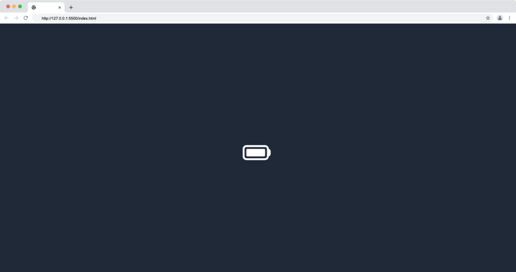
Code snippet:
<body class="bg-gray-800 flex justify-center items-center h-screen">
    <!-- Icon goes here -->
    <svg
      xmlns="<http://www.w3.org/2000/svg>"
      viewBox="0 0 24 24"
      fill="currentColor"
      class="w-10 h-10 text-white"
    >
      <path
        fill-rule="evenodd"
        d="M3.75 6.75a3 3 0 00-3 3v6a3 3 0 003 3h15a3 3 0 003-3v-.037c.856-.174 1.5-.93 1.5-1.838v-2.25c0-.907-.644-1.664-1.5-1.837V9.75a3 3 0 00-3-3h-15zm15 1.5a1.5 1.5 0 011.5 1.5v6a1.5 1.5 0 01-1.5 1.5h-15a1.5 1.5 0 01-1.5-1.5v-6a1.5 1.5 0 011.5-1.5h15zM4.5 9.75a.75.75 0 00-.75.75V15c0 .414.336.75.75.75H18a.75.75 0 00.75-.75v-4.5a.75.75 0 00-.75-.75H4.5z"
        clip-rule="evenodd"
      />
    </svg>
    <!-- Icon ends here -->
  </body>
You can learn more about supporting dark mode in a Tailwind CSS project from the video below:
Tailwind CSS Icon Design Resources and Components
Below are websites that offer free ready-made Tailwind icon components, and resources for working with icons built with Tailwind CSS.
Wrapping Up
This article taught you how to customize Tailwind SVG icons, how to use Heroicons basic SVG in web projects, and how to install Heroicons in React and Vue libraries.
Finally, you can find more incredible articles like this on our blog at CopyCat. CopyCat is a tool that saves you about 35% of development time by converting your Figma files to an up-and-running React project. Check it out here.
Interesting Reads From Our Blogs
- Setting up Tailwind CSS in React Application: Walk-through and Examples
- 10 CSS Frameworks for Frontend Developers in 2022
- How to Add Toast Notifications to a React App Using React Toastify
- The Top 16 Design System Examples
Happy Coding 👨🏽💻
Related Articles
-
 React.js
Complete Guide On How To Use React Beautiful Drag And Drop
Introduction Drag and Drop refers to the software's ability to trigger a callback when one component is dragged over another. It's an interaction that enables someone to click on something, drag it to another location, and dump it there, often…
December 23, 2022 -
React.js
React Strict Mode: A Guide on Using it in your Application
Introduction React Strict Mode is a developer tool that has been around in React from version 16.3. But, if you are like me, you might be seeing it in your index.js file without giving it a thought about why it has been there (if…
September 14, 2022

