- Introduction
- What is Material UI Tabs Component?
- Setting up a React App
- Installing Material UI Library
- Building Tabs component with Material UI Tabs
- Customizing Material UI Tabs Components
- Material UI Tabs Props
- Creating Full-Width Tabs in Material UI
- Creating Vertical Tabs in Material UI
- Disabling Tabs in Material UI Tabs
- Wrapping Up
Introduction
Tabs are elements that help you navigate between multiple elements when only one can be viewed at a time.
In this article, we’ll look at the Material UI tabs component, how they work, and how to create tab components with it in React.
Do you want to be more productive? Consider using CopyCat, an AI-driven plugin that will convert your Figma design to Material UI so you can focus on the app’s business logic.
What is Material UI Tabs Component?
Material UI Tabs is a component in the Material UI library to create groups of content in tabs and navigate between each tab.
Setting up a React App
Use the following command to create a new react application:
npx create-react-app my-app
Next, run the following command to navigate to your newly generated app directory:
cd my-app
Then run the following command to start your React server:
yarn start
Or using npm:
npm start
Your server should launch in your browser at http://localhost:3000/, as shown below:

Installing Material UI Library
In this section, we’ll install the Material UI library. Run the command below to install Material UI to your project:
npm:
npm install @mui/material @emotion/react @emotion/styled
yarn:
yarn add @mui/material @emotion/react @emotion/styled
Building Tabs component with Material UI Tabs
Building tabs components in Material UI is simple; all we need to do is to import the Tabs and Tab components from Material UI. These are the two most important elements to consider when creating tabs with Material UI.
The Tabs component acts as the parent container that wraps around the tab headers, while the Tab component is used to define the tab labels (text tab or icon tabs) for each tab header. The Tab component is a child of the Tabs component.
One way to write the above explanation in code is as follows:
<Tabs>
  <Tab label='Tab 1' />
  <Tab label='Tab 2' />
  <Tab label='Tab 3' />
  <Tab label='Tab 4' />
</Tabs>
Update your App.js file with the code below:
import React from "react";
import { Tab, Tabs } from "@mui/material";

function App() {
  return (
    <React.Fragment>
      <Tabs>
        <Tab label='Tab 1' />
        <Tab label='Tab 2' />
        <Tab label='Tab 3' />
        <Tab label='Tab 4' />
      </Tabs>
    </React.Fragment>
  );
}

export default App;
The above code will produce the following output:
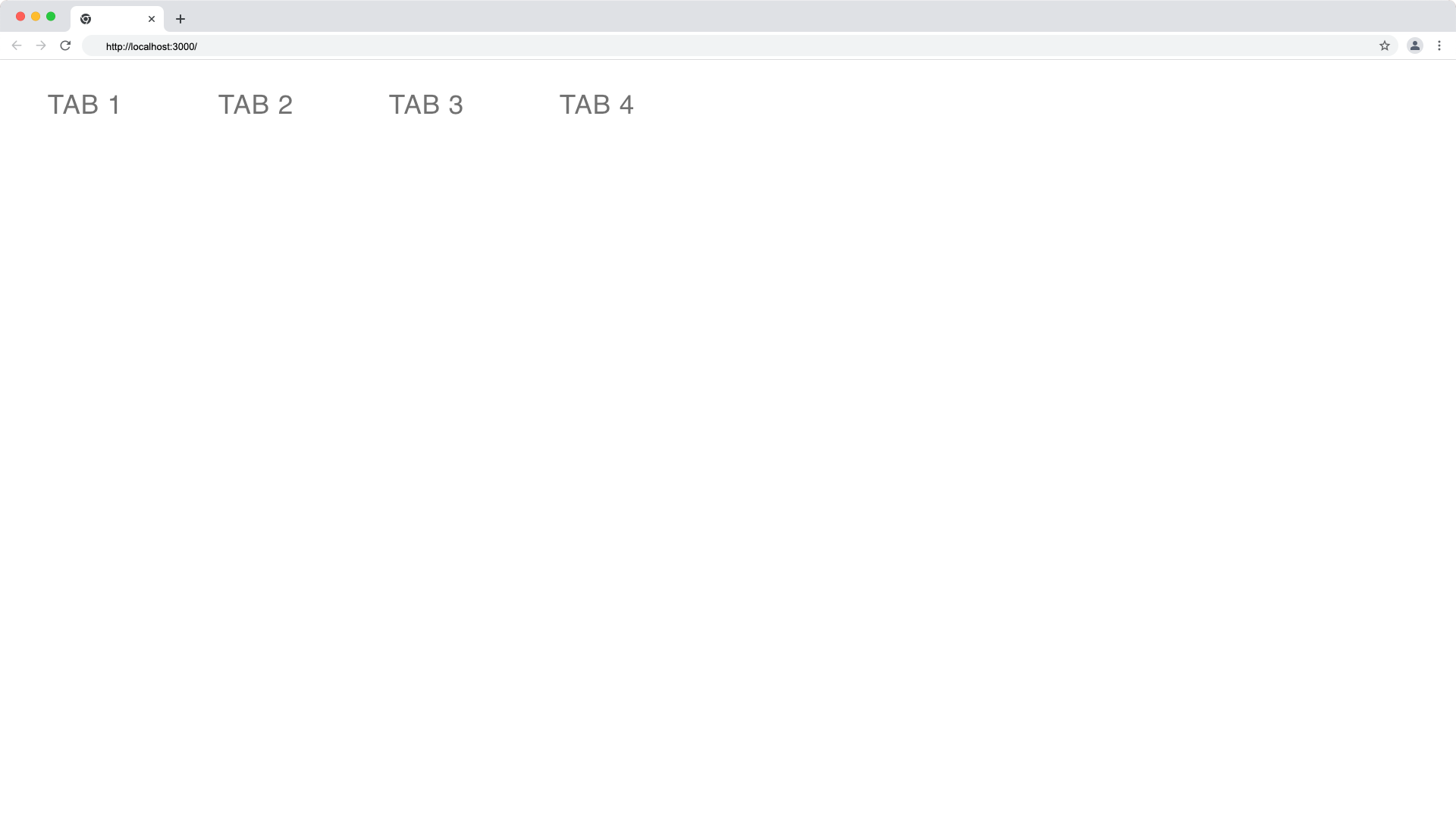
Our tabs don’t have any functionality yet like switching. The Tabs component works similarly to the select tag with multiple options; it provides us with the index of the currently selected tab through the onChange event and we can track the index of the current tab with the local state management useState hook. The child position index of the Tabs component starts from 0 as well.
Update your App.js file with the code below:
import React, { useState } from "react";
import { Tab, Tabs } from "@mui/material";

function App() {
  const [currentTabIndex, setCurrentTabIndex] = useState(0);

  const handleTabChange = (e, tabIndex) => {
    console.log(tabIndex);
    setCurrentTabIndex(tabIndex);
  };
  return (
    <React.Fragment>
      <Tabs value={currentTabIndex} onChange={handleTabChange}>
        <Tab label='Tab 1' />
        <Tab label='Tab 2' />
        <Tab label='Tab 3' />
        <Tab label='Tab 4' />
      </Tabs>
    </React.Fragment>
  );
}

export default App;
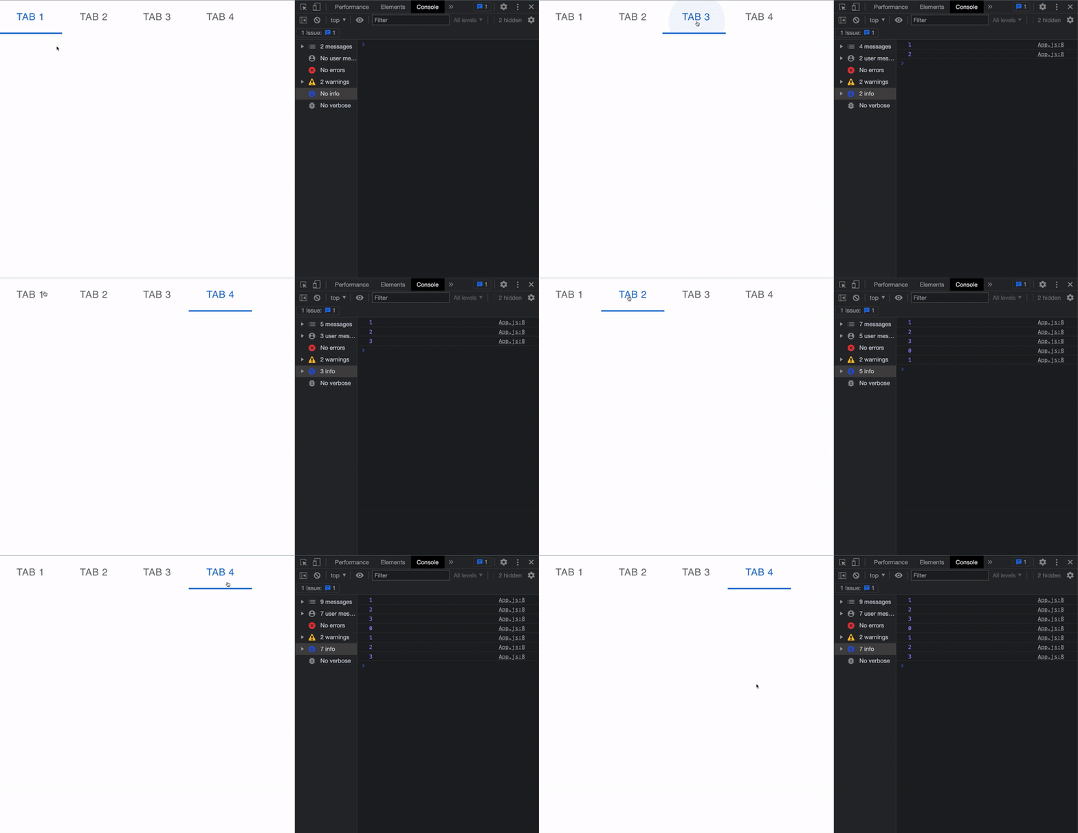
Below is a demo of switching tabs and logging the current tab in the Material UI tabs.
Creating Contents
Now, let’s proceed to create the content for each of the tabs. These contents are displayed when a tab is active. We’ll use the concept of conditional rendering in ReactJS.
Since we’re already tracking the index of the current tab in our local state with useState hook we’ll write a logic to render the content of a particular tab, only when its index is the current index in our currentTabIndex state.
Achieve the conditional rendering with JavaScript strict equality (===) operator and the logical AND operator:
Update your App.js file with the following code:
import React, { useState } from "react";
import { Box, Tab, Tabs, Typography } from "@mui/material";

function App() {
  const [currentTabIndex, setCurrentTabIndex] = useState(0);

  const handleTabChange = (e, tabIndex) => {
    console.log(tabIndex);
    setCurrentTabIndex(tabIndex);
  };

  return (
    <React.Fragment>
      <Tabs value={currentTabIndex} onChange={handleTabChange}>
        <Tab label='Tab 1' />
        <Tab label='Tab 2' />
        <Tab label='Tab 3' />
        <Tab label='Tab 4' />
      </Tabs>

      {/* TAB 1 Contents */}
      {currentTabIndex === 0 && (
        <Box sx={{ p: 3 }}>
          <Typography variant='h5'>Tab 1 Content</Typography>
          <Typography variant='p'>
Lorem ipsum dolor sit amet, consectetur adipiscing elit. Vestibulum
finibus odio eget orci bibendum, ac hendrerit mi porta. Nullam
volutpat libero tempus leo lacinia ornare. In hac habitasse platea
dictumst. Pellentesque facilisis ex eget vulputate tincidunt.
Curabitur fringilla ultrices commodo.
          </Typography>
        </Box>
      )}

      {/* TAB 2 Contents */}
      {currentTabIndex === 1 && (
        <Box sx={{ p: 3 }}>
          <Typography variant='h5'>Tab 2 Content</Typography>
          <Typography variant='p'>
Lorem Ipsum is simply dummy text of the printing and typesetting
industry. Lorem Ipsum has been the industry's standard dummy text
ever since the 1500s, when an unknown printer took a galley of type
and scrambled it to make a type specimen book.
          </Typography>
        </Box>
      )}

      {/* TAB 3 Contents */}
      {currentTabIndex === 2 && (
        <Box sx={{ p: 3 }}>
          <Typography variant='h5'>Tab 3 Content</Typography>
          <Typography variant='p'>
It is a long established fact that a reader will be distracted by
the readable content of a page when looking at its layout. The point
of using Lorem Ipsum is that it has a more-or-less normal
distribution of letters, as opposed to using 'Content here, content
here', making it look like readable English.
          </Typography>
        </Box>
      )}

      {/* TAB 4 Contents */}
      {currentTabIndex === 3 && (
        <Box sx={{ p: 3 }}>
          <Typography variant='h5'>Tab 4 Content</Typography>
          <Typography variant='p'>
The standard chunk of Lorem Ipsum used since the 1500s is reproduced
below for those interested. Sections 1.10.32 and 1.10.33 from "de
Finibus Bonorum et Malorum" by Cicero are also reproduced in their
exact original form, accompanied by English versions from the 1914
translation by H. Rackham.
          </Typography>
        </Box>
      )}
    </React.Fragment>
  );
}

export default App;
Now the content switches based on the current tab index as demonstrated below:
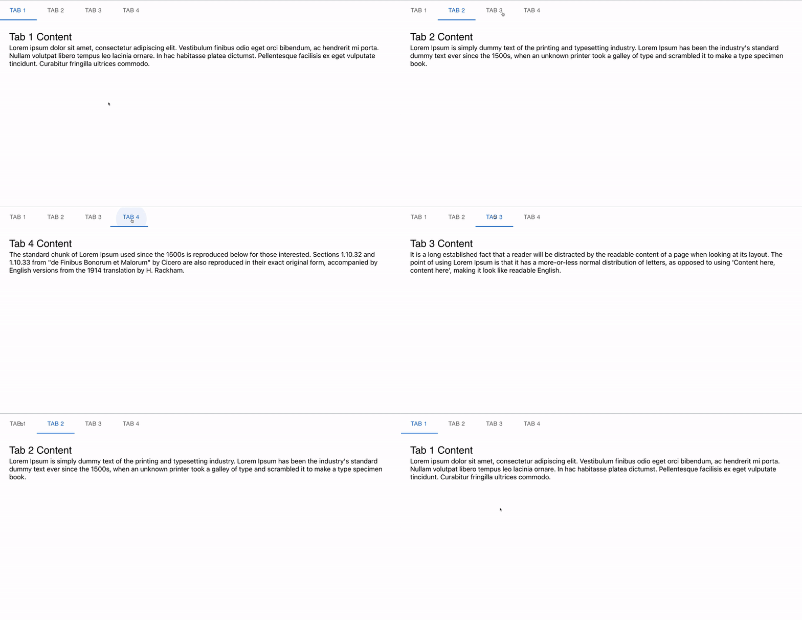
As you can see above, the content of a tab is only visible when it’s clicked and not all the items are visible at once. You can read also read more about the import typography component here.
Customizing Material UI Tabs Components
Customizing MUI elements are easy, we can add custom styles or override the default stylings from the MUI tabs using Vanilla CSS or MUI props.
In this tutorial, we’ll make use of the MUI Tabs props and vanilla CSS to customize our tabs.
Material UI Tabs Props
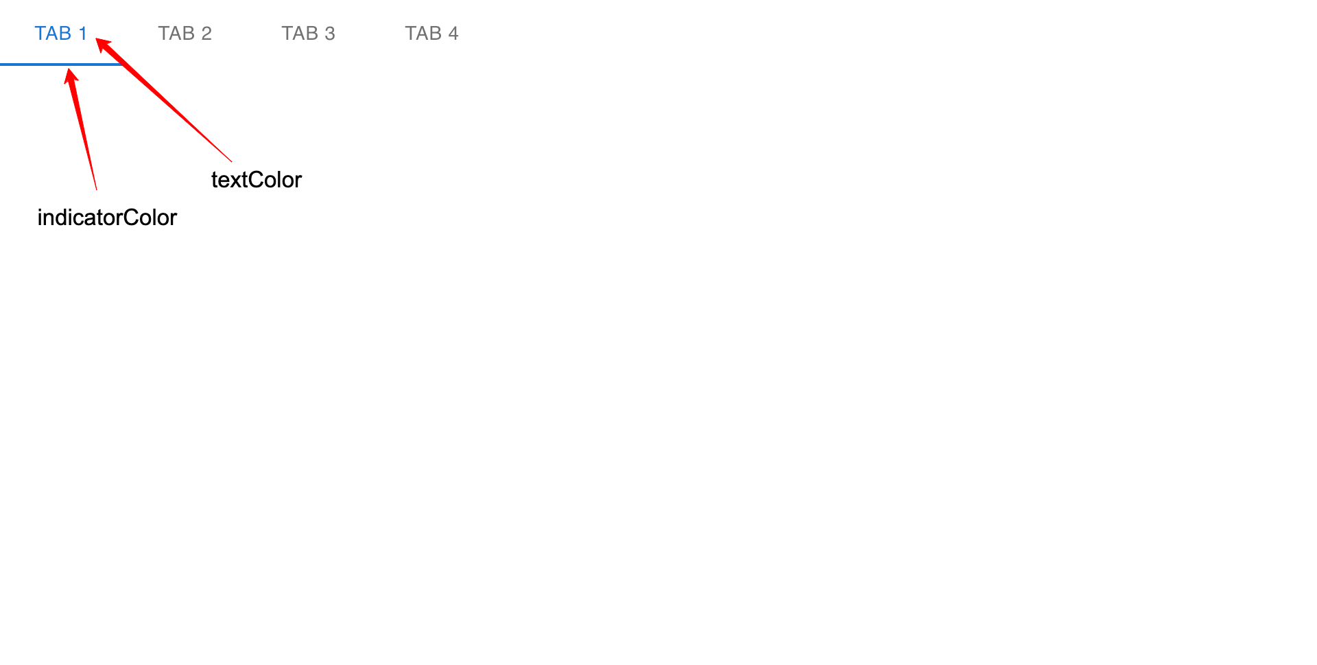
Material UI Tabs props are the properties that we can use to apply styles or override some of the default properties like indicator underlining and text color of the active tab.
Changing the Active Tab Underline Border Color in Material UI
We can customize the underline border of an active Tab in Material UI using the indicatorColor prop in the Tabs component.
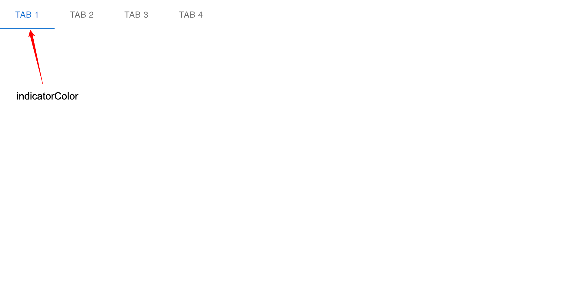
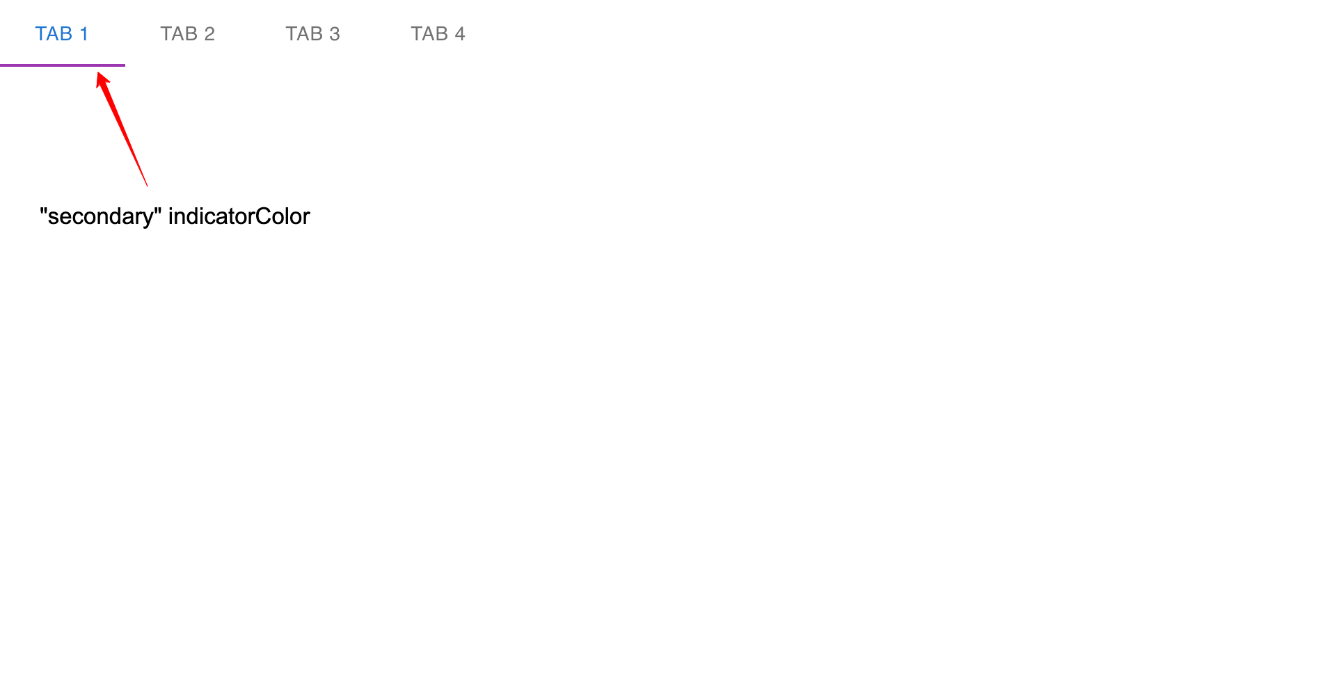
The indicatorColor prop accepts only two color values; the primary and secondary color values. By default the indicatorColor is set to primary and we can modify this to secondary as shown below:
<Tabs
  value={currentTabIndex}
  onChange={handleTabChange}
  indicatorColor='secondary' // New line
>
  <Tab label='Tab 1' />
  <Tab label='Tab 2' />
  <Tab label='Tab 3' />
  <Tab label='Tab 4' />
</Tabs>
The secondary indicator border color looks something like this:
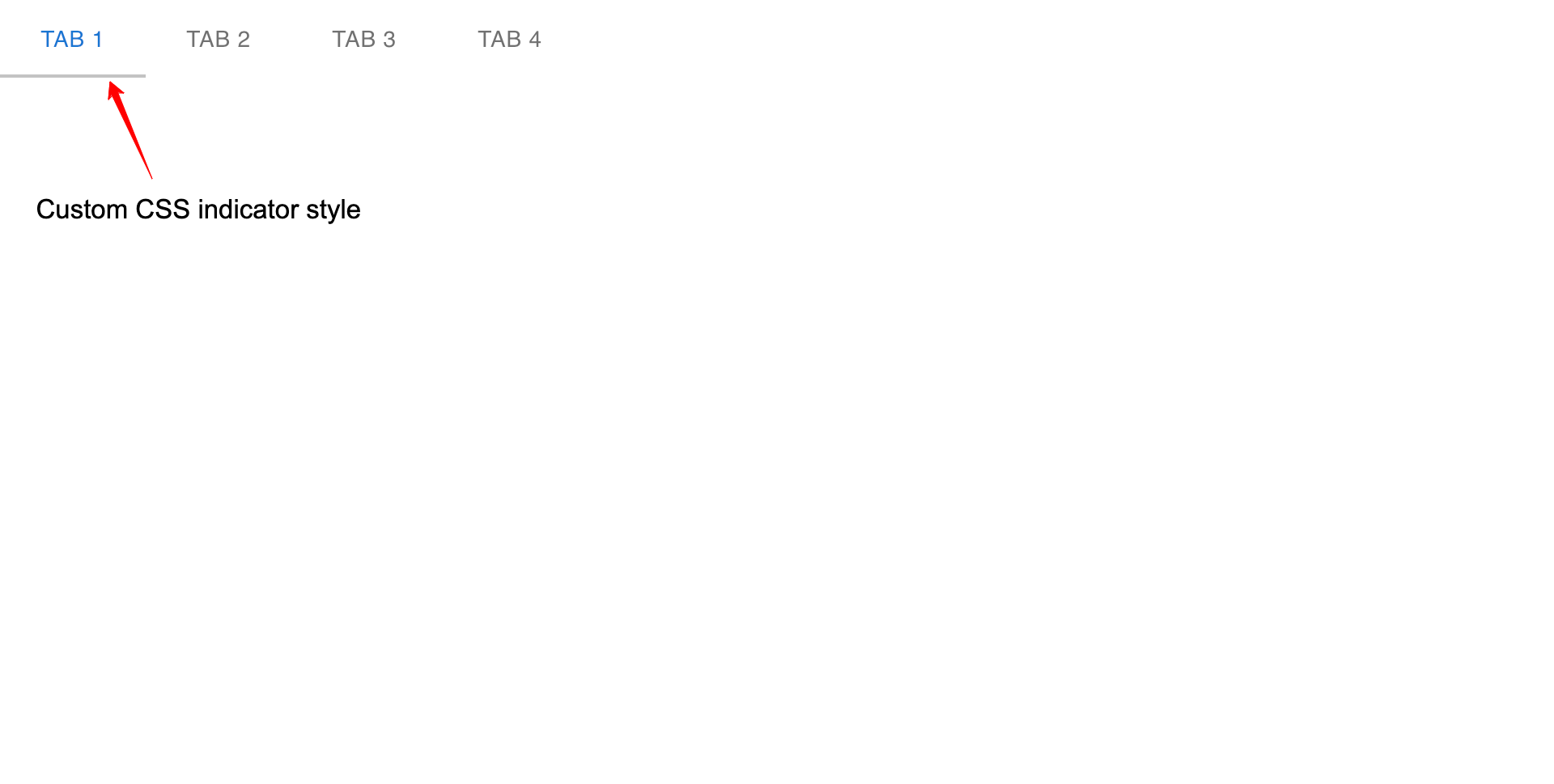
To customize the indicator color using vanilla CSS, we can target the indicator using the MuiTabs-indicator class and add our styles as follows:
.MuiTabs-indicator{
  background: #c3c3c3 !important;
}
It’s essential to add the !important keyword to make your styles take precedence over the default MUI styles.
Our custom tab indicator color will look something like this:
Changing the Active Tab Text Color in Material UI
We can customize the active tab text color in Material UI using the textColor prop in the Tabs component.
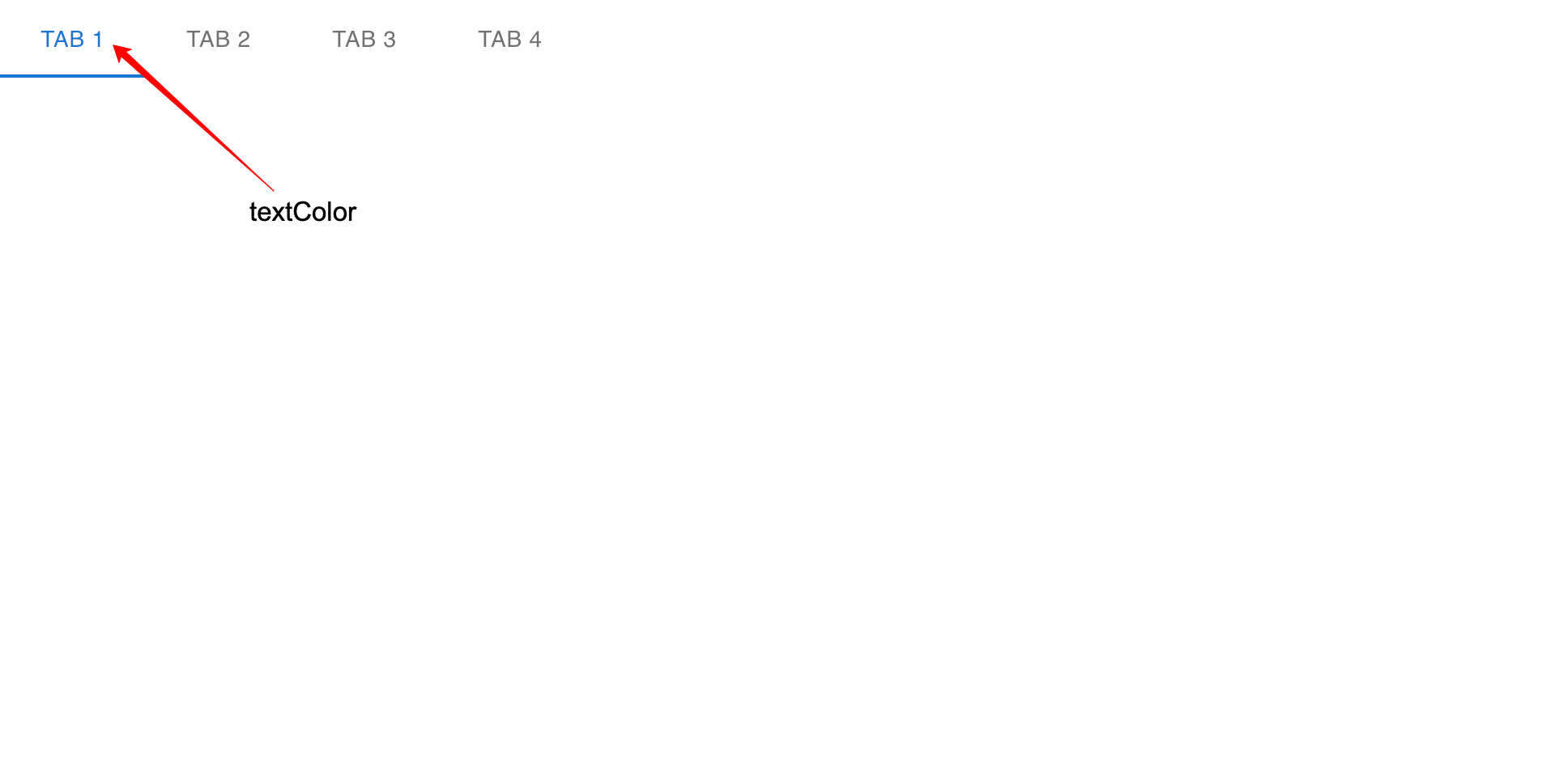
The textColor prop accepts only three values; the inherit, primary and secondary color values. By default the textColor is set to primary and we can modify this to secondary as follows:
<Tabs
  value={currentTabIndex}
  onChange={handleTabChange}
  textColor='secondary'
>
  <Tab label='Tab 1' />
  <Tab label='Tab 2' />
  <Tab label='Tab 3' />
  <Tab label='Tab 4' />
</Tabs>
The secondary color value will look something like this:
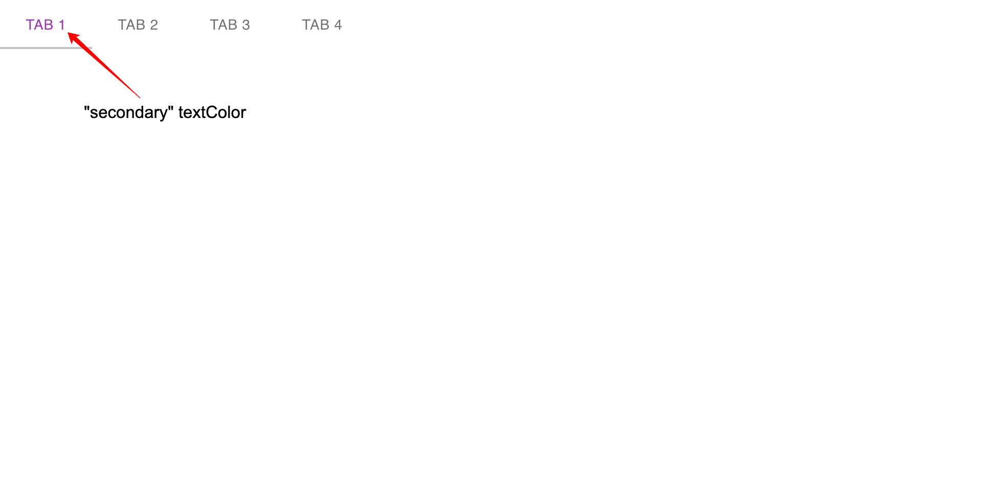
If you want to make use of vanilla CSS to customize the tab’s active text color, target the Mui-selected class and add your styles rules with !important keyword as follows.
.Mui-selected {
  color: #c3c3c3 !important;
}
Material UI Tabs Wrapped Labels Prop
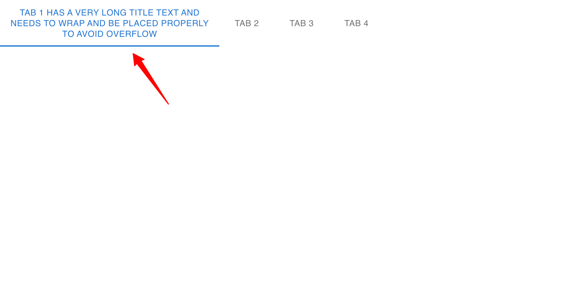
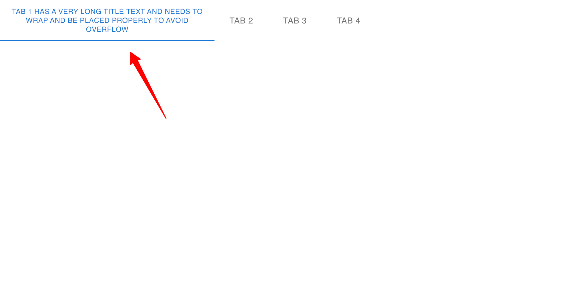
Sometimes you might have a tab with a very long heading label, which might result to overflow and the text not being visible; we can make use of the wrapped property in the Tab component to make the long text wrap and not overflow.
Below is an example without the wrapped prop:
<Tabs value={currentTabIndex}>
  <Tab
    label='Tab 1 has a very long title text and needs to wrap and be placed properly to avoid overflow'
  />
  <Tab label='Tab 2' />
  <Tab label='Tab 3' />
  <Tab label='Tab 4' />
</Tabs>
Output:
Example with the wrapped prop:
<Tabs value={currentTabIndex}>
  <Tab
    wrapped
    label='Tab 1 has a very long title text and needs to wrap and be placed properly to avoid overflow'
  />
  <Tab label='Tab 2' />
  <Tab label='Tab 3' />
  <Tab label='Tab 4' />
</Tabs>
Output:
Material UI Tabs Centered Prop
When you’re building a tab for a large screen it’s best to place them at the center of the screen. MUI provides a centered prop for the Tab component to center the Tabs components on the page.
<Tabs value={currentTabIndex} centered>
  <Tab label='Tab 1' />
  <Tab label='Tab 2' />
  <Tab label='Tab 3' />
  <Tab label='Tab 4' />
</Tabs>
The MUI Tabs will now be placed at the center of the screen as shown below:

Creating Full-Width Tabs in Material UI
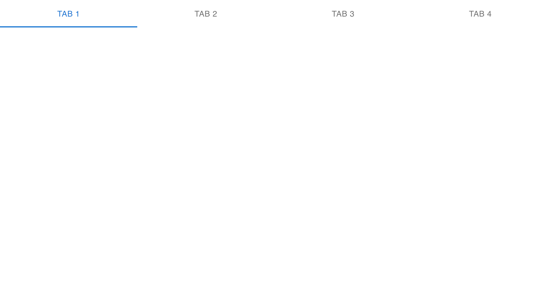
You can make use of the variant="fullWidth" to create a full-screen material UI tab.
<Tabs
  value={currentTabIndex}
  variant='fullWidth'
>
  <Tab label='Tab 1' />
  <Tab label='Tab 2' />
  <Tab label='Tab 3' />
  <Tab label='Tab 4' />
</Tabs>
The full-width tabs will take an equal width of the screen or container which looks something like this:
Creating Vertical Tabs in Material UI
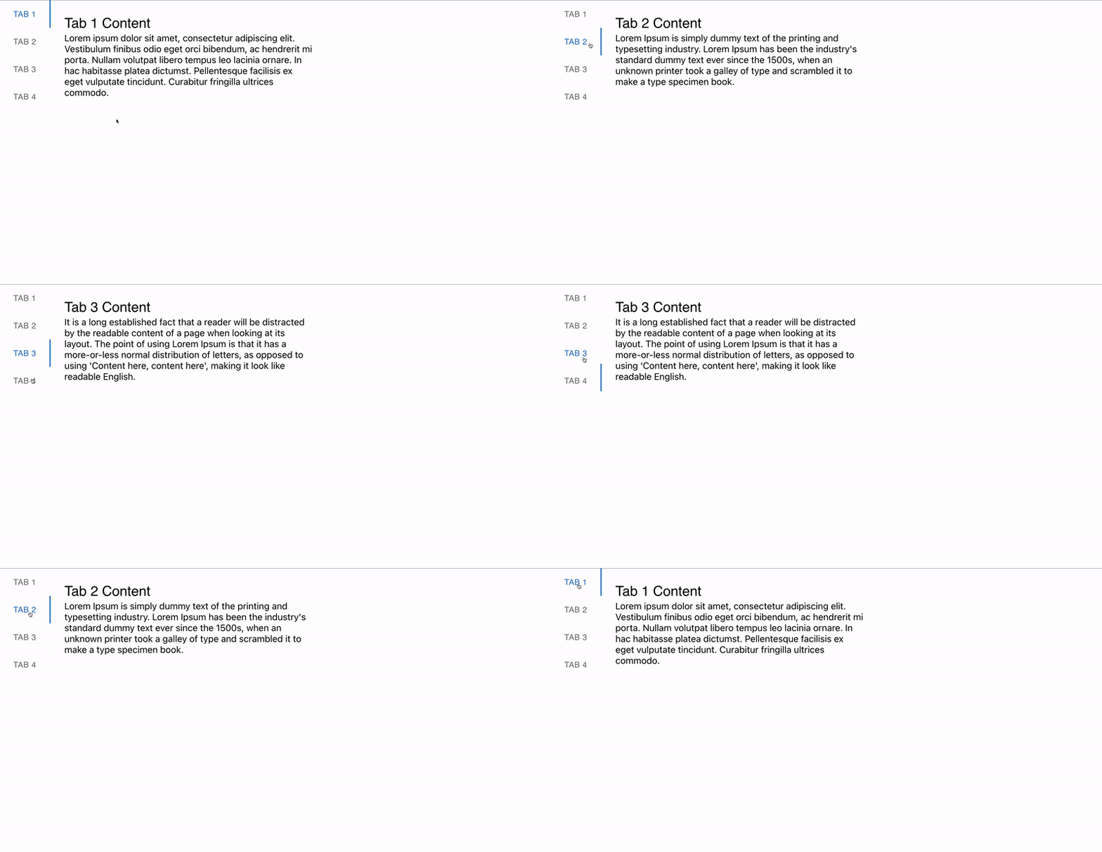
Material UI provides an orientation prop to create a horizontal or vertical tab component. By default the orientation property is set to horizontal and we can change the display to vertical by setting the orientation prop to vertical value and using flexbox property as shown in the code below:
<div style={{ display: "flex" }}>
      <Tabs
        value={currentTabIndex}
        orientation=''
        onChange={handleTabChange}
      >
        <Tab label='Tab 1' />
        <Tab label='Tab 2' />
        <Tab label='Tab 3' />
        <Tab label='Tab 4' />
      </Tabs>

      <div style={{ width: "50%" }}>
        {/* TAB 1 Contents */}
        {currentTabIndex === 0 && (
          <Box sx={{ p: 3 }}>
            <Typography variant='h5'>Tab 1 Content</Typography>
            <Typography variant='p'>
Lorem ipsum dolor sit amet, consectetur adipiscing elit. Vestibulum
finibus odio eget orci bibendum, ac hendrerit mi porta. Nullam
volutpat libero tempus leo lacinia ornare. In hac habitasse platea
dictumst. Pellentesque facilisis ex eget vulputate tincidunt.
Curabitur fringilla ultrices commodo.
            </Typography>
          </Box>
        )}

        {/* TAB 2 Contents */}
        {currentTabIndex === 1 && (
          <Box sx={{ p: 3 }}>
            <Typography variant='h5'>Tab 2 Content</Typography>
            <Typography variant='p'>
Lorem Ipsum is simply dummy text of the printing and typesetting
industry. Lorem Ipsum has been the industry's standard dummy text
ever since the 1500s, when an unknown printer took a galley of type
and scrambled it to make a type specimen book.
            </Typography>
          </Box>
        )}

        {/* TAB 3 Contents */}
        {currentTabIndex === 2 && (
          <Box sx={{ p: 3 }}>
            <Typography variant='h5'>Tab 3 Content</Typography>
            <Typography variant='p'>
It is a long established fact that a reader will be distracted by
the readable content of a page when looking at its layout. The point
of using Lorem Ipsum is that it has a more-or-less normal
distribution of letters, as opposed to using 'Content here, content
here', making it look like readable English.
            </Typography>
          </Box>
        )}

        {/* TAB 4 Contents */}
        {currentTabIndex === 3 && (
          <Box sx={{ p: 3 }}>
            <Typography variant='h5'>Tab 4 Content</Typography>
            <Typography variant='p'>
The standard chunk of Lorem Ipsum used since the 1500s is reproduced
below for those interested. Sections 1.10.32 and 1.10.33 from "de
Finibus Bonorum et Malorum" by Cicero are also reproduced in their
exact original form, accompanied by English versions from the 1914
translation by H. Rackham.
            </Typography>
          </Box>
        )}
      </div>
    </div>
The vertical orientation from the code above will look something like this, with the tab headings and contents side by side:
Disabling Tabs in Material UI Tabs
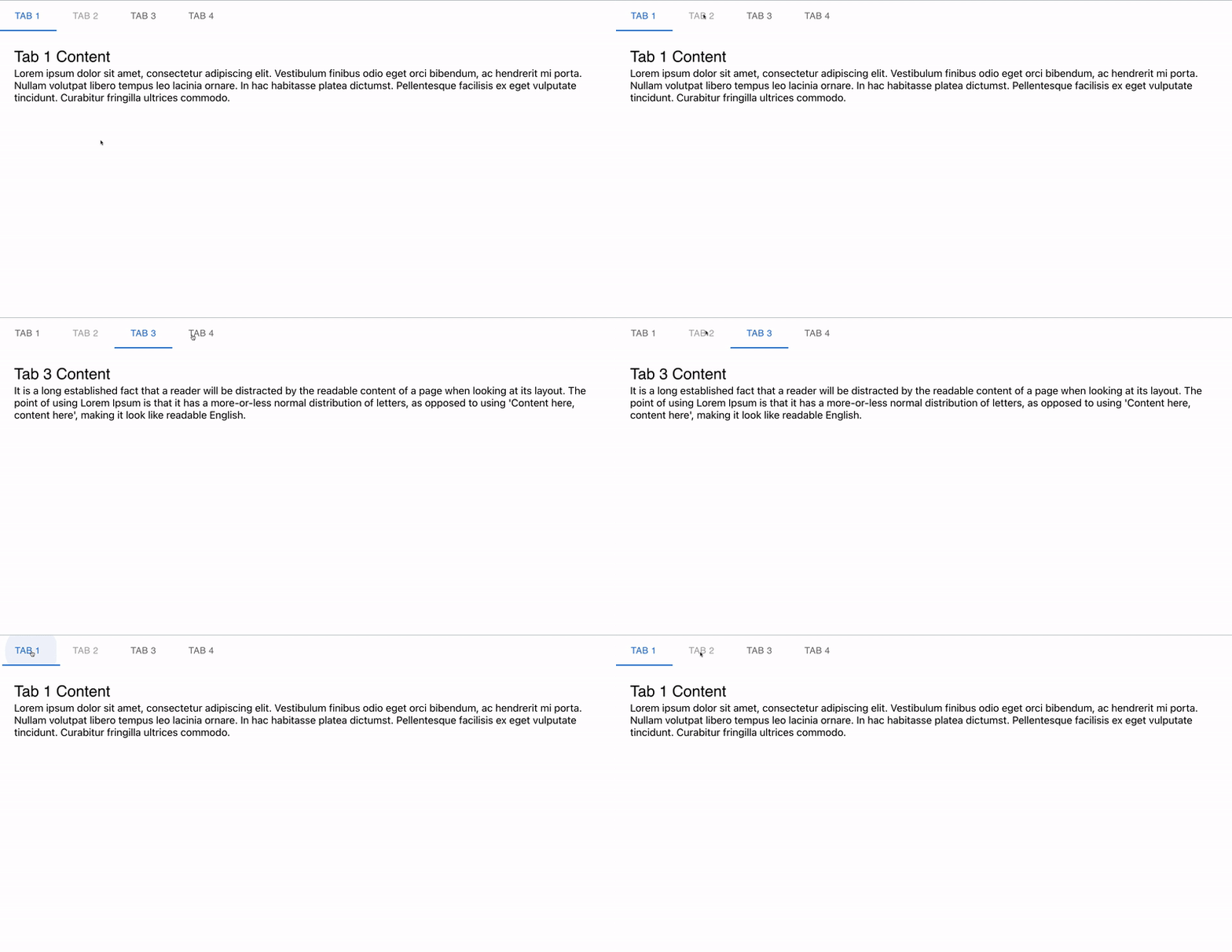
Add the disabled prop to a tab if you don’t want it to be clickable.
<Tabs value={currentTabIndex} onChange={handleTabChange}>
  <Tab label='Tab 1' />
  <Tab label='Tab 2' disabled />
  <Tab label='Tab 3' />
  <Tab label='Tab 4' />
</Tabs>
The disabled button will not be clickable as follows:
Wrapping Up
In this article, we looked into the Material UI tabs component, how they work, and how to create tab components with it in React.
If you prefer a video tutorial on Material UI Tabs Component, watch the tutorial by Codevolution below:
Finally, more articles like this can be found on our CopyCat blog. CopyCat converts your Figma files into a ready-to-use React project, saving you over 35% of development time. You can check out CopyCat here.
Interesting Reads From Our Blogs
- A Great Guide To Using Material UI Textfield Efficiently
- Material UI Grid: The Ultimate Guide to Building Responsive Web Layout in React
- Complete Guide to Using Material UI Button in React
Happy Coding 👨🏽💻


