 December 24, 2022
  Emmanuel Uchenna


- Introduction to React Select
- What You Will Learn in this Tutorial
- Other Resources to Accompany this Tutorial
- Installation and Basic Usage of React Select
- Advanced Features of React Select
- Summary of React Select's Benefits and Capabilities
- Conclusion
- Great Reads from Our Blog
- Additional Resources for Learning more about React Select
Introduction to React Select
In regular HTML, you have the select tag that allows you to create a dropdown list or a menu of options.
In modern web applications or websites today, using the regular HTML select element itself puts a limitation on the user interface and user experience.
When working on a React project, you need to think about various features such as the focus behavior of elements, the styling of select elements, the ability to retrieve data from a remote source, and so on. It can be frustrating to have to create all of these features from scratch, and you might wish that a reusable component that includes all of these features already exists somewhere.

You do not have to keep wishing, because, this is what the React-Select library brings to the world of building web applications with React.
I’d like to introduce you to CopyCat before we continue. CopyCat is a tool that converts Figma UI designs into code and we have honed the ability to copy code. Find out more information here.
What is React Select
React-Select is a popular dropdown component for React applications that allows users to select from a list of options.
React Select was built by Jed Watson as an open-source project.
Why use React Select
The main reason you should use React Select over a regular HTML <select> element is that the react-select library is a more feature-rich version of the <select> element, designed specifically for use with the React JavaScript library. Some of the additional features provided by react-select include support for asynchronous option loading, customizable styles, easy accessibility, animated components, async loading, AJAX support, and support for creating complex, multi-level select components. Additionally, react-select is built to be highly performant and scalable, making it well-suited for use in large, complex web applications.
By making the dropdowns searchable and asynchronous, you can improve the user experience by allowing them to quickly find the option they are looking for, even in large lists of options.
What You Will Learn in this Tutorial
In this tutorial, you will learn how to use the React-Select library to create searchable, asynchronous dropdowns in your React application. You will also learn how to use customizable styles to customize the look of your select component.
Other Resources to Accompany this Tutorial
This tutorial comes with an accompanying GitHub repository where the codes for the react-select-tutorial app that I built for this tutorial are hosted. I also included some additional YouTube video tutorials.
Installation and Basic Usage of React Select
To complete this tutorial, you will need to satisfy the following requirements:
Prerequisites
- NodeJS is installed on your local development environment. Follow this tutorial to install Node.JS on your local machine.
- Basic knowledge of HTML, CSS, and JavaScript (ES6)
- Basic knowledge of ReactJS and using CRA (create react app)
- Either NPM or Yarn is installed on your local machine.
- Basic knowledge of using the CLI (command line interface).
Create React App
You will need to bootstrap a React application for this tutorial. To do that, you can make use of CRA (create react app). This will quickly create a React application.
Run the following command:
mkdir dev && cd dev && npx create-react-app react-select-tutorial && cd react-select-tutorial && npm start
What the commands above do are:
- Creates a new directory called
dev - Change the directory to
dev - Create a new React app called
react-select-tutorialusing the CRA command - Change the directory to
react-select-tutorial - Start your React app using
npm start
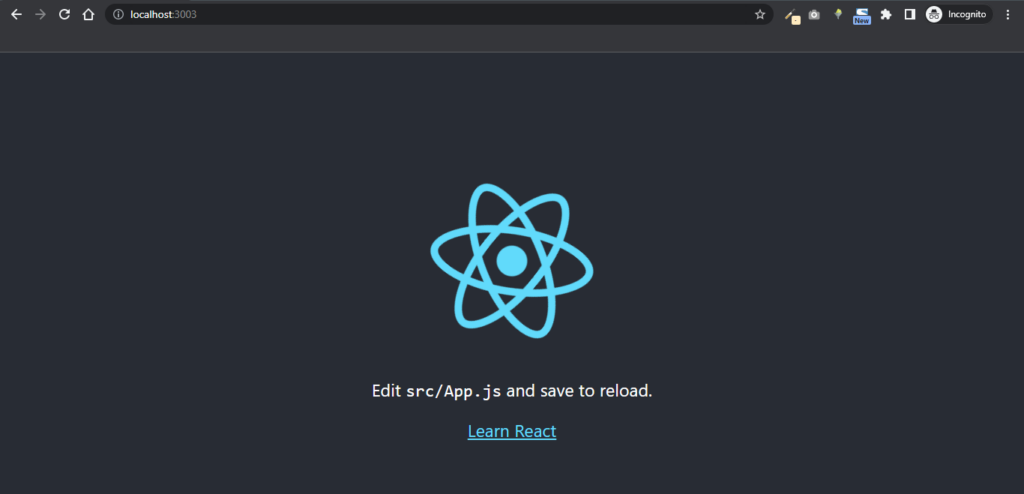
You should get the following in your terminal upon completion of the commands above:
Compiled successfully!

You can now view react-select-tutorial in the browser.

  Local:            <http://localhost:3000>
  On Your Network:  <http://192.168.137.1:3000>

Note that the development build is not optimized.
To create a production build, use npm run build.

webpack compiled successfully
Once you start your React app, it will begin automatically updating your development environment and can be accessed at the default address of localhost:3000.
I am running the application on [localhost:3003](<http://localhost:3003>) because I have another application running on port 3000.
NOTE: We will make use of this app react-select-tutorial throughout this tutorial.
Installing React Select
Having satisfied the above requirements, you may proceed with the installation of React Select.
To install, run the following command in the directory of react-select-tutorial
cd react-select-tutorial
Next, you need to install React Select using npm or yarn:
with npm
npm install react-select
with yarn
yarn add react-select
Note: I used React Select v5.7.0; the latest version (as of the time of writing this tutorial).
How to Import React Select Library into your Application
Import the Select component from React Select into your project by adding the following lines to the top of the file where you want to use it.
To do this, first, create a component called MySelect.jsx and paste the following code:
//MySelect.jsx
import React from 'react';
import Select from 'react-select';
...

...
The above code imports the React component and the Select component from their respective packages.
Your <Select /> component is similar to the regular HTML <select> tag in that both make use of options and values except for the <Select /> component, where you will need to pass in your options as props.
Basic Usage and Implementation
Use the Select component in your project by adding the following code to the render function of your component:
//MySelect.jsx
import React from 'react';
import Select from 'react-select';

const options = [
  { value: 'helene', label: 'Helene' },
  { value: 'berline', label: 'Berline' },
  { value: 'selene', label: 'Selene' }
];

const MySelect = () => {
  return (
    <Select
      options={options}
      placeholder="Favourite artists"
    />
  );
}

export default MySelect;
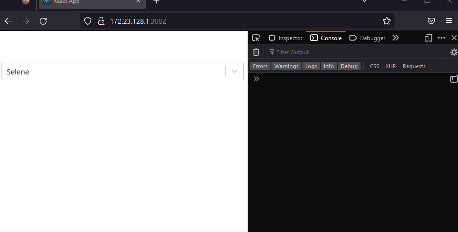
In the code above, the Select component is being passed a list of favorite artists as props. This code will create a dropdown menu with the options “Helene”, “Berline”, and “Selene”.
You can customize the Select component by passing additional props, such as placeholder and the onChange props, to change its behavior.
Next, open App.js and import your MySelect component like so:
// App.js

import './App.css';
import MySelect from "./MySelect";

function App() {
  return (
    <MySelect
    />
  );
}

export default App;
The MySelect component is then exported so that it can be rendered in the App component in the DOM. When the application is run, a select element should appear as shown below:

How to use onChange in React Select
The onChange prop is used to detect when a user selects an option. In this section, you will learn how to keep track of the selected value in your MySelect component. You will modify the initial MySelect.jsx component with this code below:
// MySelect.jsx
import React, { useState } from 'react';
import Select from 'react-select';

const MySelect = () => {
const [selectedOption, setSelectedOption] = useState(null);

  const handleChange = (selectedOption) => {
    setSelectedOption(selectedOption);
    console.log(`Option selected:`, selectedOption);
  };

  const options = [
    { value: 'helene', label: 'Helene' },
    { value: 'berline', label: 'Berline' },
    { value: 'selene', label: 'Selene' }
  ];

  return (
   <>
      <Select
        options={options}
        onChange={handleChange}
        placeholder="Favourite artists"
      />
   </>
  );
}

export default MySelect;
What the above snippet does:
- We imported the
[useState hook](https://www.copycat.dev/blog/react-custom-hooks/) from React - In this specific code,
const [selectedOption, setSelectedOption] = useState(null); we declared a new state variable calledselectedOptionand initialized it tonull. TheuseStatehook returns an array with two elements; the current value of the state variable, and a function for updating the variable. In this case, we destructured theselectedOptionvariable from the array returned byuseState, so the variable will contain the current value ofselectedOption, and thesetSelectedOptionvariable will contain a function for updating the value ofselectedOption. - We made use of
setSelectedOptionin an event handler like this:
const handleChange = (option) => {
  setSelectedOption(option);
  console.log(`Option selected:`, option);
};
When handleOptionSelected is called, it will update the value of selectedOption with the value of option.
We bound the handleChange() function to the onChange property. So, anytime there is a change, the handleChange() function is called.
The placeholder props set the placeholder for the Select components.
Below is a demo of how our app will function:
How do I use React Select Async?
To make the drop-down menu asynchronous, you use the async prop in combination with the loadOptions prop. The async prop enables the asynchronous loading of options, and the loadOptions prop accepts a function that should return a promise that resolves with the options to be displayed in the drop-down menu. This allows the options to be loaded from a remote source, such as an API. Learn more about React-select async here.
First, you need to import Async and useAsync from react-select/async like so;
import Async, { useAsync } from 'react-select/async';
Then use this code example to better understand how async works:
import React from 'react';

import AsyncSelect from 'react-select/async';
import { ColourOption, colourOptions } from './docs/data';

const filterColors = (inputValue: string) => {
  return colourOptions.filter((i) =>
    i.label.toLowerCase().includes(inputValue.toLowerCase())
  );
};

const loadOptions = (
  inputValue: string,
  callback: (options: ColourOption[]) => void
) => {
  setTimeout(() => {
    callback(filterColors(inputValue));
  }, 1000);
};

export default () => (
  <AsyncSelect cacheOptions loadOptions={loadOptions} defaultOptions />
);
Below is how the asynchronous select work:

Advanced Features of React Select
Customization of React Select
One of the key features of React Select is its ability to allow users to customize the look and feel of the dropdown menu to fit their specific needs. This can be achieved through the use of custom styles and classes, as well as by passing in props that control the behavior and appearance of the component.
To customize the styles of a React Select component, you need to pass in a styles prop that contains an object with CSS styles that will be applied to the component.
For example, to change the background color of the dropdown menu, you could use the following code:
const styles = {
  container: (base) => ({
    ...base,
    backgroundColor: 'red'
  })
}

<Select styles={styles} />
In addition to the styles prop, you can also pass in a className prop to apply custom CSS classes to the component. For example, to apply a custom class to the dropdown menu, you could use the following code:
const className = 'custom-class'

<Select className={className} />
Another way to customize the behavior and appearance of a React Select component is to pass in props that control specific aspects of the component. For example, the placeholder prop can be used to specify the default text that is displayed in the dropdown menu when no option is selected.
The isClearable prop can be used to control whether or not the user can clear their selection, and the isSearchable prop can be used to enable or disable the search box in the dropdown menu.
Overall, React Select provides a wide range of options for customizing the look and feel of the dropdown menu to fit the needs of your application. Whether you want to change the styles, apply custom classes, or control the behavior of the component, the library makes it easy to create a dropdown menu that is both user-friendly and visually appealing.
Enhancing Search Functionality
To make the drop-down menu searchable, you will need to add a isSearchable prop to the Select component and sets it to true. This enables a search input field in the drop-down menu, allowing users to search for options by typing.
<Select
    options={options}
    onChange={handleChange}
    isSearchable={true}
    placeholder="Favourite artists"
  />
Utilizing Themes, Styling, and Animated Components
To utilize themes and styling in React-select, you can use the styles prop to pass in a custom CSS object that defines the desired styles for the dropdown menu and its options. This allows for a high level of customization and allows you to match the styles of the dropdown menu with the overall design of the application.
React-select also offers the ability to use animated components to enhance the user experience. This can be done by using the components prop to pass in custom components that include animation. For example, you can use the Animated component provided by React-select to add animations to the dropdown menu when it is opened or closed. This can add a sense of polish and professionalism to the user interface.

Congratulation 🎉, you have successfully built your app with the react-select library 👏🏽.

Summary of React Select’s Benefits and Capabilities
React Select is a popular choice for creating highly customizable and user-friendly select components in React. Some of the benefits and capabilities of React Select include:
- Easy to use: React Select is designed to be easy to use, with a simple API and a wide range of options and themes that can be customized to match your needs.
- High performance: It is built with performance in mind, using efficient algorithms and optimized code to ensure fast rendering and smooth interactions.
- Customizable: It allows you to customize almost every aspect of the select component, from the styles and colors to the placeholder text and options that are displayed.
- Accessible: React Select is built with accessibility in mind and includes support for keyboard navigation and screen reader compatibility.
- Flexible: It can be used as a standalone component or integrated with other libraries and frameworks such as Redux and Redux Form.
Overall, React Select offers a powerful and flexible solution for creating user-friendly select components in React. It is highly customizable, easy to use, and provides excellent performance, making it a popular choice among developers.
Conclusion
In this tutorial, you learn how to install and import the React-Select library into a React application. Next, you were walked through an example of a basic drop-down menu implemented with React-Select, and you were explained how to customize the menu with props such as placeholder text, option labels, and option values.
You also saw how to use the library’s built-in support for asynchronous data loading to load options from a remote API.
Finally, I demonstrated how to use the library’s built-in support for filtering and searching to allow users to quickly find the options they are looking for.
Overall, this article provides a clear and detailed guide to using React-Select to create searchable, async drop-down menus in React applications.
In conclusion, I recommend you take a look at our amazing tool called CopyCat. It assists you in mastering the skill of copying code and quickly converts Figma designs into ReactJS code. Please give it a try.
Great Reads from Our Blog
- All You Need to Know About React Spring Animations Jammed Into One Article
- How to Virtually Render Large Lists Using React Virtualized
- Top 33 Free React Charts (Libraries)
- How To Use React-Styled Components Efficiently
Additional Resources for Learning more about React Select
Related Articles
-
 React.js
Impress Your Users Using The Top 8 React Animation Libraries
Introduction The modern web has advanced significantly over the years, with various features ranging from basic to sophisticated animated UI components becoming a must-have for websites to increase attractiveness and user satisfaction. In this article, we'll look at the features…
October 1, 2022 -
React.js
React Bootstrap: How To Use Bootstrap In React.js?
Introduction: How to Use Bootstrap with React ReactJS Bootstrap is a front-end toolkit component library developed by React, which is the most used JavaScript framework, to create responsive, component-based elements. It is a counterpart to Bootstrap Javascript and offers accessible,…
February 25, 2022

