 December 24, 2022
  Amazing Agu


Introduction
Text has always been a crucial part of the web experience. Text that is legible and understandable makes for a more pleasurable experience.
Material UI is a React JS Component Library. In this article, we will explore typography in Material UI and how to create stunning text with it.
Before we dive in, we could build React components and copy the code directly from Figma. This is possible with the CopyCat plugin. CopyCat also supports component libraries. Examples are Material UI, Chakra UI, etc. This saves development time massively. Check out the CopyCat Plugin.
What is Typography in UI design?
Typography can be defined as the art of arranging text and letters in a clear and concise manner. This makes the text easily readable and makes no room for confusion.
User Interface Designers pay close attention to how they arrange text. This is because the user should easily understand whatever information they are trying to pass across.
How to use Typography in React Material UI
While building Web Applications with React JS and Material UI, we need good typography to make our design stand out. Material UI makes it very easy to achieve this.
Getting started with Typography in Material UI
In this section of the article, we are going to install Material UI and a font family for our Web App. Before we keep going, this article assumes that the reader has an already running React JS App.
Installing Material UI
To install Material UI, run the following command in the terminal.
npm install @mui/material @emotion/react @emotion/styled
This command installs Material UI and Emotion which is the default styling engine for Material UI. For more information on what the command does, check out the documentation website.
Installing a Font family
Material UI uses Roboto as its default font. The font however does not come preinstalled so we need to install it separately.
For this article, we will install it using Fontsource.
npm install @fontsource/roboto
After this, we bring in the default Roboto font weights Material UI uses. The imports should go into our entry point JavaScript file.
This article assumes a Vite + React setup, therefore the entry point is main.jsx.
import React from 'react'
import ReactDOM from 'react-dom/client'
import App from './App'
import '@fontsource/roboto/300.css';
import '@fontsource/roboto/400.css';
import '@fontsource/roboto/500.css';
import '@fontsource/roboto/700.css';

ReactDOM.createRoot(document.getElementById('root')).render(
  <React.StrictMode>
    <App />
  </React.StrictMode>
)
Using the Typography component
The best way to display text in Material UI is using the Typography Component. This component handles font weights and sizes for any HTML element we specify.
We use the Typography component this way:
import { Typography, Box } from '@mui/material'

function TextDemo() {
    return (
        <Box sx={{ width: '100%', maxWidth: 500, margin: 'auto' }}>
            <Typography variant="h1">Main Title</Typography>
            <Typography variant="h2">Introduction</Typography>
            <Typography variant="body1">
                Lorem ipsum dolor sit amet consectetur adipisicing elit. Distinctio amet pariatur cupiditate ullam, cumque magni dolorum, deleniti aperiam temporibus quas corrupti, consectetur eligendi.
            </Typography>
        </Box>
    )
}

export default TextDemo
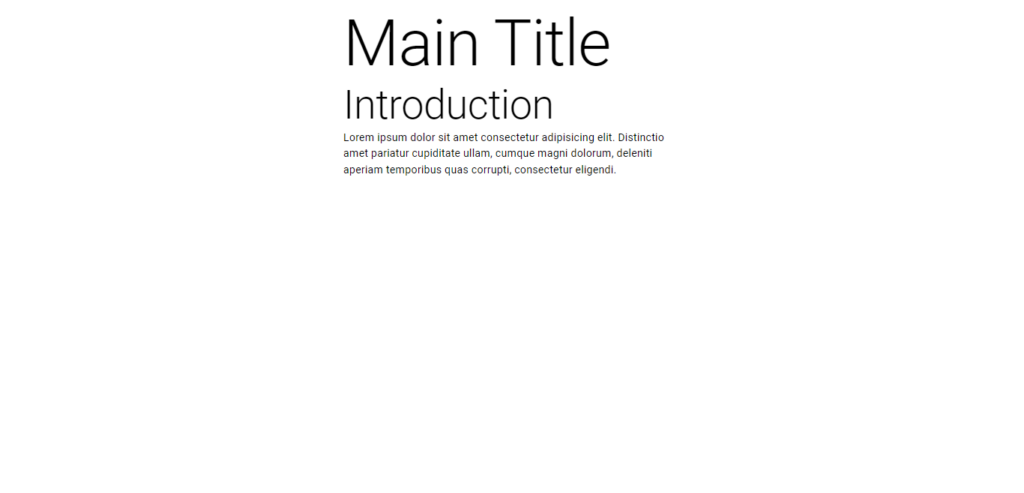
From the source code above, we imported the Typography and Box components from Material UI. We used the Box Component as a container for our text in this case. More about the Box component can be found here.
We can also see that we use the prop called “variant” to indicate the style of text we want for our typography component.
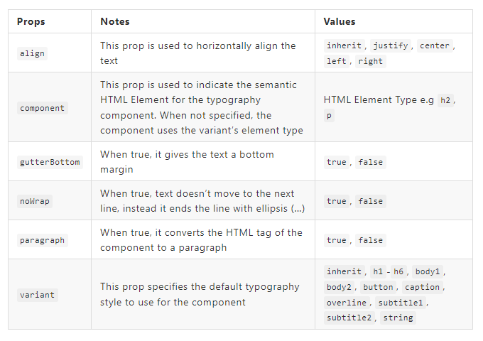
Typography Component Props
We have already seen “variant” as a typography component prop, however, there are many more props we can use to further enhance our text. They include align, component, gutterBottom, noWrap, paragraph, and variant prop. Below is a rundown of what they do:
How to add Colors in Material UI Typography
To add colors, we use the sx prop which accepts an object as its value. Then we put in the theme name of the color.
<Typography variant="h1" sx={{ color: 'primary.main' }}>Main Title</Typography>

What CSS is applied for Typography components?
For further customization of Elements, one can use the sx prop. We can use this to customize the font weight, font size, font style, letter spacing, line height and so much more. More information can be found here.
Conclusion
In this article, we have looked at the importance of Typography and how we can easily implement it in Material UI. We have also learned about props for the enhancement of our text and how to apply further customizations.
Start converting your Material UI Figma designs to Code using the CopyCat Plugin. Save 35% of your development time and create projects with lightning speed. Check it out.
Resources
These are additional resources on the topic
- What Is Typography, and Why Is It Important? A Beginner’s Guide
- Material UI Typography API
- Material UI Typography Demo
Some interesting reads from our Blogs
- Step-by-Step Guide to using Reactstrap for Building Amazing Web Apps in React
- A Great Guide To Using Material UI Textfield Efficiently
- Material UI Grid: The Ultimate Guide to Building Responsive Web Layout in React
Related Articles
-
 React.js
What is TypeScript: A Beginner’s Guide
Introduction There is no better way to write JavaScript than using TypeScript. TypeScript is a superset of JavaScript language. TypeScript has gained increasing popularity over the past years to become the most popular programming language in 2021 according to a…
December 16, 2022 -
React.js
Your Guide To The React Context API
Introduction More often than not, building React applications involves consuming data of different forms for our use. Primarily, data management in React applications is via props; and sometimes, that’s just all we need. However, as our application grows larger and…
August 26, 2022


