
 November 26, 2022
  copycat


- What is Reactstrap?
- What is Reactstrap used for?
- Is Reactstrap a framework?
- How to set up Reactstrap in your application
- Installing React JS
- Installing Bootstrap
- Installing Reactstrap
- Different Components in Reactstrap
- How to add Buttons
- How to add Modals
- How to add Carousels
- How to add Cards
- How to add Tables
- FAQ
- Conclusion
- Resources
React still goes strong as one of the most popular JavaScript libraries used for building Single Page Applications (SPAs). The React developers community is very robust and there are a lot of helper tools that can be used with React to make SPAs stand out more.
Some helper tools include React Calendar, Styled Components, React Markdown and so many more. CopyCat, a Figma plugin even converts User interface designs to React Code. Try out CopyCat here. With these tools, a lot of development time is saved.
One such tool is Reactstrap. This article will a few core concepts xfdiscuss it in detail. It will include when the tool should be used, setting up our React application to use it, the different components we can use, and many more.
The following are required to gain the most value out of this article.
- Familiarity with React JS
- Knowledge of Bootstrap
With that aside, let us jump into the article.
What is Reactstrap?
Reactstrap is a React Component Library for Bootstrap. It is a tool that makes it easier to use Bootstrap components in React. Bootstrap on the other hand is a CSS Library used for styling web page elements.
Using Bootstrap most time eliminates the need for writing custom CSS code. This capability of Bootstrap CSS is what Reactstrap brings to React JS.
What is Reactstrap used for?
Reactstrap is used for creating React Bootstrap components. It offers a lot of components and customizations for those components. Some things we can do with Reactstrap include Modals, Forms, Navbars, Buttons, Toasts, Alerts, and more.
The react components are already pre-built using Bootstrap classes and once we have the library, we can simply import the components and declare them in our app.
Is Reactstrap a framework?
The terms Library and Framework are thrown around interchangeably by developers. Libraries and frameworks do not have the same meaning though.
A Library is a set of pre-written functions or classes that perform specific tasks. These functions or classes can then be imported into any project and called. Examples of Libraries are JQuery, Lodash, Moment JS, React, and so on.
A Framework on the other hand is an already-built system and stand-alone application. In this case, the developer merely has to slot code into some application sections to customize it. Examples of frameworks are Django, Angular JS, Ember JS, and so on.
The core difference between a Library and a framework lies in control. While using libraries, you can import and call the library whenever you deem fit. With frameworks, however, the opposite is the case. Here, the framework has all control and calls custom code whenever it needs it.
To answer the question, it is not a framework. It is a design library that uses Bootstrap classes underneath the hood to create components. We can now import these react components into our programs however we want to. The developers have control while using Reactstrap.
How to set up Reactstrap in your application
In this section of the article, we will start up a React app, install Bootstrap, and finally Reactstrap.
Installing React JS
There are some common ways to install React JS. For this article, we will be using Vite which is arguably the fastest method.
Using our Command Line interface, navigate to the folder that will house your project and run the command:
npm create vite@latest
What the above command does is run the Vite command line tool.
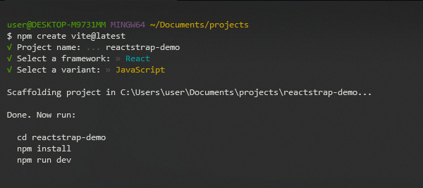
After running the command, we will be prompted to choose our project name, framework, and variant. The illustration below is the configuration we should use for this tutorial.
Now, we will follow the commands listed for us to finish up the installation.
cd reactstrap-demo
npm install
npm run dev
To know if everything worked, we should get something similar to the illustration below on our terminal.
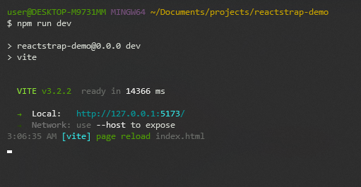
And also, when we visit the locally created URL, we should see the following on our browser.

With that, we are done with installing React JS with the Vite tool.
Installing Bootstrap
Reactstrap doesn’t come with its style. It relies on Bootstrap and uses Bootstrap classes. Thus, we cannot use it without installing Bootstrap.
To install Bootstrap, we run the command inside the project’s folder.
npm install bootstrap
After running this command, we navigate to our Appjsx file. We can find this file inside the `src` directory of our codebase. Inside the App.jsx file, we will import the Bootstrap CSS stylesheet using the following code:
...
import 'bootstrap/dist/css/bootstrap.min.css';
...
With this, we have fully installed Bootstrap and are almost ready to start building.
Installing Reactstrap
Before we learn how to build react bootstrap components in Reactstrap, we need to install it. This is the final step before we start building. To install Reactstrap, we run the following command into our terminal. Here, we also make sure we are in the project directory.
npm install reactstrap
After that, we should have it as a dependency in our react app. Now let us begin to create react components with our installed library.
Different Components in Reactstrap
There are many components Reactstrap offers. These react components are common elements used in many websites. Building most of these elements from scratch uses up precious development time. Instead, we can import these already-built components from the library and display them in our App.
How to add Buttons
Buttons are prevalent elements in Graphical User Interface software today. To add Buttons, we first import the Button component and then style it.
import { Button } from 'reactstrap';

function App() {
  return (
    <div>
      <Button color="primary">Primary Button</Button>
    </div>
  )
}
The code above produces the following output.

There are some things to note about Buttons in Reactstrap.
Buttons accept “color” as a prop. The values that color takes are primary, secondary, success, danger, warning, info, light and dark.
<div>
    <Button color='primary'>Primary Button</Button>
    <Button color='secondary'>Secondary Button</Button>
    <Button color='success'>Success Button</Button>
    <Button color='danger'>Danger Button</Button>
    <Button color='warning'>Warning Button</Button>
    <Button color='info'>Info Button</Button>
    <Button color='light'>Light Button</Button>
    <Button color='dark'>Dark Button</Button>
</div>

Buttons also accept “outline” as Props. This outline gets rid of the background color of a button, giving it a simple border.
<div>
  <Button color='success' outline>Success Button</Button>
</div>

There are also different sizes of Buttons we can use. They include “lg” and “small”. These values are passed to the “size” prop and can make the buttons larger or smaller respectively.
<div>
    <Button color='primary' size='lg'>Primary Button</Button>
    <Button color='success'>Success Button</Button>
    <Button color='danger' size='sm'>Danger Button</Button>
</div>

How to add Modals
Modals are a way of passing important information, and sometimes prompting the user to action. One unique characteristic of modals is that it highlights itself and stops the user from interacting with other elements on the page.
For the user to go back to normal content on the page, they usually have to interact with the modal or close it.
Reactstrap offers a modal component we can use in our websites to create these important prompts.
import React, { useState } from 'react'

import './App.css'
import 'bootstrap/dist/css/bootstrap.min.css';

import { Button, Modal, ModalHeader, ModalBody, ModalFooter } from 'reactstrap';

function App() {

  const [modal, setModal] = useState(false);

  const toggle = () => setModal(!modal);

  return (
    <div>
        <Button color='primary' onClick={toggle}>Open Modal</Button>
        <Modal isOpen={modal} toggle={toggle}>
          <ModalHeader toggle={toggle}>Modal Header</ModalHeader>
          <ModalBody>
            Lorem ipsum dolor sit amet consectetur adipisicing elit. Ipsam fuga quia, laborum aperiam mollitia, fugiat ipsa cumque non, deleniti voluptatum eum numquam. Omnis, quas fugit eligendi quae voluptatem sit optio, ab saepe praesentium quidem nulla ipsam sed error laborum quo ullam delectus illum consequuntur ratione libero. Deleniti quas ratione corrupti?
          </ModalBody>
          <ModalFooter>
            <Button color='primary' onClick={toggle}>Close</Button>
          </ModalFooter>
        </Modal>
    </div>
  )
}

export default App;
In the code illustration above, we imported React and the useState hook on the first line. The useState hook is useful for toggling the Modal on and off. After that we brought in our stylesheets.
For us to create Modals in Reactstrap, we need four components.
- Modal: This is the component that wraps around the smaller Modal components.
- ModalHeader: This is for giving our Modal some sort of title
- ModalBody: This component is to display information passed across through the Modal
- ModalFooter: This component can contain extra information. It can also contain Buttons to perform an action, or close the Modal.
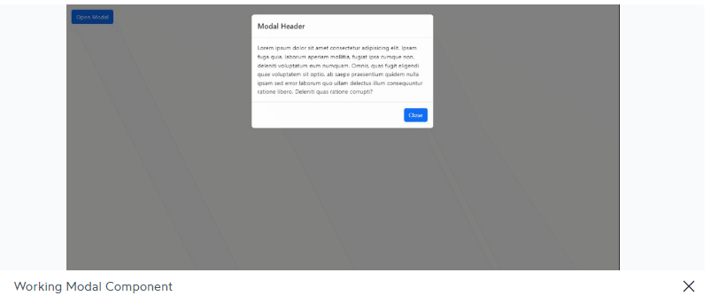
After importing the different components, we set the state value “modal” to false. The Modal component has a prop called “isOpen” whose value has to be true or false. In the illustration, we set the value to the state “modal”. This is because the value for modal is going to be changing frequently and we want to use it to toggle the modal on and off.
Finally we create a function that whenever called negates the value of “modal”. With that done, we create the modal content properly and then we have it working.
To create a close button in Reactstrap, we modify the code a little. We create a component called “CloseButton” and then we pass it as a value of the prop “close” in the modal header component.
import React, { useState } from 'react'
import './App.css'
import 'bootstrap/dist/css/bootstrap.min.css';
import { Button, Modal, ModalHeader, ModalBody, ModalFooter } from 'reactstrap';
function App() {
const [modal, setModal] = useState(false);
const toggle = () => setModal(!modal);
const CloseButton = (
<button onClick={toggle} type='button'> × </button>
)
return (
<div>
<Button color='primary' onClick={toggle}>Open Modal</Button>
<Modal isOpen={modal} toggle={toggle}>
<ModalHeader close={CloseButton} toggle={toggle}>Modal Header</ModalHeader>
<ModalBody>
Lorem ipsum dolor sit amet consectetur adipisicing elit. Ipsam fuga quia, laborum aperiam mollitia, fugiat ipsa cumque non, deleniti voluptatum eum numquam. Omnis, quas fugit eligendi quae voluptatem sit optio, ab saepe praesentium quidem nulla ipsam sed error laborum quo ullam delectus illum consequuntur ratione libero. Deleniti quas ratione corrupti?
</ModalBody>
<ModalFooter>
<Button color='primary' onClick={toggle}>Do something</Button>
</ModalFooter>
</Modal>
</div>
)
}
export default App;

How to add Carousels
Carousels are beautiful website react components that display information in the form of slides. These slides can contain images, text, or a combination of both.
Reactstrap makes it very easy to create Carousels. We do this by importing the following components:
- Carousel: This is going to be the component that will wrap other smaller Carousel Components
- CarouselItem: This needs to be used for each Carousel slide created. It accepts some props and also wraps itself around the carousel image and CarouselCaption
- CarouselControl: CarouselControl creates the Control Bars for moving to the previous or next slides in a the Carousel.
- CarouselIndicators: This is where we place information about the items we want to show.
- CarouselCaption: This component is used for giving our slides captions.
import React, { useState } from 'react'

import './App.css'
import 'bootstrap/dist/css/bootstrap.min.css';

// Import useful components for the Carousel
import { Carousel, CarouselItem, CarouselControl, CarouselIndicators, CarouselCaption } from 'reactstrap';

// Define Photo Properties
const photos = [
  {
    id: 1,
    src: 'https://loremflickr.com/1200/400?random=1',
    alt: 'Placeholder Image',
    caption: 'Slide 1',
  },
  {
    id: 2,
    src: 'https://loremflickr.com/1200/400?random=2',
    alt: 'Placeholder Image',
    caption: 'Slide 2',
  },
  {
    id: 3,
    src: 'https://loremflickr.com/1200/400?random=3',
    alt: 'Placeholder Image',
    caption: 'Slide 3',
  },
];

function App() {

  // Create State for current slide index
  const [index, setIndex] = useState(0);

  // Create State to know when a transition is occuring
  const [slideAnimation, setSlideAnimation] = useState(false);

  // Create function for next Slide handler
  const next = () => {
    if (slideAnimation) return;
    const nextIndex = index === photos.length - 1 ? 0 : index + 1;
    setIndex(nextIndex);
  }

  // Create function for previous Slide handler
  const prev = () => {
    if (slideAnimation) return;
    const nextIndex = index === 0 ? photos.length - 1 : index - 1;
    setIndex(nextIndex);
  }

  // Enable non-linear navigation of slides
  const moveToIndex = (newIndex) => {
    if (slideAnimation) return;
    setIndex(newIndex);
  }

  // Loop over Photos to create a Carousel Item
  const slides = photos.map(photo => (
    <CarouselItem
      key={photo.id}
      onExiting={() => setSlideAnimation(true)}
      onExited={() => setSlideAnimation(false)}
    >
      <img src={photo.src} alt={photo.alt} />
      <CarouselCaption
        captionText={photo.caption}
        captionHeader={photo.caption}
      />
    </CarouselItem>
  ));

  return (
    // Center the Carousel
    <div style={{margin: '0 auto', maxWidth: 1200}}>
      <Carousel
      activeIndex={index}
      next={next}
      previous={prev}
      >
        <CarouselIndicators
          items={photos}
          activeIndex={index}
          onClickHandler={moveToIndex}
        />
        { slides }
        <CarouselControl
          direction="prev"
          directionText="Previous"
          onClickHandler={prev}
        />
        <CarouselControl
          direction="next"
          directionText="Next"
          onClickHandler={next}
        />
      </Carousel>
    </div>
  )
}

export default App;

NOTE: Carousel Images are gotten from LoremFlickr.
How to add Cards
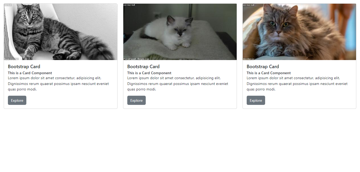
Cards are a smart way to present direct information to users on websites. A typical card will include a title, subtitle, and content. Some Cards can also have images.
In this article, we will create three cards on a Bootstrap grid. That way, the cards are responsive and aligned with each other.
For this we need to import the following components:
- Card: This React component houses every other thing inside our Card component. Any dimension style (height or width) applied to this particular component will shape the size of the whole card.
- CardBody: This component contains the rest of the other items that will be in the card.
- CardTitle: After importing this, we can give our Card a title.
- CardSubtitle: For giving our Card a subtitle.
- CardText: If our Cards have text content, we use this element to add it.
import React from 'react'

import './App.css'
import 'bootstrap/dist/css/bootstrap.min.css';

// Importing the necessary components
import { Row, Col, Card, CardBody, CardTitle, CardSubtitle, CardText, Button } from 'reactstrap';

function App() {

  return (
    <div>
      <Row>
        <Col>
          <Card>
            <img src="https://loremflickr.com/400/200?random=1" alt="Placeholder Image" />
            <CardBody>
              <CardTitle tag='h5'>Bootstrap Card</CardTitle>
              <CardSubtitle tag='h6'>This is a Card Component</CardSubtitle>
              <CardText>Lorem ipsum dolor sit amet consectetur, adipisicing elit. Dignissimos rerum quaerat possimus ipsam nesciunt eveniet quas porro modi.</CardText>
              <Button>Explore</Button>
            </CardBody>
          </Card>
        </Col>
        <Col>
          <Card>
            <img src="https://loremflickr.com/400/200?random=2" alt="Placeholder Image" />
            <CardBody>
              <CardTitle tag='h5'>Bootstrap Card</CardTitle>
              <CardSubtitle tag='h6'>This is a Card Component</CardSubtitle>
              <CardText>Lorem ipsum dolor sit amet consectetur, adipisicing elit. Dignissimos rerum quaerat possimus ipsam nesciunt eveniet quas porro modi.</CardText>
              <Button>Explore</Button>
            </CardBody>
          </Card>
        </Col>
        <Col>
          <Card>
            <img src="https://loremflickr.com/400/200?random=3" alt="Placeholder Image" />
            <CardBody>
              <CardTitle tag='h5'>Bootstrap Card</CardTitle>
              <CardSubtitle tag='h6'>This is a Card Component</CardSubtitle>
              <CardText>Lorem ipsum dolor sit amet consectetur, adipisicing elit. Dignissimos rerum quaerat possimus ipsam nesciunt eveniet quas porro modi.</CardText>
              <Button>Explore</Button>
            </CardBody>
          </Card>
        </Col>
      </Row>
    </div>
  )
}

export default App;
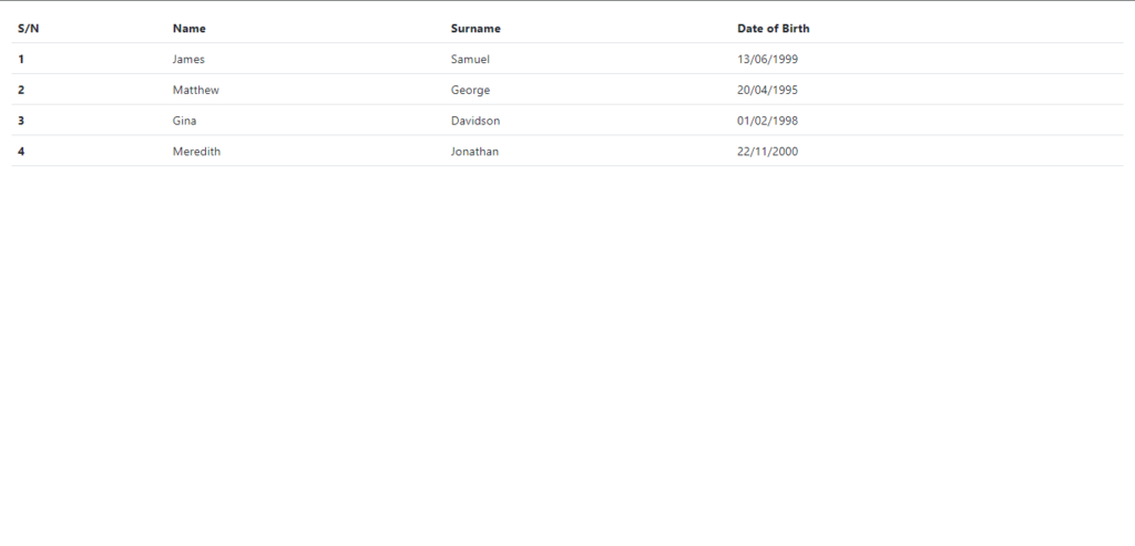
How to add Tables
Tables display information in Rows and Columns. They are ideal for large amounts of data with similar fields.
In this section of the article, we will create a simple table with Reactstrap.
import React from 'react'

import './App.css'
import 'bootstrap/dist/css/bootstrap.min.css';

// Import the Table Component
import { Table } from 'reactstrap';

function App() {

  return (
    <div>
      <Table>
        <thead>
          <tr>
            <th>S/N</th>
            <th>Name</th>
            <th>Surname</th>
            <th>Date of Birth</th>
          </tr>
        </thead>
        <tbody>
          <tr>
            <th scope='row'>1</th>
            <td>James</td>
            <td>Samuel</td>
            <td>13/06/1999</td>
          </tr>
          <tr>
            <th scope='row'>2</th>
            <td>Matthew</td>
            <td>George</td>
            <td>20/04/1995</td>
          </tr>
          <tr>
            <th scope='row'>3</th>
            <td>Gina</td>
            <td>Davidson</td>
            <td>01/02/1998</td>
          </tr>
          <tr>
            <th scope='row'>4</th>
            <td>Meredith</td>
            <td>Jonathan</td>
            <td>22/11/2000</td>
          </tr>
        </tbody>
      </Table>
    </div>
  )
}

export default App;
There are a lot of other things we can do with Reactstrap. Check out the Resources section of this article to learn more.
FAQ
Is Reactstrap the same as Bootstrap?
No. Reactstrap is a Component Library for React. The components in Reactstrap are styled with Bootstrap CSS.
Which is better Reactstrap or React-Bootstrap?
React-Bootstrap is an alternative to Reactstrap. This means they are both Component Libraries for React. They both use Bootstrap CSS classes for their styling under the hood. Let us compare both on how popular they are among the developer community. These stats are from the time of this article.
REACTSTRAP
- 10.4K Stars on GitHub
- 476,311 NPM Downloads
REACT-BOOTSTRAP
- 21.2K Stars on GitHub
- 1,214,595 NPM Downloads
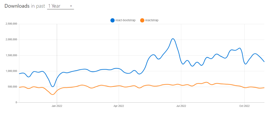
From the above, we can see that React-Bootstrap is more popular than Reactstrap. Reactstrap however is a nice library and since it does almost the same thing React-Bootstrap does (although slightly differently), It’s hard to say any library is objectively better.
Conclusion
In this article, we have explored the Reactstrap library and have learned how to use it to build some common elements found in many modern websites along with a few core concepts. The elements we have learned how to create include Buttons, Carousels, Modals, Cards, Tables, and Forms.
Instead of writing Code from scratch, we can design our Components on Figma and have Copycat generate the source code for the component. Click here to check it out.
Resources
Further resources to learn more.
- https://github.com/reactstrap/reactstrap
- https://getbootstrap.com/docs/4.0/layout/grid/
- https://www.positronx.io/react-bootstrap-tutorial-getting-started-reactstrap-with-react/?amp
- https://www.geeksforgeeks.org/difference-between-reactstrap-and-react-bootstrap/
Related Articles
-
 React Best Practices
How React.js CDN Makes Your Life Incredibly Easier
Introduction Setting up a React Project sometimes comes with time-consuming steps, especially when you are a beginner to the React ecosystem. You need to worry about npx, create-react-app, accurate npm version, React associated libraries, etc. However, ReactJs CDN makes your…
April 1, 2022 -
React.js
How to use React Player in React Applications
Introduction A video on a website adds to the static content there, giving the user an engaging experience by supplementing it. Building enduring relationships with web visitors is easy with the help of videos. According to statistics, viewers are more…
December 24, 2022


