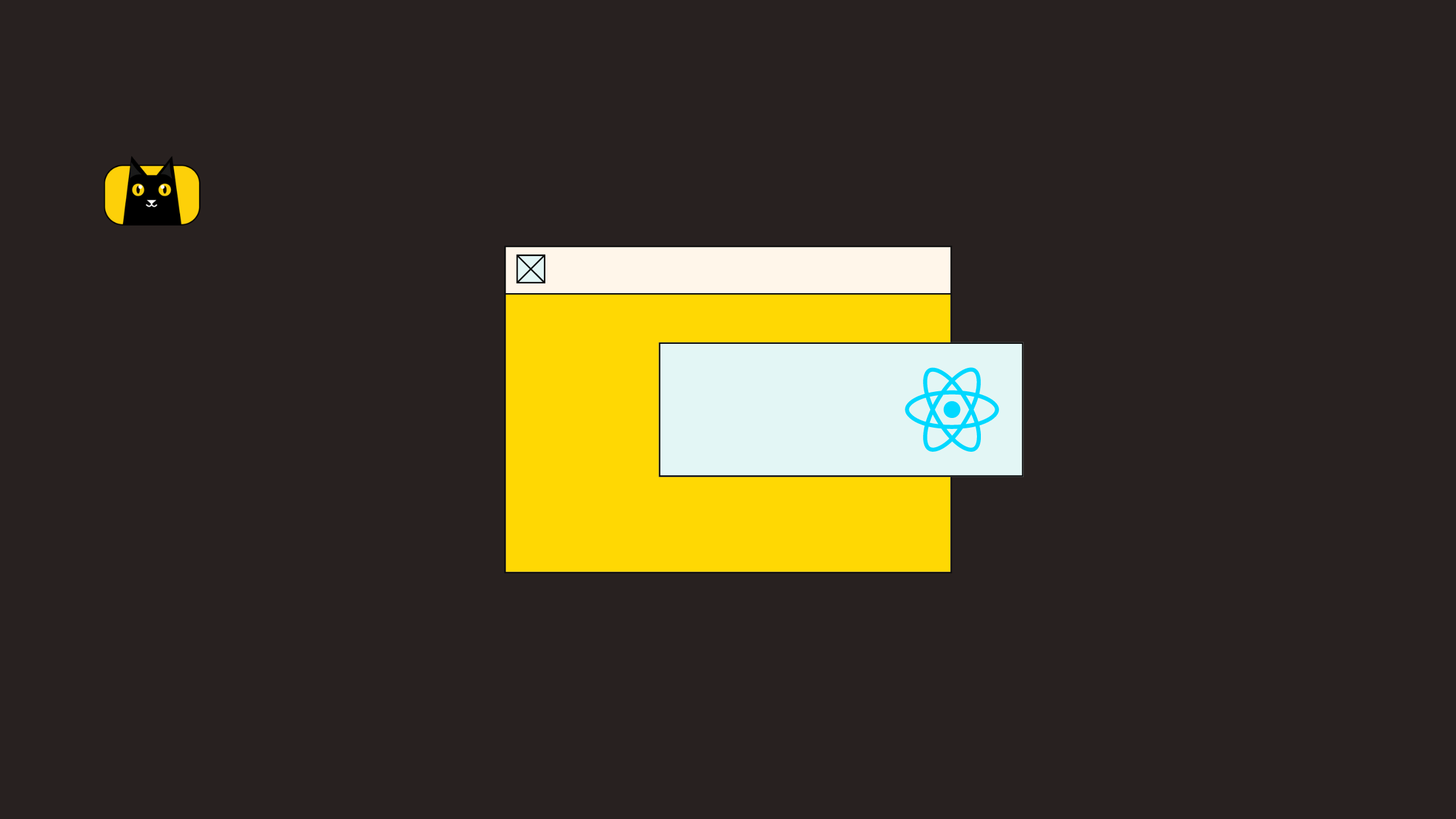
 February 7, 2022
  copycat


Great user experience and user interfaces plays a vital role in the success of any Application. Whether it is a Hybrid Application or a Native one, the end-user demands good UX. When creating any such good experience on an App, there are use cases where you have to collect quick information from the user without re-routing the Page. In such a case, Reactjs PopUp is one of the best choices you could have. They are fixed containers containing information based on any action from the user on the Page and can add a good user experience.
There are numerous ways to implement a Reactjs PopUp, all depending on the framework used. Several issues also arise with the Pop Up not getting closed, not being triggered on time or positions on the Viewport. Scrolling, editing and backdrop are also significant issues you face. This blog will guide you through different ways to develop a Reactjs PopUp while avoiding these common problems.
Creating a Custom Reactjs PopUp
Let us assume a use case where you have to render a Reactjs PopUp once the user clicks on a button. Technically, Pop Up is simply a container where you are collecting or showing information to the user. So, all you need is a container.
Before proceeding, let us create our React App Project using npx create-react-app.

The Components are divided into generic Functional Components PopUpsGalley and CustomPopUp. All the Reactjs Popups you will go through this blog will be the child of the PopUpsGallery Component.

import styled from 'styled-components';
import CustomPopUp from './CustomPopUp';

const PopUpsGallery = ({props}) => {
   return (
       <StyledPopUpsGallery>
           <CustomPopUp></CustomPopUp>
       </StyledPopUpsGallery>
    );
}
export default PopUpsGallery;
Now, let’s define create our simple react Popup Component Structure in App.js.
import styled from 'styled-components';
import PopUpsGallery from './Components/PopUpsGallery';
import { createGlobalStyle } from 'styled-components'

function App() {

 return (
    <StyledParent>
       <GlobalStyle></GlobalStyle>
       <PopUpsGallery></PopUpsGallery>
    </StyledParent>
 );
}

export default App;
As we discussed before, PopUps are simply containers. These containers can be a div element or even a span. You need to have a Parent Container StyledCustomPopUp, on which you need a fixed positioned child element which will be your Pop Up. You can place the Pop Up onto the Parent based on your requirements.
So, we have below DOM structure :
Parent – 100% height and 100% width of its main Parent and,
Modal – x% height and y% width fixed to the Viewport or relative to the Parent.
Then, we need to have a button in the UI components that will trigger the handler method handleBtnClick to open the PopUp. Next, you need a state variable btnState that will bind the toggle logic for the PopUp.
import { useEffect, useState } from "react";
import styled from "styled-components";

const CustomPopUp = () => {
 //state variables for the Modal State
 const [btnState, setBtnState] = useState(false);

 //toggle the Modal Display State
 const handleBtnClick = (e) => {
   setBtnState((prev) => !prev);
 };

 return (
   <StyledCustomPopUp id="grand-parent">
     <StyledLabel>Click the button to open the Custom PopUp</StyledLabel>
     <StyledButton>
       <button className="btn" onClick={(e) => handleBtnClick(e)}>
         Click
       </button>
     </StyledButton>
     <StyledPopUpBackdrop id="backdrop-parent" className={btnState ? "show-modal" : ""}>
       <StyledPopUp id="popup">
         <StyledCloseIcon onClick={(e) => handleBtnClick(e)}></StyledCloseIcon>
         I am a Modal !!
       </StyledPopUp>
     </StyledPopUpBackdrop>
   </StyledCustomPopUp>
 );
};

export default CustomPopUp;
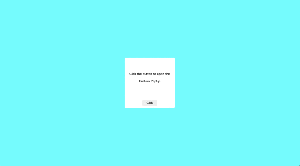
As you can see in the above output, with the Button’s click, the Pop Up is rendered, and a close icon is positioned right to the Modal to toggle the visibility.
Common Issues While Building Reactjs PopUp in production
Creating this prototype is easy, but the challenge comes when you tackle real-world problems such as:
- The user can click outside the Reactjs PopUp when it is open. This action can create numerous issues if you have activities behind your pop up that you don’t want the user to interact with. This issue is commonly known as the BackDrop problem.
- Another critical issue you can face in a real-world scenario is the event bubbling to its parents. Ideally, this should never occur as this can create a bad user experience. It can also produce unexpected output to the user. One good example of this issue is Scrolling. Let’s say your Reactjs PopUp has a child who has an overflowing height, and you want the user to scroll within the PopUp. Once the user reaches the end of the scroll, the event will bubble up to its Parent, and in case if Parent has an overflowing height, that will start to scroll.
These issues can have a significant impact on the user experience. Let us go through the ways by which you can avoid these problems.
Fixing the backdrop Problem
An essential aspect of creating a Reactjs PopUp is not to let users click anything behind the PopUp. This depends on the dimension of the Reactjs PopUp container and might not be a problem for developers who are occupying a significant portion of the Viewport. But, on the other side, most of the PopUps are small in size and are meant to render information within their boundary.
So, how can we restrict the user from not interacting with what is behind the PopUp?
Well, there are numerous ways you can do this. You can either disable the rest of the DOM Elements while the Reactjs PopUp is open, but this is not an efficient way as the browser will get occupied traversing the entire DOM tree whenever the PopUp toggles. The best and most widely used method is introducing a full 100vh * 100vw Parent to the PopUp whose background is as light as possible. Developing this way can also add good UX because you are adding a dim light on the Reactjs PopUp backdrop when it opens, letting the users know that you can’t do anything outside.
Now the question comes, how can you do this. Let me guide you through that.
const StyledPopUpBackdrop = styled.div`
 position: fixed;
 height: 100%;
 width: 100%;
 display: flex;
 align-items: center;
 justify-content: center;
 background: #f7f1f185;
 left: 0;
 top: 0;
 display : none;
 &.show-modal {
   display: flex;
 }
`;

const StyledPopUp = styled.div`
 display : flex;
 align-items: center;
 justify-content: center;
 height: 10rem;
 width: 30rem;
 background: rgba(255, 255, 255, 0.25);
 box-shadow: 0 8px 32px 0 rgba(31, 38, 135, 0.37);
 backdrop-filter: blur(7px);
 -webkit-backdrop-filter: blur(7px);
 border-radius: 10px;
 border: 1px solid rgba(255, 255, 255, 0.18);
`;
Here, StyledCustomBackdrop is the Parent of the Reactjs PopUp StyledPopUpPositioned fixed to the main Parent ( could be your body or a grand-parent ). StyledCustomBackdrop is taking the entire Viewport, and the main display PopUp that we see in the gif above is where the information is showing. This way, you are restricting the user not to do anything outside the Reactjs PopUp as StyledCustomBackdrop stacks the outside elements.
Fixing the Event Problem:
As you read above, the problem occurs when the event bubbles to the next Parent till the way to the top. This bubbling can’t be termed a problem but is a normal behaviour of how events delegate within the DOM tree, which sometimes creates problems when developing any PopUp. So, the idea is to restrict the events bubbling from the Reactjs PopUp and will only reside inside it.
Let us attach three-click event listeners to the Reactjs PopUp and its corresponding parents.
useEffect(() => {
   if (document.getElementById("popup")) {
     document.getElementById("popup").addEventListener(
       "click",
       (e) => {
         console.log("popup");
       },
       false
     );
   }

   if (document.getElementById("backdrop-parent")) {
     document.getElementById("backdrop-parent").addEventListener(
       "click",
       (e) => {
         console.log("backdrop-parent");
       },
       false
     );
   }

   if (document.getElementById("grand-parent")) {
     document.getElementById("grand-parent").addEventListener(
       "click",
       (e) => {
         console.log("grand-parent");
       },
       false
     );
   }
 }, []);
Note: All the listeners attached are within the useEffect because you dont want to connect multiple listeners to the same element whenever a render cycle occurs.
Just for a brief, Event delegation is a process by which events bubbles to the top. For every listener attached, you can specify this phenomenon. By adding false as the third parameter, you let the events bubble up from the container, and with True, you are Trickling them. Event delegation follows the Bubbling process. I would highly recommend you read about them because they are fundamental concepts to know about in JavaScript.
Now that you know about the delegation process, you are more likely to understand that when you click on the Reactjs PopUp ( the innermost child element ), the event will bubble to the BackDrop Parent and the Main Parent. To restrict this, all you need to do is to stop this propagation of events from the Reactjs PopUp to the next Parent. So, you need to add event.stopPropagation() to the PopUp’s attached click listener.
useEffect(() => {
   if (document.getElementById("popup")) {
     document.getElementById("popup").addEventListener(
       "click",
       (e) => {
	  e.stopPropagation();
         console.log("1");
       },
       false
     );
   }

   if (document.getElementById("backdrop-parent")) {
     document.getElementById("backdrop-parent").addEventListener(
       "click",
       (e) => {
         console.log("2");
       },
       false
     );
   }

   if (document.getElementById("grand-parent")) {
     document.getElementById("grand-parent").addEventListener(
       "click",
       (e) => {
         console.log("3");
       },
       false
     );
   }
 }, []);
Tackling these two problems are very important while developing PopUps in React. These fundamental ideas decrease the chances of bugs and create a good user experience. But in case of strict timelines within your Project, you would not get so to think about these issues unless you are experienced. Let us see a PopUp Library developed by the React Community itself, which takes care of all these issues and adds more value to your simple react Popup Component.
Reactjs PopUp Using Bootstrap
React Bootstrap PopUps are a widely used library-based PopUp Component and is simple to use. This library comes up with different options that make it even more robust. A few of them are :
- Full-Screen Mode
- Focus Control
- Position Control
- Access to various events on multiple actions like exit and open of PopUp.
- Scrollable or Non-Scrollable
- Size, etc..
Summing Up Reactjs PopUp
In Summary, it all depends on the use cases. Sometimes for simple PopUps, developing a custom is a good idea. It gives you control over the react Component, and you can play around with it. But if your use case is vast, having large and dynamic data, React BootStrap Popups are the best you can integrate into your Project. Many other open source libraries are available, but it is best to use the popular ones widely used among the developers. I hope this blog must have helped you get clear insights about PopUps and has given you a helpful guide.
Moreover, if you want to read more React js content visit the CopyCat blog or check out our tool that turns Figma to React with the click of a button. Building user interfaces will be quicker and less painful by using our smart reusable components.
Interesting Reads From Our Blogs
- Complete Guide to React Lazy Loading and Code Splitting
- React UseRef: Create Scalable Apps That Perform Like a Dream
- Create Responsive, UI Components-Based UI Elements Like a Pro with Reactjs Bootstrap
- Create Smooth and Easy React Navigation
- React Router Redirect: How to Use in Your App
Related Articles
-
 React.js
Creating a Dropdown Selection in React Using Material UI Select
Introduction MUI provides more than enough available styled components to assist developers in making their designs more artistic and pleasing. One of these available styled components is the Material UI Select. It is an input that comes with configurable props…
December 16, 2022 -
React.js
A Great Guide To Using Material UI Textfield Efficiently
Introduction We use TextFields everywhere across different parts of web applications, whether it is when filling out a form, a message box, or areas that allow users to enter and edit text. And depending on the areas where a TextField…
November 29, 2022


