
 December 16, 2022
  Temitope Asama


Introduction
Over the years, modern development has evolved from simple and basic layouts with floats and clears to more dynamic, complex and almost fluid-like responsive layouts.
In line with this evolution, tools employed to create these layouts have also evolved. One of these advanced layout tools is the Grid.
In this article, we’ll be walking through the Bootstrap Grid System, its components, as well as how to use it in our applications.
However, before we proceed, I’d like to introduce you to a cool plugin for your React projects. Copycat cuts down your development time by almost 35% by converting your Figma files to up-and-running React projects! Not only that, but it also has support for your favorite tools like Typescript, Bootstrap, and TailwindCSS, amongst others! Check it out here!
Moving on, we can start by understanding the Bootstrap Grid System.
What is Bootstrap Grid?
Bootstrap grid is a robust system for creating mobile-first, responsive and flexible layouts. Using it, a developer may arrange items into columns and rows. It’s a highly comprehensive tool with lots of possibilities.
Built upon the CSS Grid Layout, Bootstrap Grid excels in dividing a page into key areas or defining the connection between pieces of a control constructed from HTML primitives in terms of size, position, and layer.
The Grid is a much greater improvement from HTML tables. Therefore, a far greater number of layouts are either conceivable or simpler than they were with tables.
Bootstrap Grid Classes
There are six pre-defined grid classes in the Bootstrap 5 grid system:
- sm (for tablets – displays or devices with screen width greater than or equal to 567 pixels.)
- md (for smaller laptops – displays or screens greater than or equal to 768 pixels)
- lg (for laptops and desktops – displays or screens greater than or equal to 992 pixels wide)
- xl (for screens greater than or equal to 1200 pixels)
- xxl (for screens greater than or equal to 1400 pixels)
The aforementioned classes can be combined to create more dynamic and adaptable layouts as we will soon see in the following sections.
Getting Started With Bootstrap’s Grid System
Getting started with Bootstrap’s grid system is fairly easy.
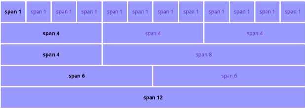
The Bootstrap Grid System is a twelve-column system, i.e. supports up to 12 grid columns per page. You may use each one alone or merge them to create even broader grid columns. You may also use any combination of numbers of columns as long as they add up to 12.
To enable all of these features, Bootstrap provides a set of predefined grid classes to enable proper alignment.
Below are some basic rules to guide you.
Rules Guiding The Use of Bootstrap Grid
A few rules guide the use of Bootstrap Grid. They are as follows;
- For appropriate alignment and padding, rows must be contained within a .container (fixed-width) or .container-fluid (full-width).
- Use rows to create horizontal groupings of columns.
- Columns should include content; only columns may be rows’ direct children.
- Predefined classes like .row and .col-sm-* may be used to create grid layouts easily.
- Padding in columns results in gutters (spaces between column content). Negative margins on .rows is used to counterbalance that padding in rows for the first and last columns.
- You may build unequal or equal columns by indicating how many of the 12 available columns you want to span.
- Column widths are always flexible and proportioned in relation to their parent element since they are expressed as percentages.
Container
The container is the root (top-level) element of the Bootstrap grid. It may appear insignificant or unnecessary at first, yet it’s crucial for regulating layout width. Bootstrap offers two different classes (types) of containers:
- container-fluid
<div class=”container-fluid”>
.container-fluid creates a full-width container that spans the entire viewport width.
- container
<div class=”container”>
.container creates a fixed-width container centered in the middle of the viewport.
Let’s demonstrate this with a simple code snippet;
<div class="container bg-info">
        <h1>Hello CopyCat</h1>
        <h2>This is my Bootstrap Grid using the .container class</h2>
      </div>

      <br/>
      <br/>

      <div class="container-fluid bg-info">
        <h1>Hello CopyCat</h1>
        <h2>This is my Bootstrap Grid using the .container-fluid class</h2>
      </div>
Below is the output of the code above;
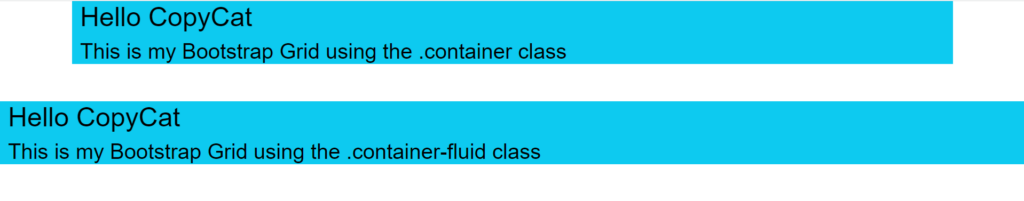
On smaller devices, the container‘s width scales down responsively until it reaches 100% width (the same as container-fluid).
The .row and .col-* (rows) and the Bootstrap containers (.container or .container-fluid) together form “the grid.”
Rows
Rows must be put within a container or container-fluid for appropriate alignment and padding. They are used to horizontally align columns or form horizontal groups of columns.
The .row class is used within the container to encapsulate the grid columns. To guarantee adequate spacing between the page content and the edge of the browser, rows should always be put inside of a container (.container or .container-fluid).
A row will overflow beyond the viewport if it is not contained inside a container, resulting in a horizontal scrollbar.
Columns
Columns (col-*) complete the link between .container and .row. Each row is separated horizontally by utilizing the column classes col-* from Bootstrap. Only columns should be rows’ direct children. The page’s horizontal layout is essential since screen width is crucial in responsive design.
You may build grid columns by indicating how many of the twelve available columns you want to span. Therefore, with this flexibility, we can afford equal-width columns as well as irregular or unequal columns.
For instance, three “col-sm-4” creates three equal-width columns, each spanning 4 of the 12 grid columns available like below;
export default function App() {
  return (
    <div className="App">
      <div class="container">
        <div class="row">
            <div class="bg bg-primary w-100">
                First row
            </div>
        </div>
        <div class="row">
            <div class="col-sm-4 bg bg-info border border-primary">
                Second row
            </div>
            <div class="col-sm-4 bg bg-info border border-primary">
                Second row
            </div>
            <div class="col-sm-4 bg bg-info border border-primary">
                Second row
            </div>
        </div>
        <div class="row">
            <div class="bg bg-primary w-100">
                Third row
            </div>
        </div>
        <div class="row">
            <div class="bg bg-info w-100">
                Fourth row
            </div>
        </div>
        <div class="row">
            <div class="bg bg-primary w-100">
                Fifth row
            </div>
        </div>
    </div>
    </div>
  );
}
Breakpoints
In addition to the idea of column width, Bootstrap’s grid system also includes several predefined grid classes or “breakpoints.” There are currently six sizes of the Bootstrap grid system to accommodate various screen (or viewport) widths.
Each grid’s “size” includes a variety of widths that are intended to best fit the screens of common devices, including desktops, laptops, tablets, and smartphones. Bootstrap provides responsive breakpoints that set a limit for each grid size using CSS media queries.
These predefined grid classes allow you to alter the column arrangement to better suit various screen sizes and devices, which is essential to responsive design.
There are six breakpoint-specific column classes to this effect;
- For devices with screens smaller than 576 pixels, such as smartphones, there’s no class infix as it is the default grid class.
- The sm class is used as a breakpoint for devices with screens greater than or equal to 567 pixels.
- The md class for screens greater than or equal to 768 pixels.
- The lg class works for screens greater than or equal to 992 pixels, and finally, the xl and xxl classes work for screens greater than or equal to 1200 pixels and screens greater than or equal to 1400 pixels, respectively.
In order to build distinct column layouts on various devices, the different breakpoints are coupled with the column classes. Col-md-3, for instance, would be 25% wide on medium-sized displays, but col-xl-6, when added, would make the same column 50% wide on larger screens.
Simply define the grid size using the proper col-*-* class in your HTML code to activate or “use” it.
Take a column like the one below;
<div class="col-md-3">..</div>
The column specified above takes up 25% of screen space on medium devices.
We could likewise have another that takes up 50% of screen space on smaller devices like the below;
<div class="col-sm-6">..</div>
However, we could combine both classes and create a column that will take up 25% of screen space on medium devices and 50% of screen space on smaller devices like the below;
<div class="col-sm-6 col-md-3">..</div>
Noteworthy information concerning breakpoints and grid sizes:
- Unless you provide a special col-xs-* class in your HTML code, columns will stack vertically (and expand to fill the screen) on xs displays. Avoid vertical stacking by using xs.
- Unless overridden, especially for bigger displays, the smaller grid classes likewise apply to larger screens. Hence,
<div class=”col-md-6"></div>
is practically equivalent to
<div class=”col-md-6 col-lg-6"></div>
..and if you just want to support a particular device width, you only need to apply the class for that width.
Advanced Bootstrap Layouts
As you experiment with several complex responsive layouts, you discover that some situations necessitate more intricate arrangements of rows and columns in order to “fit” on various devices.
We’ll walk through some of these layouts.
Column Offsets
You may reposition columns to the right or add additional whitespace to the left by using the grid’s offset feature. This is useful when you desire a narrower, centered layout.
Here is an example of a 2-33% width column with individual offsets.
export default function App() {
  return (
    <div className="App">
      <div className="container">
      <div class="row">
        <div class="col-md-4 offset-md-1 bg bg-info"> 1 </div>
        <div class="col-md-4 offset-md-6 bg bg-primary"> 2 </div>
      </div>
    </div>
    </div>
  );
}
A video of this in action can be found here;
https://capture.dropbox.com/LDpnYbhGx7D6mCme
Column Wrapping
Once in a while, you may find that a single .row element has to have columns longer than 12 units while building responsive layouts. Consider a layout where we want three columns on bigger devices and two on smaller devices, for instance.
Our markup would look something like this;
export default function App() {
  return (
    <div className="App">
      <div class="container">
          <div class="row">
            <div class="col-sm-6 col-md-4 bg bg-primary"> x </div>
              <div class="col-sm-6 col-md-4 bg bg-secondary"> x </div>
              <div class="col-sm-6 col-md-4 bg bg-info"> x </div>
              <div class="col-sm-6 col-md-4 bg bg-primary"> x </div>
              <div class="col-sm-6 col-md-4 bg bg-secondary"> x </div>
              <div class="col-sm-6 col-md-4 bg bg-info"> x </div>
          </div>
    </div>
    </div>
  );
}
The markup above shows that there are more than 12 total column units in the row.
How are they managed if the Bootstrap grid system only provides a 12-column grid?
The answer to this question would be column wrapping. Column wrapping is one of Bootstrap’s most potent responsive web design features.
According to the Bootstrap docs:
“If more than 12 columns are placed within a single row, each group of extra columns will, as one unit, wrap onto a new line”
This is important to responsive web design as sibling columns automatically resize in response to available screen space.
Thus, having more than 12 units in a row is acceptable and supported by Bootstrap for responsive layouts. Read more about it here.
Check out a live demo of this feature in action here.
Here’s a video tutorial on column wrapping for better understanding: https://www.youtube.com/watch?v=Je-GL71hNgU
Bootstrap Grid: Nesting Grid Columns
Many scenarios necessitate the use of columns within columns, in which case our columns act as containers. By allowing us to nest row and col-* within another col-*, Bootstrap gives us more control over how vertically stacked columns behave at particular breakpoints.
You may nest the intended smaller device layout inside the desired larger layout if you keep in mind to “think mobile-first.” When columns stack vertically on tiny devices, this feature allows the columns to alter locations (change the order).
Take the code snippet below, for example;
export default function App() {
  return (
    <div className="App">
      <div className="container">
        <div className="row">
            <div class="col-sm-6 col-md-3
                    col-lg-4 col-xl-6">
                <div class="bg bg-success">
                    First Column
                </div>
            </div>
            <div class="col-sm-6 col-md-3
                    col-lg-4 col-xl-6">
                <div class="bg bg-danger">
                    second Column
                    <div class="row">
                        <div class="col-md-3 col-lg-4 col-xl-6">
                            <div class="bg bg-success">
                                First Nested Column
                            </div>
                        </div>
                        <div class="col-md-3 col-lg-4 col-xl-6">
                            <div class="bg bg-primary">
                                Second Nested Column
                            </div>
                        </div>
                    </div>
                </div>
            </div>
        </div>
    </div>
    </div>
  );
}
The output of this example is below;
https://capture.dropbox.com/V98adhOIHZmAdrvE
Tip: Always put another row around the inner columns when nesting to guarantee adequate padding and spacing. Inner rows shouldn’t have more than 12 columns, either.
Here’s a video tutorial on nested rows and columns with Bootstrap grid:
Ordering (Push-Pull)
It is often preferred to stack columns vertically on smaller screens (such as tablets and phones) where horizontal space is constrained. The most prevalent use case for column ordering may be seen on a normal 2-column page layout. We can use the Bootstrap grid’s column ordering functionality by using the col-*-push-* and col-*-pull-* CSS classes. We may display our primary content at the top and the sidebar navigation below on tiny (mobile) devices. This also benefits SEO because the main content is closer to the top of the page when the Google bot indexes it.
export default function App() {
  return (
    <div className="App">
      <div className="container">
        <div className="row">
          <div className="col-sm-9 col-sm-push-3"> main content </div>
          <div className="col-sm-3 col-sm-pull-9"> sidebar </div>
        </div>
      </div>
    </div>
  );
}
With the code above, we would have the following output;
https://capture.dropbox.com/vBVBZjbIMHzZcodF
It’s crucial to keep in mind that you can alter the order of columns using both push/pull classes and nesting. Additionally, it’s essential to think mobile-first. The markup should be created for the intended small screen layout and adjusted for the desired large screen layout.
A better alternative to Ordering in Bootstrap might be using Flexbox (grid columns are quite tricky to order compared to flex columns) instead of Bootstrap’s basic grid system.
FAQ
Why does Bootstrap use negative margins?
There are spaces, or “gutters,” surrounding each column in every grid layout. Bootstrap uses padding of 15 pixels around each column to create the gutter. The actual gutter was presented as a 30-pixel space between adjacent columns. To maintain even spacing, the outside columns (leftmost & rightmost) must have half of the gutter (15px) on the outside.
Bootstrap employs negative margins on those outside grid columns rather than a distinct class like “.first” or “.last.” This aligns the gutters of the left and right edges of the two outermost columns with the container’s outside boundary, .row.
Conclusion
As you can see, the Bootstrap grid is a strong, well-built grid system of containers, columns, and rows that enables us to create incredibly adaptable responsive layouts. Its alignment abilities are almost limitless and will be a great addition to your projects.
At CopyCat, we have a robust collection of easy-to-grasp React and Bootstrap articles to aid your development.
A few of them are;
- Most Accessible Guide To Using React Bootstrap Button
- Your Comprehensive Guide To Bootstrap Forms
- Reactjs Bootstrap: How To Use Bootstrap In React.js?
Check them all out here.
Related Articles
-
 React.js
An In-depth Explanation of React Ref With Examples
React-createref-DOM-featured-image Introduction to React Ref Like many other UI libraries, React offers a way to rethink a view resulting from a component's state with React Ref. This is a significant pivot away from how we usually build applications. When we…
June 30, 2022 -
React Best Practices
How React.js CDN Makes Your Life Incredibly Easier
Introduction Setting up a React Project sometimes comes with time-consuming steps, especially when you are a beginner to the React ecosystem. You need to worry about npx, create-react-app, accurate npm version, React associated libraries, etc. However, ReactJs CDN makes your…
April 1, 2022

