 November 29, 2022
  Faith Ajayi


A modal(also known as a modal window or lightbox) is a web page element that shows in front of and disables all other page content. The user must interact with the modal either by performing an action on it or closing it to get back to the main content.
Modals are frequently used on websites and applications to draw users’ attention to a crucial action or piece of information.
At the end of this article, you will know:
- What a React modal is.
- How to build a modal in React.
- Different ways of implementing a modal in React.
Prerequisites
To get the most out of this article, you need the following:
- Working knowledge of React and React hooks.
- Working knowledge of bootstrap CSS and tailwind CSS.
How to Implement a Modal in React?
There are numerous ways to implement modals in React, but this article focuses on implementing modals in 3 ways, namely;
- Implementing it as a modal component.
- Implementing it in a component as a div or section.
- Implementing a React modal using an external library.
Note: A running React application is required to start this process. You may consider checking out, how to set up a React app.
1. Implementing as a Modal Component
One of React’s major building blocks is the component. Writing clean and neat code is a major factor every developer considers; it is good practice to avoid extremely long lines of code that would seem difficult to read.
Building React components can be time-consuming and exhausting. You can create scalable React components with speed with tools like Copycat React.js Co-pilot etc. Based on the content and length of a modal, we separate the modal as a component itself.
The different methods of implementing modals as modal components in React are below:
A. Implementing as a modal component using React hooks.
B. Implementing as a modal component using Tailwind CSS.
C. Implementing as a modal component using Bootstrap CSS.
A. Implementing as a Modal Component using React Hooks
Hooks are functions that enable functional components to “hook into” react state and lifecycle characteristics. Hooks do not work in class-based components.
Step 1: Creating a new Component
Create a new file and name it modal.js.
The new file, modal.js would contain the following lines of codes.
```js
import React from "react";
const Modal = ({ toggleModal }) => {
return (
<div>
<div className="modal">
<div className="modal-content">
<header>
<div className="close">
<span className="close-btn" onClick={() => toggleModal(false)}>
×
</span>
</div>
<h1>Modal Title</h1>
</header>
<body>
<p>Modal content</p>
</body>
<footer>
<button onClick={() => toggleModal(false)}>Close</button>
</footer>
</div>
</div>
</div>
);
}
export default Modal;
Understanding the code logic
The above component is a react functional component that builds up the modal component. In the above component the following functionalities are:
i. The prop “toggleModal” is passed in order to notify the modal component whenever the React hook (useState) which is responsible for handling the opening and closing of the modal is updated.
ii. The click function is responsible for closing the modal when the modal component is in view. The click function sets the value of the prop “toggleModal” to false, which in turn notifies the react useState hook.
Step 2: Importing and making use of the React Modal Component
The created modal component can be imported and made use of from other parent components and rendered conditionally by triggering an event (in this article an onClick event is used) that notifies the react useState hook.
Example:
```js

import logo from './logo.svg';
import './App.css';
import React from 'react';
import { useState, useEffect } from 'react';
import Modal from './components/modal';


function App() {
  const [showModal, setShowModal] = useState(false);
  return (
    <div className="App">
      <header className="App-header">
        <img src={logo} className="App-logo" alt="logo" />
        <p>
          Edit <code>src/App.js</code> and save to reload.
        </p>
        <a
          className="App-link"
          style={{ cursor: "pointer" }}
         onClick={() => setShowModal(true)}
        >
          Launch Modal
        </a>
      </header>
     {
        showModal ? <Modal className="fade-up" toggleModal={setShowModal} /> : null
     }
    </div>
  );
}


export default App;
You can observe the live demo or look at the implementation’s source code in its github repository for a better understanding.
B. Implementing as a Modal Component using Tailwind CSS
Write code in your application faster and maintained quicker with Tailwind CSS. Using this utility-first framework will result in no necessity to create any unique CSS to lay out your application. Instead, you may manage your application’s padding, margin, color, font, shadow, and other characteristics using utility classes.
Note: Tailwind CSS must be configured and installed before it could be used in the application. However, you could check out Tailwind’s configuration and installation guide.
Step 1: Creating a new Component
Create a new file and name it modal.js.
The new file, modal.js would contain the following line of codes;
```js

import React from "react";

const Modal = ({ id, closeModalFunction }) => {

    return (

        <>
            {/* Main modal  */}
            <div id={id} tabIndex="-1" aria-hidden="true" className={`hidden overflow-y-auto overflow-x-hidden fixed top-0 right-0 left-0 z-50 w-full md:inset-0 h-modal md:h-full`}>
                <div className="relative p-4 w-full max-w-2xl h-full md:h-auto">
                    {/* Modal content  */}
                    <div className="relative bg-white rounded-lg shadow dark:bg-gray-700">
                        {/* Modal header */}
                        <div className="flex justify-between items-start p-4 rounded-t border-b dark:border-gray-600">
                            <h3 className="text-xl font-semibold text-gray-900 dark:text-white">
                                Terms of Service
                            </h3>
                            <button
                                onClick={closeModalFunction}
                                type="button" className="text-gray-400 bg-transparent hover:bg-gray-200 hover:text-gray-900 rounded-lg text-sm p-1.5 ml-auto inline-flex items-center dark:hover:bg-gray-600 dark:hover:text-white" data-modal-toggle={id}>
                                <svg aria-hidden="true" className="w-5 h-5" fill="currentColor" viewBox="0 0 20 20" xmlns="http://www.w3.org/2000/svg"><path fillRule="evenodd" d="M4.293 4.293a1 1 0 011.414 0L10 8.586l4.293-4.293a1 1 0 111.414 1.414L11.414 10l4.293 4.293a1 1 0 01-1.414 1.414L10 11.414l-4.293 4.293a1 1 0 01-1.414-1.414L8.586 10 4.293 5.707a1 1 0 010-1.414z" clipRule="evenodd"></path></svg>
                                <span className="sr-only">Close modal</span>
                            </button>
                        </div>
                        {/*  Modal body  */}
                        <div className="p-6 space-y-6">
                            <p className="text-base leading-relaxed text-gray-500 dark:text-gray-400">
                                With less than a month to go before the European Union enacts new consumer privacy laws for its citizens, companies around the world are updating their terms of service agreements to comply.
                            </p>
                            <p className="text-base leading-relaxed text-gray-500 dark:text-gray-400">
                                The European Union’s General Data Protection Regulation (G.D.P.R.) goes into effect on May 25 and is meant to ensure a common set of data rights in the European Union. It requires organizations to notify users as soon as possible of high-risk data breaches that could personally affect them.
                            </p>
                        </div>
                        {/* <!-- Modal footer --> */}
                        <div className="flex items-center p-6 space-x-2 rounded-b border-t border-gray-200 dark:border-gray-600">
                            <button
                                onClick={closeModalFunction}
                                data-modal-toggle={id} type="button" className="text-white bg-blue-700 hover:bg-blue-800 focus:ring-4 focus:outline-none focus:ring-blue-300 font-medium rounded-lg text-sm px-5 py-2.5 text-center dark:bg-blue-600 dark:hover:bg-blue-700 dark:focus:ring-blue-800">I accept</button>
                            <button
                                onClick={closeModalFunction}
                                data-modal-toggle={id} type="button" className="text-gray-500 bg-white hover:bg-gray-100 focus:ring-4 focus:outline-none focus:ring-blue-300 rounded-lg border border-gray-200 text-sm font-medium px-5 py-2.5 hover:text-gray-900 focus:z-10 dark:bg-gray-700 dark:text-gray-300 dark:border-gray-500 dark:hover:text-white dark:hover:bg-gray-600 dark:focus:ring-gray-600">Decline</button>
                        </div>
                    </div>
                </div>
            </div>
        </>
    );
}

export default Modal;
Understanding the code logic
The above component is a react functional component that builds up the modal component. In the above component the functionality made is that;
i. The prop id is passed in order to set the value for the data-modal-toggle attribute which would serve as the Id for the modal component.
ii. The prop closeModalFunction is passed to serve as the function that would be set onClick of the close buttons to close the modal component.
Step 2: Importing and making use of the React Modal Component
The created modal component can be imported and made use of from other parent components and rendered into view conditionally and by triggering a click event of which functionality would be simulated by tailwind CSS.
Example:
```js
import logo from './logo.svg';
import './App.css';
import React from 'react';
import Modal from './components/modal';

function App() {
  const targetEl = document.getElementById('defaultModal');
  // open and hide modaal
  const openModal = () => {
    targetEl.classList.remove('hidden');
  };
  const closeModal = () => {
    targetEl.classList.add('hidden');
  };

  return (
    <div className="App">
      <header className="App-header">
        <img src={logo} className="App-logo" alt="logo" />
        <p>
          Edit <code>src/App.js</code> and save to reload.
        </p>
        <button
          onClick={openModal}
          className="block text-white bg-blue-700 hover:bg-blue-800 focus:ring-4 focus:outline-none focus:ring-blue-300 font-medium rounded-lg text-sm px-5 py-2.5 text-center dark:bg-blue-600 dark:hover:bg-blue-700 dark:focus:ring-blue-800" type="button" data-modal-toggle="defaultModal">
          Toggle modal
        </button>
      </header>
      <Modal
        className="fade-up"
        id={"defaultModal"}
        closeModalFunction={closeModal}
      />
    </div>
  );
}

export default App;
Understanding the code logic
Note: The Id’s value passed has to be the exact value set for the button’s data-modal-toggle attribute.
In the above react functional component the functionalities made are;
i. The variable targetEl is created to store and get the id set for the modal component.
ii. The function openModal removes the tailwind class hidden from the modal component’s class list using the javascript classlist.remove. This function handles the logic for showing the modal component and rendering it into view.
iii. The function closeModal adds the tailwind class hidden to the modal component’s class list using the javascript classlist.add. This function handles the logic for hiding the modal component and rendering it out of view.
For a better understanding, see the live demo and implementation’s source code on its GitHub repository.
C. Implementing as a Modal Component using Bootstrap CSS
A well-liked front-end framework called Bootstrap, facilitates and speeds up web development. Bootstrap includes HTML and CSS-based design templates for typography, forms, buttons, tables, navigation, modals, picture carousels, and many more features in addition to optional JavaScript plugins. In addition to this, you can check out our CopyCat tool, which will enables you to create user interfaces more quickly. The CopyCat Figma Bootstrap plugin converts figma designs into fully supported, production-ready Bootstrap and React.js codes.
Note: Bootstrap CSS must be configured and installed before it could be used in the application. However, you could check out Bootstrap’s configuration and installation guide.
Step 1: Creating a new Component
The name of the new file will be modal.js.
The following line of code is found in the brand-new file, modal.js:
```js
import React from "react";
const Modal = ({ id }) => {
return (
<>
<div class="modal fade" id={id} tabindex="-1" role="dialog" aria-labelledby="exampleModalLabel" aria-hidden="true">
<div class="modal-dialog" role="document">
<div class="modal-content">
<div class="modal-header">
<h5 class="modal-title" id="exampleModalLabel">Modal title</h5>
<button type="button" class="close" data-dismiss="modal" aria-label="Close">
<span aria-hidden="true">×</span>
</button>
</div>
<div class="modal-body">
...
</div>
<div class="modal-footer">
<button type="button" class="btn btn-secondary" data-dismiss="modal">Close</button>
<button type="button" class="btn btn-primary">Save changes</button>
</div>
</div>
</div>
</div>
</>
);
};
export default Modal;
Understanding the code logic
The react functional component mentioned above creates the modal component. The above component has the functionality listed below:
i. The prop id is passed in order to set the value for the data-target attribute which would serve as the Id for the modal component.
Step 2: Importing and making use of the React Modal Component
The newly generated modal component can be imported, used, and conditionally brought into view from other parent components by generating a click event, the functionality of which would be emulated by bootstrap CSS.
Example:
```js
import logo from './logo.svg';
import './App.css';
import React from 'react';
import Modal from './components/modal';

function App() {
  return (
    <div className="App">
      <header className="App-header">
        <img src={logo} className="App-logo" alt="logo" />
        <p>
          Edit <code>src/App.js</code> and save to reload.
        </p>
<!-- Button trigger modal -->
<button type="button" class="btn btn-primary" data-toggle="modal" data-target="#exampleModal">
  Launch demo modal
</button>

  </header>
     <Modal className="fade-up" id={"exampleModal"} />
    </div>
  );
}
export default App;
Understanding the code logic
Note: The Id’s value passed has to be the exact value set for the button’s data-target attribute.
When we press a button with the attribute “data-target”, this technique of implementing a bootstrap modal feature provides conditionally renders a modal component.
View the live demo or look through the implementation’s source code on its github repository for a better understanding.
2. Implementing it in a Component as a Div or Section
Modals can also be implemented as part of a component and not compulsorily a component itself. However, this article would advise that modals with extremely large/bulky contents should be separated and transitioned as components. This article will go over different methods of achieving this.
A. Implementing React Modal in a Component using React Hooks
The following lines of code show this:
```js
import React from "react";
import { useState } from "react";
const Modal = () => {
const [showModal, setShowModal] = useState(false);
return (
<div>
<button onClick={() => setShowModal(true)}> Open Modal </button>
{showModal ? (
<div className="modal">
<div className="modal-content">
<div className="close">
<span className="close-btn" onClick={() => setShowModal(false)}>
×
</span>
</div>
<h1>Modal</h1>
<p>Modal content</p>
</div>
</div>
) : null}
</div>
);
}
export default Modal;
Understanding the code logic
In the above component the following functionalities are:
i. React useState hook is used in the above to handle the state that controls the rendering of the modal. It is imported and initiated.
ii. An onClick function that alters and notifies the react useState hook.
For a better knowledge, view the live demo or browse the implementation’s source code on its github repository.
B. Implementing React Modal in a Component using Tailwind CSS
The following lines of code show this:
```js
import React from "react";

const Modal = () => {

  const targetDivEl =  document.getElementById('defaultModalDiv');

  const openDivModal = () => {
    targetDivEl.classList.remove('hidden');
  };

  const closeDivModal = () => {
    targetDivEl.classList.add('hidden');
  };
    return (
<>
<!-- Modal toggle -->
     <button
          onClick={openDivModal}
          className="block my-2 text-white bg-blue-700 hover:bg-blue-800 focus:ring-4 focus:outline-none focus:ring-blue-300 font-medium rounded-lg text-sm px-5 py-2.5 text-center dark:bg-blue-600 dark:hover:bg-blue-700 dark:focus:ring-blue-800" type="button" data-modal-toggle="defaultModalDiv">
          Toggle Div modal
        </button>

     {/* Modal div */}

      <div id="defaultModalDiv" tabIndex="-1" aria-hidden="true" className={`hidden overflow-y-auto overflow-x-hidden fixed top-0 right-0 left-0 z-50 w-full md:inset-0 h-modal md:h-full`}>
                <div className="relative p-4 w-full max-w-2xl h-full md:h-auto">
                    {/* Modal content  */}
                    <div className="relative bg-white rounded-lg shadow dark:bg-gray-700">
                        {/* Modal header */}
                        <div className="flex justify-between items-start p-4 rounded-t border-b dark:border-gray-600">
                            <h3 className="text-xl font-semibold text-gray-900 dark:text-white">
                                Terms of Service
                            </h3>
                            <button
                                onClick={closeDivModal}
                                type="button" className="text-gray-400 bg-transparent hover:bg-gray-200 hover:text-gray-900 rounded-lg text-sm p-1.5 ml-auto inline-flex items-center dark:hover:bg-gray-600 dark:hover:text-white" data-modal-toggle="defaultModalDiv">
                                <svg aria-hidden="true" className="w-5 h-5" fill="currentColor" viewBox="0 0 20 20" xmlns="http://www.w3.org/2000/svg"><path fillRule="evenodd" d="M4.293 4.293a1 1 0 011.414 0L10 8.586l4.293-4.293a1 1 0 111.414 1.414L11.414 10l4.293 4.293a1 1 0 01-1.414 1.414L10 11.414l-4.293 4.293a1 1 0 01-1.414-1.414L8.586 10 4.293 5.707a1 1 0 010-1.414z" clipRule="evenodd"></path></svg>
                                <span className="sr-only">Close modal</span>
                            </button>
                        </div>
                        {/*  Modal body  */}
                        <div className="p-6 space-y-6">
                            <p className="text-base leading-relaxed text-gray-500 dark:text-gray-400">
                                With less than a month to go before the European Union enacts new consumer privacy laws for its citizens, companies around the world are updating their terms of service agreements to comply.
                            </p>
                            <p className="text-base leading-relaxed text-gray-500 dark:text-gray-400">
                                The European Union’s General Data Protection Regulation (G.D.P.R.) goes into effect on May 25 and is meant to ensure a common set of data rights in the European Union. It requires organizations to notify users as soon as possible of high-risk data breaches that could personally affect them.
                            </p>
                        </div>
                        {/* <!-- Modal footer --> */}
                        <div className="flex items-center p-6 space-x-2 rounded-b border-t border-gray-200 dark:border-gray-600">
                            <button
                                onClick={closeDivModal}
                                data-modal-toggle="defaultModalDiv" type="button" className="text-white bg-blue-700 hover:bg-blue-800 focus:ring-4 focus:outline-none focus:ring-blue-300 font-medium rounded-lg text-sm px-5 py-2.5 text-center dark:bg-blue-600 dark:hover:bg-blue-700 dark:focus:ring-blue-800">I accept</button>
                            <button
                                onClick={closeDivModal}
                                data-modal-toggle="defaultModalDiv" type="button" className="text-gray-500 bg-white hover:bg-gray-100 focus:ring-4 focus:outline-none focus:ring-blue-300 rounded-lg border border-gray-200 text-sm font-medium px-5 py-2.5 hover:text-gray-900 focus:z-10 dark:bg-gray-700 dark:text-gray-300 dark:border-gray-500 dark:hover:text-white dark:hover:bg-gray-600 dark:focus:ring-gray-600">Decline</button>
                        </div>
                    </div>
                </div>
            </div>
</>
    );
}

export default Modal;
For a better understanding, see the live demo and implementation’s source code on its GitHub repository.
C. Implementing React Modal in a Component using Bootstrap CSS
The following lines of code show this:
```js
import React from "react";
const Modal = () => {
return (
<button type="button" class="btn btn-primary" data-toggle="modal" data-target="#exampleModal">
Launch demo modal
</button>
<!-- Modal -->
<div class="modal fade" id="exampleModal" tabindex="-1" role="dialog" aria-labelledby="exampleModalLabel" aria-hidden="true">
<div class="modal-dialog" role="document">
<div class="modal-content">
<div class="modal-header">
<h5 class="modal-title" id="exampleModalLabel">Modal title</h5>
<button type="button" class="close" data-dismiss="modal" aria-label="Close">
<span aria-hidden="true">×</span>
</button>
</div>
<div class="modal-body">
...
</div>
<div class="modal-footer">
<button type="button" class="btn btn-secondary" data-dismiss="modal">Close</button>
<button type="button" class="btn btn-primary">Save changes</button>
</div>
</div>
</div>
</div>
);
}
export default modal;
View the live demo or browse the implementation’s source code on its github repository for more information.
3. Implementing a React Modal using an External Library
React.js has a thriving community that frequently generates a wide range of solutions. With a community like it, library integrations, UI elements, and solutions to development issues are frequently available as components. React libraries provide betterandfaster ways to create customized components.
There are different React libraries for creating customized components and functionalities. In this article, we would mention a few different external libraries in React, that would help in implementing a simple modal, namely:
- Rodal.
- Reactjs-Popup.
- React-modal.
- React-confirm-alert.
Rodal
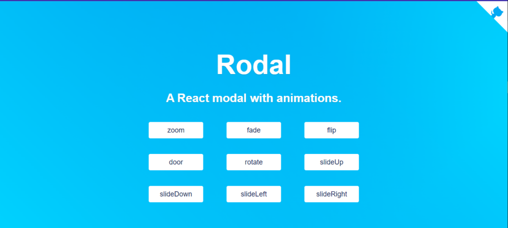
The open-source library Rodal, which has an emphasis on animations, is one of the few external libraries that are available in the React community.
This external library has nine different animation types:
- Rotate.
- SlideUp.
- SlideDown.
- SlideLeft.
- SlideRight.
- Flip.door.
- Fade.
Reactjs-Popup.
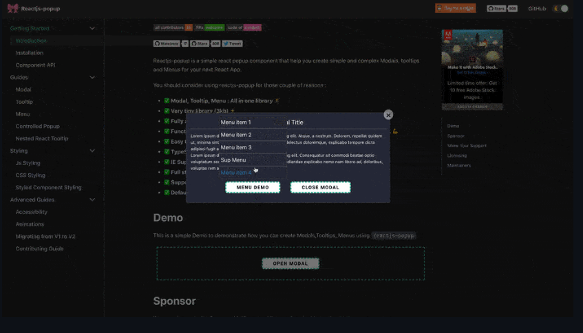
Reactjs. Pop-up is an external library that enables you to build both straightforward and intricate modals, tooltips, and menus for your next React application. It is a modern, well-kept external library.
This library provides two different types of modal components:
i. For use scenarios where a dialog box or popup is sufficient, a straightforward component is needed.
ii. A component with modifiable appearance, dimensions, and behavior.
React-modal
React-confirm-alert is an external library for web applications. It has an extended list of props to alter the modal component’s appearance and functionality
Conclusion
This article explained when to use a react modal, the different ways of implementing a modal in React, and the different methods required to do so. We also looked at the external libraries, and the different types available although they are still more.
If you’re looking for a cool React tool to help you write component code faster and be production ready then check out the CopyCat plugin for React. To find more interesting articles check out the Copycat blog here.
Related Articles
-
 Bootstrap
Using Bootstrap Card to Make Your React App Furiously Responsive
Introduction As mobile internet users continue to grow, developers need to build applications using lightweight technologies that support these mobile users. That's where Bootstrap Card comes in. Bootstrap is a free, open-source, mobile-first, and popular CSS framework that allows you…
October 31, 2022 -
React.js
Building Maps in React with react-leaflet Library
Make your developers' lives easier by using CopyCat, an AI that can convert your Figma designs into React, Tailwind, Bootstrap, and other popular CSS frameworks. Click here to check out the CopyCat plugin for Figma. Convert Design to Code with…
December 20, 2022


