 October 31, 2022
  Emmanuel Uchenna


- Introduction
- What is Bootstrap Card
- How to Create a Basic Bootstrap Card
- Using Different Content Types with Bootstrap Cards
- How to create Bootstrap Cards Group
- How to Resize A Bootstrap Card
- How to Resize Bootstrap Card Using Grid Markup
- Adding Navigation to Cards
- How to Use Bootstrap Card in React
- Top Questions
- Interesting Reads From Our Blogs
- Videos On React Bootstrap and Bootstrap Card
- Conclusion
Introduction
As mobile internet users continue to grow, developers need to build applications using lightweight technologies that support these mobile users. That’s where Bootstrap Card comes in.
Bootstrap is a free, open-source, mobile-first, and popular CSS framework that allows you to build responsive websites and web applications. Bootstrap can be used with almost any Single Page Application (SPA) library, such as React, Vue, Angular, and others. We wrote a guide on how you could set up Bootstrap with React, check it out.
In this guide, you will be walked through using Bootstrap card to layout contents on your website, how to customize your Bootstrap card to include images, titles, and links, and also how to resize your Bootstrap card.
Before we delve further, do check out our tool, CopyCat, which will help you to build UI effortlessly faster than anybody else. CopyCat Figma Bootstrap plugin converts your Figma designs to fully supported production-ready Bootstrap and React.js code.
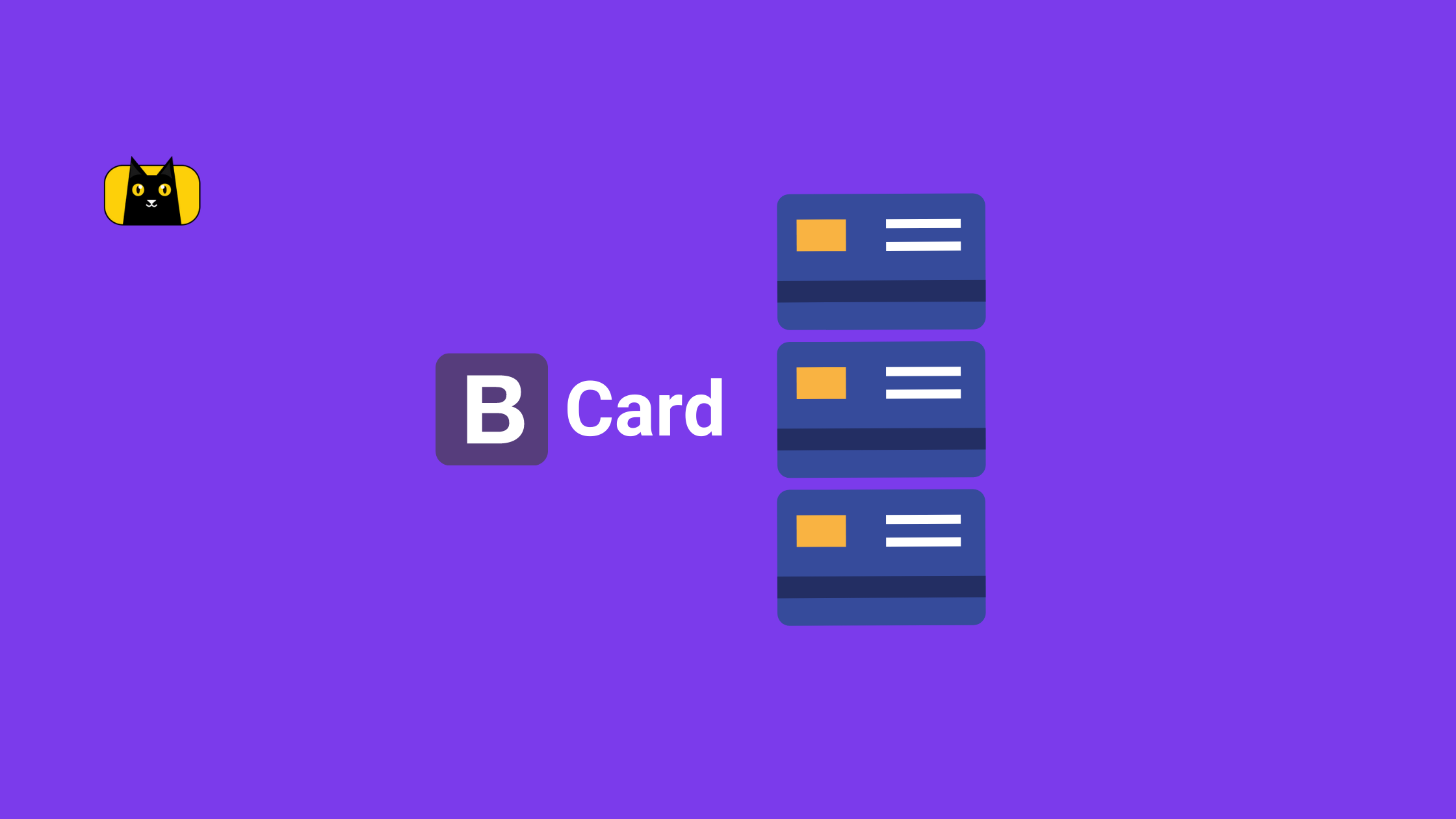
What is Bootstrap Card
Bootstrap card is a responsive and customizable mobile-friendly content container. It is essentially an element that wraps children’s elements providing tons of options for custom card images, headers, footers, contextual card background colors, and many other options such as card background colors.
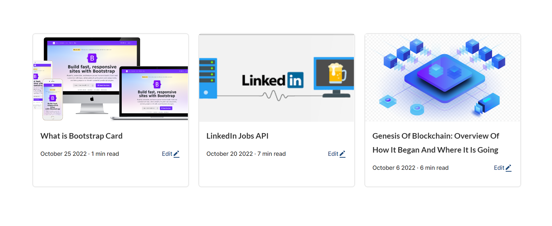
Cards can be used to group related content, such as on a page to display related content about an article, an image thumbnail, an article title, article preview text, and an article link.
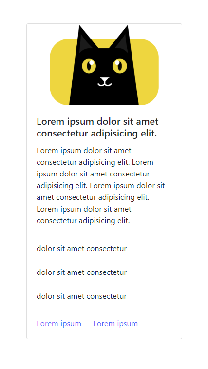
Below is an example of using Bootstrap cards to group articles on a webpage. To learn more about Bootstrap cards, see the official Bootstrap documentation.
How to Create a Basic Bootstrap Card
Bootstrap cards are created with as minimal markup as possible. Even though they are created with minimal markup, Bootstrap cards still provide you with a ton of options for its customization. Cards are built with flexbox as such, they offer responsiveness out of the box and can blend well with other Bootstrap components.
The snippet below shows an example of the markup needed for a basic Bootstrap card.
 <div class="card" style="width: 20rem;">
        <img class="card-img-top"
          src="https://user-images.githubusercontent.com/24845008/196540812-9a6fc861-6def-48d0-b6a3-37134e6a08e6.png"
          alt="Card image cap">
        <div class="card-body">
          <h5 class="card-title">Lorem ipsum dolor sit amet consectetur adipisicing elit.</h5>
          <p class="card-text">Lorem ipsum dolor sit amet consectetur adipisicing elit. Lorem ipsum dolor sit amet
            consectetur adipisicing elit. Lorem ipsum dolor sit amet consectetur adipisicing elit. Lorem ipsum dolor sit
            amet consectetur adipisicing elit.
          </p>

          <a href="https://www.copycat.dev/" class="btn btn-primary">dolor sit amet consectetur</a>
        </div>

        <div class="card-footer">
          Lorem ipsum, dolor sit amet consectetur adipisicing elit.
        </div>
      </div>
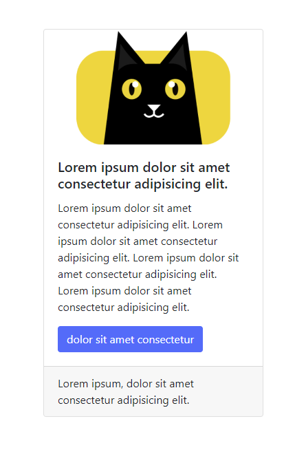
In the above snippet, 3 features are noticeable, these are:
- Card image: This you added by adding the card-img-top class to the img tag and then passing the image src to the img tag.
- Card body: This section contains the main content of Bootstrap cards. This is where you place the card title and card text.
- Card title: This contains the title of your card. You use the class card-title to set the title of your Bootstrap card.
- Card text: This refers to the main text seen on the Bootstrap card. To create a card text, inside the card body; `card-body`, you create an element and pass the `card-text` class to it.
- You are also able to use Bootstrap buttons in your cards. You use the btn-primary class in the snippet above to create a primary button. Bootstrap buttons allow a ton of customization to them by using btn classes. We wrote an article explaining how to create and customize your buttons with Bootstrap.
- Card footer: The card footer in Bootstrap card is the section where you place the ending contents of your card.
Using Different Content Types with Bootstrap Cards
You can add different contents to Bootstrap cards such as images, titles, texts, links, list groups, etc. Bootstrap card is flexible enough to contain all these contents.
In the following example, you will add the contents listed above to your card:
 <div class="card" style="width: 20rem;">
    <img class="card-img-top"
      src="https://user-images.githubusercontent.com/24845008/196540812-9a6fc861-6def-48d0-b6a3-37134e6a08e6.png"
      alt="CopyCat logo">
    <div class="card-body">
      <h5 class="card-title">Lorem ipsum dolor sit amet consectetur adipisicing elit.</h5>
      <p class="card-text">Lorem ipsum dolor sit amet consectetur adipisicing elit. Lorem ipsum dolor sit amet
      consectetur adipisicing elit. Lorem ipsum dolor sit amet consectetur adipisicing elit. Lorem ipsum dolor sit
      amet consectetur adipisicing elit.</p>
    </div>
    <ul class="list-group list-group-flush">
      <li class="list-group-item">dolor sit amet consectetur</li>
      <li class="list-group-item">dolor sit amet consectetur</li>
      <li class="list-group-item">dolor sit amet consectetur</li>
    </ul>
    <div class="card-body">
      <a href="https://www.copycat.dev/" class="card-link">Lorem ipsum</a>
      <a href="https://www.copycat.dev/" class="card-link">Lorem ipsum</a>
    </div>
  </div>
In the snippet above, in addition to the card image, card title, card text, and button, you added a list of group items. To add a list group of items, you used the class list-group list-group-flush on a ul element. Then each list item will have the class list-group-item.
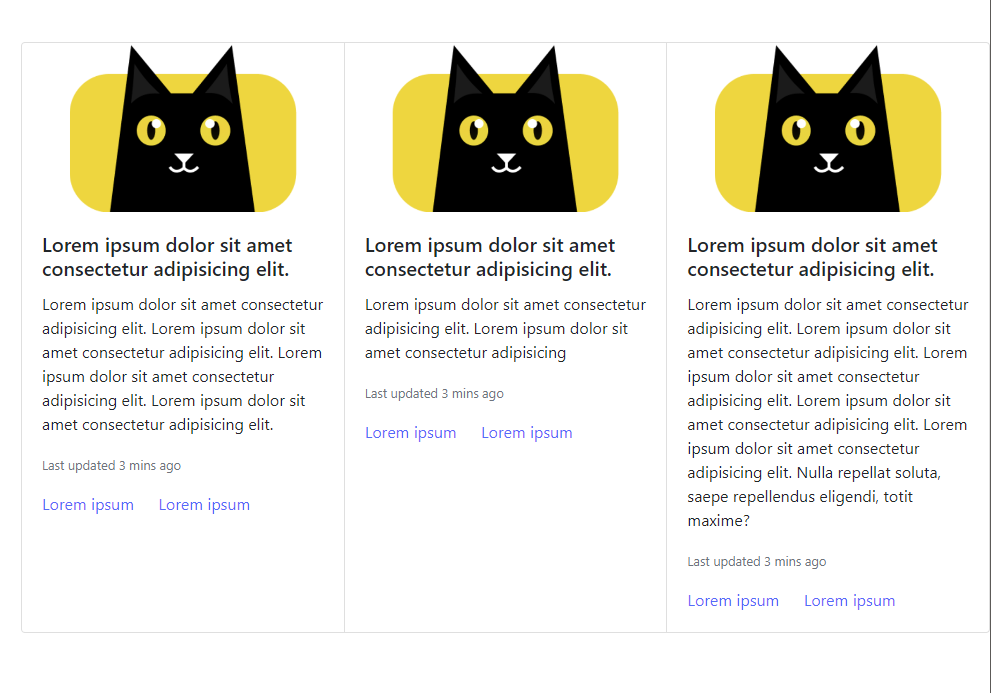
How to create Bootstrap Cards Group
So far, you have seen how to create a single Bootstrap card, but what about you want to create a group of cards? Bootstrap cards group are useful on blog pages where each card represents an article. You do not need to worry about responsiveness to your cards as Bootstrap takes care of that. Bootstrap makes use of its grid and utility classes to create its responsive cards.
The Bootstrap card components will represent the blog image, blog details, and blog link as card image, card body, and card link, respectively.
To create a Bootstrap card, wrap your single cards with a div element with the card-group class.
The snippet below demonstrates how to create a Bootstrap cards group. You wrap your initial single cards with a card-group class as a container.
<div class="card-group">

      <div class="card">
        <img class="card-img-top"
          src="https://user-images.githubusercontent.com/24845008/196540812-9a6fc861-6def-48d0-b6a3-37134e6a08e6.png"
          alt="CopyCat logo">
        <div class="card-body">
          <h5 class="card-title">Lorem ipsum dolor sit amet consectetur adipisicing elit.</h5>
          <p class="card-text">Lorem ipsum dolor sit amet consectetur adipisicing elit. Lorem ipsum dolor sit amet
            consectetur adipisicing elit. Lorem ipsum dolor sit amet consectetur adipisicing elit. Lorem ipsum dolor sit
            amet consectetur adipisicing elit.</p>
        </div>
        <ul class="list-group list-group-flush">
          <li class="list-group-item">dolor sit amet consectetur</li>
          <li class="list-group-item">dolor sit amet consectetur</li>
          <li class="list-group-item">dolor sit amet consectetur</li>
        </ul>
        <div class="card-body">
          <a href="https://www.copycat.dev/" class="card-link">Lorem ipsum</a>
          <a href="https://www.copycat.dev/" class="card-link">Lorem ipsum</a>
        </div>
      </div>

    </div>
How to Resize A Bootstrap Card
Bootstrap cards are responsive out of the box, thanks to the Bootstrap grid system that offers auto-scaling content to fit the available width. Cards do not assume any definite `width` or height, so they start with 100% width. You can change this behavior with your custom CSS, grid classes, grid Sass mixins, or utilities.
This section will teach you how to resize your Bootstrap cards using the grid markup, the Bootstrap utility classes, and custom CSS.
How to Resize Bootstrap Card Using Grid Markup
Bootstrap grid system provides responsive layout-ing and scaling of your cards in rows and columns as needed.
To resize Bootstrap Card using grid markup, you must wrap your cards in columns using `col-breakpoint-limit`, and then wrap everything with a row class like so. That is:
  <div class="row">
    <div class="col-sm-6 col-lg-4">
      <div class="card">
        <!-- Your card content goes here -->
      </div>
    </div>

    <div class="col-sm-6 col-lg-4">
      <div class="card">
        <!-- Your card content goes here -->
      </div>
    </div>

    <div class="col-sm-6 col-lg-4">
      <div class="card">
        <!-- Your card content goes here -->
      </div>
    </div>
  </div>
In the example below, you will create a grid with 3 cards for large screens and 2 cards for medium screens. This will result in a responsive container that will automatically scale to accommodate the cards.
 <div class="row">
      <div class="col-sm-6 col-lg-4">
        <div class="card">
          <img class="card-img-top"
            src="https://user-images.githubusercontent.com/24845008/196540812-9a6fc861-6def-48d0-b6a3-37134e6a08e6.png"
            alt="CopyCat logo">
          <div class="card-body">
            <h5 class="card-title">Lorem ipsum dolor sit amet consectetur adipisicing elit.</h5>
            <p class="card-text">Lorem ipsum dolor sit amet consectetur adipisicing elit. Lorem ipsum dolor sit amet
              consectetur adipisicing elit. Lorem ipsum dolor sit amet consectetur adipisicing elit. Lorem ipsum dolor
              sit
              amet consectetur adipisicing elit.</p>
          </div>
          <ul class="list-group list-group-flush">
            <li class="list-group-item">dolor sit amet consectetur</li>
            <li class="list-group-item">dolor sit amet consectetur</li>
            <li class="list-group-item">dolor sit amet consectetur</li>
          </ul>
          <div class="card-body">
            <a href="https://www.copycat.dev/" class="card-link">Lorem ipsum</a>
            <a href="https://www.copycat.dev/" class="card-link">Lorem ipsum</a>
          </div>
        </div>

      </div>
      <div class="col-sm-6 col-lg-4">
        <div class="card">
          <img class="card-img-top"
            src="https://user-images.githubusercontent.com/24845008/196540812-9a6fc861-6def-48d0-b6a3-37134e6a08e6.png"
            alt="CopyCat logo">
          <div class="card-body">
            <h5 class="card-title">Lorem ipsum dolor sit amet consectetur adipisicing elit.</h5>
            <p class="card-text">Lorem ipsum dolor sit amet consectetur adipisicing elit. Lorem ipsum dolor sit amet
              consectetur adipisicing elit. Lorem ipsum dolor sit amet consectetur adipisicing elit. Lorem ipsum dolor
              sit
              amet consectetur adipisicing elit.</p>
          </div>
          <ul class="list-group list-group-flush">
            <li class="list-group-item">dolor sit amet consectetur</li>
            <li class="list-group-item">dolor sit amet consectetur</li>
            <li class="list-group-item">dolor sit amet consectetur</li>
          </ul>
          <div class="card-body">
            <a href="https://www.copycat.dev/" class="card-link">Lorem ipsum</a>
            <a href="https://www.copycat.dev/" class="card-link">Lorem ipsum</a>
          </div>
        </div>

      </div>
    </div>
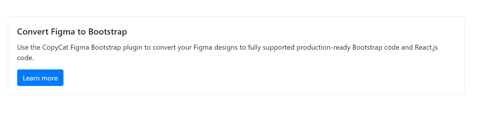
How to Resize Bootstrap Card Using Bootstrap Utilities Classes
Bootstrap provides 5 sizing utility classes to quickly set your card’s width. These utility classes are: w-25, w-50, w-75, w-100, w-auto that translate to width 25%, width 50%, width 75%, width 100% and width auto respectively.
To use a utility class to scale your card responsively, simply add the desired utility class with the `card` class like so. In the snippet below, you set your card width to `75%`.
<div class="card w-75">
    ...
 </div>
The example below demonstrates how to use Bootstrap utility classes on your card.
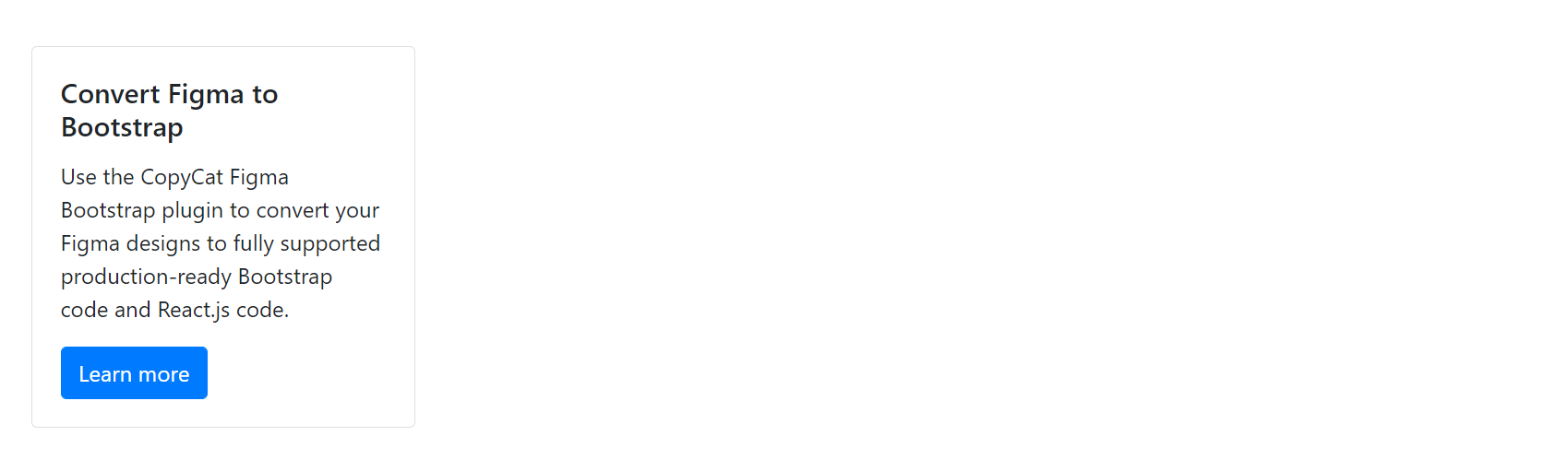
<div class="card w-auto">
<div class="card-body">
<h5 class="card-title">Convert Figma to Bootstrap</h5>
<p class="card-text">Use the CopyCat Figma Bootstrap plugin to convert your Figma designs to fully supported production-ready Bootstrap code and React.js code.</p>
<a href="https://www.copycat.dev/figma-to-bootstrap" class="btn btn-primary">Learn more</a>
</div>
</div>
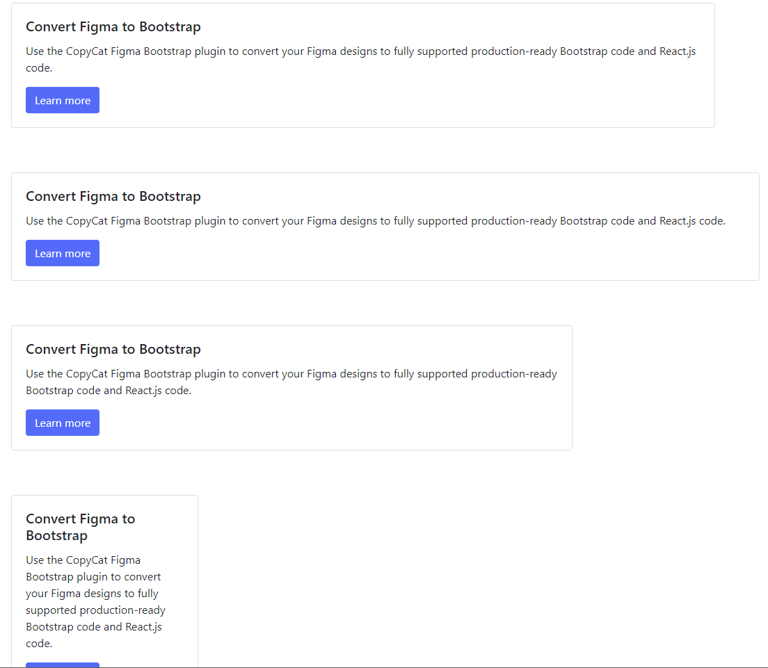
<div class="card w-100">
<div class="card-body">
<h5 class="card-title">Convert Figma to Bootstrap</h5>
<p class="card-text">Use the CopyCat Figma Bootstrap plugin to convert your Figma designs to fully supported production-ready Bootstrap code and React.js code.</p>
<a href="https://www.copycat.dev/figma-to-bootstrap" class="btn btn-primary">Learn more</a>
</div>
</div>
<div class="card w-75">
<div class="card-body">
<h5 class="card-title">Convert Figma to Bootstrap</h5>
<p class="card-text">Use the CopyCat Figma Bootstrap plugin to convert your Figma designs to fully supported production-ready Bootstrap code and React.js code.</p>
<a href="https://www.copycat.dev/figma-to-bootstrap" class="btn btn-primary">Learn more</a>
</div>
</div>
<div class="card w-25">
<div class="card-body">
<h5 class="card-title">Convert Figma to Bootstrap</h5>
<p class="card-text">Use the CopyCat Figma Bootstrap plugin to convert your Figma designs to fully supported production-ready Bootstrap code and React.js code.</p>
<a href="https://www.copycat.dev/figma-to-bootstrap" class="btn btn-primary">Learn more</a>
</div>
</div>
You set the width to auto in the first card using the Bootstrap utility class w-auto. This created a card that will automatically expand and fill its parent available width.
The second card’s width was set to 100% using the Bootstrap utility class w-100. This card grows with the size of the window.
The third card’s width was set to 75% using the Bootstrap utility class w-75, which set the maximum width to be 75% of the parent container’s width.

Finally, the fourth card’s width was set to 25% using the Bootstrap utility class w-25. This set the card’s width was set to 25% of its parent’s container.
Comparing all cards
Below is how the cards compare against each other.
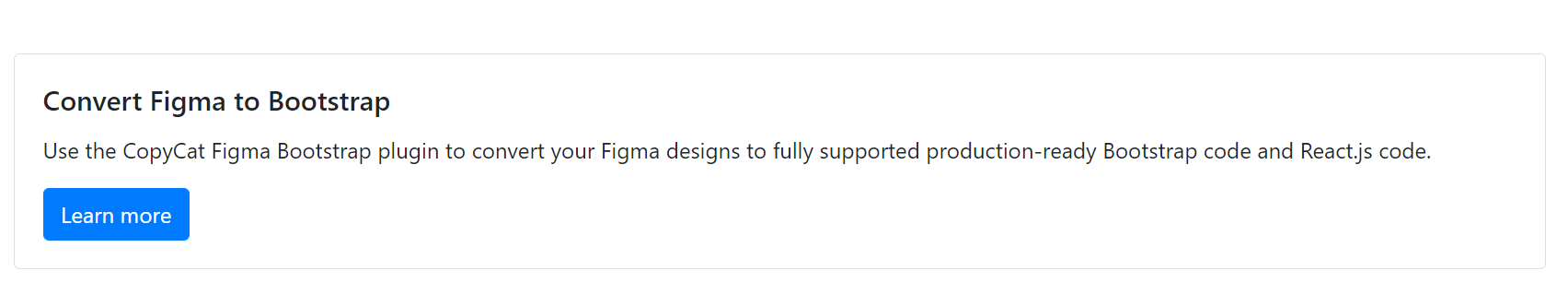
How to Resize Bootstrap Card Using Using Custom CSS
If you do not want to use Bootstrap provision of grid and utility classes, you can use your custom CSS to resize Bootstrap Card.
To use your custom stylings, you only need to pass the width property with your desired value to the style attribute.
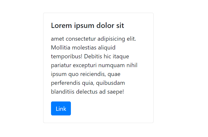
In the example below, you see how to set a custom width for your card using the style attribute. We set a custom width of 300px for the card.
  <div class="card" style="width: 300px;">
    <div class="card-body">
      <h5 class="card-title">Lorem ipsum dolor sit</h5>
      <p class="card-text">amet consectetur adipisicing elit. Mollitia molestias aliquid temporibus! Debitis hic itaque pariatur excepturi numquam
      nihil ipsum quo reiciendis, quae perferendis quia, quibusdam blanditiis delectus ad saepe!</p>
      <a href="https://www.copycat.dev/figma-to-bootstrap" class="btn btn-primary">Learn more</a>
    </div>
  </div>
How to Align Text in a Bootstrap Card
Text alignment in Bootstrap card is fairly straightforward. By default, the text is aligned at the left. You can change this behavior by using either of the text alignment classes: text-left, text-right, or text-center.
To change the text alignment, simply add the desired class to the card class. In the example below, all text in the card will be aligned at the center.
 <div class="card text-center">
  <div class="card-body">
    <h5 class="card-title">Your card title goes here</h5>
    <p class="card-text">Add some descriptions</p>
    <a href="#" class="btn btn-primary">CTA link</a>
  </div>
</div>
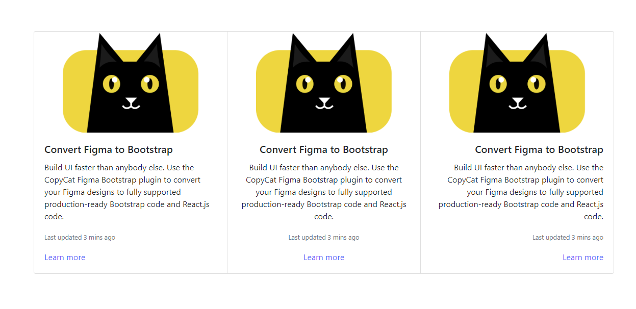
To demonstrate this holistically, refer to this snippet below and the accompanying screenshot below:
 <div class="card-group">

    <div class="card text-left">
      <img class="card-img-top"
        src="https://user-images.githubusercontent.com/24845008/196540812-9a6fc861-6def-48d0-b6a3-37134e6a08e6.png"
        alt="CopyCat logo">
      <div class="card-body">
        <h5 class="card-title">Convert Figma to Bootstrap</h5>
        <p class="card-text">Build UI faster than anybody else. Use the CopyCat Figma Bootstrap plugin to convert your Figma designs to fully
        supported production-ready Bootstrap code and React.js code.</p>
        <p class="card-text"><small class="text-muted">Last updated 3 mins ago</small></p>
        <a href="https://www.copycat.dev/figma-to-bootstrap" class="card-link">Learn more</a>
      </div>
    </div>
    <div class="card text-center">
      <img class="card-img-top"
        src="https://user-images.githubusercontent.com/24845008/196540812-9a6fc861-6def-48d0-b6a3-37134e6a08e6.png"
        alt="CopyCat logo">
      <div class="card-body">
        <h5 class="card-title">Convert Figma to Bootstrap</h5>
        <p class="card-text">Build UI faster than anybody else. Use the CopyCat Figma Bootstrap plugin to convert your Figma designs to fully
        supported production-ready Bootstrap code and React.js code.</p>
        <p class="card-text"><small class="text-muted">Last updated 3 mins ago</small></p>
        <a href="https://www.copycat.dev/figma-to-bootstrap" class="card-link">Learn more</a>
      </div>
    </div>

    <div class="card text-right">
      <img class="card-img-top"
        src="https://user-images.githubusercontent.com/24845008/196540812-9a6fc861-6def-48d0-b6a3-37134e6a08e6.png"
        alt="CopyCat logo">
      <div class="card-body">
        <h5 class="card-title">Convert Figma to Bootstrap</h5>
        <p class="card-text">Build UI faster than anybody else. Use the CopyCat Figma Bootstrap plugin to convert your Figma designs to fully
        supported production-ready Bootstrap code and React.js code.</p>
        <p class="card-text"><small class="text-muted">Last updated 3 mins ago</small></p>
        <a href="https://www.copycat.dev/figma-to-bootstrap" class="card-link">Learn more</a>
      </div>
    </div>

  </div>
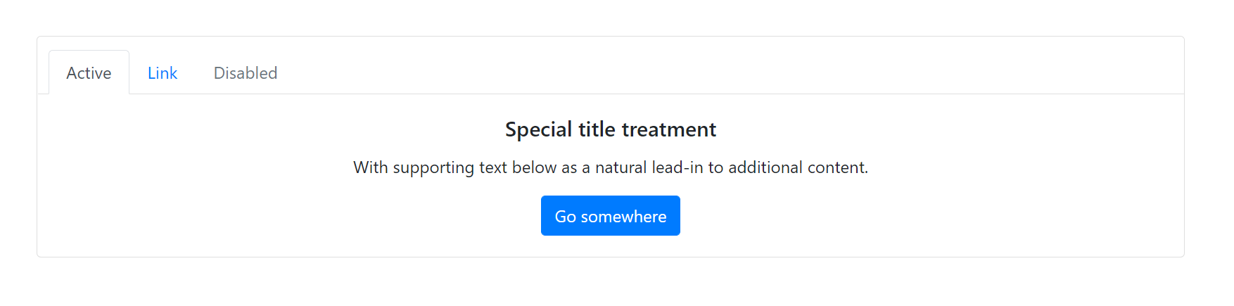
Adding Navigation to Cards
Bootstrap cards also support navigation. This is usually added in the card header.
 <div class="card text-center">
    <div class="card-header bg-white">
      <ul class="nav nav-tabs card-header-tabs">
        <li class="nav-item">
          <a class="nav-link active" aria-current="true" href="#">Nav Link Active</a>
        </li>
        <li class="nav-item">
          <a class="nav-link" href="#">Nav Link</a>
        </li>
        <li class="nav-item">
          <a class="nav-link disabled">Nav Link Disabled</a>
        </li>
      </ul>
    </div>
    <div class="card-body">
      <h5 class="card-title">Convert Figma to Bootstrap</h5>
      <p class="card-text">Build UI faster than anybody else. Use the CopyCat Figma Bootstrap plugin to convert your
        Figma designs to fully
        supported production-ready Bootstrap code and React.js code.</p>
      <a href="#" class="btn btn-primary">Go somewhere</a>
    </div>
  </div>
How to Use Bootstrap Card in React
So far, you have seen how to use Bootstrap Cards in regular websites built with HTML, CSS, and JavaScript. This section will guide you on using Bootstrap Cards in React.
You will need to install react-bootstrap in your React project. We have a guide detailing how to install Bootstrap in your React application.
React Bootstrap makes use of cont types such as card body <Card.Body>, card title <Card.Title>, card subtitle <Card.Subtitle> and card text <Card.Text> to render cards.
The following examples further illustrate this.
How to Create a Card Body in React Bootstrap
To create a card body with react-bootstrap, you use <Card.Body> to wrap your content inside a <Card> parent.
 import { Card } from "react-bootstrap";
import "bootstrap/dist/css/bootstrap.min.css";

function App() {
  return (
    <div className="App">
      <Card>
        <Card.Body>Example of using texts in a card body.</Card.Body>
      </Card>
    </div>
  );
}

export default App;

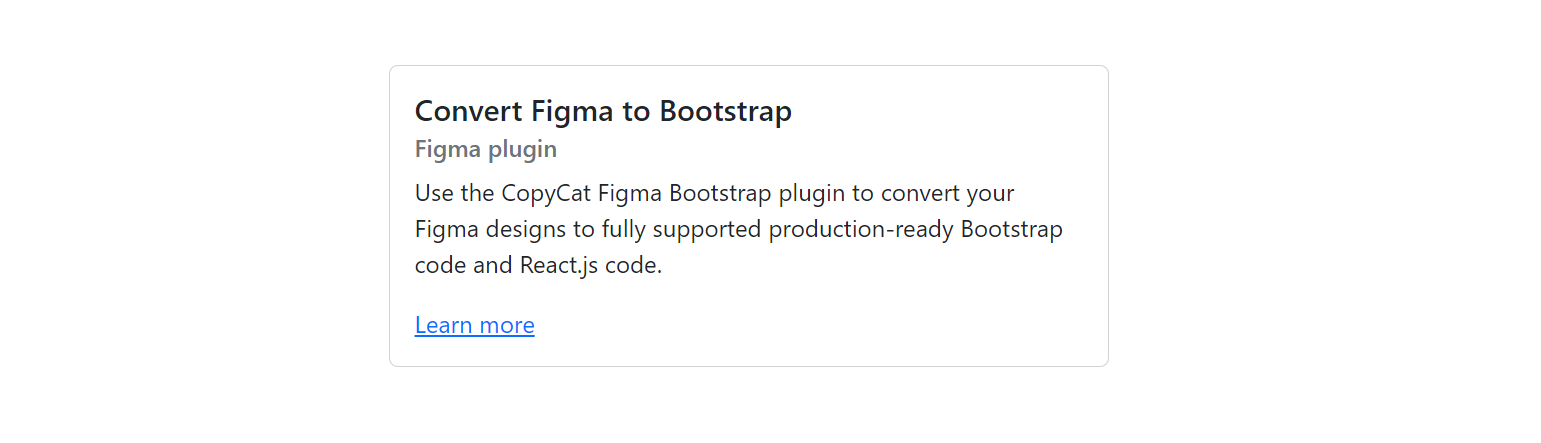
How to Create Titles, Text, and Links in React Bootstrap
Earlier on, you saw how to add titles, texts, and links to your cards with Bootstrap in a regular HTML website. However, with React, it is a bit different.
To create a title, you need to use <Card.Title>, <Card.Subtitle> for a subtitle, and <Card.Text> for regular texts. Note that these must be inside the `Card.Body` component.
<Card.Text> compiles to <p> tags around the content, so you can use multiple <Card.Text>s to many paragraphs.
 import { Card } from "react-bootstrap";
import "bootstrap/dist/css/bootstrap.min.css";

function App() {
  return (
    <div className="App">
      <Card
        style={{ width: '30rem' }}
      >
        <Card.Body>
          <Card.Title>Convert Figma to Bootstrap</Card.Title>
          <Card.Subtitle className="mb-2 text-muted">Figma plugin</Card.Subtitle>
          <Card.Text>
            Use the CopyCat Figma Bootstrap plugin to convert your Figma designs to fully supported production-ready Bootstrap code and React.js code.
          </Card.Text>
          <Card.Link href="https://www.copycat.dev/figma-to-bootstrap">Learn more</Card.Link>
        </Card.Body>
      </Card>
    </div>
  );
}

export default App;
React Bootstrap Cards offer many features such as Navigation, Card Header, Footer, List Groups, Images, and card Groups, among others. To learn more about these features and their implementation. refer to the official documentation.
Top Questions
Can React be used with Bootstrap?
Ans: Yes, React can be used with Bootstrap. We have a guide detailing everything you need to get started with Bootstrap and ReactJS. Learn more here.
Does Bootstrap 5 have Card Deck
Ans: As from Bootstrap 5, the card desk is no longer supported. Learn more here.
What is React Bootstrap Card
Ans: A React Bootstrap Card is a responsive and customizable mobile-friendly content container. It is highly customizable and mobile-friendly. The card in Bootstrap provides options for images, headers, and footers, a wide variety of content, contextual background colors, and excellent display options. It is both adaptable and extendable, with various versions and possibilities.
Interesting Reads From Our Blogs
- Most Accessible Guide To Using React Bootstrap Button
- Setting up Tailwind CSS in React Application: Walk-through and Examples
- Impress Your Users Using The Top 8 React Animation Libraries
Videos On React Bootstrap and Bootstrap Card
Bootstrap Video Card – YouTube
Bootstrap in 3 Hours – freeCodeCamp
Conclusion
In this article, you were introduced to the Bootstrap CSS framework and how Bootstrap card can be used to group related content about an article on a webpage such as an article title, image thumbnail, article preview link, etc. You also saw the different options that are included in Bootstrap cards such as card images, card header, and card footer.
You learned how to resize Bootstrap cards with either grid markup, the Bootstrap utility classes, or using your custom CSS. Finally, you learned how to add navigation to cards.
Check out the codes used in this article on GitHub.
To wrap up, I want you to check out our incredible tool, CopyCat, which helps you perfect the art of copying code. CopyCat converts your Figma designs to Bootstrap codes in no time. Check it out.
Related Articles
-
 React.js
The Dark Side of React.js: Common Pitfalls and How to Avoid Them
Did you know that React.js is used by over 17 million websites worldwide, including major players like Facebook, Instagram, and Airbnb? It is the most used web frameworks worldwide. This popular JavaScript library has revolutionized web development with its component-based…
March 13, 2023 -
React.js
Understanding the Typescript forEach Loop
Introduction The forEach loop is one of the ways to iterate between the elements of an array. Array manipulation is one of the techniques developers use daily. Rendering data from an API call usually requires iteration between each element. In…
November 30, 2022


