
 December 24, 2022
  Uncle Big Bay


- Introduction
- What is a Select Tag?
- What is Bootstrap Form-Select?
- Setting Up Bootstrap
- Creating Options with Bootstrap Select Element
- Customizing Bootstrap Select Tag
- Difference Between Bootstrap Form Control and Form Select
- Bootstrap Select Tag Sizing
- Disabled Select Tag in Bootstrap
- Bootstrap Multiple Select Tag
- Bootstrap Select Option Groups
- Adding Floating Labels to Bootstrap Select Tag
- Conclusion
Introduction
Bootstrap is a popular CSS framework that offers great UI components that are also accessible.
In this tutorial, we’ll go over how to create and style select dropdown options with Bootstrap, as well as how they work.
Additionally, if you want to increase your productivity, try CopyCat, an AI that can convert your Figma designs into React, Tailwind, Bootstrap, and other popular CSS frameworks. Click here to check out the CopyCat plugin for Figma.
What is a Select Tag?
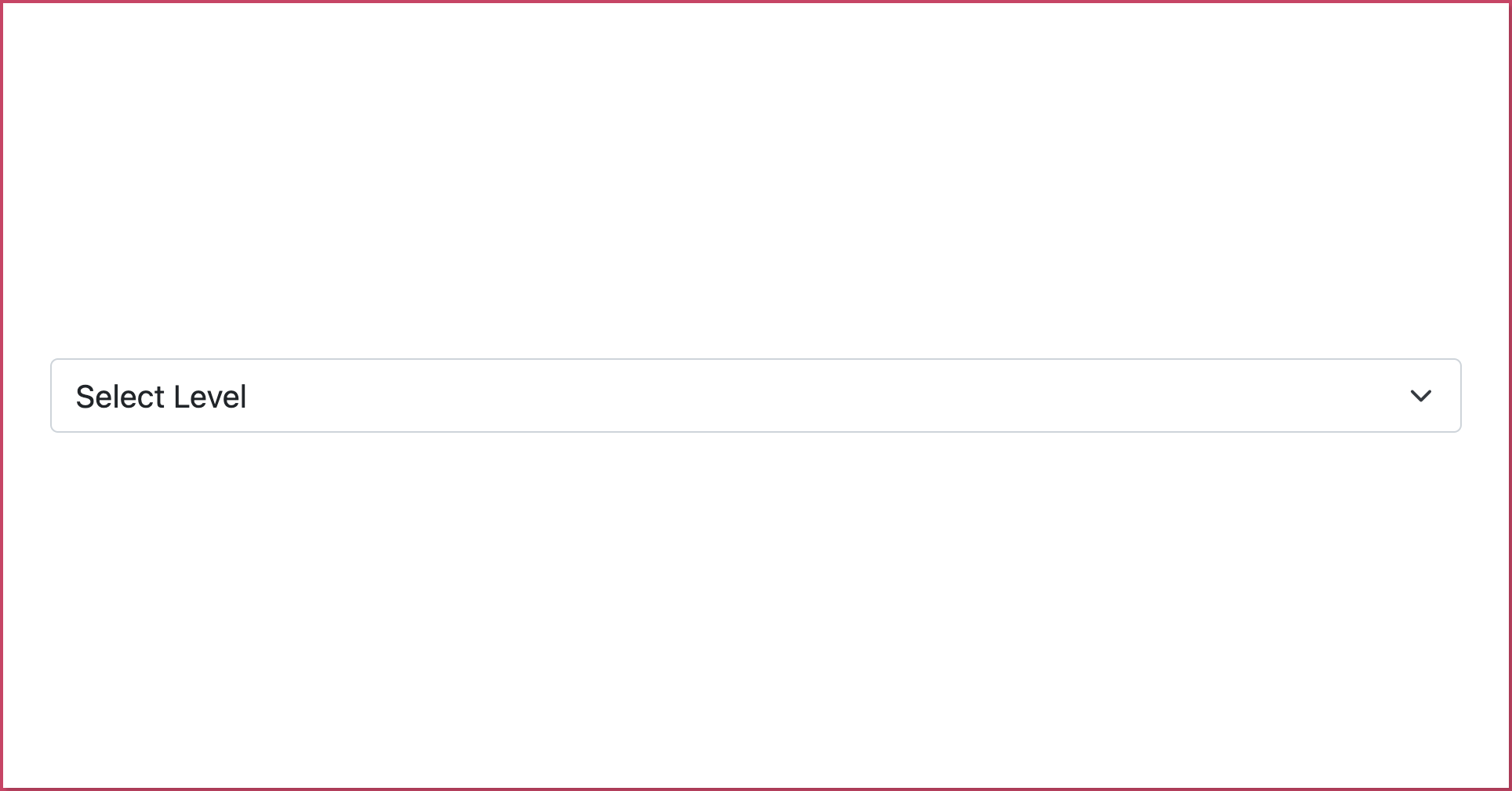
The HTML select tag is a feature that allows users to select an option from a dropdown list. It is commonly used in forms to collect a user’s selection from a list of provided choices.
Below is the markdown syntax for an HTML select tag:
<select name="expertise">
    <option selected>Select Level</option>
    <option value="Beginner">Beginner</option>
    <option value="Intermediate">Advanced Beginner</option>
    <option value="Professional">Professional</option>
    <option value="Advanced">Advanced</option>
    <option value="Expert">Expert</option>
</select>
- The
nameattribute is used to identify each select tag when there are multiple select tags on the same page. - The
selectedattribute will make the option the default selection regardless of its position in the option lists. - The
valueattribute contains the name or identifier for each option; if no value attribute is provided, the option’s inner text is used. All alphanumerics are supported values in an option tag.
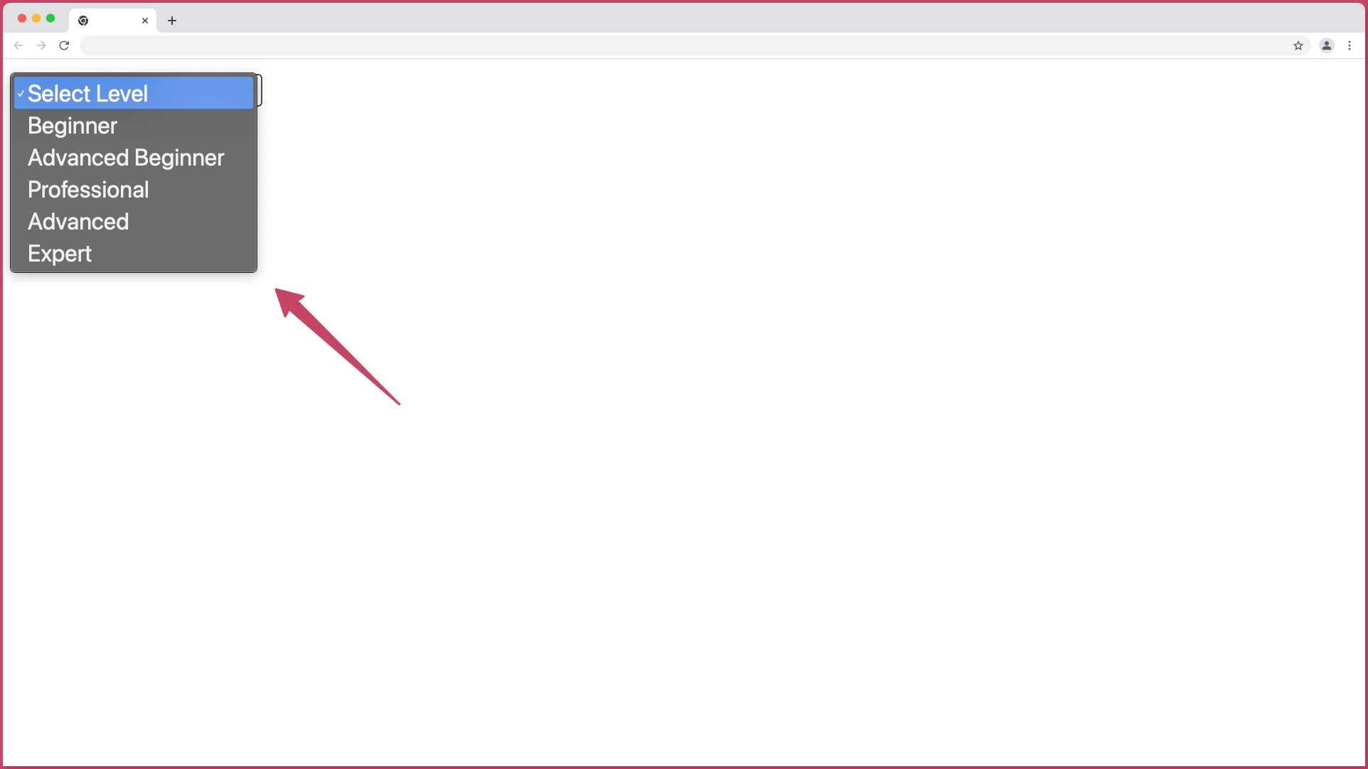
The above select code will look something like this on your browser:
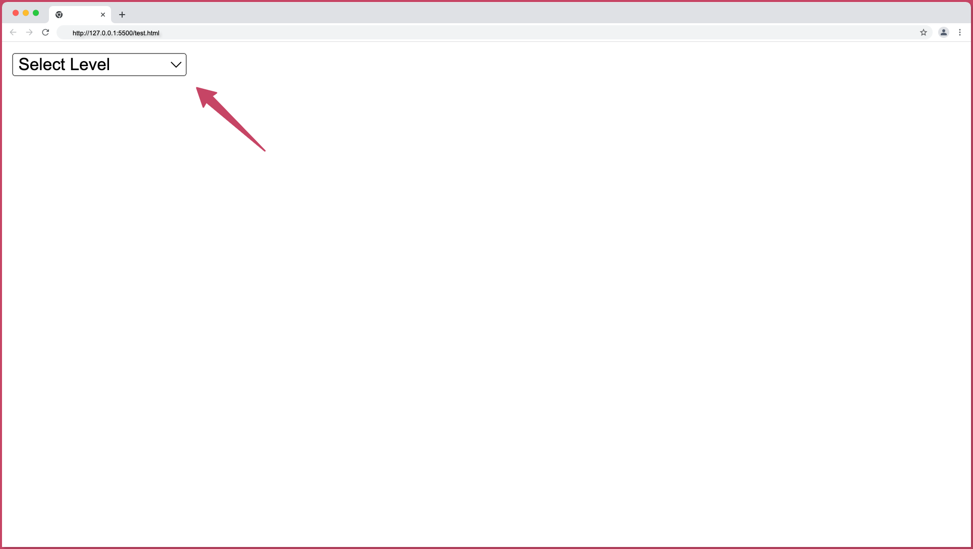
Click the dropdown icon or body to see the available options from the select tag, as follows:
What is Bootstrap Form-Select?
The .form-select utility class name in bootstrap is used to trigger the custom styles for an HTML select tag. It is used to alter the native styles and appearance of the select tag.
Setting Up Bootstrap
We’ll make use of Bootstrap v5.0 CDN to set up bootstrap in our project.
- Create a new
index.htmlfile. - Then, copy and paste the code below inside:
<!DOCTYPE html>
<html lang="en">
  <head>
    <meta charset="UTF-8" />
    <meta http-equiv="X-UA-Compatible" content="IE=edge" />
    <meta name="viewport" content="width=device-width, initial-scale=1.0" />

    <!-- Bootstrap CSS -->
    <link
      href="https://cdn.jsdelivr.net/npm/bootstrap@5.0.2/dist/css/bootstrap.min.css"
      rel="stylesheet"
      integrity="sha384-EVSTQN3/azprG1Anm3QDgpJLIm9Nao0Yz1ztcQTwFspd3yD65VohhpuuCOmLASjC"
      crossorigin="anonymous"
    />

    <!-- Bootstrap Bundle - JavaScript plugins and Popper -->
    <script
      src="https://cdn.jsdelivr.net/npm/bootstrap@5.0.2/dist/js/bootstrap.bundle.min.js"
      integrity="sha384-MrcW6ZMFYlzcLA8Nl+NtUVF0sA7MsXsP1UyJoMp4YLEuNSfAP+JcXn/tWtIaxVXM"
      crossorigin="anonymous"
    ></script>

    <title>Bootstrap Tooltip</title>
  </head>
  <body class="d-flex vh-100 p-4 align-items-center justify-content-center">
    <h2 class="text-warning">Hello, World!</h2>
  </body>
</html>
When you open index.html in a browser, your page should look something like this:
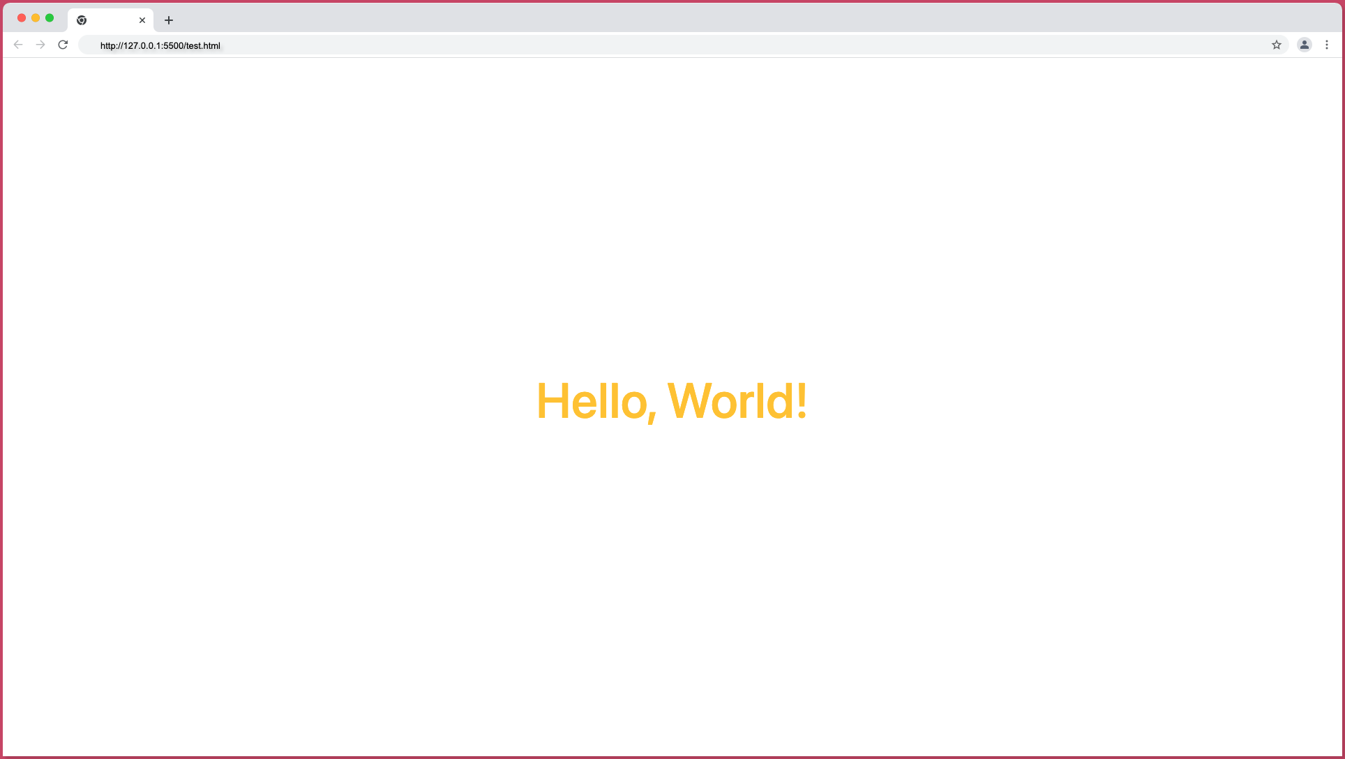
If the text is yellow and centered on the page, then bootstrap is properly added to your project.
Creating Options with Bootstrap Select Element
Creating a select tag with options in bootstrap is the same as creating a regular select tag and its options in HTML as the following (add this code below within your body tag):
<select name="expertise">
    <option selected>Select Level</option>
    <option value="Beginner">Beginner</option>
    <option value="Intermediate">Advanced Beginner</option>
    <option value="Professional">Professional</option>
    <option value="Advanced">Advanced</option>
    <option value="Expert">Expert</option>
</select>
The above select tag code will produce the following output:
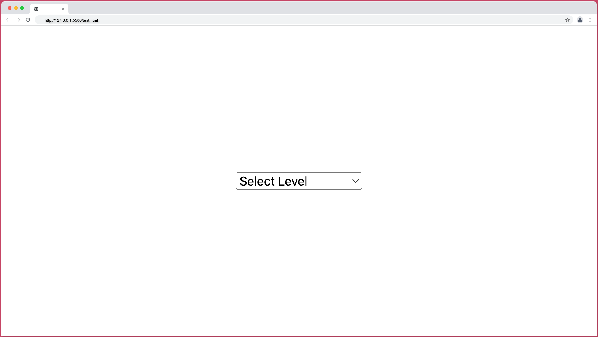
By default, bootstrap does not add any special styles to the select tag, in the next section, we’ll discuss how to customize the bootstrap-select tag.
Customizing Bootstrap Select Tag
As discussed earlier, the most important bootstrap utility class needed to style a select tag is .form-select. Hence we apply this to the class property of the select tag as follows:
<select name="expertise" class="form-select">
    <option selected>Select Level</option>
    <option value="Beginner">Beginner</option>
    <option value="Intermediate">Advanced Beginner</option>
    <option value="Professional">Professional</option>
    <option value="Advanced">Advanced</option>
    <option value="Expert">Expert</option>
</select>
The form-select class name will make the select tag take the full width of the browser or available space within its parent element/container as shown below:
The .form-select can only be used on a select tag and is only a custom class required for the select tag in bootstrap and it’s different from the .form-control class.
Difference Between Bootstrap Form Control and Form Select
The Bootstrap form control class is used to manage textual forms such as input, select, and textarea. The form control includes styles for general appearance, focus state, sizing, and more.
While, the bootstrap form select class, as the name implies, is only used to activate the custom styles for the select.
Due to browser limitations, custom styles in the form select class are limited to the initial appearance of the select tag and cannot modify the option tags within it or any other tags.
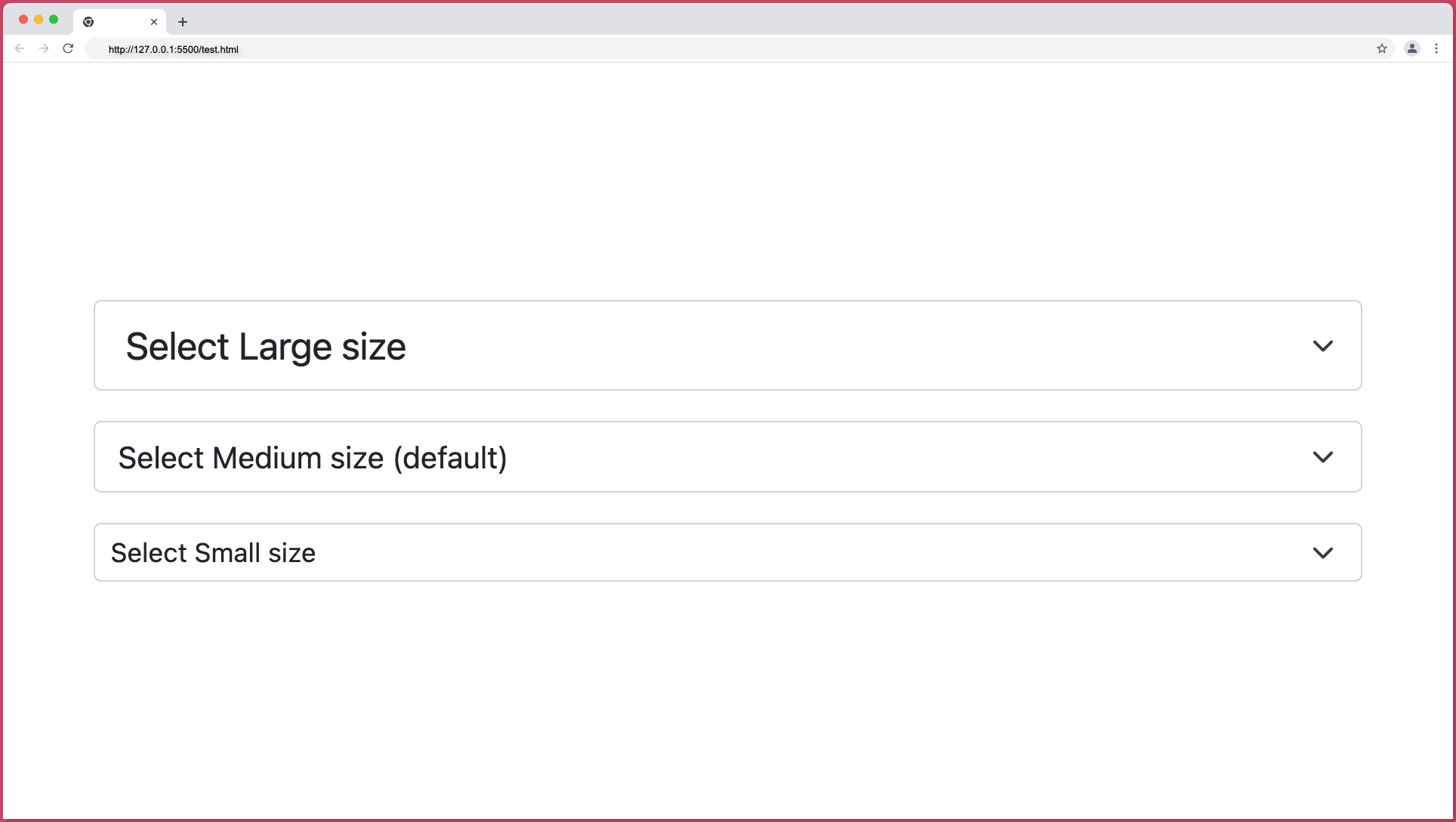
Bootstrap Select Tag Sizing
The .form-select class also provides additional classes to adjust the sizes of the select tags to small and large custom select sizes using the .form-select-sm class and form-select-sm class respectively.
As an illustration, below are the three sizes of the bootstrap-select tag using .form-select classes:
<!-- Large -->
<select class="form-select form-select-lg">
    <option selected>Select Large size</option>
</select>

<!-- Medium (Default) -->
<select class="form-select">
    <option selected>Select Medium size</option>
</select>

<!-- Small -->
<select class="form-select form-select-sm">
    <option selected>Select Small size</option>
</select>
The above will produce the following output of different select tag sizes:
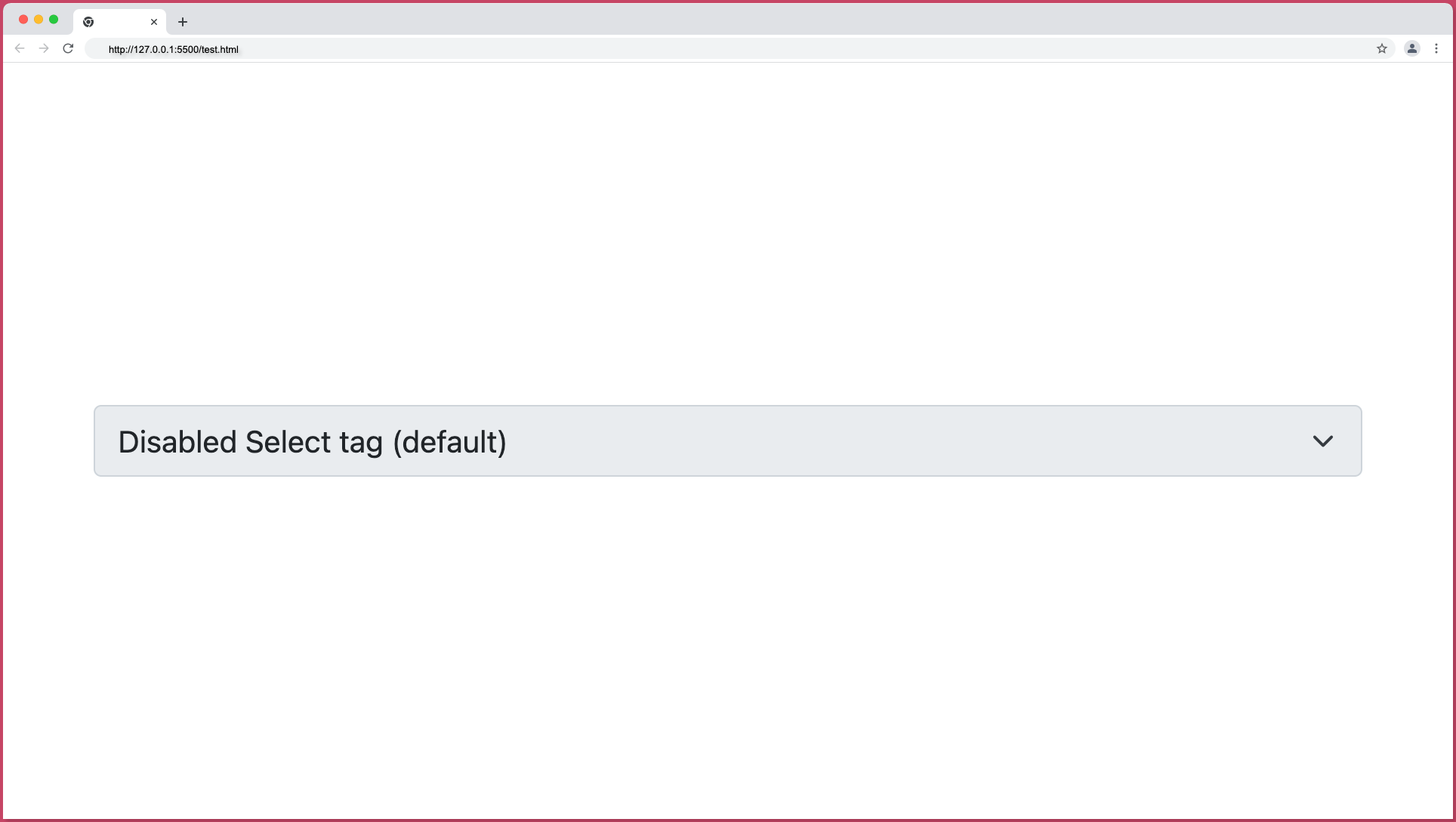
Disabled Select Tag in Bootstrap
A select tag can be disabled using the disabled attribute in HTML as follows:
<select class="form-select" disabled>
    <option selected>Disabled Select tag (default)</option>
</select>
The preceding code will produce a disabled select box with a grayed-out appearance without pointer events that look like this:
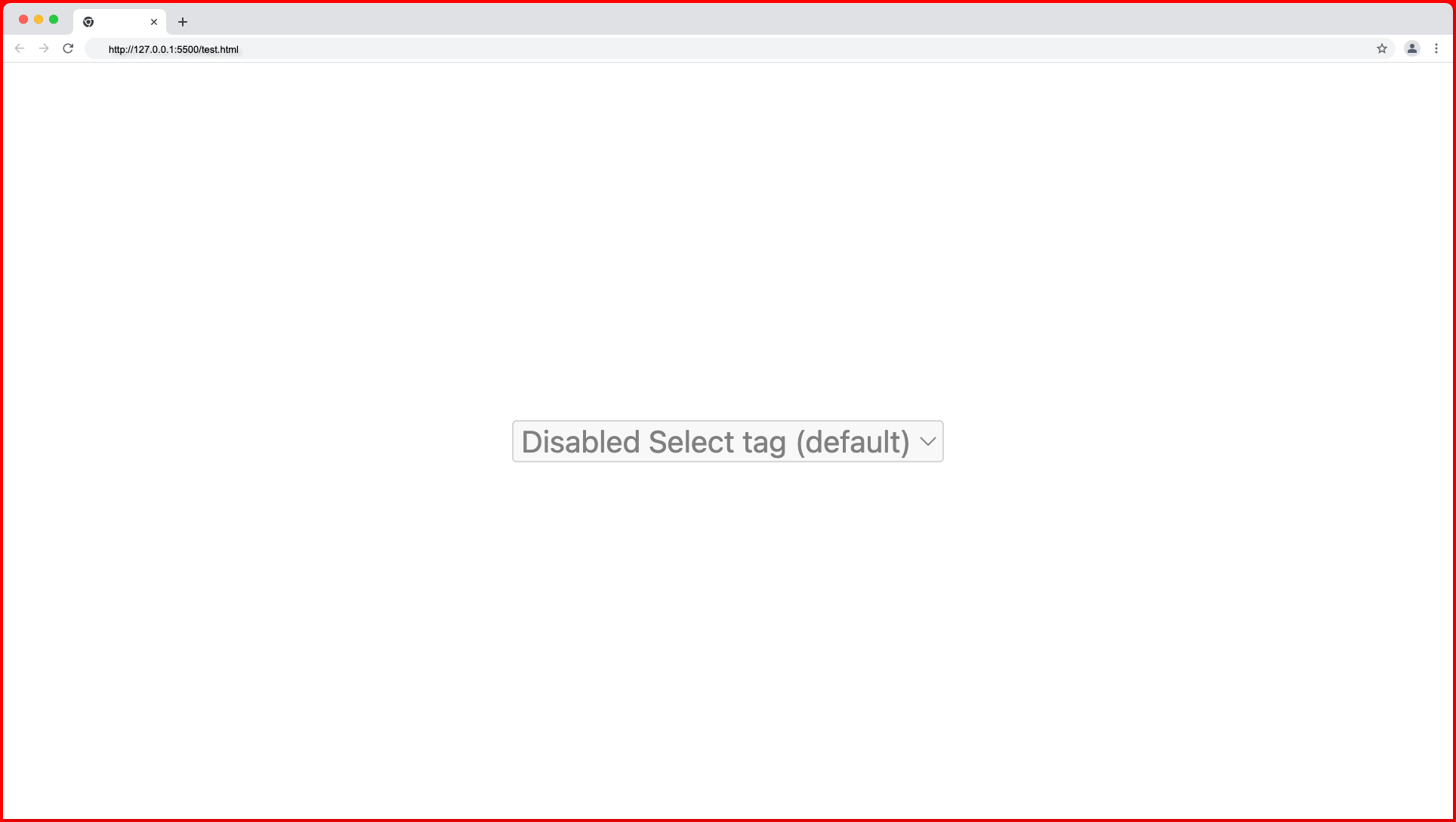
The native select tag without the .form-select class name will look something like this:
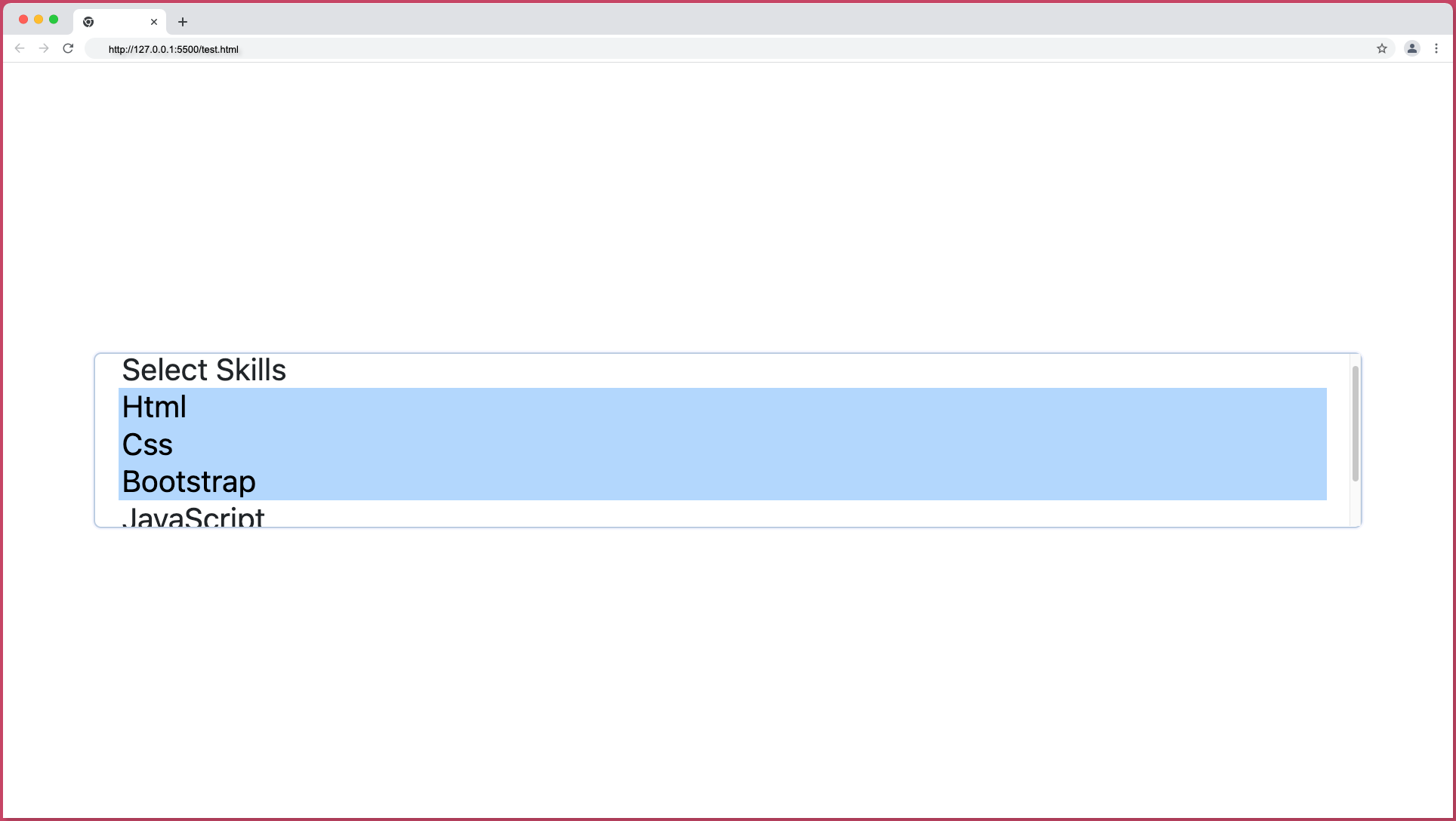
Bootstrap Multiple Select Tag
The select tag also has a multiple attribute that enables the selection of multiple options from the dropdown lists:
<select name="skills" class="form-select" multiple>
    <option selected>Select Skills</option>
    <option value="Html">Html</option>
    <option value="Css">Css</option>
    <option value="Bootstrap">Bootstrap</option>
    <option value="JavaScript">JavaScript</option>
    <option value="Axios">Axios</option>
</select>
We can now select multiple choices from the select tag options by holding down the cmd key or ctrl key while selecting your options, as shown below:
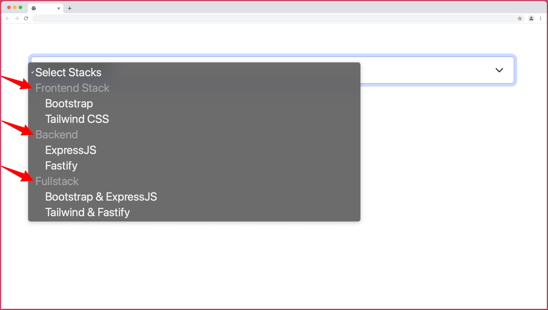
Bootstrap Select Option Groups
We can group the options in a select tag based on their categories by wrapping the corresponding options with a <optgroupd> tag, as shown below:
<select class="form-select">
    <option selected>Select Stacks</option>
    <optgroup label="Frontend Stack">
        <option value="Bootstrap">Bootstrap</option>
        <option value="Tailwind-CSS">Tailwind CSS</option>
    </optgroup>
    <optgroup label="Backend">
        <option value="ExpressJS">ExpressJS</option>
        <option value="Fastify">Fastify</option>
    </optgroup>

    <optgroup label="Fullstack">
        <option value="Bootstrap-ExpressJS">
            Bootstrap & ExpressJS
        </option>
        <option value="Tailwind-Fastify">
            Tailwind & Fastify
        </option>
    </optgroup>
</select>
As shown below, the <optgroup> tag will act as a divider or header for each category:
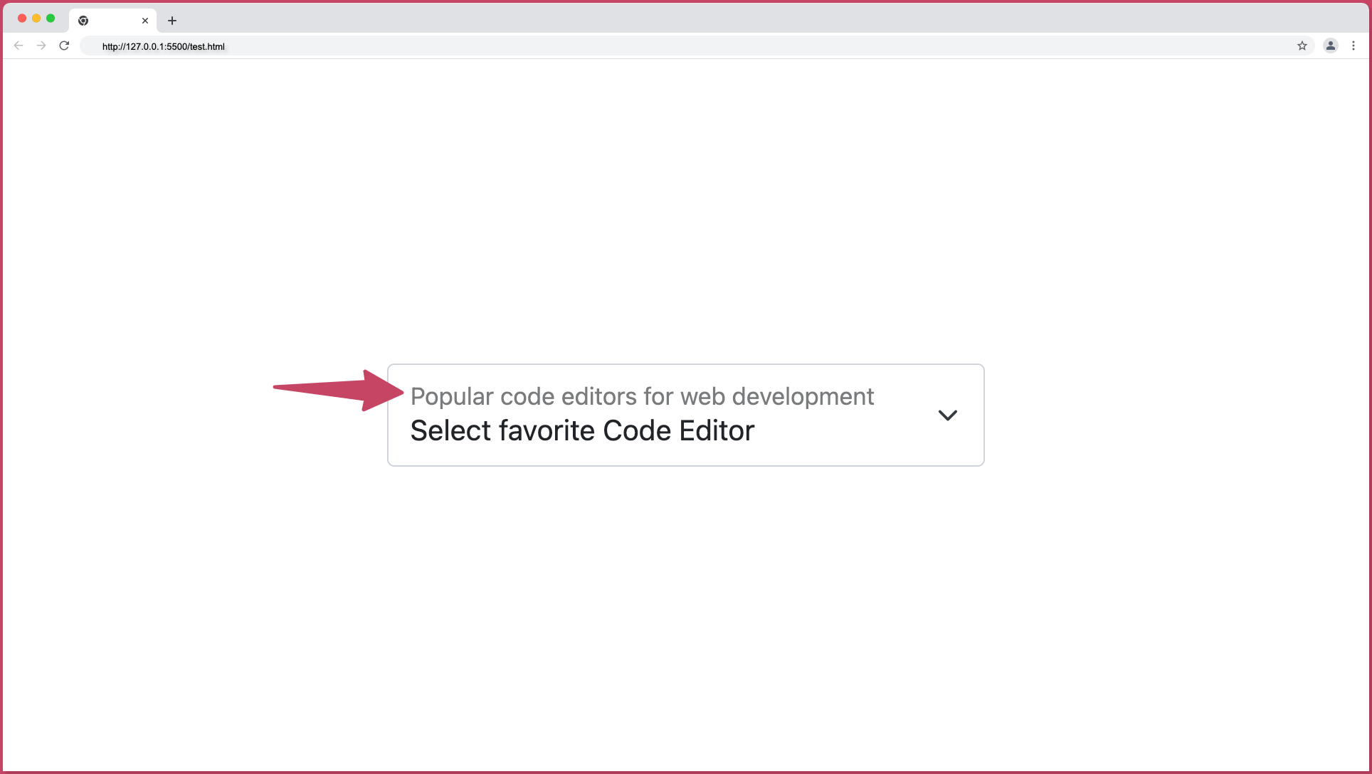
Adding Floating Labels to Bootstrap Select Tag
We can further improve our select tag with the bootstrap .form-floating class without any JavaScript or custom data attributes.
This works by wrapping the select tag with a parent tag which has a class of .form-floating, assigning an id to the select tag, and specifying the id as the value of the for attribute in the label tag, as shown in the code below:
<div class="form-floating w-50">
    <select
    name="code-editors"
    id="editors-floating-label"
    class="form-select"
    >
    <option selected>Select favorite Code Editor</option>
    <option value="VScode">VScode</option>
    <option value="Notepad">Notepad++</option>
    <option value="SublimeText">Sublime Text</option>
    <option value="Atom">Atom</option>
    <option value="Vim">Vim</option>
    </select>
    <label for="editors-floating-label">
    Popular code editors for web development
    </label>
</div>
The floating label will appear in the select tag as follows:
The bootstrap floating label also works with form elements that have support for the .form-control and .form-select classes. More information on adding floating labels to form elements can be found here.
Conclusion
In this article, we discussed how to use the bootstrap form-select class to personalize the select tag, including customizing, adding floating labels, and categorizing options in the select tag.
If you prefer a video hands-on tutorial like this where you can create an interactive select tag using the knowledge you’ve gained from this article, watch the video below.
Finally, more articles like this can be found on our CopyCat blog. CopyCat converts your Figma files into a ready-to-use React project, saving you over 35% of development time. You can check out CopyCat here.
Interesting Reads From Our Blogs
- How to Create an Amazing Bootstrap Navbar Complete Guide
- Understanding Bootstrap Colors in Full
- Use Bootstrap Flex in Your React Projects for Great Web Design
- A Complete Guide On How to Use Bootstrap Breakpoints
Happy Coding 👨🏽💻
Related Articles
-
 Bootstrap
The Fastest Way to Build Professional Websites with Bootstrap CDN
Does Bootstrap have a CDN? Initially, Bootstrap was hosted on a CDN called MaxCDN, but this changed when StackPath acquired MaxCDN in 2019. The official Bootstrap website now hosts its CDN, the recommended way to use the framework. The official…
February 24, 2023 -
Bootstrap
How to use Bootstrap Tooltip Efficiently
Do you want to be more efficient? Consider CopyCat, an AI-powered plugin that will convert your Figma design to UI code, allowing you to concentrate on the app's business logic. Convert Design to Code with CopyCat Introduction This article will…
December 23, 2022


