 December 24, 2022
  Faith Ajayi


- Introduction
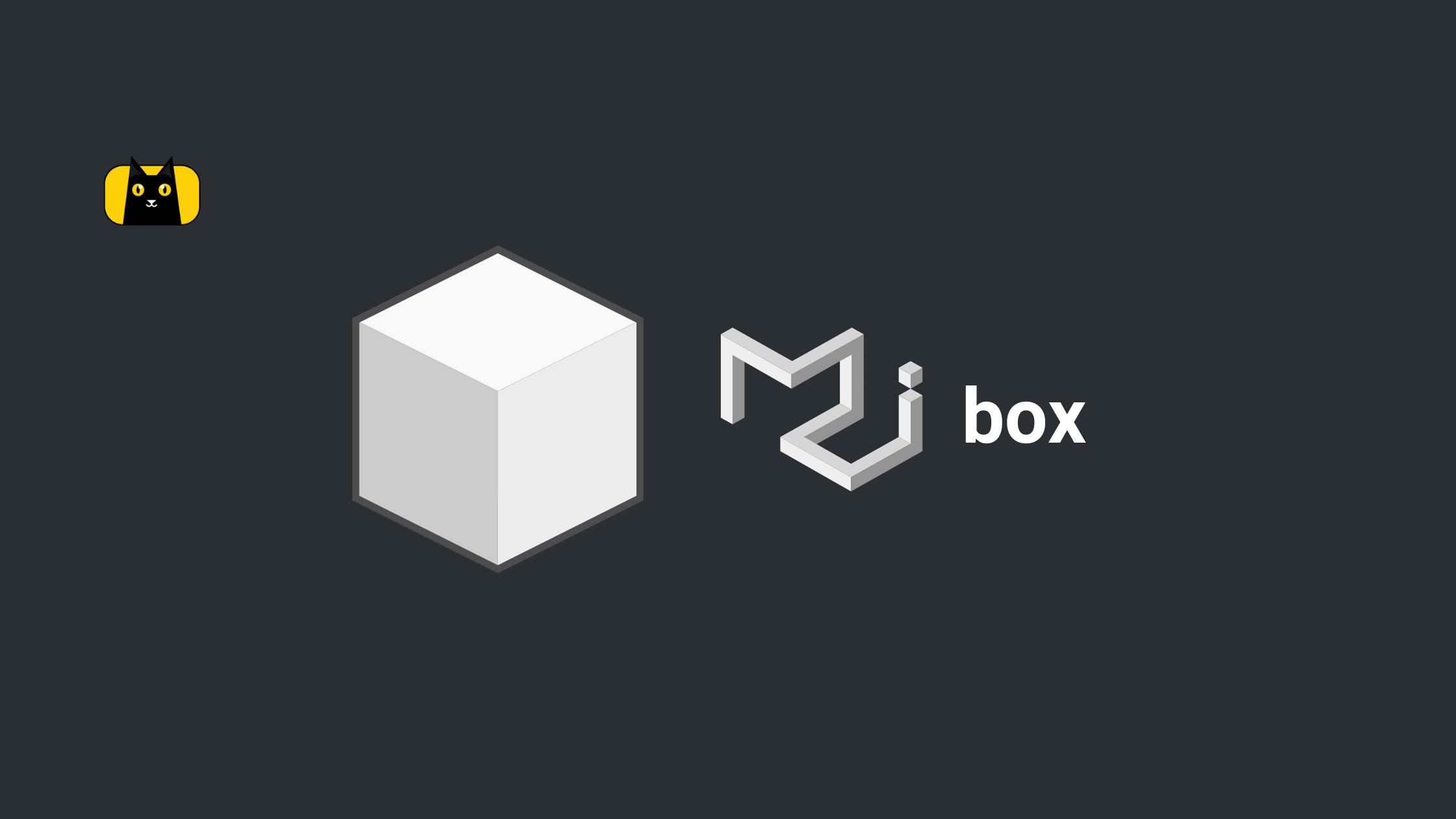
- What is Material UI Box?
- Implementing Material UI Box Component in a React App
- Understanding the SX prop in the Material UI Box
- Adding Borders to Material UI Box Component
- Positioning Content in Material UI Box with Flexbox
- Adding Colors to Material UI using Palette
- Material UI Box Sizing
- Material UI Box Typography
- Conclusion

Introduction
Before we begin, assume you have a box of building blocks. Each block is a different color, shape, or size. You can use them to construct a variety of interesting structures. You can create your website or app using Material UI, which is a unique set of building bricks. They are unique because they enhance the beauty and polished appearance of your website.
In Material-UI React, the Box component serves as a wrapper component. When styling elements in a React app, the Material-UI Box component comes in handy. You may accomplish this without utilizing any additional CSS files or the often-used built-in make styles hook.
This is quite helpful for adding features to components like margins that would often require non-reusable wrapper elements or classes.
We’ll examine the Material-UI component Box in this article. Before moving on to several instances, we shall first discuss how it functions in the next section below.
Most importantly, to get the most out of this article you need to have basic knowledge and hands-on experience with:
- Javascript Es6
- React.js
- Material UI
- Typescript as a plus
However, are you seeking methods to reduce the time you and your team spend creating user interfaces? Use CopyCat to quickly convert your Figma design to MUI; learn more about this tool here.
What is Material UI Box?
The Material-UI library, a well-known React-based UI framework, has a component called Material-UI Box (however material UI has many other components). It serves as a wrapper for additional components or elements. It may be used to decorate the items it contains by applying padding, margins, dimensions, display attributes, and other custom styles.
The Material-UI Box component may be easily adjusted to match the appearance and feel of your ap. It is made to integrate smoothly with the Material-UI theme. It is also constructed using Google’s Material Design concepts, a set of design principles intended to deliver a unified and user-friendly interface across all platforms and devices.
The ability of the Material-UI Box component to assist developers in producing uniform space and layout in their user interfaces is one of its primary characteristics. This can help to ensure that items are appropriately aligned and spaced in accordance with Material Design principles like the built-in makestyles hook, as well as to create a clean and orderly appearance.
Material UI Box component props
Additionally, the Material-UI Box component has a number of component prop (s) or adaptable choices, that may be used to further alter its design and behavior.
For instance, the “display” prop can be used to indicate the display property type, such as “flex” or “inline-block,” that should be applied to the included items. The container’s or div component width and height may be set using the “width” and “height” values, and the space surrounding the components it contains can be increased using the “margin” and “padding” props.
In addition to these parameters, the Material-UI Box component also enables the application of extra custom styles and style functions to the container and enclosed items via inline and CSS classes. This enables designers to quickly tweak the look of their user interfaces and to produce distinctive designs that distinguish themselves from the competition.
Implementing Material UI Box Component in a React App

In this section, we would be explaining how to implement material UI box in React app in full but before that, you must first ensure that Material-UI is installed in your project before using the Material-UI Box component in a React application. Run the following command to accomplish this:
npm install @material-ui/core
After installing Material-UI, use the following code to import the Box component into your React component:
import { Box } from '@material-ui/core';
When you’ve imported the Box component, you can use it in the render method of your React component as follows:
render() {
  return (
    <Box component="span" m={1}>
      This is a box
    </Box>
  );
}
In the prior example, a span element is wrapped in the ‘Box’ component and given some Material-UI styling. The margin of the element is set using the m prop, where a value of 1 sets the margin to the small size required by the Material-UI theme.
By utilizing the additional props that the Box component takes, you can alter its appearance. By utilizing the bgcolor prop, for instance, you can alter the box’s background color as shown below:
<Box component="span" m={1} bgcolor="primary.main">
  This is a box with a primary color background
</Box>
Understanding the SX prop in the Material UI Box
The Box component in Material-UI can be styled using a shortcut prop called sx. It enables the use of JSS syntax for inline styling of the Box element.
The backgroundColor and margin of the Box element, for instance, might be set using the sx prop as follows:
<Box component="span" sx={{ backgroundColor: 'primary.main', margin: 1 }}>
  This is a box with a primary color background and a small margin
</Box>
The backgroundColor is set to the primary.main color specified by the Material-UI theme in the prior example, and the margin is set to 1 to correspond to the theme’s small margin size.
Because it eliminates the need to construct a CSS class and use the className attribute to apply it to the Box element, the sx prop is quite helpful. By doing this, you can make your React components shorter and simpler to read.
Adding Borders to Material UI Box Component
The border prop can be used to add borders to the Material-UI Box component. This prop allows you to customize the Box element’s border style, width, and color.
Here is an illustration of how to apply a border to the Box element using the border prop:
<Box component="span" border={1}>
  This is a box with a border
</Box>
In the preceding example, we use the border prop to set the border width to 1, resulting in a 1px wide border. The Material-UI theme will dictate the border style and color.
Positioning Content in Material UI Box with Flexbox
You can use the display and flexDirection props to position content in the Material-UI Box component using flexbox. The position of the Box element on the page depends on the display type that the display prop specifies for the element. The Box element’s children will be arranged according to the direction specified by the flexDirection prop.
In order to arrange content in the Box component, utilize the display and flexDirection props as seen in the following example:
<Box component="span" display="flex" flexDirection="row">
  <Box component="span" m={1}>
    This is the first box
  </Box>
  <Box component="span" m={1}>
    This is the second box
  </Box>
</Box>
In the above example, we’re utilizing the display prop to change the Box element’s display type to flex, enabling the flexbox layout for the element. Additionally, we are utilizing the flexDirection parameter to specify the direction in which the child components will be arranged, causing them to be arranged horizontally from left to right.
The various Flexbox-related props that the Box component accepts can be used to alter how the child elements are positioned. For instance, you may use the alignItems and justifyContent props to manage the vertical and horizontal alignment of the child elements, respectively.
Here is an illustration of how you may adjust the child components positioning by using the alignItems and justifyContent props:
<Box component="span" display="flex" flexDirection="row" justifyContent="center" alignItems="center">
  <Box component="span" m={1}>
    This is the first box
  </Box>
  <Box component="span" m={1}>
    This is the second box
  </Box>
</Box>
The child components in the example above will be centered horizontally within the Box element since the justifyContent prop was used to set the child elements’ horizontal alignment to the center. Additionally, we are using the alignItems parameter to set the child elements’ vertical alignment to the center. As a result, the child components will be centered vertically within the Box element.
Adding Colors to Material UI using Palette
The Palette component can be used to add colors to the Material-UI interface. This component offers a means to provide a palette of colors for your application and is a part of the Material-UI core library.
Here is how to apply it:
- The Palette component should first be imported from the Material-UI core library:
import { Palette } from '@material-ui/core'; - Then, specify in an object the colors you intend to utilize in your program. The hexadecimal values for the colors should be the values of this object’s keys, which should be their names. Examples include:
const colors = {
  primary: '#00bcd4',
  secondary: '#ff9800',
  error: '#f44336',
};
- The
Palettecomponent may now be used to apply these colors to your Material-UI application. To accomplish this, wrap your application with aPalettecomponent and supply thecolorsobject as a prop:
<Palette colors={colors}>
  {/* Your Material-UI application goes here */}
</Palette>
The Material-UI components in your application will now be colored according to the colors you specified in the colors object. Following that, you may use these colors in your components by using their names (e.g. primary, secondary, etc.).
For instance, you can follow these steps to use the primary color as the text color of a Typography component:
<Typography color="primary">
  This text will be the primary color
</Typography>
Material UI Box Sizing
You can manage the sizing behavior of the element by using the boxSizing prop provided by the Material-UI Box component. The padding and border of the element are included in the element’s overall width and height because the boxSizing prop’s default setting is ‘border-box’. This can help to prevent items with specified widths and heights from overflowing their container.
As an illustration, suppose you have a div element with a set width of 100 pixels and 10-pixel padding on all edges. The element’s entire width would be 140 pixels without the boxSizing prop being specified (100 pixels for the width plus 20 pixels for the padding on the left and right sides). The element would overrun its container as a result of this.
If the boxSizing prop, on the other hand, was set to “border-box,” the element’s padding and the border would be counted against its 100-pixel total width. As a result, the element would be displayed as intended and would not overrun its container.
The default value for the majority of CSS elements is “content-box”. However, you can also set the boxSizing prop to that value. As a result, you would need to take into consideration the padding and border of the elements separately when determining their measurements because they are not included in the element’s overall width and height.
To summarize, the size prop in the Material-Box UI component lets you specify how an element’s padding and border are added to its overall width and height. This can be helpful for making sure that your elements are properly shown and don’t overflow their container.
Material UI Box Typography
The Box and Typography components are part of the widely used Material-UI React-based UI library’s large selection of components. While the Typography component is used to show text, the Box component serves as a general-purpose container that may be used to enclose other elements.
A container element can have styles like padding, margin, and size applied to it using the Box component. Additionally, it offers useful props for alignment and presentation, like justifyContent, alignItems, and display.
However, text can be displayed in a variety of forms, including headings, body text, and captions, using the typography component. The font size, weight, text alignment, and color can all be adjusted using the tools provided.
Installing the Material-UI library is a prerequisite for using the Box and Typography components in a React project. To accomplish this, issue the following command:
npm install @material-ui/core
Using the components in your code after installing the library allows you to import them. Using the Box and Typography components to make a straightforward page layout as demonstrated in the following example:
import { Box, Typography } from '@material-ui/core';

function MyPage() {
  return (
    <Box display="flex" flexDirection="column" alignItems="center" p={2}>
      <Typography variant="h1">My Page</Typography>
      <Box mt={2}>
        <Typography variant="body1">
          This is the content of my page.
        </Typography>
      </Box>
    </Box>
  );
}
In this illustration, a container element with some padding and page centering is made using the Box component. A heading and a paragraph of body text are shown inside this container using the Typography component.
Overall, the Box and Typography components can be used to build dependable and attractive layouts for your React apps. They offer a quick and simple approach to applying styles to text and container elements. They are also simple to adapt to the requirements of your project.
Conclusion
In this article, we looked at what Material UI Box is, how to implement it in React app, and understand SX prop in Material UI. We also looked at how to add borders to Material UI box component, and how to position content in Material UI Box with flexbox. Also looked at how to add colors to Material UI using Palette, explaining Material UI Box sizing and typography.
Do you know that by converting your Figma files to a live React project, CopyCat is a solution that can help you cut your development time by roughly 35%? View it right here.
Last but not least, visit our blog at CopyCat to read more amazing articles like this one.
Interesting Reads From Our Blogs
Click here to view a youtube tutorial.
Related Articles
-
 React.js
Everything you Need to Know About React Fragment
CopyCat is an AI-powered plugin helps you streamline your workflow by automatically converting your Figma designs into production-ready UI code. This frees up your time to focus on the app's business logic, allowing you to work more efficiently and effectively.…
December 22, 2022 -
React.js
Top 10 React Interview Questions and Answers You Need to Know 2022
Introduction React has become a go-to solution for developers wanting to construct user interfaces. It is one of the most popular front-end JavaScript frameworks with over 17 million weekly downloads on Npm and 199k stars on GitHub. React is the…
December 24, 2022

