 December 24, 2022
  Uncle Big Bay


- Introduction
- What is Tooltip Component in Material UI?
- Setting up a React App
- Installing Material UI Library
- Setting Up the File Structure
- Using Material Tooltip Component in React
- Rendering JSX in Material UI Tooltip
- Customizing Material UI Tooltip
- Material UI Tooltip Positioning
- Material UI Arrow Tooltip
- Wrapping Up
- Interesting Reads From Our Blogs
Do you want to be more efficient? Consider CopyCat, an AI-powered plugin that will convert your Figma design to UI code, allowing you to concentrate on the app’s business logic.
Introduction
Material UI is one of the top 15 React UI components that offer a wide range of UI components that are pre-built, fully accessible, and support themes and customization.
One of the components available in MUI is a Tooltip component that appears when a user hovers over or clicks on an element. MUI has over 1 million weekly downloads on the NPM website.
This article will show you how to create tooltips in a React application with the Material UI Tooltip component.
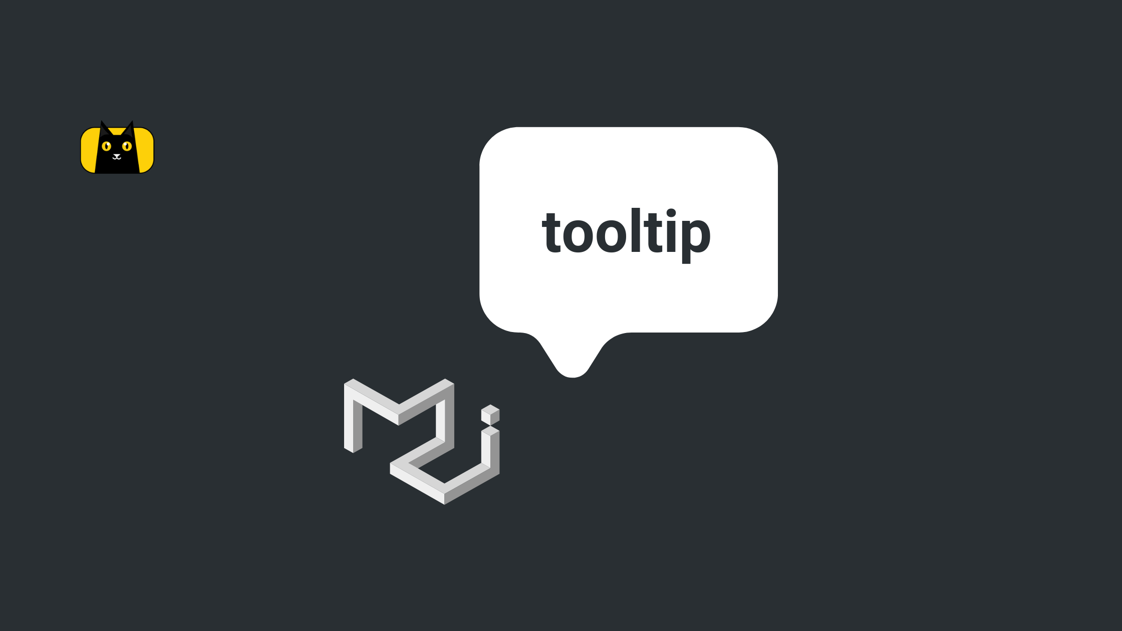
What is Tooltip Component in Material UI?
Material UI Tooltip is a React component that provides a rich interactive tooltip experience for displaying additional or hidden information when hovering over an element on the page.
Material-UI Tooltip provides an excellent way of providing hints, instructions, or additional information to users without taking up too much space as demonstrated below:
MUI Tooltips display descriptions when users hover over an element paired with them as shown above.
Setting up a React App
Use the following command to create a new react application:
npx create-react-app my-app
Next, run the following command to navigate to your newly generated app directory:
cd my-app
Then run the following command to start your React server:
yarn start
Or using npm:
npm start
Your server should launch in your browser at http://localhost:3000, as shown below:
Installing Material UI Library
In this section, we’ll install the Material UI library. Run the command below to install Material UI to your project:
npm:
npm install @mui/material @emotion/react @emotion/styled
yarn:
yarn add @mui/material @emotion/react @emotion/styled
Setting Up the File Structure
- In the
srcfolder, create a new folder namedcomponent. - Next, create a new Navbar.jsx file with the following code:
import React from "react";
import "./navbar.css";

export const Navbar = () => {
  return (
    <nav>
      <button>View</button>
      <button>Delete</button>
      <button>Edit</button>
    </nav>
  );
};
- Then, create a new
navbar.csswith the following CSS styles:
nav{
    display: flex;
    justify-content: center;
    align-items: center;
    gap: 20px;
    margin-top: 20px;
}

nav button{
    font-size: 18px;
    padding: 12px;
    border-bottom: 1px solid white;
}

nav button:hover{
    border-bottom: 1px solid #000;
}
When you check the browser, our app should look and function as shown below:
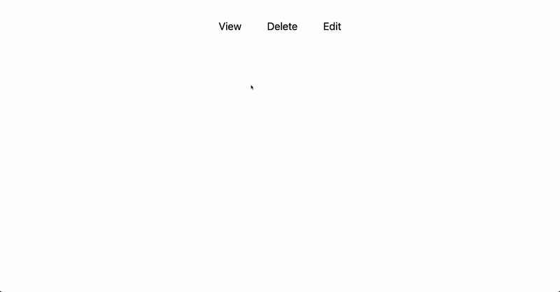
In the following section, we’ll use the Material Tooltip component to show tooltips when the component is being hovered over.
Using Material Tooltip Component in React
To use the Material UI Tooltip component, simply import it and wrap it around the element or custom react element that you want the tooltip to appear when you hover over it, as shown below:
import { Tooltip } from "@mui/material";
import React from "react";
import "./navbar.css";

export const Navbar = () => {
  return (
    <nav>
      <Tooltip title='View transaction 🔍'>
        <button>View</button>
      </Tooltip>
      <Tooltip title='Delete transaction 🗑'>
        <button>Delete</button>
      </Tooltip>
      <Tooltip title='Edit transaction ✍️'>
        <button>Edit</button>
      </Tooltip>
    </nav>
  );
};
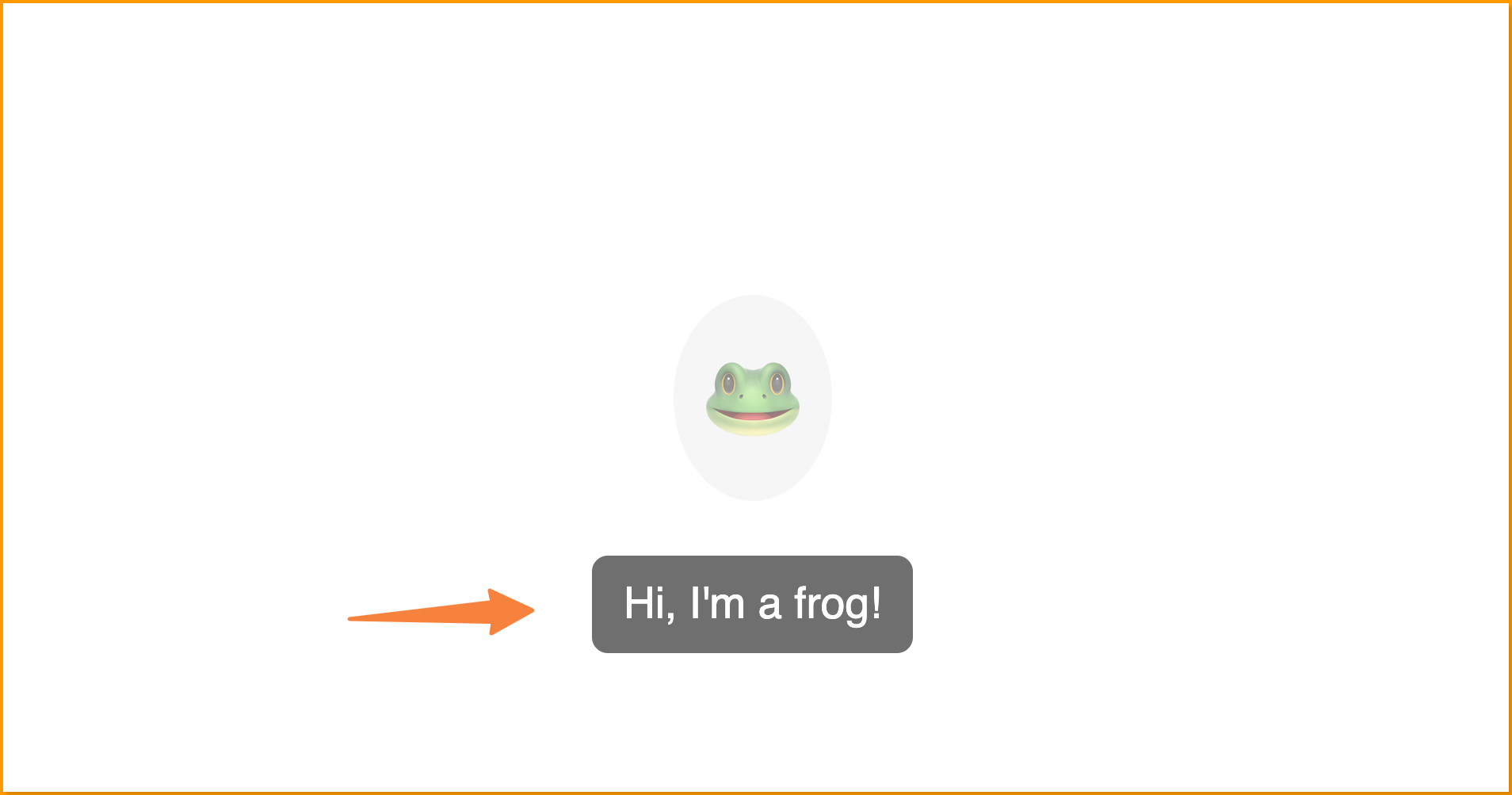
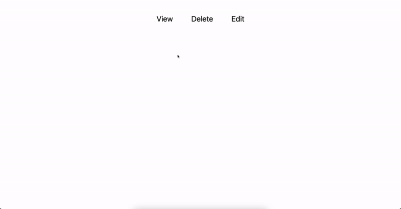
We wrapped the Tooltip component around the button element in the component above, and we declared the sentence we want to display in the tooltip element in the Tooltip component title prop.
Now, our app navbar buttons should display a tooltip component when you hover over them as demonstrated below:
Rendering JSX in Material UI Tooltip
We can render JSX as the content of the Material UI Tooltip as shown below:
import { Tooltip } from "@mui/material";
import React from "react";
import "./navbar.css";

export const Navbar = () => {
  return (
    <nav>
      <Tooltip
        placement='bottom'
        title={
          <details>
            <summary>Click to view transaction 🔍</summary>
            <a href='#'>#0910101910</a>
            <a href='#'>#0818172827</a>
            <a href='#'>#0762822827</a>
          </details>
        }
      >
        <button>View</button>
      </Tooltip>
      <Tooltip title='Delete transaction ❌' placement='bottom'>
        <button>Delete</button>
      </Tooltip>
      <Tooltip title='Edit transaction ✍️' placement='bottom'>
        <button>Edit</button>
      </Tooltip>
    </nav>
  );
};
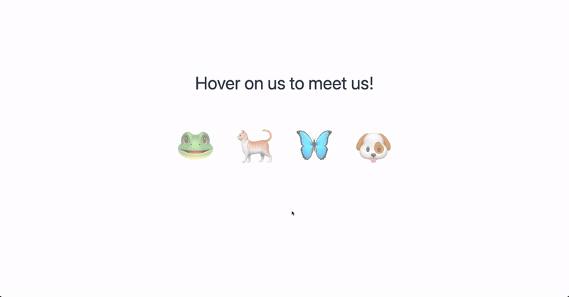
The JSX child element above will be displayed within the tooltip and function as shown below:
Customizing Material UI Tooltip
Material UI Tooltip is highly customizable, allowing the user to control the tooltip’s position, size, and content. We’ll discuss how to position the material UI tooltip in the next section.
Material UI Tooltip Positioning
The default position of the material UI Tooltip is the bottom of the element, and we can change this using the placement prop and specifying either of the following positions:
toptop-starttop-end
bottom (default)bottom-startbottom-end
rightright-startright-end
leftleft-startright-start
We’ll demonstrate the top, right, left, and bottom positions below:
Tooltip Position Top
Set the placement prop to top to position the tooltip at the top of the element, also ensure there is enough space at the top of the element, else the tooltip will be reverted to the bottom position.
import { Tooltip } from "@mui/material";
import React from "react";
import "./navbar.css";

export const Navbar = () => {
  return (
    <nav style={{ marginTop: "3rem" }}>
      <Tooltip title='View transaction 🔍' placement='top'>
        <button>View</button>
      </Tooltip>
      <Tooltip title='Delete transaction ❌' placement='top'>
        <button>Delete</button>
      </Tooltip>
      <Tooltip title='Edit transaction ✍️' placement='top'>
        <button>Edit</button>
      </Tooltip>
    </nav>
  );
};
The tooltip positioned at the top will look something as below:
Tooltip Position Right
Set the placement prop to right to position the tooltip at the right side of the element as shown below:
import { Tooltip } from "@mui/material";
import React from "react";
import "./navbar.css";

export const Navbar = () => {
  return (
    <nav style={{ marginTop: "3rem" }}>
      <Tooltip title='View transaction 🔍' placement='right'>
        <button>View</button>
      </Tooltip>
      <Tooltip title='Delete transaction ❌' placement='right'>
        <button>Delete</button>
      </Tooltip>
      <Tooltip title='Edit transaction ✍️' placement='right'>
        <button>Edit</button>
      </Tooltip>
    </nav>
  );
};
The tooltip will now be positioned at the right side of the element and will look something as below:
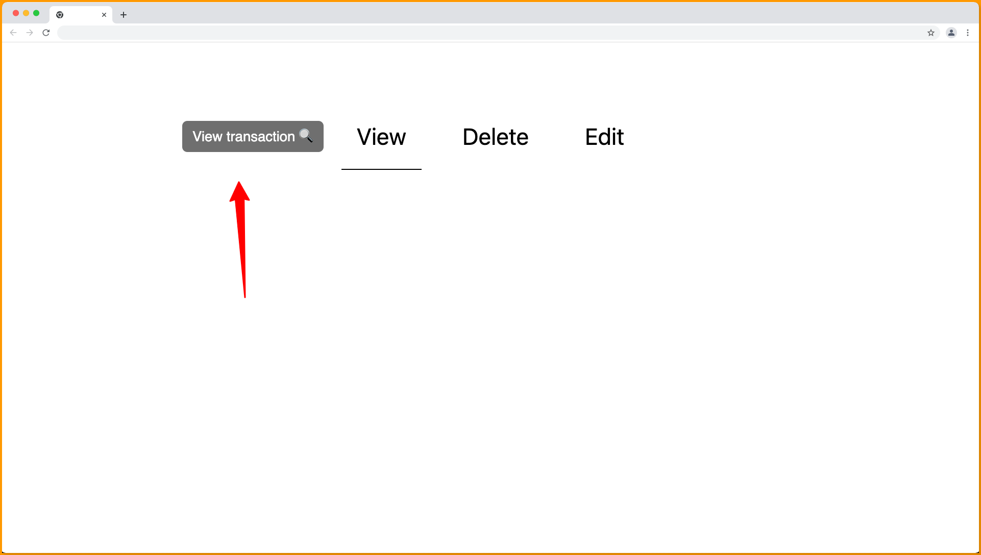
Tooltip Position Left
Set the placement prop to left to position the tooltip at the left side of the element as shown below:
import { Tooltip } from "@mui/material";
import React from "react";
import "./navbar.css";

export const Navbar = () => {
  return (
    <nav style={{ marginTop: "3rem" }}>
      <Tooltip title='View transaction 🔍' placement='left'>
        <button>View</button>
      </Tooltip>
      <Tooltip title='Delete transaction ❌' placement='left'>
        <button>Delete</button>
      </Tooltip>
      <Tooltip title='Edit transaction ✍️' placement='left'>
        <button>Edit</button>
      </Tooltip>
    </nav>
  );
};
The tooltip will now be positioned at the left side of the element and will look something as below:
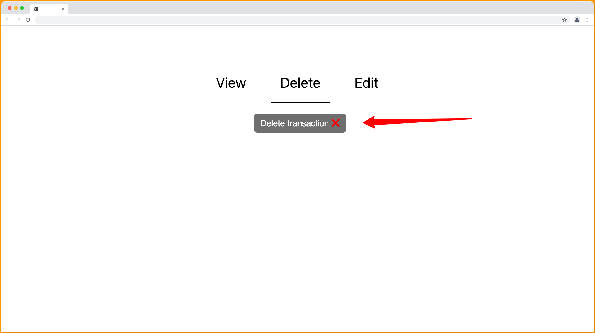
Tooltip Position Bottom
This is the default position of the material UI tooltips and can be declared by setting the placement prop to bottom as shown below:
import { Tooltip } from "@mui/material";
import React from "react";
import "./navbar.css";

export const Navbar = () => {
  return (
    <nav style={{ marginTop: "3rem" }}>
      <Tooltip title='View transaction 🔍' placement='bottom'>
        <button>View</button>
      </Tooltip>
      <Tooltip title='Delete transaction ❌' placement='bottom'>
        <button>Delete</button>
      </Tooltip>
      <Tooltip title='Edit transaction ✍️' placement='bottom'>
        <button>Edit</button>
      </Tooltip>
    </nav>
  );
};
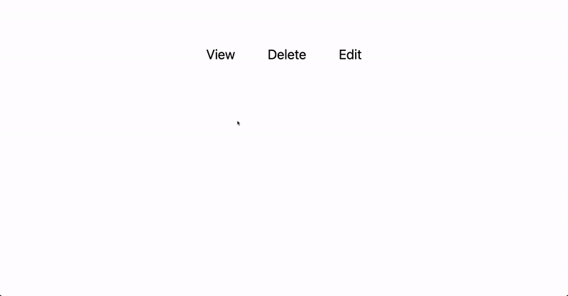
The tooltip will be positioned at the bottom of the element as follows:
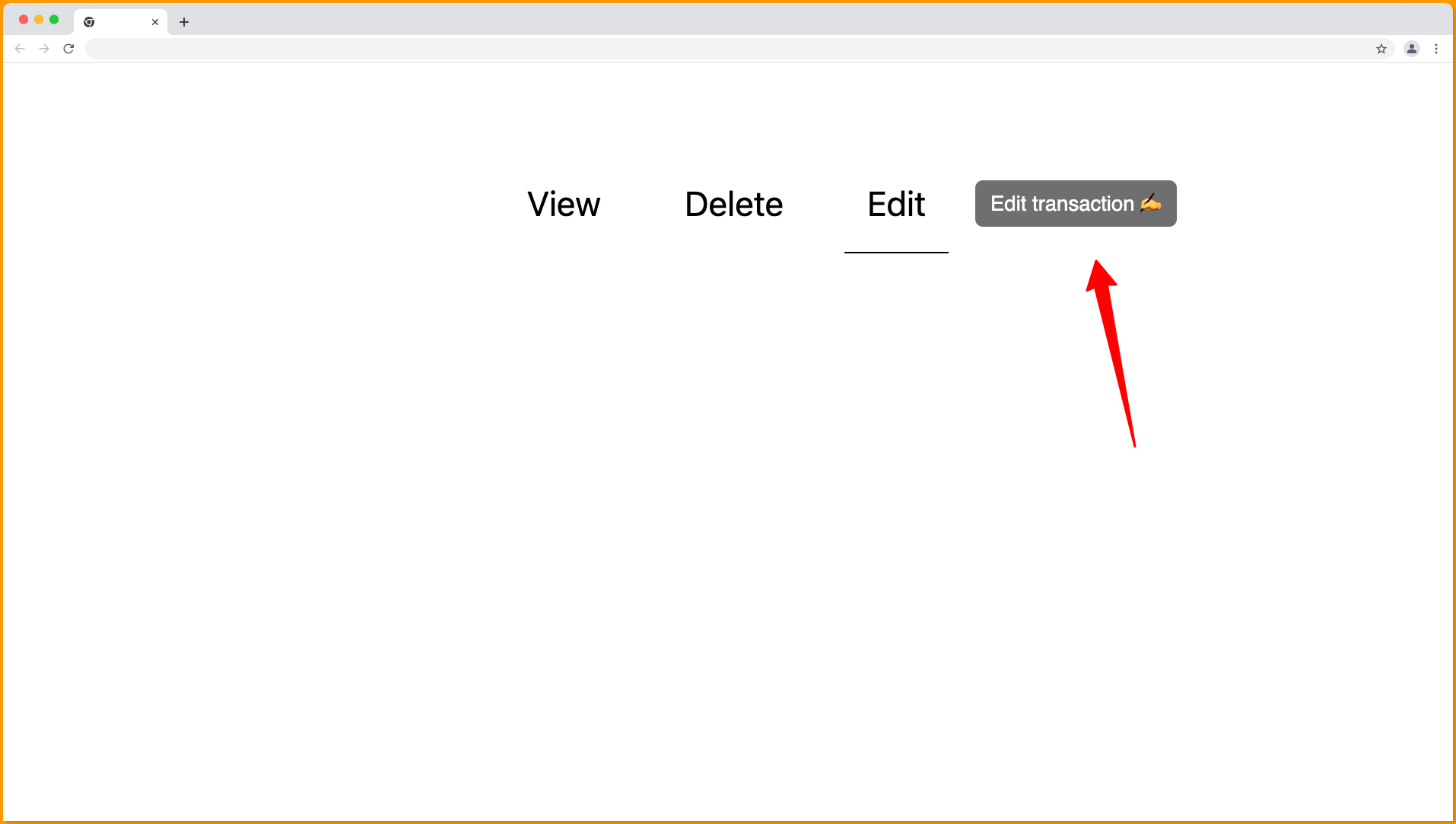
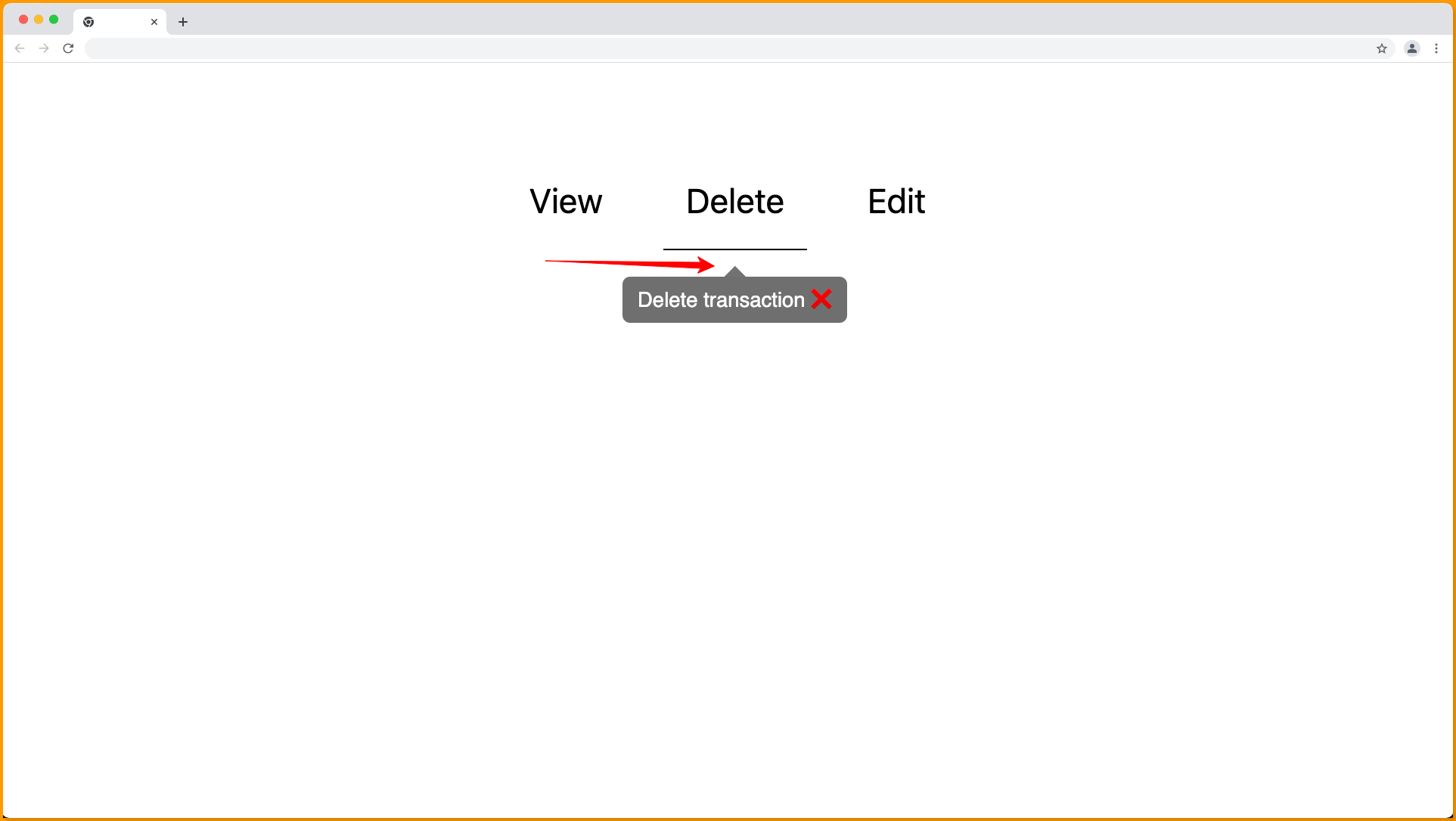
Material UI Arrow Tooltip
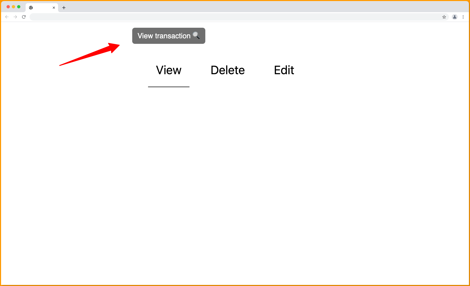
Pass the arrow prop to the MUI Tooltip to customize the tooltip to have an arrow pointing to the element attached to it.
import { Tooltip } from "@mui/material";
import React from "react";
import "./navbar.css";

export const Navbar = () => {
  return (
    <nav style={{ marginTop: "3rem" }}>
      <Tooltip title='View transaction 🔍' arrow>
        <button>View</button>
      </Tooltip>
      <Tooltip title='Delete transaction ❌' arrow>
        <button>Delete</button>
      </Tooltip>
      <Tooltip title='Edit transaction ✍️' arrow>
        <button>Edit</button>
      </Tooltip>
    </nav>
  );
};
The arrow prop will be visible pointing toward the element paired to the tooltip as follows:
Wrapping Up
Tooltips displays when users hover over an element paired with them.
This article has introduced you to the Material Tooltip component, how to set it up and how to make use of it in a react application to render a floating component that appears when an element is hovering over.
If you prefer a video tutorial on the Material UI Tooltip component, you can watch the video below:
Interesting Reads From Our Blogs
You can find more interesting reads like this on the CopyCat blog:
- Creating Tooltips in React with React-Tooltip Library
- Top 17 VSCode Plugins to Boost Productivity as a Developer
- All You Need To Know About Typescript Array
Happy Coding 👨🏽💻
Related Articles
-
 React.js
Vue vs React: What Tool Is Right For Your Project?
Introduction Front-end development is one of the most dynamic subfields in software development, and for this reason, it can be challenging to keep up with all of its emerging trends and tools. However, whether you're a beginner or a pro frontend…
October 17, 2022 -
React.js
Guide to Working with Material UI Box Component
https://images.surferseo.art/1e1eefdb-d696-4ca7-af29-190475deb8eb.png Introduction Before we begin, assume you have a box of building blocks. Each block is a different color, shape, or size. You can use them to construct a variety of interesting structures. You can create your website or app…
December 24, 2022

