
 December 20, 2022
  Victor Yakubu


Introduction
Bootstrap tabs are a popular component of the popular open-source front-end development toolkit, Bootstrap. It provides a way to create navigation elements on a web page quickly. This article will discuss how to use Bootstrap tabs to create navigation elements on a web page.
We will discuss the available options, how to create, configure, and how to style unique and attractive navigation elements. Through this article, you will be able to see the benefits of using Bootstrap tabs. You will also see alternatives to Bootstrap that you can use to create dynamic tabs in your React projects.
What is Bootstrap
React Bootstrap is designed to make building React applications easier. It provides a set of components and utilities that are styled according to the Bootstrap CSS framework. This means developers can spend more time focusing on writing the code and less time worrying about styling and layout.
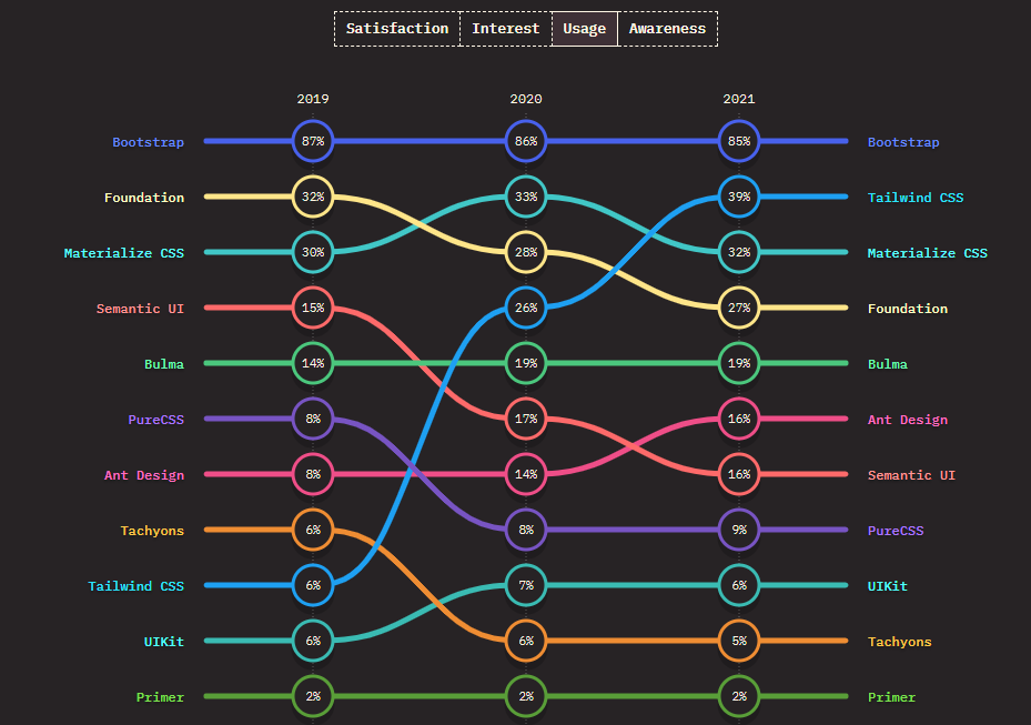
It also helps to improve the performance of React applications. Overall, React Bootstrap is an excellent choice for developers looking to quickly build React applications with a consistent look and feel. According to the State of CSS 2021, Bootstrap ranks number 1 as the most used CSS framework for three consecutive years.
It currently has over 4.6M weekly downloads from the npm package manager.
Before we proceed further, check out the cool CopyCat plugin that can be used to convert Figma designs to React code or Bootstrap code in little to no time, ensuring that you build production-ready projects faster than others.
What are Bootstrap Tabs
The Bootstrap Tabs component is used in the Bootstrap framework for creating dynamic tabbed navigation. Tabs are horizontal navigation elements that can contain text, icons, or images. Each tab is identified by a unique identifier. When a user clicks on a tab, the content associated with that tab is displayed.
It provides an easy way to organize content into separate sections. Each section is accessible by clicking on its associated tab, and it can easily be integrated into a React application using the Bootstrap React library. The Tabs component is designed to be used in conjunction with Tab. It allows users to quickly switch between different sections of content.
Bootstrap tabs are easy to use and can be customized to meet specific design needs, and they are responsive versions of web navigation components. They are also responsive, meaning they will automatically adjust their size and layout depending on the device or screen size. This makes them ideal for creating dynamic, user-friendly web applications.
Setting up and Using Bootstrap in a React application
In this section, you will be going through every step required to install Bootstrap in your React application and how to use the Bootstrap tabs and pills components.
Creating a React App
Follow the steps below to create a new React application; if you already have an existing project that you want to use the Bootstrap tab on, you can skip this step.
On your command line, run the code below:
npx create-react-app my-app
The above command will create a new React project with my-app as the name. You will then have to navigate into the newly created project using the code below:
cd my-app
Then run either of these commands below to start your React server on your default browser
yarn start
Or using npm:
npm start
The React server will launch on your browser at http://localhost:3000/, as shown in the image below:
Installing Bootstrap
Now that you have your React project ready, you can then proceed to install Bootstrap using either the npm or yarn package managers.
Run the code below to install Bootstrap using npm:
npm install bootstrap react-bootstrap
Or using Yarn:
yarn add bootstrap react-bootstrap
The reason why you installing both Bootstrap and React-bootstrap is that React-bootstrap is just JavaScript and it does not contain any styling, so you need to install Bootstrap for the styling of your components. Once the installation is complete, you can now use the various Bootstrap components across your application.
The code for all the examples used in this article is available in the codesandbox embedded below.
Bootstrap tabs
The Bootstrap tabs component allows users to switch between different panes or tab by clicking on them, it activates the given tab and shows its associated lane. It’s also worthy of note that the tab component also supports the customization of the look and feel of tabs by providing various classes and styles. For example, you can change the background color, font size, or border style of the tabs.
Using the Bootstrap tabs in React is easy. All you need to do is import the Bootstrap tab component into your React project and then create a React class that renders the tabs based on the given props. You can also customize the look and feel of the tabs by adding the desired classes and styles.
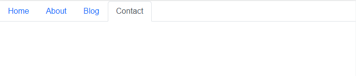
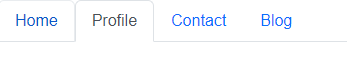
The following example creates navigation tabs using the Tab and Tabs component
import React from "react";
import { Tabs, Tab } from "react-bootstrap";
import "bootstrap/dist/css/bootstrap.min.css";

export default function Demo() {
  return (
    <Tabs defaultActiveKey="profile">
      <Tab eventKey="home" title="Home" />
      <Tab eventKey="profile" title="Profile" />
      <Tab eventKey="contact" title="Contact" />
      <Tab eventKey="blog" title="Blog" />
    </Tabs>
  );
}
Bootstrap Tab Props
The Boostrap Tab and Tabs have various props that you can pass into the component from the Boostrap, these props can be used to add styling or give you dynamic change and control
For the <Tabs/> component some of the props are:
- id: A unique id for the tabs container
- activeKey: The key of the tab that is currently active
- onSelect: A callback function that is triggered when a tab is selected
The <Tab/> component also has a number of props, some include:
- disabled: Used to disable a particular tab
- eventKey: It is unique to a particular tab and serves as an identifier
- title: This is a required prop that is used to assign a name to the tab
You can check out the Bootstrap documentation for other props and how to use them
Once you have created the tabs, you can add the content for each tab by using the Bootstrap tab pane component. The content for each tab can be specified in the props of the tab pane component.
Bootstrap Tabs with Controlled Tab
Controlled Tabs in Bootstrap React are when a tab is disabled. A previous active tab can be made inactive so that when a user interacts with it, such as by clicking on it, its content won’t be clickable and won’t show. This is mainly used when you want to handle the selection personally.
A Bootstrap tab can be controlled in that it remains disabled until a condition is met. For example, you can set a tab to remain disabled until a fetch request is completed, this is just one use case. Controlling a tab with Bootstrap is straightforward; all you have to do is pass the disabled prop to that particular tab. Here is an example.
import React from "react";
import { Tabs, Tab } from "react-bootstrap";
import "bootstrap/dist/css/bootstrap.min.css";

export default function Demo() {
  return (
    <Tabs >
      <Tab eventKey="home" title="Home" />
      <Tab eventKey="profile" title="Profile" />
      <Tab eventKey="contact" title="Contact" />
      <Tab eventKey="blog" title="Blog" disabled/>
    </Tabs>
  );
}
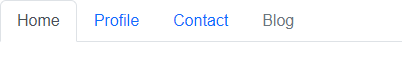
From the image above, you can see that the Blog Tab is disabled and a fade class is applied to the tab.
In summary, controlled tabs in React are a powerful way to manage tabs in Bootstrap and they can be used to make sure only one tab is active at a time.
Creating dynamic tabs
You have seen how to use the Tab and Tabs components on Bootstrap, but how do you use them to render content dynamically? This is the main reason why the Tabs component was created; it provides an easier way to switch between tabs while also changing the content accordingly, each tab is activated individually so the content of the previously selected tab switches to the content when you toggle tabs. An event fires when you click on an element’s tab, which removes the current content from the DOM and replaces it with a new one.
Let’s see how to do that.
import React from "react";
import { Tabs, Tab } from "react-bootstrap";
import "bootstrap/dist/css/bootstrap.min.css";

export default function Dynamic() {
  const Demo = () => {
    return <div>Tab 4 using component screen readers</div>;
  };
  return (
    <Tabs>
      <Tab eventKey="home" title="Home">
        Tab 1 content
      </Tab>
      <Tab eventKey="profile" title="Profile">
        Tab 2 Content
      </Tab>
      <Tab eventKey="contact" title="Contact">
        Tab 3 content
      </Tab>
      <Tab eventKey="blog" title="Blog">
        <Demo />
      </Tab>
    </Tabs>
  );
}
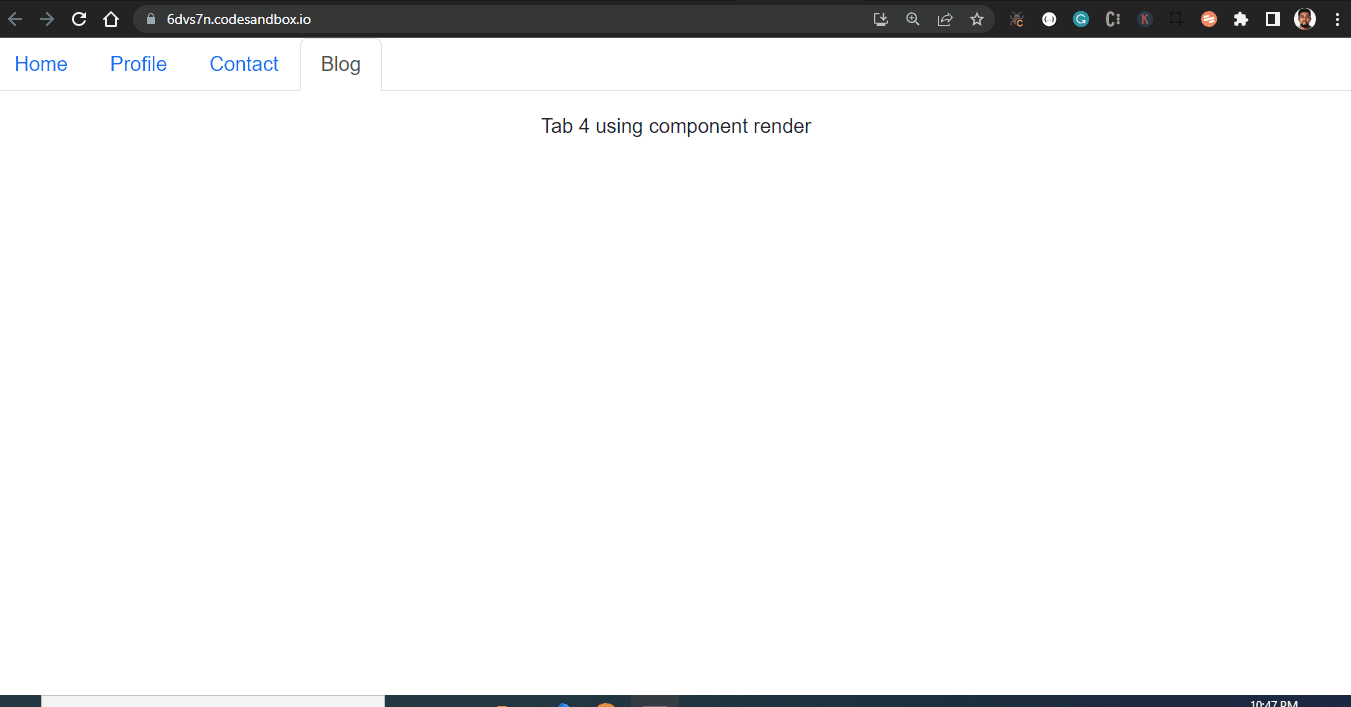
So rather than linking each tab to a new page or location and writing lots of JavaScript code, you can easily use the power of the Bootstrap tab to rather each content.
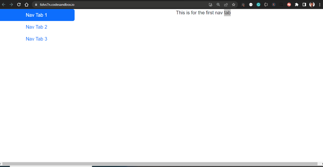
Custom Bootstrap tabs
Oftentimes, you will need a more complex layout for your tab navigation, and Bootstrap allows you to create that. Using the tab container, tab content, and tab pane, the tab container serves the parent container.
The TabContainer helps you to create a tabbed interface with a variety of different options, such as the ability to customize the tab labels, the ability to add custom content within the tab container, and the ability to handle different types of events.
While the TabContent is used in conjunction with the TabPane to create a tabbed interface, both the Tab Content and the Tab Pane support various props, including active, eventKey, as, bsPrefix, transition, and a lot more. I’ve attached the link to the documentation here so you can check them out.
Tab Props
The <Tab.Container/> component API also has a number of props, some including:
- activeKey: The eventKey of the currently active tab.
- id: This is a required field, to assign an id, in cases where the id of the attribute is needed
- transition: It is used to set default animation it sets the class tab pane – fade to all children else, use false to disable, or a custom react-transition-group <Transition/> component.
- onSelect: It is a callback function that is called whenever a tab is selected.
- unmountOnExit: Is used to unmount a current active tab and remove it from the DOM when they are no longer visible.
The <Tab.Content/> component API also has a number of props, some including:
- as: You can use a custom element type for this component.
- bsPrefix: This is a required field, it is used to change the underlying component CSS base class name and modifier class names prefix. This is an escape hatch for working with heavily customized bootstrap CSS.
The <Tab.Pane/> component API also has a number of props, some including:
- eventKey: It is used to link the TabPane to its associate NavLink
- active: It is used to toggle the active state of the TabPane, this is generally controlled by a TabContainer.
- mountOnEnter: It waits for the onEnter callback function to return true before mounting the tab to the DOM element.
The following example shows you how to use the props
import React from "react";
import { Tab, Col, Nav, Row } from "react-bootstrap";
import "bootstrap/dist/css/bootstrap.min.css";

export default function Complex() {
  return (
    <Tab.Container>
      <Row>
        <Col sm={3}>
          <Nav variant="pills" className="flex-column">
            <Nav.Item>
              <Nav.Link eventKey="first">Nav Tab 1</Nav.Link>
            </Nav.Item>
            <Nav.Item>
              <Nav.Link eventKey="second">class Nav Tab 2 vertical pills</Nav.Link>
            </Nav.Item>
            <Nav.Item>
              <Nav.Link eventKey="third">Nav Tab 3 activate individual tabs</Nav.Link>
            </Nav.Item>
          </Nav>
        </Col>
        <Col sm={9}>
          <Tab.Content>
            <Tab.Pane eventKey="first">This is for the first nav tab</Tab.Pane>
            <Tab.Pane eventKey="second">
              This is for the second nav tab
            </Tab.Pane>
            <Tab.Pane eventKey="third">
              I guess this is for the third nav tab
            </Tab.Pane>
          </Tab.Content>
        </Col>
      </Row>
    </Tab.Container>
  );
}
Creating Fill and Justify navigation tabs
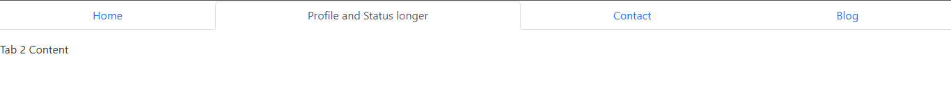
By default, Tabs do not cover the entire width of your screen as the Nav component in Boostrap does. Fill and Justify force your nav’s contents to extend the full available width. It’s very easy to implement, you just need to pass the fill or justify prop to the Tabs component. Let’s first see how to use fill.
From the image below, you will notice that the Tabs are not all of the same width, so the fill prop makes the Tabs container fill the available space of the screen but does not appropriate the same size for each tab.
import React from "react";
import { Tabs, Tab } from "react-bootstrap";
import "bootstrap/dist/css/bootstrap.min.css";

export default function Dynamic() {
  const Demo = () => {
    return <div>Tab 4 using component to render tab instance</div>;
  };
  return (
    <Tabs fill className="mb-3">
      <Tab eventKey="home" title="Home">
        Tab 1 content
      </Tab>
      <Tab eventKey="profile" title="Profile and Status longer">
        Tab 2 Content
      </Tab>
      <Tab eventKey="contact" title="Contact">
        Tab 3 content
      </Tab>
      <Tab eventKey="blog" title="Blog">
        <Demo />
      </Tab>
    </Tabs>
  );
}
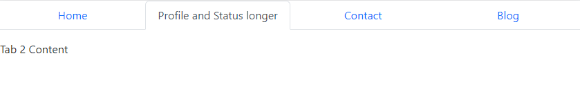
But if you want each tab to have the same width across various screen sizes and also occupy all horizontal space, use Justify and force the tabs to maintain the same width.
All you have to do is replace “fill” with “justify” in the code above.
import React from "react";
import { Tabs, Tab } from "react-bootstrap";
import "bootstrap/dist/css/bootstrap.min.css";

export default function Dynamic() {
  const Demo = () => {
    return <div>Tab 4 using component render</div>;
  };
  return (
    <Tabs justify className="mb-3">
      <Tab eventKey="home" title="Home">
        Tab 1 content
      </Tab>
      <Tab eventKey="profile" title="Profile and Status longer">
        Tab 2 Content
      </Tab>
      <Tab eventKey="contact" title="Contact">
        Tab 3 content tabs plugin
      </Tab>
      <Tab eventKey="blog" title="Blog">
        <Demo />
      </Tab>
    </Tabs>
  );
}
Frequently Asked Questions
Can you create a dropdown menu with the Tab component?
Dropdown menus shouldn’t be used in dynamic tabbed components as they compromise both usability and accessibility. The trigger element for the presently visible tab is hidden behind the closed dropdown menu, which can be confusing from a usability standpoint. So it doesn’t make sense to do that, and Bootstrap does not support that currently. However, you can use the dropdown menu with the Nav component in Bootstrap.
What is the difference between the Nav and Tabs Component
Both the Nav and Tabs components are used to create a navigation bar in your React application; however, they are different in the way it is rendered.
React Bootstrap Nav:
- React Bootstrap Nav is a React component that allows you to create navigation menus.
- It allows you to create a nav item that is responsive, mobile-friendly, and accessible.
- It is built with JavaScript and works with any modern web framework such as React, Angular, or Vue. nav link active,
Tabs Component:
- React Bootstrap Tabs is a React component that allows you to create tabbed interfaces.
- It allows you to organize content into different tabs and easily switch between them.
- It is built with JavaScript and works with any modern web framework such as React, Angular, or Vue.
Alternatives to Bootstrap Tabs
Aside from Bootstrap, there are other React component UI libraries that can be used to create Tabs for your web page.
More Materials on Bootstrap
There are other features available in Bootstrap tabs, so if you want to learn more about this wonderful component, here are some recommended materials.
- React Bootstrap Documentation
- https://www.youtube.com/watch?v=-qfEOE4vtxE
- https://youtu.be/kN7_M4wjDhE
Conclusion
In this article, you have learned about the Bootstrap Tab component and how it can be used to create dynamic navigation on your web page. You also saw how the different Tab APIs work with examples. If you want to learn about a different way of creating navigation on your web page using Boostrap, you can check out the Navbar component.
Finally, you can find more insightful articles around Bootstrap, Material UI, and other React topics on our blog at CopyCat. CopyCat is a tool that can save you and your engineering team a lot of development time as it helps you convert Figma files to up-and-running Bootstrap or React code. You can check it out here.
Other Interesting Reads From Our Blogs
- Creating Tooltips in React with React-Tooltip Library
- Material UI Grid: The Ultimate Guide to Building Responsive Web Layout in React
- Everything You Need to Get Started with Tailwind UI
- Step-by-Step Guide to using Reactstrap for Building Amazing Web Apps in React
Related Articles
-
 React.js
Building Maps in React with react-leaflet Library
Make your developers' lives easier by using CopyCat, an AI that can convert your Figma designs into React, Tailwind, Bootstrap, and other popular CSS frameworks. Click here to check out the CopyCat plugin for Figma. Convert Design to Code with…
December 20, 2022 -
React.js
The Complete Guide to React Draggable Components
Have you ever wondered how popular project management software implemented draggable components that allow users to drag and drop items? In this article, we’ll explore a library called React-Draggable in depth by creating a list with draggable components. Are you…
July 20, 2022
