 December 20, 2022
  David Ozokoye


- Introduction
- Getting Started With the Bootstrap Dropdown
- How to Add Dropdowns in Navigation
- How to Add Dropdowns Within Buttons
- How to Add Headers to Dropdown Items
- How to Create Dropup, Dropleft, and Dropright menus
- Disable Items in a Dropdown Menu
- Dropdown Divider
- How to Add Dropdowns via Data Attributes
- Creating the Right Aligned Dropdown Menus
- Bootstrap Dropdown Alternatives
- Conclusion
- Related Blogs
Introduction
When building a web application, having a good navigation system makes your content easily accessible to users. With a dropdown menu, you can group related menu items for easy access.
With Bootstrap, you can easily create a dropdown menu anywhere within your website. It provides support for adding dropdowns in navbars and buttons. And you can customize it to suit your brand.
In this tutorial, you’ll learn how to add a dropdown menu in your React application using the React-bootstrap library. We’ll also show you how to add dropdown menus using data attributes if you don’t want to install the React-bootstrap library.
Without further ado, let’s get started 🙂
Getting Started With the Bootstrap Dropdown
Bootstrap is a frontend styling library that allows you to easily style your components in React without writing custom CSS.
It has many customization options, such as the Bootstrap dropdown plugin. The dropdown menu makes it easy to group related menu items. The items will be visible when a user clicks on the toggling element.
Bootstrap makes it easy and fast to build User Interfaces. However, you can also use CopyCat’s tool to convert your Figma designs into functional components. This would save a lot of downtime and enable you to focus on building out functionalities.
Requirements
To follow along with this guide, you’ll need basic Knowledge of HTML, Bootstrap, and React. If you’re new to Bootstrap, the video below should get you up to speed.
Creating a React App
We’ll use the create-react-app boilerplate for this project to create a react application. To install react, first, open your terminal window and navigate to the directory you’d like to install React.
Then run the command below:
npx create-react-app dropdown-demo
Once the installation completes, navigate into the directory containing your react files using the cd command.
cd dropdown-demo
Next, proceed to install react-bootstrap.
Installing React Bootstrap
React BootStrap is a library that lets you easily integrate bootstrap in React. To install the library, run the command below.
npm:
npm install react-bootstrap bootstrap
yarn:
yarn add react-bootstrap bootstrap
After installing the library, run the code below to start the dev server.
npm start
Next, we’ll see a basic example of a basic implementation of the Dropdown menu. Before we get started, you’ll need to import the default CSS styles provided by Bootstrap. For this, open the project with a code editor and then open the index.html file within the public folder.
Within the <head> tag, add the following code to link to the Bootstrap CSS bundle.
<!--public/index.html-->

<link
  rel="stylesheet"
  href="https://cdn.jsdelivr.net/npm/bootstrap@5.2.3/dist/css/bootstrap.min.css"
  integrity="sha384-rbsA2VBKQhggwzxH7pPCaAqO46MgnOM80zW1RWuH61DGLwZJEdK2Kadq2F9CUG65"
  crossorigin="anonymous"
/>
Now proceed to create your first dropdown menu.
Basic Bootstrap Dropdown
Here is an example of how to use the Dropdown component in a React project. For this example, we’ll use the App component to test out the Dropdown menu.
To start, you’ll need to import the Dropdown component from react-bootstrap.
//App.js
import Dropdown from 'react-bootstrap/Dropdown';
After importing it, replace the code in the return statement of App.js with the snippet below.
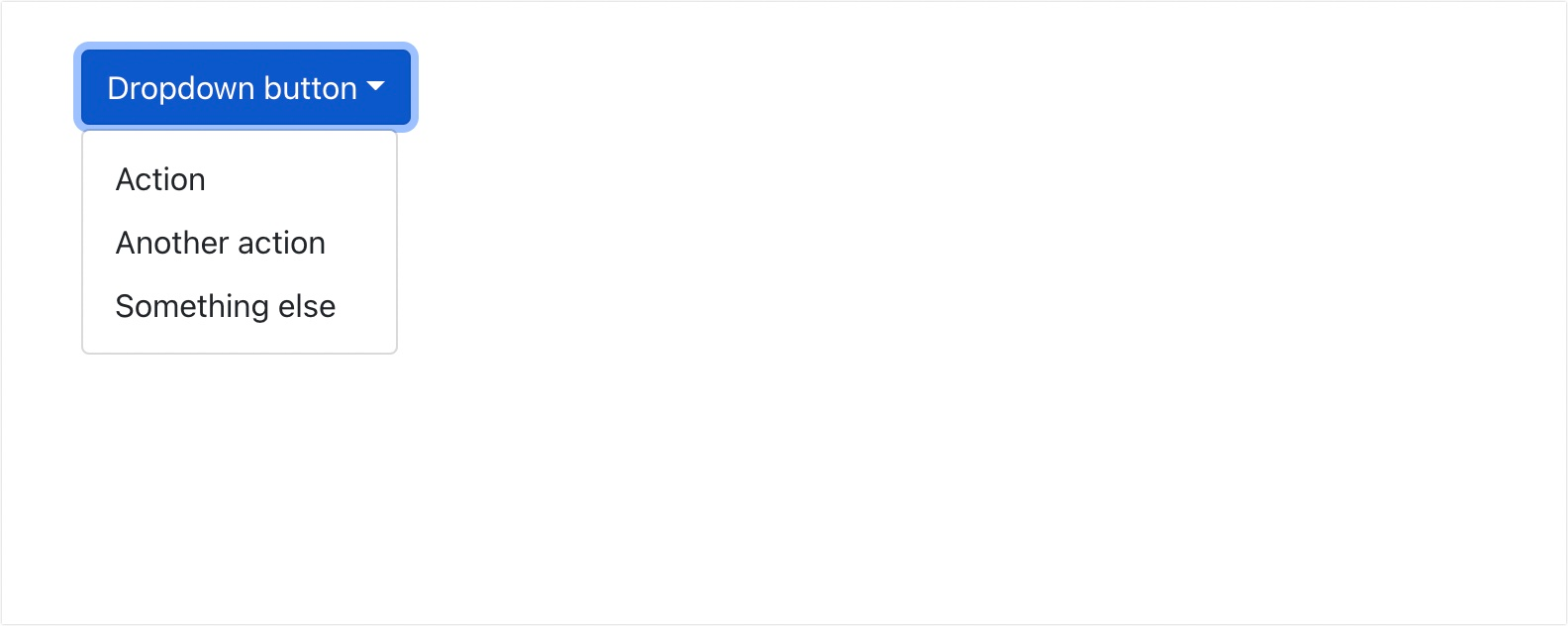
<Dropdown>
      <Dropdown.Toggle variant="success" id="dropdown-basic">
        Dropdown Button
      </Dropdown.Toggle>

      <Dropdown.Menu>
        <Dropdown.Item href="#/action-1">Action</Dropdown.Item>
        <Dropdown.Item href="#/action-2">Another action</Dropdown.Item>
        <Dropdown.Item href="#/action-3">Something else</Dropdown.Item>
      </Dropdown.Menu>
</Dropdown>
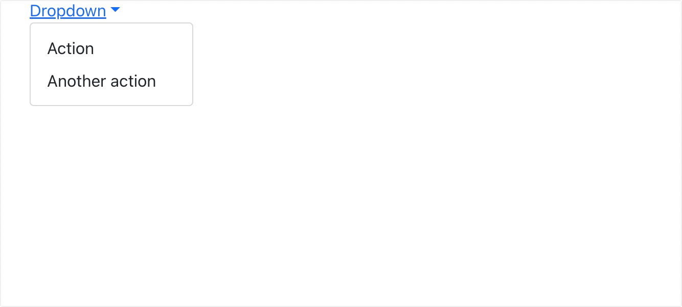
In the code above, we use the Dropdown component to create a new bootstrap dropdown. It requires the <Dropdown.Toogle> subcomponent, which specifies the title of the dropdown menu.
Within the <Dropdown.Menu> component, you’ll enter each item you need to add to the dropdown menu using the <Dropdown.Item> component.
Inside the <Dropdown.Item> component, you can add an href prop that lets you include an anchor link on the dropdown menu items. You can also add the onClick event handler
Here is the output from the example code above.
Dropdown Menu Dark Mode
Bootstrap dropdown menus can also implement a dark theme. To use a dark dropdown menu, simply add a dark variant prop to the <Dropdown.Menu> component.
<Dropdown>
      <Dropdown.Toggle variant="success" id="dropdown-basic">
        Dropdown Button
      </Dropdown.Toggle>

      <Dropdown.Menu variant="dark">
        <Dropdown.Item href="#">Item 1</Dropdown.Item>
        <Dropdown.Item href="#">Item 2</Dropdown.Item>
      </Dropdown.Menu>
</Dropdown>
How to Add Dropdowns in Navigation
To create a navigation menu with a dropdown in react, we use the <NavDropdown> component. The NavDropdown requires a title prop that’s used to specify the title on the dropdown. Within the component, we use the NavDropdown.Item sub-component to add the individual dropdown items.
For this example, let’s create a new component within our React App named NavBarExample.jsx. You can name yours however you’d like. Copy and paste the code below to the NavBarExample component we just created.
//components/NavBarExample.jsx

import Container from 'react-bootstrap/Container';
import Nav from 'react-bootstrap/Nav';
import Navbar from 'react-bootstrap/Navbar';
import NavDropdown from 'react-bootstrap/NavDropdown';

function NavBarExample() {
  return (
    <Navbar bg="light" expand="lg">
      <Container>
        <Navbar.Brand href="#home">David's Brand</Navbar.Brand>
        <Navbar.Toggle aria-controls="basic-navbar-nav" />
        <Navbar.Collapse id="basic-navbar-nav">
          <Nav className="me-auto">
            <Nav.Link href="#home">Home</Nav.Link>
            <Nav.Link href="#link">About</Nav.Link>
            <NavDropdown title="My Dropdown" id="basic-nav-dropdown">
              <NavDropdown.Item href="#action/3.1">Contact</NavDropdown.Item>
              <NavDropdown.Item href="#action/3.2">
                Another action
              </NavDropdown.Item>
              <NavDropdown.Item href="#action/3.3">Services</NavDropdown.Item>
              <NavDropdown.Divider />
              <NavDropdown.Item href="#action/3.4">
                Using Divider
              </NavDropdown.Item>
            </NavDropdown>
          </Nav>
        </Navbar.Collapse>
      </Container>
    </Navbar>
  );
}

export default NavBarExample;
After creating the component, head over to App.js and import the Navbar component we just created.
// App.js
import NavBarExample from './components/NavBarExample';
In the return statement of App.js, we can use the component like so.
...
<NavBarExample />
...
Here is the output from implementing the code above.
How to Add Dropdowns Within Buttons
React bootstrap comes with a Dropdown button component that makes it easy to create a button dropdown menu. You’d typically import the DropdownButton component. Then wrap each dropdown item within the DropdownButton component. Here is a basic implementation of a button dropdown.
import Dropdown from 'react-bootstrap/Dropdown';
import DropdownButton from 'react-bootstrap/DropdownButton';

function ButtonExample() {
  return (
    <DropdownButton id="dropdown-basic-button" title="Dropdown button">
      <Dropdown.Item href="#/action-1">Action</Dropdown.Item>
      <Dropdown.Item href="#/action-2">Another action</Dropdown.Item>
      <Dropdown.Item href="#/action-3">Something else</Dropdown.Item>
    </DropdownButton>
  );
}

export default ButtonExample;
The code above will have the following output.
You can also use the variant prop to update the colors of your button dropdown. If you’d like also, you can update the size of your dropdown menus using the size prop. Bootstrap support 2 extra sizes: sm (small) and lg (large).
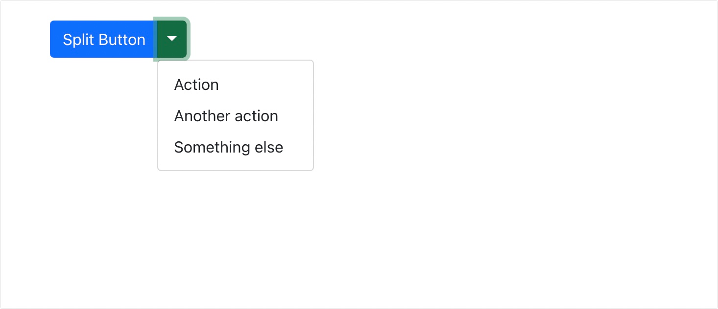
Bootstrap Split Button Dropdowns
With button groups, you can create split button dropdowns by combining the dropdown title with the element’s dropdown icon. Here is an example implementation of split dropdown buttons.
import Button from 'react-bootstrap/Button';
import ButtonGroup from 'react-bootstrap/ButtonGroup';
import Dropdown from 'react-bootstrap/Dropdown';

function SplitBasicExample() {
  return (
    <Dropdown as={ButtonGroup}>
      <Button>Split Button</Button>

      <Dropdown.Toggle split variant="success" id="dropdown-split-basic" />

      <Dropdown.Menu>
        <Dropdown.Item href="#/action-1">Action</Dropdown.Item>
        <Dropdown.Item href="#/action-2">Another action</Dropdown.Item>
        <Dropdown.Item href="#/action-3">Something else</Dropdown.Item>
      </Dropdown.Menu>
    </Dropdown>
  );
}

export default SplitBasicExample;
In the code snippet above, we’re using the ButtonGroup component as a dropdown menu. This would allow us to separate the toggle button and the title button. The code above will have the following output on the browser.
How to Add Headers to Dropdown Items
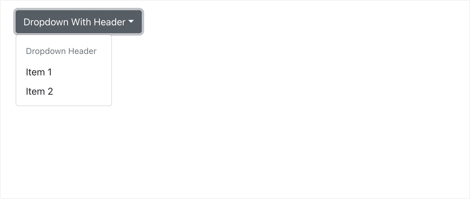
You can add a dropdown header using the <Dropdown.Header> component. You’ll typically add this component within the <Dropdown.Menu> component. Here is a basic implementation of a Dropdown menu with a header.
<Dropdown>
      <Dropdown.Toggle variant='secondary' id="dropdown-basic">
        Dropdown With Header
      </Dropdown.Toggle>
      <Dropdown.Menu>
        <Dropdown.Header>Dropdown Header</Dropdown.Header>
        <Dropdown.Item href="#/action-2">Item 1</Dropdown.Item>
        <Dropdown.Item href="#/action-3">Item 2</Dropdown.Item>
      </Dropdown.Menu>
    </Dropdown>
The code above will have the following output on the browser.
How to Create Dropup, Dropleft, and Dropright menus
Bootstrap also allows you to specify a direction for the dropdown menu you are creating. To use this, you’ll need to include the drop prop in the dropdown component.
Dropup Menu
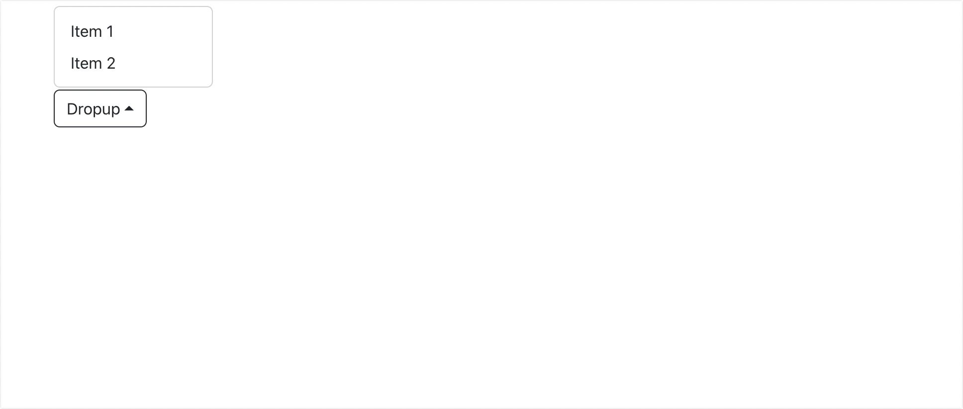
To use the dropup menu, simply add the drop prop to the dropdown component. Then add a string with a value of up. Let’s see an example implementation.
 <Dropdown drop='up'>
      <Dropdown.Toggle variant='text' id="dropdown-basic">
        Dropup
      </Dropdown.Toggle>
      <Dropdown.Menu>
        <Dropdown.Item href="#/action-2">Item 1</Dropdown.Item>
        <Dropdown.Item href="#/action-3">Item 2</Dropdown.Item>
      </Dropdown.Menu>
    </Dropdown>
Here is the output from the code implementation above.
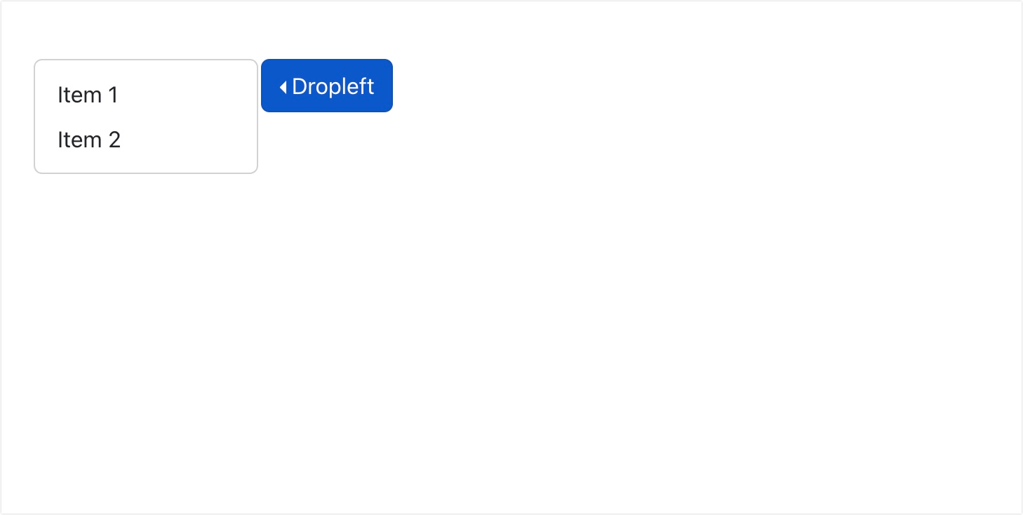
Dropleft Menu
To implement a menu that drops to the left, we also use the drop prop. In this case, we pass start as the value for the prop. Here is an example implementation.
<Dropdown drop='start'>
      <Dropdown.Toggle variant='text' id="dropdown-basic">
        Dropleft
      </Dropdown.Toggle>
      <Dropdown.Menu>
        <Dropdown.Item href="#/action-2">Item 1</Dropdown.Item>
        <Dropdown.Item href="#/action-3">Item 2</Dropdown.Item>
      </Dropdown.Menu>
</Dropdown>
When you run the code above, you should see the output on the browser window.
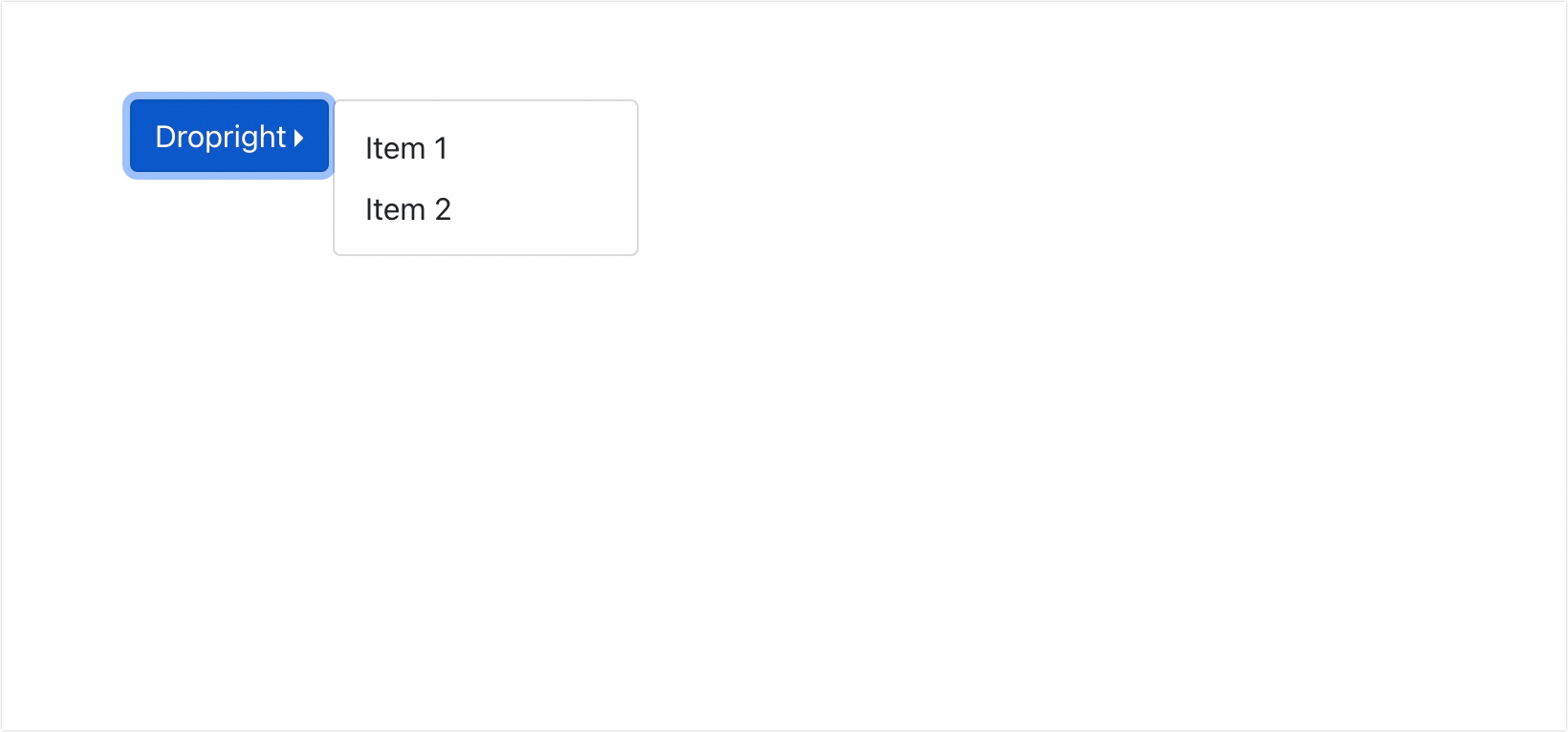
Dropright Menu
To implement the drop-right menu, we use the drop prop. In this case, you’ll need to specify the value as end. Here is an example implementation.
<Dropdown drop='end'>
      <Dropdown.Toggle variant='text' id="dropdown-basic">
        Dropleft
      </Dropdown.Toggle>
      <Dropdown.Menu>
        <Dropdown.Item href="#/action-2">Item 1</Dropdown.Item>
        <Dropdown.Item href="#/action-3">Item 2</Dropdown.Item>
      </Dropdown.Menu>
</Dropdown>
When you run the code above, you should get the output below.
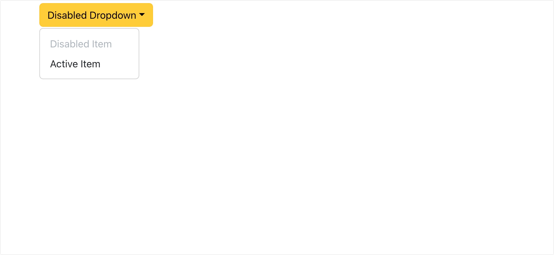
Disable Items in a Dropdown Menu
To disable an item within a dropdown menu, add the disabled prop to the <Dropdown.Item> component. Here is an example implementation.
<Dropdown drop='right'>
      <Dropdown.Toggle id="dropdown-basic">
        Disabled Dropdown
      </Dropdown.Toggle>
      <Dropdown.Menu>
        <Dropdown.Item disabled href="#/action-2">Disabled Item</Dropdown.Item>
        <Dropdown.Item href="#/action-3">Active Item</Dropdown.Item>
      </Dropdown.Menu>
</Dropdown>
In the code above, we’ve created 2 dropdown items. One with the disabled prop, while the other uses the regular item implementation. The code above will have the following output when viewed on the browser.
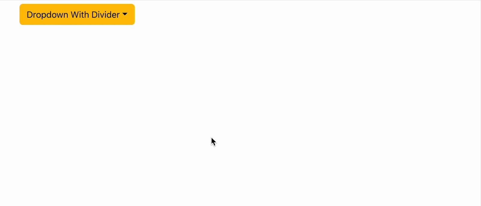
Dropdown Divider
The dropdown divider works like the horizontal rule tag <hr> in HTML. It adds a line break below each dropdown menu item.
You can add it to the dropdown menu using the <Dropdown.Divider/>component. It is a self-closing component. To see how it works, add the following code snippets to the return block in App.js.
//App.js

<Dropdown drop='right'>
      <Dropdown.Toggle variant='warning' id="dropdown-basic">
        Dropdown With Divider
      </Dropdown.Toggle>
      <Dropdown.Menu>
        <Dropdown.Item href="#/action-1">Item 1</Dropdown.Item>
        <Dropdown.Divider />
        <Dropdown.Item href="#/action-2">Item 2</Dropdown.Item>
        <Dropdown.Divider />
        <Dropdown.Item href="#/action-3">Item 3</Dropdown.Item>
      </Dropdown.Menu>
</Dropdown>
In the code above, we added the dropdown divider component below each menu item. Here is how the code will look on the UI.
How to Add Dropdowns via Data Attributes
Bootstrap provides an easy way to create dropdown menus using data attributes in HTML. This means you can have a div element and use bootstrap classes to enable dropdown in that element.
If you don’t want to install the react-bootstrap library, you can simply add the bootstrap CDN import to your index.html file. Then within your react components, you use standard HTML syntax to create your dropdown menus.
Basic Usage
Here is an example of using data attributes in HTML.
<div class="dropdown">
    <a href="#" class="dropdown-toggle" data-bs-toggle="dropdown">Dropdown</a>
    <div class="dropdown-menu">
        <a href="#" class="dropdown-item">Action</a>
        <a href="#" class="dropdown-item">Another action</a>
    </div>
</div>
In the code above, we use the .dropdown bootstrap class to specify that it should be a dropdown. The .dropdown-toggle class is used to define the dropdown’s trigger element. The data-bs-toggle=”dropdown” is a required attribute that’s added to the toggle element.
You should also get the following output when you run the code above.
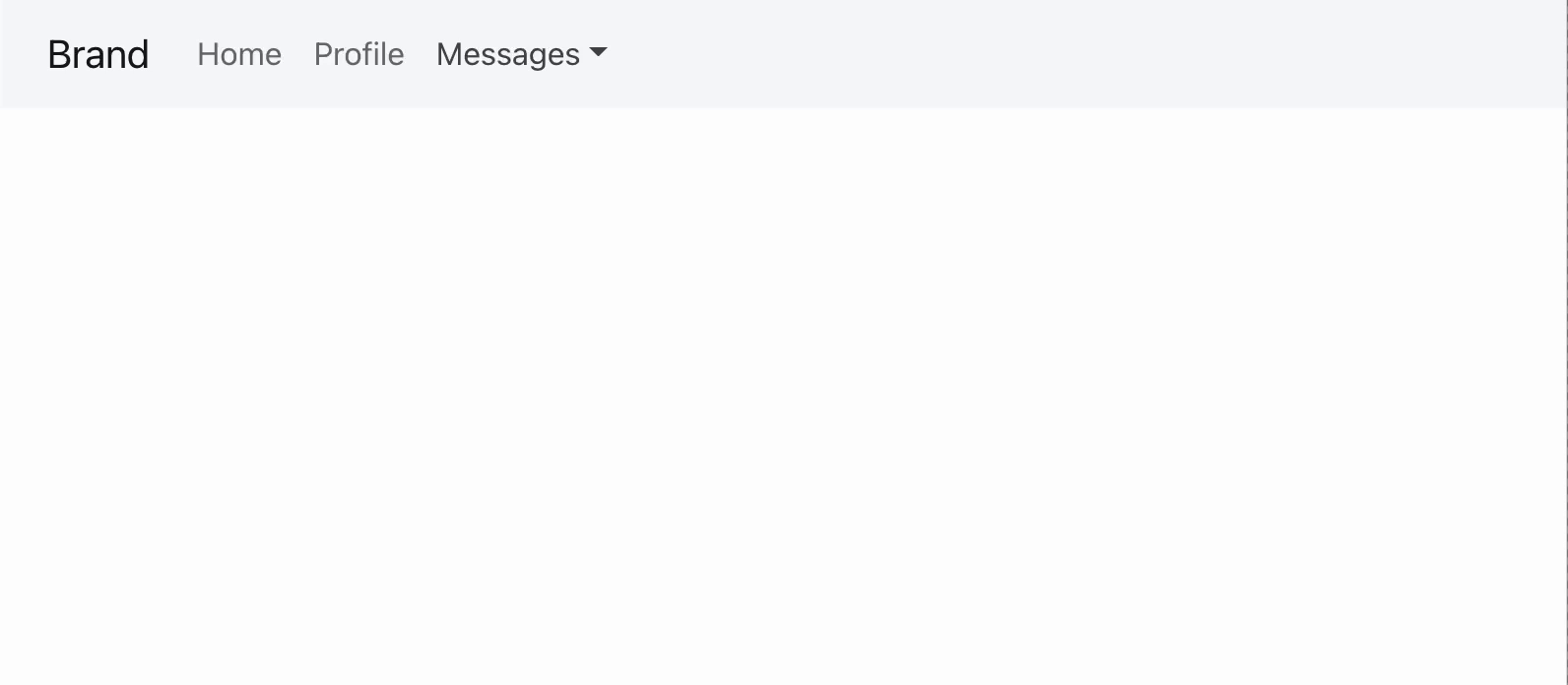
Dropdown Menu on Navbars
Similarly, you can use this implementation on navbars.
<nav class="navbar navbar-expand-sm navbar-light bg-light">
      <div class="container-fluid">
        <a href="#" class="navbar-brand">Brand</a>
        <button type="button" class="navbar-toggler" data-bs-toggle="collapse" data-bs-target="#navbarCollapse">
            <span class="navbar-toggler-icon"></span>
        </button>
        <div id="navbarCollapse" class="collapse navbar-collapse">
            <ul class="nav navbar-nav">
                <li class="nav-item">
                    <a href="#" class="nav-link">Home</a>
                </li>
                <li class="nav-item">
                    <a href="#" class="nav-link">Profile</a>
                </li>
                <li class="nav-item dropdown">
                    <a href="#" class="nav-link dropdown-toggle" data-bs-toggle="dropdown">Messages</a>
                    <div class="dropdown-menu">
                        <a href="#" class="dropdown-item">Inbox</a>
                        <a href="#" class="dropdown-item">Drafts</a>
                        <a href="#" class="dropdown-item">Sent Items</a>
                        <div class="dropdown-divider"></div>
                        <a href="#"class="dropdown-item">Trash</a>
                    </div>
                </li>
            </ul>
            <ul class="nav navbar-nav ms-auto">
                <li class="nav-item dropdown">
                    <a href="#" class="nav-link dropdown-toggle" data-bs-toggle="dropdown">Admin</a>
                    <div class="dropdown-menu dropdown-menu-end">
                        <a href="#" class="dropdown-item">Reports</a>
                        <a href="#" class="dropdown-item">Settings</a>
                        <div class="dropdown-divider"></div>
                        <a href="#" class="dropdown-item">Logout</a>
                    </div>
                </li>
            </ul>
        </div>
    </div>
</nav>
When you run the snippet above, you should get the following output.
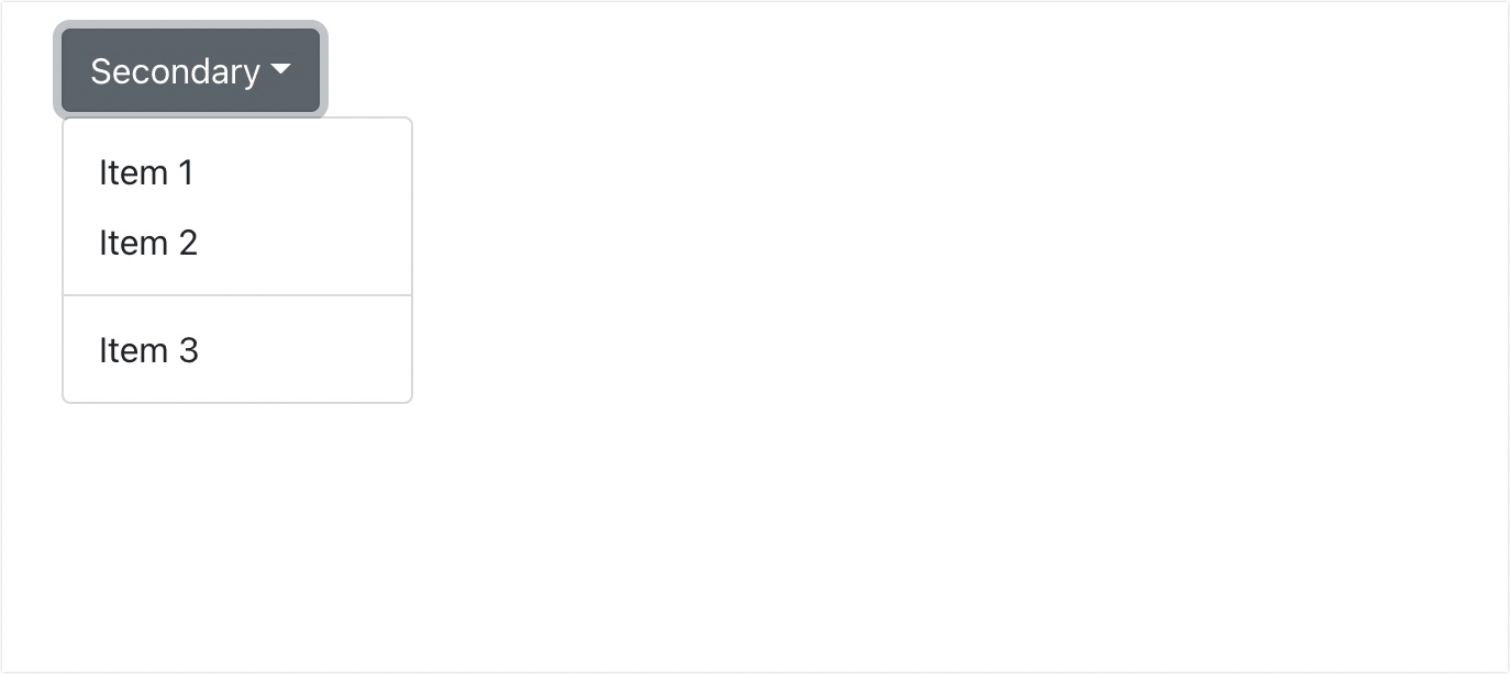
Dropdown Menu Within Buttons
Using data attributes, you can also create a dropdown button menu.
<div class="btn-group">
    <button type="button" class="btn btn-secondary dropdown-toggle" data-bs-toggle="dropdown">Secondary</button>
    <div class="dropdown-menu">
        <a href="#" class="dropdown-item">Item 1</a>
        <a href="#" class="dropdown-item">Item 2</a>
        <div class="dropdown-divider"></div>
        <a href="#" class="dropdown-item">Item 3</a>
    </div>
</div>
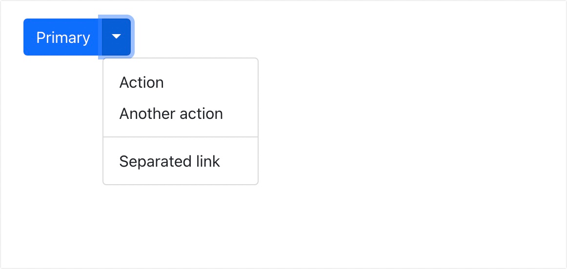
You can also implement split dropdown buttons via the data attribute.
<div class="btn-group">
    <button type="button" class="btn btn-primary">Primary</button>
    <button type="button" class="btn btn-primary dropdown-toggle dropdown-toggle-split" data-bs-toggle="dropdown">
        <span class="visually-hidden">Toggle Dropdown</span>
    </button>
    <div class="dropdown-menu">
        <a href="#" class="dropdown-item">Action</a>
        <a href="#" class="dropdown-item">Another one</a>
        <div class="dropdown-divider"></div>
        <a href="#" class="dropdown-item">Separated link</a>
    </div>
</div>
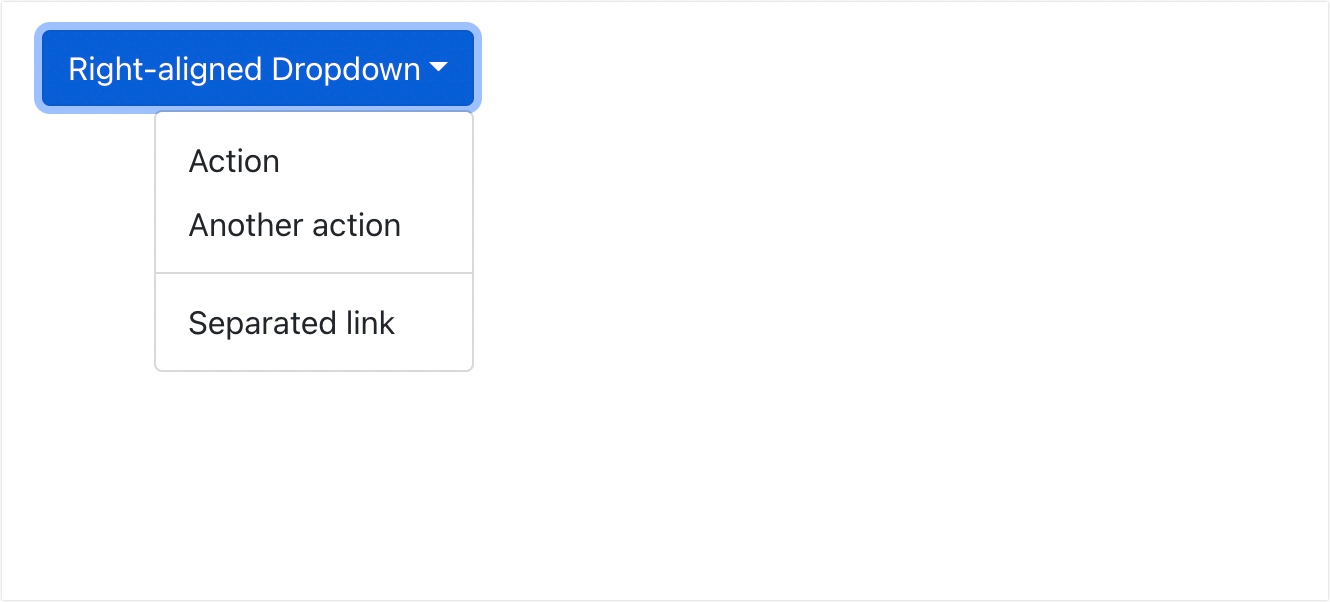
Creating the Right Aligned Dropdown Menus
The default dropdown clickable action will align the menu items on the bottom-left corner of its parent element. However, you can override the dropdown alignment options. To right-align your dropdown menu, simply add the dropdown-menu-end class next to the dropdown-menu class.
<div class="btn-group">
    <button type="button" class="btn btn-primary dropdown-toggle" data-bs-toggle="dropdown">Right-aligned Dropdown Menu</button>
    <div class="dropdown-menu dropdown-menu-end">
        <a href="#" class="dropdown-item">Action</a>
        <a href="#" class="dropdown-item">Another action</a>
        <div class="dropdown-divider"></div>
        <a href="#" class="dropdown-item">Separated link</a>
    </div>
</div>
To learn more about using Bootstrap in HTML, check out the video below.
Bootstrap Dropdown Alternatives
There are many alternatives to the Bootstrap dropdown component that you can use in your web projects. Some popular options include:
- Semantic UI: This comprehensive front-end framework includes a dropdown component and many other UI elements and styles.
- Materialize: This is a modern responsive front-end framework based on Material Design principles. It includes a dropdown component and many other UI elements.
- Bulma: This is a modern CSS framework based on Flexbox and built with SASS. It includes various UI components, including dropdowns, and has a clean, simple design.
Conclusion
Adding a dropdown menu improves user experience by allowing you to group related items together. In this tutorial, we’ve shown you how to create a dropdown menu using Bootstrap.
We explained how to integrate it with the React bootstrap library as well as adding bootstrap dropdown menus in HTML via data attributes.
If you use BootStrap to Build React components, CopyCat’s Figma to BootStrap converter will make you build faster than your competitors. Our tool generates production-level code that’s based on your Figma designs.
Related Blogs
Check out other related articles from our blog.
- Complete guide to using Bootstrap breakpoint
- How to use Bootstrap Flex in React
- How to Create Forms in Bootstrap
Related Articles
-
 React.js
How to use React useCallback Hook and Stop Unnecessary Re-renders
What are React Hooks? They let us "hook into" React class component features like state, reducer, and component lifecycle methods and use them within a functional component. React hooks are built-in Javascript objects or functions that allow developers to utilize…
August 23, 2022 -
React.js
Complete Guide to Using Material UI Button in React
Introduction Are you looking to add buttons to your React app? Material UI buttons provide an easy library for creating and customizing buttons with minimal coding. In this article, you'll learn how to install and use the material UI button…
October 31, 2022
