
 November 30, 2022
  Uncle Big Bay


Introduction
Forms are an important component of a website because they serve as a user interface for data to be received from the user to the website administrator or to collect information for a specific action such as contact us, registration and authentication form, payment form, and so on.
In this article, we’ll go over how to use Tailwind CSS to build a nice form for your web projects.
How Forms Work in Tailwind CSS
Tailwind CSS does not provide pre-built form control classes for building forms, but form controls and states are simple to style using existing Tailwind CSS utility classes.
This article will cover the basics of creating form components with Tailwind CSS utility classes, including examples and code snippets.
Setting Up Tailwind
For this tutorial, we’re going to make use of the Tailwind CSS Play CDN to set up our Tailwind CSS environment.
Please note that the Play CDN is designed for development purposes only, and is not the best choice for production.
- Create a new folder named tailwind-forms and open it in your favorite code editor (we love VScode)
- Next, create a new index.html file inside the tailwind-forms folder with the following HTML snippet:
<!DOCTYPE html>
<html>
<head>
<meta charset="UTF-8" />
<meta name="viewport" content="width=device-width, initial-scale=1.0" />
<!-- Tailwind Play CDN -->
<script src="https://cdn.tailwindcss.com"></script>
<title>Tailwind Play Ground</title>
</head>
<body class="flex justify-center items-center min-h-screen bg-red-900">
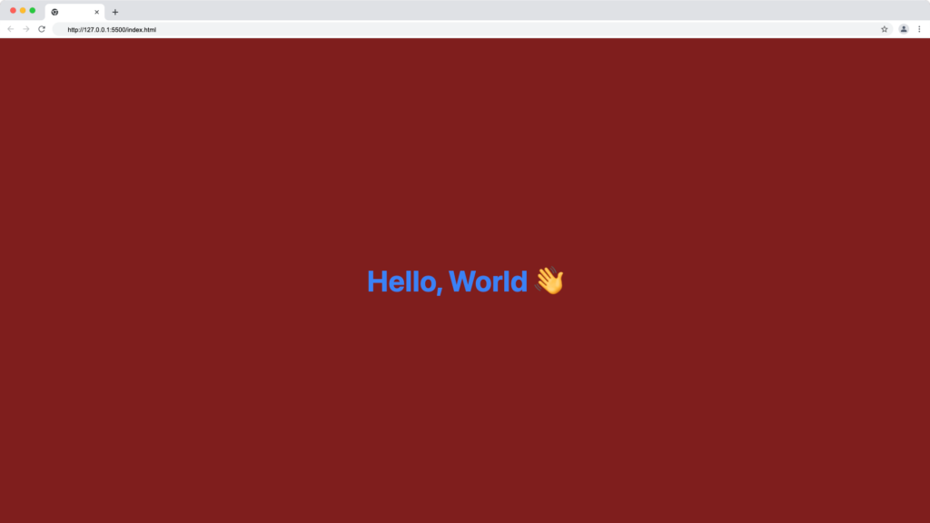
<h1 class="text-3xl font-bold text-blue-500">
Hello, World 👋
</h1>
</body>
</html>
Now, open your index.html file on your browser manually or by using the VScode live server extension.
If all goes well, your browser should look something like this:
How to Create Forms with Tailwind CSS
As previously stated in this article, unlike other CSS frameworks such as Bootstrap, which provide form classes for creating form elements such as input, textarea, and button, Tailwind CSS does not provide dedicated utility classes for creating form elements such as input, textarea, and button.
Instead, we’ll use Tailwind CSS utility classes like rounded, shadow, p, m, and border to control the form’s appearance and use focus and hover to control the form element states.
Tailwind Form Elements
We’ll discuss how to create and design the common HTML form elements using Tailwind CSS utility classes.
Input
The form input tag is the most commonly used form element, and it can be displayed based on the type attribute.
A basic HTML input tag structure looks as follows:
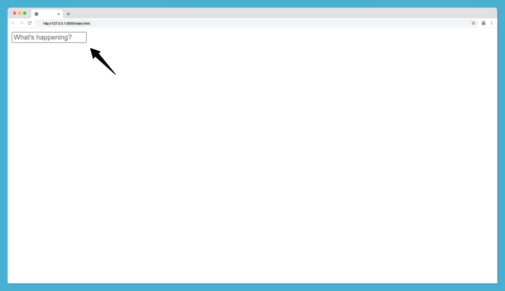
<input placeholder="What's happening?" type="text" />
Where the type can be any of text, number, email, password etc. The output of the above input tag code without Tailwind CSS will be as follow:
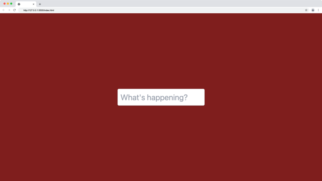
Let’s update our index.html file with the text inputs tag using the Tailwind CSS classes text-2xl shadow border p-2 rounded as shown below:
<input
  placeholder="What's happening?"
  type="text"
  class="text-2xl shadow border p-2 rounded"
/>
From the above input tag snippet, we added five Tailwind CSS utility classes to the input box:
- The text-2xl class to set the font size of the input box to 24px.
- The shadow class to add outer box shadows to the input box.
- The border class to add a border around the input box.
- The p-2 class to add a 8px at the top, right, bottom and left of the input box.
- Finally, we added the rounded class to apply a 4px border radius to the input box.
Our Tailwind input box should now look something like this:
PS: You can also apply your custom CSS as well.
Textarea
The textarea is similar to the input tag, however, the textarea is adjustable and can contain multi-line content, unlike the input tag.
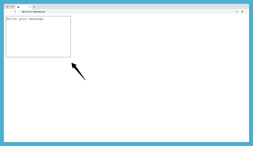
The basic syntax for an HTML textarea looks as follows:
<textarea
    placeholder="Write your message"
    cols="30"
    rows="10"
></textarea>
Where the cols and rows attributes are used to control the height and width of the textarea box. The output of the above textarea tag code without Tailwind CSS will be as follow:
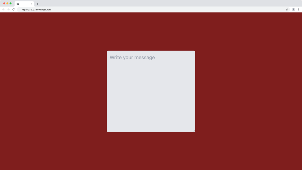
Let’s update our index.html file with the textarea tag using these Tailwind CSS classes border p-2 shadow-sm bg-gray-200 as shown below:
<textarea
    placeholder="Write your message"
    cols="30"
    rows="10"
    class="border p-2 shadow-sm bg-gray-200 rounded"
></textarea>
From the above textarea tag snippet, we added five Tailwind CSS utility classes to the input box:
- The border class to add a border around the textarea box.
- The p-2 class to add a 8px at the top, right, bottom and left of the textarea box.
- The shadow-sm class to add a smaller outer box shadow to the textarea box.
- The bg-gray-200 class to add a dark background color to the textarea box.
- The rounded class to add border-radius to the textarea box.
Our textarea box should now look something like this:
Select
The select tag is useful for creating a drop-down list of options in a form for users to pick their choice.
The basic syntax for an HTML select tag looks as follows:
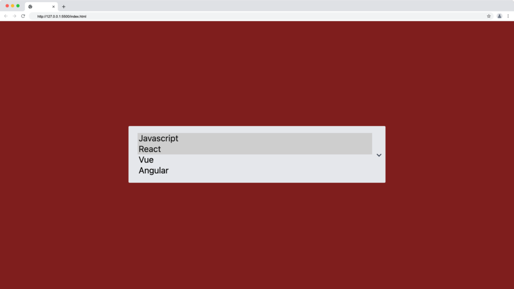
<select>
    <option value="javascript">Javascript</option>
    <option value="react">React</option>
    <option value="vue">Vue</option>
    <option value="Angular">Angular</option>
</select>
The output of the above select tag code without Tailwind CSS will be as shown below:
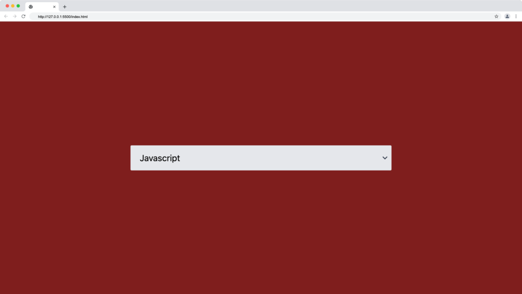
We can improve the appearance of the HTML select tag using Tailwind CSS utility classes and an arrow down SVG as follows:
<div class="relative w-1/2">
    <select
    class="appearance-none w-full bg-gray-200 border border-gray-200 py-3 px-4 pr-6 rounded-sm leading-tight"
    >
        <option value="javascript">Javascript</option>
        <option value="react">React</option>
        <option value="vue">Vue</option>
        <option value="Angular">Angular</option>
    </select>
    <div
    class="pointer-events-none absolute inset-y-0 right-0 flex items-center px-1 text-gray-700"
    >
        <svg
            class="fill-current h-4 w-4"
            xmlns="http://www.w3.org/2000/svg"
            viewBox="0 0 20 20"
        >
            <path
            d="M9.293 12.95l.707.707L15.657 8l-1.414-1.414L10 10.828 5.757 6.586 4.343 8z"
            />
        </svg>
    </div>
</div>
The Tailwind code above will improve the native appearance of the select element as shown below:
Select Multiple
A select multiple is an option in the select tag that enables the user to select multiple options from a list.
We can create a form multi-select dropdown by passing the multiple attribute to the select tag :
<select multiple="true" class="...">
...
</select>
Or setting the multiple attributes to true as follows:
<select multiple class="...">
...
</select>
Then, we’ll have the following result:
Radio button
The form radio button is a type attribute of an input element. It is useful for restricting a user to selecting only one option from a list of the same category options.
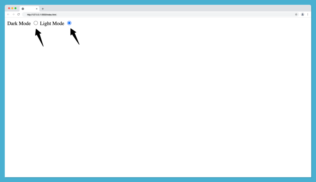
Given that we want a user to select either a dark mode or a light mode but not the two at the same time. We create this with the input radio button as follows:
<label for="dark-mode">Dark Mode</label>
<input type="radio" name="theme" id="dark-mode" />

<label for="light-mode">Light Mode</label>
<input type="radio" name="theme" id="light-mode" />
Then we have the following output with vanilla HTML radio:
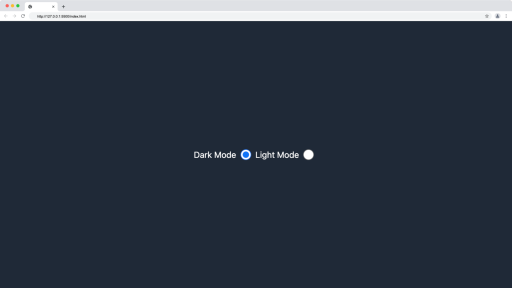
The code below recreates an input radio button using Tailwind CSS:
<body class="flex justify-center items-center min-h-screen bg-gray-800">

    <label for="dark-mode" class="text-white">Dark Mode</label>
    <input
        type="radio"
        name="theme"
        id="dark-mode"
        class="mx-2"
    />

    <label for="light-mode" class="text-white">Light Mode</label>
    <input
        type="radio"
        name="theme"
        id="light-mode"
        class="mx-2"
    />
</body>
The output of the code above will be as follows:
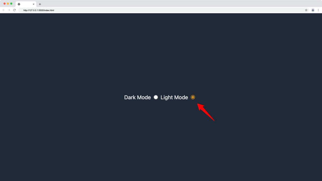
Changing the color of the Radio button in Tailwind CSS
We can make use of the Tailwind Accent Color to change the default color of the radio button. We’ll make use of the accent-gray-800 as shown below:
<body class="flex justify-center items-center min-h-screen bg-gray-800">
<label for="dark-mode" class="text-white">Dark Mode</label>
<input
    type="radio"
    name="theme"
    id="dark-mode"
    class="mx-2 accent-gray-800"
/>

<label for="light-mode" class="text-white">Light Mode</label>
<input
    type="radio"
    name="theme"
    id="light-mode"
    class="mx-2 accent-yellow-600"
/>
</body>
Our radios button will display a yellow color when checked:
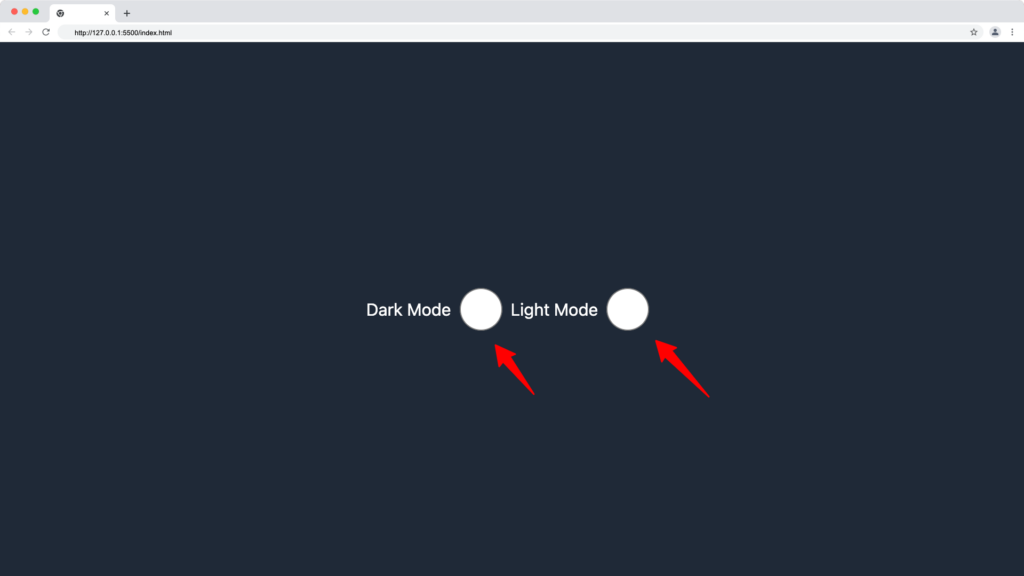
Changing the size of the Radio button in Tailwind CSS
Use the Tailwind size utility classes to adjust the width and height of the radio button as shown in the code below:
<body class="flex justify-center items-center min-h-screen bg-gray-800">
<label for="dark-mode" class="text-white">Dark Mode</label>
<input
    type="radio"
    name="theme"
    id="dark-mode"
    class="mx-2 h-10 w-10"
/>

<label for="light-mode" class="text-white">Light Mode</label>
<input
    type="radio"
    name="theme"
    id="light-mode"
    class="mx-2 h-10 w-10"
/>
</body>
The h10 and w-10 will add a width and height of 40px to the radio button, making it bigger as shown below:
Checkbox
The form checkbox is a type attribute of an input element. It is useful to enable users to select one or more options in the form of square options.
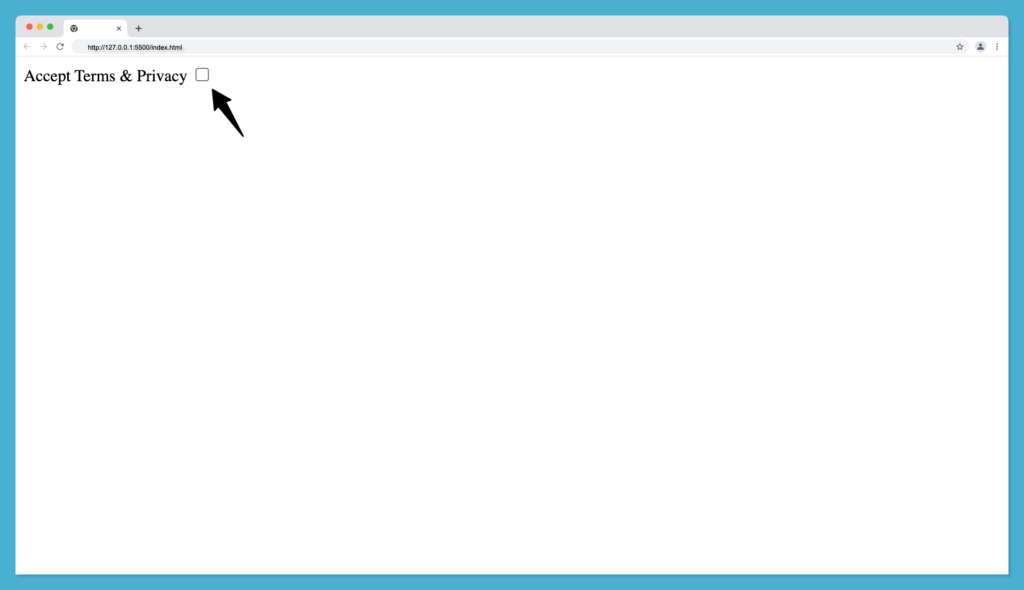
The basic syntax for an HTML checkbox tag looks as follows:
<label for="toc">Accept Terms & Privacy</label>
<input type="checkbox" id="toc" />
Then we have the following output with a vanilla HTML checkbox:
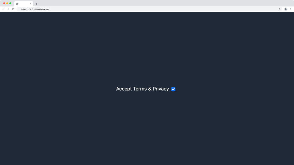
The code below recreates an input checkbox using Tailwind CSS:
<label for="toc" class="text-white">Accept Terms & Privacy</label>
<input type="checkbox" id="toc" class="mt-1 mx-2 cursor-pointer" />
The output of the Tailwind checkbox code above will be as follows:
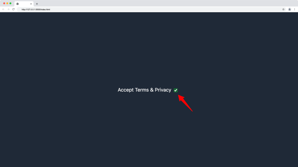
Changing the color of the checkbox in Tailwind CSS
We can make use of the Tailwind Accent Color to change the default color of the radio button. We’ll make use of the accent-green-800 as shown below:
<label for="toc" class="text-white">Accept Terms & Privacy</label>
<input
    type="checkbox"
    id="toc"
    class="accent-green-800 mt-1 mx-2 cursor-pointer"
/>
Our radios button will display a green color when checked:
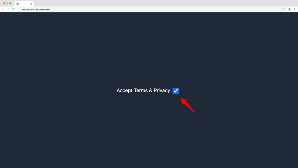
Changing the size of the checkbox in Tailwind CSS
Use the Tailwind size utility classes to adjust the width and height of the checkbox button as shown in the code below:
<label for="toc" class="text-white">Accept Terms & Privacy</label>
<input type="checkbox" id="toc" class="h-5 w-5 mt-1 mx-2 cursor-pointer" />
The h-5 and w-5 will add a width and height of 20px to the checkbox button, making it bigger as shown below:
Tailwind Registration Form
In this section, we’re going to put everything we’ve learned about building forms with Tailwind CSS utility classes to create a registration form as shown below:
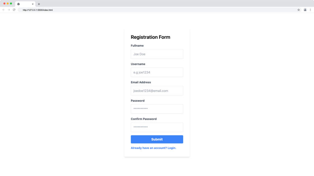
Tailwind registration form code snippet:
<body class="flex justify-center items-center min-h-screen">
    <div class="w-full max-w-xs">
      <form class="bg-white shadow-md rounded px-8 pt-6 pb-8 mb-4">
        <h2 class="mb-4 text-2xl font-semibold">Registration Form</h2>
        <div class="mb-4">
          <label
            class="block text-gray-700 text-sm font-bold mb-2"
            for="fullname"
          >
            Fullname
          </label>
          <input
            class="shadow-sm appearance-none border rounded w-full py-3 px-3 text-gray-700 leading-tight focus:outline-none focus:shadow-outline"
            id="fullname"
            type="text"
            placeholder="Joe Doe"
          />
        </div>
        <div class="mb-4">
          <label
            class="block text-gray-700 text-sm font-bold mb-2"
            for="username"
          >
            Username
          </label>
          <input
            class="shadow-sm appearance-none border rounded w-full py-3 px-3 text-gray-700 leading-tight focus:outline-none focus:shadow-outline"
            id="username"
            type="text"
            placeholder="e.g joe1234"
          />
        </div>
        <div class="mb-4">
          <label class="block text-gray-700 text-sm font-bold mb-2" for="email">
            Email Address
          </label>
          <input
            class="shadow-sm appearance-none border rounded w-full py-3 px-3 text-gray-700 leading-tight focus:outline-none focus:shadow-outline"
            id="email"
            type="text"
            placeholder="joedoe1234@email.com"
          />
        </div>
        <div class="mb-4">
          <label
            class="block text-gray-700 text-sm font-bold mb-2"
            for="password"
          >
            Password
          </label>
          <input
            class="shadow-sm appearance-none border rounded w-full py-3 px-3 text-gray-700 leading-tight focus:outline-none focus:shadow-outline"
            id="password"
            type="password"
            placeholder="**********"
          />
        </div>
        <div class="mb-4">
          <label
            class="block text-gray-700 text-sm font-bold mb-2"
            for="cpassword"
          >
            Confirm Password
          </label>
          <input
            class="shadow-sm appearance-none border rounded w-full py-3 px-3 text-gray-700 leading-tight focus:outline-none focus:shadow-outline"
            id="password"
            type="password"
            placeholder="**********"
          />
        </div>

        <button
          class="bg-blue-500 w-full hover:bg-blue-700 text-white font-bold py-2 px-4 rounded focus:outline-none focus:shadow-outline"
          type="button"
        >
          Submit
        </button>

        <a
          class="mt-3 inline-block align-baseline font-bold text-sm text-blue-500 hover:text-blue-800"
          href="#"
        >
          Already have an account? Login.
        </a>
      </form>
    </div>
  </body>
Tailwind Login Form
In this section, we’re going to put everything we’ve learned about building forms with Tailwind CSS utility classes to create a login form with a username and password input field as shown below:
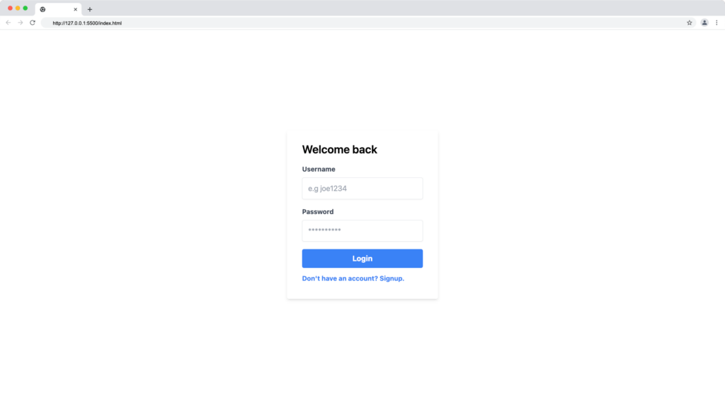
Tailwind registration form code snippet:
<body class="flex justify-center items-center min-h-screen">
    <div class="w-full max-w-xs">
      <form class="bg-white shadow-md rounded px-8 pt-6 pb-8 mb-4">
        <h2 class="mb-4 text-2xl font-semibold">Welcome back</h2>

        <div class="mb-4">
          <label
            class="block text-gray-700 text-sm font-bold mb-2"
            for="username"
          >
            Username
          </label>
          <input
            class="shadow-sm appearance-none border rounded w-full py-3 px-3 text-gray-700 leading-tight focus:outline-none focus:shadow-outline"
            id="username"
            type="text"
            placeholder="e.g joe1234"
          />
        </div>

        <div class="mb-4">
          <label
            class="block text-gray-700 text-sm font-bold mb-2"
            for="password"
          >
            Password
          </label>
          <input
            class="shadow-sm appearance-none border rounded w-full py-3 px-3 text-gray-700 leading-tight focus:outline-none focus:shadow-outline"
            id="password"
            type="password"
            placeholder="**********"
          />
        </div>

        <button
          class="bg-blue-500 w-full hover:bg-blue-700 text-white font-bold py-2 px-4 rounded focus:outline-none focus:shadow-outline"
          type="button"
        >
          Login
        </button>

        <a
          class="mt-3 inline-block align-baseline font-bold text-sm text-blue-500 hover:text-blue-800"
          href="#"
        >
          Don't have an account? Signup.
        </a>
      </form>
    </div>
  </body>
How to Create Dark Mode Forms in Tailwind CSS
Dark-mode themes are common in modern websites, we can build a dark-mode form in Tailwind CSS by applying a dark background color to the body and the form container. We’ll cover the basics of creating a dark mode registration and login form in this section.
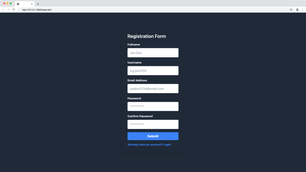
Tailwind CSS Dark Mode Registration Form
For this tutorial, we’ll apply a background class of bg-gray-800 to the body and form tag and then apply a text color class of text-gray-200 to the heading and label tag in the form, as shown below:
<body class="flex justify-center items-center min-h-screen bg-gray-800">
    <div class="w-full max-w-xs">
      <form class="bg-gray-800 shadow-md rounded px-8 pt-6 pb-8 mb-4">
        <h2 class="text-gray-200 mb-4 text-2xl font-semibold">
          Registration Form
        </h2>
        <div class="mb-4">
          <label
            class="block text-gray-200 text-sm font-bold mb-2"
            for="fullname"
          >
            Fullname
          </label>
          <input
            class="shadow-sm appearance-none border rounded w-full py-3 px-3 text-gray-700 leading-tight focus:outline-none focus:shadow-outline"
            id="fullname"
            type="text"
            placeholder="Joe Doe"
          />
        </div>
        <div class="mb-4">
          <label
            class="block text-gray-200 text-sm font-bold mb-2"
            for="username"
          >
            Username
          </label>
          <input
            class="shadow-sm appearance-none border rounded w-full py-3 px-3 text-gray-700 leading-tight focus:outline-none focus:shadow-outline"
            id="username"
            type="text"
            placeholder="e.g joe1234"
          />
        </div>
        <div class="mb-4">
          <label class="block text-gray-200 text-sm font-bold mb-2" for="email">
            Email Address
          </label>
          <input
            class="shadow-sm appearance-none border rounded w-full py-3 px-3 text-gray-700 leading-tight focus:outline-none focus:shadow-outline"
            id="email"
            type="text"
            placeholder="joedoe1234@email.com"
          />
        </div>
        <div class="mb-4">
          <label
            class="block text-gray-200 text-sm font-bold mb-2"
            for="password"
          >
            Password
          </label>
          <input
            class="shadow-sm appearance-none border rounded w-full py-3 px-3 text-gray-700 leading-tight focus:outline-none focus:shadow-outline"
            id="password"
            type="password"
            placeholder="**********"
          />
        </div>
        <div class="mb-4">
          <label
            class="block text-gray-200 text-sm font-bold mb-2"
            for="cpassword"
          >
            Confirm Password
          </label>
          <input
            class="shadow-sm appearance-none border rounded w-full py-3 px-3 text-gray-700 leading-tight focus:outline-none focus:shadow-outline"
            id="password"
            type="password"
            placeholder="**********"
          />
        </div>

        <button
          class="bg-blue-500 w-full hover:bg-blue-700 text-white font-bold py-2 px-4 rounded focus:outline-none focus:shadow-outline"
          type="button"
        >
          Submit
        </button>

        <a
          class="mt-3 inline-block align-baseline font-bold text-sm text-blue-500 hover:text-blue-800"
          href="#"
        >
          Already have an account? Login.
        </a>
      </form>
    </div>
  </body>
The Tailwind CSS code above will produce the following dark mode registration form:
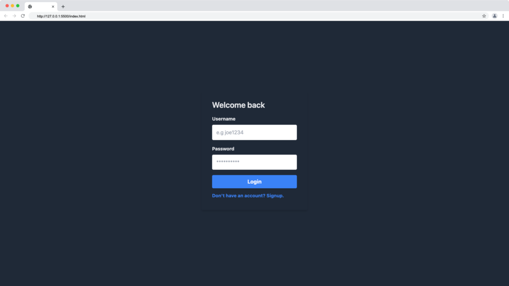
Tailwind CSS Dark Mode Login Form
Similar to the dark mode registration form, we can create a dark mode login form using the dark background and text color, as shown in the code below:
<body class="flex justify-center items-center min-h-screen bg-gray-800">
    <div class="w-full max-w-xs">
      <form class="bg-gray-800 shadow-md rounded px-8 pt-6 pb-8 mb-4">
        <h2 class="text-gray-200 mb-4 text-2xl font-semibold">Welcome back</h2>

        <div class="mb-4">
          <label
            class="block text-gray-200 text-sm font-bold mb-2"
            for="username"
          >
            Username
          </label>
          <input
            class="shadow-sm appearance-none border rounded w-full py-3 px-3 text-gray-700 leading-tight focus:outline-none focus:shadow-outline"
            id="username"
            type="text"
            placeholder="e.g joe1234"
          />
        </div>

        <div class="mb-4">
          <label
            class="block text-gray-200 text-sm font-bold mb-2"
            for="password"
          >
            Password
          </label>
          <input
            class="shadow-sm appearance-none border rounded w-full py-3 px-3 text-gray-700 leading-tight focus:outline-none focus:shadow-outline"
            id="password"
            type="password"
            placeholder="**********"
          />
        </div>

        <button
          class="bg-blue-500 w-full hover:bg-blue-700 text-white font-bold py-2 px-4 rounded focus:outline-none focus:shadow-outline"
          type="button"
        >
          Login
        </button>

        <a
          class="mt-3 inline-block align-baseline font-bold text-sm text-blue-500 hover:text-blue-800"
          href="#"
        >
          Don't have an account? Signup.
        </a>
      </form>
    </div>
  </body>
The Tailwind CSS code above will produce the following dark-mode login form:
You can learn more about Tailwind CSS Dark Mode from here.
Free Tailwind CSS Form Components
The resources listed below can help you get ideas and code samples for creating responsive and interactive forms with Tailwind CSS.
Tailwind Elements
Tailwind Elements provides Bootstrap components that are recreated with Tailwind CSS.

Some of the Tailwind Elements components that can be useful for building Tailwind CSS forms include:
- Tailwind Elements Timepicker component
- Tailwind Elements Datepicker component
- Tailwind Elements Dropdown component
- Tailwind Elements form elements (input, textarea and form templates)
Flowbite
Flowbite library offers fully responsive and interactive form UI components built with Tailwind CSS utility classes for frameworks such as React, Vue.js, Svelte and Angular.

This library provides the following form components:
- Tailwind CSS Buttons – Flowbite
- Tailwind CSS Input Field – Flowbite
- Tailwind CSS File Input – Flowbite
- Tailwind CSS Textarea – Flowbite
- Tailwind CSS Select – Flowbite
- Tailwind CSS Search Input – Flowbite, etc.
Free Frontend
The free frontend website provides a collection of free Tailwind CSS form code examples from Codepen and other resources. Examples include form grids, inline forms etc.
Wrapping Up
We discussed how to create form components in Tailwind CSS as well as how to build a dark mode form in this article. This article also includes inspiration resources and code snippets for creating forms in Tailwind CSS.
If you prefer a video tutorial on Tailwind forms, check the official video below:
Checkout the video below on how to fix forms in Tailwind CSS:
Finally, you can find more articles like this on our CopyCat blog. CopyCat is a tool that converts your Figma files to a ready-to-use React project, saving you over 35% of development time. Copycat can be found here.
Interesting Reads From Our Blogs
- Setting up Tailwind CSS in React Application: Walk-through and Examples
- 10 CSS Frameworks for Frontend Developers in 2022
- How to Add Toast Notifications to a React App Using React Toastify
- The Top 16 Design System Examples
Happy Coding!
Related Articles
-
 React.js
Guide to Creating Cards with Material UI Card
Introduction Just like physical cards, cards in User Interface (UI) designs contain information about a particular subject. It is an organized way of presenting content in a web application. Note that we can convert our UI designs to code from…
December 24, 2022 -
React.js
Reactjs PopUp: How to Easily Create Popups in React?
Great user experience and user interfaces plays a vital role in the success of any Application. Whether it is a Hybrid Application or a Native one, the end-user demands good UX. When creating any such good experience on an App,…
February 7, 2022

